Growth
Neuro-Branding: The Architecture of Subconscious B2B Conversion
01The Myth of the Rational Buyer
In high-stakes B2B procurement, we operate under a comforting delusion.
We assume stakeholders are "Logical Maximizers." We believe they weigh technical specifications, SLAs, and ROI projections with cold, clinical precision.
The neuro-biological data contradicts this entirely.
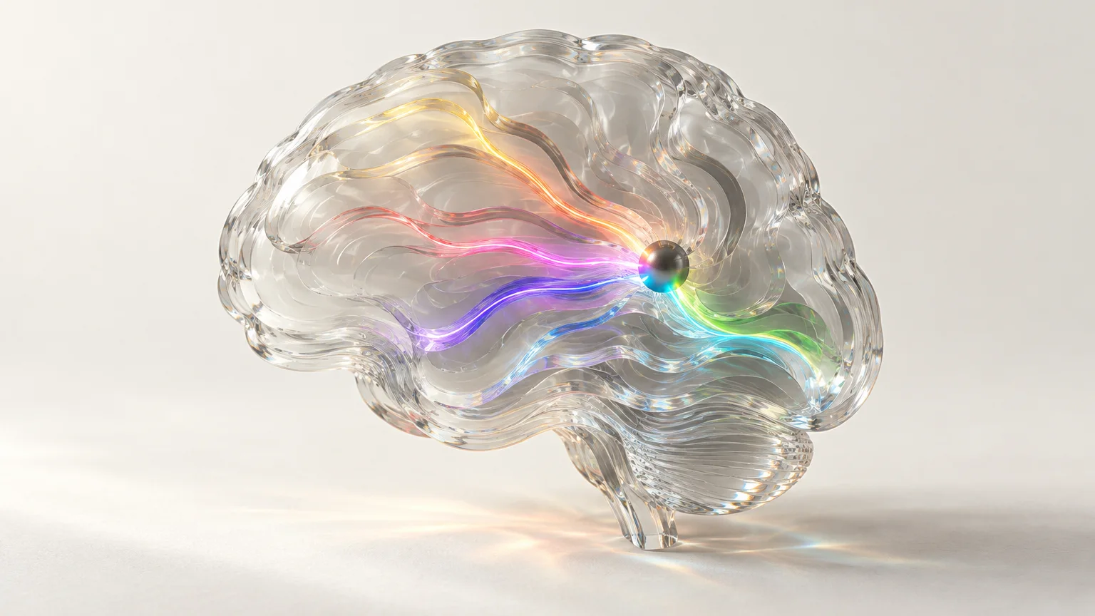
Research in Behavioral Economics and fMRI studies confirms that the human brain initiates the "Trust or Threat" response within 33 to 50 milliseconds of visual exposure. This happens in the amygdala—long before the rational prefrontal cortex has processed a single bullet point of your value proposition.
If your brand's visual identity fails the brain's subconscious audit, your technical superiority becomes irrelevant.
You aren't just losing a sale.
You are being filtered out by the Reticular Activating System (RAS).
02The Biological Blueprint: Optimizing Visual Stimuli
To achieve Neuro-Design Excellence, we must treat color, form, and typography not as "creative choices," but as sensory inputs designed to trigger specific neural pathways.
1. Chromatic Engineering: Beyond Basic Color Theory
Colors are not merely aesthetic; they are biological signals that modulate the Autonomic Nervous System (ANS).
The Blue-Trust Correlation: In B2B, high-wavelength colors like Deep Navy stimulate the release of oxytocin, signaling stability and long-term reliability. The Arousal Paradox: High-saturation reds or oranges trigger minor cortisol spikes. While effective for B2C "Urgency," in a complex B2B sale, they can inadvertently signal "High Risk" to a cautious CFO. The Goal: Align your palette with the Chronotype of your decision-maker. Stability requires low-arousal pigments; innovation requires high-contrast, additive color gamuts.
2. Morphological Psychology: The Power of Form
The human brain is evolutionarily hardwired to react to geometry. This is known as Neural Encodement of Shape.
Angular vs. Curvilinear: Sharp angles (triangles, zig-zags) are processed as "Active" and "Aggressive." They signal cutting-edge technology but can also trigger a primal threat response. The Circle Constraint: Curvilinear forms suggest inclusivity and organic growth. The Strategy: Use Gestalt Principles of "Continuity" and "Closure" to reduce cognitive load. If your logo or UI is difficult to "solve" visually, the brain experiences Cognitive Friction, which it mistakenly attributes to your product's complexity.
3. Typographic Fluency and Semantic Priming
Typography is the "body language" of your written word. The ease with which a font is read—Processing Fluency—directly impacts the perceived truth of the statement.
Serif vs. Sans-Serif: Serif fonts (like Garamond) are neurologically associated with "Institutional Authority" and historical permanence. Sans-serifs (like Inter or Helvetica) prime the brain for "Efficiency" and "Digital-First" agility. The Deficit of Complexity: Intricate or decorative fonts increase the brain's metabolic cost to process information. The Outcome: High fluency leads to Affirmative Bias. If it’s easy to read, it feels "True."
03The Insight: The "Visual Body Language" of B2B
Here is the expert perspective often missed in standard brand audits:
Visual Identity is the "Pre-Cognitive Handshake."
In 2026, where AI-generated content is creating an Information Entropy crisis, the human brain is retreating toward "Heuristics"—mental shortcuts. Your brand isn't just a logo; it is a Heuristic Anchor.
When your visual system (Neuro-Branding) is inconsistent, it creates Cognitive Dissonance. If your sales deck feels "light" but your product is "enterprise-grade," the brain senses a mismatch. This "gut feeling" is actually the ventromedial prefrontal cortex flagging a potential deception.
Strategic rebranding is not about "refreshing a look." It is about Sensory Alignment with the client's internal risk-assessment model.
04Relevant Feed: A Call for Insight Sharing
We are seeing a massive shift from "Creative-Led" design to "Data-Driven Neuro-Architecture." However, the ethical boundary between "Optimizing for Clarity" and "Subconscious Nudging" is becoming thinner.
I invite my colleagues in UX Research, Brand Strategy, and Cognitive Science to share:
Have you seen a measurable delta in Time-to-Trust by adjusting the chromatic contrast of your B2B interfaces? In an era of "Pixel-First" branding, are we losing the "Tactile Authority" that traditional serif-heavy branding once provided? How are you adapting your Neuro-Design to account for "Screen Fatigue" in C-level stakeholders?
Let's move the conversation from "I like this color" to "This color activates the correct neural pathway."