01
Visão geral
01.1
Em resumo
The letter K drawn as an eagle: power, precision and performance for a Dubai car-service brand.
- Projeto
- Identidade visual
- Setor
- Car and heavy-machinery services · Dubai
- Ano
- 2025
- Serviços
- Identidade visual, Brand Guidelines
01.2
Introdução
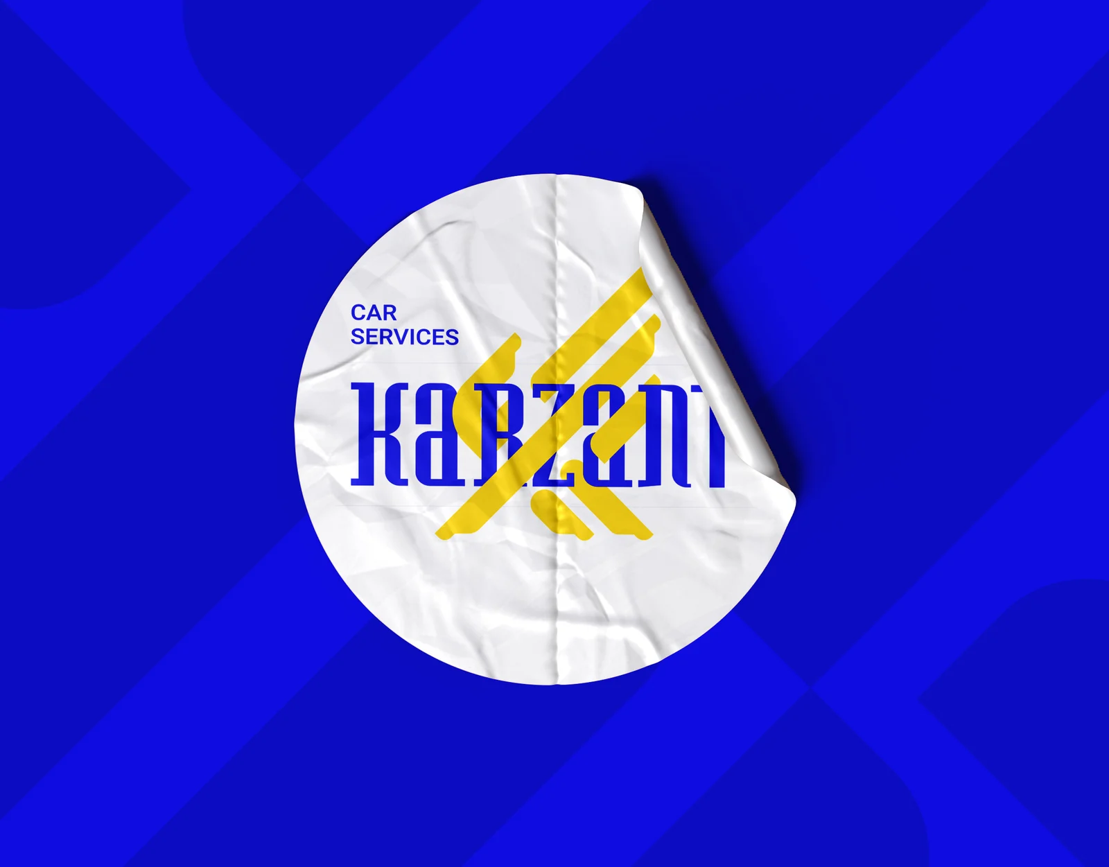
KARZANT Car Services works in Dubai’s highly competitive automotive market and needed an identity that communicates trust, engineering precision and high performance.
01.3
Sobre
The logo transforms the letter K into an eagle, merging dominance, strategic vision, speed and technical mastery into one memorable mark. The brand book sets out its rationale, structure and rules, and carries it across stationery, environmental graphics, vehicles, packaging, uniforms and digital applications.
01.4
História
Brand history in a brand book provides the narrative foundation of origin and growth. Beyond chronology, it should establish a coherent meaning system that can be traced across visual language, symbol construction, tone of voice, and service experience. A well crafted history sets the psychological context for trust and frames the logic of differentiation.
KARZANT emerged in Dubai’s highly competitive automotive service landscape to meet a growing demand for accurate, fast, and reliable technical care for vehicles and heavy machinery. From the outset, the brand centered on technical mastery, rigorous quality standards, and customer reassurance. Over time, Karzant developed into a trust driven service presence where expertise becomes a consistent experience. The renewed identity builds on this foundation by transforming the letter K into an eagle, elevating power, precision, and performance into a memorable visual narrative.

01.5
Missão
A mission defines what a brand delivers today, for whom, and through which concrete capabilities. It should be operational, measurable, and closely aligned with service architecture and customer experience. In identity design, the mission prevents the visual system from becoming a disconnected aesthetic by anchoring it to real performance commitments.
KARZANT’s mission is to deliver specialized automotive and heavy machinery services with a focus on accurate diagnostics, fast execution, and sustained quality. With expert teams and modern technologies, we provide a trust centered experience that restores every vehicle to optimal safety and performance standards.

01.6
Visão
KARZANT’s vision is to become one of the most trusted and leading automotive and heavy machinery service brands in Dubai and the wider region. We aim to set new benchmarks for technical strength, operational precision, and practical innovation, positioning Karzant as a reference point of trust in the industry.
01.7
Valores da marca
• Technical Precision: Commitment to accurate diagnostics, standard compliant execution, and rigorous quality control
• Trust and Transparency: Clear explanations of issues, solutions, and costs with full accountability for outcomes
• Speed with Quality: Efficient delivery without compromising professional standards
• Mastery and Professionalism: Expertise grounded in experience and continuous technical development
• Practical Innovation: Adopting technology to create measurable improvements in performance and customer experience
01.8
Tom de voz
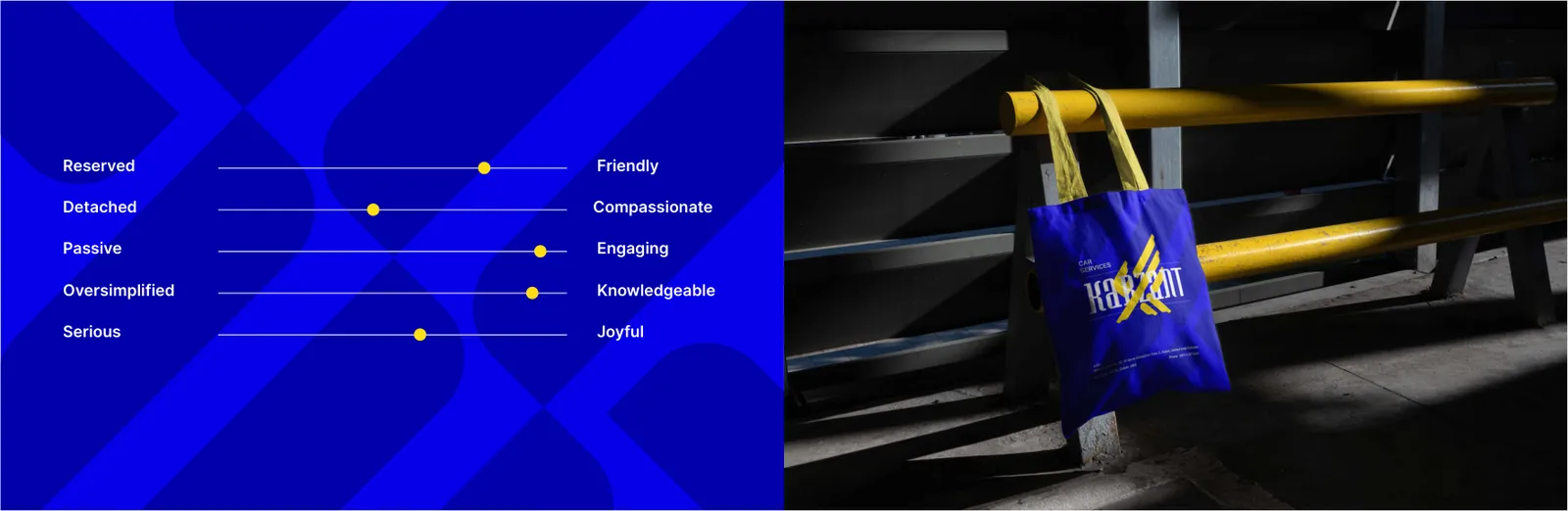
• Confident and authoritative: Evidence based communication without exaggeration
• Technical yet accessible: Clear, practical language that respects the audience’s need for understanding
• Pragmatic and outcome focused: Emphasis on problem solving, timelines, and measurable results
• Accountable and reassuring: A calm voice that signals control, safety, and reliability
• Modern and digitally aligned: Concise, structured messaging suitable for fast paced digital platforms
02
O logotipo
02.1
Conceito
The Brand Logo section defines the primary mark as the core of recognition and trust. It clarifies the conceptual origin, the relationship between symbol and name, and the role of the logo within the broader identity system. For technical service brands, the logo must communicate credibility, competence, and precision with immediate clarity.
Logo meaning translates form into perception. This section connects visual elements to brand values and explains how the symbol supports the brand promise in a credible and memorable way.
KARZANT’s logo transforms the letter K into a powerful eagle. The concept aligns with the brand’s role in Dubai’s competitive automotive and heavy machinery service landscape. The sharp geometry and dynamic posture communicate mastery, speed, and technical control, positioning Karzant as a trusted benchmark rather than a conventional service provider.
KARZANT’s logo carries a dual meaning. First, it functions as a refined K monogram for immediate recognition. Second, it becomes an eagle that symbolizes dominance, precision, and speed. Together, these layers position Karzant as a standard of excellence grounded in technical mastery and trust.


02.2
Construção
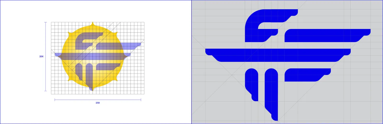
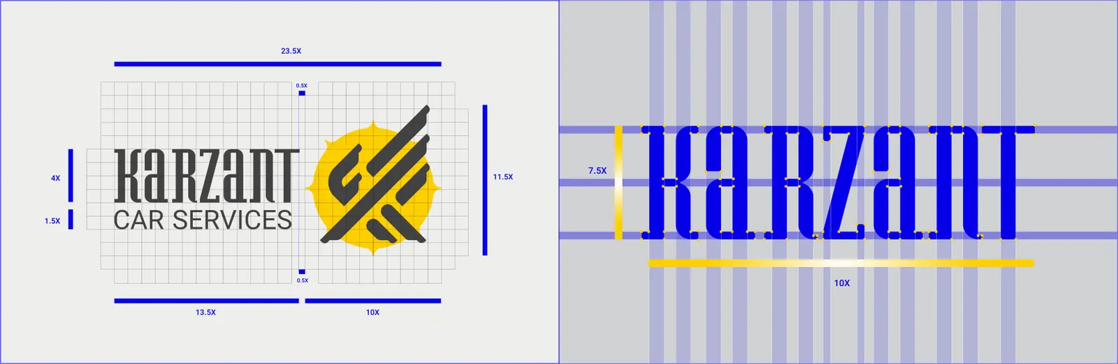
Logo structure documents the geometric logic, proportions, and construction principles of the mark. For technical brands, a disciplined structure becomes part of the trust message, signaling control and engineering level accuracy.
KARZANT’s structure evolves the letter K into an engineered eagle form. The sharp angles and controlled expansion express performance driven design, reflecting advanced diagnostics and expert technical execution. The structure must be preserved exactly to protect meaning and visual strength.
02.3
Área de proteção
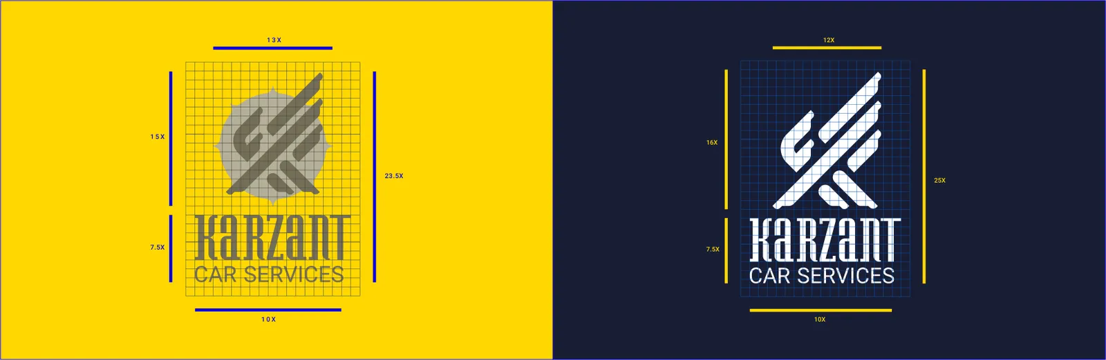
The exclusion zone defines the protected space surrounding the logo to preserve legibility and authority. This buffer is established through a measurable unit derived from the mark itself. Its discipline is essential in both crowded print layouts and fast paced digital environments.
KARZANT’s exclusion zone is defined using a unit derived from the internal structure of the eagle form. No text, icons, or graphic elements may enter this area. The rule safeguards clarity and reinforces the brand’s confident technical presence.
02.4
Variações
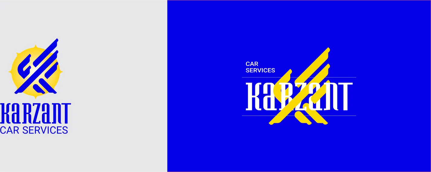
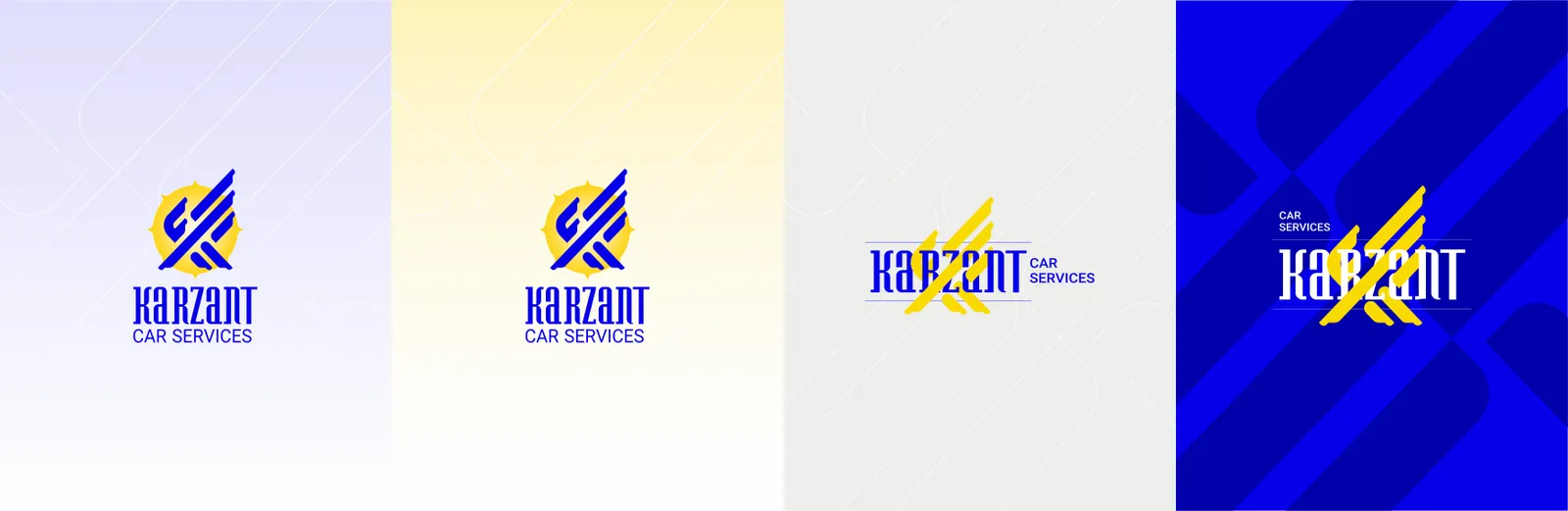
Logo variations are standardized versions created for different contexts. They ensure flexibility while protecting identity consistency. Typical sets include primary, symbol only, one color, reversed, and simplified configurations for limited spaces.
KARZANT’s official variations include the primary lockup with logotype, a symbol only version for compact use, a one color industrial version, and a reversed version for dark backgrounds. Proportions, angles, and line rhythm must remain unchanged across all applications.
02.5
Sobre fundos
Logo on background rules protect legibility, contrast, and brand integrity. This section specifies how the logo should appear on light, dark, colored, photographic, and textured surfaces, and when to use one color or reversed versions. In fast paced industrial and digital environments, these rules prevent recognition loss and preserve visual authority.
KARZANT’s logo must always appear with maximum clarity and confident presence. On light backgrounds, the primary version or a dark one color version is recommended. On dark backgrounds, the reversed or light one color version should be used. On photographic backgrounds such as vehicles, workshops, or mechanical details, usage is permitted only when strong contrast and clear space are fully maintained. If the image is visually busy, a controlled color field behind the logo is recommended to preserve the eagle form and the K structure with full precision.

02.6
Tamanho mínimo
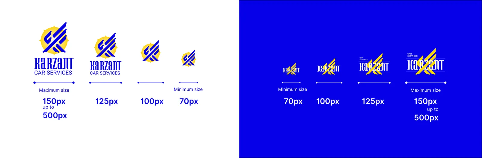
Minimum size rules protect legibility by ensuring the logo is never reproduced below a readable threshold. Requirements may vary between print and digital contexts.
KARZANT’s minimum size should preserve the recognizability of both the eagle form and the K structure. For small digital uses, the symbol only version is recommended. For fine print, the one color version with strong contrast ensures clarity.
02.7
Ícone do app
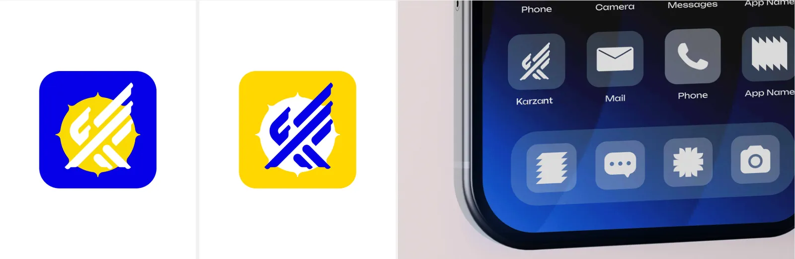
An app icon is a simplified, high contrast translation of the brand symbol designed for small scale recognition. It must remain legible, distinct, and consistent across device interfaces.
KARZANT’s app icon is derived from the eagle symbol shaped from the letter K. The design should be simplified with controlled details to preserve power and clarity at small sizes, ensuring fast recognition on mobile screens.
02.8
Posicionamento
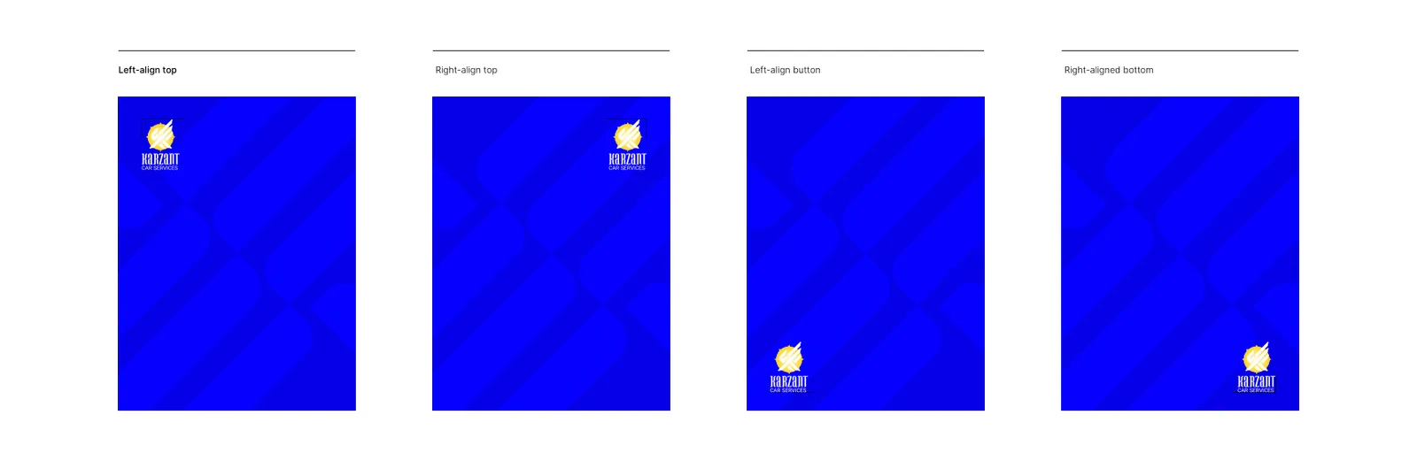
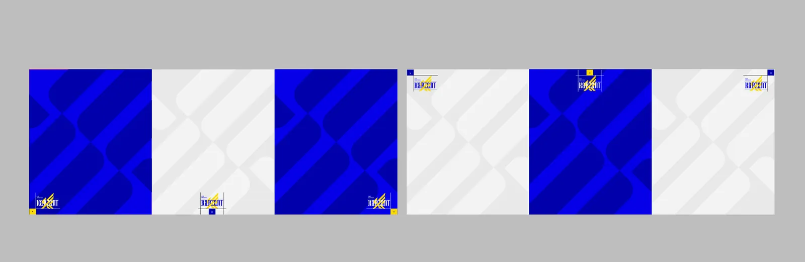
Placement guidelines define how the logo anchors layouts across print, environmental, and digital touchpoints. Correct placement sustains hierarchy, readability, and brand authority.
This section provides practical examples of correct logo use, helping teams apply the identity consistently in real world scenarios.
KARZANT’s logo should be placed to reinforce balance and technical confidence. In formal and environmental contexts, stable placements that support trust are preferred. In digital interfaces, placement should follow user attention flow while maintaining clear separation from informational elements.
KARZANT’s correct placement examples should cover signage, uniforms, stationery, and digital interfaces. In all cases, the logo must respect clear space, contrast requirements, and layout structure to reinforce the brand’s promise of power, precision, and performance.
02.9
Usos incorretos
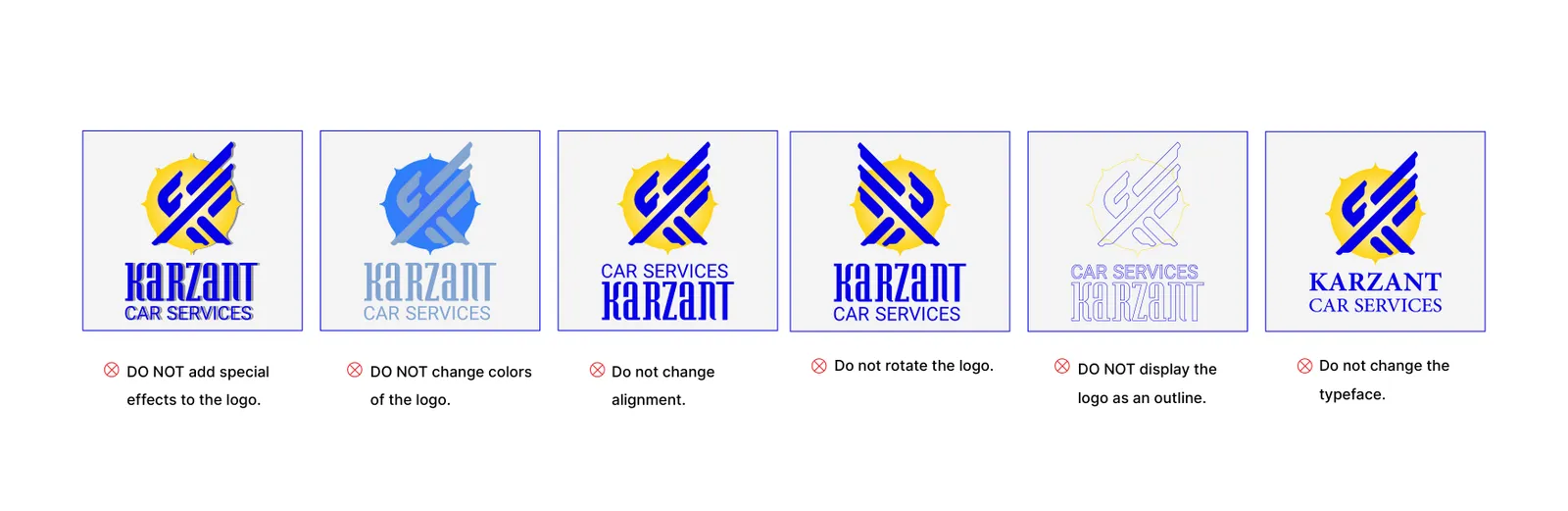
Prohibited uses list all manipulations that could weaken the identity. This includes changes in proportion, color, geometry, effects, or background conditions that compromise legibility and consistency.
For KARZANT, prohibited uses include altering proportions, modifying angles, redrawing the eagle, adding heavy shadows or unnecessary three dimensional effects, applying non approved colors, and placing the logo on visually noisy backgrounds without sufficient contrast.
03
Cor
03.1
Paleta
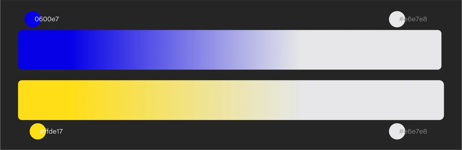
As cores da identidade e suas referências.
- Name:
- Blue
- RGB:
- 6/0/231
- HEX:
- #0600E7
- Name:
- Yellow
- RGB:
- 255/222/23
- HEX:
- #FFDE17
- Name:
- Black
- RGB:
- 0/0/0
- HEX:
- #000000
- Name:
- White
- RGB:
- 255/255/255
- HEX:
- #FFFFFF
03.2
História da cor
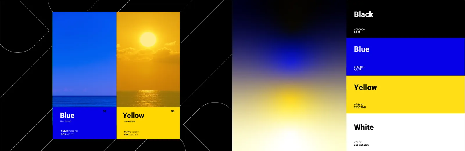
A brand color story explains the strategic and psychological reasoning behind color choices. It transforms color from decoration into meaning, aligning it with brand personality, market context, and performance promise. In technical service brands, the color narrative should communicate trust, precision, and controlled power, ensuring the visual system feels credible and consistent across every touchpoint.
KARZANT’s color story is built around three core ideas. Power, precision, and performance. In Dubai’s competitive automotive environment, Karzant’s colors must instantly trigger a sense of technical authority and dependable expertise. The primary colors are selected to project a modern, professional, and trustworthy presence, while supporting tones enhance the brand’s technological character and fast, mastery driven service experience.
03.3
Sistema de cores
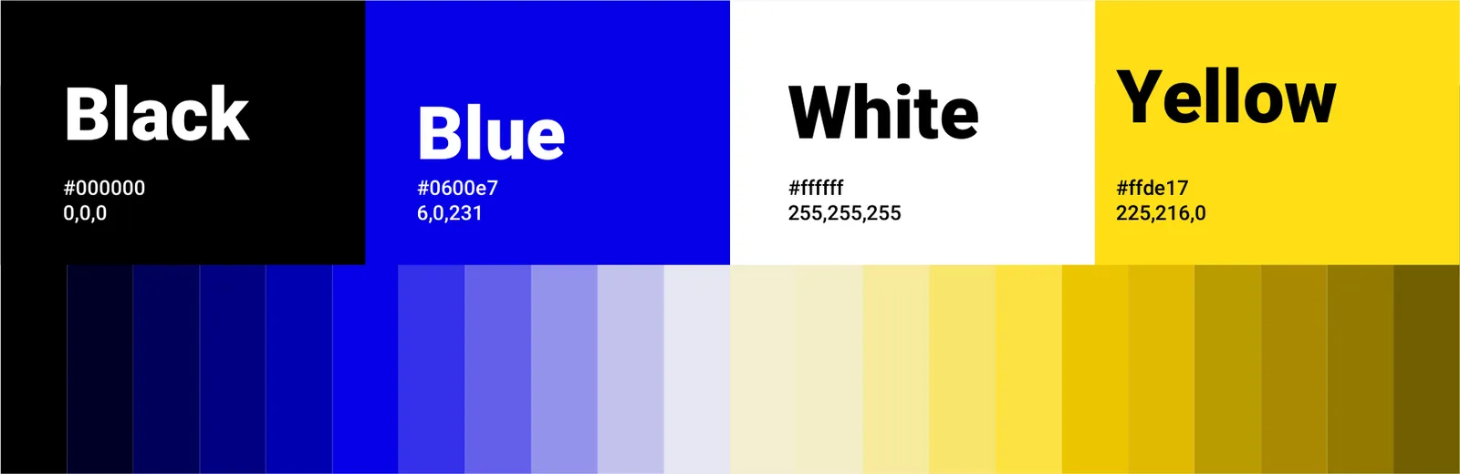
A brand color palette is the standardized color system that defines primary, secondary, and neutral tones for print, digital, and environmental applications. It should also guide usage proportion and contrast standards. For technical brands, the palette must maintain high legibility, strong functional hierarchy, and visual stability under varied lighting conditions.
KARZANT’s palette is designed to anchor a bold and precise identity across all applications. The primary color carries the strongest brand signature and should dominate key recognition points such as the logo, headlines, and critical service touchpoints. Secondary colors support functional emphasis and visual rhythm in digital and industrial contexts. Neutral tones provide clarity for technical information and structured communication. Final selections should be validated through real world testing across signage, uniforms, workshop environments, and digital interfaces to ensure consistent authority and readability.
04
Tipografia
04.1
Fontes
As tipografias da identidade e os pesos que ela usa.
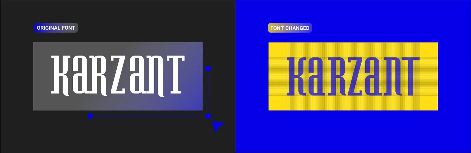
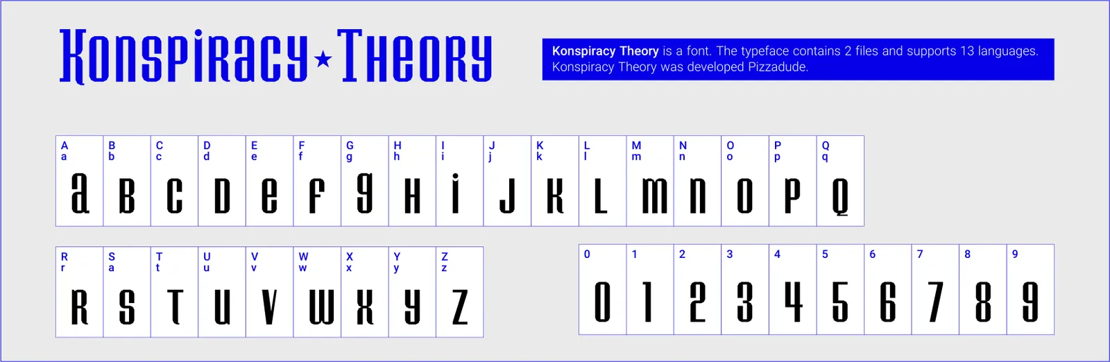
- Konspiracy Theory
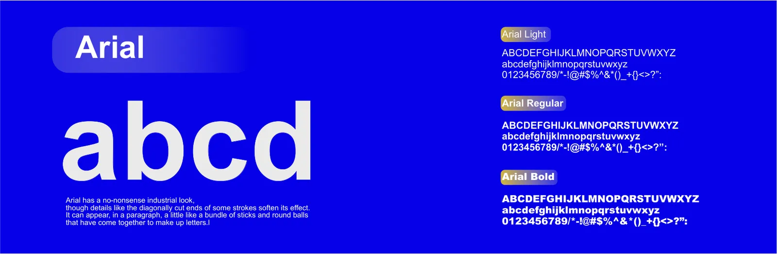
- ArialRegularBold
04.2
Espécime tipográfico
This section standardizes typography so it functions as a structured identity system rather than a personal preference. Weights and sizes should be defined according to information hierarchy, reading distance, application context, and brand character. For technical service brands, typography must deliver clarity, engineered confidence, and consistent performance across signage, documents, uniforms, websites, and social content.
Primary fonts define the core typographic voice of the brand. They are used across major recognition touchpoints including headlines, key messaging, official documents, and digital interfaces. Selection criteria include clarity at multiple sizes, strong numeric design, broad language support, and consistent performance in print and screen. Technical brands typically benefit from modern structured sans serif families that align with engineering and reliability.
Secondary fonts provide controlled variety and functional separation. They often support long form reading, technical notes, service explanations, and educational content. The secondary choice should complement the primary font, adding flexibility without fragmenting identity.
For KARZANT, typography should reinforce controlled power and technical precision. Headline weights must project authority and trust, while body text must remain highly readable in both industrial and digital contexts.
For KARZANT, the secondary font can strengthen operational clarity across service forms, reports, and extended digital content. A clean highly legible sans serif is recommended.
05
Elementos gráficos
05.1
Padronagem
Brand patterns expand the identity system beyond the logo by extracting repeatable visual logic from the mark. They enhance memorability and unify diverse applications.
KARZANT’s brand pattern can be derived from the eagle’s sharp line language, angles, and directional energy. The pattern extends the identity across large surfaces, service packaging, uniforms, and digital backgrounds. Use should remain controlled and always support information clarity.


06
Papelaria
06.1
Papelaria completa
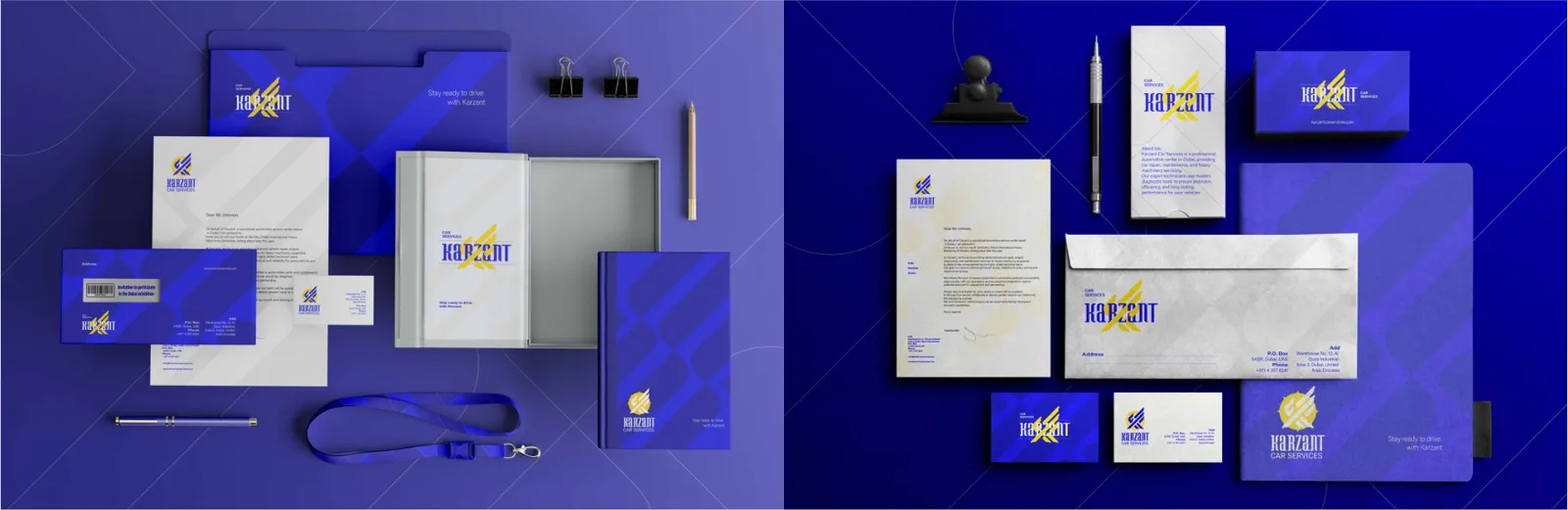
The full stationery system represents a structured collection of communication materials that must maintain brand consistency across all formal interactions.
For Karzant, this consistency embodies speed, order, analytical strength and high engineering standards. From business cards to formal letters, every item utilizes an engineered grid, controlled typography and precise brand colors to create a unified and authoritative presence. The stationery system functions as an organizational framework that reflects Karzant’s technical and performance driven identity.
06.2
Cartões de visita
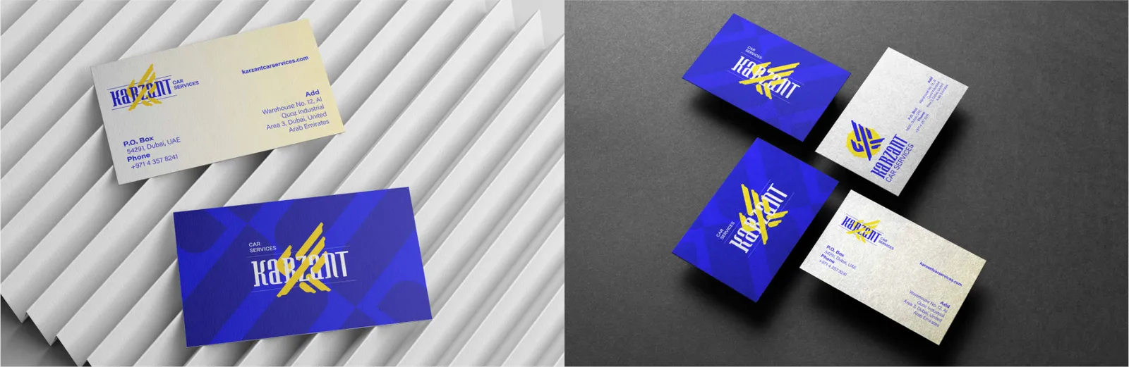
The business card represents one of the most compact yet impactful touchpoints of the brand. It must communicate the identity, tone, and design system in a concise and functional form.
For Karzant, the business card showcases engineered precision through structured layouts, refined spacing, and the iconic K shaped eagle symbol. Its visual clarity reflects the brand’s power, technical mastery and dynamic character.
06.3
Papel timbrado
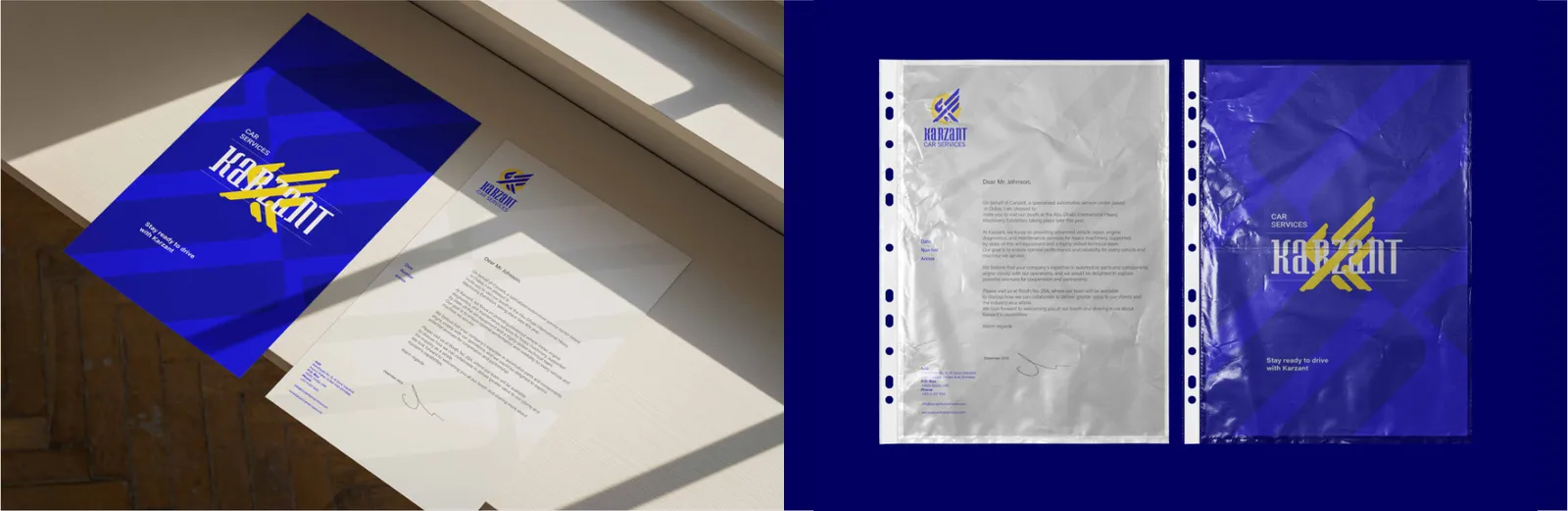
The letterhead is the most formal written communication tool and must express clarity, identity and order.
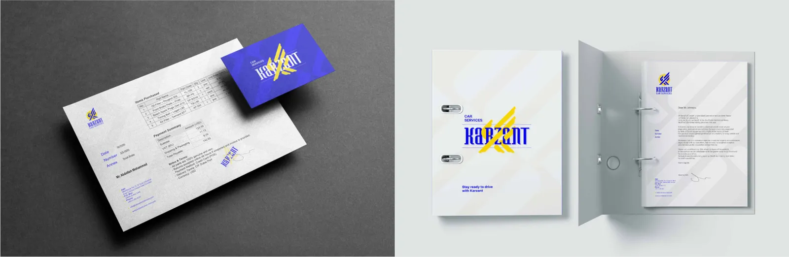
An invoice must demonstrate clarity, structure and trust.
Karzant’s letterhead uses controlled white space, precise placement of the eagle emblem and a grid based structure to reinforce the brand’s technical accuracy and analytical mindset. The composition ensures that every page subtly communicates the brand's authority, reliability and engineered professionalism.
In Karzant’s identity system, invoices are designed like engineered frameworks. Accurate grid alignment, typographic hierarchy and standardized data organization reflect the brand’s transparent and systematic approach. The invoice acts not only as a financial document but also as a statement of professionalism and operational discipline.
06.4
Envelopes
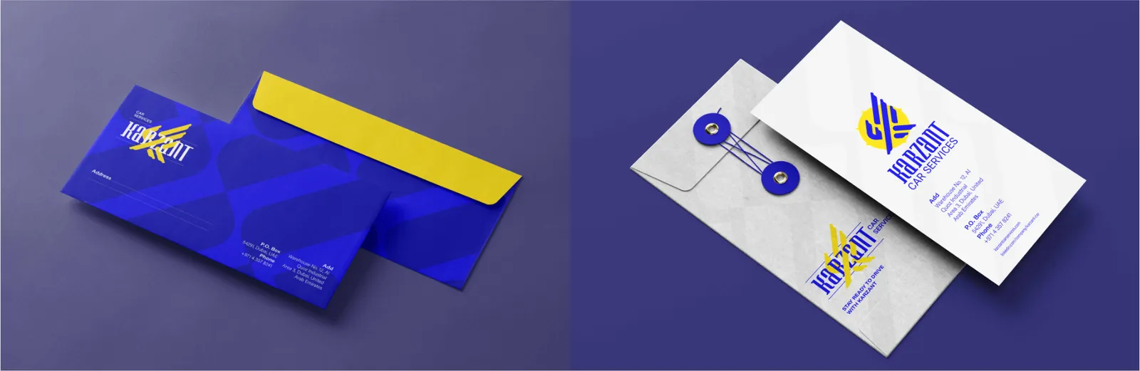
Envelopes create the initial physical impression when documents are received.
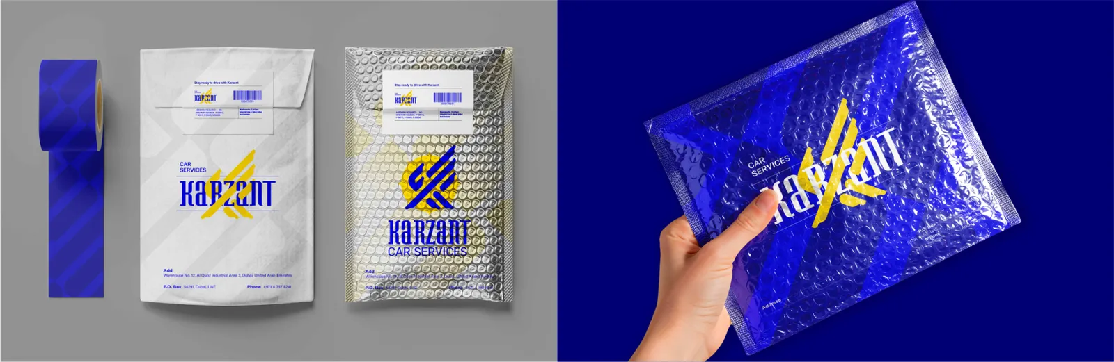
Mailing labels must be clear, readable and visually aligned with the brand.
For Karzant, envelope design must communicate speed, performance and strength. Directional geometry, precise spacing and strategic logo placement ensure that even before opening, the envelope conveys a sense of engineering accuracy and technical sophistication.
Karzant’s labels communicate order, speed and transparency. Geometric information layout, controlled white space and purposeful logo placement transform them into functional elements of the engineered brand system.
06.5
Pastas
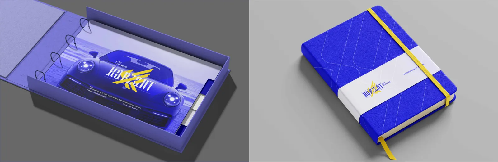
The folder serves as a protective and presentation tool for documents.
Designed for organizing and archiving internal documents, the document folder must enhance visual order and system consistency.
Karzant’s folder integrates the eagle symbol, geometric grid and refined color surfaces to convey strength, expertise and structural integrity. It functions as an engineered shell that visually represents the brand’s disciplined and performance oriented identity.
In Karzant’s identity, it reflects structural thinking, precision and a systematic approach. Internal grid logic, disciplined placement and controlled use of brand elements turn the folder into a functional extension of Karzant’s engineered language.
06.6
Cadernos
The notebook enhances everyday physical interaction with the brand.
For Karzant, the notebook must express technology, movement and performance. The dynamic cover design featuring the eagle symbol embodies speed and focus, while internal grid structures reinforce precision and analytical thinking.
07
Digital
07.1
Site
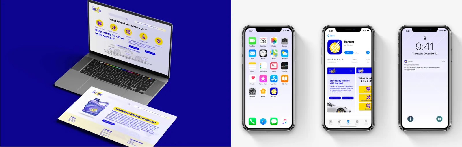
Landing pages are entry points that convert user interaction into action.
E-commerce templates require strong structure, readability and optimized user flow.
The website is the core of Karzant’s digital identity. It must present power, precision and a seamless user experience. Engineered grid systems, structured typography and controlled motion reflect the brand’s spirit of speed and performance. The website should operate like a technical system, demonstrating accuracy, clarity and efficiency throughout.
The UI components library forms the backbone of the digital design system, ensuring consistency, scalability and visual coherence. For Karzant, this library uses precise geometry, controlled spacing and the brand’s eagle language. Buttons, forms, icons and interactive elements must express systematic order, speed and responsive performance.
Karzant’s landing pages prioritize clarity, speed and guided user flow. Logical structure, visual hierarchy and strategic use of the eagle symbol ensure a seamless and intuitive path for users.
Design tokens form the foundation of the digital system, defining standardized colors, typography, spacing, shadows and sizing. For Karzant, these tokens must reflect geometric order and engineered discipline, ensuring scalability and consistency across all digital products.
Karzant’s templates communicate engineering precision, efficiency and clarity when presenting services or components. Logical layout and visual hierarchy enhance user decision making and reinforce brand trust.

07.2
App móvel
The app icon serves as the most condensed digital expression of the brand identity.
For Karzant, the icon must capture the energy, precision and power of the eagle symbol in a minimal yet highly recognizable form. Its geometric composition and sharp rhythm derived from the K structure create a sense of speed and performance even at small sizes. The app icon functions as a visual flag for Karzant across digital platforms.
Push notifications are instant digital touchpoints and must convey brand identity in a fraction of a second. Karzant’s templates use strict typographic hierarchy, brand colors and the eagle icon to communicate speed, reliability and engineered responsiveness. These templates form an essential part of a cohesive user experience.

07.3
Redes sociais
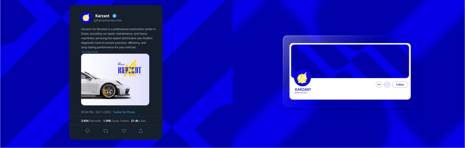
Social feed templates reinforce a unified and recognizable presence in competitive digital environments.
Post templates communicate key brand messages through concise and impactful visuals.
Karzant’s templates must showcase strength, speed and technical sophistication through dynamic compositions and assertive typography. Diagonal motion and geometric rhythm help distinguish the brand across social platforms.
Social profiles serve as the digital storefront of the brand. Karzant’s profiles must use the eagle symbol, structured headers and the brand color palette to project authority, trust and professionalism. Aligned profile visuals guarantee a consistent and powerful presence across platforms.
Karzant’s posts must express energy, strength and motion through simplified yet powerful forms. Controlled linework, defined color fields and the eagle mark reinforce the brand’s core visual identity.
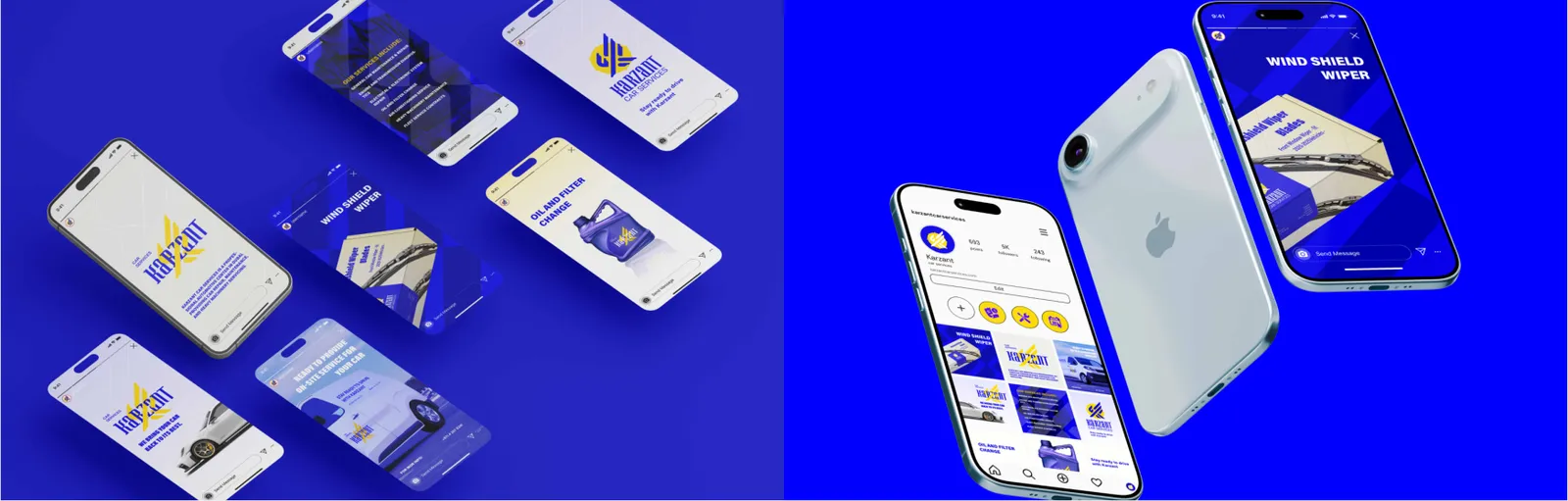
Stories are fast paced and dynamic environments. Karzant’s story templates must convey speed, action and high performance using strong contrast, dynamic typography and geometric motifs. These stories create an energetic and expressive extension of the brand.
07.4
Campanhas e e-mail
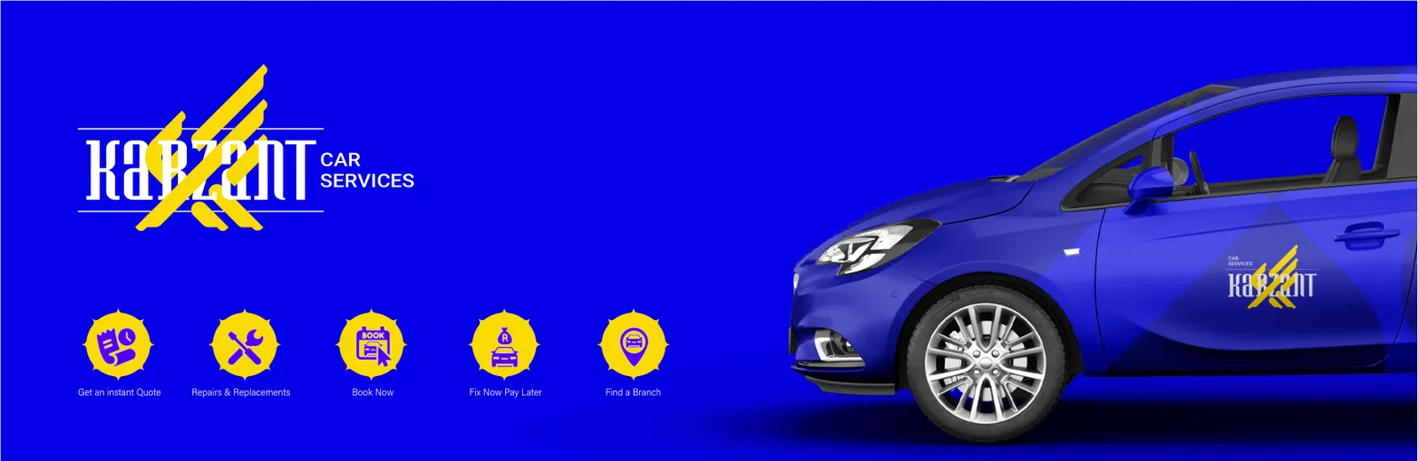
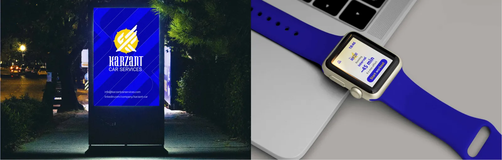
Digital display ads must deliver information quickly and capture immediate attention.
Karzant’s ads use sharp geometry, concentrated typography and the eagle emblem to express power, speed and trust within seconds. Visual consistency ensures distinction in competitive environments.
08
Produtos de marca
08.1
Vestuário
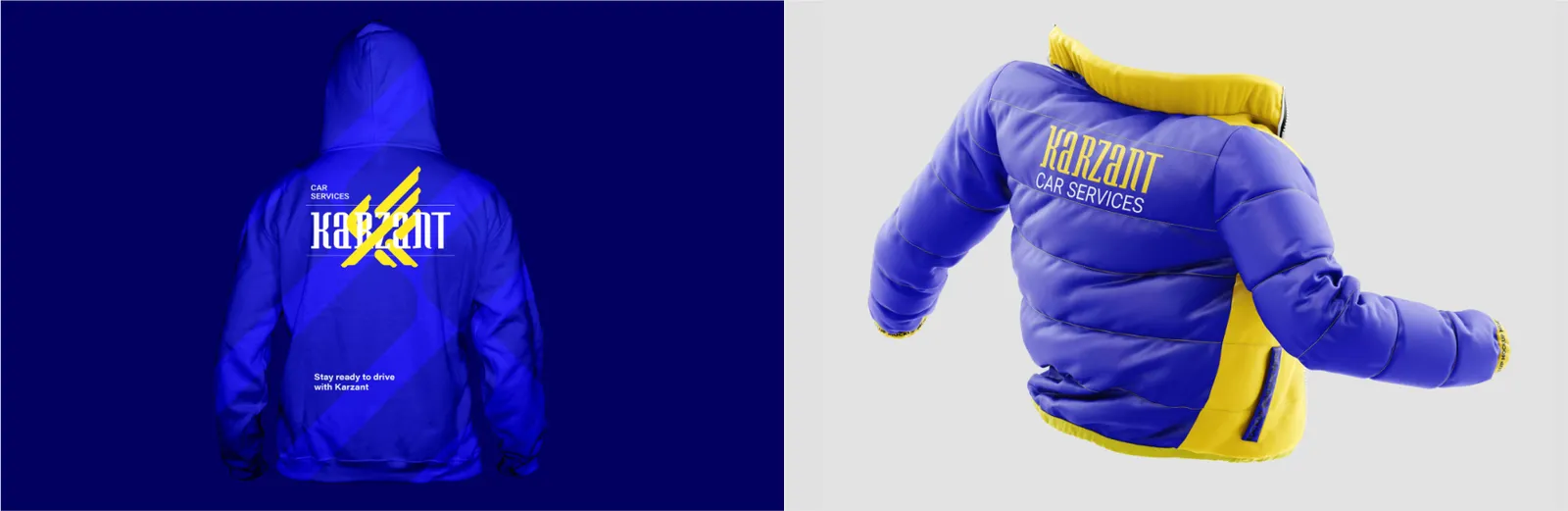
The hoodie is a key lifestyle apparel item that represents the brand in casual and everyday environments.
The T shirt is a simple yet highly effective medium for brand visibility.
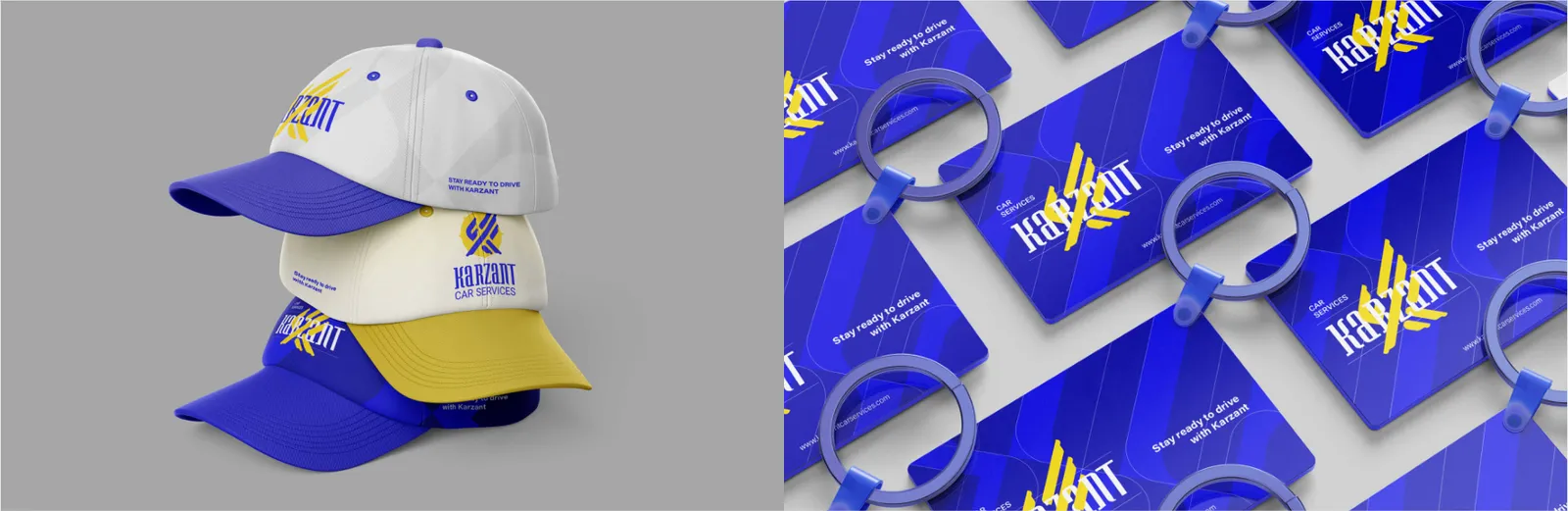
The cap is a prestige item that displays the brand in a compact yet impactful form.
Uniforms are critical elements of human brand identity, communicating service quality before any interaction.
For Karzant, the hoodie must express performance, power and dynamism. Scaled applications of the eagle symbol, engineered typography and minimalist color usage transform the hoodie into a wearable identity statement, embodying speed, energy and confidence.
The polo shirt serves as a semi formal apparel item that conveys professionalism and brand consistency. For Karzant, minimal use of the emblem, precise placement and disciplined color selection create a clean and authoritative appearance that reflects the brand’s engineered precision.
Karzant’s T shirts showcase energy, speed and dynamic identity through controlled contrasts, simplified graphics and the eagle symbol. This item reflects the youthful and active dimension of the brand.
Karzant’s caps use the eagle emblem in precise scale and minimal placement to create a strong and professional appearance that directly embodies brand authority.
For Karzant, uniforms must represent order, strength and technical expertise. Precise logo placement, identity aligned colors and clean yet authoritative design present the team as highly professional. The uniform should signal a coordinated, engineered and trustworthy system.

08.2
Sacolas
The tote bag serves both as a functional carrying tool and a mobile visual platform.
For Karzant, the tote design must balance simplicity, power and practicality. The emblem, directional linework and structured layout create a bold presence that aligns with the brand’s engineered character.
08.3
Brindes
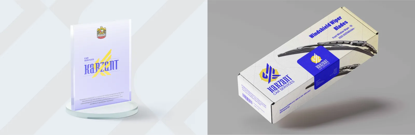
The award is a ceremonial brand element that must express value, prestige and excellence.
The mug is a long lasting promotional item that builds continuous daily interaction with the brand.
The keychain is one of the smallest yet most enduring branding items.
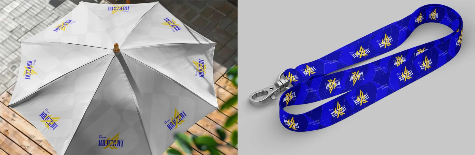
The lanyard is an identity tool used in operational and corporate environments.
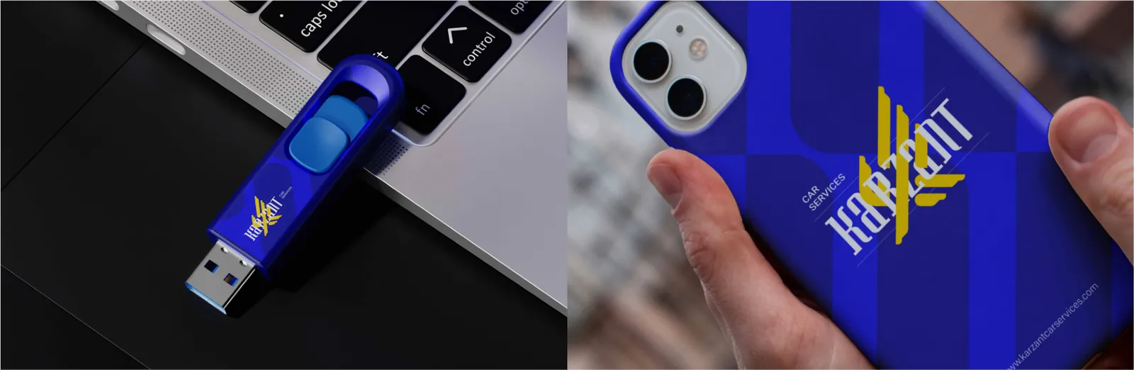
The phone case is a digital physical medium that integrates the brand into daily routines.
For Karzant, the award symbolizes leadership, authority and superior standards. Its geometric refinement, controlled minimalism and the iconic eagle emblem transform it into a visual representation of achievement and brand dominance.
Karzant’s mug showcases the eagle emblem, engineered typography and clean color application, creating a strong and enduring representation of the brand’s identity.
The bottle is a lifestyle item that communicates functionality and durability. Karzant’s bottles feature geometric linework, disciplined color usage and the eagle emblem to evoke speed, energy and resilience, reinforcing the brand’s performance driven identity.
For Karzant, the keychain must serve as a compact symbol of power and performance. The K shaped eagle or minimal metallic forms express a precise, industrial and engineered identity.
For Karzant, it must demonstrate order, strength and visual coherence through controlled logo repetition and directional patterns, making it an essential item for formal and event based settings.
The umbrella functions as a lifestyle accessory that exposes the brand within urban environments. For Karzant, the umbrella must feature bold minimal surfaces and the eagle emblem or geometric patterns, expressing protection, resilience and professional strength.
Karzant’s phone case uses the eagle emblem, technical linework and geometric structure to convey speed, power and technological sophistication.
The USB drive is a practical tool that must communicate both function and identity in a compact form. For Karzant, it should embody industrial precision and durability through robust materials, minimal shapes and engraved eagle detailing, making it a symbol of the brand’s engineered character.

08.4
Embalagens
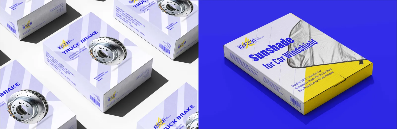
The packaging system must unify functionality, durability and visual identity.
Product labels are identity and information carriers that must ensure brand credibility and content clarity.
For Karzant, packaging communicates technology, speed and engineering excellence. Sharp geometric lines, precise typography and calculated structural design transform the boxes into an expression of performance and technical mastery.
For Karzant, labels should communicate technical rigor and standards driven quality. Engineered grids, clear typographic hierarchy and disciplined color use turn each label into a compact certificate of precision. The eagle emblem must be applied purposefully and with balance to convey power without visual noise.

09
Aplicações
09.1
Eventos e feiras
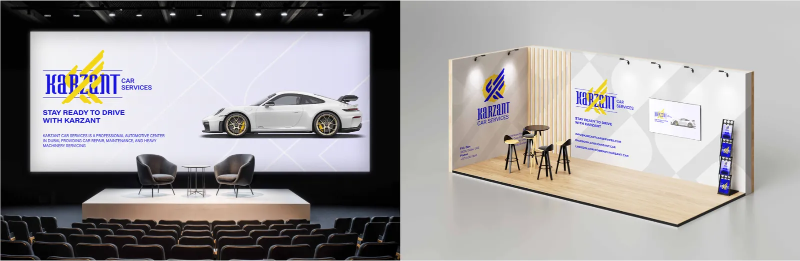
Event signage is responsible for guidance, information delivery and visual cohesion in temporary environments.
Pop up displays are fast, high impact structures used in events and retail spaces.
For Karzant, the system must be built on rapid readability, geometric order and an authoritative visual language. Engineered grids, standardized typography and controlled use of the eagle symbol create a professional and unified experience that naturally extends the brand’s identity into event spaces.
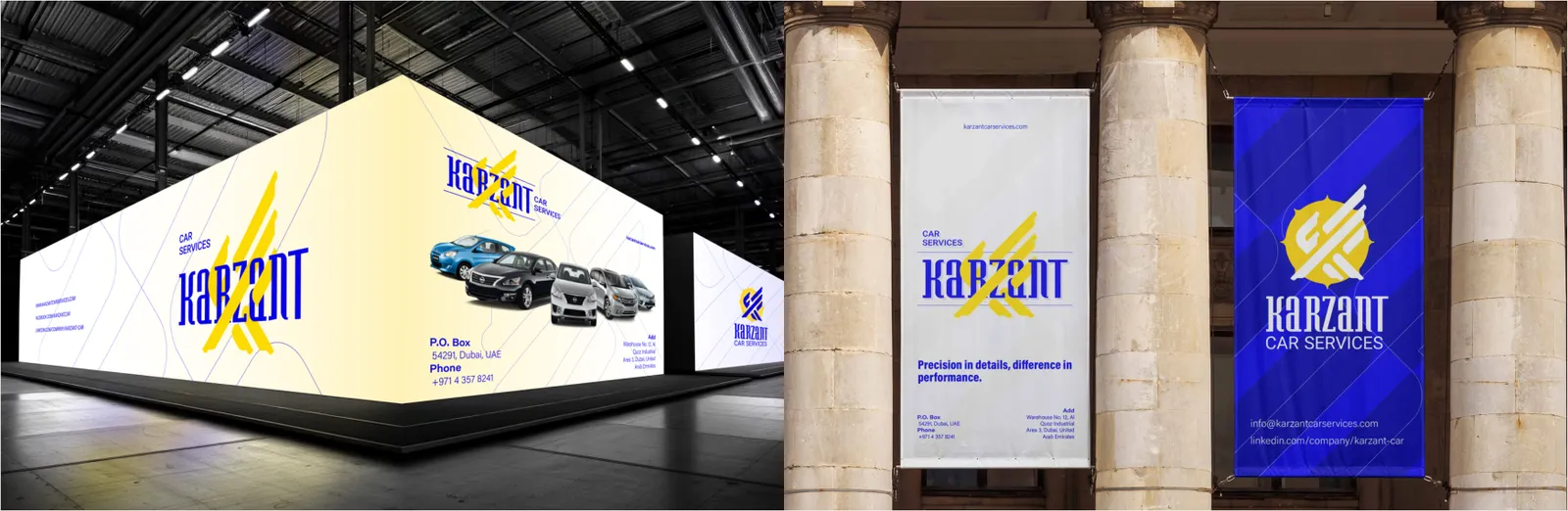
Exhibition stands are strategic touchpoints for demonstrating capability, differentiation and credibility. Karzant’s stand should be designed like an engineered structure where order, power and visual dynamism coexist. Angular forms, directional lines and a prominent eagle emblem reinforce Karzant’s position as an authoritative automotive service brand in Dubai. The experience must feel both inviting and commanding, projecting superiority and trust.
For Karzant, they must deliver maximum visual authority with minimal elements. Large scale placement of the eagle symbol, supported by concise messaging and decisive typography, ensures immediate comprehension of the brand’s character. The display acts as a compact introduction to Karzant’s power and precision.
09.2
Publicidade
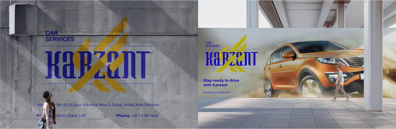
Billboards are among the most powerful urban media for large scale brand presence and must deliver a message within seconds from a long distance.
Flyers are short term yet effective communication tools for services, offers and events.
Street posters are mid scale urban media that must capture attention in crowded environments.
For Karzant, billboard design focuses on clarity, authority and motion. A large scale application of the K shaped eagle symbol, supported by decisive typography and controlled negative space, ensures instant recognition and memorability. The visual language must express rapid responsiveness, technical mastery and premium service standards.
For Karzant, the focus is rapid message delivery and instant trust building. Strong headlines, structured layouts and strategically placed eagle branding help audiences perceive Karzant as professional and reliable. The visual language must highlight performance and engineered precision.
For Karzant, they require a precise balance of concise messaging, powerful imagery and visual order. The eagle emblem, dynamic geometry and controlled contrast give the posters strong presence in competitive street contexts. They reinforce the brand’s speed and authority within the public urban landscape.
09.3
Interiores
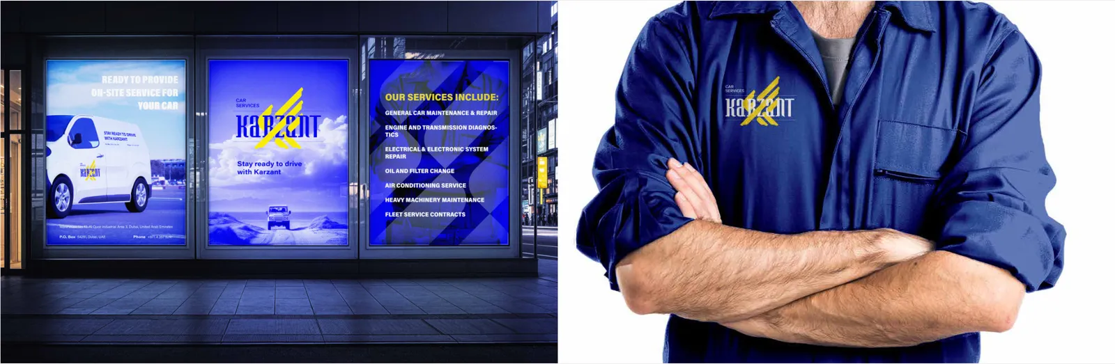
The company wall is a core element of spatial identity that shapes the in person brand experience.
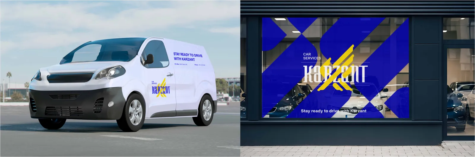
Window decals contribute to the physical identity coherence of brand touchpoints.
For Karzant, this surface should narrate power and precision at an architectural scale. Accurate execution of the eagle emblem, paired with appropriate materials and controlled lighting, transforms the wall into a bold identity statement. The overall structure must feel engineered and organized, reinforcing trust and authority.
For Karzant, they must deliver maximum clarity and authority with minimal visual complexity. Monochrome or minimal eagle applications combined with precise, simple typography enhance the professionalism and transparency of the service environment. These decals define the threshold between the city space and Karzant’s specialized automotive domain.
09.4
Bandeiras
The flag is a symbolic and ceremonial brand element that creates strong presence in outdoor or event contexts.
For Karzant, the priority is logo legibility in motion and from a distance. A disciplined use of primary brand colors and simplified composition ensures the eagle emblem remains clear under wind and movement. The flag reinforces brand authority at an urban scale.
09.5
Veículos
Vehicle branding is one of the most visible mobile media that distributes brand identity throughout the city.
For Karzant, the eagle form and directional line language must enhance the perception of speed, mastery and purposeful motion. Correct logo scaling, distance readability and controlled color surfaces transform branded vehicles into moving symbols of power and precision. This element plays a strategic role in reinforcing Karzant’s presence across Dubai’s urban fabric.