01
Visão geral
01.1
Em resumo
Um coração e um estetoscópio numa só marca: cuidado e medicina, em roxo e rosa.
- Projeto
- Identidade visual
- Setor
- Associação de apoio a pacientes com câncer
- Serviços
- Identidade visual
01.2
Introdução
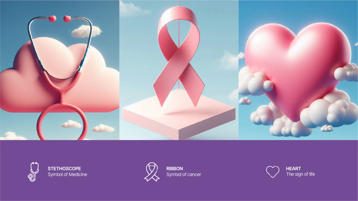
O logotipo une um coração, que representa o amor, a compaixão, o cuidado e o papel de apoio da organização, a um estetoscópio, que destaca sua atuação médica. As cores escolhidas são rosa e roxo.
01.3
Sobre
A PEJVAK é uma organização sem fins lucrativos que apoia pacientes com câncer e busca melhorar a vida das pessoas afetadas pela doença. Atua com dedicação nessa área, e seu logotipo reflete seus objetivos e sua missão.
01.4
História
The brand’s history is a journey through its milestones, showcasing the evolution, achievements, and legacy that shape its identity today.
PEJVAK was founded as a response to the growing need for emotional, psychological, and medical support for cancer patients. This non-profit organization started with a mission to bring hope and care to those affected by this challenging disease. From its inception, PEJVAK has focused on creating a space where patients can receive comprehensive support, ranging from medical care to emotional counseling. With a team of dedicated professionals, PEJVAK has built a reputation for excellence in providing advanced medical services, hosting educational and support programs, and raising awareness about cancer. Its commitment to transparency, accountability, and compassion has earned the trust of patients and their families. Today, PEJVAK is not only a leader in care and support but also a significant player in prevention and education initiatives.
01.5
Missão
The mission defines the brand’s purpose, guiding its actions and decision-making to fulfill customer needs and create value.
PEJVAK is dedicated to improving the quality of life for cancer patients and their families through comprehensive medical, counseling, educational, and supportive services. Our mission is to create a space where patients feel supported and cared for every step of the way. This mission is rooted in human values, respect for patients' dignity, and a commitment to sustainable progress. We strive to ensure that every cancer patient can navigate their treatment journey with hope and dignity.
01.6
Visão
The vision statement articulates the brand’s aspirations, serving as a roadmap for long-term growth and success.
PEJVAK envisions a society where no cancer patient is deprived of supportive and medical services. We aspire to be a recognized and trusted organization in the field of cancer patient support. Our goal is to expand our services and impact both nationally and internationally, serving as a model for other charitable and support organizations. The future we see is one filled with hope and health for all cancer patients.
01.7
Valores da marca
Core values reflect the principles that drive the brand, influencing its culture, behavior, and commitment to stakeholders. 1.Kindness and Empathy: Kindness and empathy are central to PEJVAK's activities, reflecting its dedication to addressing patients’ emotional and physical needs while fostering hope and comfort. 2. Accountability: PEJVAK is committed to transparent operations, taking full responsibility for its actions and outcomes while adhering to high standards. 3. Support and Solidarity: Providing comprehensive support ensures that patients never face the challenges of cancer alone, reinforcing PEJVAK’s identity. 4. Expertise and Quality: PEJVAK prioritizes high-quality services and professional standards in all its activities to ensure the best outcomes for its beneficiaries. 5. Awareness and Prevention: Promoting education about cancer prevention and early detection is a core focus of PEJVAK, reflected in its workshops, screenings, and educational content.
01.8
Tom de voz
The tone of voice establishes the brand’s personality in communication, ensuring consistency and resonance with its target audience.
PEJVAK’s tone must convey understanding and compassion. Phrases like "We are here for you" or "You are not alone" emphasize this principle. Calm and Reassuring: Patients and their families need messages that are positive and reassuring, avoiding any sense of worry or distress. Trustworthy and Professional: Official communications must be professional and precise, providing accurate information to build trust. Encouraging and Motivational: PEJVAK should use a motivational tone to inspire patients to continue their treatment journey. Phrases like "There is always hope" can have a profound impact.
02
O logotipo
02.1
Logotipo da marca
A marca, por si só.
02.2
O design
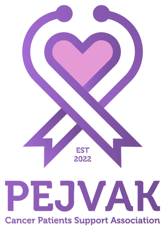
O rosa simboliza amor, amizade e compaixão e desperta emoções positivas como confiança, paciência, paz e esperança. O roxo transmite tranquilidade e conforto e remete à área médica. As duas cores se completam e criam um design equilibrado e bonito que atrai a atenção. O coração e o estetoscópio expressam compaixão e cuidado médico, e o uso adequado de formas e cores resulta em um logotipo à altura da organização.
02.3
Conceito
The logo symbolizes the brand’s ethos, visually communicating its mission, values, and unique identity.
We all know logo is one of the most important things in a business/company. So, this logo should be created in a very professional way that speaks to the business company.
The Pejvak logo combines a ribbon, stethoscope, and heart, symbolizing care, medical support, and compassion for cancer patients. It visually conveys hope and the organization's commitment to healing and support.
02.4
Variações
Multiple logo variations offer flexibility for use across various platforms while maintaining a consistent visual identity.
02.5
Sobre fundos
The logo is optimized for seamless integration across different backgrounds, ensuring versatility and brand consistency.
02.6
Posicionamento
Strategically positioned, the logo enhances visibility and reinforces brand identity across diverse applications.
The Pejvak logo should always be positioned prominently to ensure maximum visibility and brand recognition. Maintain a balanced composition by centering the logo or aligning it with key elements of the design. Avoid placing the logo near cluttered backgrounds or edges that may compromise its clarity. Always adhere to clear space guidelines to preserve its visual integrity.
03
Cor
03.1
Paleta
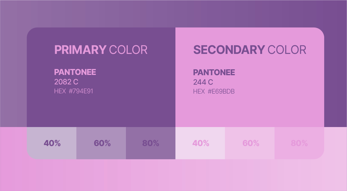
As cores da identidade e suas referências.
- RGB:
- 121/78/145
- HEX:
- #794E91
- PMS:
- 2082 C
- RGB:
- 230/155/219
- HEX:
- #E69BDB
- PMS:
- 244 C
03.2
História da cor
Each color in the palette has a distinct meaning, symbolizing the brand’s values and enhancing its narrative.
Pejvak’s brand colors, pink and purple, have been carefully selected to convey the organization’s core values and mission. Pink symbolizes love, compassion, and friendship, reflecting the emotional and supportive role Pejvak plays in the lives of cancer patients. This color evokes feelings of trust, patience, and hope, aligning with the organization’s aim to provide comfort and care during challenging times. Purple, on the other hand, represents tranquility, dignity, and wisdom. It signifies Pejvak’s involvement in the medical and healthcare sectors while creating a sense of reassurance and peace for the patients and their families. Together, these colors complement each other to form a balanced and harmonious identity that stands out while maintaining a sense of professionalism and empathy. The combination of pink and purple in Pejvak’s visual identity not only draws attention but also creates a warm, inviting, and trustworthy image. These colors embody the organization’s commitment to improving the lives of cancer patients through care, education, and support, ensuring a positive impact on everyone it touches.
03.3
Sistema de cores
The color palette is the essence of the brand’s visual identity, carefully curated to evoke emotions and create memorable connections.
04
Tipografia
04.1
Fontes
As tipografias da identidade e os pesos que ela usa.
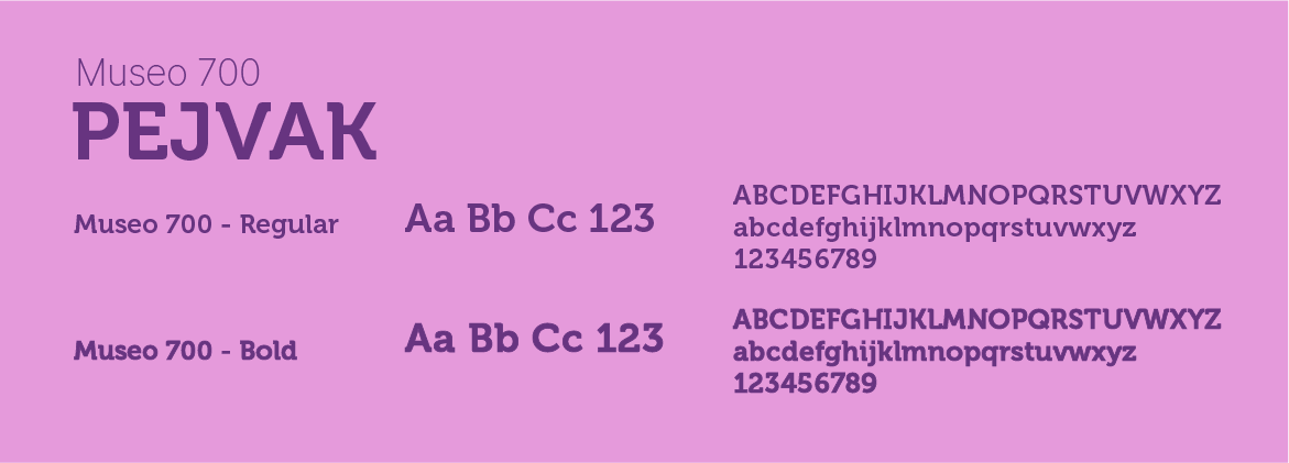
- Museo 700RegularBold
04.2
Espécime tipográfico
Typography plays a pivotal role in defining the brand’s identity. The primary font ensures clarity, professionalism, and alignment with the brand's modern and approachable character.
TYPOGRAPHY Museo 700 is a bold, modern font with geometric shapes and rounded edges. It has a consistent stroke width, giving it a uniform appearance.
Museo 700 is part of the Museo font family, designed by the Dutch type designer Jos Buivenga. This font is widely appreciated for its uniform weight, high readability, and modern appearance, making it a popular choice for logo design, headings, and graphic applications. Museo 700 includes uppercase and lowercase letters, numbers, and special characters, making it versatile for branding and print design.
05
Elementos gráficos
05.1
Padronagem
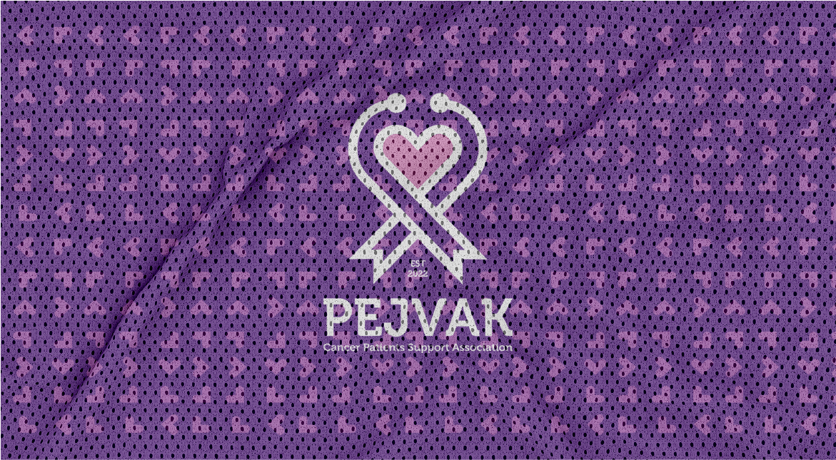
The brand pattern extends the visual identity, creating a cohesive design language that complements the logo and supports branding.


06
Papelaria
06.1
Cartões de visita
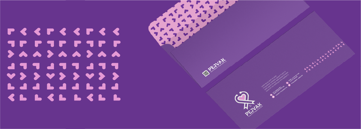
A business card is a compact representation of the brand, offering essential contact information while reinforcing professionalism and brand identity.
07
Digital
07.2
Campanhas e e-mail
Email marketing strengthens customer relationships by delivering personalized messages, promotions, and updates directly to the audience’s inbox.
Together, We Can Keep Hope Alive Stay Connected with Hope!
Digital advertising ensures targeted and measurable brand promotion across various online platforms, maximizing visibility and impact.
Dear Friend, At Pejvak, your support brings hope to children and cancer patients. Thanks to your contributions, we've provided essential treatments and care to those in need. Join our campaign to support children battling cancer and make a meaningful impact. Every little help makes a big difference. [Support Now] Thank you for your kindness and compassion.
08
Produtos de marca
08.1
Vestuário
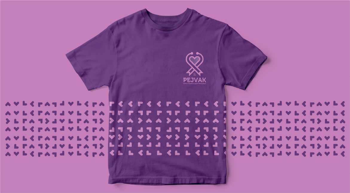
Branded hoodies merge comfort with style, turning everyday wear into a promotional tool.
Branded polos project professionalism and consistency, often used in corporate and event settings.
Branded face masks ensure visibility even in protective wear, maintaining a professional and cohesive image.
08.2
Sacolas
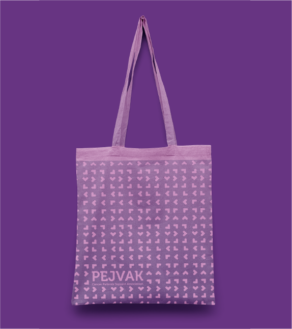
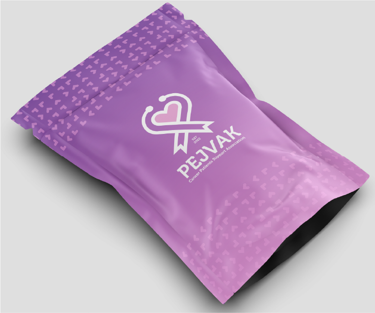
Branded bags add value to customer interactions, merging practicality with brand promotion.
08.3
Brindes
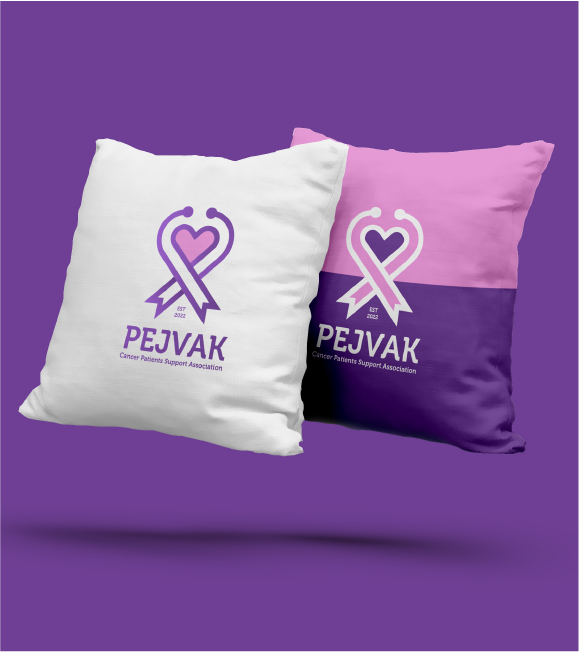
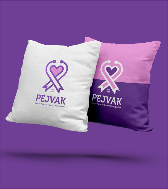
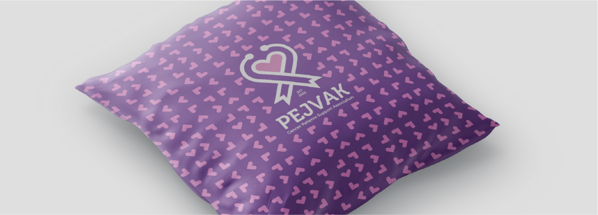
A branded pillow enhances comfort while reinforcing the brand identity, making it a subtle yet effective element in branded spaces.
Custom-branded pen drives merge practicality with promotion, leaving a lasting impression in professional settings.
08.4
Embalagens
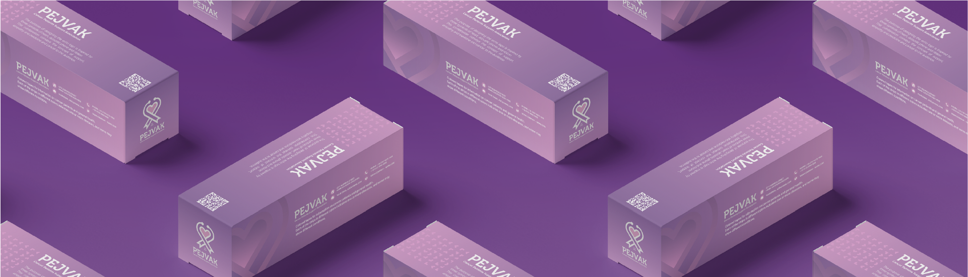
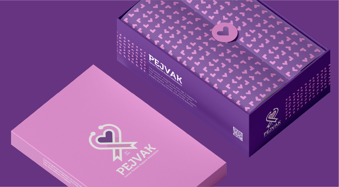
Packaging reflects the brand’s identity while enhancing the unboxing experience, ensuring a memorable customer journey.
Branded packaging tape adds a personal touch to shipments, reinforcing the brand’s identity during delivery.
09
Aplicações
09.1
Eventos e feiras
Pop-up installations highlight the brand creatively during temporary events, leaving memorable impressions.
The event ticket reflects the brand’s identity, ensuring a cohesive and professional look while enhancing the attendee experience.
Branded event chairs contribute to a unified event atmosphere, reinforcing brand presence and creating a visually cohesive environment.
09.2
Publicidade
Brochures provide a detailed overview of the brand’s services and products, offering an engaging format for promotion and information sharing.
Posters visually communicate key messages in a bold format, perfect for promotional and informational campaigns.
Billboards maximize exposure in high-traffic areas, effectively communicating the brand’s message to a broad audience.
Street posters grab attention in urban areas, delivering impactful messaging and increasing brand awareness.
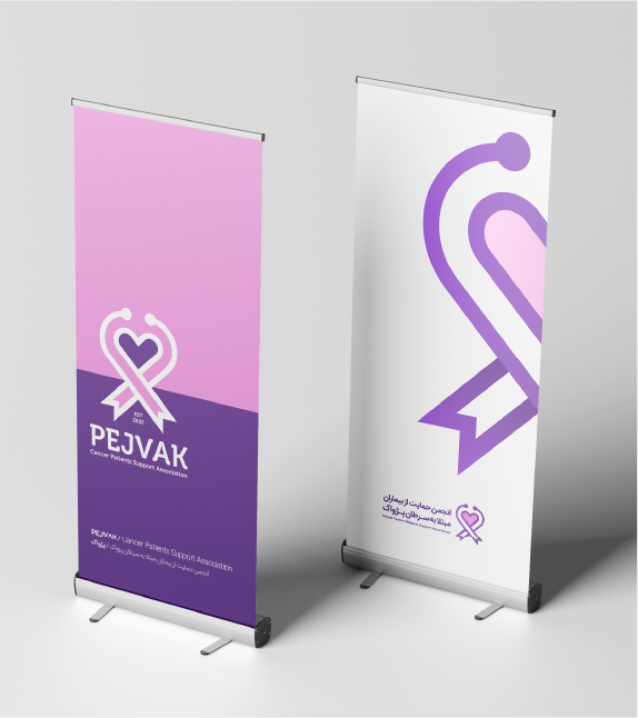
The roll-up banner is a versatile promotional tool that enhances brand visibility at events, exhibitions, and presentations. It ensures a strong brand presence while maintaining a professional and cohesive visual identity.