01
Overview
01.1
At a glance
The Networked Eye: an eye, a spider’s web and a 360° circle for an agency that leaves no blind spots.
- Project
- Visual identity
- Field
- Advertising agency
- Year
- 2024
- Services
- Visual identity, Brand Guidelines
01.2
Introduction
PICTORIAL 360 AGENCY is a multipurpose creative and advertising hub. Its mission is not just to run campaigns but to engineer 360-degree solutions where no aspect of a client’s business is overlooked. The challenge was to translate this omnipresent vision and limitless connectivity into a bold, minimal and authoritative identity.
01.3
About
The emblem, the Networked Eye, joins three archetypes: the eye for vigilance and strategic insight, the spider’s web for a resilient network of services where every thread supports the other, and the 360-degree circle for full-service capability and an unbroken loop of creative support.
Built on a rigorous geometric grid, the identity uses Crimson Red and Silver Gray to project authority and technological sophistication, with rules for typography, spatial branding, exhibition stands, signage, digital touchpoints and merchandise.
01.4
History
Founded in May 2024, PICTORIAL 360 AGENCY emerged from a fundamental realization: modern brands require more than just scattered advertising efforts; they need an interconnected ecosystem. Born as a multipurpose advertising agency, our foundation was built upon the concept of the "Networked Eye"—merging profound visual insight with the structural integrity of a spider's web. Since our inception, we have dedicated ourselves to providing holistic, 360-degree branding solutions that weave every detail of a client's business into a unified masterpiece.
01.5
Mission
Our mission is to engineer multipurpose, 360-degree advertising and branding solutions that leave no blind spots. We strive to observe every intricate detail of our clients' businesses through a lens of strategic insight, meticulously weaving these elements together to construct a powerful, interconnected network that drives sustainable growth and absolute market dominance.
01.6
Vision
To be the most trusted and visionary advertising agency globally, recognized as the ultimate "all-seeing eye" for forward-thinking brands.
We envision a future where PICTORIAL 360 is synonymous with absolute visual clarity and structural perfection, empowering businesses to connect flawlessly with their audiences across every possible touchpoint.
01.7
Brand values
Omniscience (360° Vision): We maintain a holistic view.
We ensure every angle, market trend, and possibility is explored and utilized.
Precision (The Eye): We are vigilant and detail-oriented. Every micro-element matters and is kept strictly under our strategic microscope.
Interconnectivity (The Web): We believe in synergy. Our diverse services are tightly woven together to create a resilient, unified brand ecosystem.
Integrity (The Circle): We deliver complete, unbroken promises. We maintain consistency, transparency, and perfection in all our creative endeavors.

01.8
Tone of voice
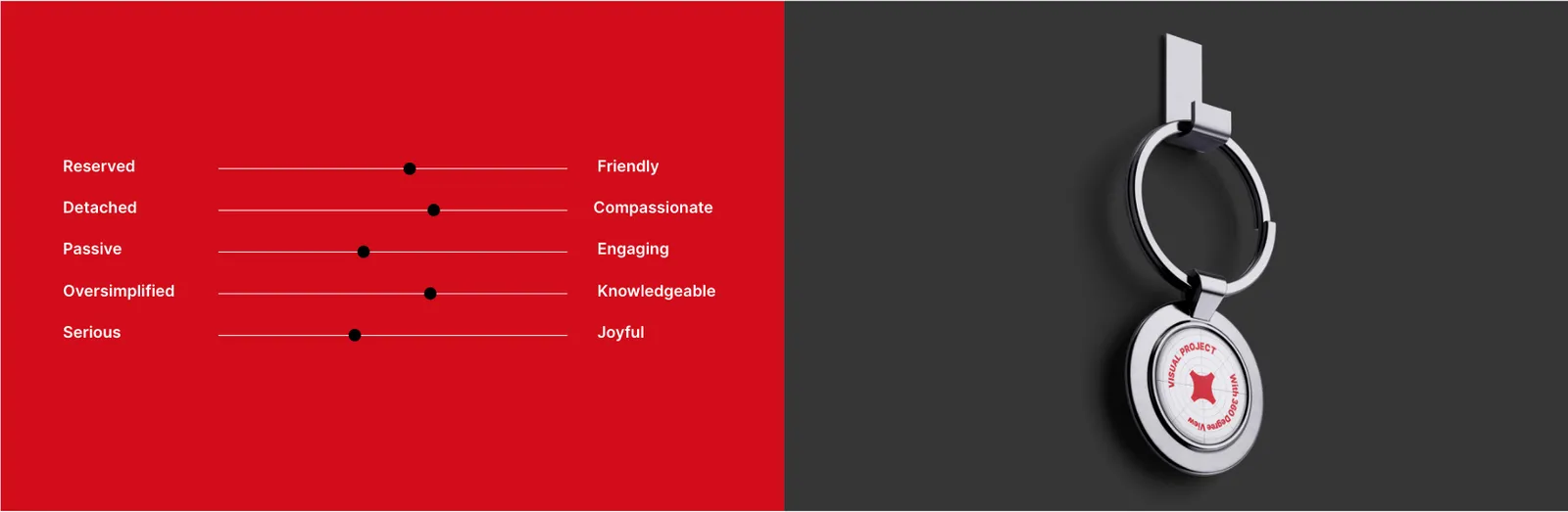
The PICTORIAL 360 Tone of Voice is Authoritative, Insightful, and Meticulous. We speak with the confident clarity of an expert architect who sees the macro picture while controlling the micro details. Our language is structural, professional, and inspiring. We avoid scattered or ambiguous messaging; instead, our words are carefully woven together to project precision, strategic vigilance, and comprehensive control. We communicate not just to be heard, but to demonstrate profound understanding.
02
The logo
02.1
Concept
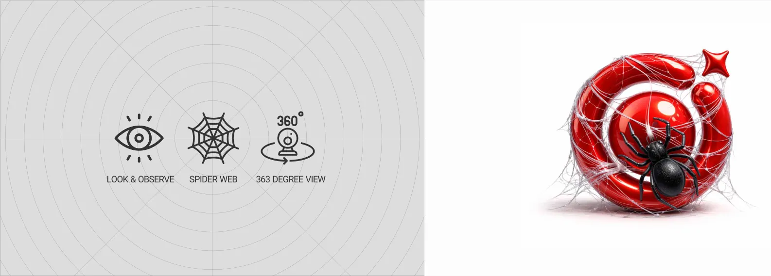
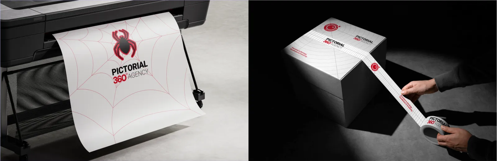
The semantic depth of our logo is built on three core pillars: Look & Observe (The Eye): Representing our unwavering focus and analytical vigilance. Spider Web: Symbolizing our intricate, highly connected network of solutions. 360 Degree View: Reflecting our holistic, all-encompassing strategic approach. The powerful 3D visualization of the spider weaving through the red eye perfectly encapsulates our identity: a vigilant, hyper-connected entity that commands its environment.
The primary PICTORIAL 360 AGENCY logo is a masterclass in visual hierarchy and geometric balance. It consists of our signature red "Networked Eye" icon paired with typography that employs a strategic weight distribution: bold black for "PICTORIAL," bold red for "360°", and light grey for "AGENCY." This precise color coding and typographic weighting instantly communicate our brand's authority, focus, and comprehensive nature.

02.2
Construction
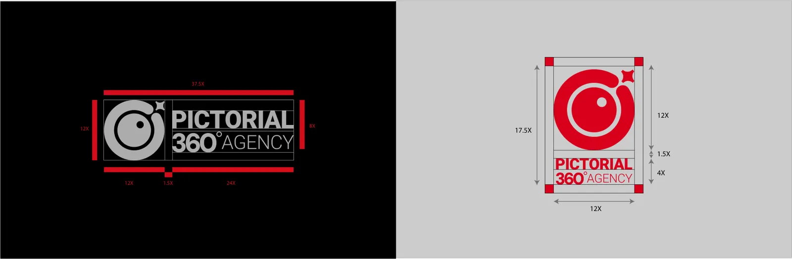
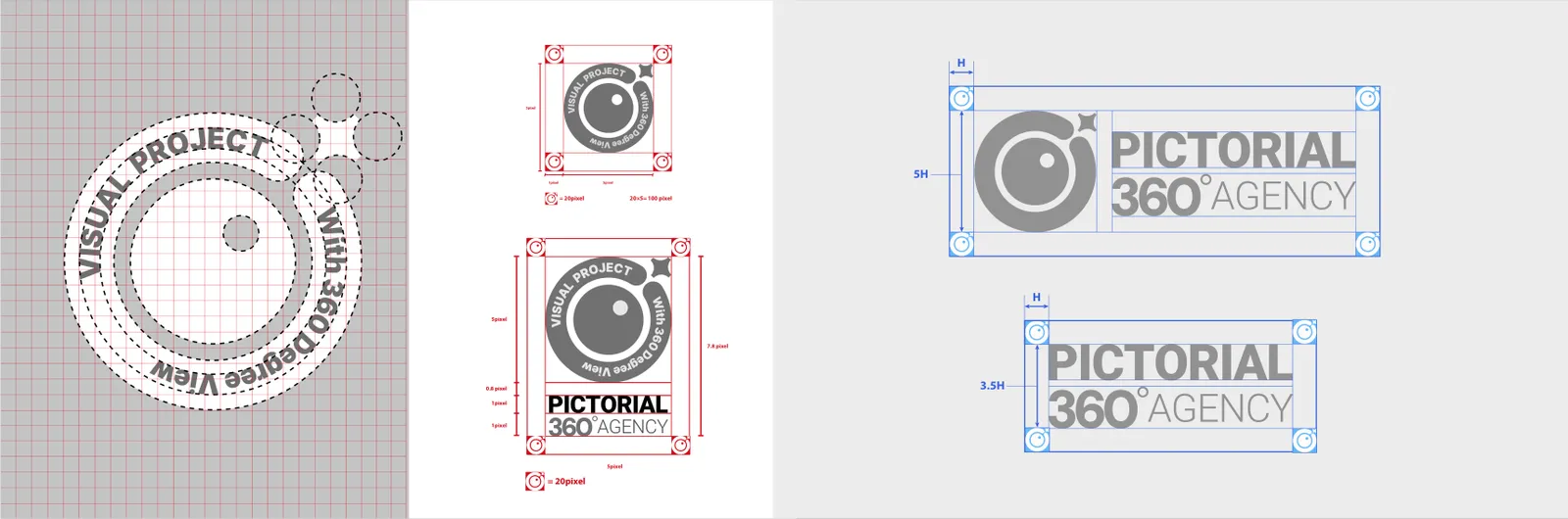
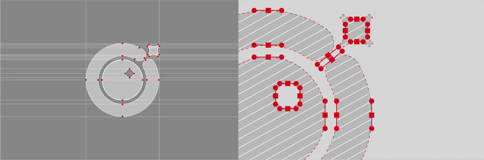
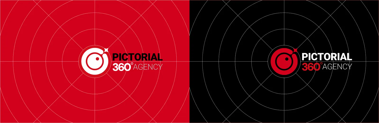
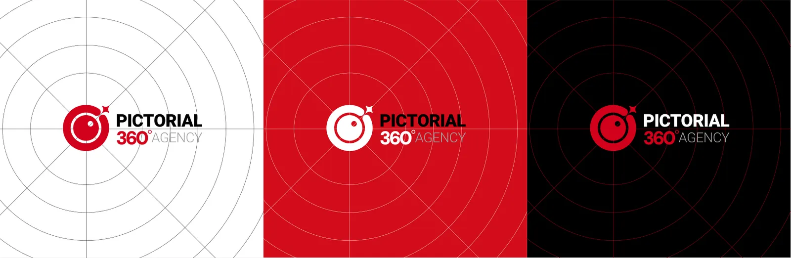
The PICTORIAL 360 emblem is a triumph of precise vector architecture. As detailed in the blueprint, the logo is not arbitrarily drawn. It is constructed using exact node placements, intersecting circular paths, and calculated negative space cuts. The outer broken ring, the solid inner circle, and the four-pointed spark element are engineered with mathematical symmetry to ensure pixel-perfect rendering at any scale.
02.3
Clear space
The PICTORIAL 360 emblem is a triumph of precise vector architecture. As detailed in the blueprint, the logo is not arbitrarily drawn. It is constructed using exact node placements, intersecting circular paths, and calculated negative space cuts. The outer broken ring, the solid inner circle, and the four-pointed spark element are engineered with mathematical symmetry to ensure pixel-perfect rendering at any scale.
02.4
Variations
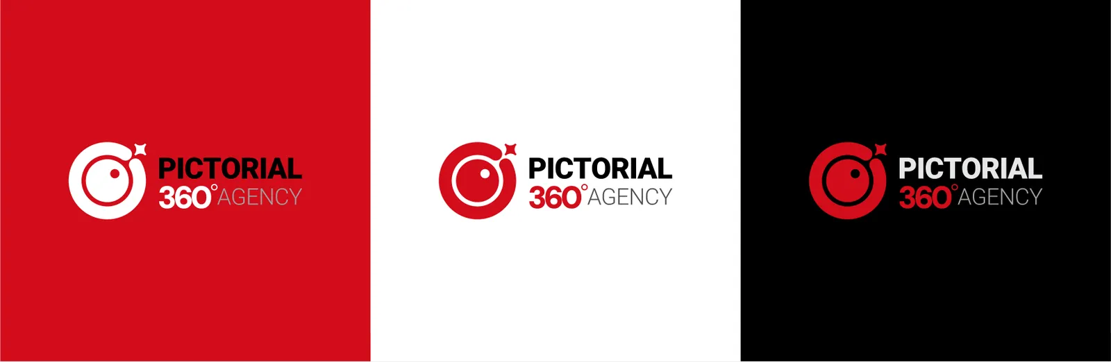
To ensure flawless adaptability, the logo exists in specific structural configurations. As shown in our guidelines, we utilize both horizontal lockups for standard applications and vertical (stacked) lockups for vertical spatial constraints. Additionally, reverse color variations (white typography) are strictly defined for use on our brand's solid red and black backgrounds.
02.5
On background
Contrast is the cornerstone of brand visibility.
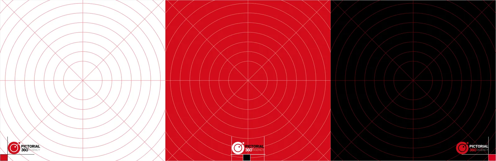
The PICTORIAL 360 AGENCY logo has strict color configurations based on its background environment to maintain maximum authority: On White/Light Backgrounds: Use the standard full-color lockup, featuring the red emblem with black and grey typography. On Brand Red Backgrounds: The entire logo (emblem and typography) must completely invert to solid white to ensure flawless legibility and premium contrast. On Black/Dark Backgrounds: The core emblem remains our signature Crimson Red, while the primary typography ("PICTORIAL") inverts to white, and the secondary text ("360° AGENCY") retains its red and grey weighting to emerge boldly from the darkness.
Our logo is crafted to function seamlessly across all types of backgrounds, reflecting a flexible yet cohesive brand identity. Each element, from color palette to form and spacing, has been thoughtfully considered to preserve clarity, contrast, and legibility in diverse environments. Whether applied on digital platforms, print materials, or environmental graphics, the logo maintains its distinct presence and reinforces brand recognition. By ensuring visual consistency in every context, it embodies professionalism, versatility, and the core values of the brand.
02.6
Minimum size
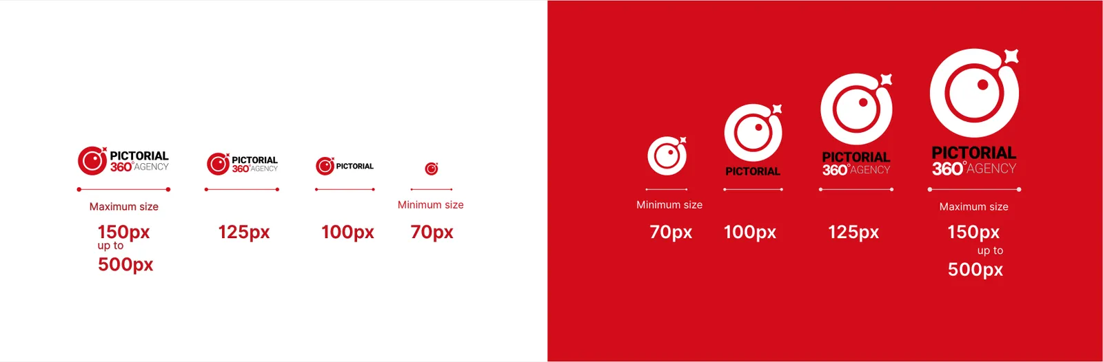
Scalability is critical. To maintain legibility of the typography and the emblem's internal cuts, strictly adhere to the sizing rules. The absolute minimum digital size allowed is 70px. Optimal viewing sizes range between 100px and 125px, with a maximum standard scale defined from 150px up to 500px depending on the layout format.
02.7
App icon
For digital interfaces and mobile applications, the core emblem is housed within a standardized squircle container.
We deploy three authorized variations: the red icon on a light grey background, the negative white icon on our brand's solid red background, and a premium 3D embossed version for specialized digital touchpoints. This ensures high-impact brand recall on smaller screens.

02.8
Placement
Contrast is key to authority. When the logo is placed on our primary brand colors—solid black or solid red—the typography must invert to white to maximize legibility. The red emblem remains solid on the black background but reverses to white when placed on the red background. Never place the full-color logo on complex backgrounds that compromise readability.
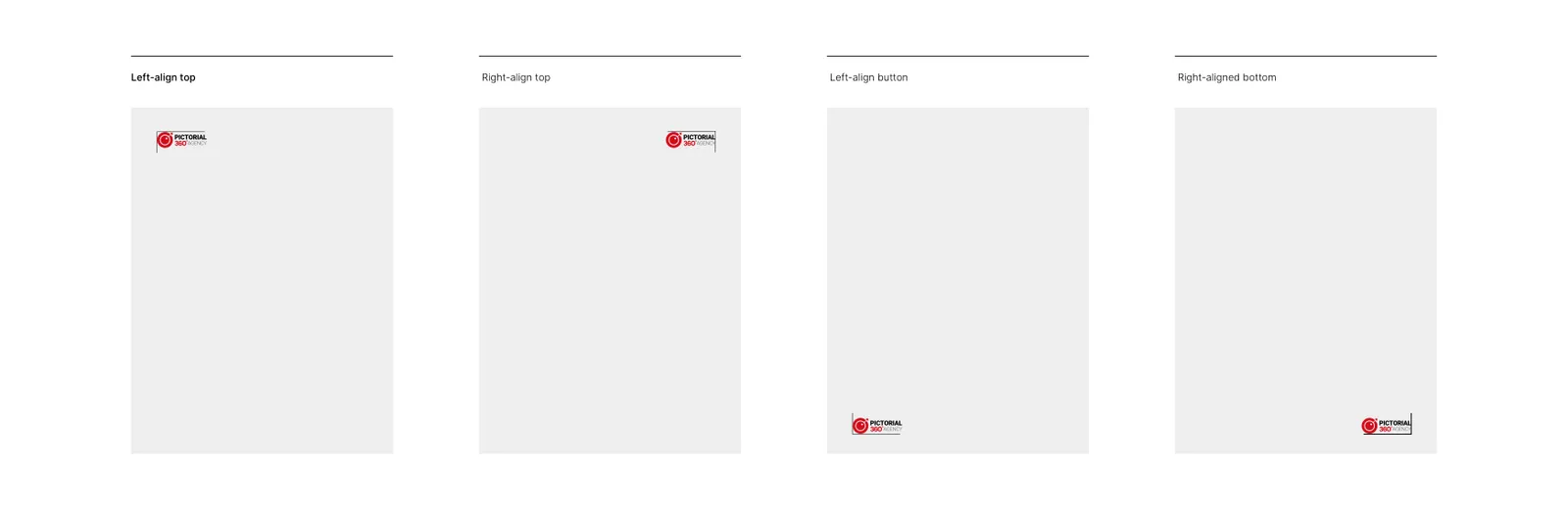
The placement of the PICTORIAL 360 logo anchors our visual compositions. As demonstrated in our alignment guide, the logo must be definitively anchored in one of the four corners of the canvas (Top-Left, Top-Right, Bottom-Left, or Bottom-Right). Floating or arbitrarily centered placements without structural reasoning are not recommended.
02.9
Misuse
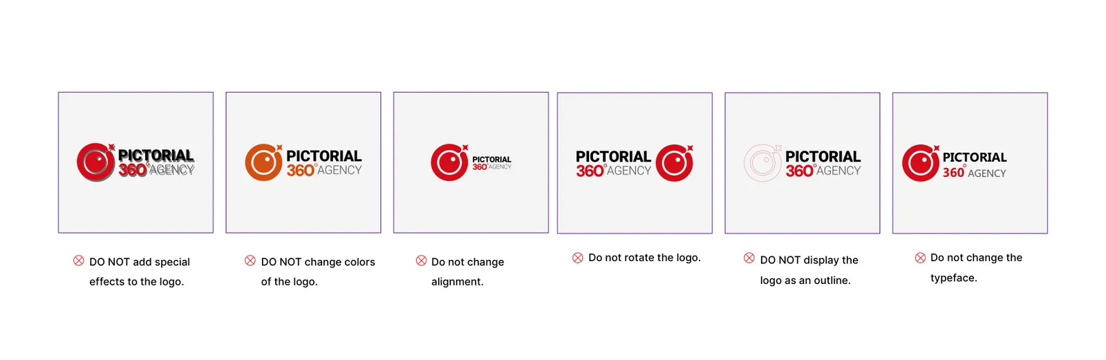
The brand’s integrity depends on strict visual discipline. As explicitly outlined, the following actions are strictly prohibited: DO NOT add special effects (e.g., drop shadows). DO NOT change authorized colors. DO NOT change alignment or internal proportions. DO NOT rotate the logo. DO NOT display the logo as an outline/stroke.
03
Colour
03.1
Palette
The colours of the identity and their references.
- Name:
- Crimson Red
- CMYK:
- 15/85/100/0
- RGB:
- 210/0/27
- HEX:
- #D2001B
- Name:
- Silver Gray
- CMYK:
- 0/0/0/10
- RGB:
- 230/231/232
- HEX:
- #E6E7E8
- Name:
- Burgundy
- RGB:
- 125/0/16
- HEX:
- #7D0010
- Name:
- Charcoal
- RGB:
- 88/89/89
- HEX:
- #585959
03.2
Colour story
The PICTORIAL 360 AGENCY color palette is a strategic reflection of our brand's dual nature: bold visionary energy and calculated precision. Our primary hue, Crimson Red, embodies the vitality, alertness, and commanding presence of the "Networked Eye". It is the color of action, passion, and unparalleled focus. Grounding this intense energy is Silver Gray, which represents the structural integrity of our web, technological sophistication, and corporate stability. Together, these colors create a dynamic, authoritative tension between creative passion and engineered logic.

03.3
Colour system
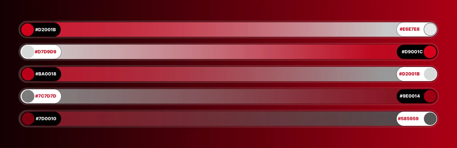
To build depth, shadow, and 3D network visualizations, we employ a designated spectrum of supporting gradients ranging from deep burgundy (#7D0010) to dark charcoal (#585959). This expanded tonal palette allows for the creation of immersive, radar-like concentric backgrounds and structural grids.
Our visual identity relies on a highly disciplined color system. The primary palette consists of two core anchors:
Crimson Red: HEX: #D2001B | CMYK: (15, 85, 100, 0) | RGB: (27, 0, 210). Silver Gray: HEX: #E6E7E8 | CMYK: (0, 0, 0, 10) | RGB: (232, 231, 230).

04
Typography
04.1
Typefaces
The typefaces of the identity and the weights it uses.
- IRAN SansLightRegularMediumBold
- BahnschriftLightRegularMediumBold
04.2
Type specimen
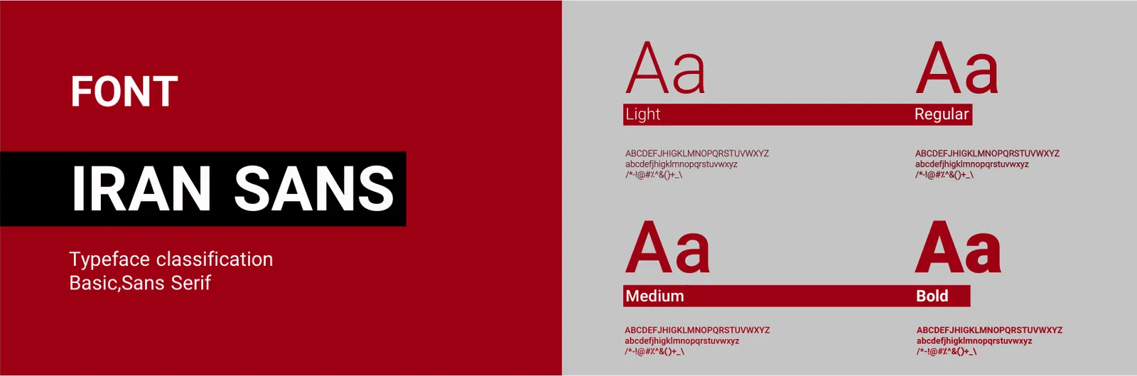
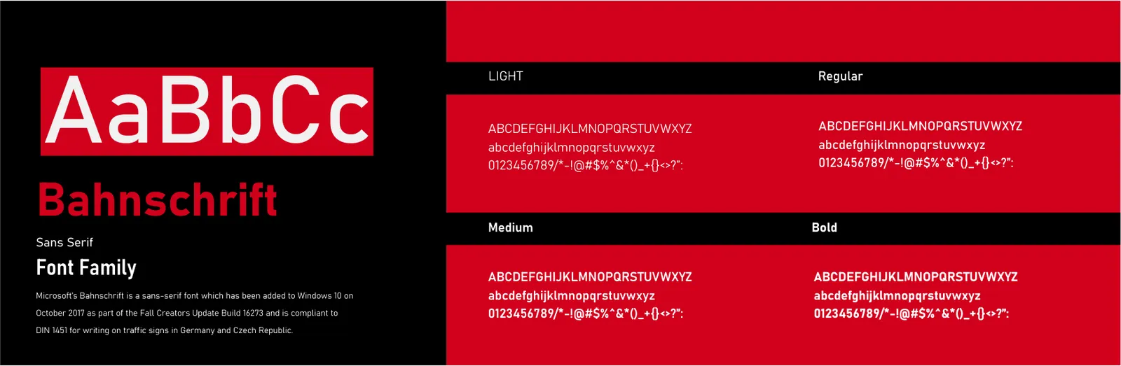
To construct a strict and readable visual hierarchy, both our primary and secondary fonts (IRAN SANS and Bahnschrift) are systematically deployed in four specific weights: Light, Regular, Medium, and Bold.
For Latin scripts and international communications, our chosen secondary font is Bahnschrift. This robust sans-serif font family, introduced by Microsoft, is compliant with the rigorous DIN 1451 standards used for writing on traffic signs in Germany and the Czech Republic. This engineering-grade heritage guarantees absolute legibility, industrial strength, and a commanding visual presence that perfectly complements our 360-degree strategic vision.
Bold: Reserved for impactful headlines and core brand identifiers, such as the word "PICTORIAL" in our primary logo. Medium & Regular: Utilized for subheadings and body copy to ensure optimal readability across all media. Light: Deployed for secondary descriptors, such as the word "AGENCY" in our logo, creating a sophisticated typographic contrast and balance.
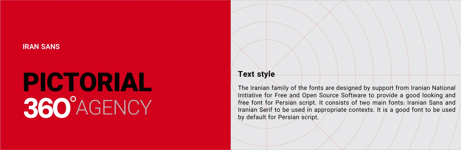
Our primary typographic voice for the Persian script is IRAN SANS. Classified as a Basic, Sans Serif typeface, it perfectly aligns with our brand's geometric and modern architectural essence. Developed with the support of the Iranian National Initiative for Free and Open Source Software, it is the default standard for legibility and aesthetic excellence in Persian typography. We utilize it to project clarity, authority, and structural precision across all core brand communications.
05
Graphic elements
05.1
Pattern
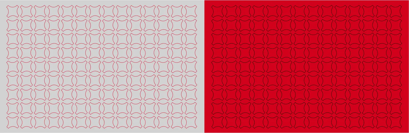
Expanding beyond the primary logo, we utilize functional brand extensions. As seen in our design files, we have developed a circular badge/stamp incorporating the typography "VISUAL PROJECT With 360 Degree View" wrapped around the core emblem. Furthermore, the concentric radar grids serve as a dynamic brand pattern, visually representing our far-reaching network and 360-degree radar vision across layouts.
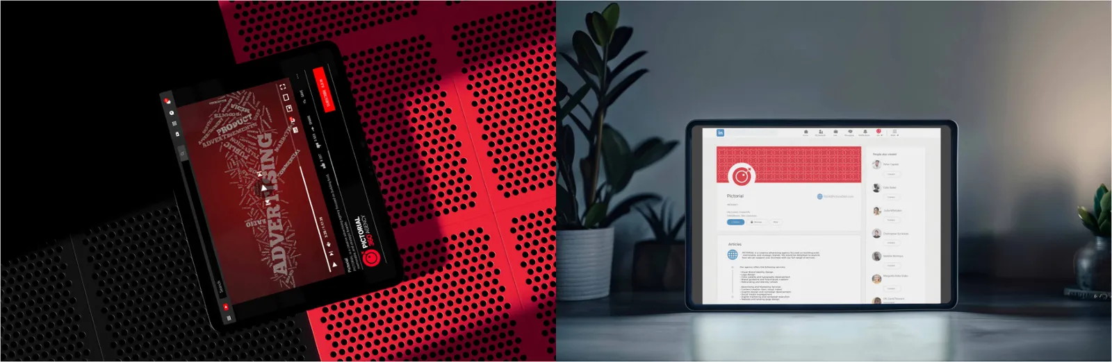
Our landing page frameworks are built on conversion-focused architecture and Gestalt visual principles. By integrating strategic eye-tracking flows, clean typographic hierarchies, and high-impact call-to-action modules, these pages convert digital traffic into high-value strategic partnerships.
06
Stationery
06.1
Business cards
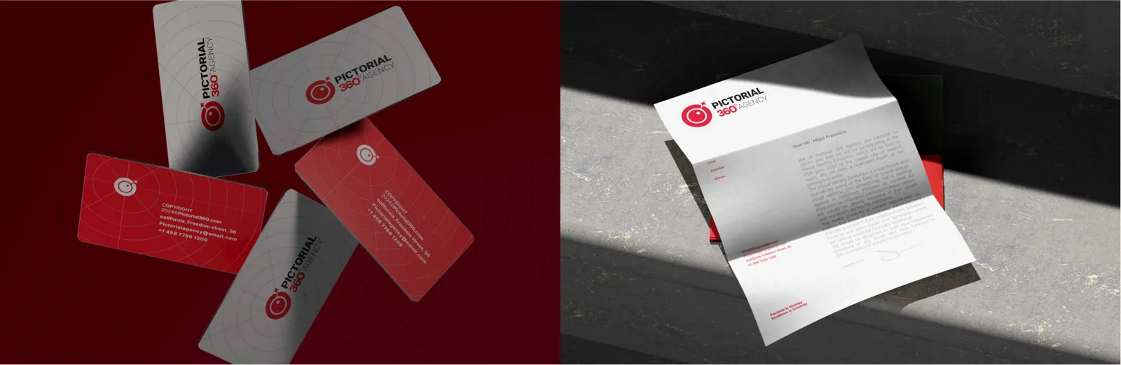
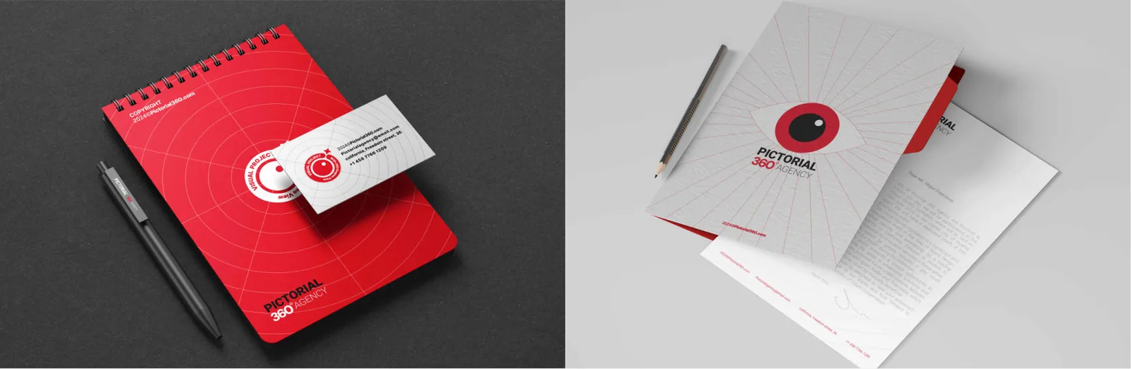
The PICTORIAL 360 business card is more than a contact exchange; it is a pocket-sized manifestation of our brand architecture. Printed on premium, heavyweight stock, it features a strictly calculated geometric layout and striking contrast between Crimson Red and Silver Gray. It ensures that our first physical touchpoint leaves an authoritative and unforgettable impression.
06.2
ID cards
The corporate ID card is the personal badge of our strategic architects.
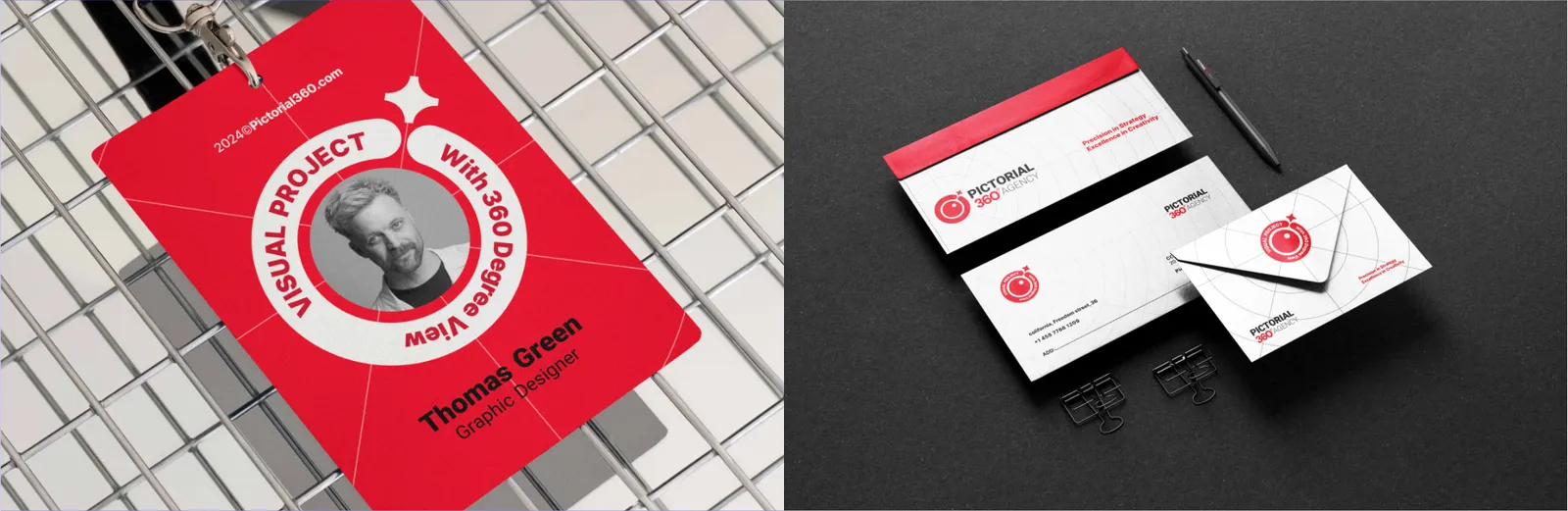
Featuring a clean, grid-based layout and strict typographic hierarchy (utilizing Bahnschrift and IRAN SANS), it instantly identifies the bearer as an integral node within the powerful PICTORIAL 360 network.
06.3
Letterhead
Every detail matters in our logistics.
Our letterhead serves as the official canvas for strategic communication. Designed with meticulous attention to negative space and structural alignment, it places the "Networked Eye" in a commanding position. This guarantees that every contract, proposal, and official correspondence carries the weight of absolute professionalism and clarity.
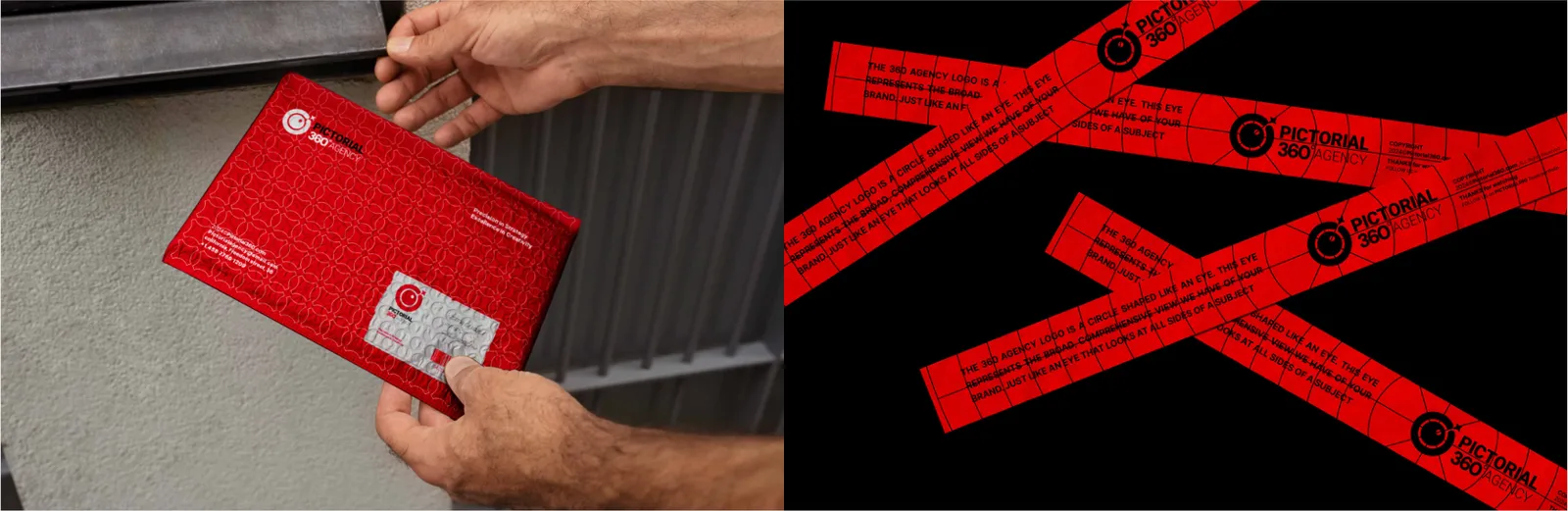
Our mailing and address labels apply a strict typographic grid (utilizing Bahnschrift for international clarity) to ensure information is conveyed with absolute precision. The subtle presence of the radar grid pattern ensures that even in transit, the package is unmistakably PICTORIAL 360.
As an agency that prides itself on vigilance and timing, our reminder cards are designed for maximum functionality and elegance. With dedicated blank zones for time-sensitive data and the assertive presence of the "Networked Eye," they ensure that our clients remain seamlessly connected to our ongoing strategic processes.
06.4
Envelopes
The PICTORIAL 360 envelope acts as the secure physical vessel for our insights. Utilizing our signature brand patterns—derived from the concentric radar grids and web intersections—the envelope design builds anticipation and visually communicates our expansive network before it is even opened.
06.5
Folders
Designed to securely hold comprehensive project strategies, the presentation folder is a structural masterpiece. The exterior boldly showcases our Crimson Red identity and concentric brand pattern, while the interior is engineered to logically organize proposals, symbolizing our capability to handle every angle of a client's business.
06.6
Notebooks
The PICTORIAL 360 notebook is the birthplace of visionary ideas. Bound in our signature colors and featuring subtle web-grid patterns on its pages, it provides our team and clients with an inspiring, disciplined space to record observations, sketch concepts, and engineer strategic solutions.
06.7
Stickers and seals
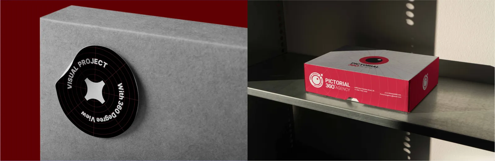
Our brand stickers act as versatile, high-visibility markers of the PICTORIAL 360 ecosystem. Precision-die-cut into the shape of our primary emblem or squircle app icon, they are tactical assets used to seal packages, brand equipment, and organically expand our visual footprint.
07
Digital
07.1
Website
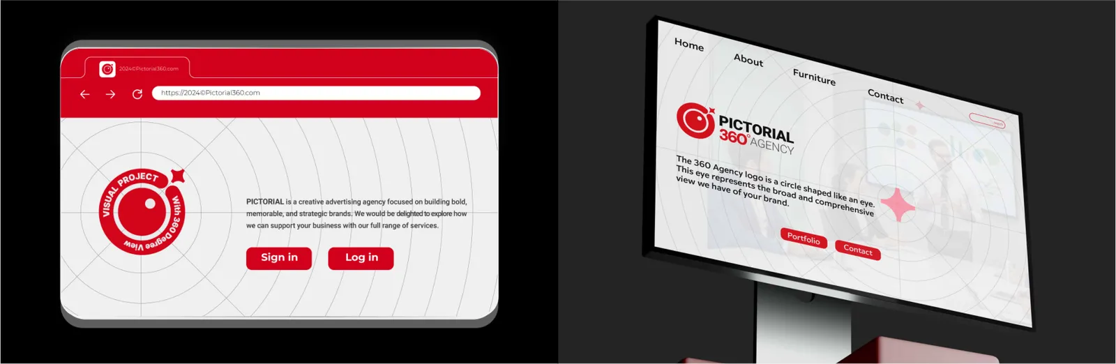
The PICTORIAL 360 digital headquarters is engineered on a robust Information Architecture (IA) that mirrors our 360-degree approach. Every UI component, grid system, and interactive module is meticulously structured to guide the user seamlessly through our strategic services, ensuring absolute digital clarity and operational authority.
Serving as the micro-digital signature of our brand, the PICTORIAL 360 favicon distills the core "Networked Eye" emblem into its purest form. Optimized for high contrast and immediate recognition on browser tabs, it ensures our digital presence remains sharp and vigilant across all web platforms.
07.2
Mobile app
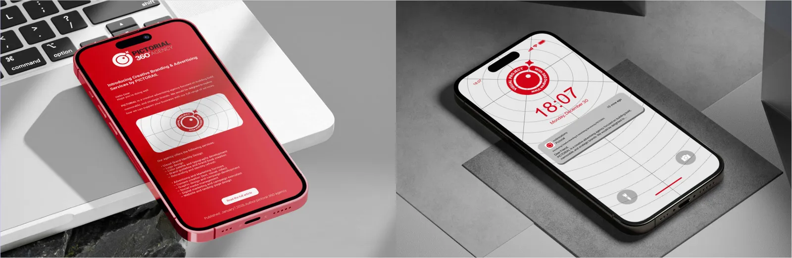
Our marketing email templates translate our corporate authority into direct digital communication. Built with a modular grid system, striking Crimson Red highlights, and strict typographic hierarchy, these templates ensure every outreach campaign projects professionalism, clarity, and uncompromised strategic value.
Designed for instant impact in fast-paced digital environments, our push notification UI templates incorporate the core brand iconography and concise typography. They are engineered to capture attention immediately while maintaining the sophisticated, authoritative voice of the PICTORIAL 360 ecosystem.
07.3
Social media
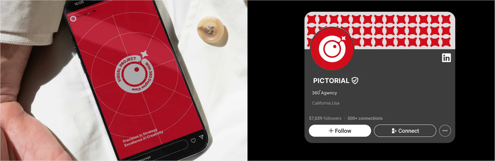
Our social media profiles act as unified nodes within the global digital network. From optimized avatar placements utilizing the squircle icon to standardized cover imagery featuring our concentric radar patterns, every profile projects a synchronized, highly disciplined brand identity across all platforms.
The PICTORIAL 360 story templates are dynamic digital frameworks optimized for vertical mobile screens. Featuring bold typographic grids, high-contrast color blocking, and strategic empty zones for real-time updates, they enable our team to share insights and project milestones with fluid elegance.
07.4
Campaigns and email
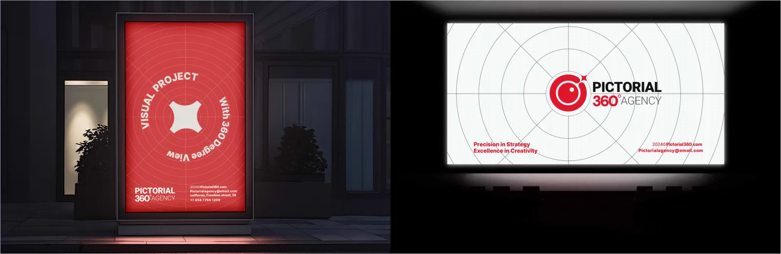
Engineered to cut through digital noise, our display ad units leverage the full power of our color palette and semantic imagery. Each banner is mathematically structured to drive high click-through rates while reinforcing our core promise of 360-degree strategic oversight.
The PICTORIAL 360 webinar asset system includes branded presentation decks, virtual background walls, lower-thirds, and transition slides. Designed to maintain visual command during live digital events, these assets ensure an immersive, professional, and authoritative thought-leadership experience.
Video assets within the PICTORIAL 360 ecosystem are marked by cinematic precision and structural rhythm. Featuring custom animated intro/outro sequences, standardized lower-thirds, and radar-grid overlays, our video content brings the "Networked Eye" to life with motion authority.
08
Merchandise
08.1
Apparel
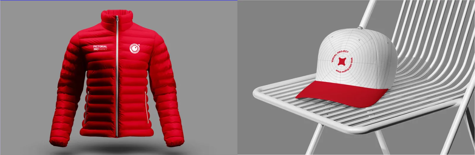
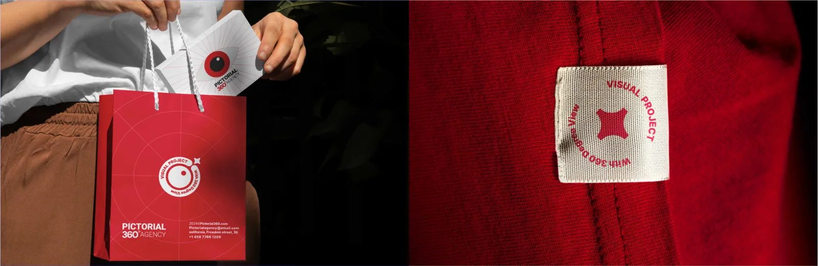
Translating vector geometry into tactile reality demands absolute technical precision. For all apparel and textiles, we strictly mandate High-Density 3D Puff Embroidery for the core emblem to ensure structural volume. Thread colors must mathematically match our CMYK profiles, prohibiting any fraying, distortion, or misalignment of the geometric grid.
The PICTORIAL 360 corporate jacket serves as the functional armor for our strategic team. Tailored with structural precision and utilizing premium weather-resistant fabrics, it features a minimalist exterior in deep black or Silver Gray, accented by a striking Crimson Red inner lining. The "Networked Eye" is applied with high-density embroidery, projecting modern professionalism and team unity across any environment.
Positioned near the line of sight, our branded headwear is a direct extension of our visionary identity. The cap utilizes a structured, five-panel architectural fit. Embellished with a subtle, raised silicone or 3D embroidered logo on the front crown, it represents casual authority and a forward-looking mindset, ensuring the brand remains visible and vigilant.
08.2
Promotional items
Drinkware provides a daily, intimate touchpoint.
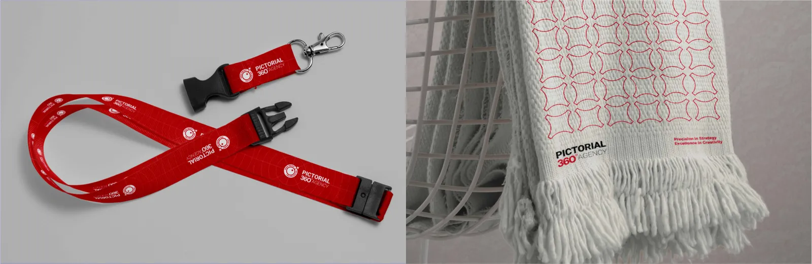
The lanyard is the physical thread that binds our network. Woven with heavy-duty fibers, it integrates our signature spider-web pattern along with bold, repeating typography. It is an assertive identity tether that unifies the team during events, seminars, and daily corporate operations.
Extending the brand into premium lifestyle spaces, our branded textiles utilize high-quality jacquard weaving. The towels present the "Networked Eye" in a bold, oversized format through contrasting two-tone threading (Red and Gray), commanding presence and brand recall even in recreational environments.
Sunglasses are the ultimate metaphor for our "360-degree view" and visual protection.
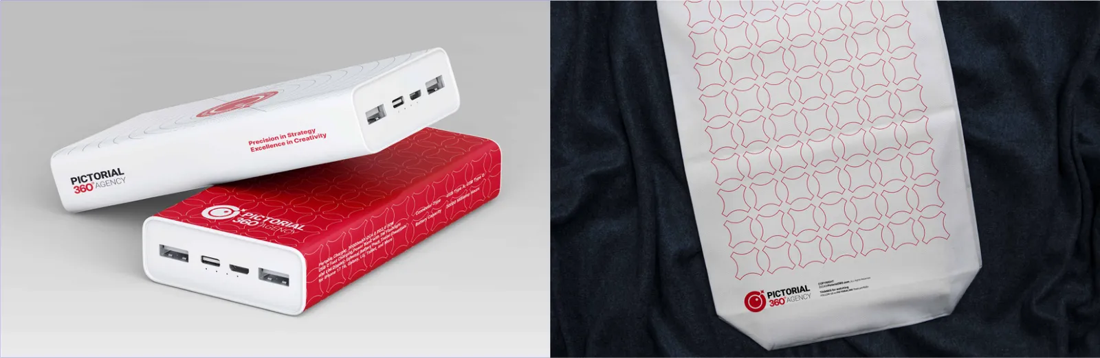
The PICTORIAL 360 tote bag is a mobile canvas for our brand’s expansive network. Constructed from heavy-duty canvas for maximum structural durability, it proudly displays the concentric radar brand pattern. It acts as a functional carrier for our ecosystem, symbolizing our capacity to hold, organize, and transport vast amounts of strategic value.
Tech accessories reflect our role as a continuous source of energy for our clients. The PICTORIAL 360 power bank is designed with a sleek, matte metallic finish. Featuring a minimalist laser-engraved logo, it is a premium, tactical tool that ensures our clients and team remain powered, connected, and operational within the global digital network.
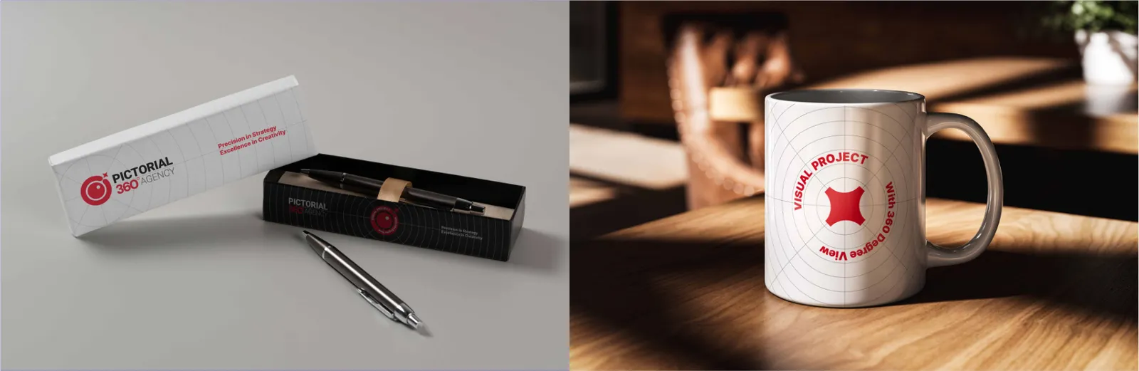
The PICTORIAL 360 mug contrasts a soft-touch matte exterior with a high-gloss Crimson Red interior. This tactile juxtaposition, paired with a perfectly scaled typographic lockup, serves as a daily focal point for clarity and inspiration during intense strategic planning sessions.
The corporate pen is an instrument of precision. Crafted with a weighted, balanced metallic body, it mirrors the calculated geometry of our brand. The PICTORIAL 360 pen transforms visionary concepts into actionable strategies, acting as the physical tool that drafts the blueprints of our clients' success.
Featuring sleek, geometric frames and polarized lenses, the PICTORIAL 360 sunglasses include a discreet, laser-etched logo on the temple. They embody our role as the visionary guardian that filters out the noise to focus on what matters.
08.3
Packaging
The presentation of our merchandise must match the prestige of the brand.
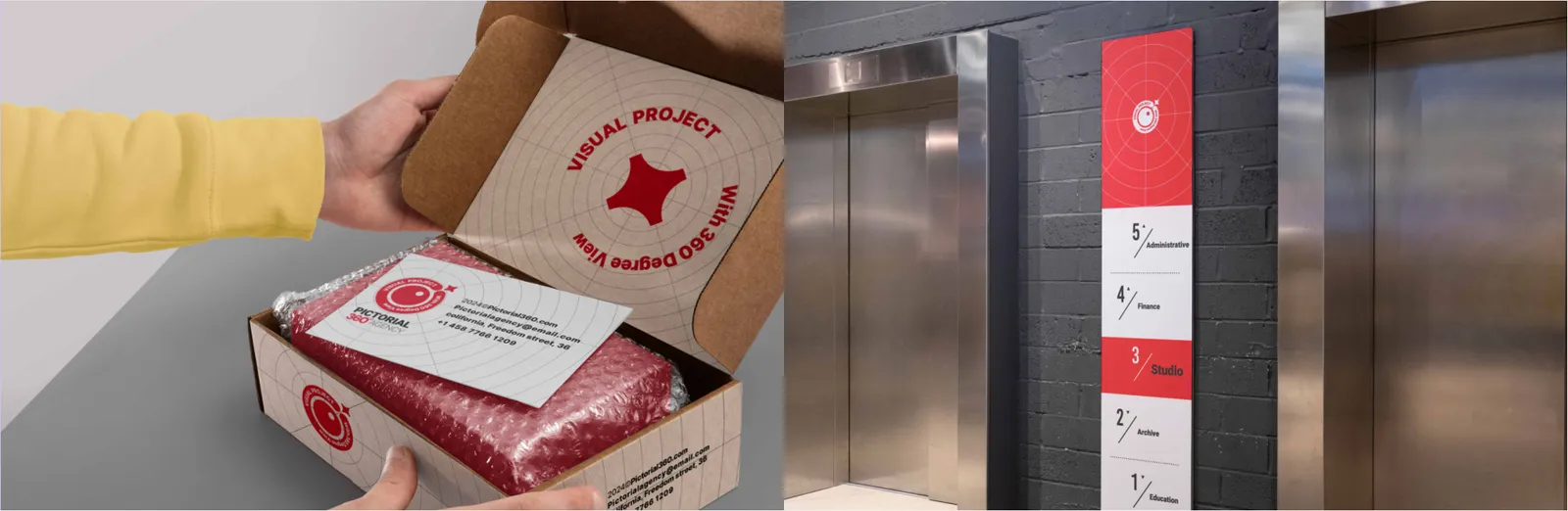
Even our logistics must project our analytical precision. Shipping boxes are constructed from durable, premium materials adorned with minimalist brand insignias.
Our corporate certificates represent the pinnacle of validation and excellence. Utilizing our formal typographic weights and the elegant Silver Gray palette as a foundation, the certificate is anchored by a premium foil-stamped "Networked Eye" seal, authenticating achievements with uncompromising prestige.
The PICTORIAL 360 gift card translates our corporate identity into a premium lifestyle touchpoint. With a sleek, minimalist design applying the Crimson Red on a dark or metallic canvas, it offers an exclusive experience that reflects the high value and luxury standard of our brand network.
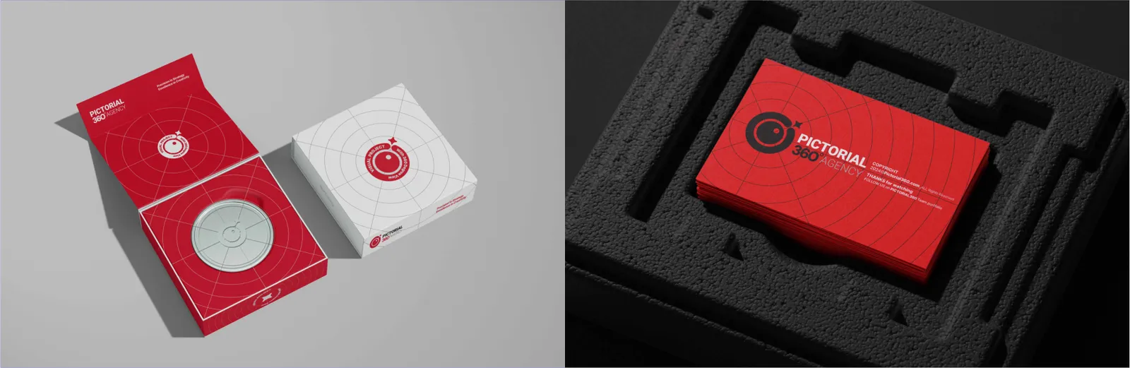
The PICTORIAL 360 packaging system is a three-dimensional architectural experience. Engineered with sturdy materials, sharp edges, and a sophisticated interplay of matte Silver Gray and glossy Crimson Red accents, our boxes protect their contents while delivering an authoritative, premium unboxing experience.
Our merch packaging employs a rigid box architecture with a soft-touch matte finish. Embellished with a subtle, blind-embossed radar grid and a foil-stamped logo, the unboxing experience is meticulously engineered to convey luxury, security, and strategic value.
The custom sealing tape acts as the ultimate security thread, repeating the PICTORIAL 360 typography and spider-web pattern, proving that the contents have been secured and authorized by our network.
09
Applications
09.1
Signage
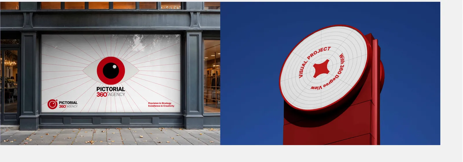
The exterior signage acts as the architectural beacon of PICTORIAL 360 AGENCY. Engineered for maximum visibility, the main emblem and typography must be constructed using 3D illuminated channel letters. Placed with strict alignment to the building's structural grid, it projects our authority and visionary presence to the outside world before a client even enters the premises.
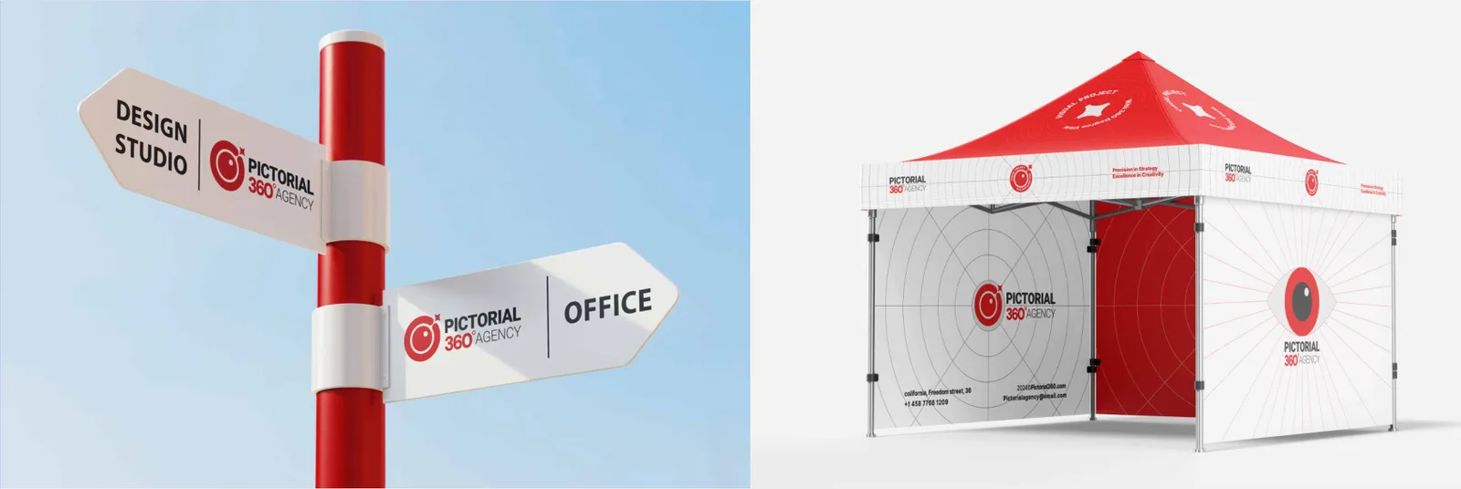
The PICTORIAL 360 wayfinding system is a masterclass in functional UI applied to physical space. Utilizing the Bahnschrift font for maximum legibility and the brand's geometric icons, the signs are constructed from matte metal and acrylic. These directional nodes eliminate confusion, guiding clients and staff with the same 360-degree clarity we apply to our business strategies.
09.2
Events and exhibitions
Physical events require architectural dominance.
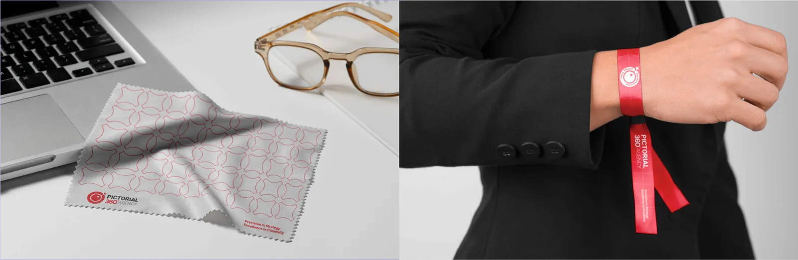
Our event items—ranging from modular exhibition booths and commanding roll-up banners to VIP wristbands—are synchronized through strict grid layouts and our core color palette. They ensure that the PICTORIAL 360 space acts as a magnetic epicenter of industry authority.
Portable outdoor banners and roll-ups are tactical outposts of the PICTORIAL 360 network. Designed on a rigid vertical grid, they deploy our solid Crimson Red background with negative white typography for uncompromising legibility from a distance. They are structured to deliver clear, commanding messages without visual noise.
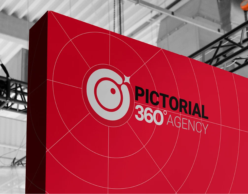
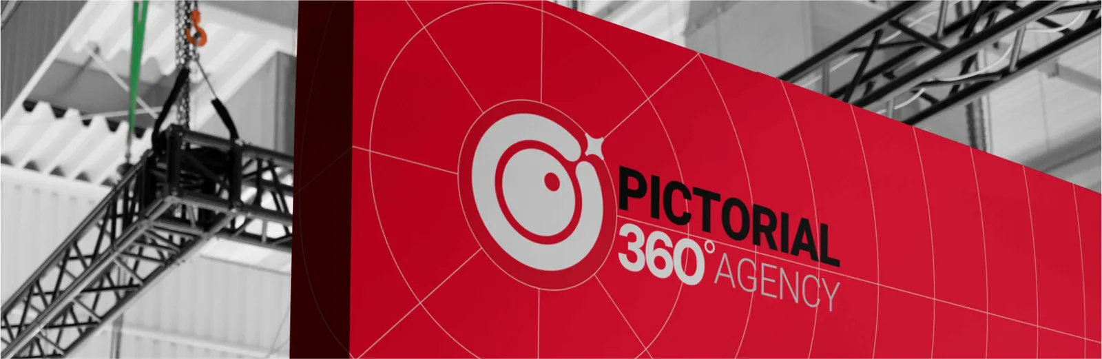
Our exhibition stands are the three-dimensional embodiment of the PICTORIAL 360 network. Engineered with modular architectural frames, they feature massive overhead circular structures mirroring the primary logo's ring. The space is divided into high-energy red presentation zones and focused, silver-gray meeting nodes, capturing attention and dominating the exhibition floor.
09.3
Advertising
The print campaign toolkit provides a highly disciplined typographic and structural grid for all offline marketing collateral. From multi-page brochures to strategic flyers, the toolkit ensures every printed asset remains mathematically balanced. It mandates proper logo exclusion zones, strict use of IRAN SANS and Bahnschrift, and exact CMYK color matching for consistent physical execution.
09.4
Interior
Window graphics strike a balance between spatial transparency and branded privacy. Utilizing frosted vinyl decals, we apply the concentric radar grid and subtle spider-web patterns across meeting room glass panels and main entrances. This filtering mechanism mirrors our analytical process: observing everything while maintaining a secure, focused environment.
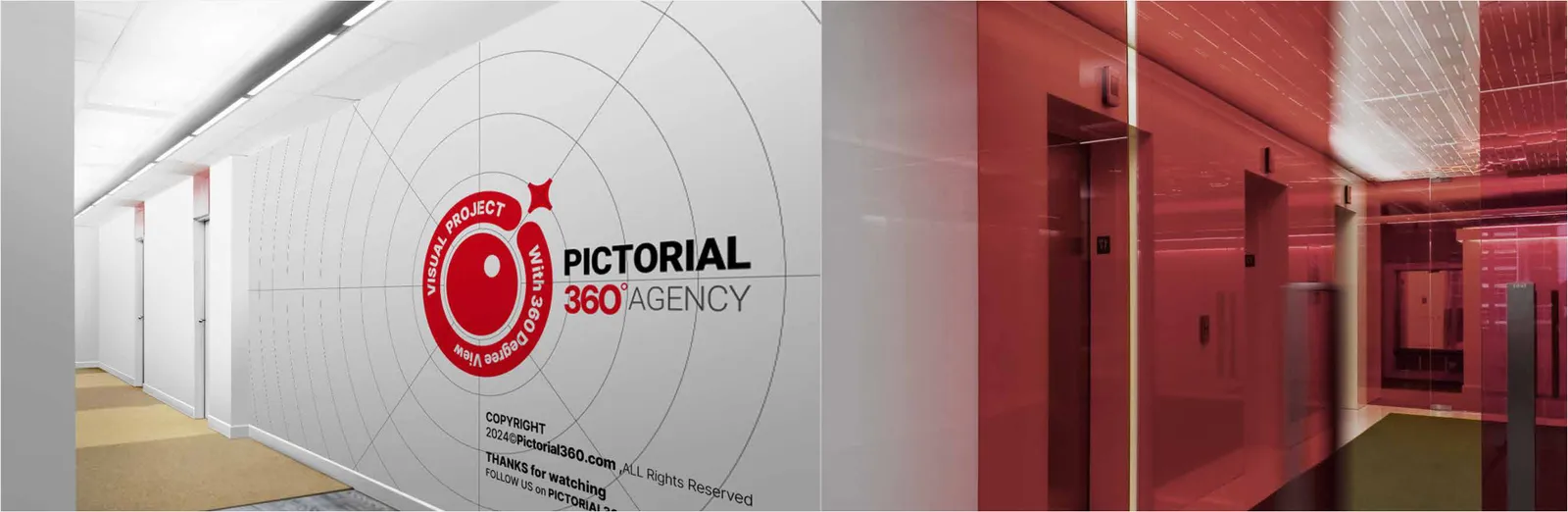
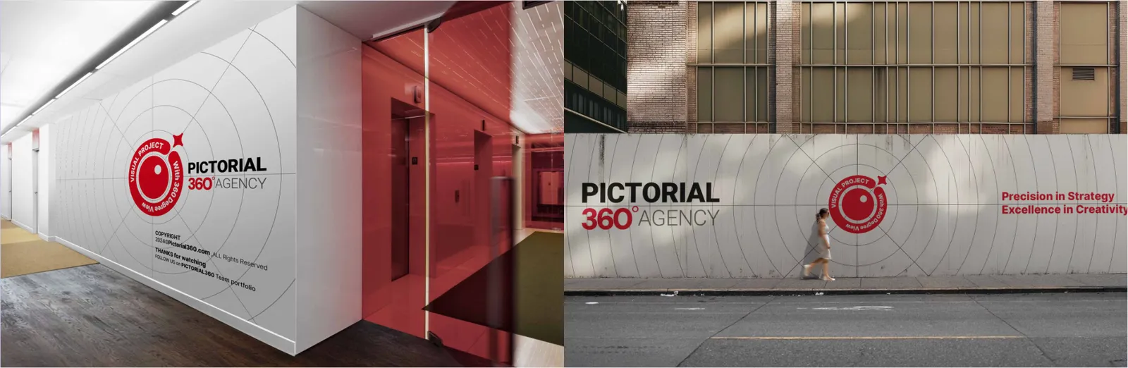
Interior branding transforms our physical workspace into an immersive strategic ecosystem. By contrasting Silver Gray architectural surfaces with striking Crimson Red focal points, the environment breathes the brand's logic. The primary logo must be displayed in the reception area as a solid, high-contrast, premium installation, establishing absolute corporate authority from the first touchpoint.
Wall graphics act as massive spatial canvases that map our strategic vision. Instead of cluttered imagery, we utilize vast, minimalist geometric murals featuring the interconnected web and typography. These oversized vector installations run across strategic corridors and creative hubs, inspiring the team and surrounding clients within the brand's expansive 360-degree radar.
Corporate gift kits are curated physical experiences representing the prestige of our partnerships. Housed in custom rigid boxes with soft-touch matte black finishes and Crimson Red foil-stamping, the kits contain meticulously aligned strategic tools. The unboxing process itself is engineered to build anticipation and project luxury.
Transition spaces like elevators are critical touchpoints for immersion. Elevator door exteriors display continuous brand patterns that complete upon closing. Inside, the environmental graphics utilize high-contrast mirrored surfaces and deep Crimson Red panels, creating a modern, focused capsule that conceptually elevates clients into our strategic mindset.
09.5
Vehicles
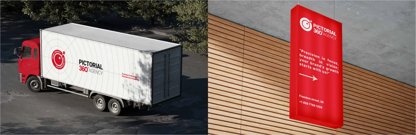
Our corporate fleet functions as mobile nodes of the PICTORIAL 360 network. Vehicle wraps strictly adhere to an asymmetrical, high-speed aesthetic. A matte black or silver base is aggressively wrapped with the Crimson Red radar grid and the "Networked Eye" emblem on the side panels, ensuring dynamic, moving brand recognition on the streets.