BrandMouneskhah Newsletter
Beyond the Fixed Mark

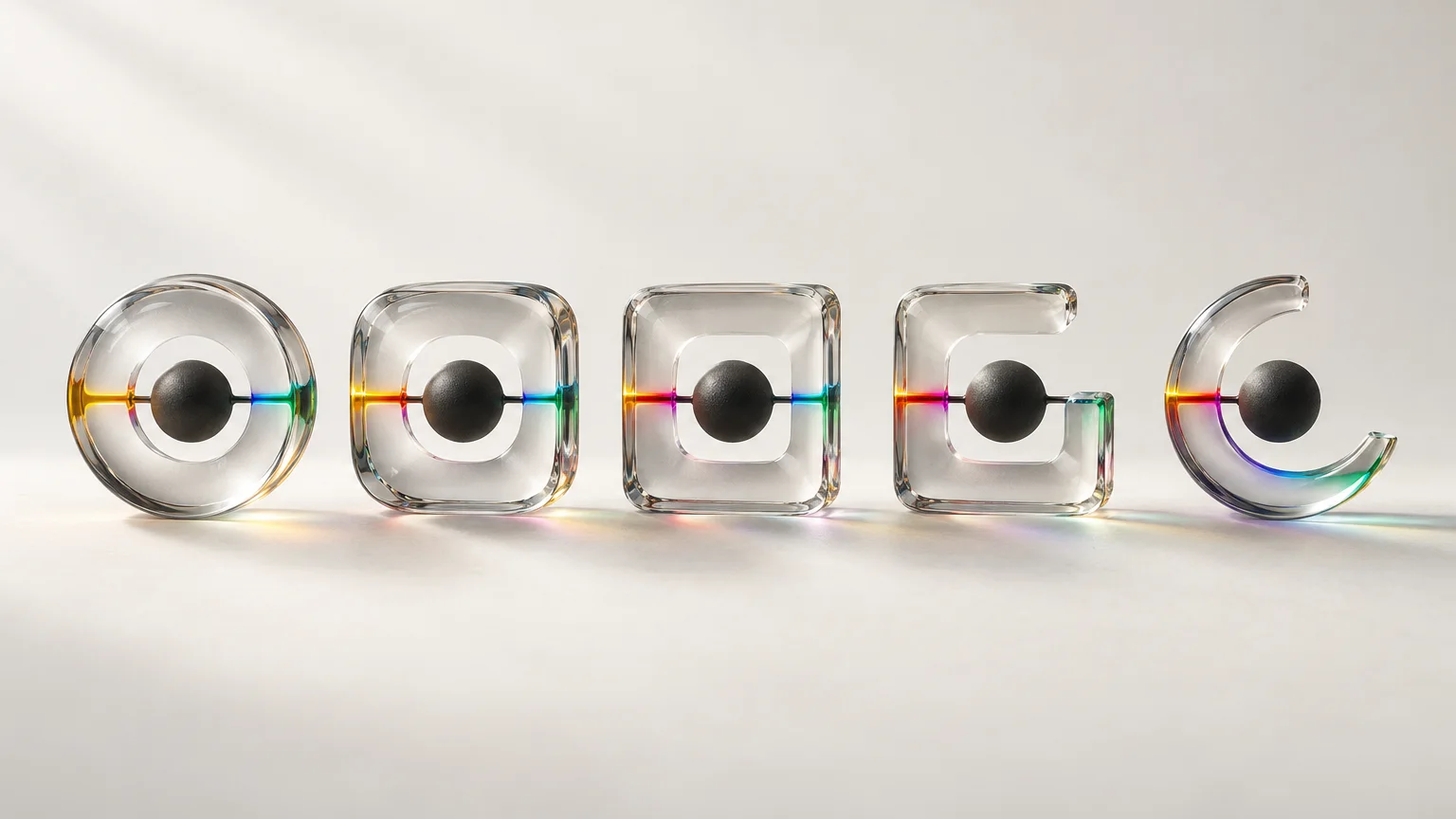
The classical paradigm of graphic design theory has long championed the concept of the "fixed mark"—the idea that a logo functions as a stable anchor, tethering a specific, controlled signified (brand promise) to a distinct signifier (visual form). Historically, rigidity meant reliability. However, in the socio-cultural landscape of liquid modernity, this stabilizing function is undergoing a profound ontological shift. Influenced by postmodern fragmentation and the hyper-reality of digital semiostasis, global brands are increasingly adopting visual identity systems based not on stasis, but on semiotic fluidity. This article interrogates the emergence of the "floating signifier" in contemporary branding strategy, analyzing how meaning is generated when logos decouple from fixed reference points to become vessels for participatory and context-dependent storytelling.
01Theoretical Framework & Semiotics
To interrogate this phenomenon, we must revisit structuralist and post-structuralist semiotics. Ferdinand de Saussure conceptualized the sign as a dyadic relationship between the signifier (form) and the signified (concept). Modernist design principles, exemplified by the International Typographic Style, sought to tighten this bond, aiming for univariate meaning—minimal ambiguity, maximum visual clarity. A logo was meant to denote specific attributes (e.g., speed, reliability, heritage).
Postmodern theory, however, introduces the concept of the floating or empty signifier—a concept developed by theorists like Claude Lévi-Strauss and later explored by Jacques Lacan and Roland Barthes. A floating signifier is a signifier with a vague, highly variable, or non-existent signified. It does not stand for a specific thing; rather, it represents an abundance of meaning, capable of absorbing diverse and even contradictory interpretations based on the interpreter's subjectivity and the cultural context.
In branding philosophy, this decoupled sign shifts perception from aesthetics to aesthetics-in-use. The graphic form ceases to be a functional container of inherent truth and becomes a performative symbol that generates meaning through interaction, juxtaposition, and iteration within a broader semiotic ecosystem.
02Critical Analysis & Philosophical Reflections
Philosophically, the use of floating signifiers in design reflects a rejection of grand narratives (Lyotard) in favor of localized, fragmented micro-narratives. When a brand allows its visual identity to float, it acknowledges the death of the monolithic brand promise.
The relationship between form, function, and meaning is thus radicalized. The function of the postmodern logo is no longer solely identification or denotation. Its primary function becomes phatic and conative—establishing a channel of communication and eliciting an active response from the audience to complete the meaning-making circuit.
The aesthetics of this approach utilize visual perception mechanics as a strategy of subversion. When a form is rendered familiar but unstable (e.g., via variable typography or generative graphics), it creates a cognitive itch. The brain, seeking closure (Gestalt psychology), is forced to actively engage with the symbol, investing cognitive labor to resolve the ambiguity. This active participation increases brand salience and fosters a deeper, subjectively constructed brand storytelling experience.
However, this strategy possesses inherent cultural and cognitive limitations. The capabilities of floating signifiers thrive in highly digitally literate, postmodern consumer cultures accustomed to ironic detachment and semiotic playfulnees. Conversely, in contexts requiring high trust, safety, or utilitarian denotation (e.g., pharmaceuticals, aerospace), visual instability may be perceived not as sophitiscation, but as incompetence. Furthermore, extreme fluidity risks semiotic entropy, where the mark loses all functional identification capability, becoming mere graphic noise.
03Case Studies & Practical Insights
For practitioners and creative directors, transitioning to a variable semiotic system requires a robust computational design framework and a distinct branding strategy.
1. The Participatory Void: The MTV Effect and Beyond MTV is often cited as an early progenitor of the floating signifier in visual identity. While its 'M' and 'TV' components were graphically stable, the internal texture and animation were infinitely variable. The logo never meant one thing; it meant whatever the cultural zeitgeist demanded. For Ph.D. researchers, analyzing the longitudinal entropy of the MTV mark provides insights into the lifespan of highly fluid identities.
2. The Generative Mark: MitMedia Lab (designed by The Green Eyl) The identity system for the MIT Media Lab represents a high-water mark in algorithmic branding. The system uses a specific algorithm to generate a unique variation of the mark for every faculty member and student, resulting in over 40,000 permutations. While the system possesses underlying mathematical logic (form and function are integrated computationaly), to the end-user, the mark "floats." Its meaning is localized to the individual and the moment. It symbolizes "innovation" not through a static icon, but through the performative act of infinite algorithmic variation.
3. Practical Insights for Creative Direction When designing for semiotic elasticity, creative directors must shift from designing objects to designing systems (rules of engagement). The design process must establish:
A Semi-Static Anchor: Define what is invariant (e.g., a specific mathematical proportion, a restricted color palette, or a typographic skeleton). Defined Variables: Define the axes of variation (e.g., weight, texture, position, distortion parameters). Contextual Logic: Establish rules for when and why the mark iterates.
04Conclusion
The emergence of floating signifiers in postmodern branding does not signal the death of the logo, but rather its evolution into a more complex visual chimera. It marks the transition from design as a discipline of controlling meaning to design as a discipline of curating contexts for meaning to emerge. For graphic design theory and doctoral research, this necessitates a more rigorous application of post-structuralist semiotics to empirical design studies. We must develop new critical frameworks to analyze visual communication that thrives not through clarity, but through provocative ambiguity, shifting our gaze from what the logo looks like to how the logo behaves culturally.