01
Resumen
01.1
De un vistazo
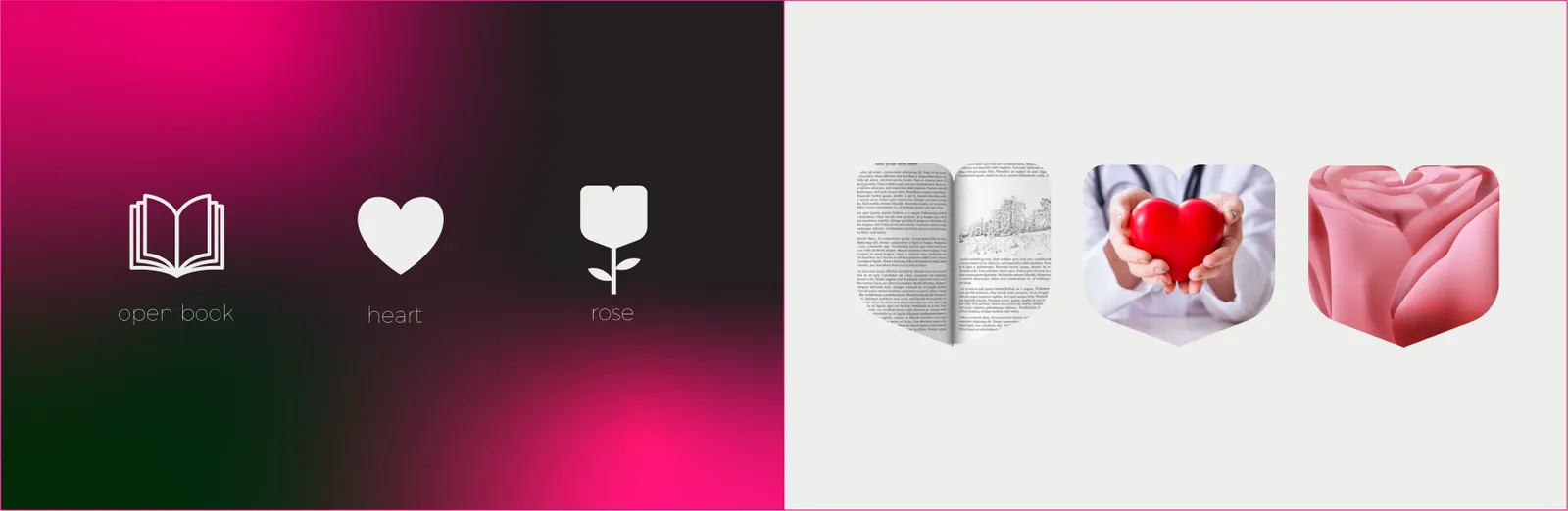
A heart, a flower and a book on a heartbeat rhythm, in a red-to-pink colour story.
- Proyecto
- Identidad visual
- Sector
- Health and wellbeing magazine
- Año
- 2025
- Servicios
- Identidad visual, Editorial Design, Brand Guidelines
01.2
Introducción
Health Magazine bridges evidence-based knowledge and everyday wellbeing. Its identity merges a heart, a flower and a book to express care, growth and knowledge.
01.3
Sobre el proyecto
Built around the heart, the flower and the book with a heartbeat rhythm, the identity balances vitality and care through a red-to-pink palette, and runs from logo construction, colour and type to stationery, social, web, video, packaging and environmental design.
01.4
Historia
Health Magazine was founded to bridge evidence-based knowledge with everyday wellbeing. From its earliest issues, the brand fused three constants: care (heart), growth (flower), and learning (book). Over time, these symbols evolved from editorial motifs into the core of the visual identity, unified by a heartbeat rhythm that reflects an active, modern lifestyle and a commitment to credible, accessible health education.
01.5
Misión
To translate trusted health knowledge into clear, motivating guidance that helps people care for body and mind—uniting compassion (heart), progress (flower), and learning (book) in every issue and touchpoint.
01.6
Valores de marca
Evidence & Ethics – Content anchored in verified science and responsible communication. Care & Empathy – We speak to the whole human: physical and mental wellbeing. Growth Mindset – Continuous improvement and hopeful storytelling (flower). Education First – Clarity, literacy, and accessibility (book). Vitality & Balance – Energetic yet calm brand behavior, reflected in the red–pink palette and heartbeat rhythm. Inclusivity – Culturally aware, age-inclusive, and jargon-free.
01.7
Tono de voz
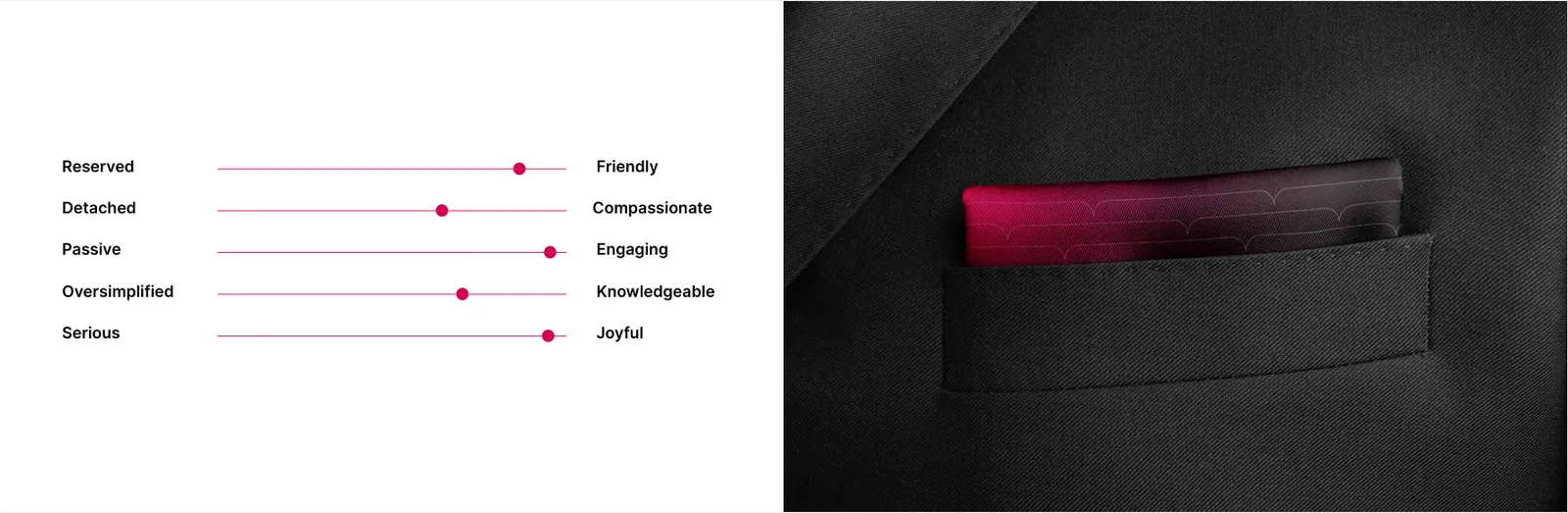
Clear & Credible: Plain language, cite sources when needed; no sensationalism. Warm & Motivational: Encouraging, never fear-based. Balanced & Human: Equal attention to body and mind; practical takeaways. Optimistic & Actionable: Frame change as achievable steps; offer checklists, infographics. Modern & Rhythmic: Short, well-paced sentences mirroring the “heartbeat” motif; headlines energetic, body text calming.
02
El logotipo
02.1
Concepto
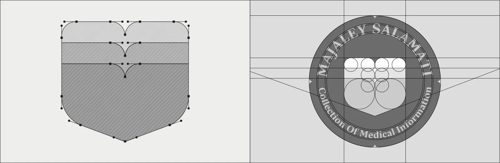
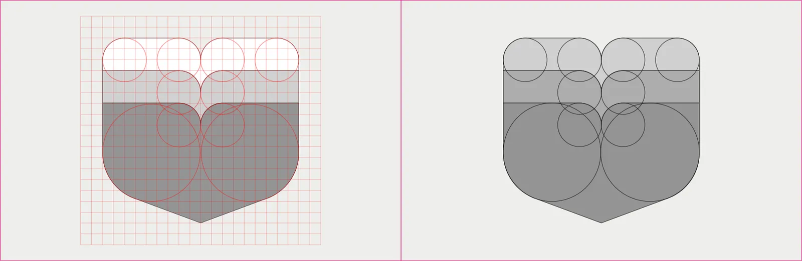
Geometry builds from a symmetrical heart whose upper lobes morph into petal arcs (recommended 6 petals) resting on an open book base. The heartbeat line (single peak + recovery) crosses the heart’s mid-axis and resolves on the book spine—signifying knowledge-guided vitality. Preferred angles: 30° multiples for petal rotations; heart curvature based on consistent circular arcs; book base with 2:1 width-to-height ratio and softened 4–6% corner radii. Stroke joins are optically corrected to avoid kinks where heartbeat meets the heart outline. Wordmark set with balanced cap-height to emblem height at 1: 1.1–1.3 depending on medium (print vs. screen).
The primary lockup consists of the emblem (heart-flower-book with integrated heartbeat) and the wordmark “Health Magazine.” The emblem is the hero asset and must never appear smaller than, or visually weaker than, the wordmark. Use the Primary (Stacked) Lockup for most applications and the Horizontal Lockup where vertical space is limited. The emblem may appear alone only when brand recognition is ensured (e.g., social avatars, app icon, favicons)

02.2
Construcción
Geometry builds from a symmetrical heart whose upper lobes morph into petal arcs (recommended 6 petals) resting on an open book base. The heartbeat line (single peak + recovery) crosses the heart’s mid-axis and resolves on the book spine—signifying knowledge-guided vitality. Preferred angles: 30° multiples for petal rotations; heart curvature based on consistent circular arcs; book base with 2:1 width-to-height ratio and softened 4–6% corner radii. Stroke joins are optically corrected to avoid kinks where heartbeat meets the heart outline. Wordmark set with balanced cap-height to emblem height at 1: 1.1–1.3 depending on medium (print vs. screen).
02.3
Área de protección
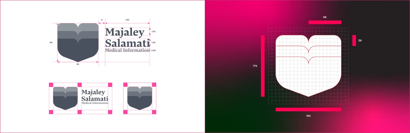
Maintain a clear space around the logo equal to X, where X = width of one petal (or ¼ of the emblem height, whichever is easier to measure). No text, icons, or edges may enter this area. For the Horizontal lockup, apply X on all sides; for the Stacked lockup, apply 1.5X below the wordmark to improve legibility.
02.4
Variaciones
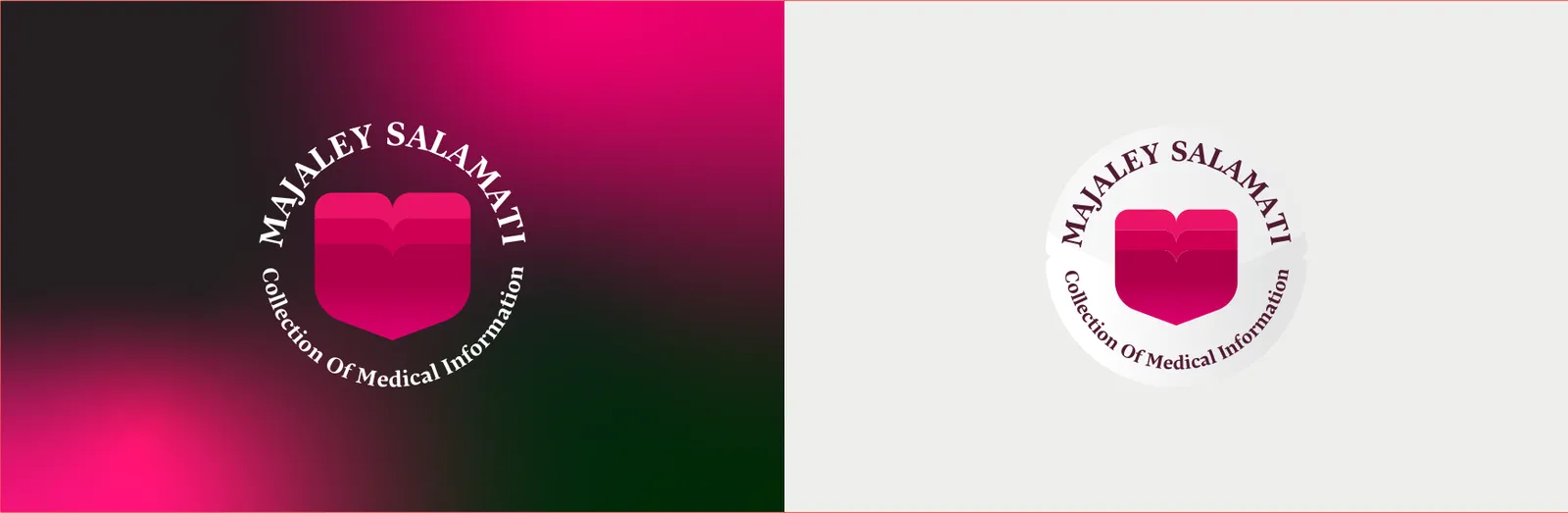
Primary (Stacked): emblem centered above wordmark. Horizontal: emblem left, wordmark right. Symbol-Only: emblem alone for small or constrained contexts. Monochrome: solid Health Red on light backgrounds / solid White on dark or photography. Grayscale: for one-color production. Color hierarchy: Health Red (dominant) → Care Pink (support) → Neutrals (Charcoal/White).
02.5
Sobre fondos
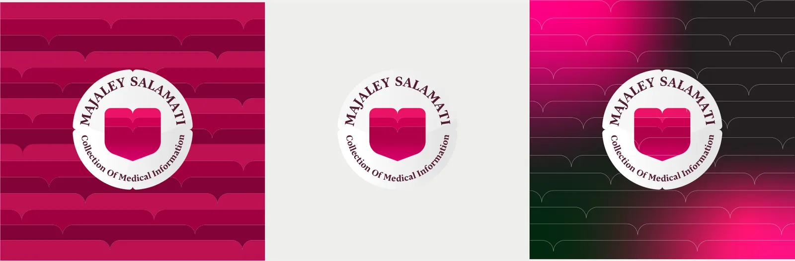
Proper logo application on backgrounds ensures clarity, contrast, and brand integrity. The logo must always remain legible, retaining its visual hierarchy regardless of context. Guidelines typically define usage on light, dark, colored, and photographic backgrounds. Avoid color clashes or low-contrast conditions that compromise recognition. On Light Backgrounds: Use the primary Health Red logo. On Dark Backgrounds: Apply the white reversed logo for maximum contrast. On Pink Tones: Use the Charcoal or white version to preserve balance. On Photography: If the image is complex, place the logo within a solid badge (white or translucent red at 85–90% opacity). Maintain a clear space equal to X (the width of one petal) around the logo to preserve visual breathing. Never apply drop shadows, glows, or place the logo over highly saturated backgrounds that compete with the red tone.
02.6
Tamaño mínimo
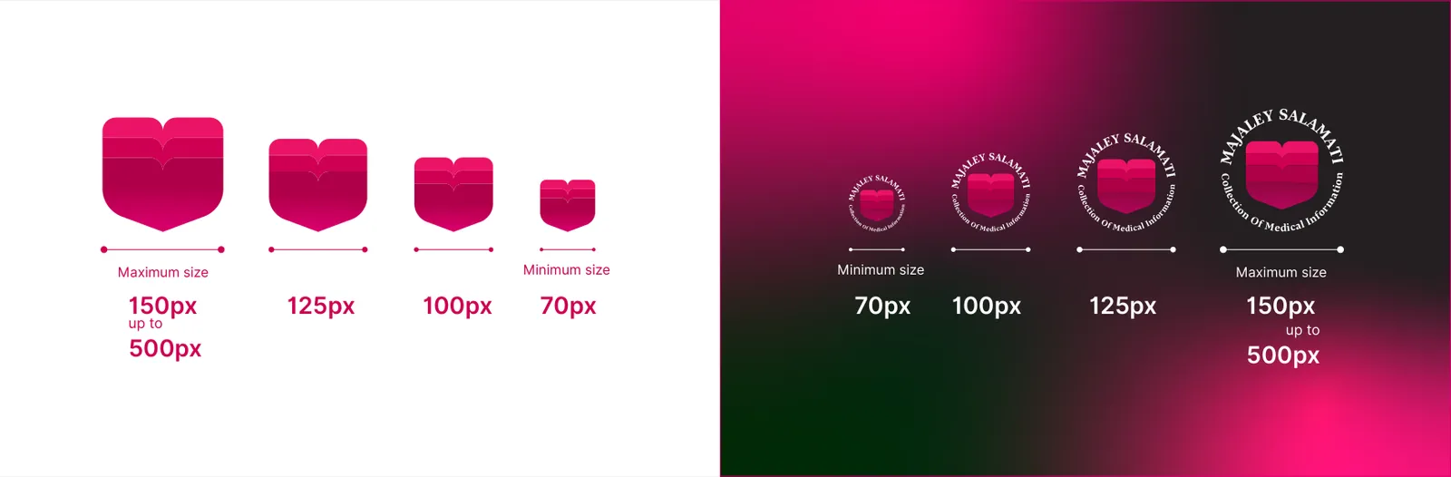
Print minimum: emblem-only ≥ 8 mm width; full lockup ≥ 18 mm width. Screen minimum: emblem-only ≥ 24 px; full lockup ≥ 120 px width. Maintain proportions; never stretch. For small sizes, prefer Symbol-Only or Monochrome for clarity.
02.7
Icono de la app
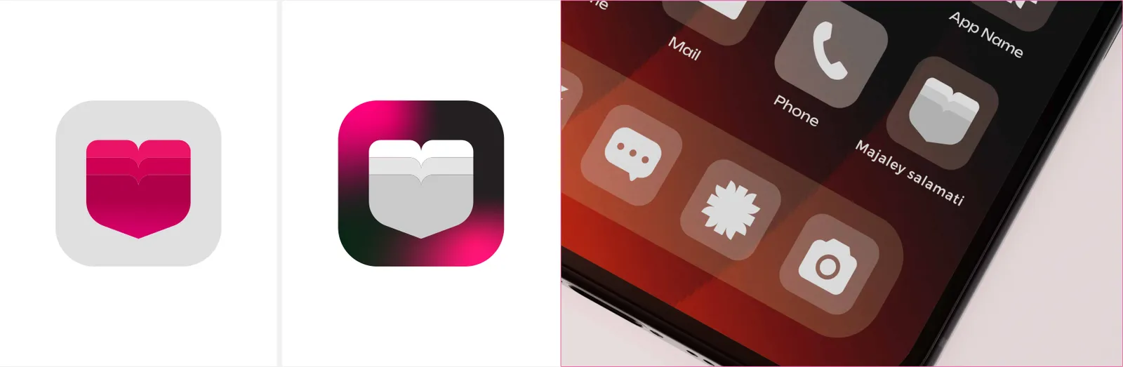
Use Symbol-Only with simplified heartbeat (single peak) centered within a rounded square. Maintain 12–14% padding from icon edge. Backgrounds: Health Red (preferred), White, or Night (Charcoal) depending on OS theme. Avoid tiny typography in the icon.
02.8
Ubicación
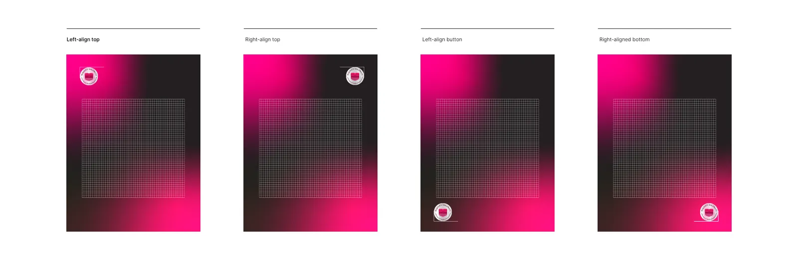
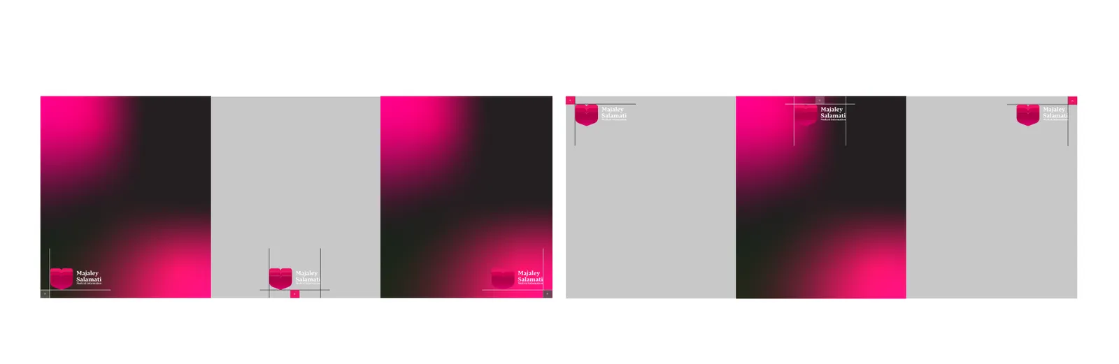
Editorial covers & posters: place top-left or bottom-right with X clear space from edges. Articles & UI: top-left placement aligns with reading flow; maintain consistent baseline with navigation. On photography: ensure AA contrast or place inside a solid/blurred badge at 90–95% opacity.
Light backgrounds: use Primary (Health Red) or Charcoal wordmark. Dark backgrounds / photography: use White or reversed lockup. Gradients: only brand gradients (Red→Pink). Keep the emblem solid; gradients may appear in background blocks, not inside the mark.
02.9
Usos incorrectos
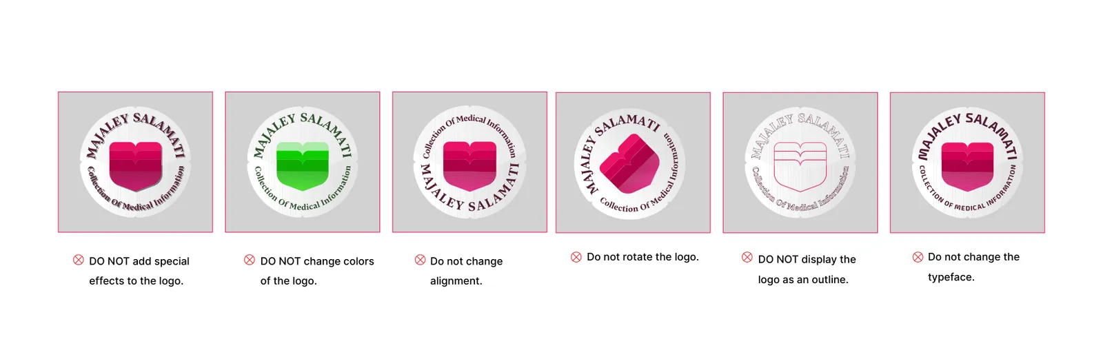
alter colors beyond the approved palette; add outlines, drop-shadows, glows; skew, stretch, or rotate; re-draw the heartbeat shape or change its thickness independently; rearrange emblem and wordmark; place on low-contrast or busy backgrounds; enclose in arbitrary shapes not specified by the system.
03
Color
03.1
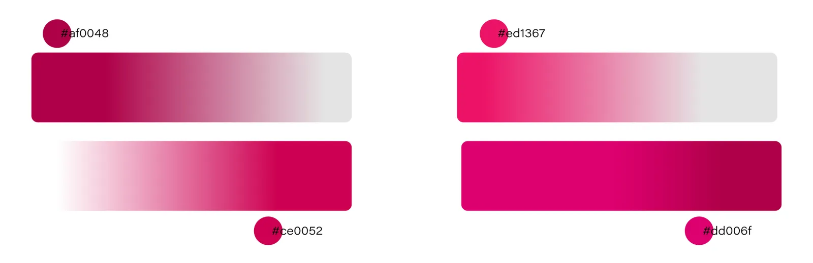
Paleta
Los colores de la identidad y sus referencias.
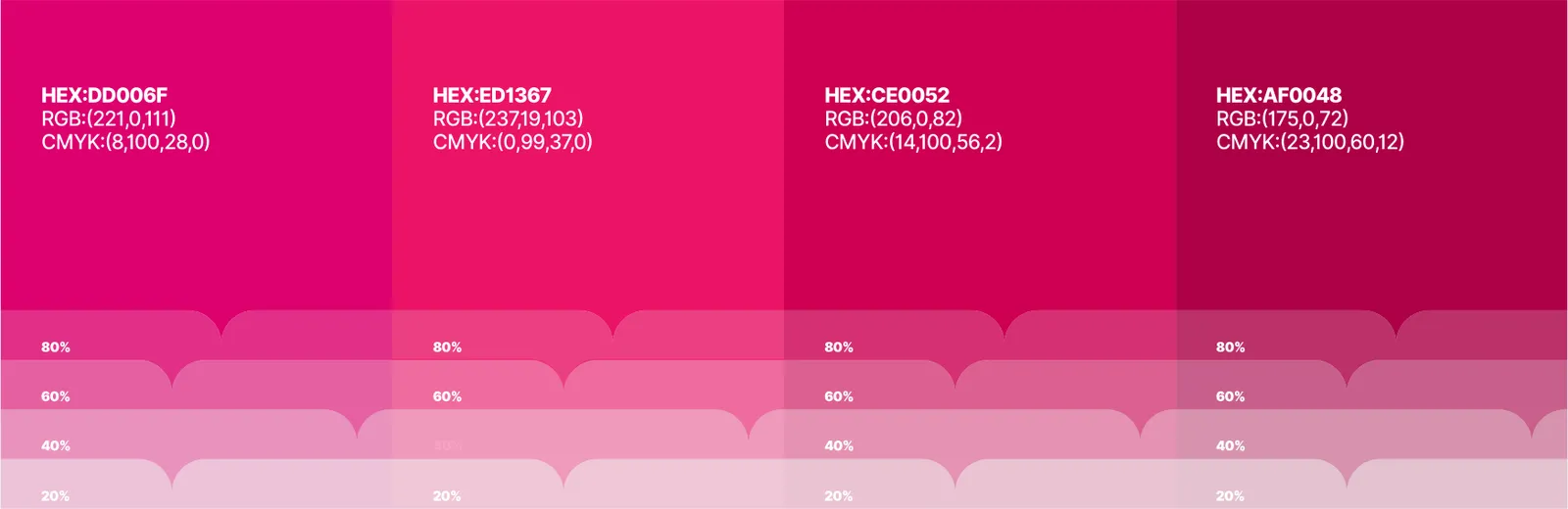
- Name:
- Magenta
- CMYK:
- 8/100/28/0
- RGB:
- 221/0/111
- HEX:
- #DD006F
- Name:
- Pink
- CMYK:
- 0/99/37/0
- RGB:
- 237/19/103
- HEX:
- #ED1367
- Name:
- Crimson
- CMYK:
- 14/100/56/2
- RGB:
- 206/0/82
- HEX:
- #CE0052
- Name:
- Berry
- CMYK:
- 23/100/60/12
- RGB:
- 175/0/72
- HEX:
- #AF0048
03.2
Historia del color
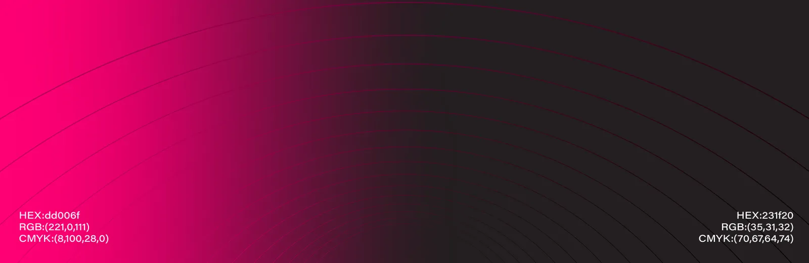
In brand identity design, color serves as one of the most powerful communication tools—capable of shaping emotional perception, defining personality, and building memorability. A color story translates the brand’s philosophy into a visual narrative. It expresses values, tone, and emotional energy through hues, contrasts, and harmonies. The chosen palette must ensure balance between functionality (legibility, contrast, accessibility) and emotional resonance (warmth, vitality, trust, calmness).
03.3
Sistema de color
A color palette defines the chromatic structure of a brand. It consists of primary, secondary, and neutral tones that together create consistency and flexibility across all visual applications. Primary colors carry the emotional essence of the brand, while secondary tones extend the system for editorial, web, and environmental usage. Neutrals ensure legibility and contrast harmony.
The Health Magazine’s color story revolves around the concept of balanced vitality—a visual equilibrium between energy and tranquility, strength and softness, body and mind. Red represents life, activity, and passion, emphasizing physical vitality and the dynamic rhythm of the heartbeat motif within the logo. Pink embodies care, empathy, and calm, connecting to the emotional and psychological aspects of well-being. Together, they create a vibrant yet gentle harmony, capturing the holistic spirit of health in both its physical and mental dimensions.
04
Tipografía
04.1
Tipos de letra
Las tipografías de la identidad y los pesos que utiliza.
- HarirRegularMediumBold
- BahnschriftLightRegularSemiBold
04.2
Muestra tipográfica
Typography is a key component of a brand’s visual identity, shaping how audiences perceive tone, professionalism, and accessibility. A well-structured typographic system ensures visual consistency across all media—from editorial layouts to digital interfaces.
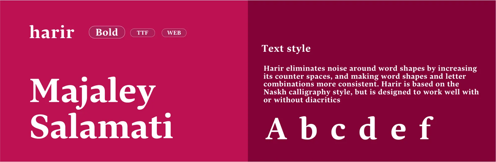
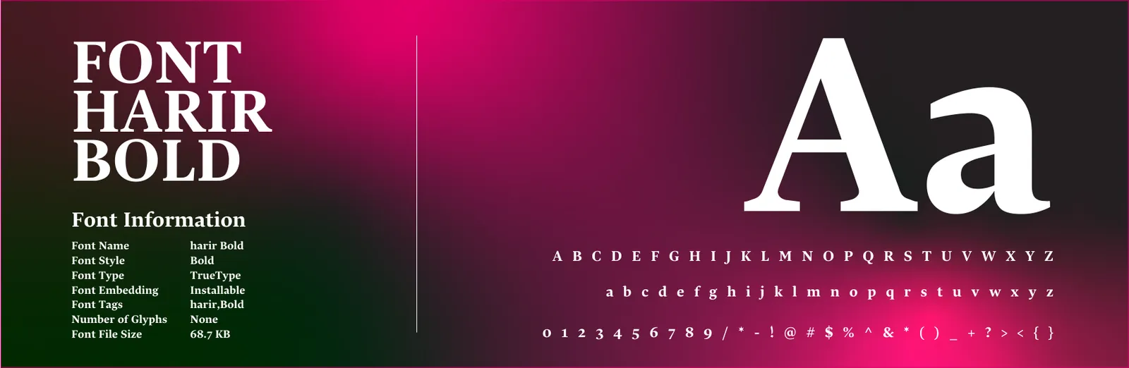
Primary Typeface – Harir: Used for editorial titles, headlines, and expressive quotes. It reflects elegance, cultural depth, and human connection, aligning with the magazine’s emphasis on emotional well-being. Character: Elegant, soft, humanist, legible in both print and digital. Usage: Headlines, pull quotes, large titles, cover typography. Recommended Weights: Regular / Medium / Bold.
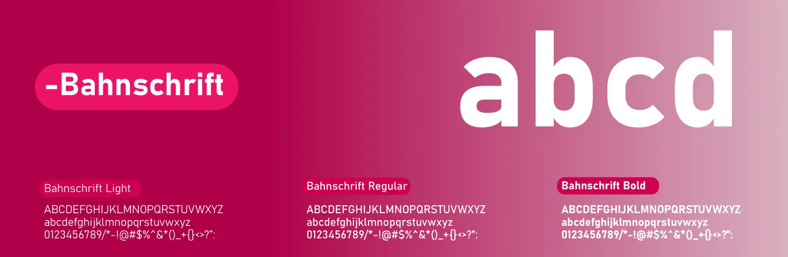
Secondary Typeface – Bahnschrift: Used for body text, captions, data tables, and UI components. Its geometric clarity enhances readability and ensures modern aesthetics. Character: Rational, structured, minimal, and accessible. Usage: Paragraphs, metadata, digital UI, diagrams, charts. Recommended Weights: Light / Regular / SemiBold.
The Health Magazine brand uses two complementary typefaces that balance emotional softness with informational clarity. “Harir” introduces warmth and humanism to editorial expressions, while “Bahnschrift” adds structural clarity for data-driven or navigational content. Together, they embody the dual essence of the magazine—empathy and precision.
05
Elementos gráficos
05.1
Patrón
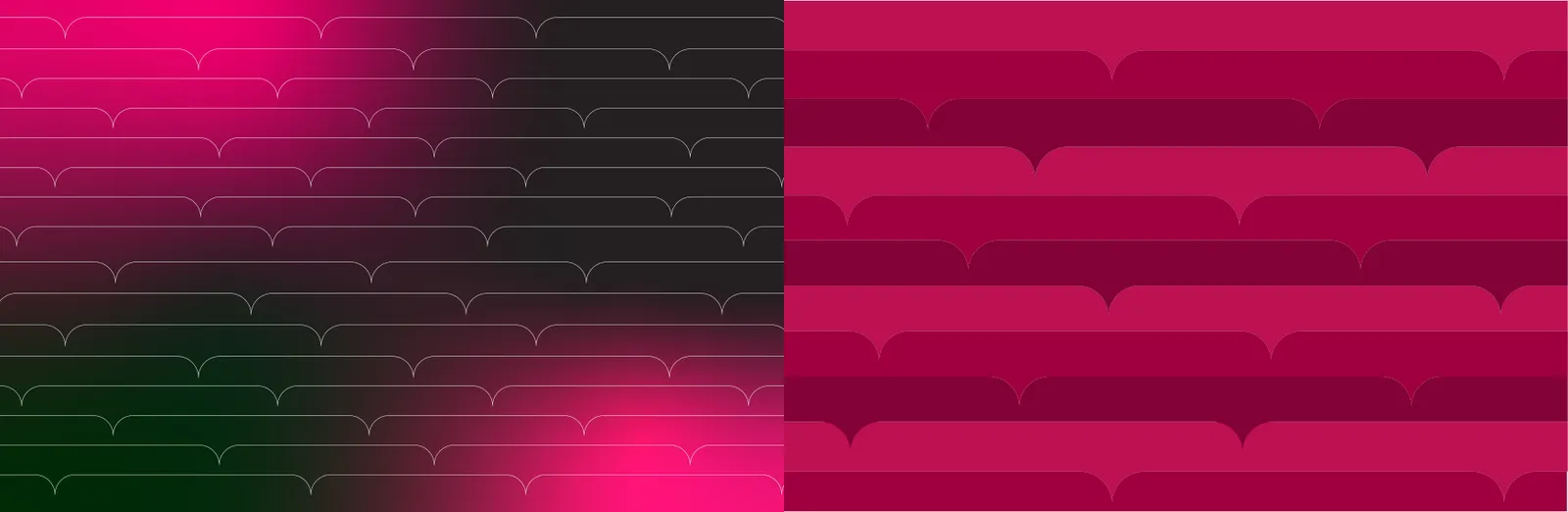
brand pattern derives from: Radial petals (6-petal rosette built from the emblem), and A modular heartbeat waveform (repeatable 1-peak modules). Use as tone-on-tone textures (5–12% tint difference) or subtle overlays behind headlines. Avoid competing with the logo; maintain a quiet zone of 1.5X around the mark when the pattern is present.

06
Papelería
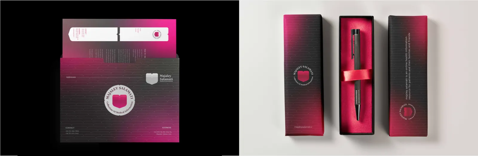
06.1
Papelería completa
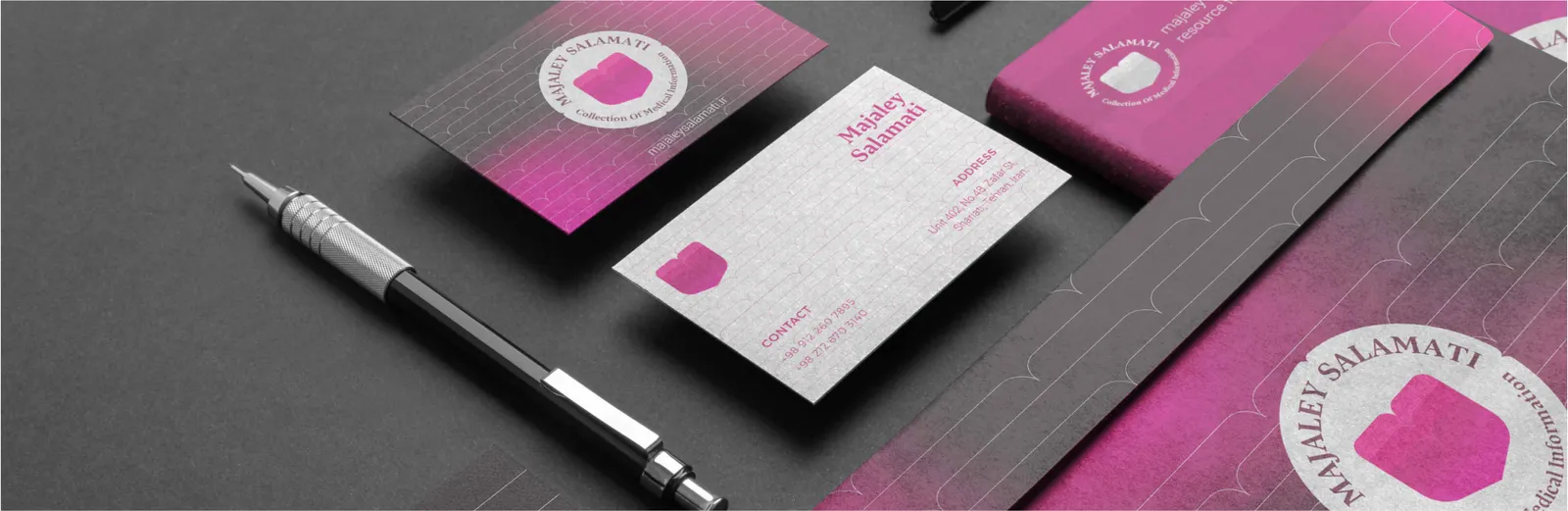
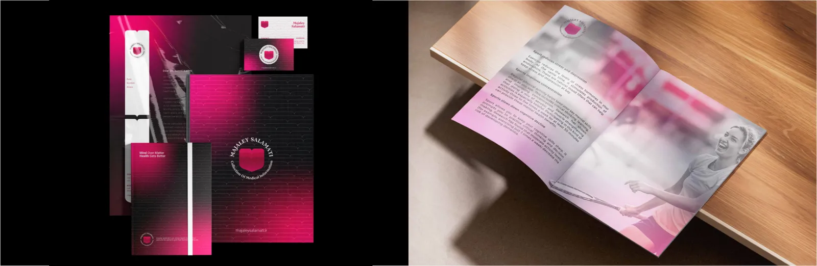
The stationery system unites all collateral through consistent geometry, typography, and rhythm. Each piece — from letterhead to envelope — follows the same modular grid derived from the logo’s proportions. The subtle repetition of the heartbeat creates coherence across all items.
06.2
Tarjetas de visita
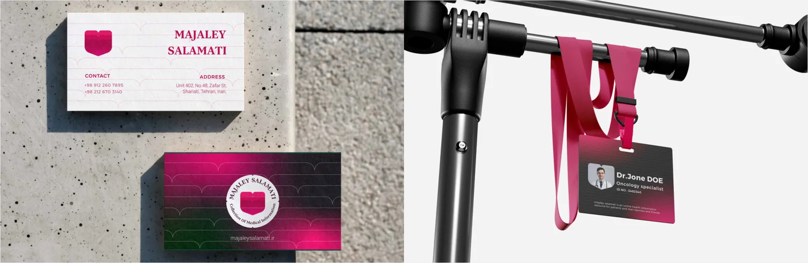
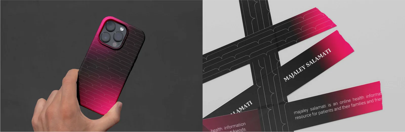
The business card reflects the Health Magazine’s essence — clarity, warmth, and trust. The front side features the logo centered or top-left aligned within the defined exclusion zone. The background may use the soft gradient from Health Red to Care Pink, subtly referencing the heartbeat flow. Typography remains clean, with the name and title in bold and contact details in regular weight. White space is intentionally generous to convey calmness and professionalism.
06.3
Papel membretado
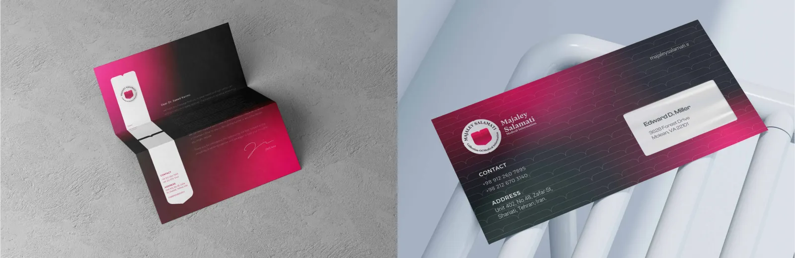
A minimal layout ensures legibility and hierarchy. The logo is positioned top-left with consistent clear space, and the heartbeat line runs faintly across the footer, symbolizing continuity and vitality. The margins are wide to retain a medical-editorial aesthetic.
06.4
Carpetas
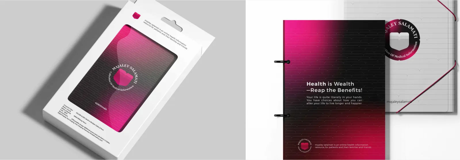
The presentation folder features the full logo on the front cover, positioned bottom-right to anchor visual weight. Inside pockets carry the heartbeat motif as a die-cut or printed pattern. The folder uses matte lamination to enhance sophistication while maintaining the medical-editorial aesthetic.
07
Digital
07.1
Sitio web
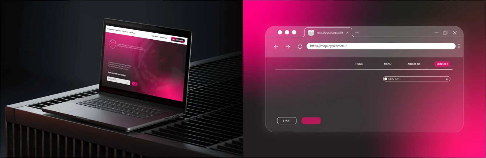
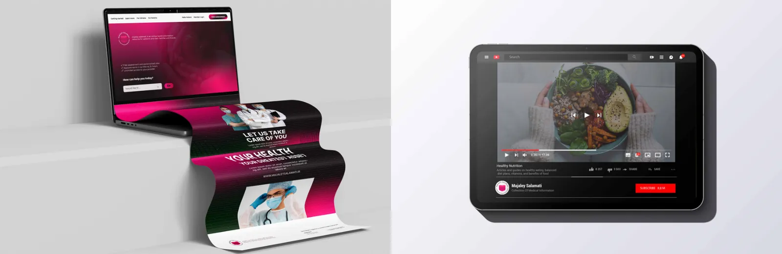
Landing pages are conversion-focused yet remain consistent with editorial aesthetics. Hero sections feature a large emblem watermark and human-centered imagery. Text blocks emphasize clarity and emotional persuasion, using the red-pink gradient as background highlights.
The website serves as the digital hub of Health Magazine. The layout is built on a clean grid emphasizing readability, intuitive navigation, and emotional connection. The heartbeat line acts as a dynamic progress or divider element. The red and pink palette is balanced with generous white space for visual comfort. Accessibility, mobile responsiveness, and SEO alignment are mandatory design standards.
The favicon uses the simplified emblem — a minimal heart-flower mark without text. It appears in 16×16 px, 32×32 px, and 48×48 px formats for browsers and tabs. The preferred color scheme is white on red for maximum legibility.
07.2
App móvil
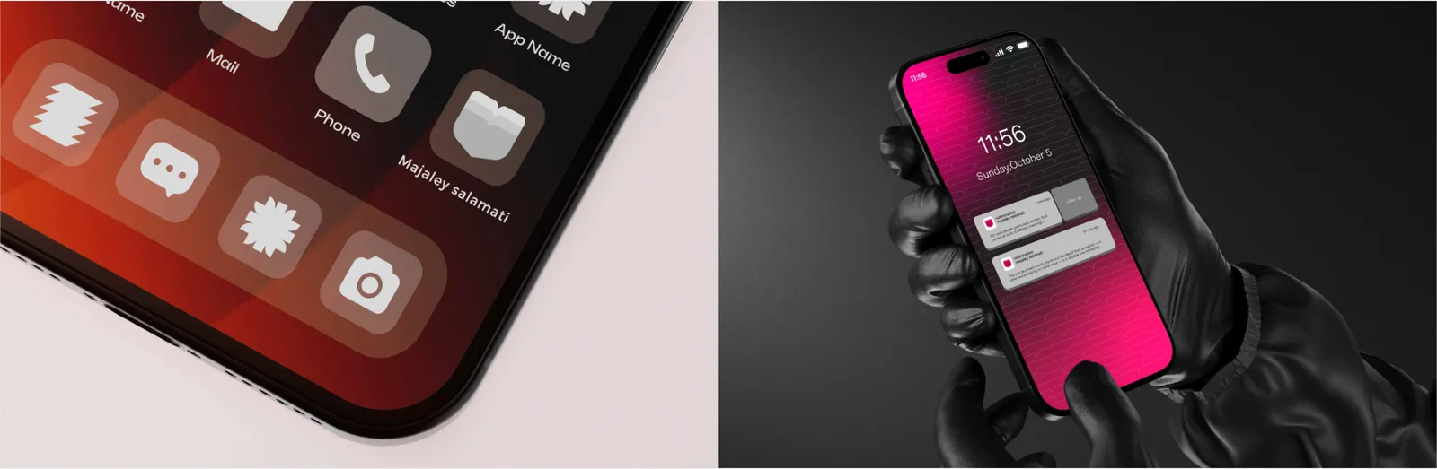
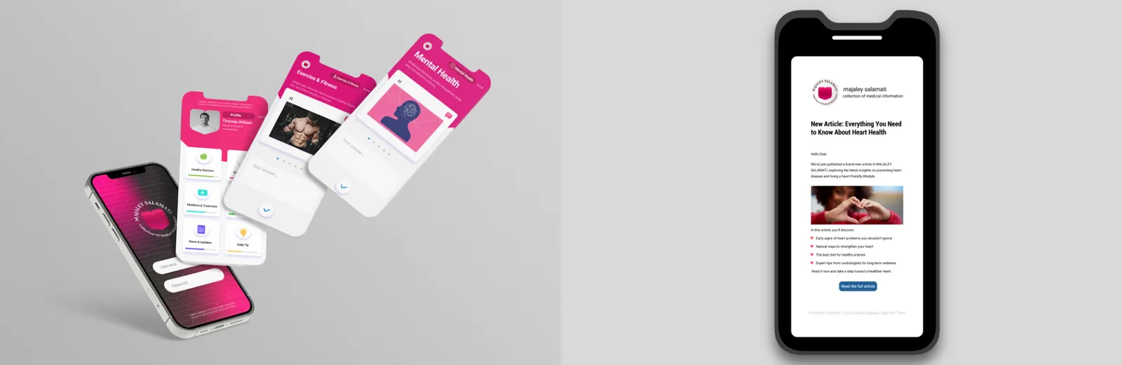
The app icon is the most compact form of the Health Magazine identity. It uses the emblem alone — the heart, flower, and heartbeat motif — within a rounded square. The design maintains a 12–14% margin from all edges. The primary version uses a Health Red background with a white emblem, while the dark mode variant reverses these colors. The simplicity ensures strong visibility and recognition across devices and OS themes.
Push notifications adopt the Health Red accent in title bars or icons to reinforce brand recall. The heartbeat line is used subtly as a divider or header graphic. Text is concise, empathetic, and informative — echoing the magazine’s voice of care and positivity. The notification icon follows the app emblem for consistent brand recognition.
07.3
Redes sociales
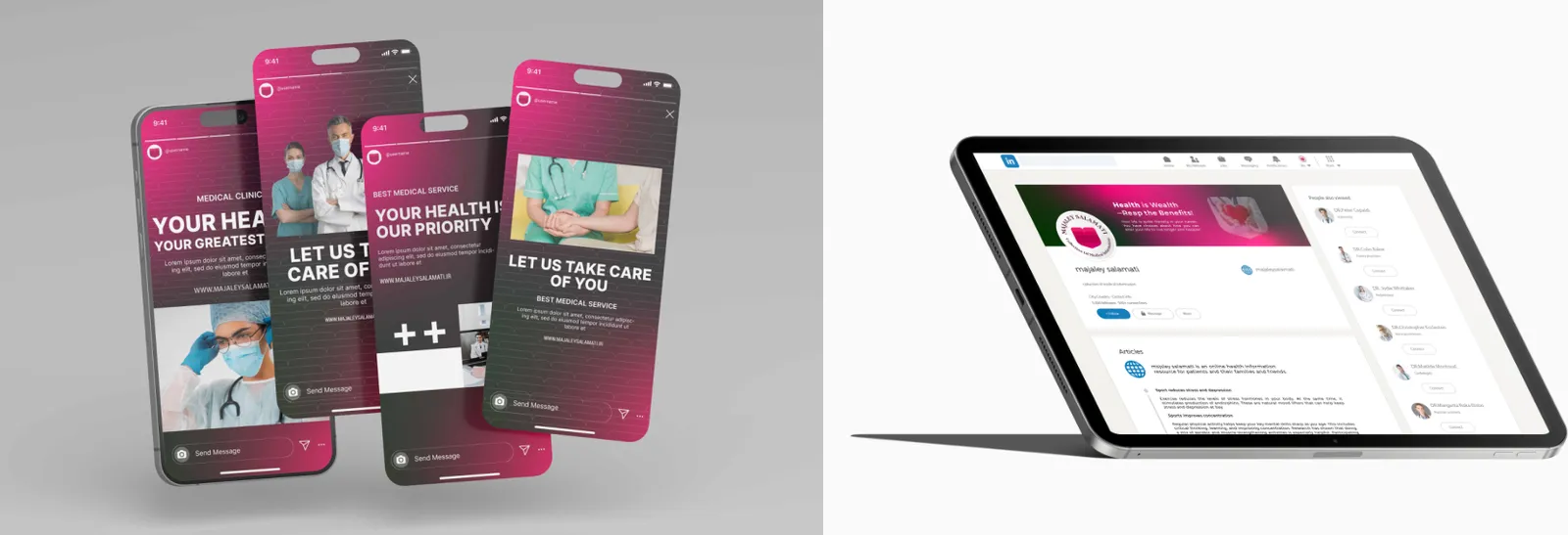
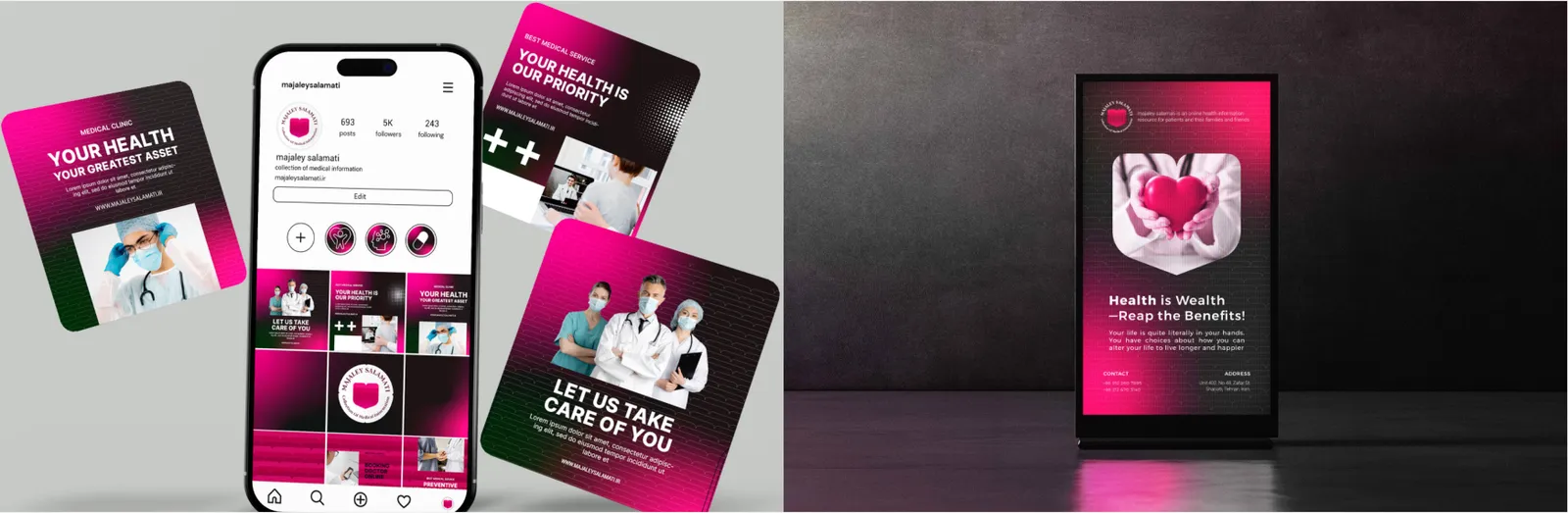
Post templates are designed with modular flexibility, allowing content to shift between educational, inspirational, and promotional tones. The logo or heartbeat line appears as a watermark in one corner, ensuring brand recognition without overpowering visuals. Typography follows the editorial style: bold headlines, clean body text, and minimal accent shapes derived from petals.
Story layouts are dynamic, prioritizing rhythm and emotional resonance. Vertical compositions feature gradient backgrounds (Red → Pink) with the heartbeat motif as an animated overlay. Minimal text and bold photography ensure engagement. The logo remains small but visible at the top or bottom edge.
Profile design maintains a consistent look across all platforms. Profile Picture: emblem-only version. Banner/Header: editorial imagery with the heartbeat motif and slogan (“Health • Growth • Knowledge”). Bio Section: concise and empathetic tone reflecting care, vitality, and education.
07.4
Campañas y email
Display ads integrate the logo and key imagery with editorial clarity. Each composition uses generous white space, headline typography, and heartbeat lines as guiding elements. The red and pink palette creates emotional engagement, while imagery focuses on lifestyle, well-being, and human connection.
Email layouts mirror the editorial tone of the magazine. The header contains the logo and heartbeat line; the body uses modular sections for news, articles, and health tips. CTA buttons are Red for visibility, with rounded corners reflecting softness and care.
Newsletters maintain the editorial voice of Health Magazine. The masthead includes the logo and issue date; section dividers use thin heartbeat lines. The color system alternates between red headlines and neutral body text for balanced readability. Imagery focuses on health, wellness, and optimism.
Video content introduces motion into the brand’s identity. The opening animation begins with a pulse expanding into the heart-flower emblem, followed by the tagline reveal. Motion principles emphasize rhythm, breathing space, and emotional pacing. Lower thirds and outros use soft gradients with minimal heartbeat accents.
08
Merchandising
08.1
Ropa
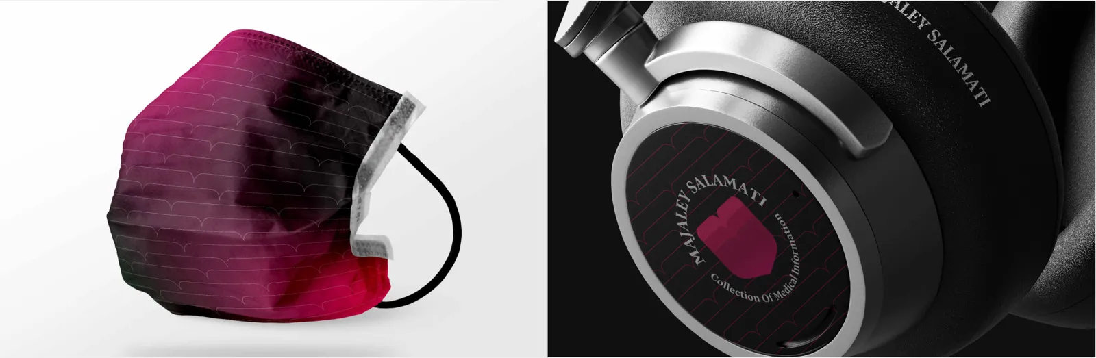
The face mask emphasizes both care and identity. The emblem is placed on the left cheek area, while a thin heartbeat line crosses horizontally for balance. Soft cotton or antibacterial fabric in white or pink ensures comfort, hygiene, and brand visibility.
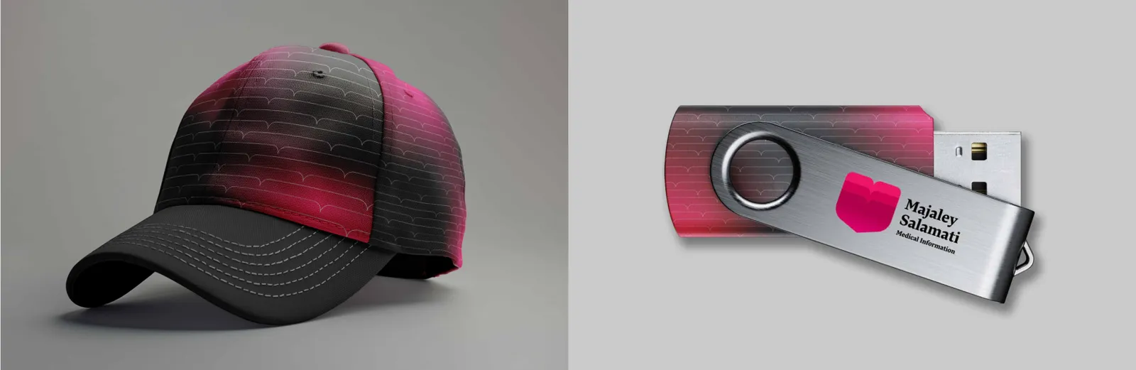
The cap design reflects simplicity and energy. The emblem is embroidered on the front panel, while the heartbeat runs subtly across the visor edge. Colorways: Health Red, White, and Care Pink.
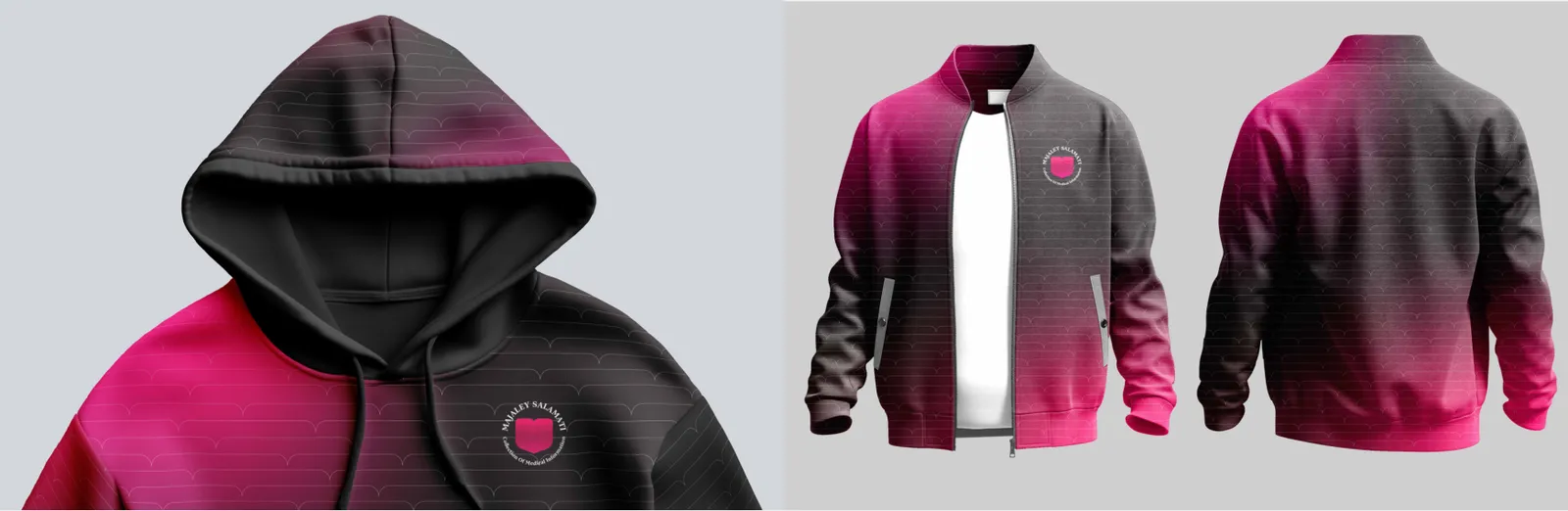
The hoodie serves as a casual ambassador of the Health Magazine brand. The emblem is embroidered or screen-printed on the left chest, while a subtle heartbeat line runs across the sleeve or lower back. The design uses clean, minimalist styling — typically in white, red, or soft pink — symbolizing purity, energy, and care.
The jacket design follows a sporty yet professional aesthetic. The emblem appears as a small woven badge on the front, while the back can feature an enlarged heartbeat motif. The inner lining may incorporate a repeating brand pattern (petal motif). The combination of red accents on neutral fabrics reflects vitality and confidence.
08.2
Bolsas
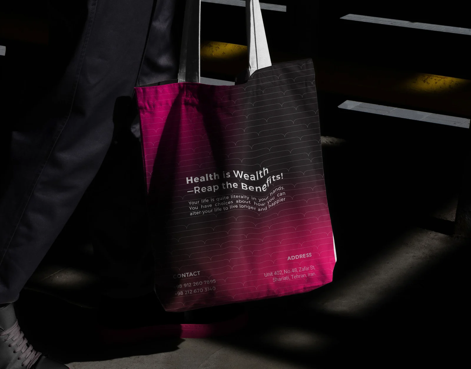
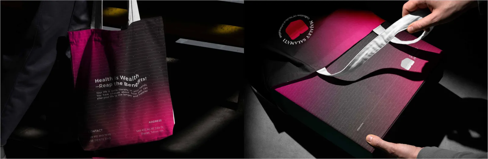
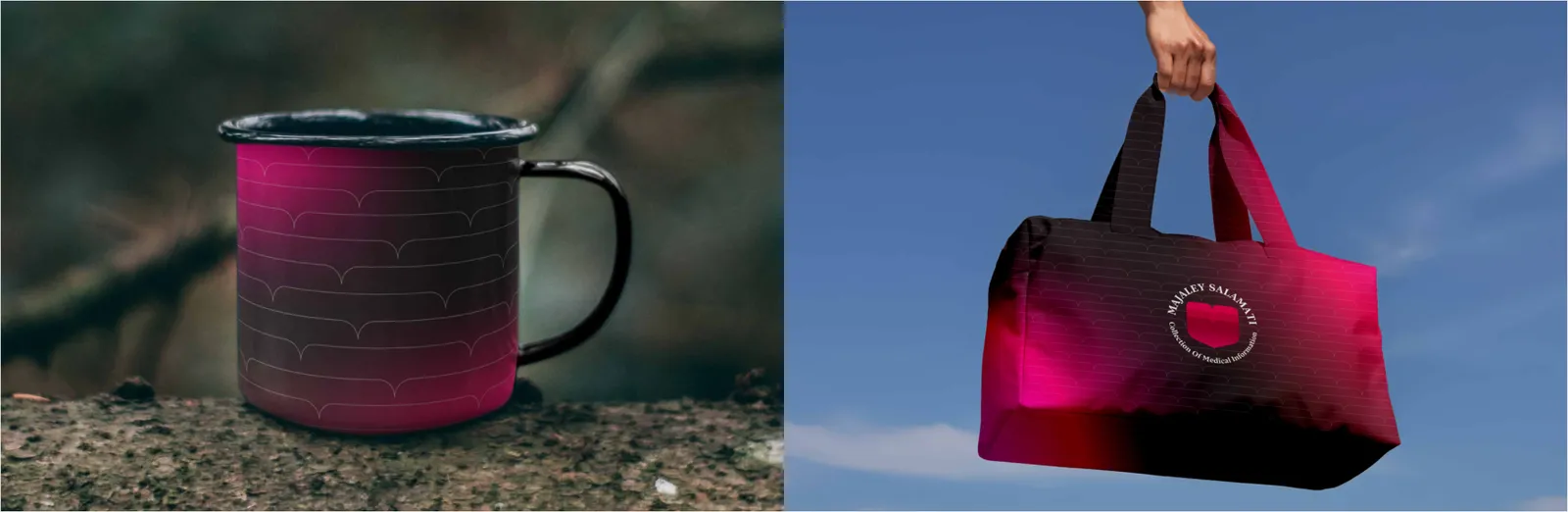
The shopping or conference bag acts as a walking billboard. The emblem is scaled large on one side, overlaid with a faint heartbeat pattern. Use recyclable paper or fabric in natural white or pink, symbolizing purity and care. Handles follow the Health Red color to maintain visual unity.
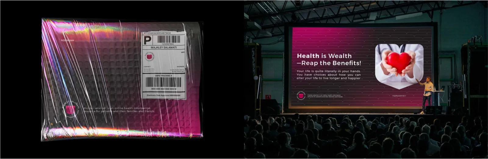
The bubble mailer, used for secure document or magazine delivery, uses a white matte base with a bold Health Red flap. The emblem is printed top-center, and the heartbeat line runs across the flap to imply safe delivery with life and energy.
Bags are functional brand carriers used for events, conferences, or merchandise. The emblem is printed large and centered, complemented by the heartbeat line wrapping around the base. Sustainable canvas or recycled polyester aligns with the health and eco-conscious brand philosophy.
08.3
Artículos promocionales
The pen integrates the brand identity in minimalist form. The emblem or heartbeat line is laser-engraved or printed in silver on a matte white or red barrel. Typography uses the sans-serif brand font in 80% black.
The mug integrates the brand motif through a delicate heartbeat wrapping the circumference. The emblem is placed opposite the handle for balanced composition. Primary colors (white ceramic base with red or pink print) convey energy and optimism — ideal for workplace or promotional gifting.
The phone case extends the brand’s modern lifestyle positioning. The design features a minimal heart-flower icon at the center or corner, with an optional faint heartbeat pattern as background texture. Transparent, white, or red silicone cases emphasize clarity, purity, and vibrance.
Headphones incorporate subtle branding through color accents and embossed details. The earcups or headband feature the emblem or heartbeat icon in silver or white over red. The overall aesthetic is clean, modern, and aligned with the magazine’s theme of vitality and mental balance.
The USB drive carries the emblem laser-engraved on metallic or bamboo surfaces, symbolizing technology combined with nature. The red accent strap or LED light reinforces the brand color. Used for sharing digital editions or press kits.
The powerbank represents energy and reliability — core brand attributes. The emblem is printed in white over a Health Red matte body. The heartbeat line serves as a subtle indicator light pattern. Minimal design conveys technology and vitality without clutter.
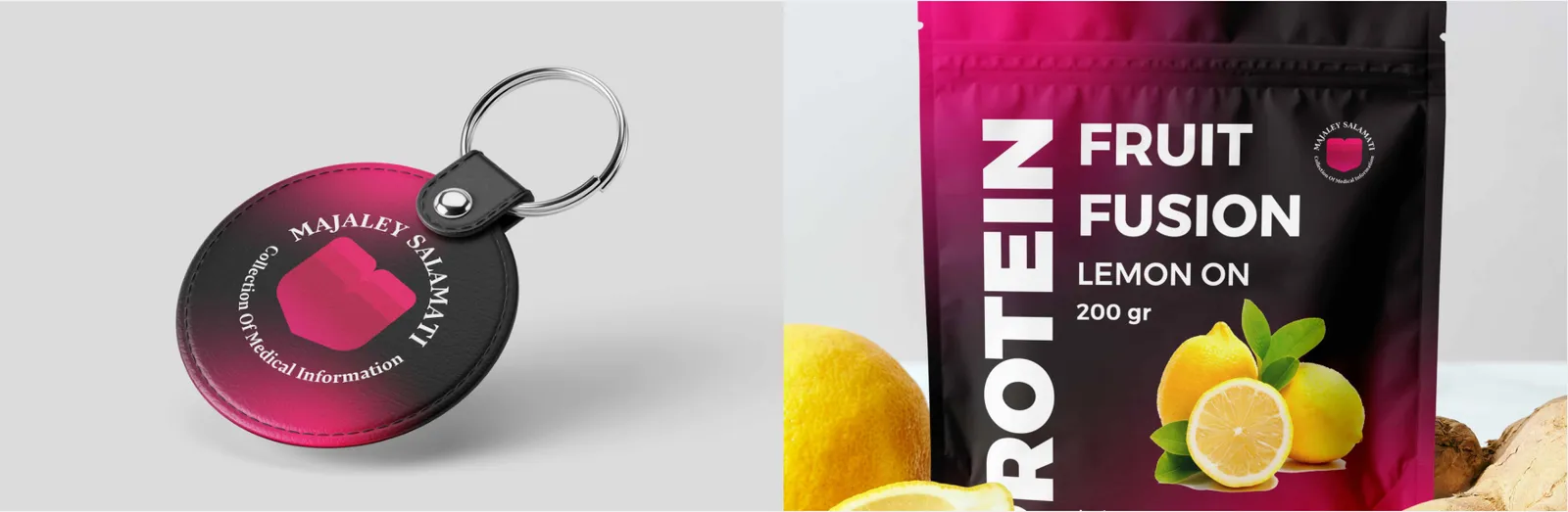
The keychain features the emblem as a die-cut metal or acrylic charm. The design maintains simplicity with either a silver or white base and a red enamel fill.
This portable item serves as a subtle reminder of vitality and connection to the Health Magazine community.
09
Aplicaciones
09.1
Señalética
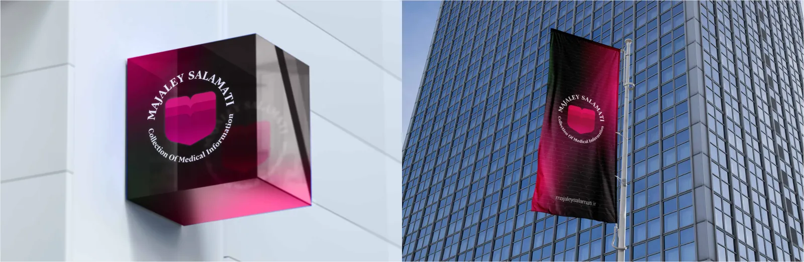
The wordmark sign represents the brand in physical environments such as offices, clinics, or editorial studios. It is produced using high-quality acrylic, aluminum, or stainless steel with backlit LED illumination. The preferred version is the white wordmark glowing over a red or neutral wall background. The illumination mimics a soft heartbeat rhythm, symbolizing vitality and care.
09.2
Eventos y ferias
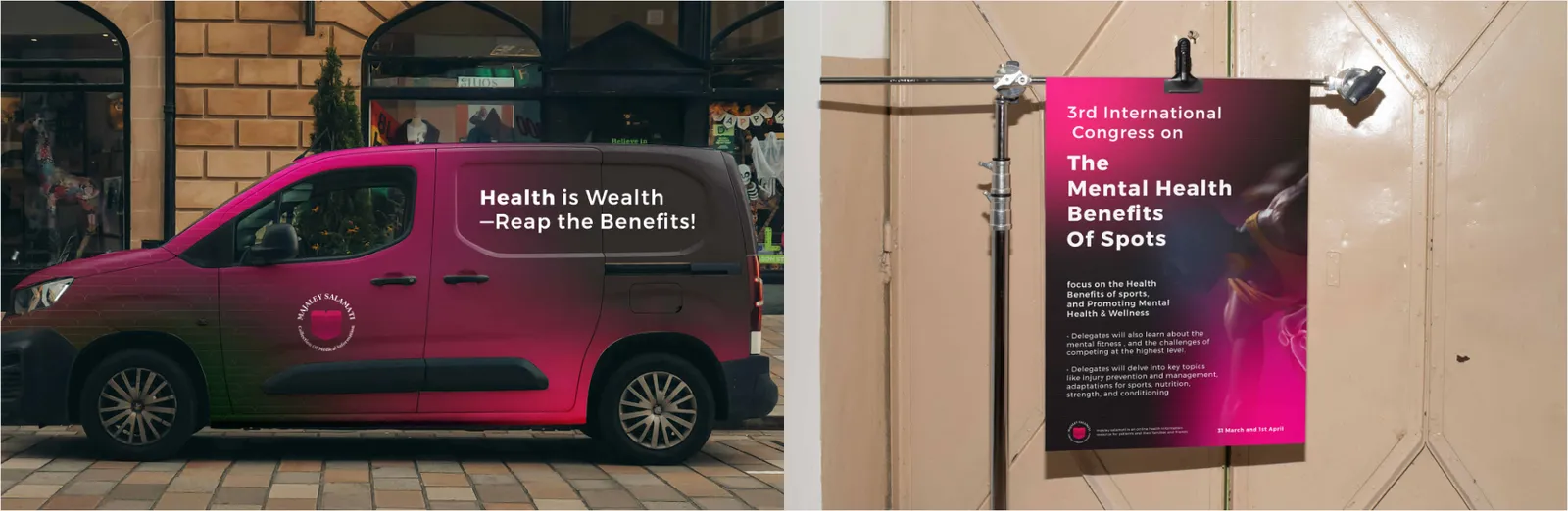
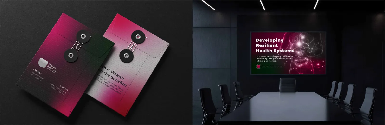
Conference branding reinforces credibility and unity across physical and digital touchpoints. Materials include stage backdrops, podium graphics, attendee badges, banners, and digital screens — all using the heartbeat line as a linking visual theme. The color palette remains consistent: Health Red dominant, balanced by Care Pink and White for clarity and warmth.
09.3
Publicidad
The brochure system blends educational structure with emotional tone. Layouts balance imagery and text with open white margins. The front cover features the emblem embossed or spot-UV finished for tactile engagement. Inside, red and pink accent lines guide the reader rhythmically, mirroring a heartbeat.
The presentation design applies the same balance of clarity and emotion found in the logo. The cover slide features the emblem in white over the Health Red background. Inner slides employ a modular grid, heartbeat dividers, and generous spacing to maintain editorial readability. Visuals focus on lifestyle, wellness, and positivity, aligning with the brand’s mission.
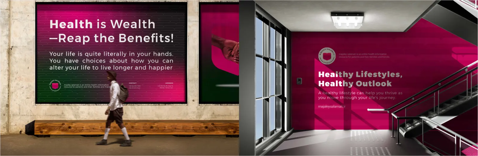
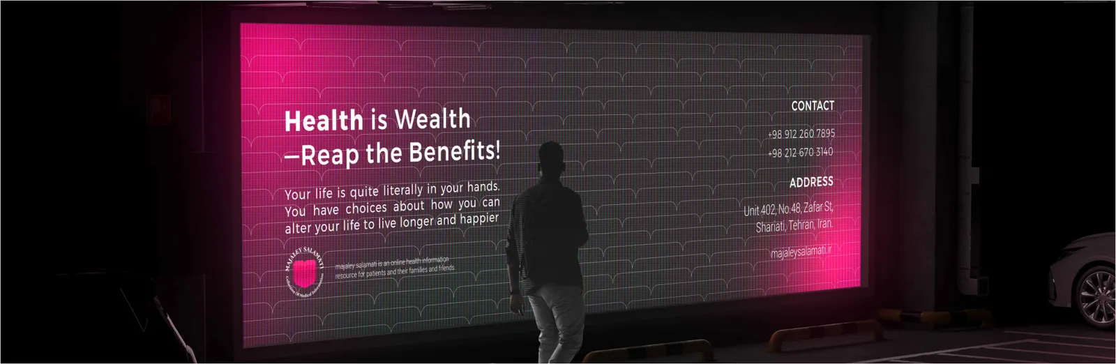
Billboard layouts are built around clarity and emotional connection. The logo appears at top-left or bottom-right with a strong photographic hero image symbolizing health and life. The red–pink gradient acts as a framing element. Typography is large, empathetic, and action-oriented, ensuring high visibility even from long distances.
Street posters employ strong visual storytelling with concise messaging. The heartbeat line may lead into the headline, symbolizing continuity of life and learning. The red background ensures immediate attention, while the flower or heart motif adds a layer of empathy and hope. Each design maintains a 20–30% white area for breathing space.