01
Resumen
01.1
De un vistazo
A D and I monogram on a hexagonal grid that also draws a house, for a property-tech platform.
- Proyecto
- Identidad visual
- Sector
- Real-estate software · Los Angeles
- Año
- 2024
- Servicios
- Identidad visual, Brand Guidelines
01.2
Introducción
DITECH is real-estate management software built for Los Angeles. The goal was to move away from generic house icons and create a visual language as precise as an architectural blueprint and as fluid as a modern app.
01.3
Sobre el proyecto
The logo is a monogram of D and I, the initials of DITECH International, constructed on a hexagonal grid that brings harmony and proportion and subtly evokes the outline of a house. Sharp angles stand for structure and reliability, soft curves for flexibility and human connection.
01.4
Historia
DITECH was founded with a clear purpose: to redefine how real estate agents manage their operations in one of the world’s most dynamic property markets—Los Angeles. The brand emerged from the intersection of technology, architecture, and human-centered design. Its origins lie in the observation that traditional management systems were fragmented, inefficient, and unable to keep up with the complexity of modern real estate demands. DITECH’s journey began by addressing these gaps, creating a software platform that integrates precision-driven tools with intuitive usability. Today, the brand represents not only a solution but also a symbol of progress, reliability, and innovation in the real estate industry.

01.5
Misión
������������������� Our mission is to empower real estate professionals by providing a seamless, efficient, and intelligent management software tailored to the needs of Los Angeles.
DITECH exists to simplify complex processes, enhance productivity, and improve client relationships by merging advanced technology with human-centered design principles. Through innovation, accuracy, and continuous improvement, we aim to transform the way real estate businesses operate, ensuring that every transaction is not only efficient but also meaningful.
01.6
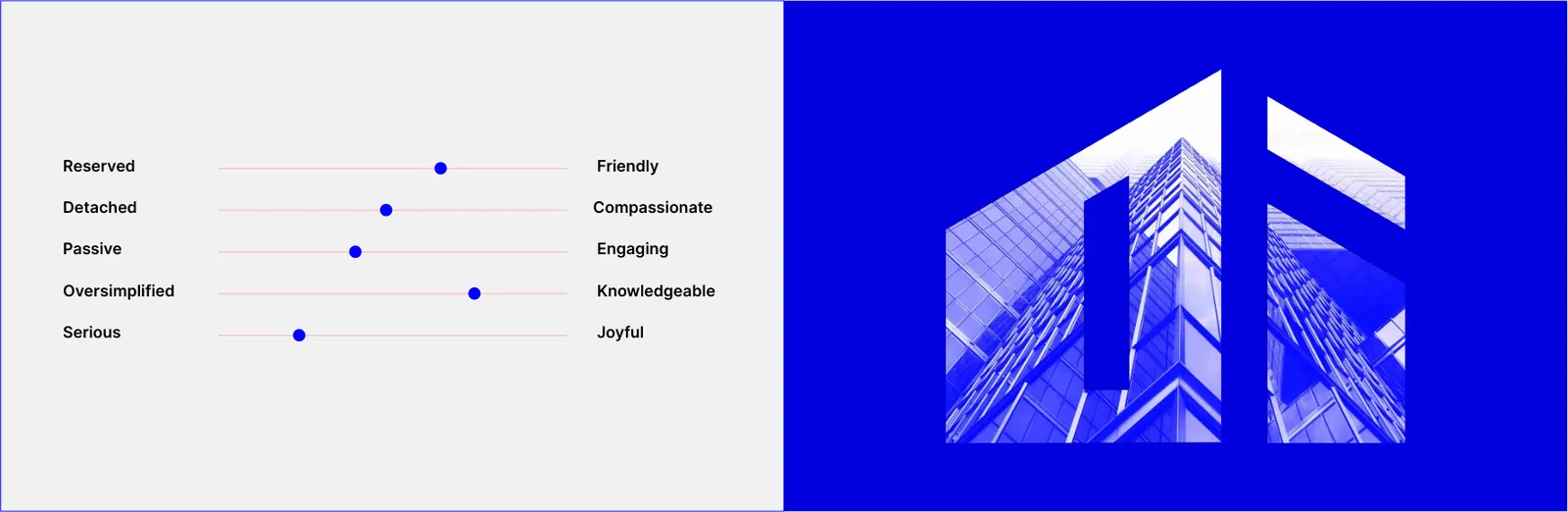
Valores de marca
01.7
Tono de voz
02
El logotipo
02.1
Concepto
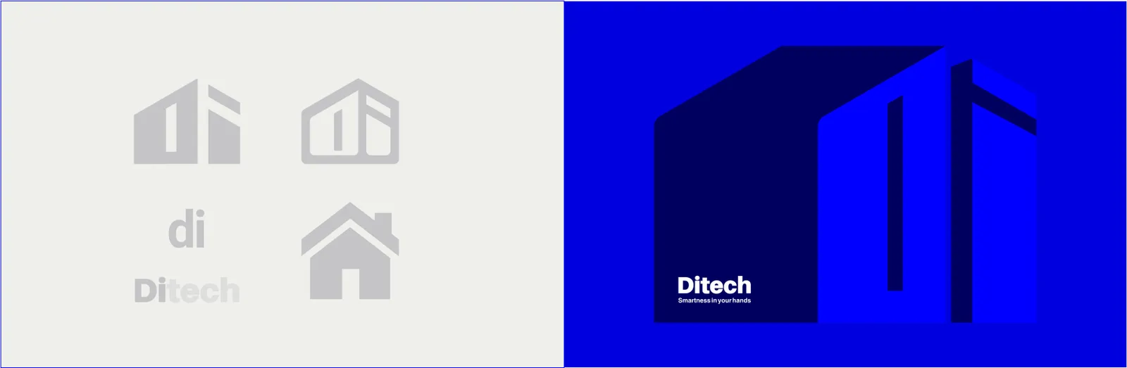
The DITECH logo is the cornerstone of the brand’s visual identity. It is carefully crafted as a monogram of the initials “D” and “I,” constructed within a precise hexagonal grid system. This geometric foundation creates visual balance, mathematical precision, and a timeless appearance, ensuring the logo works seamlessly across digital and print mediums. Beyond its aesthetic, the logo symbolizes structure, reliability, and innovation—values that define DITECH’s software and its impact in the real estate industry.
The logo goes beyond a simple monogram—it represents the essence of DITECH. The angular geometry subtly forms the abstract outline of a house, creating a direct link to real estate. Sharp lines symbolize order, accuracy, and technical reliability, while the curved forms reflect empathy, adaptability, and user connection. Together, these visual elements communicate the brand’s promise: a software that combines structural precision with human-friendly interaction.

02.2
Construcción
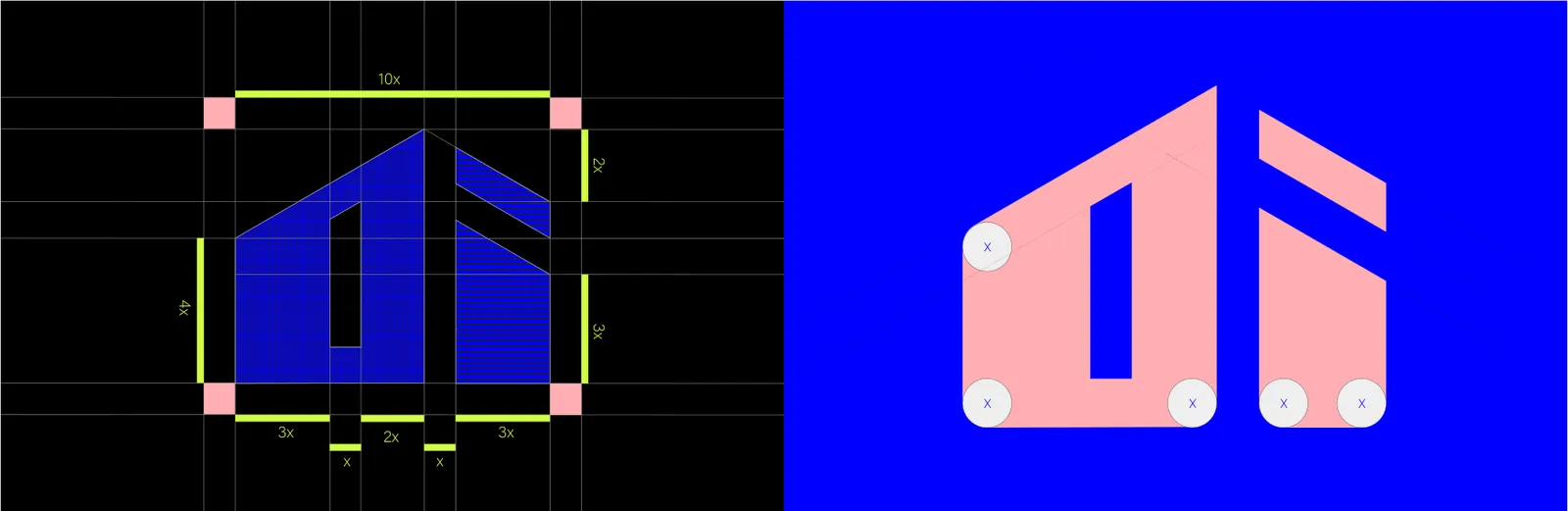
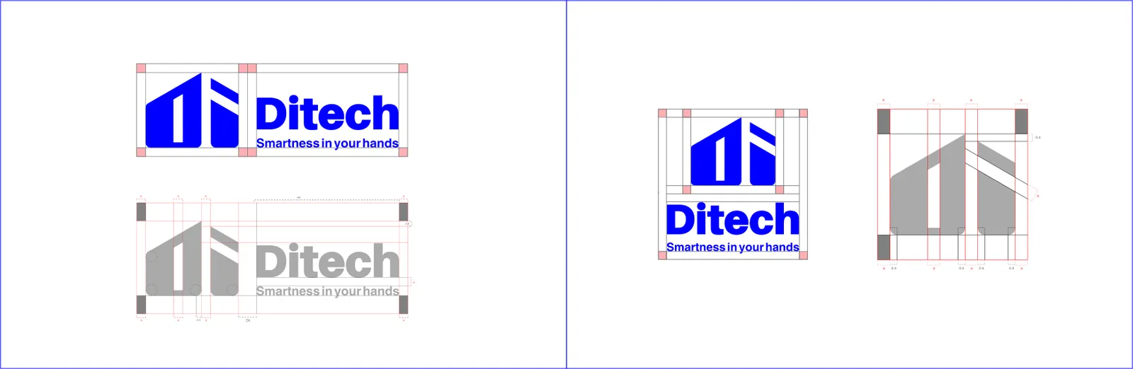
The exclusion zone defines a protective margin around the logo, ensuring that no other graphic elements, text, or visual distractions encroach upon it. This maintains the logo’s clarity, impact, and legibility across all media and applications.
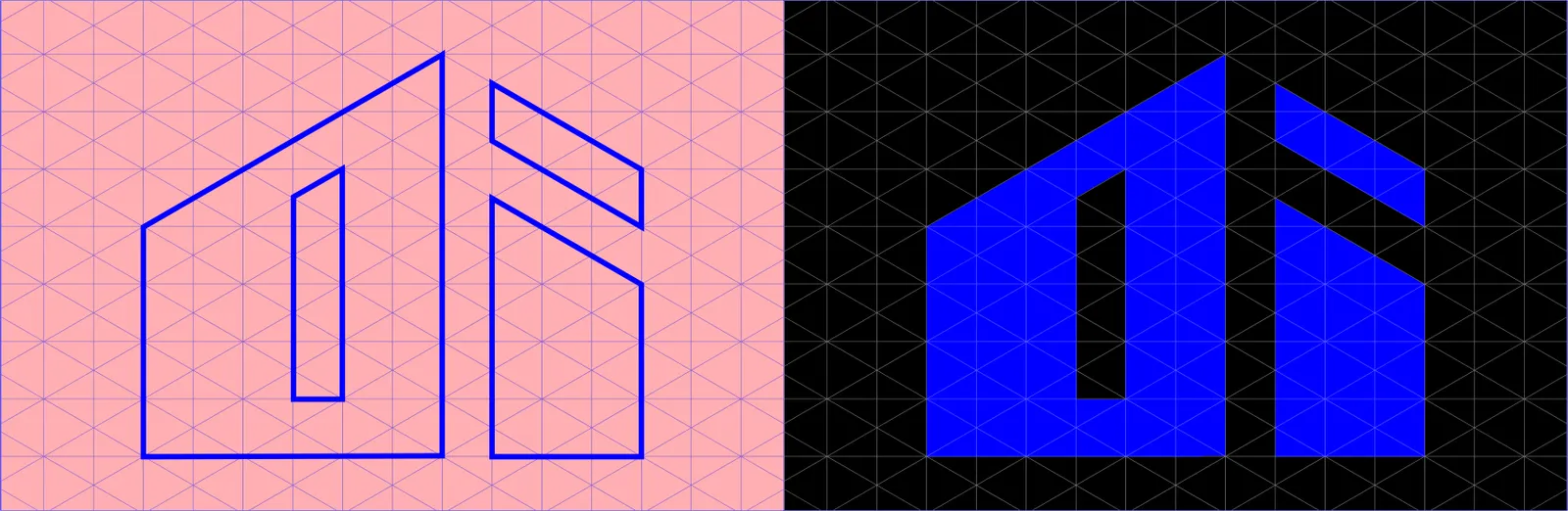
The logo structure is meticulously designed using a precise grid system, which ensures consistent alignment, proportion, and balance. This systematic approach reflects the brand’s commitment to professionalism, visual harmony, and attention to detail, reinforcing a strong and cohesive visual identity.
The DITECH logo is constructed using a hexagonal grid system, integrating sharp angles with smooth curves to create both stability and fluidity. This duality reflects the brand’s philosophy: technical strength combined with human-centered usability. The structured grid ensures mathematical precision, while the organic flow of the curves represents accessibility and modern adaptability, essential to software design.
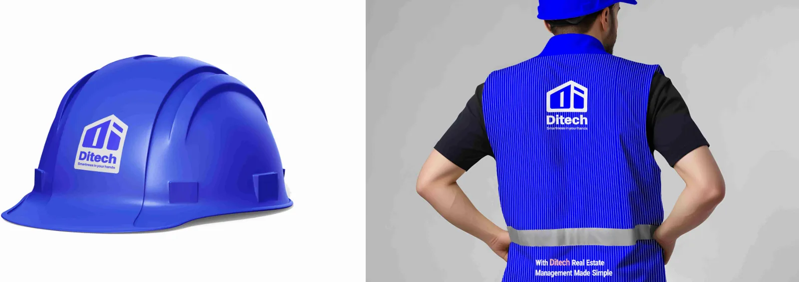
Branded construction helmets feature the DITECH logo and primary color accents. Designed for safety and visibility on-site, they simultaneously promote brand identity during field operations or construction projects.
02.3
Área de protección
The exclusion zone defines the minimum area surrounding the logo that must remain free from text, imagery, or graphic elements. This clear space protects the integrity and legibility of the logo in all contexts. Respecting the exclusion zone is critical for maintaining the logo’s impact, ensuring it is never visually compromised or overshadowed by other elements.
02.4
Variaciones
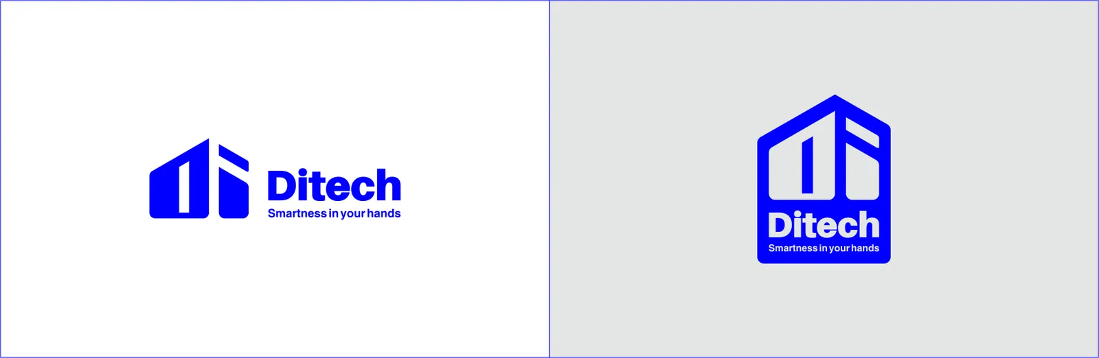
To maintain flexibility and adaptability, the DITECH logo has multiple variations, including full-color, monochrome, grayscale, and reversed versions. Each variation is optimized for specific use cases, whether digital, print, or large-scale environmental graphics. The consistent use of these variations ensures brand integrity while allowing for visual adaptability across diverse platforms and applications.
02.5
Sobre fondos
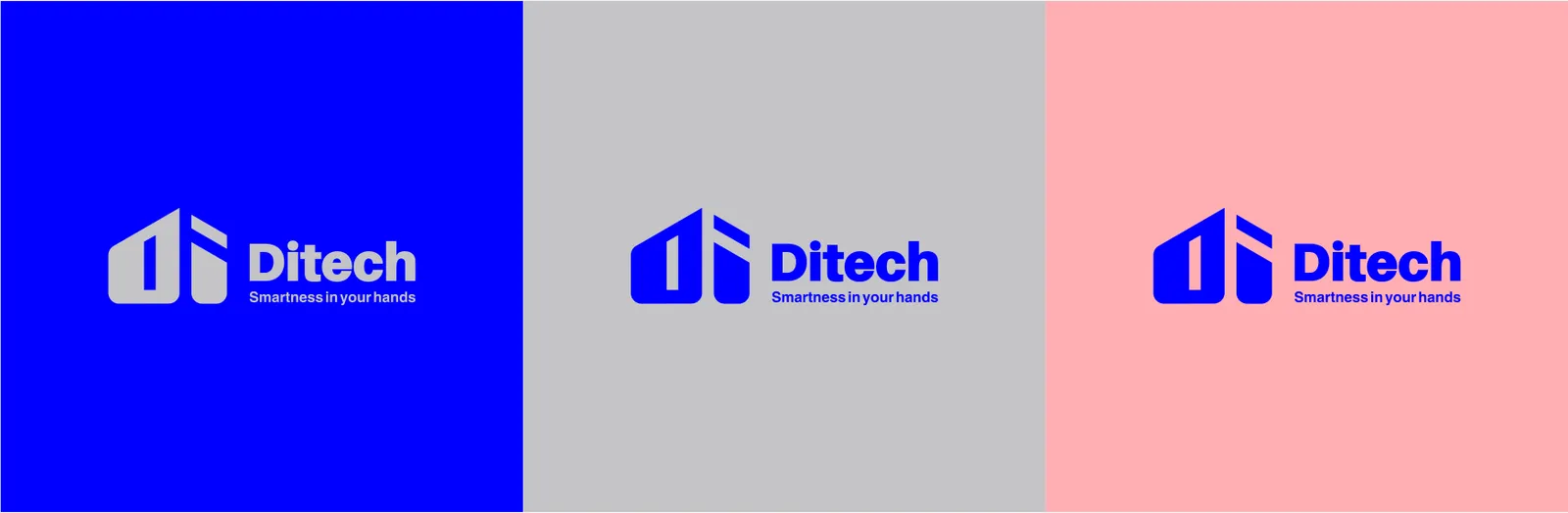
The DITECH logo should primarily appear in its full-color version on white or light gray (#C4C4C8) backgrounds to maintain clarity. When placed on dark or blue backgrounds (#0000FF), the reversed (white) logo should be used to ensure readability. The logo should avoid placement on pink (#FFB0B3) backgrounds, unless framed by sufficient contrast, as it may reduce legibility. Consistent application across backgrounds reinforces brand recognition and visual integrity.
02.6
Tamaño mínimo
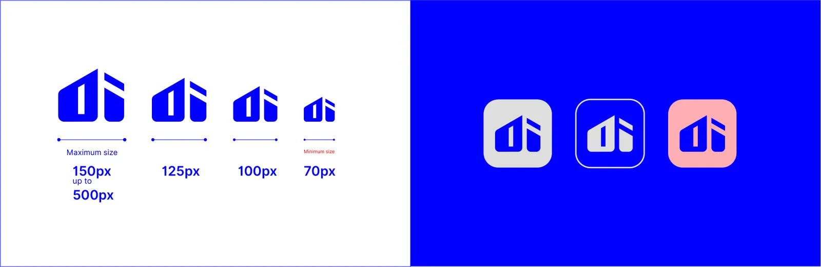
Minimum and maximum size specifications protect the legibility and clarity of the DITECH logo. The logo must never be reduced below the minimum threshold, as it would compromise recognition. Similarly, oversized applications must respect proportion and balance, ensuring the logo maintains integrity in every medium.
02.7
Icono de la app
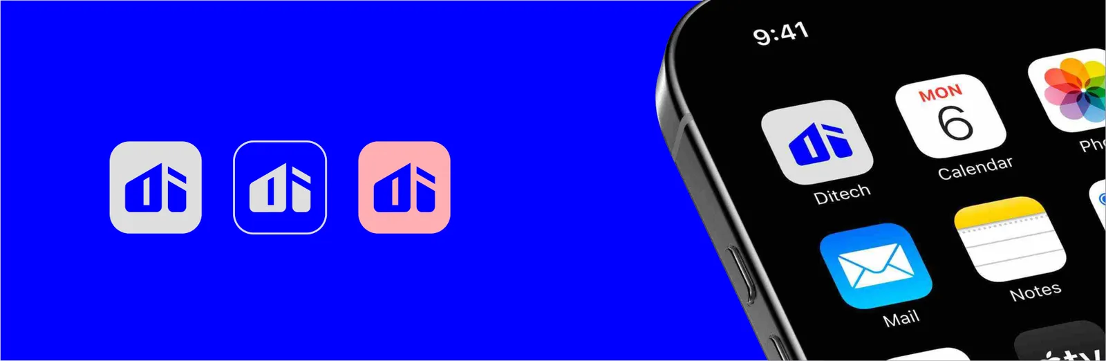
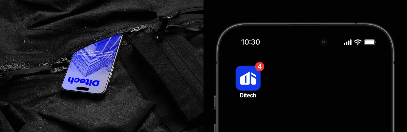
The app icon simplifies the core monogram into a compact, square-friendly format optimized for mobile and digital platforms. Designed for clarity at small scales, it retains brand recognition even in app stores and mobile devices where space is limited. The use of brand colors and geometric proportions ensures consistency and memorability.
02.8
Ubicación
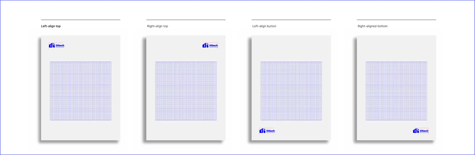
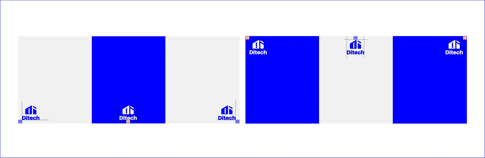
Logo placement guidelines ensure the mark is always positioned with clarity and visual hierarchy. Preferred placements include the top-left for interfaces or bottom-right for corporate layouts, ensuring visibility and balance. Strategic placement enhances recognition and strengthens the overall design composition.
Correct usage examples illustrate how the logo should appear across various applications. From digital interfaces and mobile screens to stationery and signage, these examples demonstrate the logo’s flexibility while maintaining consistency.
By following placement rules, DITECH ensures a unified brand presence across all platforms.
02.9
Usos incorrectos
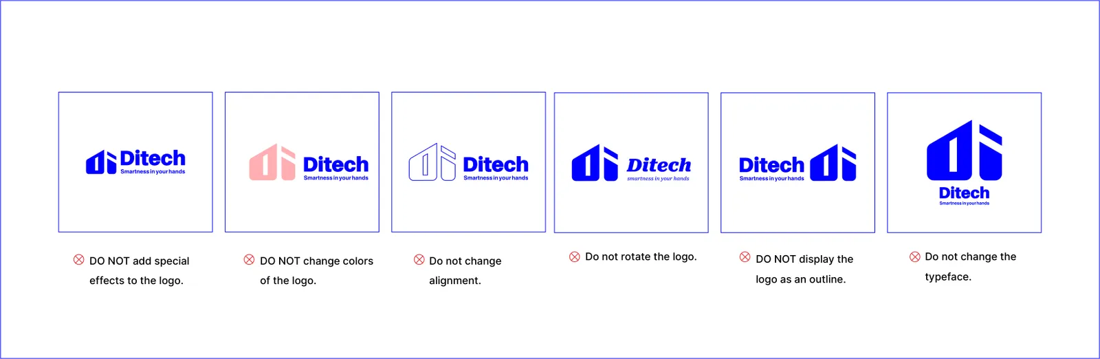
To protect brand consistency, the logo must never be altered, stretched, rotated, distorted, recolored, or placed on distracting backgrounds. Prohibited uses also include adding outlines, shadows, gradients, or effects that compromise the integrity of the design. These rules safeguard the logo’s professionalism and recognizability.
03
Color
03.1
Paleta
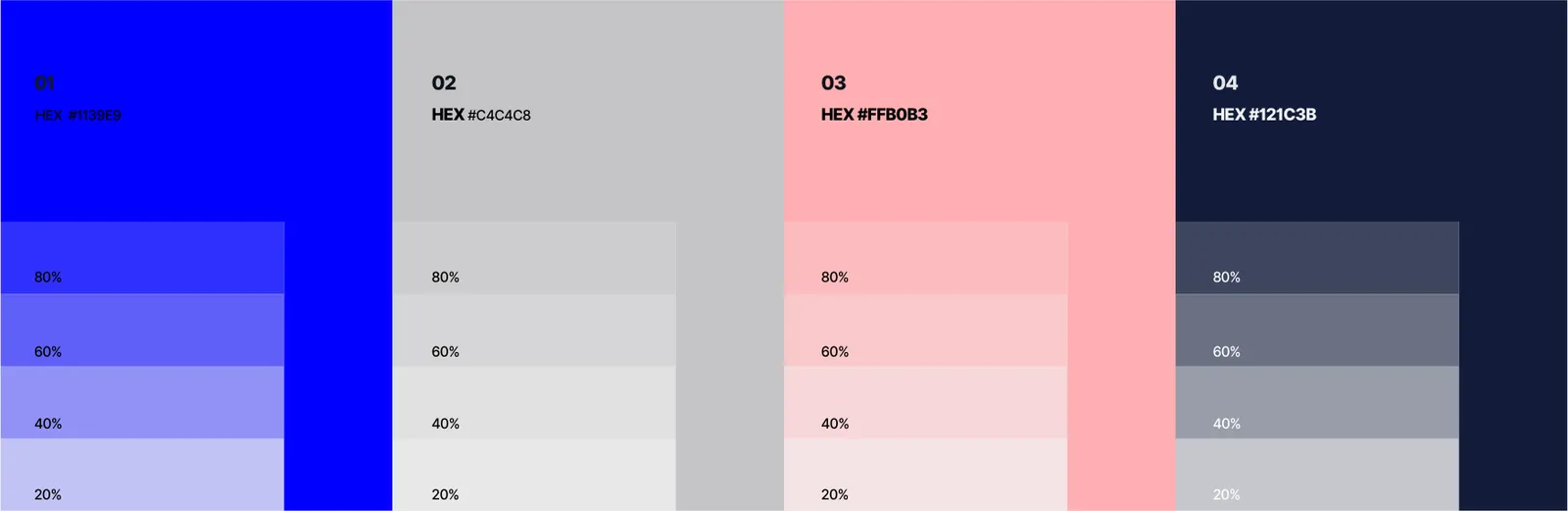
Los colores de la identidad y sus referencias.
- Name:
- Blue
- RGB:
- 0/0/255
- HEX:
- #0000FF
- Name:
- Soft Pink
- RGB:
- 255/176/179
- HEX:
- #FFB0B3
- Name:
- Gray
- RGB:
- 196/196/200
- HEX:
- #C4C4C8
03.2
Historia del color
The DITECH brand color system is crafted to balance trust, innovation, and warmth. The primary blue (#0000FF) symbolizes professionalism, technology, and reliability — establishing the brand as a trustworthy leader in the real estate technology sector. The secondary soft pink (#FFB0B3) brings a sense of human connection, creativity, and approachability, ensuring that DITECH is seen not only as a technical leader but also as a brand that values people. The background gray (#C4C4C8) provides neutrality and balance, offering a modern and elegant canvas that enhances clarity and readability. Together, these colors define DITECH’s personality: bold, innovative, and human-centered.

03.3
Sistema de color
The palette ensures consistency across print and digital applications. Primary blue is dominant and should be used for core brand assets, secondary pink highlights brand creativity and warmth, while light gray ensures clarity and balance as a background.
04
Tipografía
04.1
Tipos de letra
Las tipografías de la identidad y los pesos que utiliza.
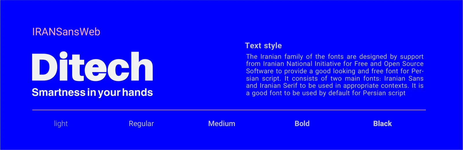
- IRANSansWeb
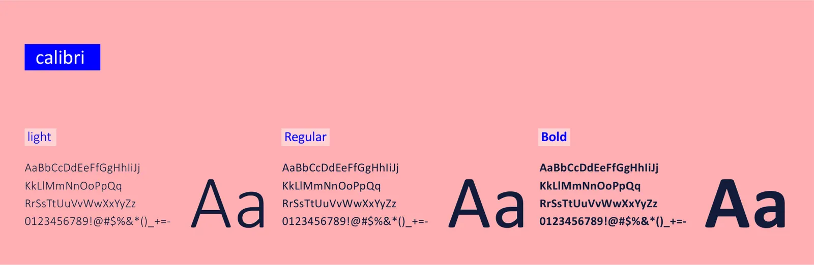
- Calibri
04.2
Muestra tipográfica
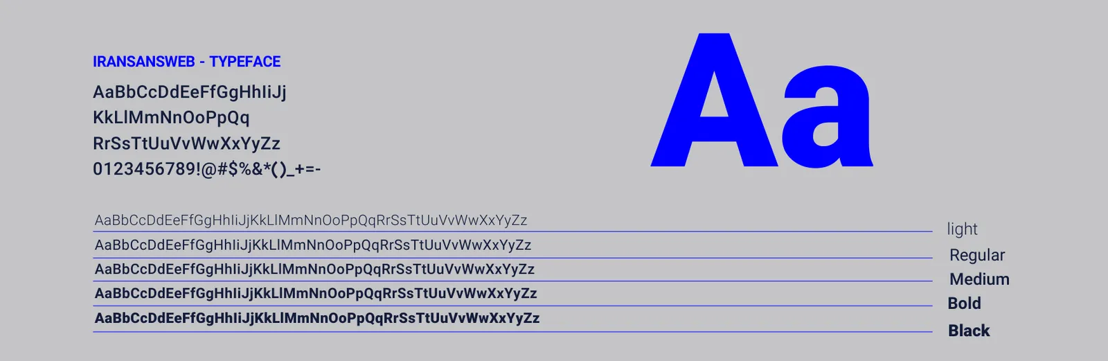
The hierarchy is carefully structured to enhance readability and emphasize key content. Headings are set in bold or semi-bold weights to convey authority and emphasis, while body text is in regular weight for comfortable reading. Captions, labels, and secondary information are styled in medium weight, providing a clear distinction without distracting from main content. Sizes are proportionally assigned: large for headings, medium for body text, and smaller for captions or supplementary details. This system ensures all text is visually balanced, legible, and consistent across multiple media.
IRANSansWeb is the primary typeface, chosen for its clean, modern design and excellent readability in both Persian and Latin scripts. It conveys reliability, professionalism, and clarity, making it suitable for headings, body text, and corporate communications.
Calibri serves as the secondary font for captions, labels, infographics, and supplementary text. Its neutral and versatile design complements IRANSansWeb, adding subtle contrast and hierarchy where needed without overpowering the primary font.
Its geometric structure reinforces DITECH’s identity as a precise and technology-driven brand, while remaining approachable to users.
Calibri ensures secondary content remains readable and aesthetically consistent, supporting the overall clarity of DITECH’s communication.
05
Elementos gráficos
05.1
Patrón
The brand pattern expands the visual identity of DITECH beyond the logo, creating a cohesive design system. Inspired by the four-pointed star and the linear geometry of the monogram, the pattern conveys rhythm, continuity, and a modern aesthetic. It can be applied subtly as a background texture or boldly across packaging, digital interfaces, and environmental graphics, reinforcing the brand’s visual recognition.

06
Papelería
06.1
Papelería completa
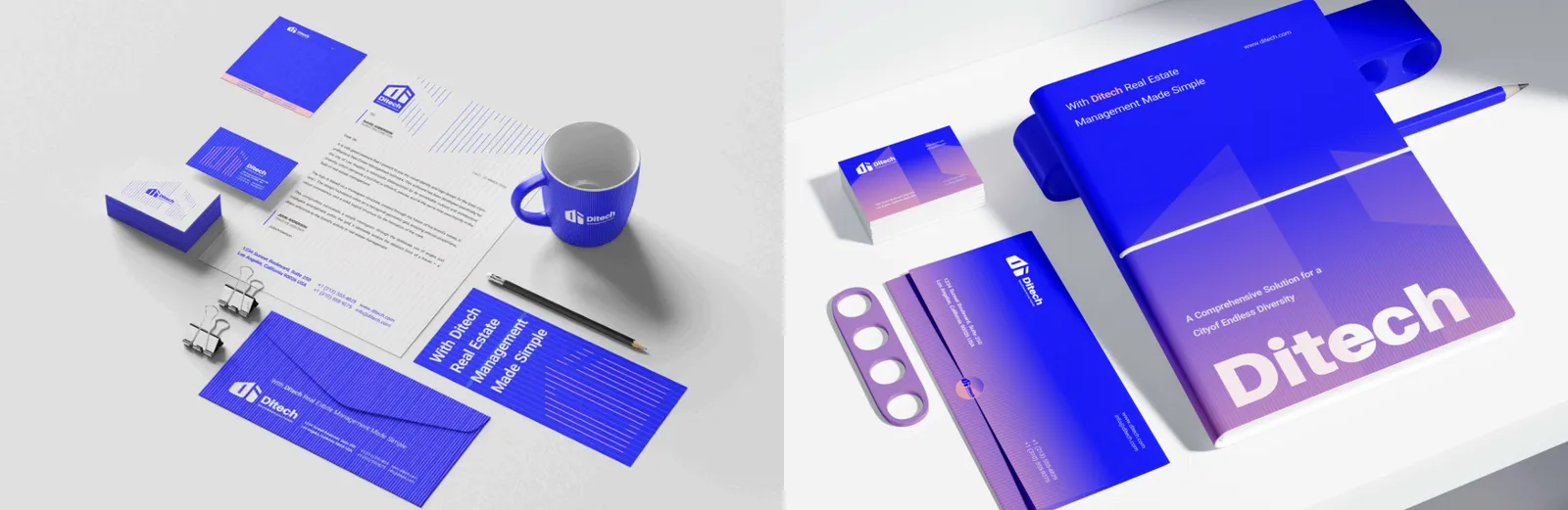
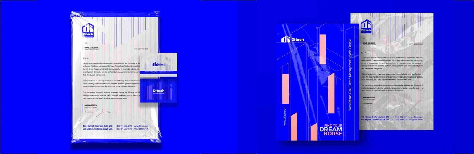
The full stationery set includes business cards, letterheads, envelopes, and folders, all designed to reflect a cohesive visual identity. Consistent use of colors, typography, and logo placement ensures professional, unified communications.
06.2
Tarjetas de visita
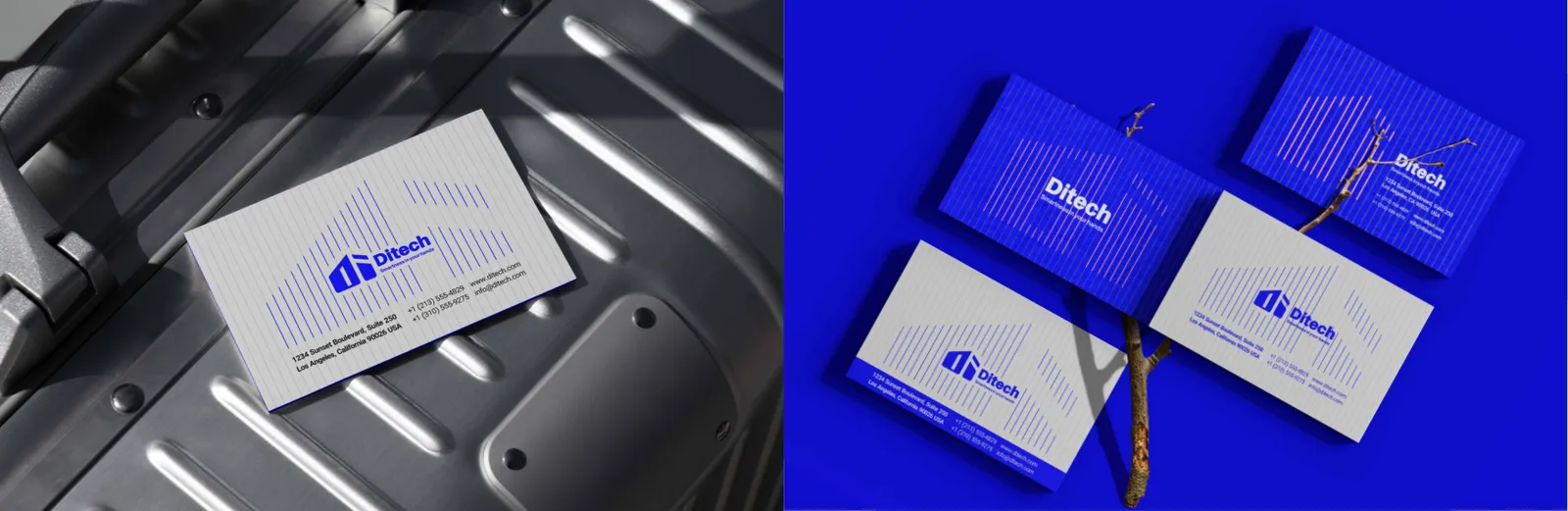
DITECH business cards reflect professionalism and technological precision. The design uses the primary blue (#0000FF) for impact, paired with clean typography (IRANSansWeb) to ensure clarity. Cards feature key information such as name, title, contact details, and website, presented in a balanced layout that communicates reliability and brand authority.
06.3
Credenciales
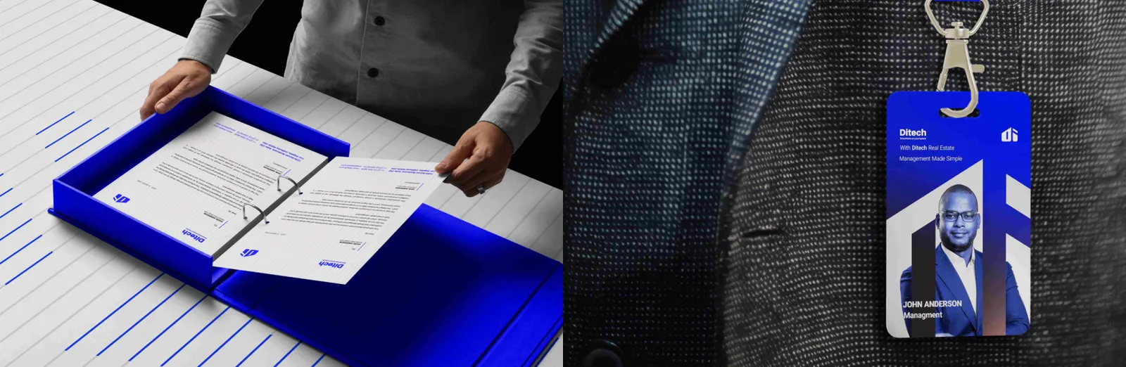
DITECH ID cards incorporate the logo, brand colors, and employee information in a clean, professional layout. These cards are designed for both internal use and client-facing interactions, reflecting the company’s identity and professionalism.
06.4
Papel membretado
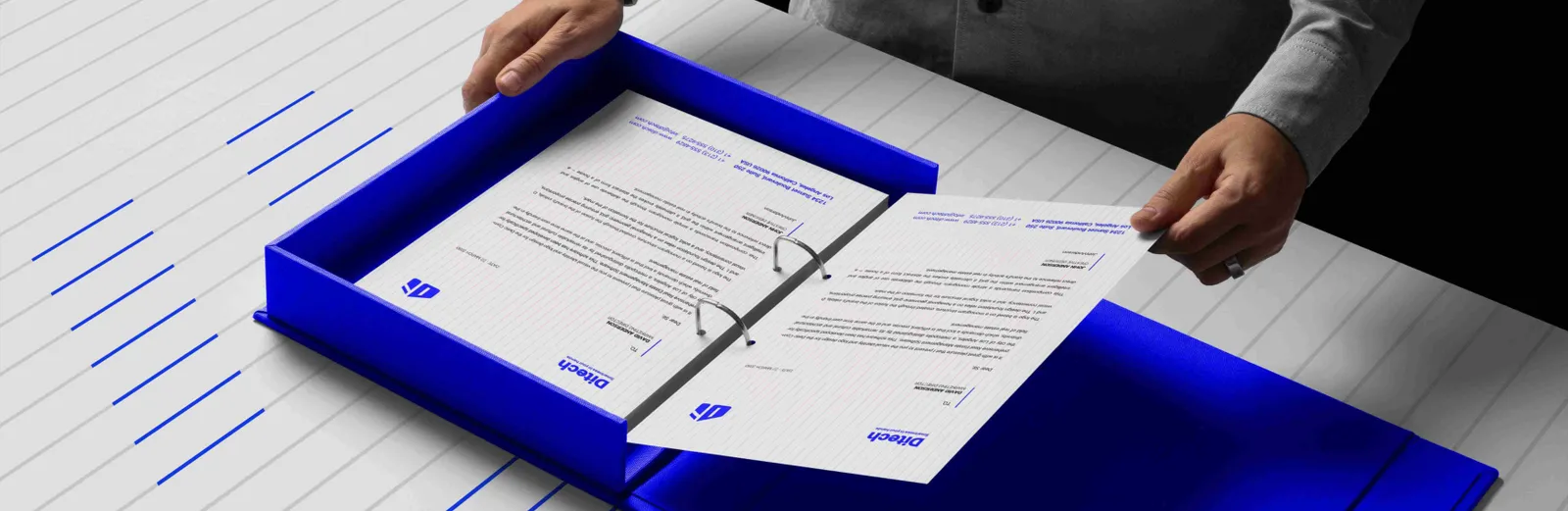
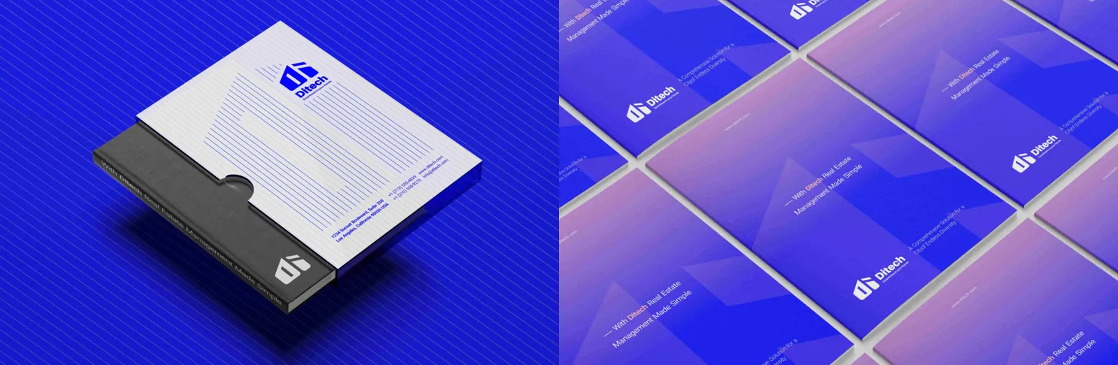
The letterhead combines the DITECH logo, brand colors, and clean typography to create a professional document framework. It ensures brand consistency in all correspondence, supporting credibility and corporate identity.
Recycled notepads demonstrate DITECH’s commitment to sustainability while maintaining brand identity. Logo placement, primary colors, and geometric patterns are applied consistently to enhance recognition and usability in offices and events.
06.5
Sobres
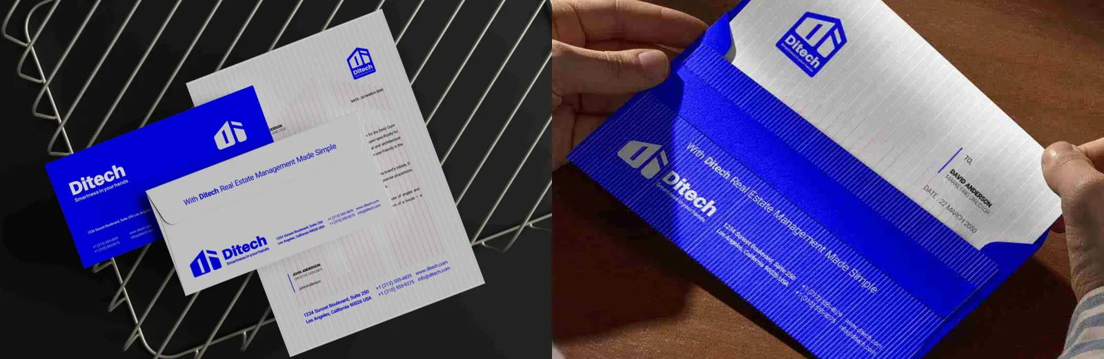
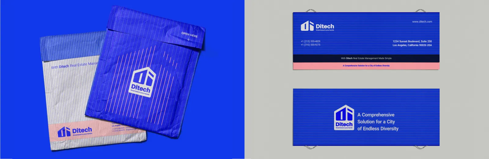
Envelopes utilize brand colors, the logo, and minimalistic design to convey professionalism from the first glance.
They ensure consistency in external communications and strengthen DITECH’s corporate identity.
06.6
Carpetas
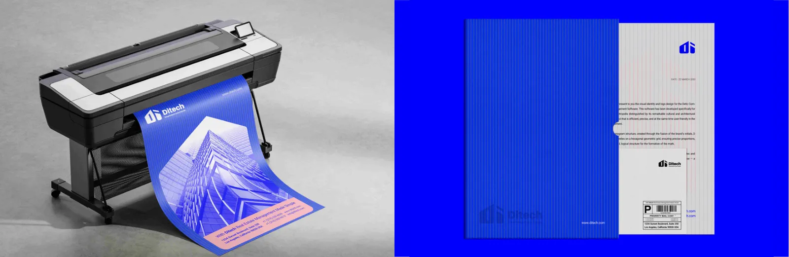
Document folders are designed to hold important company materials while reinforcing the brand.
Folders are designed for internal and external document management.
Featuring the DITECH logo, primary color accents, and subtle geometric patterns inspired by the logo structure, these folders convey organization, reliability, and modernity.
They feature a clean layout, brand colors, and geometric accents inspired by the logo, reinforcing the professional and organized nature of DITECH.
06.7
Cuadernos
DITECH notebooks are branded stationery items that combine utility with visual identity. The cover integrates the logo, primary colors, and subtle geometric patterns inspired by the brand, making them functional while reinforcing brand recognition.
06.8
Pegatinas y sellos
Employee vests are designed for fieldwork and events.
They prominently display the DITECH logo and use brand colors to enhance recognition while maintaining comfort, functionality, and a professional appearance.
07
Digital
07.1
Sitio web
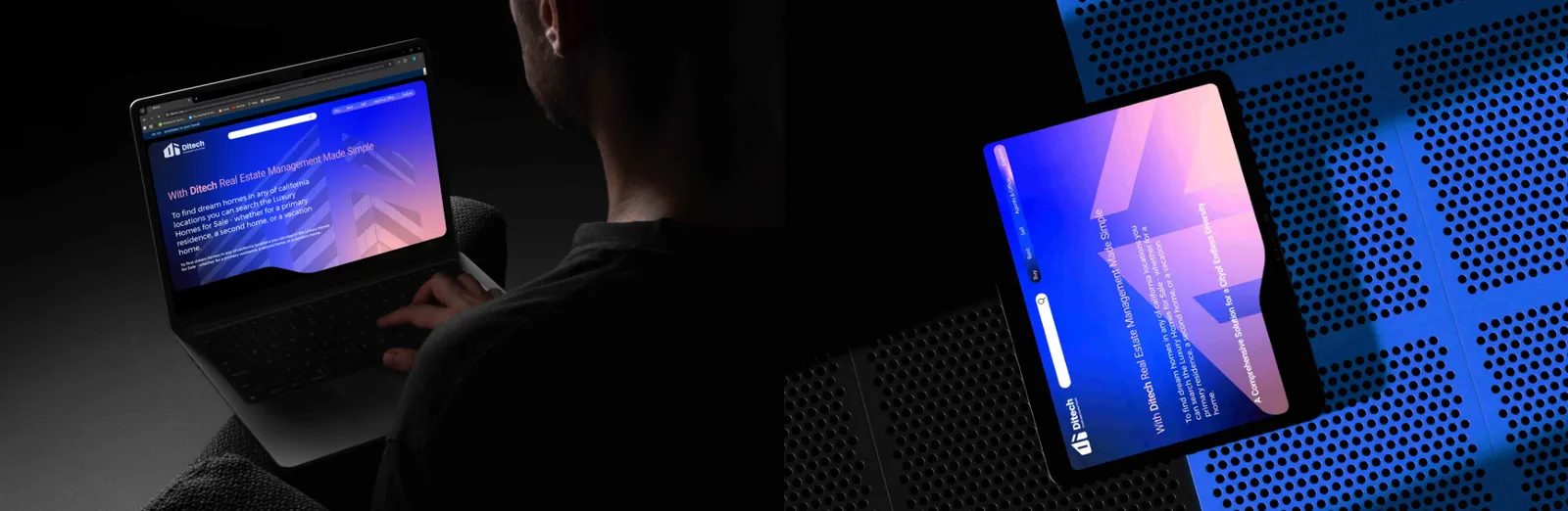
The DITECH website serves as the primary digital interface for clients and stakeholders. Its design follows the brand’s visual identity, using primary and secondary colors, geometric patterns inspired by the logo, and clear typography (IRANSansWeb and Calibri). The layout emphasizes usability, intuitive navigation, and responsiveness across devices. Every element—from buttons and icons to content hierarchy—is optimized to reflect professionalism, technological precision, and user-centered design, ensuring a seamless and engaging experience.
07.2
App móvil
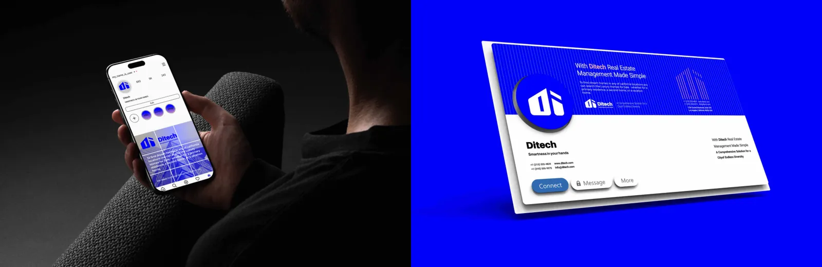
The DITECH mobile application is designed to deliver a seamless, intuitive, and visually cohesive user experience. The interface incorporates brand colors, typography, and geometric patterns, ensuring consistency with the website and other digital assets. Icons, buttons, and content hierarchy are optimized for usability and clarity. The app emphasizes accessibility, smooth navigation, and real-time functionality, reflecting DITECH’s commitment to innovation, precision, and client-centered solutions in real estate management.
07.3
Redes sociales
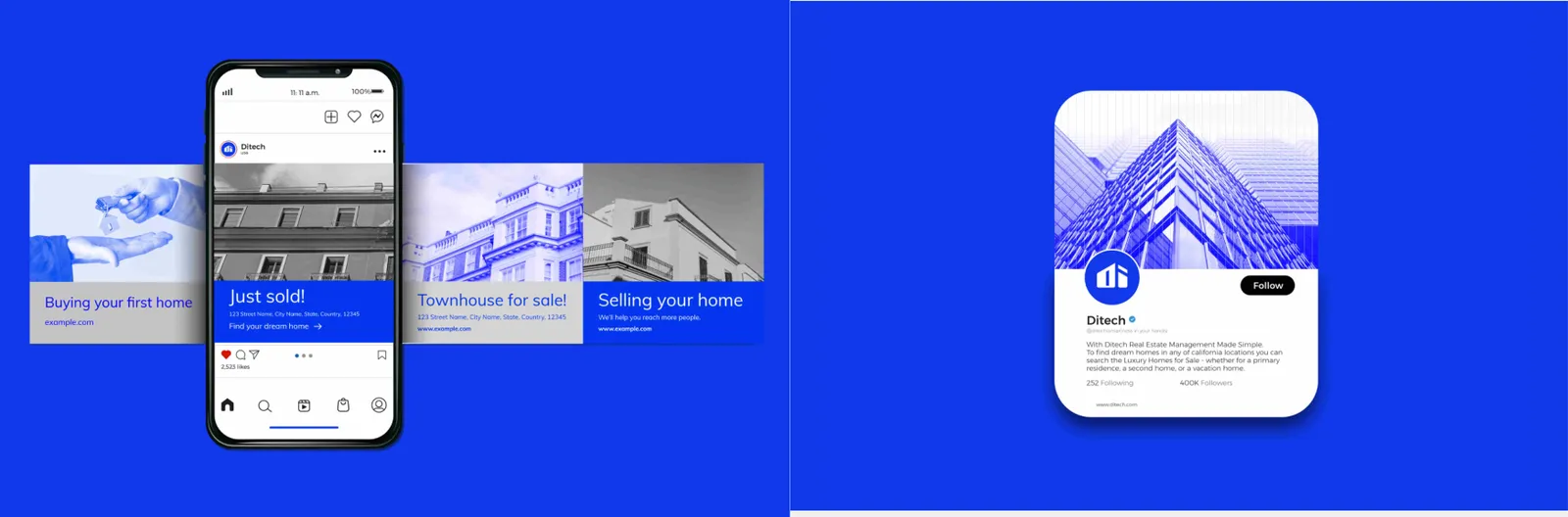
DITECH’s social media presence is designed to reinforce brand recognition and engagement. All posts, stories, and campaigns follow consistent use of the brand palette, logo placement, typography, and visual patterns. Content is strategically crafted to communicate the brand’s expertise, innovation, and human-centric approach, while maintaining a professional and modern aesthetic. Templates for regular posts ensure cohesive messaging across platforms like LinkedIn, Instagram, and Twitter.
07.4
Campañas y email
Digital advertising materials for DITECH, including banners, display ads, and online campaigns, strictly adhere to brand guidelines. They incorporate primary and secondary colors, logo placement, typography, and graphic elements consistent with the brand pattern. Visual hierarchy and messaging are optimized for engagement, readability, and conversion, while maintaining a professional and innovative brand perception across digital channels.
08
Merchandising
08.1
Ropa
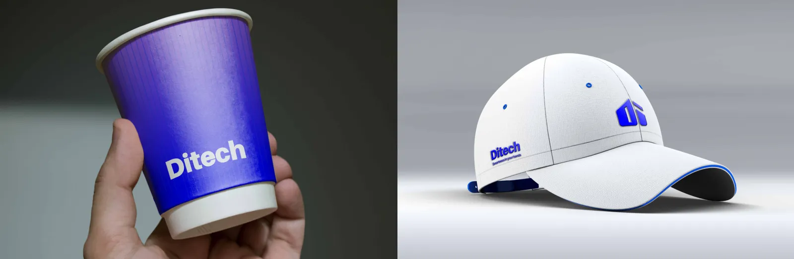
Caps are branded merchandise for events, promotions, or employee uniforms.
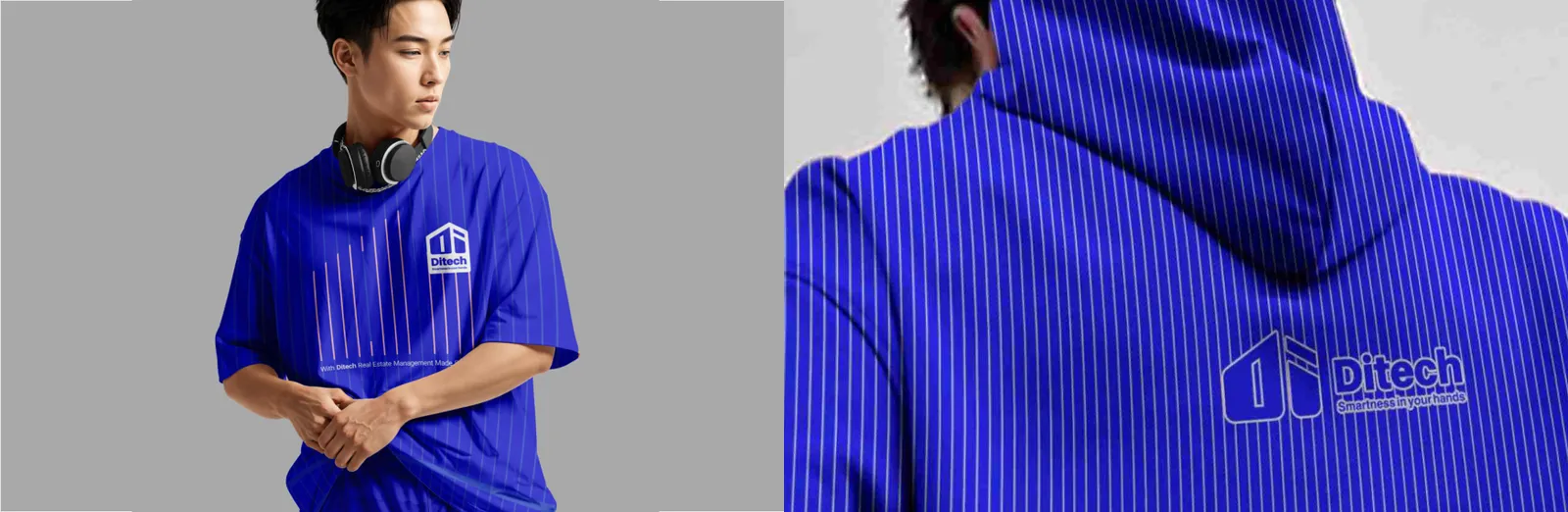
DITECH hoodies are designed as functional and promotional apparel, featuring the primary blue color (#0000FF), the logo, and subtle brand patterns. They convey a modern, professional image while providing comfort and visibility for employees or event participants.
T-shirts incorporate DITECH branding for casual events or employee uniforms. Logo placement, color palette, and typography are consistently applied to ensure a professional yet approachable appearance.
They feature the DITECH logo, primary color, and minimalist design, ensuring clear brand visibility in casual and outdoor settings.
08.2
Bolsas
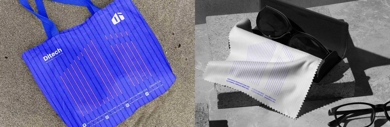
Tote bags are designed for practicality and brand visibility. The primary logo, brand colors, and subtle patterns create a professional and modern look, ideal for conferences, events, and client gifts.
Linen bags combine sustainability with brand identity. Featuring the logo, primary colors, and minimal geometric accents, they serve as eco-friendly promotional items while reinforcing professional aesthetics.
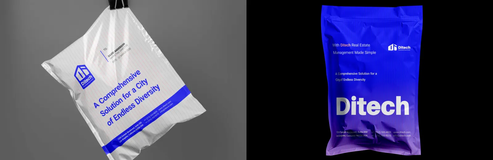
Branded bubble bags are used for packaging and shipping, integrating DITECH’s logo, colors, and patterns. This ensures a professional appearance while reinforcing brand identity during delivery.
Plastic pouches are designed for packaging and giveaways, incorporating DITECH’s primary colors, logo, and subtle patterns. They ensure brand visibility while maintaining a sleek and professional appearance.
08.3
Artículos promocionales
DITECH caps are practical promotional items for employees and clients. They feature the primary logo, subtle secondary colors, and minimalist patterns inspired by the brand, ensuring consistent visual identity in casual and outdoor settings.
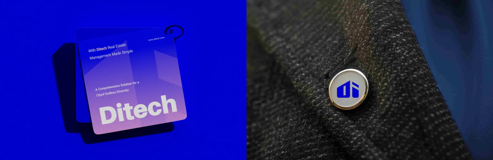
The DITECH suit pin is a premium accessory for employees and executives, reflecting professionalism and brand pride. It features the logo in metallic finish, maintaining subtlety while enhancing corporate identity in formal settings.
08.4
Packaging
DITECH-branded glasses boxes combine protection with brand aesthetics. The logo and brand colors are prominently displayed, while minimal geometric accents provide a modern, cohesive look, suitable for client gifts or promotional purposes.
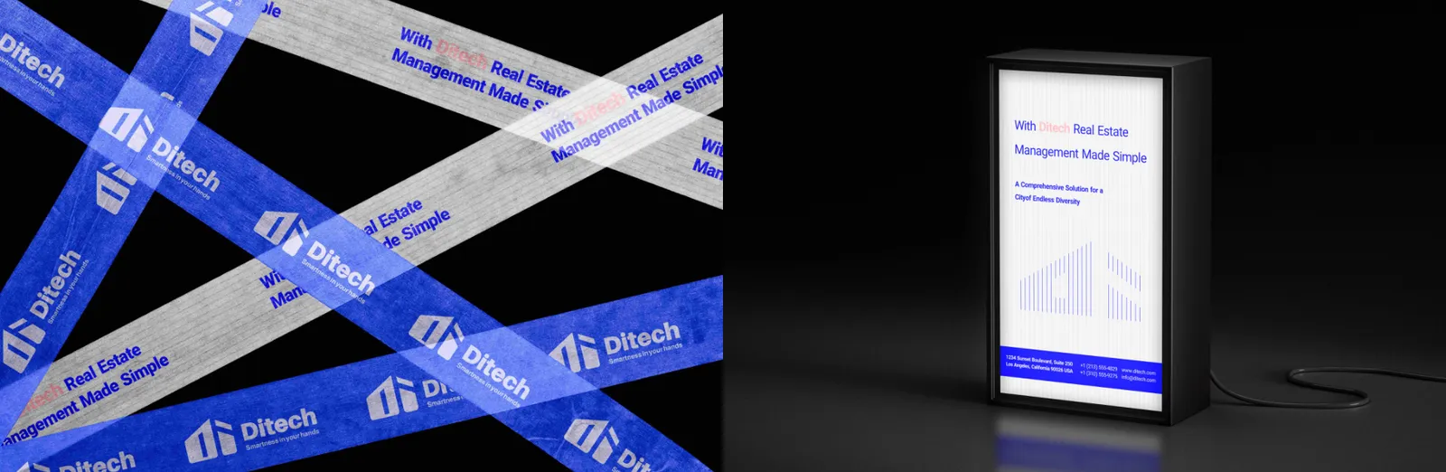
Eco-friendly tape featuring DITECH branding ensures sustainability while maintaining visibility. The tape incorporates the logo and brand colors, suitable for packaging, shipping, and promotional materials.
Light boxes are designed to enhance visibility in indoor and outdoor locations. The DITECH logo is illuminated against primary brand colors, and geometric patterns maintain a professional and modern appearance.
09
Aplicaciones
09.1
Eventos y ferias
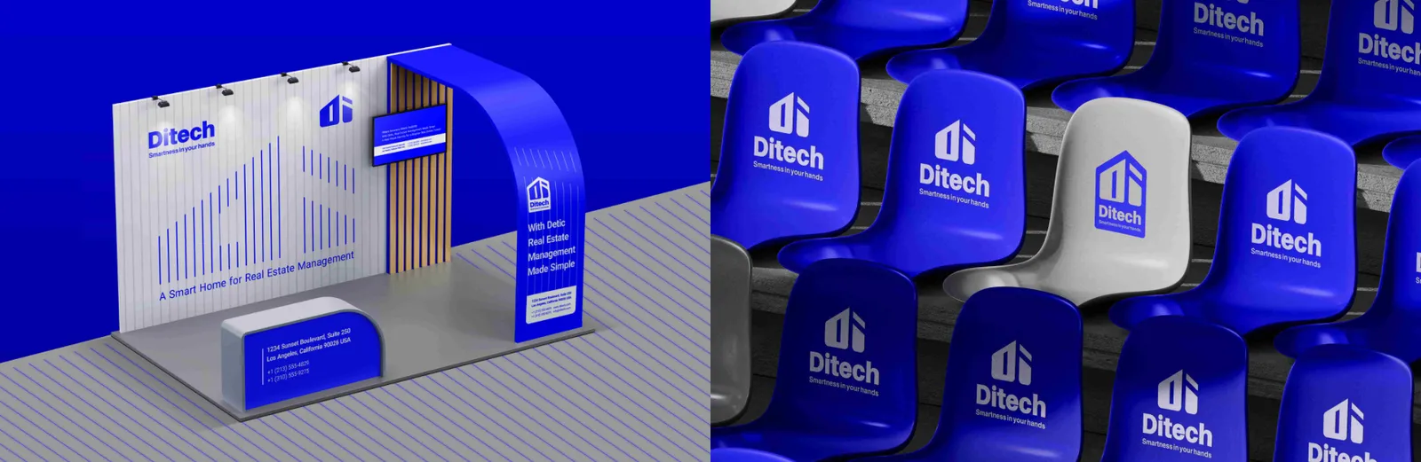
Exhibition stands are designed for trade shows and corporate events. They integrate the logo, primary and secondary colors, brand patterns, and typography to create a cohesive, professional, and visually appealing presentation that attracts visitors and reinforces brand recognition.
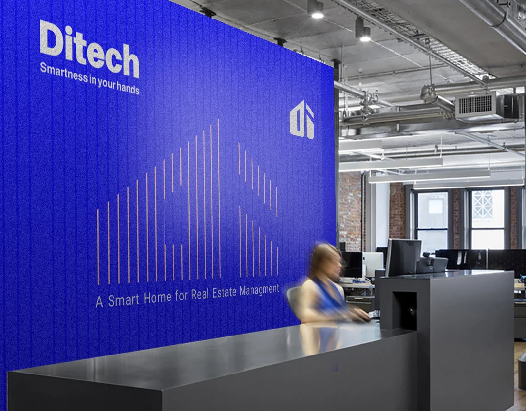
Reception and exhibition counters integrate DITECH branding with logo, colors, and geometric patterns. They create a professional and cohesive experience for visitors while maintaining functional design for interactions.
09.2
Publicidad
Posters are used for corporate events, promotions, and informational campaigns. They follow brand color rules, typography hierarchy, and logo placement guidelines, ensuring consistency and immediate recognition.
Brochures present DITECH’s services, software features, and corporate values in a clear, visually appealing format. The design incorporates brand colors, logo, modern typography, and structured layouts to ensure readability and convey professionalism. Marketing brochures are tailored for client engagement, emphasizing key selling points with a strategic use of color, imagery, and infographics.
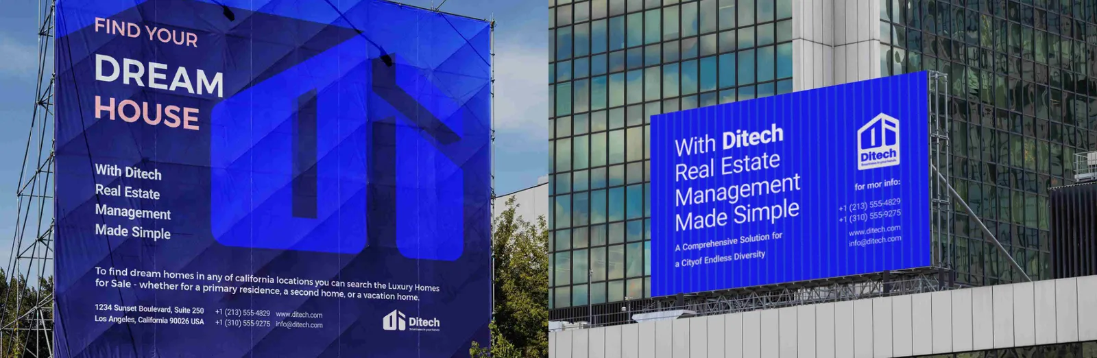
DITECH billboards are designed for maximum visibility and impact. They feature the primary logo, brand colors, and geometric patterns inspired by the brand identity. The layout ensures readability from a distance while conveying professionalism, innovation, and reliability.
Digital city screens incorporate DITECH branding with high-resolution visuals and dynamic content. The consistent use of logo, brand colors, and typographic hierarchy ensures brand recognition while engaging urban audiences.
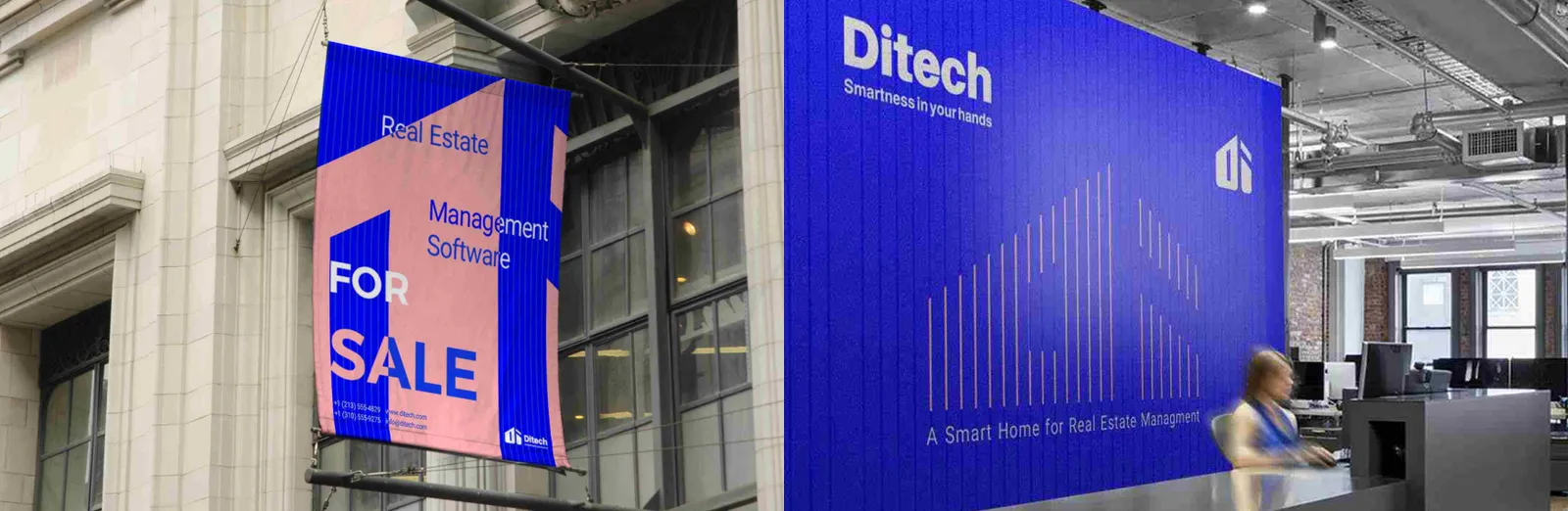
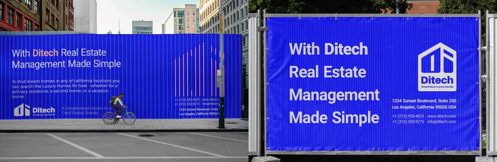
Large-format stretch banners for urban environments feature the DITECH logo, brand colors, and geometric patterns. Designed for events, expos, or outdoor advertising, they maintain legibility and visual consistency even at a distance.
Street billboards follow DITECH brand guidelines for outdoor visibility. Clear logo placement, contrasting primary and secondary colors, and geometric accents ensure the brand message is instantly recognizable in busy urban environments.
09.3
Banderas
DITECH flags are designed for corporate events, exhibitions, and offices. They prominently feature the logo and brand colors, ensuring strong visibility and reinforcing brand identity in both indoor and outdoor environments.