01
Aperçu
01.1
En bref
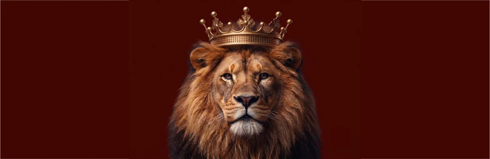
Le lion symbolise la puissance, l’élégance et l’authenticité.
- Projet
- Identité visuelle
- Secteur
- Tabac
- Année
- 2021
- Services
- Identité visuelle, Packaging, Brand Guidelines
01.2
Introduction
SHARLOT vend et exporte des produits du tabac. Son logo associe de façon créative forme et couleur pour exprimer l’identité de la marque. Deux éléments principaux, un lion et des feuilles de tabac, renforcent le lien entre la marque et ses clients.
01.3
À propos
Le lion symbolise la puissance, l’élégance et l’authenticité. Avec ses lignes courbes, ses proportions précises, son regard droit et sa posture tournée vers l’avant, il inspire confiance et assurance.
Les couleurs renvoient aux produits du tabac. Le jaune, joyeux et attirant, capte l’attention ; l’orange apporte enthousiasme et élan ; le brun crée un attachement aux valeurs et aux traditions, symbole de tradition et de solidité.
01.4
Histoire
Sharlot emerged as a distinguished international brand dedicated to the sale and export of premium tobacco and hookah products. Recognizing the necessity for a visual presence that matches the uncompromised caliber of its products, the brand partnered with Mouneskhah Studio to engineer a comprehensive identity system. The brand’s foundation was built upon the synthesis of nature and authority—merging the organic essence of the tobacco leaf with the commanding presence of a lion. From its inception, Sharlot was positioned not merely as a commodity, but as a global symbol of luxury, structural integrity, and unwavering quality.
01.5
Mission
To deliver an uncompromised, premium tobacco experience to the international market, rooted in absolute reliability, security, and honesty, while fostering a passionate and inviting connection with our consumers.
01.6
Valeurs de marque
Prestige & Power: Represented by the Lion.
We lead with authority, luxury, and undeniable market dominance.
Originality & Authenticity: We remain true to our roots, honoring the raw, organic essence of our core product (The Tobacco Leaf).
Uncompromised Quality & Security: Reflected in our earthy brown tones, we guarantee health, safety, honesty, and absolute reliability in every product we export.
Dynamic Passion & Vitality: Driven by our vibrant yellow and orange palette, we operate with energy, movement, and a commitment to delivering joy, charm, and friendship to our audience.
Trust through Symmetry: Just as our visual identity relies on smooth, decisive lines and balanced proportions, our business practices are built on transparency, stability, and absolute confidence.
01.7
Ton de voix
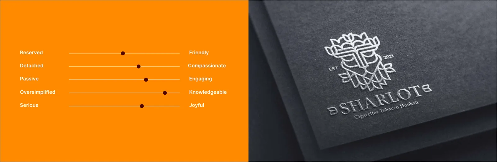
Authoritative & Decisive: Sharlot speaks with the quiet confidence of a market leader. The language is sharp, clear, and powerful (mirroring the geometric precision and the lion emblem). There is no hesitation in how the brand communicates its value.
Inviting & Passionate: Despite its power, the brand does not alienate its audience. It uses warm, engaging, and energetic language (reflecting the orange and yellow tones) that evokes charm, friendship, and cheerfulness.
Keywords for Copywriting: Premium, Uncompromised, Original, Dynamic, Trusted, Luxurious.
02
Le logo
02.1
Logo de la marque
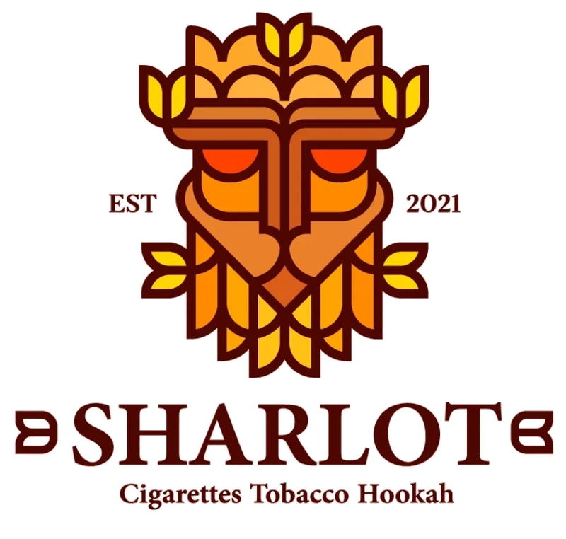
Le signe, seul.
02.2
Le design
Au final, le logo de SHARLOT associe harmonieusement forme et couleurs et met en avant les valeurs de la marque. Grâce à sa souplesse d’usage, il peut créer un lien proche et durable avec son public et se démarquer dans son secteur.
02.3
Concept
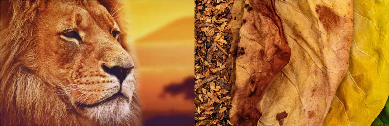
The emblem is a profound semiotic amalgamation of two powerful entities:
The Lion: The universal symbol of power, luxury, originality, and unyielding market authority.
The Tobacco Leaf: The raw, organic core of our premium product line.
The Sharlot primary logo is the ultimate visual ambassador of our brand. It is a masterful synthesis of nature and authority—merging the organic essence of the tobacco leaf with the commanding presence of a lion. Designed with smooth, decisive lines and absolute symmetrical proportions, this primary lock-up projects unwavering confidence, luxury, and trust. It must be treated with the utmost respect and serves as the cornerstone of all global packaging, corporate communications, and export materials.
Together, they communicate a singular message: Sharlot is the undisputed king of premium tobacco, offering a product that is both organically authentic and fiercely superior in quality.
02.4
Construction
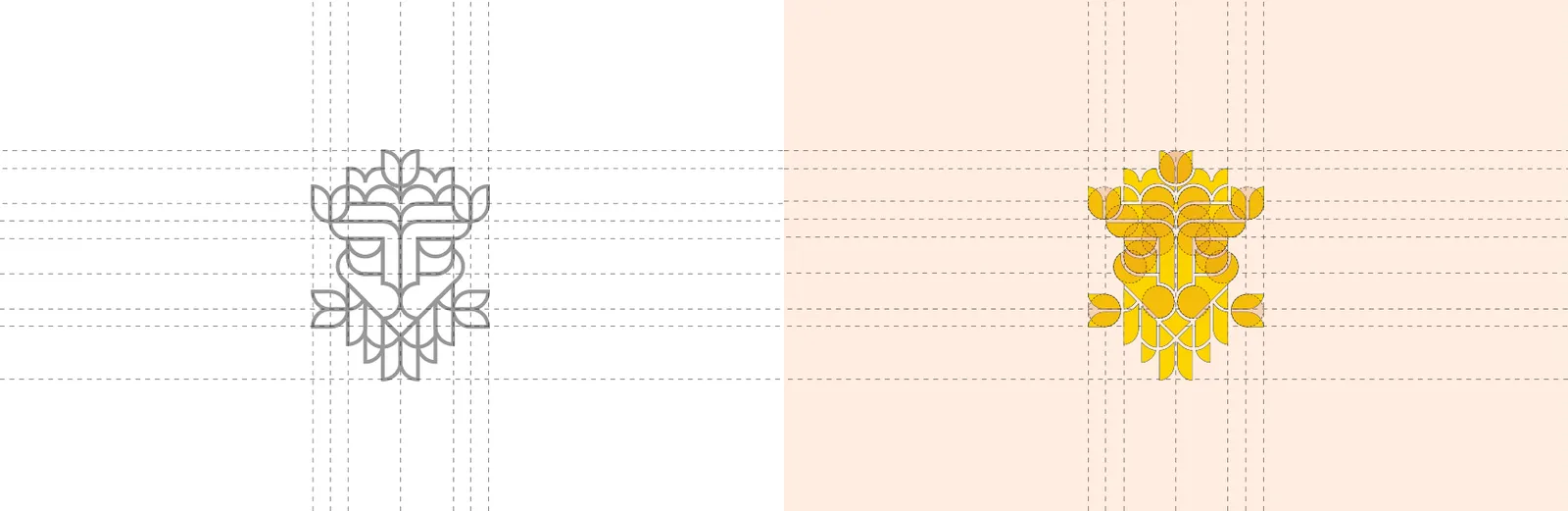
The Sharlot logo is not an arbitrary illustration; it is a meticulously engineered geometric system. Built upon a strict modular grid, the design relies on perfect symmetrical proportions to evoke stability, reliability, and security in the minds of our consumers. The curves of the tobacco leaf and the angular mane of the lion follow harmonious mathematical ratios, ensuring the emblem remains balanced and authoritative at any scale.
02.5
Zone de protection
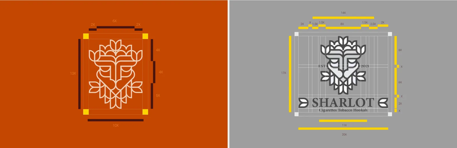
To preserve the prestige and visual impact of the Sharlot emblem, it must never be crowded by typography, imagery, or other graphic elements. The exclusion zone (Clear Space) is mathematically defined by the height of the letter "S" from the Sharlot wordmark. This measurement dictates the absolute minimum breathing room required around the perimeter of the logo on all applications.
02.6
Déclinaisons
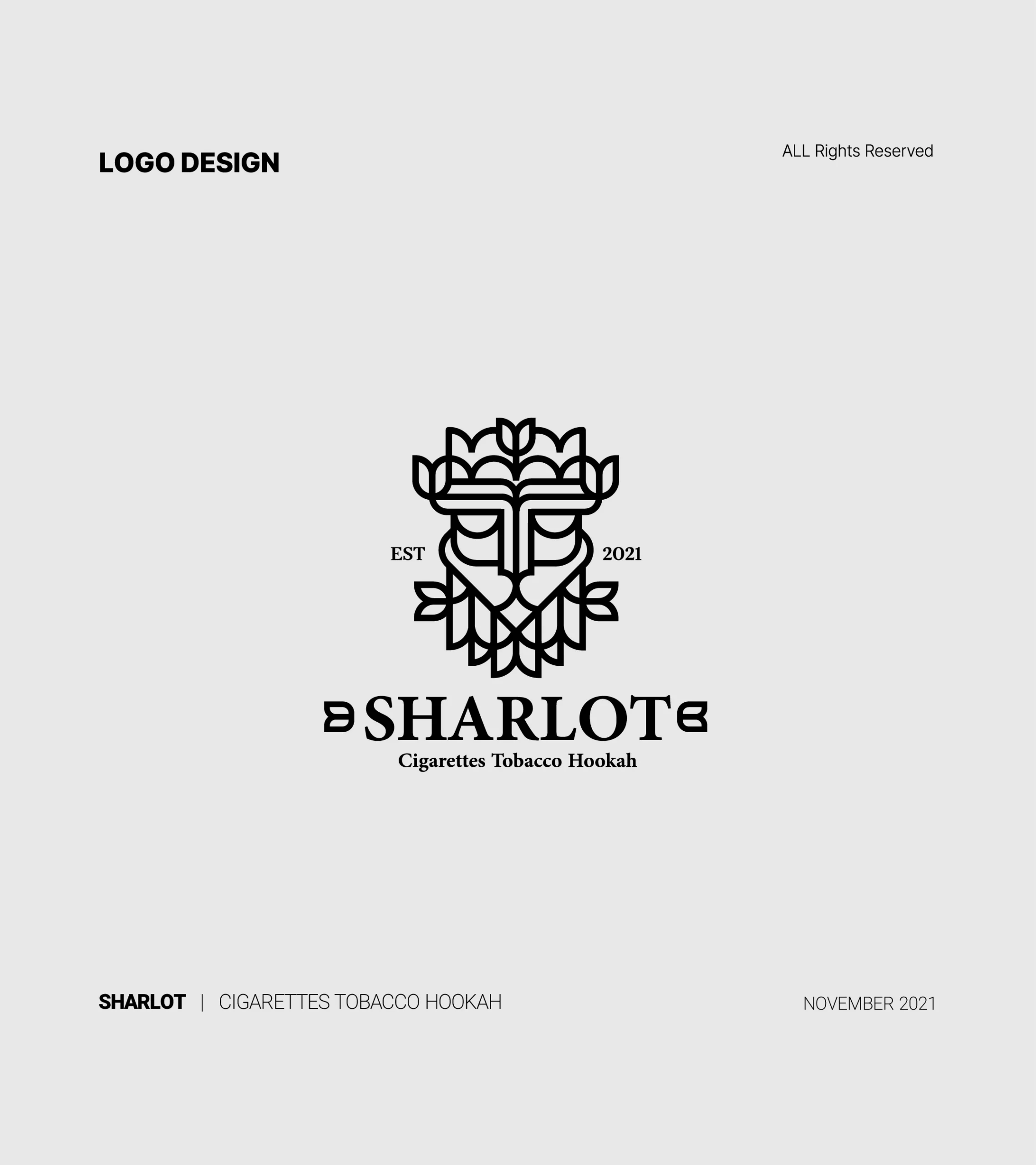
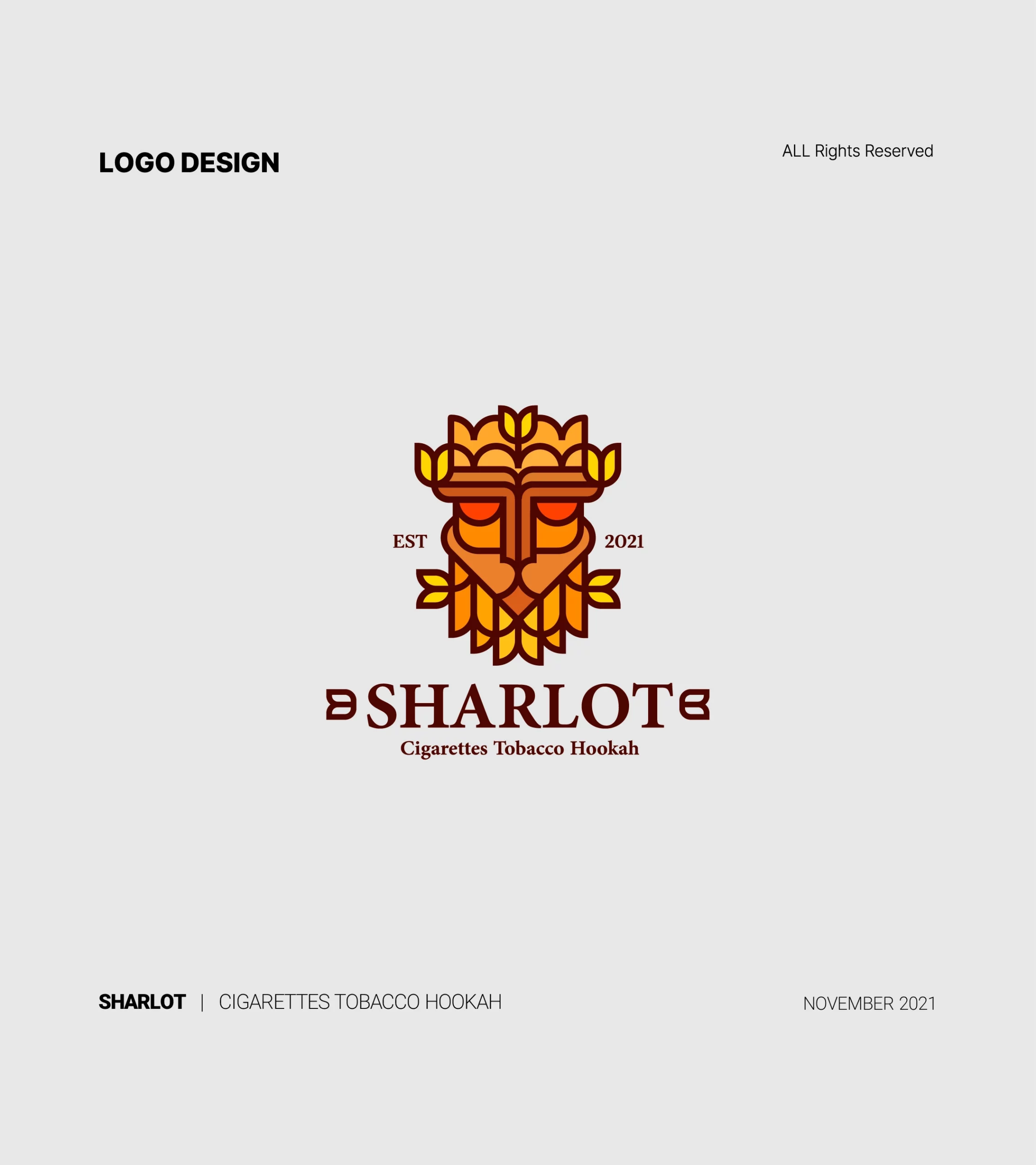
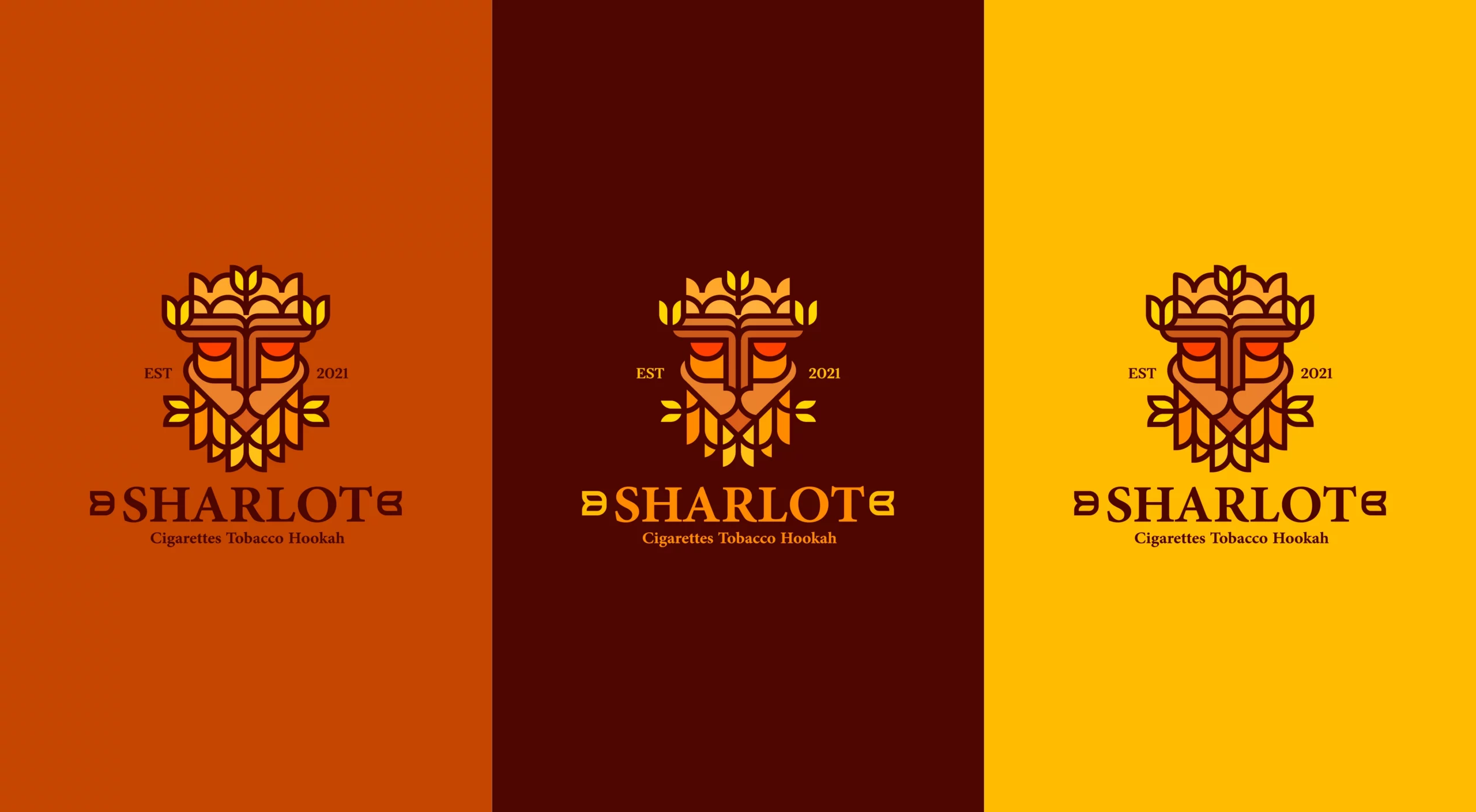
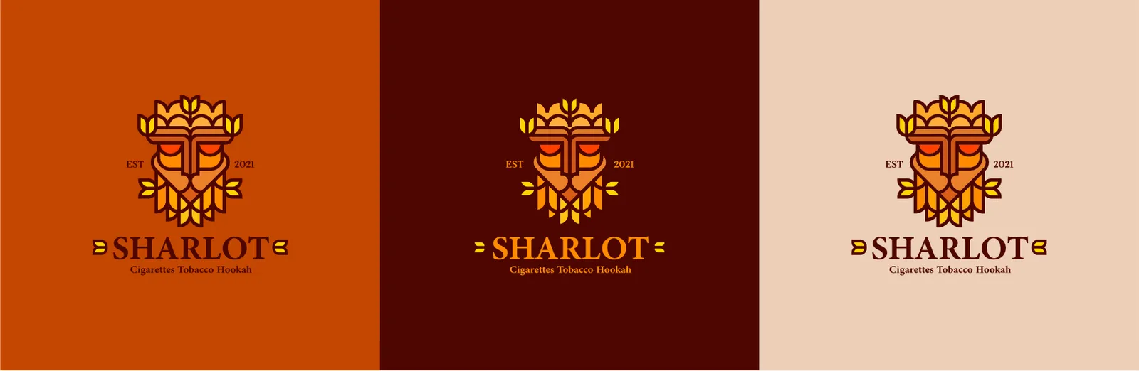
To ensure flawless adaptability across all physical and digital touchpoints, the Sharlot logo exists in carefully engineered variations: Primary Full-Color (Stacked): The preferred variation for all central branding, featuring the lion emblem centered above the Sharlot wordmark. Horizontal Lock-up: Designed for landscape applications, such as website headers and narrow packaging labels, where vertical space is restricted. Monochrome & Reversed: Single-color variations (Absolute Black and Pure White) designed for specialized printing techniques like embossing, debossing, and premium metallic foil stamping (gold/copper) on dark tobacco packaging.

02.7
Sur fond
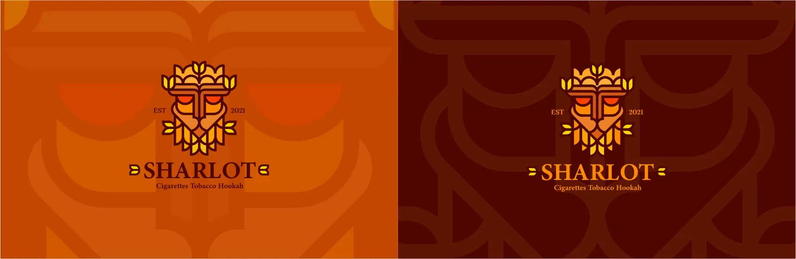
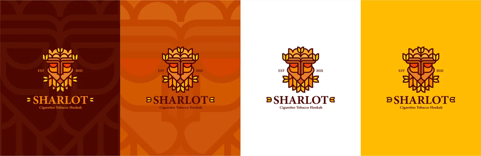
On Dark Brown: The full-color logo is placed on a solid dark brown background that features a subtle, scaled-up line-art pattern of the lion motif.
On Vibrant Orange: The full-color logo is applied to a solid orange background, which also incorporates the subtle, oversized lion line-art pattern.
On Pure White: The full-color logo is placed on a clean, solid white background without any underlying pattern to maximize contrast and clarity.
On Luminous Yellow: The full-color logo sits on a solid yellow background, keeping the background free of patterns to maintain visual balance.
To preserve the visual authority and structural integrity of the Sharlot emblem, its interaction with various backgrounds is strictly defined. The full-color primary lock-up is designed to remain highly legible across multiple brand-approved backgrounds:
02.8
Taille minimale
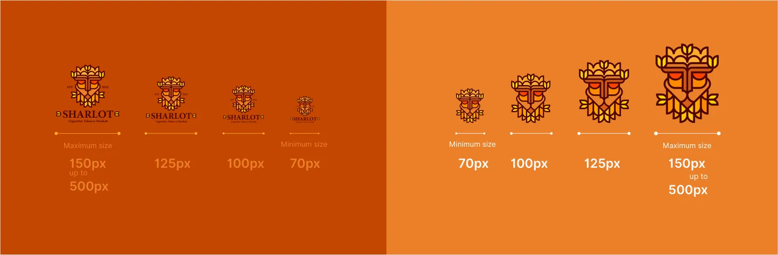
To guarantee structural integrity and readability across all international exports and digital platforms, strict minimum size rules apply:
Print Minimum: The logo must never be reproduced smaller than 15mm in width to ensure the fine smooth lines of the lion's facial features and the tobacco leaf veins do not fill in or blur.
Digital Minimum: The primary lock-up must remain at least 64px in width on digital screens to preserve the legibility of the Sharlot wordmark.
02.9
Icône d’application
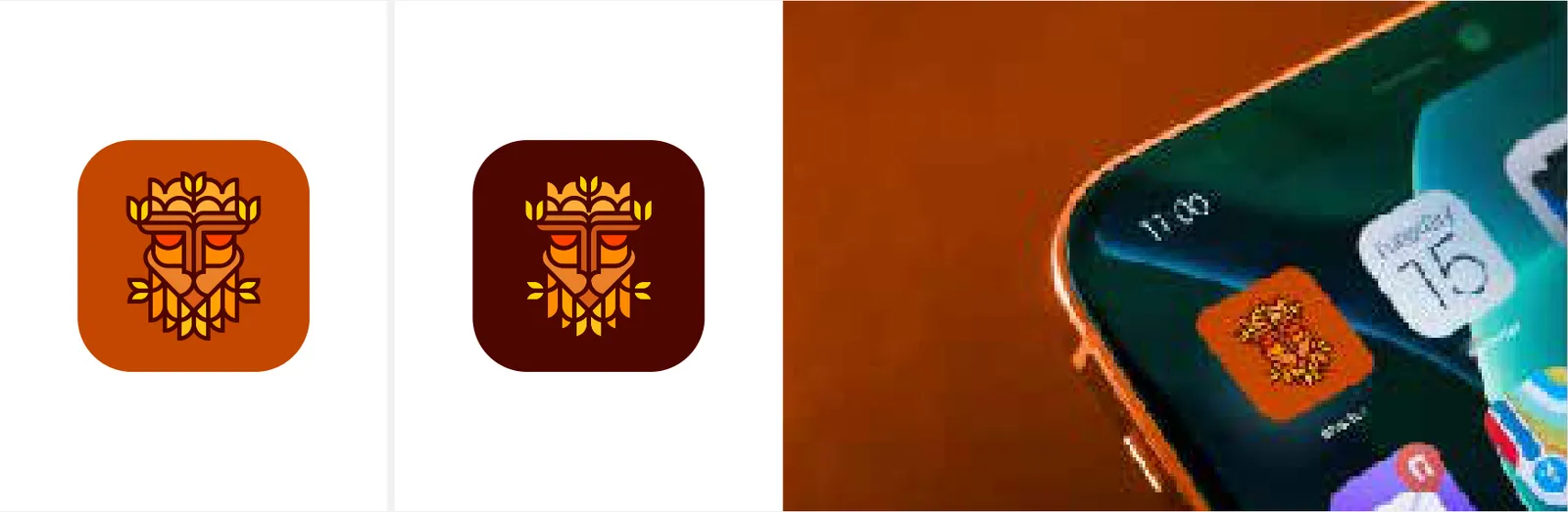
For digital micro-spaces, social media avatars, and application icons, the Sharlot wordmark is removed to maximize legibility. The App Icon relies solely on the Lion & Tobacco Leaf Monogram. This standalone emblem captures the entire essence of the brand and is optimized to remain crisp and recognizable even at dimensions as small as 16x16 pixels.
02.10
Placement
This dictates how the logo interacts with backgrounds to ensure maximum contrast and premium aesthetics:
On Light Backgrounds: Use the primary full-color logo (Yellow, Orange, Brown) to evoke warmth, passion, and earthiness.
On Dark Backgrounds (e.g., Deep Charcoal or Dark Brown): Use the Reversed (White) or specialized Metallic Foil (Gold/Bronze) versions to emphasize luxury and high-end exclusivity.
On Photography: The logo must only be placed on uncluttered, negative space areas of a photograph. If the background image is too busy, a subtle dark overlay must be applied to the image to ensure the logo remains the focal point.
Because the Sharlot logo is built on absolute geometric symmetry, its placement must respect this balance.
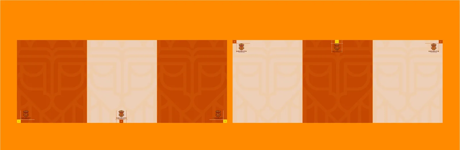
Primary Placement: Center alignment is highly preferred, especially on vertical hookah packaging and premium boxes, anchoring the design with authority.
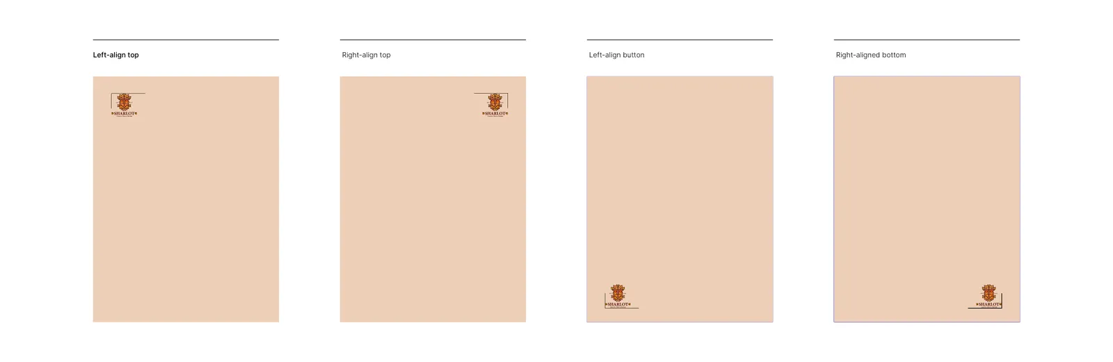
Secondary Placement: When center alignment is impossible (e.g., corporate letterheads or business cards), the logo should be anchored in the top-left or bottom-right corners, strictly adhering to the margins defined by the Exclusion Zone.
02.11
Usages interdits
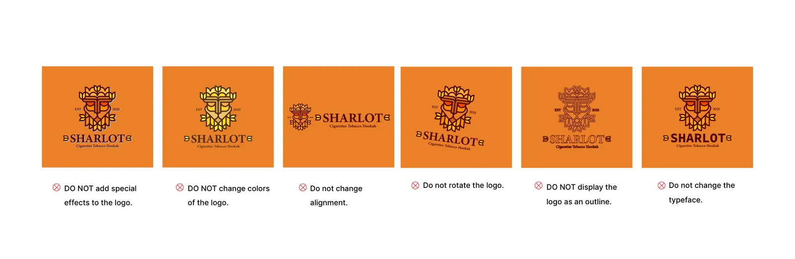
To maintain a zero-tolerance policy against visual entropy, the following actions are strictly forbidden (Logo Don'ts):
Do not alter the structural proportions, stretch, or compress the logo. Do not change the official color palette (Yellow, Orange, Brown) or assign unauthorized gradients. Do not rotate the logo at any angle; it must always remain perfectly horizontal. Do not apply drop shadows, 3D effects, or artificial glows. Do not rearrange the relationship or scaling between the lion emblem and the wordmark.
03
Couleur
03.1
Palette
Les couleurs de l'identité et leurs références.
- Name:
- Luminous Yellow
- RGB:
- 255/213/0
- HEX:
- #FFD500
- Name:
- Golden Orange
- RGB:
- 255/173/0
- HEX:
- #FFAD00
- Name:
- Vibrant Orange
- RGB:
- 255/146/0
- HEX:
- #FF9200
- Name:
- Bright Orange
- RGB:
- 255/92/0
- HEX:
- #FF5C00
- Name:
- Deep Orange
- RGB:
- 255/65/0
- HEX:
- #FF4100
- Name:
- Earthy Dark Brown
- RGB:
- 73/19/15
- HEX:
- #49130F
03.2
Histoire des couleurs
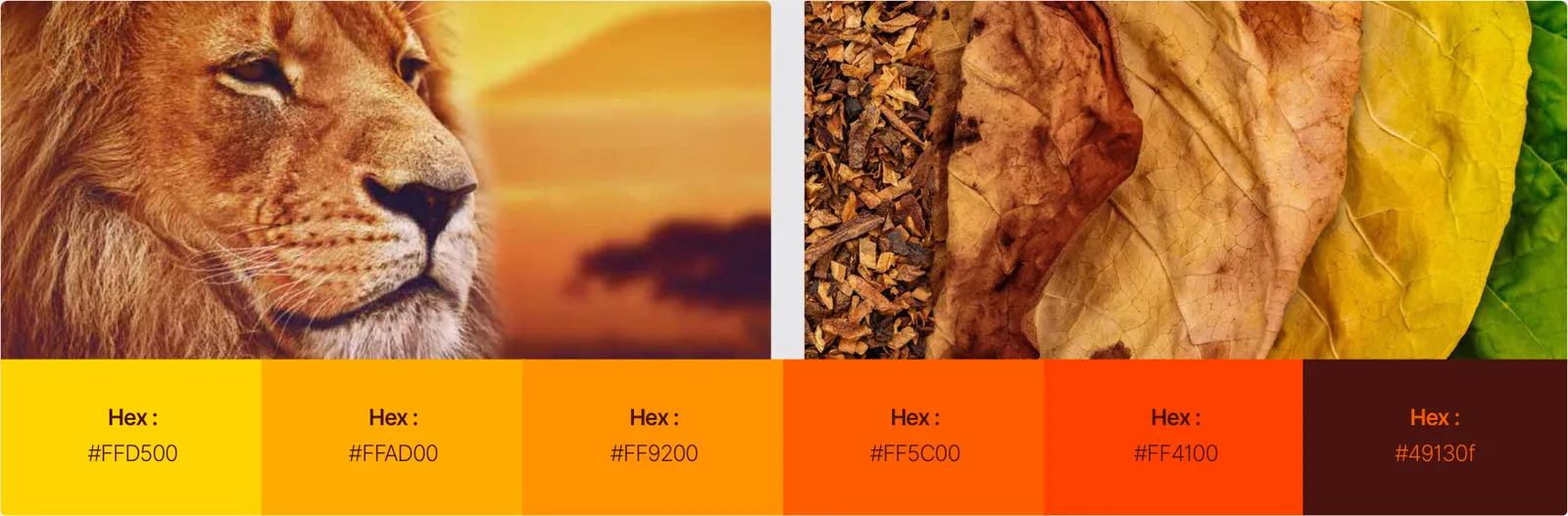
The Sharlot color story is a visual narrative directly inspired by the brand's core semiotic elements: the lion and the tobacco leaf. The palette forms an organic chromatic transition from the rich, earthy tones of dried tobacco leaves to the vibrant, energetic hues associated with the lion. This system transitions through six distinct steps, forming a geometric and radial harmony that balances deep, grounding tones with luminous, warm accents.
03.3
Système de couleurs
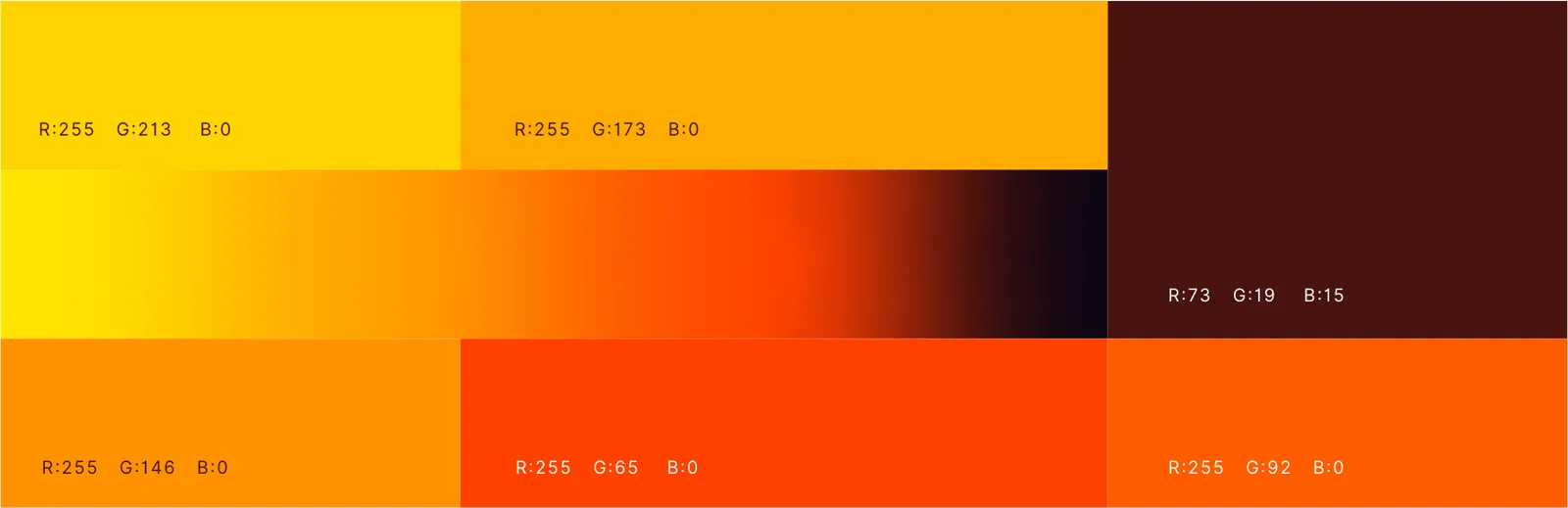
Luminous Yellow: HEX #FFD500 | RGB 255, 213, 0
Golden Orange: HEX #FFAD00 | RGB 255, 173, 0
Vibrant Orange: HEX #FF9200 | RGB 255, 146, 0
Bright Orange: HEX #FF5C00 | RGB 255, 92, 0
Deep Orange: HEX #FF4100 | RGB 255, 65, 0
Earthy Dark Brown: HEX #49130f | RGB 73, 19, 15
The official Sharlot color palette consists of a carefully calibrated spectrum ranging from bright yellow through fiery oranges to a deep, grounding brown. The absolute color values are defined as follows:

04
Typographie
04.1
Polices
Les caractères de l'identité et les graisses utilisées.
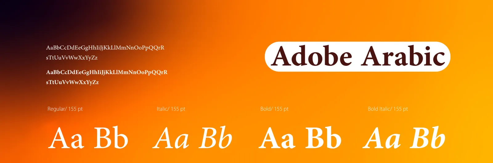
- Adobe Arabic
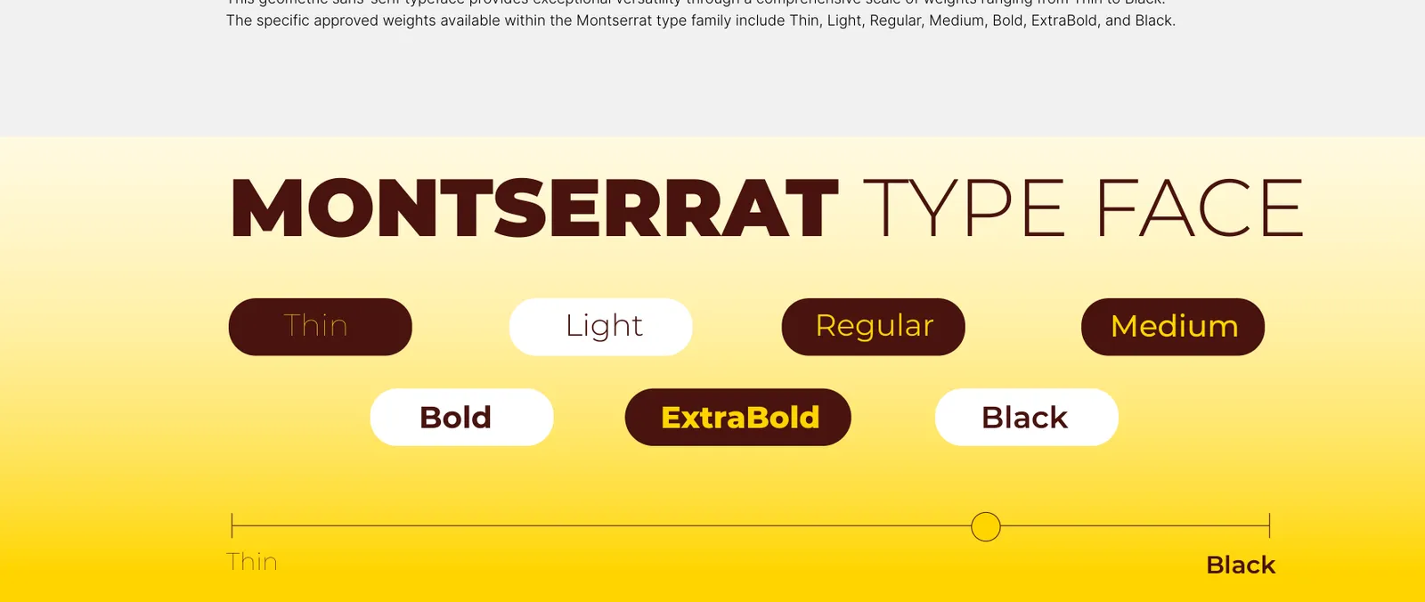
- MontserratThinLightRegularMediumBoldExtraBoldBlack
04.2
Spécimen typographique
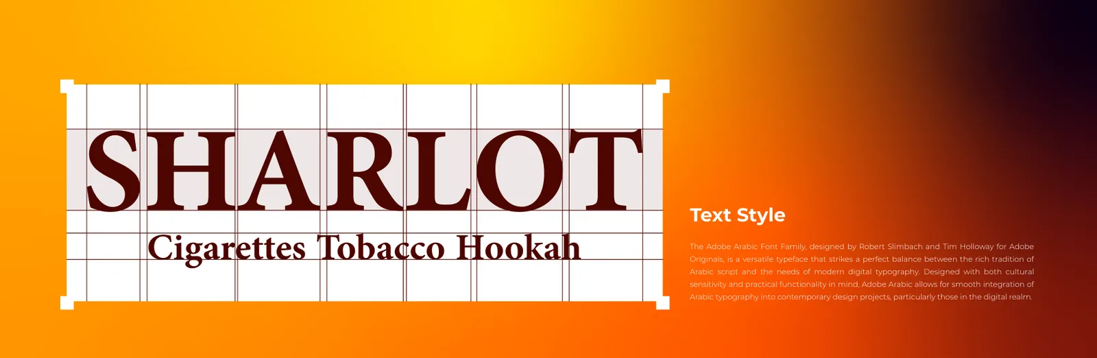
The primary typeface anchors the brand's identity, providing a sense of prestige, originality, and classic structural integrity.
The primary typeface designated for the Sharlot brand is Adobe Arabic. Designed by Robert Slimbach and Tim Holloway for Adobe Originals, this versatile typeface is utilized to strike a perfect balance between the rich tradition of Arabic script and the functional needs of modern digital typography. Within the Sharlot visual architecture, Adobe Arabic is applied directly to the core brand wordmark ("SHARLOT") and its supporting subtext ("Cigarettes Tobacco Hookah"). The font was designed with cultural sensitivity and practical functionality in mind, allowing for the smooth integration of Arabic typography into contemporary design projects, especially in the digital realm.
05
Éléments graphiques
05.1
Motif
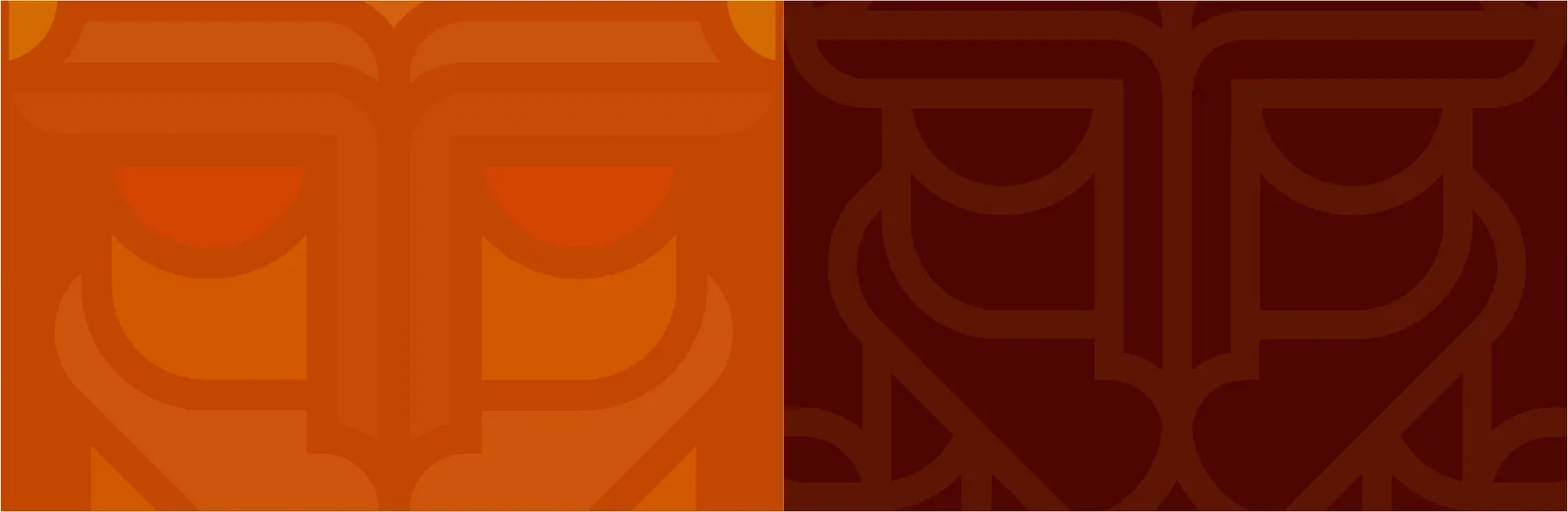
The brand pattern is a foundational element of a brand’s visual identity. It extends beyond the logo, creating a consistent and recognizable design language that permeates all brand touchpoints. A well-crafted brand pattern reinforces brand recognition, strengthens visual cohesion across applications, and communicates the brand’s personality, values, and positioning without relying solely on the logo.
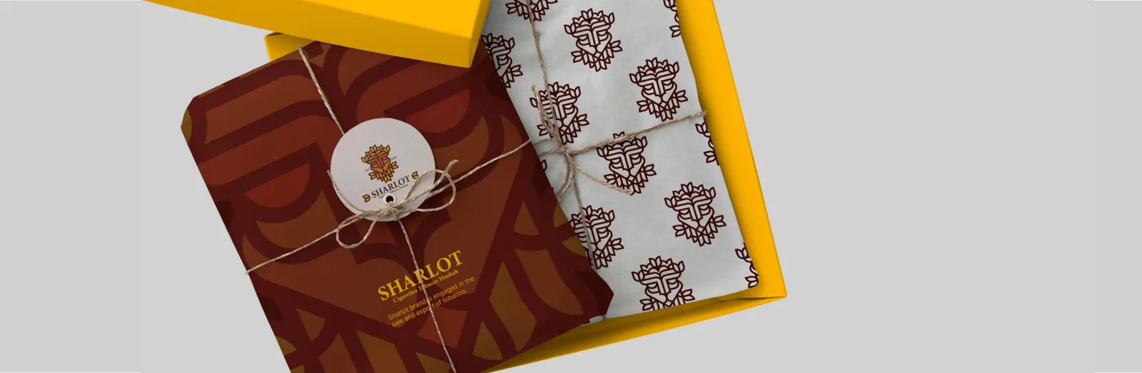
The Sharlot Brand Pattern is a seamless, repeating geometric motif extracted directly from the smooth, symmetrical lines of the lion’s mane and the veins of the tobacco leaf. Rendered in subtle tonal variations (e.g., a dark brown pattern on a slightly lighter brown background), this texture is utilized as a premium supporting asset. It is primarily applied to the interior lining of tobacco boxes, wrapping tissue paper, and the background of high-end corporate stationery to provide a rich, tactile brand experience.
06
Papeterie
06.1
Cartes de visite
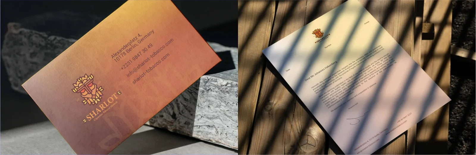
Structural Grid & Typography: The Sharlot business card design is governed by a precise structural grid. All textual and visual elements must align based on predefined mathematical proportions. The card utilizes a strict typographic hierarchy: the individual’s name is set in a heavier weight, while the job title and contact information are set in lighter weights to guide the reader’s eye. Production Rules: A minimum of 3mm bleed and a 5mm safe zone from the trim edge are mandatory. Altering the logo proportions or using unapproved color palettes is strictly prohibited. The letterhead relies on a constant scale factor for the header (logo and date positioning) and footer (contact details). The content area must maintain strict margins (minimum 25mm) to ensure ample negative space for visual breathing room. Watermark Guidelines: If a watermark is applied, the Sharlot logo must be centered within the content grid, rendered in monochrome with a maximum opacity of 5% to 10% to prevent compromising document legibility.
06.2
Papier à en-tête
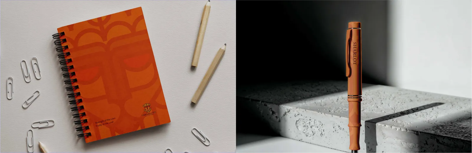
Functional Minimalism: The primary function of the notepad is utility. Any geometric grid lines utilized for writing must be exceedingly subtle (e.g., 0.25pt stroke weight in a light gray).
Brand Presence: The Sharlot logo acts as a minimal anchor in the header or footer. Intrusive graphic devices that consume the writable negative space are strictly forbidden. Micro-Scale Application: Constrained by physical printing areas (pad printing or laser engraving), only the simplified lockup or standalone emblem of the Sharlot logo may be used. Legibility Rules: The design relies on a single-color execution. Complex contact details or taglines must be omitted; a simple URL alongside the logo represents the maximum allowable information.
06.3
Enveloppes
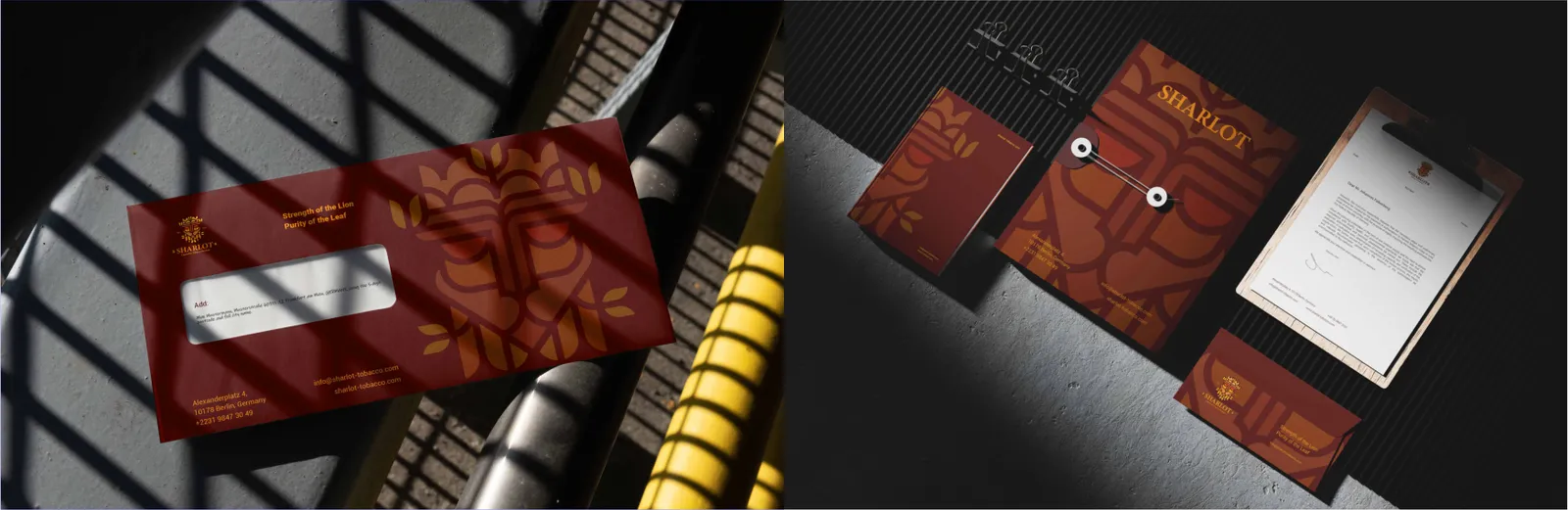
Spatial Alignment: Designed for standard formats (DL and C4), the envelope layout dictates that the Sharlot logo is positioned in the top-left (or top-right, depending on regional postal standards) adhering to its designated clear space. Clearance Zones: The top-right quadrant is strictly reserved as a blank space for postage stamps and postal seals. Sender information must follow a structured, grid-based layout either on the back flap or anchored to the bottom edge. Brand Architecture: The complete Sharlot stationery set functions as a cohesive visual ecosystem. Graphic devices, color palettes, and typographic grids must maintain structural harmony across all physical dimensions. Scale Logic: Stroke weights and spatial relationships scale proportionally using a mathematical constant, ensuring the brand identity feels identical whether viewed on a small card or a large folder.
Data Zone Architecture: Mailing labels require a strictly functional layout partitioned into specific geometric zones for the sender (Sharlot), recipient data, and barcode/postage clearance. Contrast Optimization: The background of the recipient data area must remain pure white to optimize legibility for automated thermal reading systems. Flexible Grid Implementation: Formatted for standard sticker sheets, these labels feature a dynamic grid structure that supports consistent line spacing and precise left or right text alignment depending on the language. Identity Isolation: The Sharlot logo is spatially isolated (typically on the left axis), allowing the contact typography to anchor securely beside it, ensuring maximum clarity at small scales.
06.4
Chemises
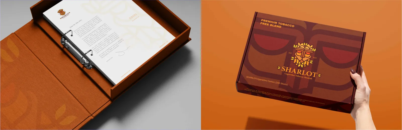
Die-cut Structure: The presentation folder requires precise structural dielines. The spine width is calculated based on standard document capacities (typically 5mm).
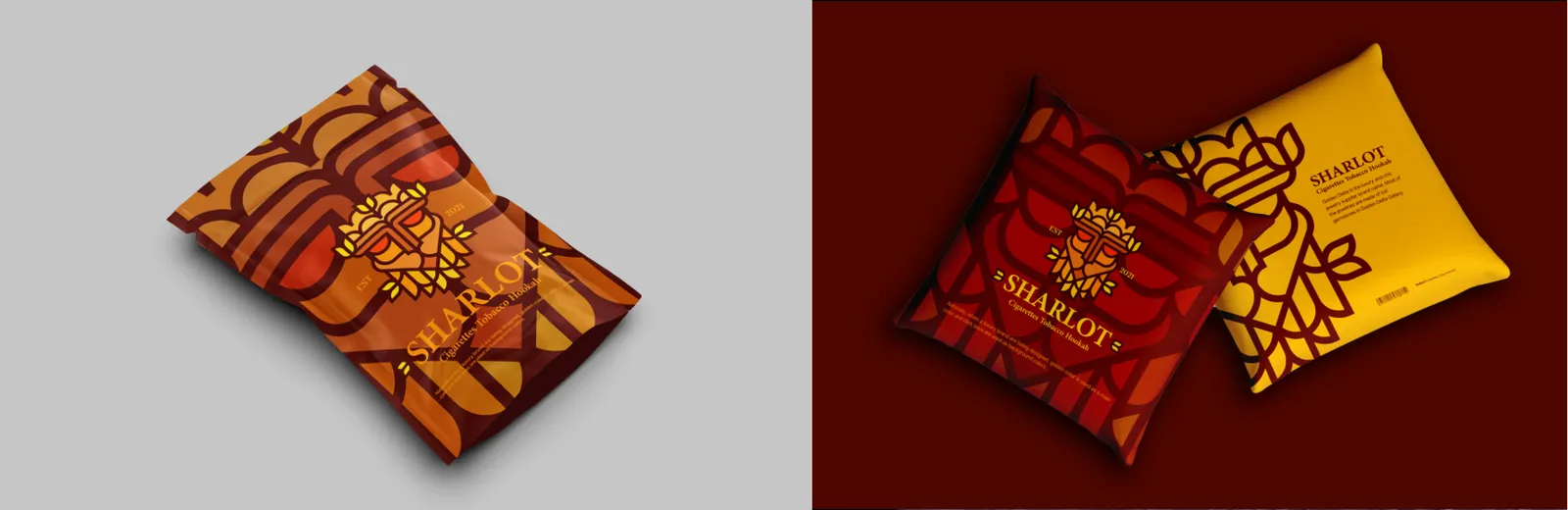
Cover Composition: The exterior cover embraces geometric minimalism, placing the Sharlot logo along the golden ratio or central grid line. The inner pockets feature functional typography and precision-cut slits for standard business cards. Structural Grid Networks: Sharlot’s packaging layout is governed by a strict spatial grid. Each panel (front, side, back) operates on a defined visual hierarchy. Information Hierarchy: The product name, key attributes, and barcodes are segregated into distinct geometric blocks to maximize clarity. Print finishing techniques (e.g., spot UV, foil stamping) must be mapped on separate spot-color layers with adequate safety margins.
07
Numérique
07.1
Site web
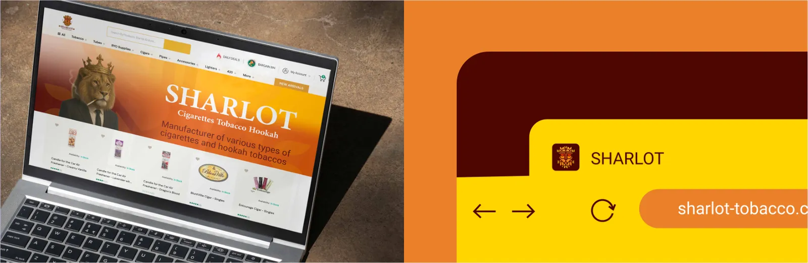
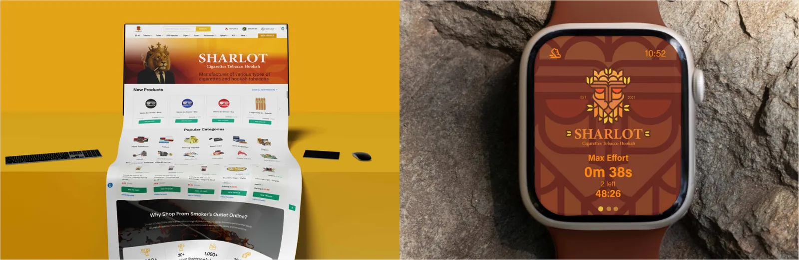
Above-the-Fold Geometry: The critical viewing area immediately visible to users is engineered for impact. The brand's value proposition is paired with heroic typography and precise structural layouts, minimizing visual friction. Conversion Architecture: Content flows rhythmically via F-pattern or Z-pattern reading logic. Strategic injection of negative space ensures user cognitive load remains low, effortlessly driving them toward conversion points. Spatial Boundaries: Product visuals command the primary layout space against pure, distraction-free backgrounds. The ratio of image to text is mathematically balanced to emphasize detail and quality. Information Isolation: Pricing, specifications, and 'Add to Cart' actions are isolated within dedicated geometric sections, maintaining the brand’s minimalist ethos while maximizing usability.
Responsive Grid System: The Sharlot website architecture is built upon a flexible 12-column structural grid. This mathematical logic governs all spatial relationships, ensuring seamless responsiveness across desktop, tablet, and mobile breakpoints. Typographic Hierarchy & UI: Web typography strictly follows the brand's scale factors. UI elements (buttons, navigation) rely on generous negative space to guide the user's eye, maintaining a clean, premium digital presence without visual clutter.
Pixel Perfection: The favicon represents the most distilled visual anchor of the brand. It exclusively utilizes the Sharlot monogram or simplified emblem, optimized for pixel grids at standard sizes (16x16px, 32x32px, and 512x512px for app clips). Micro-Legibility: High contrast and strict adherence to the brand’s core color palette are mandatory to ensure immediate recognition in crowded browser tabs.
07.2
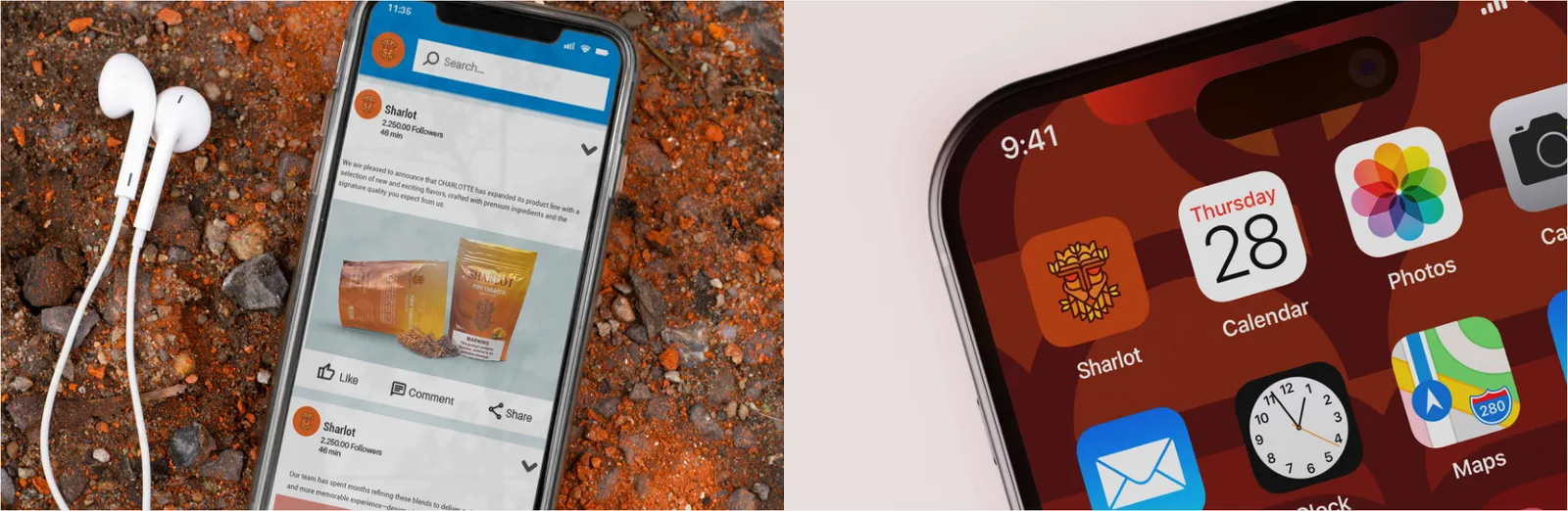
Application mobile
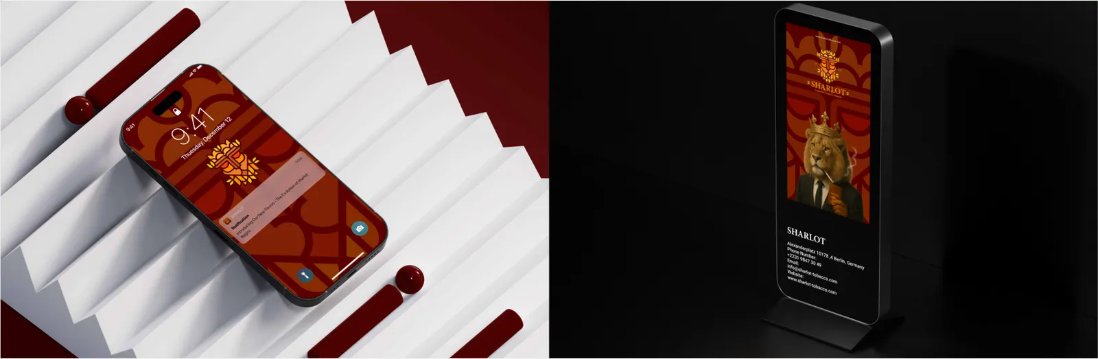
Micro-Copy Discipline: Notifications operate within severe character limits.
8pt Grid System: The Sharlot digital interface relies on a rigorous 8pt spatial grid. Padding, margins, and component dimensions scale mathematically in multiples of 8, enforcing ultimate structural harmony. Interaction Design: Minimum touch target sizes (e.g., 44x44px) are mandated. State changes (hover, active, disabled) for buttons and inputs use carefully calibrated shade variations from the official color palette.
The language must reflect Sharlot’s brand tone—direct, professional, and elegant. Visual Restraint: The use of emojis or supplementary icons is tightly controlled. Only brand-approved, flat vector icons are permitted to accompany the primary message.
07.3
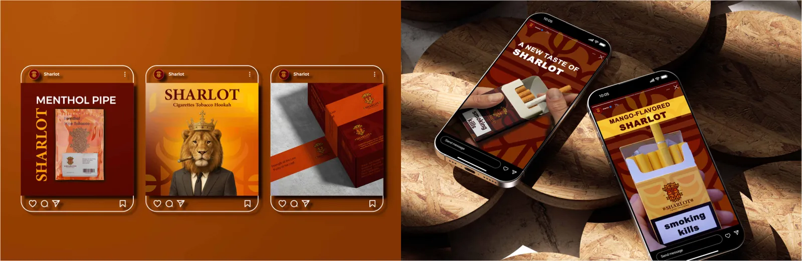
Réseaux sociaux
Grid-Based Storytelling: All square (1:1) and portrait (4:5) posts must be constructed over a standardized, invisible grid matrix. This ensures consistency when pairing lifestyle imagery with solid brand color blocks. Typographic Rules: Text overlays must maintain left or right alignment axes (depending on language). Overlaying text on high-detail image areas is strictly forbidden without a balancing solid background or gradient overlay. UI Clearance Rules: Story templates (9:16 ratio) must respect the native UI overlays of platforms like Instagram. The top 10% and bottom 20% are strict "no-text zones" to avoid overlap with app interfaces. Dynamic Framing: The layout uses geometric framing devices to direct attention. Key actions (like 'Swipe Up' or links) are strategically placed within the primary visual interaction zone.
Circular Safety Zones: Profile avatars must center the Sharlot logo perfectly within a circular mathematical grid, maintaining a minimum of 15% clear space from the cropping edge to prevent visual tension. Cover Art Composition: Banner and cover images must utilize a central focal structure, ensuring key brand messages and architectural geometry remain fully visible across both mobile and desktop safe zones. Structural Geometry (Squircle): App icons adhere to strict OS-level guidelines (e.g., Apple’s squircle mathematical proportion). The icon design must rely solely on geometric simplicity, stripping away all text or complex taglines. Visual Balance: The background employs the primary brand color, grounding the negative space, while the emblem sits centrally, scaled to perfection within the specific icon grid.
07.4
Campagnes et e-mails
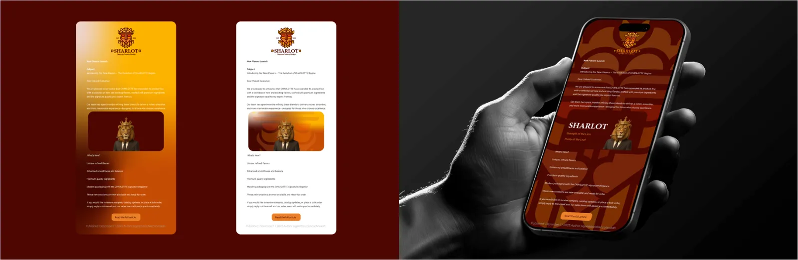
Modular Architecture: Email designs utilize a strict 600px width modular grid. This allows for stacking visual blocks perfectly on mobile devices. Clear Call-to-Action (CTA): Typographic hierarchy leads directly to primary CTA buttons, which are structurally distinguished by brand colors. System-safe fallback fonts are defined to guarantee layout integrity across all email clients.
Standardized IAB Structures: Banner ads follow standard International Advertising Bureau (IAB) dimensions. Regardless of size, all variants share a unified structural DNA: a clear hierarchy of Image, Headline, Logo, and CTA. Visual Comprehension: Given the short attention span of display networks, designs prioritize instant visual comprehension. Typography must be bold, and the brand identity unmistakably anchored.
08
Objets de marque
08.1
Textile
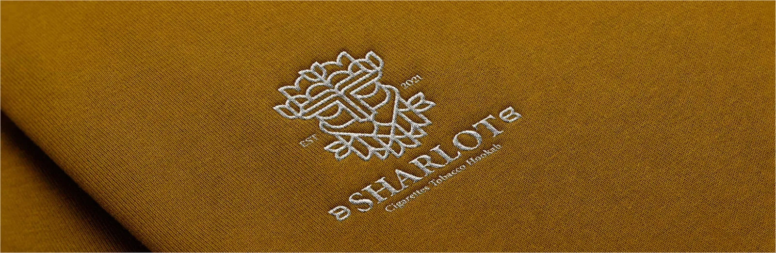
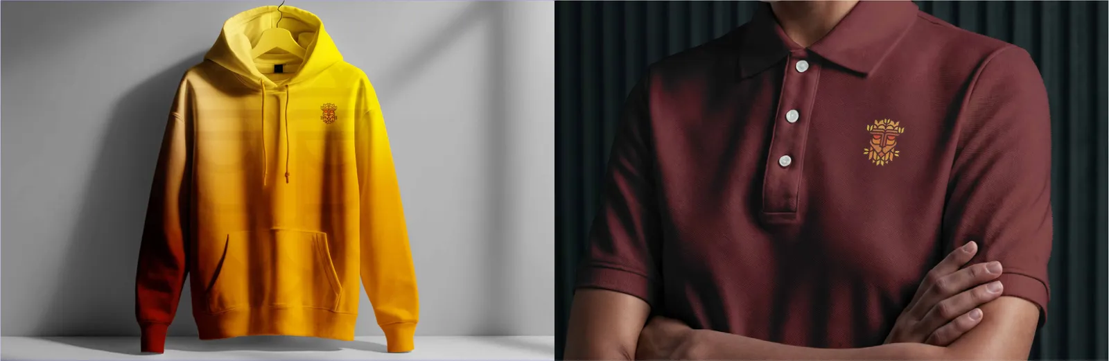
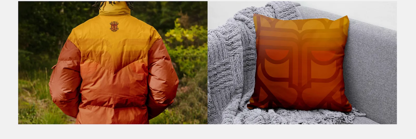
Spatial Placement: Branding on hoodies must respect the garment's structural seams. The primary logo placement is either mathematically centered on the chest or discretely anchored on the left side (over the heart). Material Tolerances: For embroidery, the logo must be optimized to prevent thread distortion. Large-scale back prints must utilize a strict grid to maintain alignment with the shoulder axes, ensuring the negative space balances the fabric's visual weight. Minimalist Grid Alignment: T-shirt graphics strictly avoid edge-to-edge clutter.
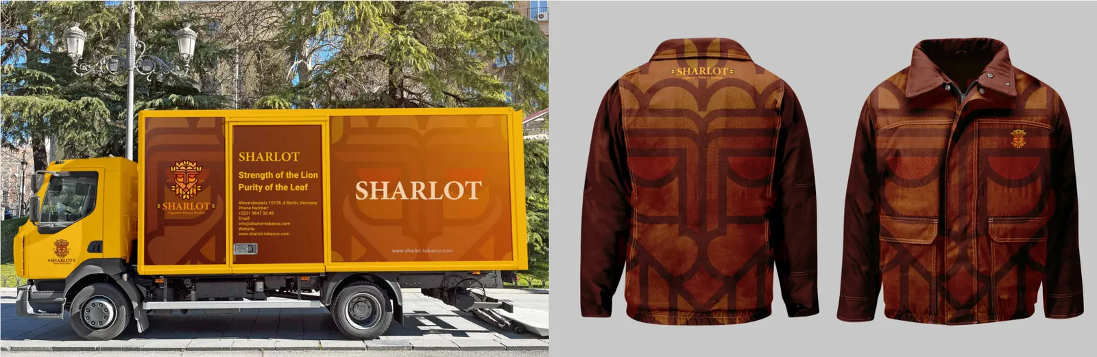
Subdued Elegance: Jackets serve as high-end corporate wear. Branding should rely on monochrome applications, tone-on-tone embroidery, or debossed leather patches. Structural Anchoring: Logos must align seamlessly with functional elements, such as parallel to zipper lines or geometrically centered above structural pockets, avoiding areas prone to folding or wrinkling.
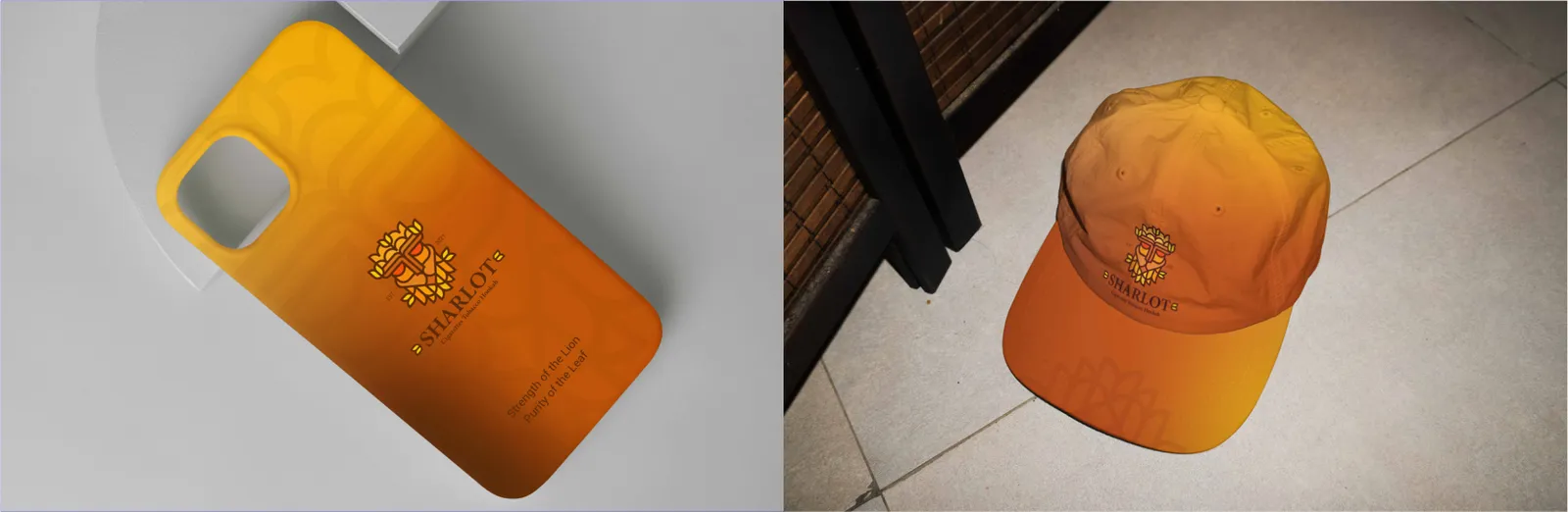
Curved Surface Dynamics: Due to the spherical geometry of the cap's front panel, complex typography must be eliminated.
Corporate Subtlety: Uniforms represent the living, breathing brand. Design dictates a preference for subtle elegance over loud branding. Role-Based Color Blocking: The apparel utilizes specific color blocks from the brand palette to distinguish staff roles.
The Sharlot logo is placed using a vertical center axis or a left-chest grid mapped consistently across all sizing variations (S to XXL). Contrast & Breathing Room: Solid brand colors are preferred for the fabric. The logo must maintain an expansive clear space, allowing the apparel to feel like a premium fashion item rather than a promotional billboard.
Emblem Isolation: Only the standalone Sharlot emblem or a heavily simplified logo lockup is permitted. It must be perfectly centered on the front panels, ensuring legibility despite the fabric's curvature and seam lines.
The Sharlot logo is restricted to a small, mathematically precise grid on the left chest or the sleeve hem, utilizing high-quality embroidery.
08.2
Sacs
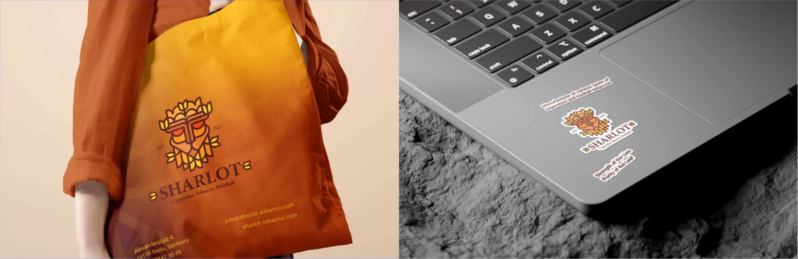
Visual Center of Gravity: The Sharlot logo must anchor the visual center of gravity on the main face of the bag. Negative Space Mastery: Cluttered backgrounds are prohibited. The design utilizes expansive brand colors and negative space to project premium structural elegance. Secondary information (website, tagline) is minimized and anchored to the side gussets or bottom margin. Proportional Constraints: Due to their varying applications, stickers must never reproduce the logo below the minimum allowable size defined in the brand guidelines. Die-cut Safety: A rigid safety margin of at least 3mm to 4mm from the cutting edge to any core element (logo or typography) is mandatory to accommodate mechanical cutting tolerances.
08.3
Objets promotionnels
Hardware Grid Interaction: The design architecture must account for the physical layout of camera modules and structural cutouts across different device models.
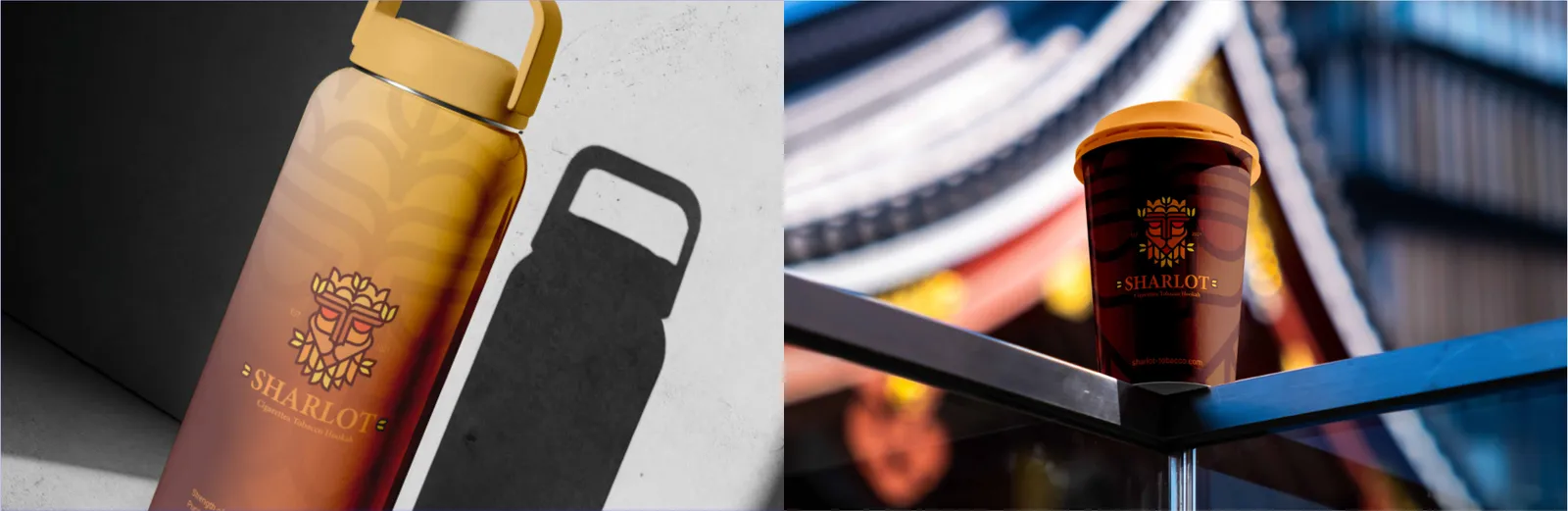
Cylindrical Distortion Correction: Artwork applied to ceramic or paper cups must compensate for the conical or cylindrical curvature. Safe Zones: Print areas are restricted to specific safe zones (either facing the user or facing outward when held by the handle). Full-wrap designs must utilize brand patterns rather than stretching the primary logo across the curve.
Vertical Precision: For tall, slim drinkware, vertical logo orientation is frequently optimal. The logo must be centered mathematically between the base and the neck curve. High-Contrast Finishing: For metallic bottles, precision laser engraving is the standard, exposing the raw metal beneath. For matte-coated bottles, high-contrast screen printing in official brand colors is mandatory.
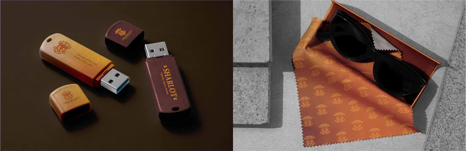
Extreme Micro-Scale: As the smallest physical touchpoint, the USB drive allows zero tolerance for complex details.
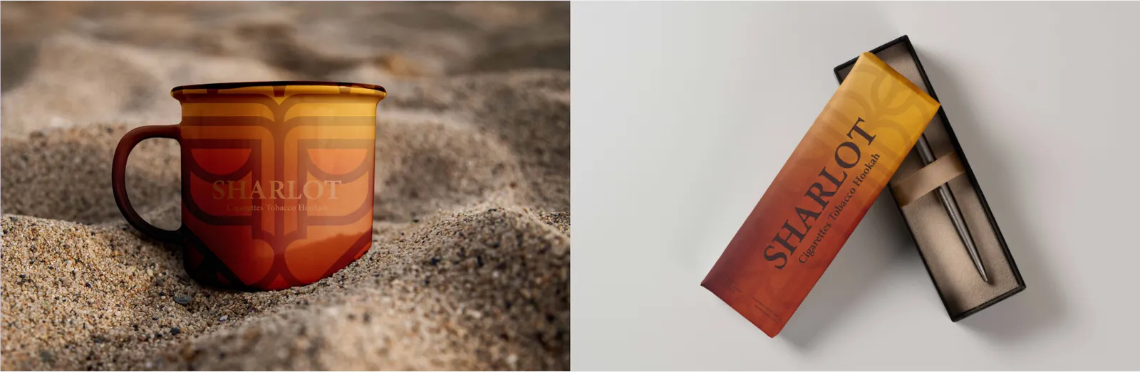
Retail Standardization: As a bulk merchandise item, the mug requires rigorous consistency across production batches. Wrap-Around Equilibrium: Designs must utilize a strict panoramic grid. If a primary logo is used, it should be placed perfectly opposite the handle or duplicated symmetrically on both sides for ambidextrous visibility. Corporate taglines must follow a baseline grid to prevent skewed printing on the cylindrical surface.
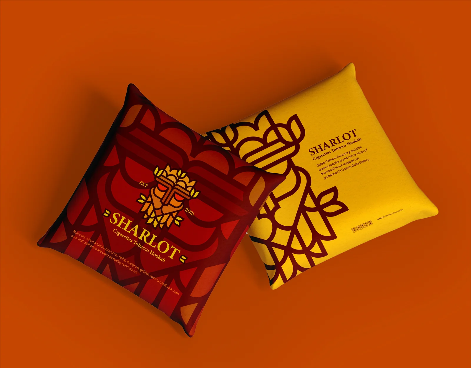
Environmental Integration: As an interior design element, the pillow must subtly integrate the Sharlot identity into physical spaces. Golden Ratio Composition: The logo or monogram must be anchored centrally or offset according to the golden ratio. Continuous geometric brand patterns (step-and-repeat) are highly recommended for a sophisticated lifestyle aesthetic.
Vertical Axis: The Sharlot logo must always align along the strict vertical center axis of the phone. Backgrounds should utilize pure brand colors or micro-patterns, ensuring the logo remains the uncontested focal point.
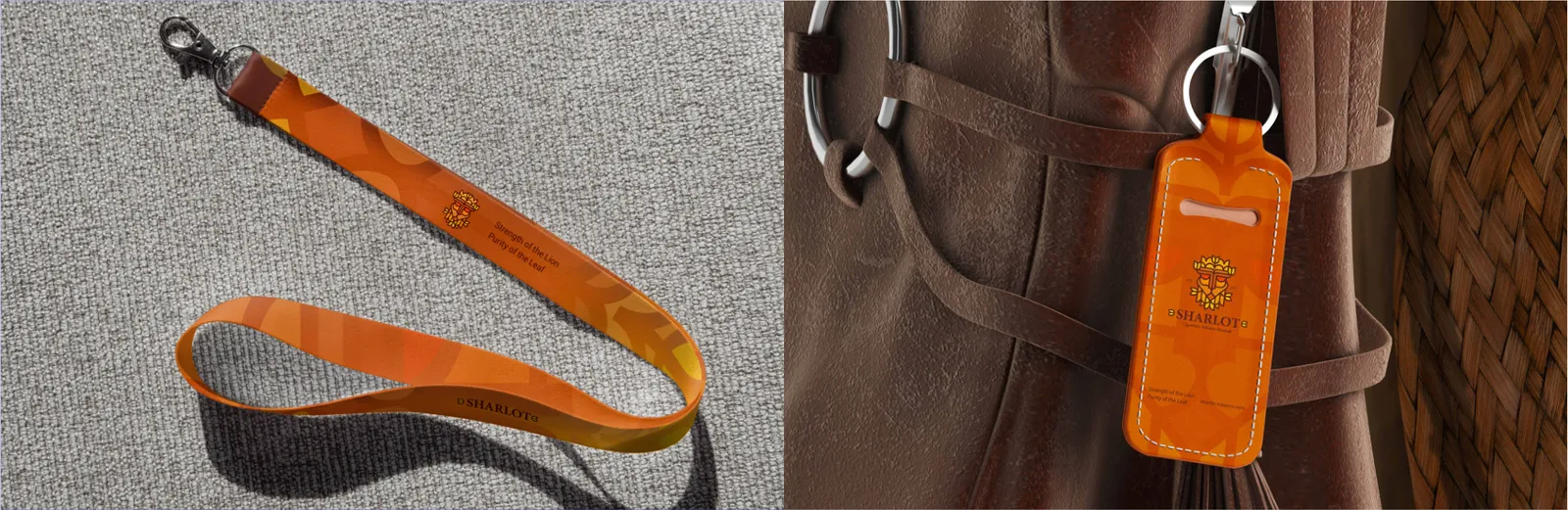
Die-Cut Geometry: Custom keychains must directly inherit the geometric outline of the Sharlot logo or emblem. Durability & Micro-Branding: Manufactured in premium metal or high-grade leather, the design strips away all secondary text. Deep laser engraving or physical die-casting are the standard production methods to ensure longevity.
Linear Rhythm: Lanyards demand a continuous linear grid. The Sharlot logo and brand name must follow a precise step-and-repeat rhythm. Visual Fatigue Prevention: The negative space between each logo repetition must be strictly calculated (typically 1.5x the width of the logo) to prevent visual clutter and maintain legibility at a distance.
Execution: Only the bare Sharlot monogram or icon is permitted. No URLs, taglines, or secondary names. The emblem must align with the physical form factor of the casing, ensuring structural harmony.
Functional Surface Design: For micro-fiber cleaning cloths, functionality supersedes aggressive branding. Pattern vs. Anchor: The design can utilize a highly subtle, low-opacity brand pattern covering the entire surface, or alternatively, maintain a pure solid color with a small, high-contrast logo anchored precisely in the bottom-right corner grid.
08.4
Emballage
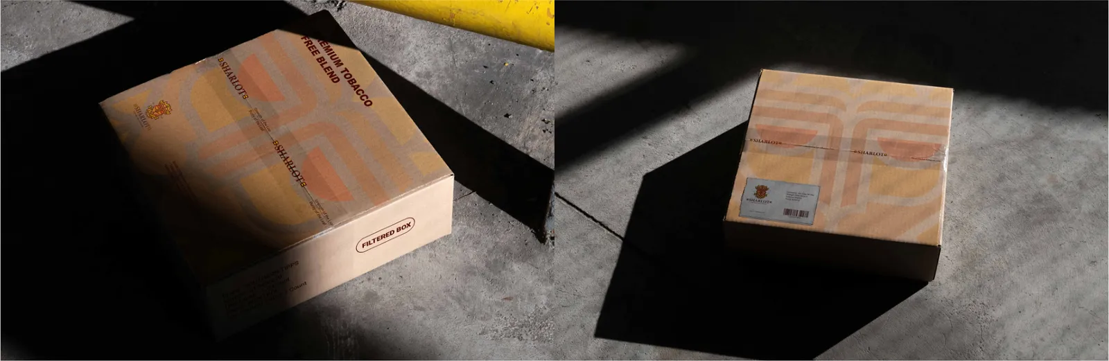
Premium Tactility: The pen box is a luxury touchpoint. The design must emphasize the tactile experience of the unboxing. Extreme Horizontal Grid: Given the elongated proportions, the structural grid is extremely narrow.
The Unboxing Narrative: Inserts serve as a direct, intimate touchpoint post-purchase. They must be standardized to a defined geometric ratio (e.g., A6 or square formats). Typographic Warmth: While the structural grid remains rigorous, the typography shifts to a more personal, welcoming tone.
The Sharlot logo must be mathematically centered on the primary lid. High-end finishing techniques, such as foil stamping or blind debossing on matte structural paper, are the standard requirements.
The Sharlot identity is presented on high-grade uncoated paper stock to reinforce the brand's tactile premium feel.
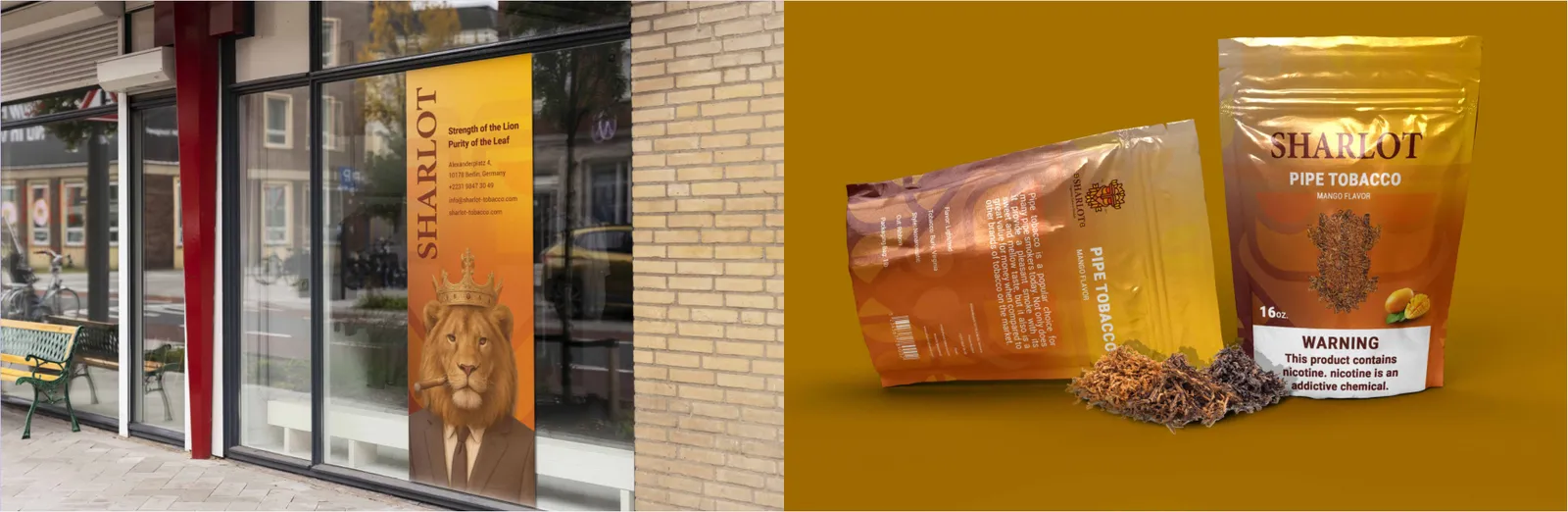
09
Applications
09.1
Signalétique
Architectural Integration: Storefront signage must harmonize with the physical architecture of the building.
Functional Wayfinding: Internal signboards prioritize absolute clarity over decorative aesthetics. Modular Alignment: Information is organized on a strict modular grid. Directional arrows, icons, and sans-serif typography are perfectly center-aligned or left-justified.
Day/Night Mechanics: The Sharlot logo must be optimized for both daylight visibility and nocturnal illumination (e.g., backlit channel letters). Scale factors are strictly constrained relative to the fascia's height to maintain elegant negative space. Overcrowding the signboard with secondary text is prohibited.
The Sharlot branding acts as a subtle endorsement (often placed uniformly in a corner) without competing with the directional data.
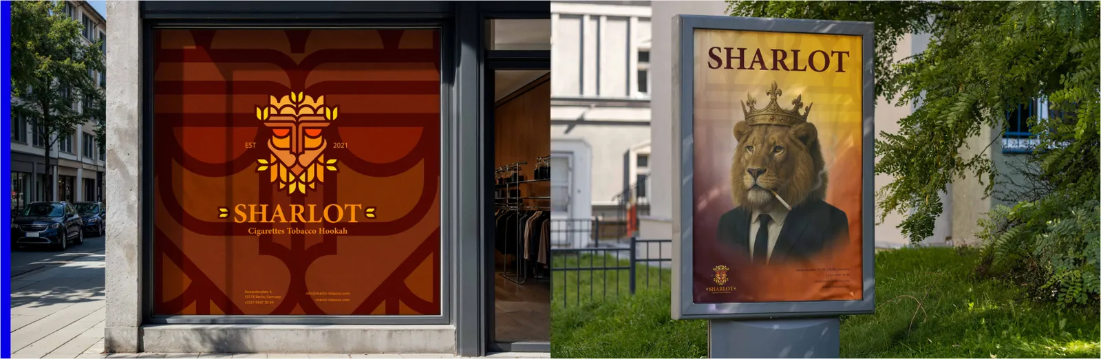
09.2
Événements et salons
Vertical Information Hierarchy: Roll-up banners are vertical monoliths. The most critical information must reside in the "Eye-Level Zone" (the top 1/3 of the banner). Bottom Isolation: The bottom 1/3 is often obscured by furniture or passing crowds; therefore, it is reserved solely for structural brand patterns, background colors, and secondary contact details.
The Sharlot logo sits at the very top axis to command the space.
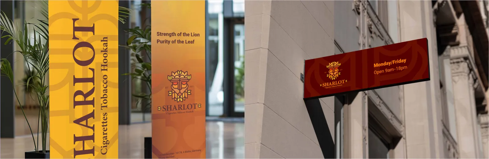
09.3
Publicité
The 3-Second Rule: Billboards target high-speed traffic. The layout is engineered for instant cognitive processing. Macro-Grid Architecture: The canvas is divided into a massive structural grid. The typography must be hyper-legible, limiting text to a maximum of 5 to 7 words.
Pedestrian Engagement Grid: Posters engage walking traffic at eye level. The layout relies on a dynamic Z-pattern or F-pattern reading gravity.
The Sharlot logo is typically anchored in an isolated corner zone (usually bottom-right or top-left) with a dramatically expanded clear space to assert dominance.
Actionable Typography: The top segment captures attention with bold typography, the middle retains focus with imagery, and the bottom structural grid serves as the action zone (housing the Sharlot logo, CTA, or QR codes aligned systematically).
09.4
Aménagement intérieur
Transparency Management: Window graphics must balance brand visibility with natural light penetration and store interior visibility. Negative Space Execution: Heavy, solid-color blocks are discouraged. Instead, the design employs die-cut white or single-color brand vinyl.
The Sharlot logo must be vector-sharp and optionally mirrored for inside-out application (protecting the decal from external weather or vandalism).
09.5
Drapeaux
Dynamic Readability: Flags operate in constant motion. The design must account for fabric draping and wind dynamics.
Hoist-Side Anchoring: The Sharlot logo must be anchored closely to the hoist (the side attached to the flagpole) rather than strictly centered. This ensures the brand identity remains visible even when the flag is not fully unfurled. Pure, high-contrast brand colors are mandatory to prevent visual fading against the sky.
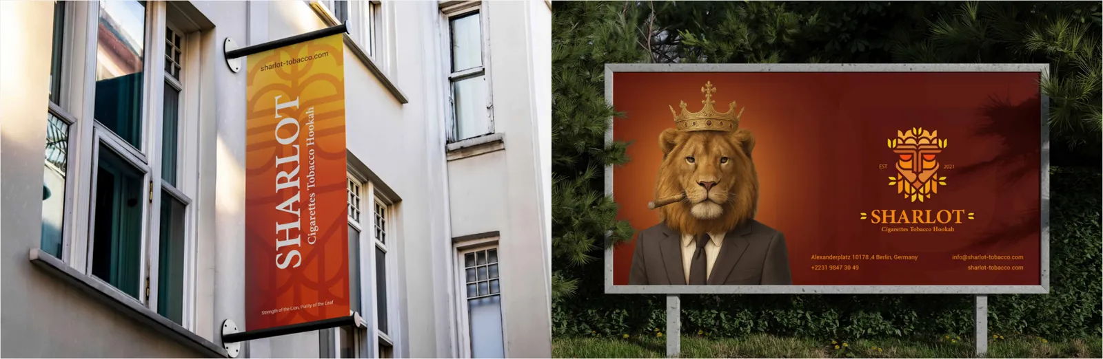
09.6
Véhicules
Mobile Architectural Grid: The truck acts as a massive moving canvas. The artwork must be mapped against the vehicle's structural grid (doors, panel gaps, wheel wells, and handles).
Focal Integrity: Core identity elements (the Sharlot logo and primary message) must be strategically positioned on flat, uninterrupted panels. Key contact numbers and web addresses are isolated on the cabin doors or the rear tail-lift for maximum read time in traffic.