01
Genel bakış
01.1
Bir bakışta
Balık formları, balık pulları ve bir hayvan burnu, tek ve sıcak bir işarette.
- Proje
- Görsel kimlik
- Alan
- Evcil hayvan hizmetleri
- Yıl
- 2022
- Hizmetler
- Görsel kimlik
01.2
Giriş
sadece evcil hayvanlara hizmet veren bir merkezi değil ayynı zamanda evcil hayvanlara özenle ve şefkatle bakılan bir yerdir. Evcil hayvanlarla ilgili hizmet alanında kapsamlı ve etkili bir marka oluşturmak için, yaratıcı, güzel ve kapsamlı bir logo tasarımı esastır.
To design a comprehensive brand in the field of pet services, a creative, beautiful, and comprehensive logo design is essential.
01.3
Hakkında
AKOPET, evcil hayvanlarla ilgili hizmetler sunan bir markadır. Bu marka, tedavi ve veterinerlik hizmetlerinin yanı sıra çeşitli hayvanlar için yiyecek sağlama, eğitimenlik, kuaförlük ve hayvanların internet üzerinden sahiplendirilmesi gibi çeşitli hizmetler de sunmaktadır. AKOPET markası, köpekler, kediler, süs balıkları ve çeşitli kuşlar gibi evcil hayvan sahipleri için kapsamlı bir kaynak olarak tanınmaktadır.
01.4
Tarihçe
AKOPET was founded with the vision of redefining the way people care for their pets. Recognizing the deep bond between humans and their animal companions, AKOPET sought to create a space where pets would not only be cared for but celebrated as integral members of the family. Starting with basic services like veterinary care and grooming, the brand quickly expanded to include a divearse range of offerings, such as premium pet food supply, professional training, and an innovative online pet adoption platform. The founders of AKOPET were driven by a desire to address the lack of comprehensive pet care services under one roof. They wanted to make it easier for pet owners to provide the best possible care without the stress of navigating multiple providers. Over the years, AKOPET has grown into a trusted community hub, catering to the needs of a variety of pets, from dogs and cats to ornamental fish and birds. With a focus on compassion, innovation, and quality, AKOPET has become more than a service provider; it’s a movement that promotes the happiness and well-being of pets and their owners. The brand’s vibrant red and yellow identity reflects its joyful and loving approach to pet care, ensuring a lasting emotional connection with its customers.

01.5
Misyon
At AKOPET, our mission is to enhance the lives of pets and their owners by providing a comprehensive range of high-quality, compassionate, and innovative services. We are committed to creating a loving environment where pets are cared for as family members, ensuring their health, happiness, and well-being. Through our diverse services and strong community presence, we strive to make pet ownership an enriching and worry-free experience.
01.6
Vizyon
AKOPET envisions a world where every pet is loved and cared for. We strive to be the most trusted pet care brand globally, setting high standards in quality and innovation. Our goal is to empower pet owners with knowledge and resources for their pets' happiness and health, while remaining committed to sustainability and community building.
01.7
Marka değerleri
Compassion: We treat every pet with love and care, ensuring they feel safe and valued.
Innovation: We adopt modern methods and technologies to meet the evolving needs of pets and their families.
Quality: Our services and products are of the highest standard, reinforcing trust in our brand.
Connection: We strengthen the bond between pets and their owners and build a sense of community among pet lovers.
Sustainability: We prioritize eco-friendly practices to protect the environment while caring for pets.
01.8
Ses tonu
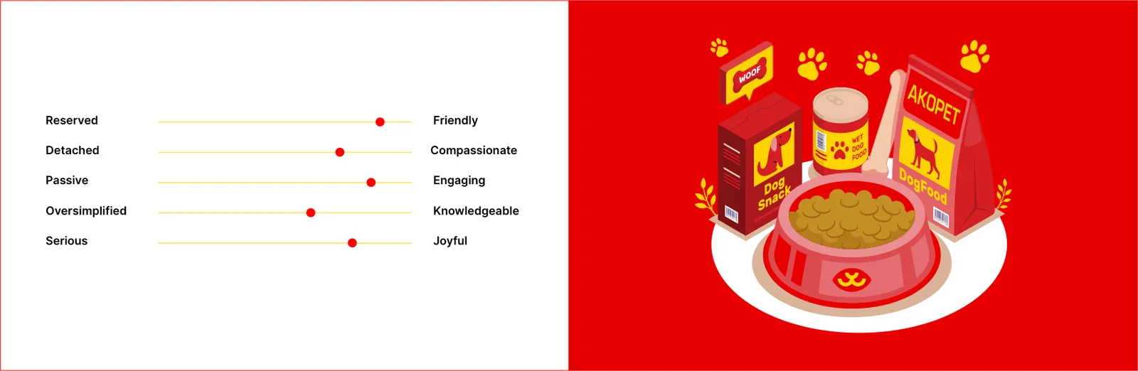
Friendly: Building a warm and welcoming connection with the audience to make them feel valued and cared for.
Compassionate: Demonstrating genuine empathy and care for pets and their owners in every interaction.
Engaging: Encouraging active participation and fostering excitement about pet care through dynamic and relatable communication.
Knowledgeable: Providing expert insights and practical advice in a way that is easy to understand and relatable.
Joyful: Celebrating the love, happiness, and energy pets bring into people’s lives through lively and cheerful communication.
02
Logo
02.1
Tasarım
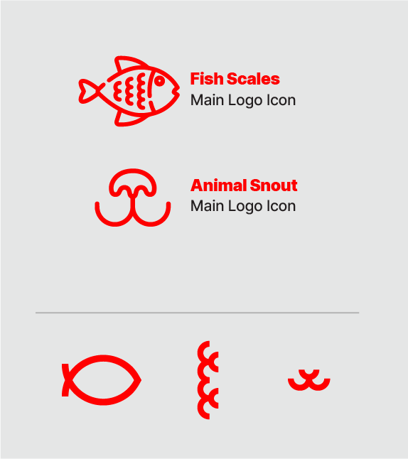
Bu nedenle, AKOPET'in logosu ve görsel kimliği balık vücut şekli ve balık pulları gibi basit kavramlara dayanarak tasarlandı. Bu seçimin yanında, köpek ve kedi gibi hayvanların burnuyla benzerlikler yaratarak AKOPET markasının faaliyet alanının genişliğine işaret eder. Bu markanın logo ve görsel kimliği tasarımında, kırmızı ve sarı renkler kullanılmıştır. Bu renkler, sevgi ve duygu sembolleridir, heyecan, neşe ve cazibeye sahiptirler. AKOPET markasının renkleri, duygusal bir bağ kurma amacıyla akıllıca seçilmiştir, böylece logoyu gören herkes daha güçlü bir bağ kurabilir.
Genel olarak, AKOPET'e tasarlanan logo sadece hizmetlerinin çeşitliliğini sembolize etmekle kalmaz, aynı zamanda izleyicilerle yakın ve samimi ilişki kurur ve güven duygusu oluşturmak için te etkili bir araç sağlar.
02.2
Konsept
We all know logo is one of the most important things in a business/company. So, this logo should be created in a very professional way that speaks to the business company.
The AKOPET logo is a sophisticated reflection of the brand’s core values and its comprehensive suite of pet care services. Its design thoughtfully integrates:
Symbolic yet Simple Forms: By incorporating fish silhouettes and scale patterns, the logo pays homage to aquatic pets, while abstract shapes evocative of dog and cat snouts emphasize AKOPET’s commitment to caring for a diverse range of animals.
Vibrant, Emotionally Resonant Colors: The deliberate choice of a red and yellow palette communicates warmth, love, energy, and joy, fostering an immediate emotional connection with pet owners and audiences alike.
Memorable, Versatile, and Recognizable: Designed with adaptability in mind, the logo maintains clarity and impact across various applications, from digital platforms to physical branding, while ensuring instant recognition and reflecting the breadth of AKOPET’s services.
This logo not only visually represents the brand but also conveys AKOPET’s dedication, compassion, and professionalism in the pet care industry.



02.3
Koruma alanı
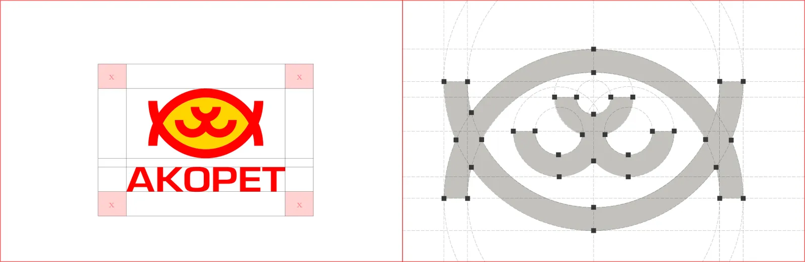
The exclusion zone defines a protective margin around the logo, ensuring that no other graphic elements, text, or visual distractions encroach upon it. This maintains the logo’s clarity, impact, and legibility across all media and applications.
02.4
Varyasyonlar
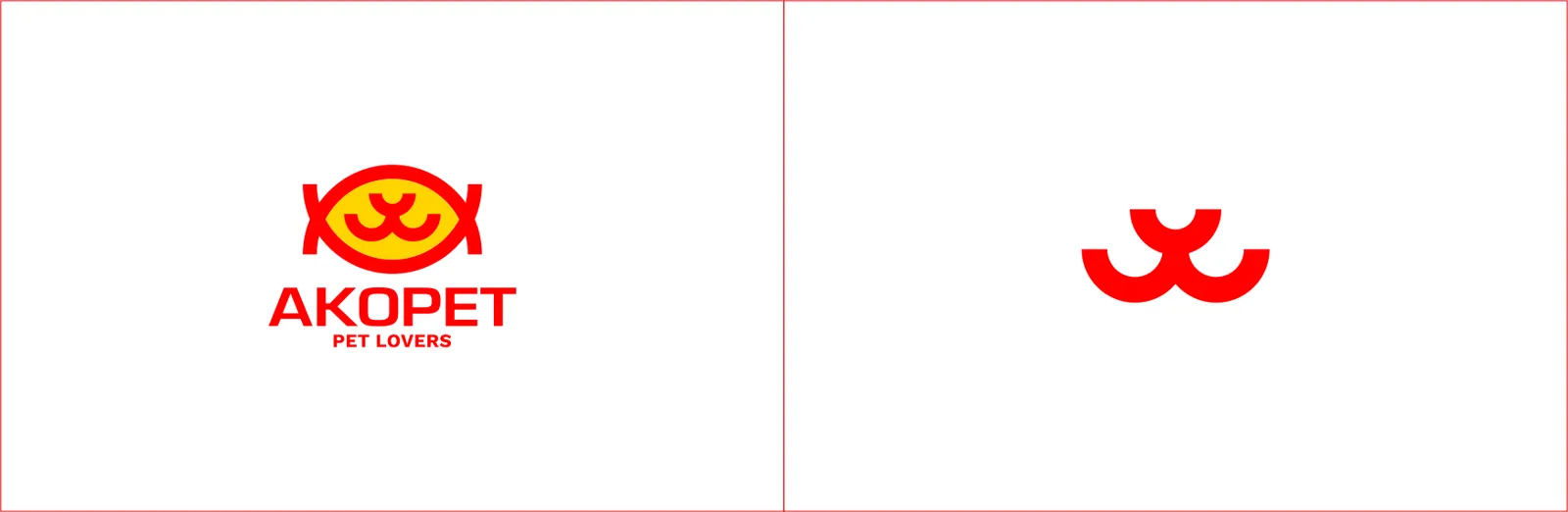
Creating multiple logo variations provides strategic flexibility, allowing a brand to maintain a consistent and cohesive visual identity across diverse platforms and applications. These variations—whether in size, color scheme, orientation, or simplified forms—ensure the logo remains recognizable and effective in every context, from digital interfaces to print materials, merchandise, and large-scale displays. By thoughtfully designing these adaptations, a brand can preserve its integrity while maximizing versatility and impact.
02.5
Zemin üzerinde
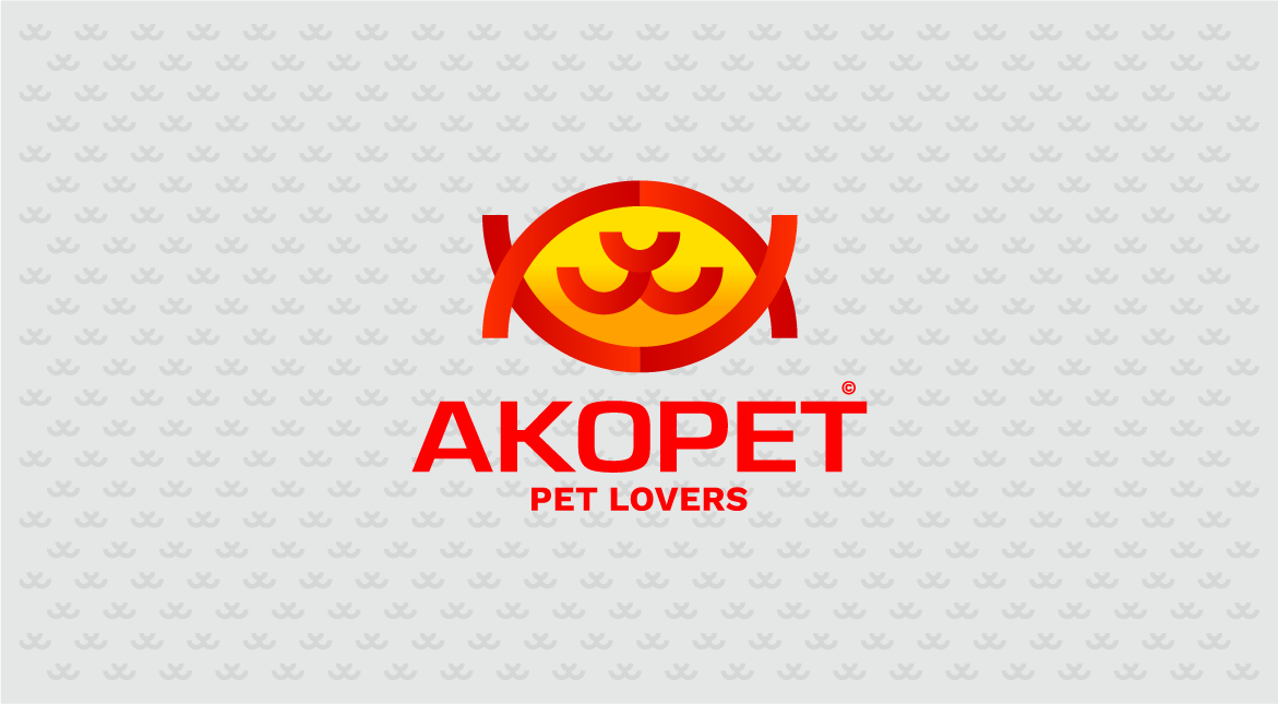
Our logo is crafted to function seamlessly across all types of backgrounds, reflecting a flexible yet cohesive brand identity. Each element, from color palette to form and spacing, has been thoughtfully considered to preserve clarity, contrast, and legibility in diverse environments. Whether applied on digital platforms, print materials, or environmental graphics, the logo maintains its distinct presence and reinforces brand recognition. By ensuring visual consistency in every context, it embodies professionalism, versatility, and the core values of the brand.
02.6
Minimum boyut
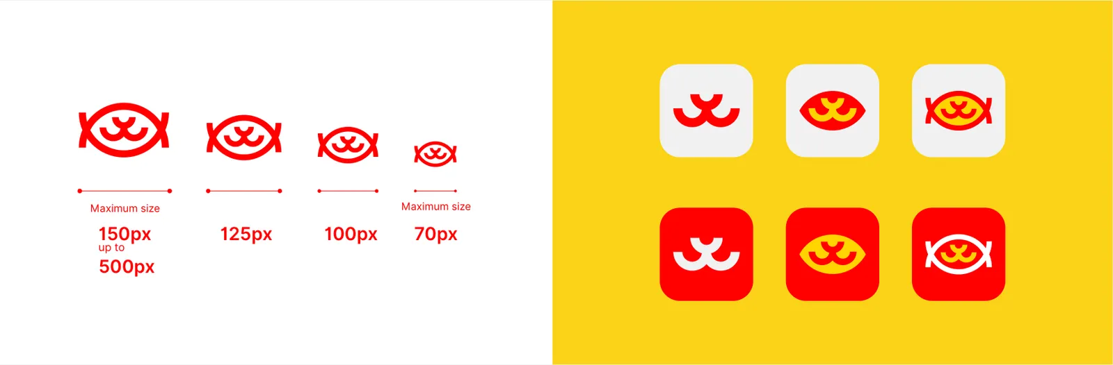
Establishing precise logo dimensions is essential for maintaining visual consistency and professionalism across all platforms and applications. Properly defined sizes ensure that the logo retains its clarity, legibility, and visual impact, whether it appears on digital screens, print materials, signage, or promotional merchandise. Consistent sizing strengthens brand recognition and conveys a cohesive, polished identity to the audience.
02.7
Uygulama simgesi
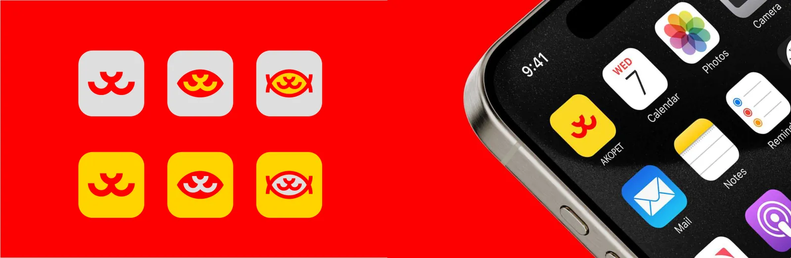
A carefully distilled version of the main logo, the app icon is designed to maximize brand recognition across digital platforms.
02.8
Yerleşim
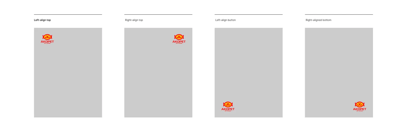
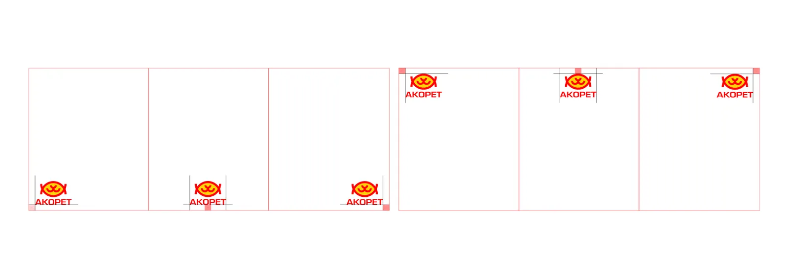
The logo is a core element of the brand’s visual identity and must be used thoughtfully to maintain its integrity and recognizability. It should not be placed arbitrarily or randomly across a page, as improper placement can distort its structure and weaken its visual impact. Always ensure that the logo has sufficient clear space around it, is aligned appropriately, and is displayed in a manner that upholds the brand’s professionalism and consistency.
To ensure the logo maintains its integrity and communicates the brand effectively, always provide sufficient clear space around it. Avoid crowding the logo with other visual elements and maintain a harmonious relationship with the overall layout. Proper placement ensures the logo remains legible, prominent, and visually balanced in all applications. Always consider context, scale, and surrounding elements to reinforce the brand’s identity consistently.
02.9
Hatalı kullanım
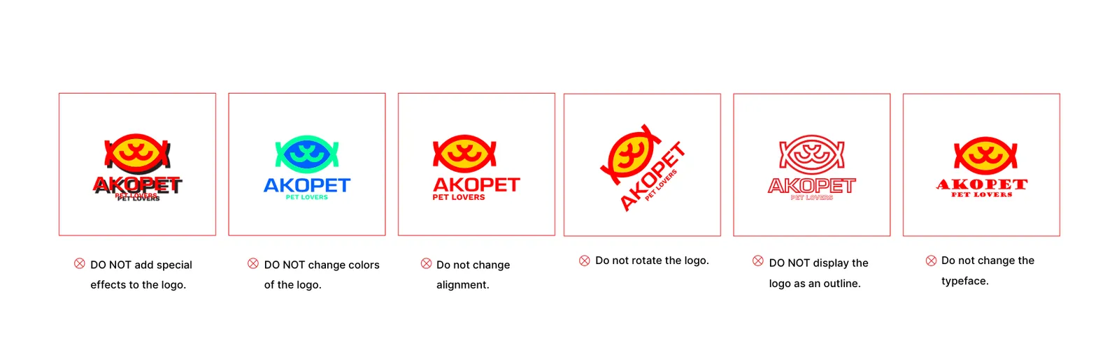
To preserve the integrity, recognition, and consistency of the brand, any unauthorized modifications to the logo are strictly prohibited. This includes, but is not limited to, altering its proportions, applying unapproved colors, adding effects, rotating, skewing, or any other distortion that compromises its visual identity. The logo must always be presented in its original form, ensuring a cohesive and professional representation across all media and applications.
03
Renk
03.1
Palet
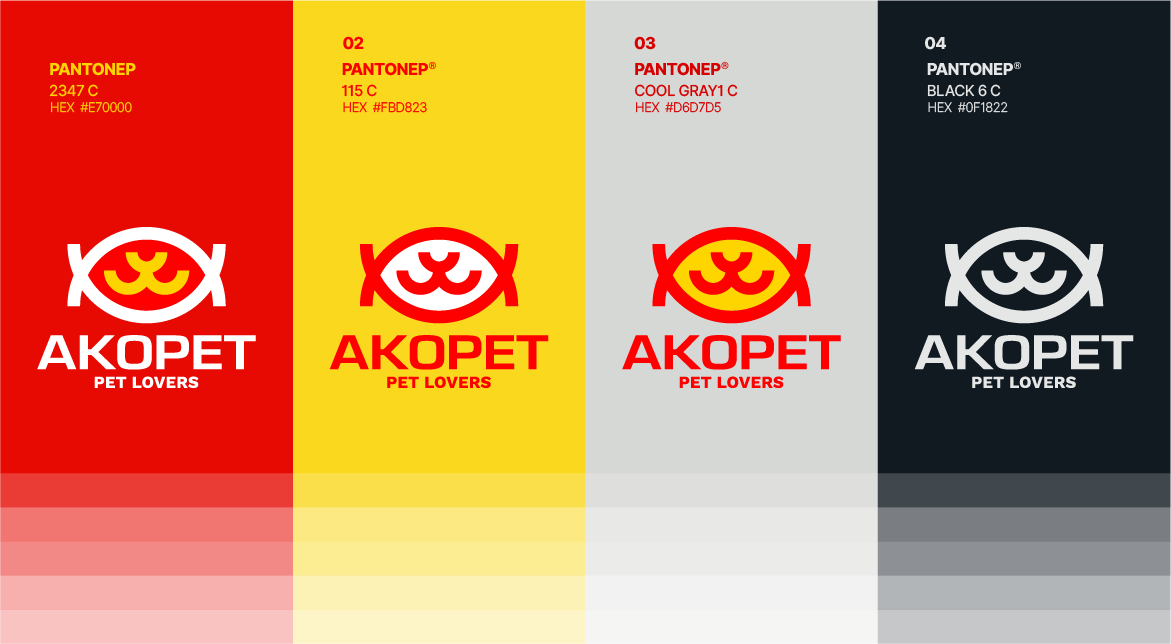
Kimliğin renkleri ve referansları.
- RGB:
- 231/0/0
- HEX:
- #E70000
- PMS:
- 2347 C
- RGB:
- 251/216/35
- HEX:
- #FBD823
- PMS:
- 115 C
- RGB:
- 214/215/213
- HEX:
- #D6D7D5
- PMS:
- Cool Gray 1 C
- RGB:
- 15/24/34
- HEX:
- #0F1822
- PMS:
- Black 6 C
03.2
Renk hikâyesi
In the creation of AKOPET’s visual identity, the colors red and yellow are carefully selected not only for aesthetic appeal but also to communicate the brand’s core values and emotional essence. Each color is applied consistently across all touchpoints of the brand to strengthen recognition, evoke emotion, and establish a meaningful connection with the audience.

03.3
Renk sistemi
Red: This hue represents love, passion, and care, symbolizing the profound emotional bond between pets and their owners.
Red conveys warmth, trust, and AKOPET’s unwavering commitment to nurturing and protecting all animals. It is used as a key accent to draw attention to important elements and create an emotional anchor in visual communications.
Yellow: Yellow embodies energy, joy, and optimism, reflecting the happiness and vitality pets bring into the lives of their families. This color is applied to inject vibrancy and positivity, enhancing user engagement while maintaining a friendly and approachable brand tone.
04
Tipografi
04.1
Yazı karakterleri
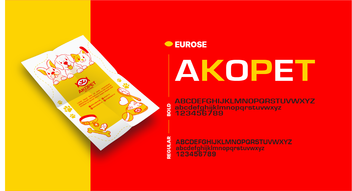
Kimliğin yazı karakterleri ve kullandığı ağırlıklar.
- EuroseBoldRegular
04.2
Yazı örneği
Typography is a cornerstone of brand identity, shaping how the brand communicates visually. The chosen primary typeface ensures legibility, conveys professionalism, and harmonizes with the brand’s modern, approachable, and sophisticated personality. Thoughtful consideration of font weights and sizes guarantees visual hierarchy and consistency across all brand touchpoints.
Typography serves as a cornerstone of the brand’s visual identity, conveying both character and credibility. The primary typeface, Eurose - Regular, has been selected to ensure legibility, sophistication, and consistency, reflecting the brand’s modern, approachable, and professional personality. Its balanced forms and clean lines enhance readability across all touchpoints while reinforcing the overall brand image.
Typography is a fundamental element in shaping a brand’s visual identity. While the primary font establishes a clear, professional, and approachable tone, secondary fonts complement it by adding versatility, hierarchy, and subtle nuance to communications. The chosen secondary typefaces work harmoniously with the primary font, Work Sans, ensuring consistency across all brand touchpoints while enhancing readability and aesthetic balance.
05
Grafik öğeler
05.1
Desen
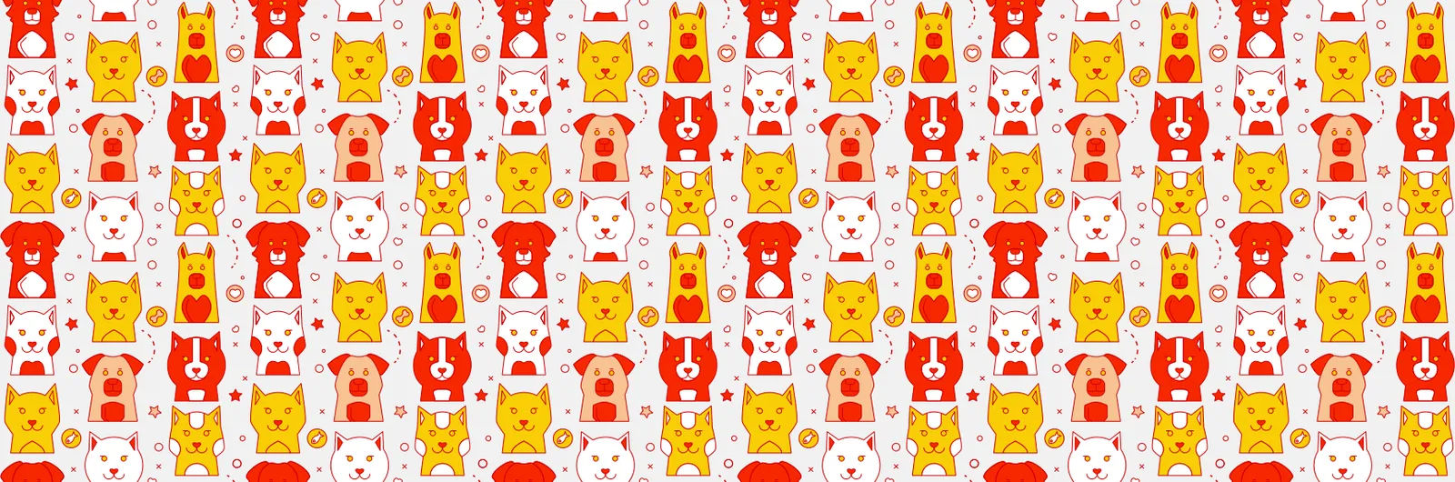
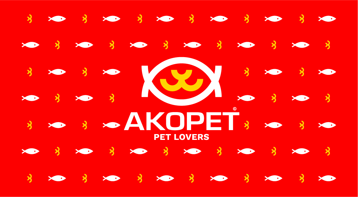
The brand pattern is a foundational element of a brand’s visual identity. It extends beyond the logo, creating a consistent and recognizable design language that permeates all brand touchpoints. A well-crafted brand pattern reinforces brand recognition, strengthens visual cohesion across applications, and communicates the brand’s personality, values, and positioning without relying solely on the logo.
In a comprehensive brand book, the brand pattern serves as a guideline for designers and marketers, specifying its proper usage, scale, repetition, color harmonies, and contextual flexibility. When applied consistently across packaging, digital media, advertising, and collateral, it ensures a unified and professional brand presence. A unique and thoughtful brand pattern transforms static brand elements into a dynamic visual system, enhancing memorability and supporting long-term brand equity.



05.2
İllüstrasyon
06
Kırtasiye
06.1
Kırtasiye seti
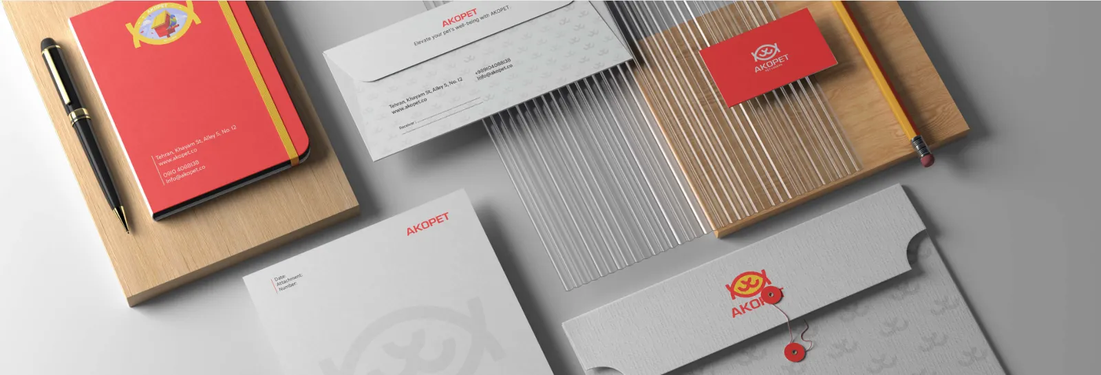
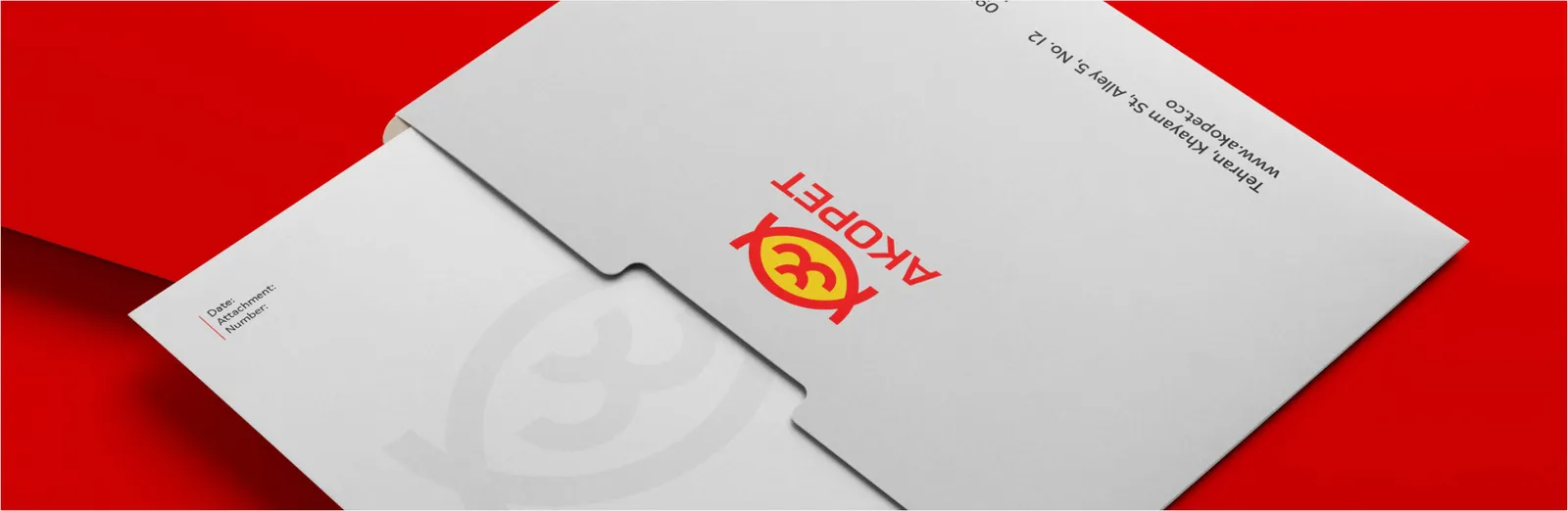
Custom-branded envelopes are not merely functional tools but strategic brand assets. They transform every correspondence into a deliberate touchpoint that communicates consistency, professionalism, and attention to detail. By seamlessly integrating into the broader visual identity system, they reinforce brand recognition and elevate the overall perception of credibility and trust.
06.2
Kartvizitler
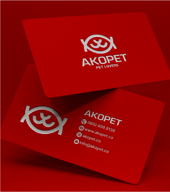
A business card serves as a concise and tangible extension of a brand’s identity. Beyond providing essential contact details, it communicates professionalism, attention to detail, and reinforces the visual and emotional essence of the brand, leaving a lasting impression on clients and partners.

06.3
Kimlik kartları
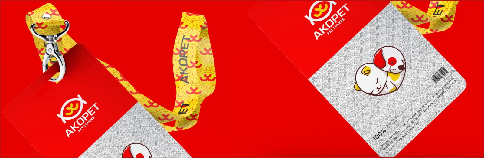
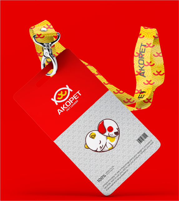
ID cards serve not only as a means of employee identification but also as a strategic tool to reinforce the brand’s visual identity. By thoughtfully integrating brand elements such as logo, color palette, and typography, these cards create a cohesive and professional representation of the organization, enhancing recognition and brand consistency across all touchpoints.
06.4
Antetli kâğıt
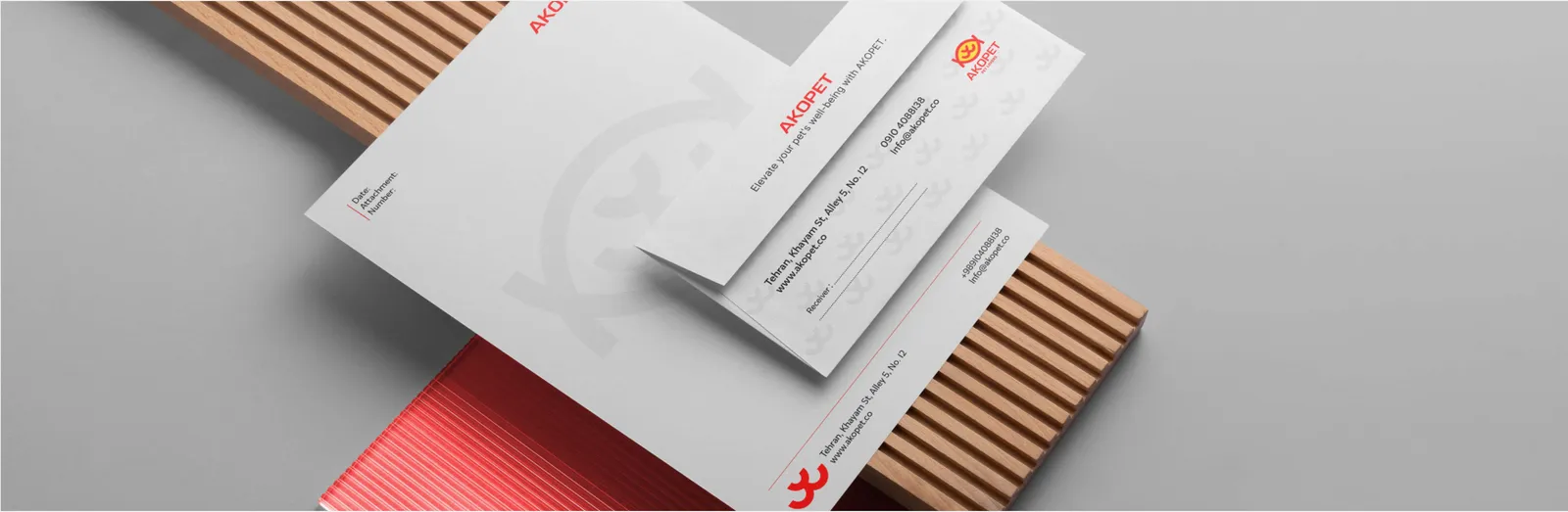
The letterhead serves as a cornerstone of official communication, ensuring that every document reflects the brand’s identity consistently and professionally. It reinforces brand recognition, conveys credibility, and provides a polished, cohesive visual presence across all formal correspondences.
06.5
Zarflar
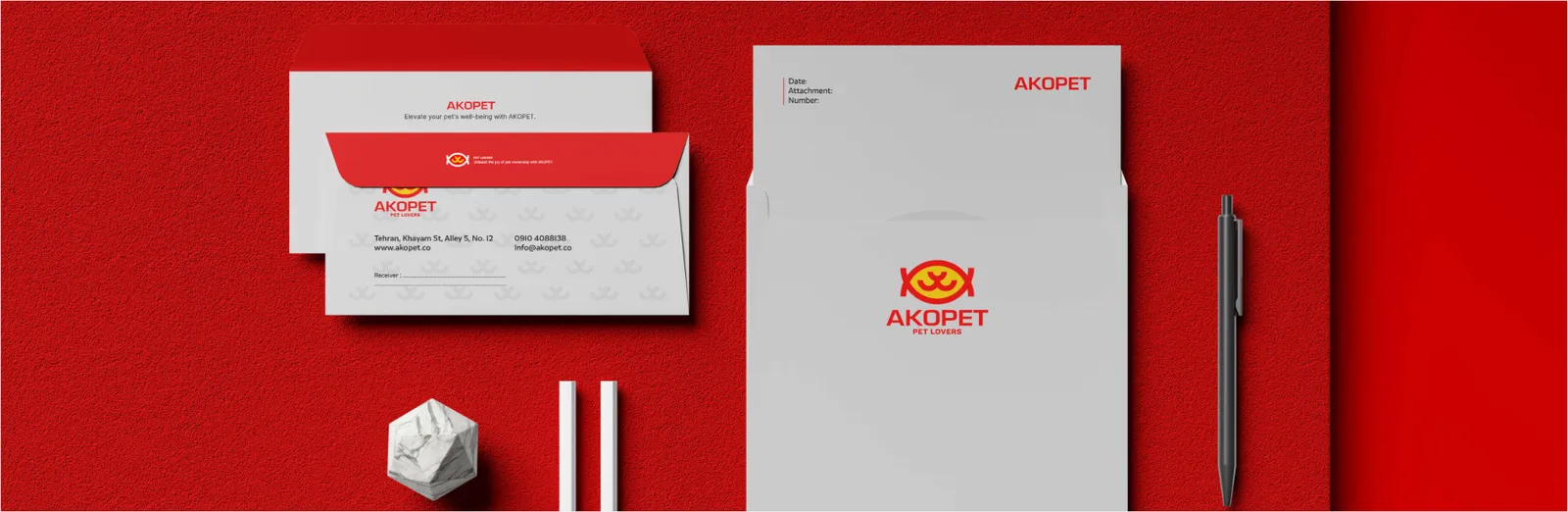
Custom-branded envelopes serve as a subtle yet powerful extension of your brand identity. Every piece of correspondence becomes an opportunity to reinforce your visual language, leaving a lasting impression of professionalism and consistency.
06.6
Dosyalar
documents but also acts as a tangible extension of the brand’s identity. Through the strategic use of the logo, typography, and visual elements, the folder communicates professionalism, consistency, and brand integrity, leaving a lasting impression in every interaction.
07
Dijital
07.1
Web sitesi
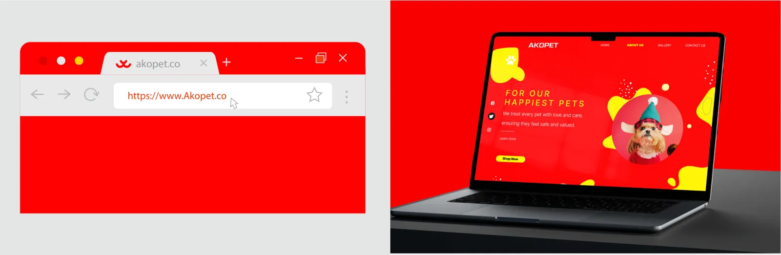
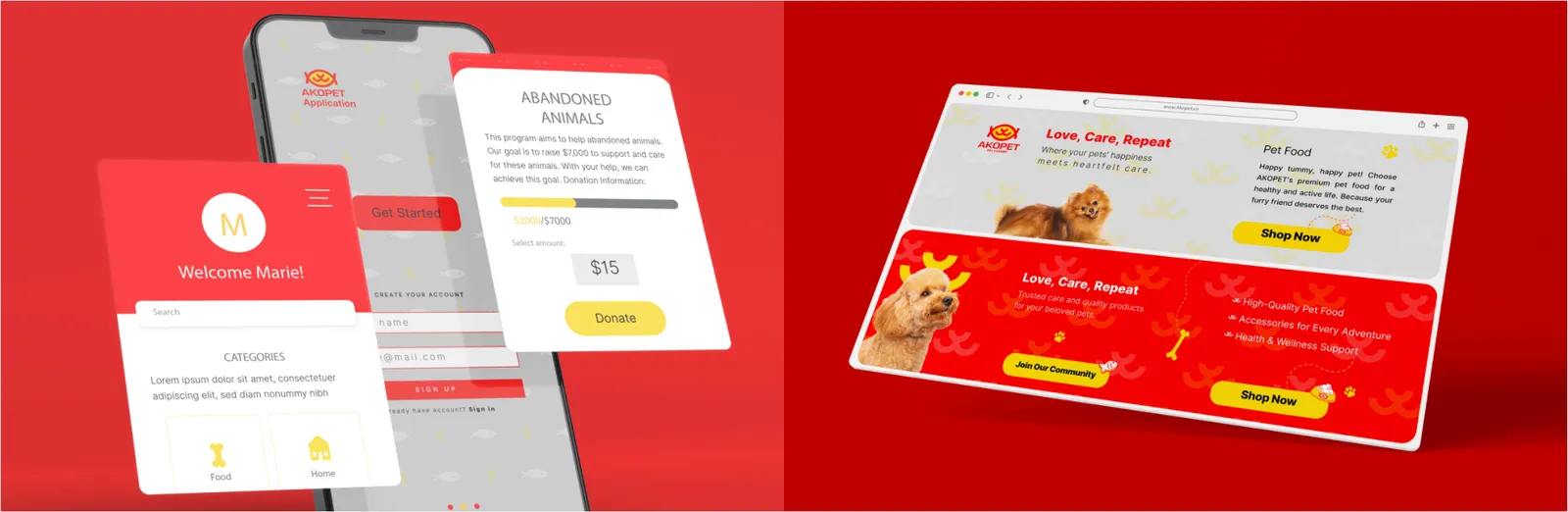
A website is not merely a digital presence but the core visual and interactive hub of a brand. It should seamlessly combine aesthetics, usability, and storytelling to communicate the brand’s essence, values, and offerings. An effectively designed website elevates credibility, fosters trust, and delivers a cohesive brand experience across all touchpoints.
A favicon, though minimal in size, carries significant weight in digital branding. As a symbolic extension of the logo, it ensures instant recognition within browsers, tabs, bookmarks, and mobile environments. A well-crafted favicon maintains clarity and consistency at small scales, reinforcing brand identity and enhancing visibility in the crowded digital landscape.
07.2
Sosyal medya
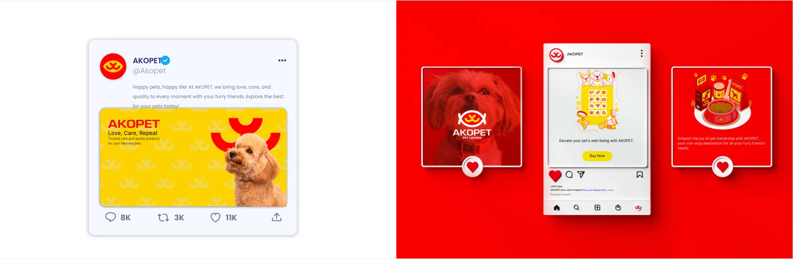
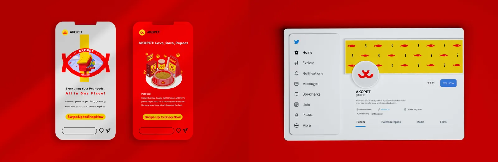
Social media serves as a powerful extension of the brand, expanding its reach and fostering meaningful engagement with audiences through thoughtfully crafted, visually compelling content that reflects the brand’s identity.
Social platforms amplify the brand’s visibility, providing a dynamic space for audience interaction through engaging visuals, cohesive storytelling, and strategically aligned content that strengthens brand recognition.
07.3
Kampanyalar ve e-posta
Digital advertising strategically amplifies brand presence across diverse online channels, delivering precise, measurable, and impactful engagement with the target audience. It ensures that the brand not only reaches but resonates meaningfully with its intended market.
08
Marka ürünleri
08.1
Giyim
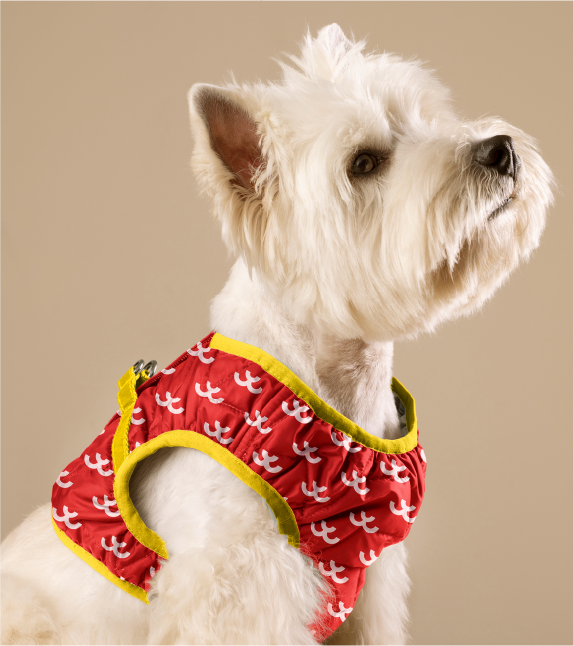
Branded hoodies seamlessly blend comfort with distinctive style, transforming everyday apparel into a subtle yet powerful marketing tool that reinforces brand identity. Branded polos convey professionalism and visual consistency, making them ideal for corporate environments, events, and any context where a polished brand presence is essential.
The curated outfit embodies the brand’s identity through a balance of style and functionality, seamlessly integrating the brand’s essence into everyday experiences. Branded caps act as versatile, wearable touchpoints that subtly reinforce brand recognition while promoting casual visibility in daily life.
Branded face masks not only provide essential protection but also reinforce brand visibility, ensuring a cohesive and professional appearance even in protective settings. They serve as a subtle yet powerful touchpoint for brand recognition.
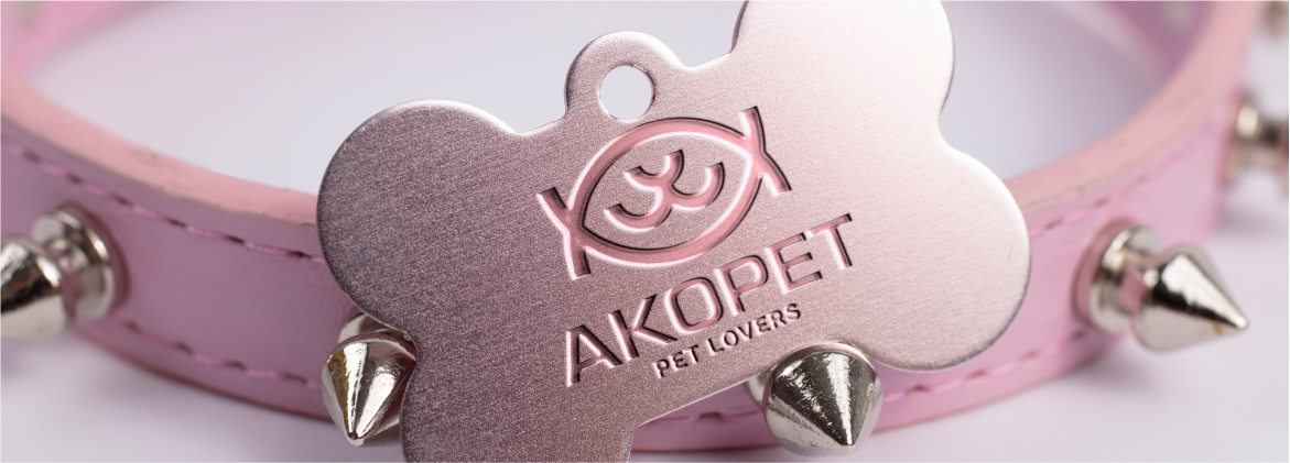
The collar exemplifies a sophisticated design that seamlessly integrates key brand elements, balancing aesthetic elegance with functional comfort. It embodies the brand’s commitment to thoughtful, user-centered design for pets.

08.2
Çantalar
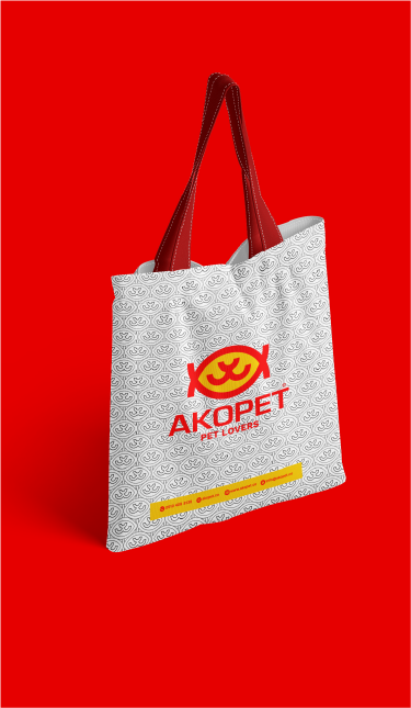
Branded bags serve as more than just practical accessories; they act as mobile ambassadors of the brand. By integrating everyday functionality with strategic visibility, they strengthen brand recognition, enhance customer experience, and extend the brand’s presence beyond traditional touchpoints.
08.3
Promosyon ürünleri
The necklace embodies the brand’s refined craftsmanship and elegance, serving as a tangible symbol of luxury, sophistication, and premium identity.
The umbrella merges practical functionality with refined brand aesthetics, offering both protection and a visually impactful extension of the brand identity. As a mobile branding element, it reinforces brand presence in everyday interactions.
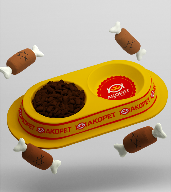
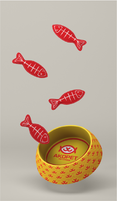
The pet bed merges superior comfort with refined visual appeal, creating a branded environment that reflects the brand’s dedication to care, quality, and emotional connection with pets.
08.4
Ambalaj
Packaging is more than just a protective layer; it serves as a tangible extension of the brand’s identity. Thoughtfully designed packaging elevates the unboxing experience, creating an emotional connection that strengthens brand perception and leaves a lasting impression on customers.
The gift card functions as a strategic extension of brand identity, seamlessly combining aesthetics and utility. Beyond its practical role as a convenient gifting medium, it embodies the brand’s values and visual language, reinforcing recognition at every touchpoint. By merging design excellence with customer-centric functionality, the gift card not only strengthens emotional connection with the audience but also fosters long-term loyalty and sustained engagement.
The collar embodies a carefully crafted design that seamlessly integrates the brand’s visual identity, balancing style with comfort. The pet bed merges functionality and aesthetic appeal, creating a branded environment that conveys care, quality, and a deep connection with pets.
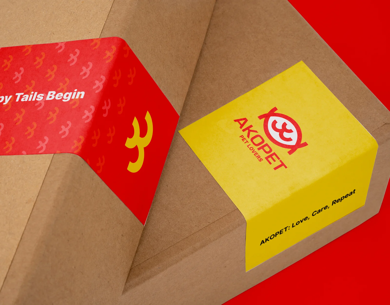
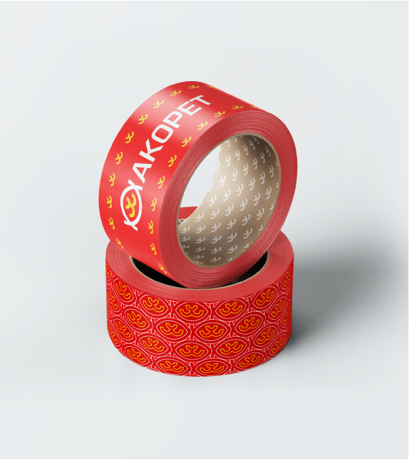
Custom-branded packaging tape transforms each shipment into a subtle yet powerful touchpoint, reinforcing brand recognition and leaving a memorable impression throughout the delivery experience.
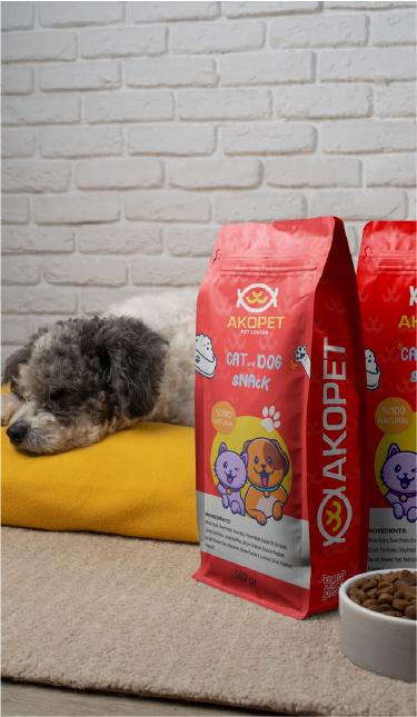
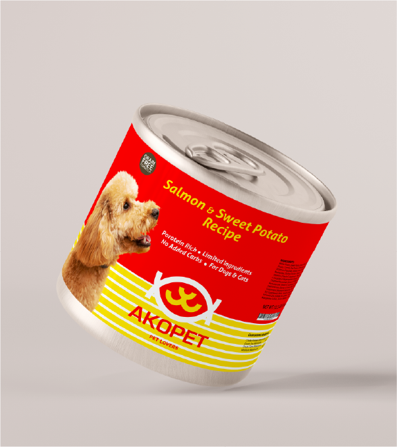
Thoughtfully designed pet food cans embody the brand’s values, blending functionality with visual sophistication. The packaging not only protects the product but also communicates the brand’s identity, quality, and commitment to its customers.
09
Uygulamalar
09.1
Tabelalar
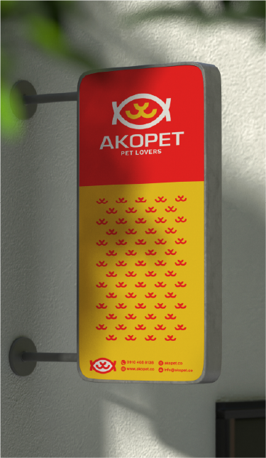
The wordmark sign serves as a versatile and strategic brand asset, designed to prominently showcase the brand name in key touchpoints. It reinforces brand recognition and ensures a consistent, high-impact presence across all visual communications.
09.2
Etkinlik ve fuarlar
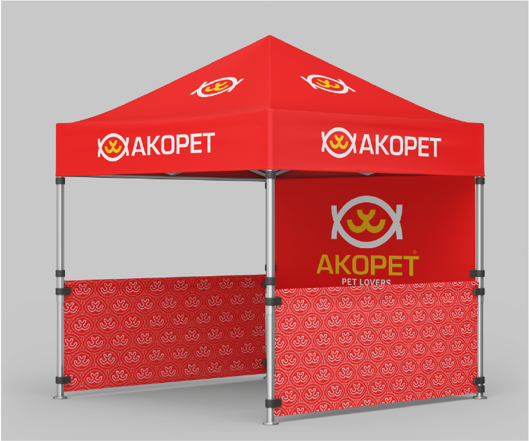
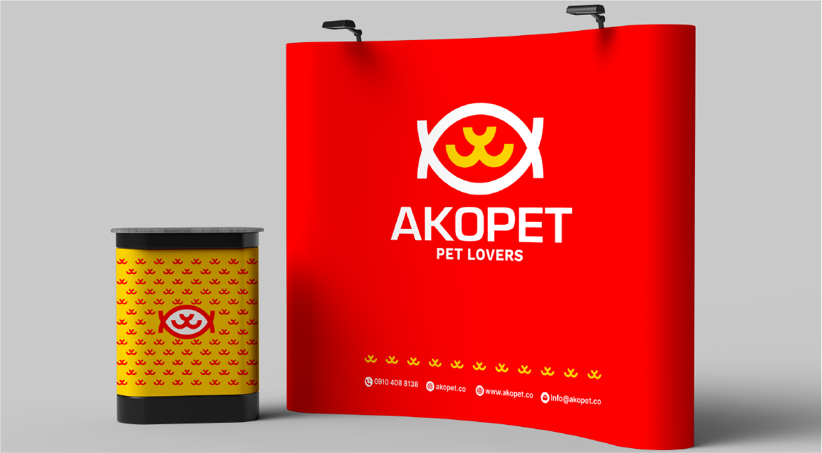
Pop-up installations serve as dynamic, temporary brand touchpoints that capture attention and create a lasting visual impression. Strategically designed, these activations not only enhance brand visibility during events but also reinforce the brand’s identity, leaving attendees with a memorable and engaging experience.
09.3
Reklam
Brochures serve as a strategic communication tool, presenting a well-structured and visually engaging overview of the brand’s services and products. Beyond simple promotion, they embody the brand’s identity, reinforcing consistency and professionalism while offering audiences a clear, memorable, and trustworthy representation of the brand.
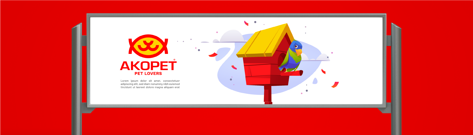
Posters serve as powerful visual tools that capture attention instantly and deliver key messages with clarity and impact. As essential elements of a brand’s visual identity system, they combine aesthetics with functionality, making them ideal for both promotional campaigns and informational purposes. Through strategic use of typography, color, and composition, posters not only inform but also reinforce brand recognition and emotional connection with the audience.
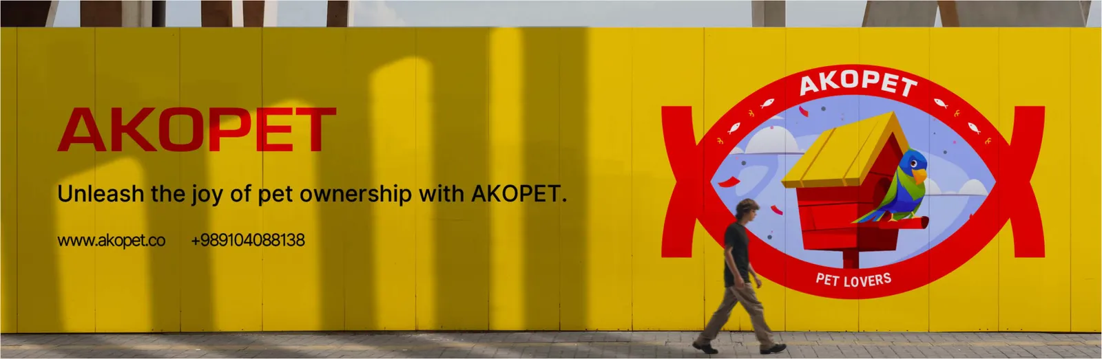
creating strong visual impact and reinforcing brand presence in public spaces. Well-designed street signage enhances visibility, ensures clear brand recognition, and guides audiences effectively, transforming everyday urban environments into strategic brand experiences.
09.4
Bayraklar
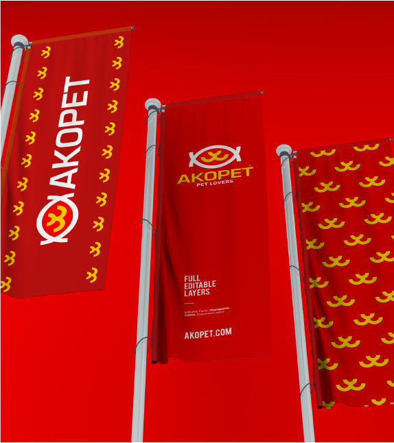
The brand flag embodies the essence of the visual identity, acting as a dynamic symbol of the brand’s presence and cohesion. Displayed in diverse environments, it communicates the brand’s character and unites its spaces under a recognizable visual language.
09.5
Araçlar
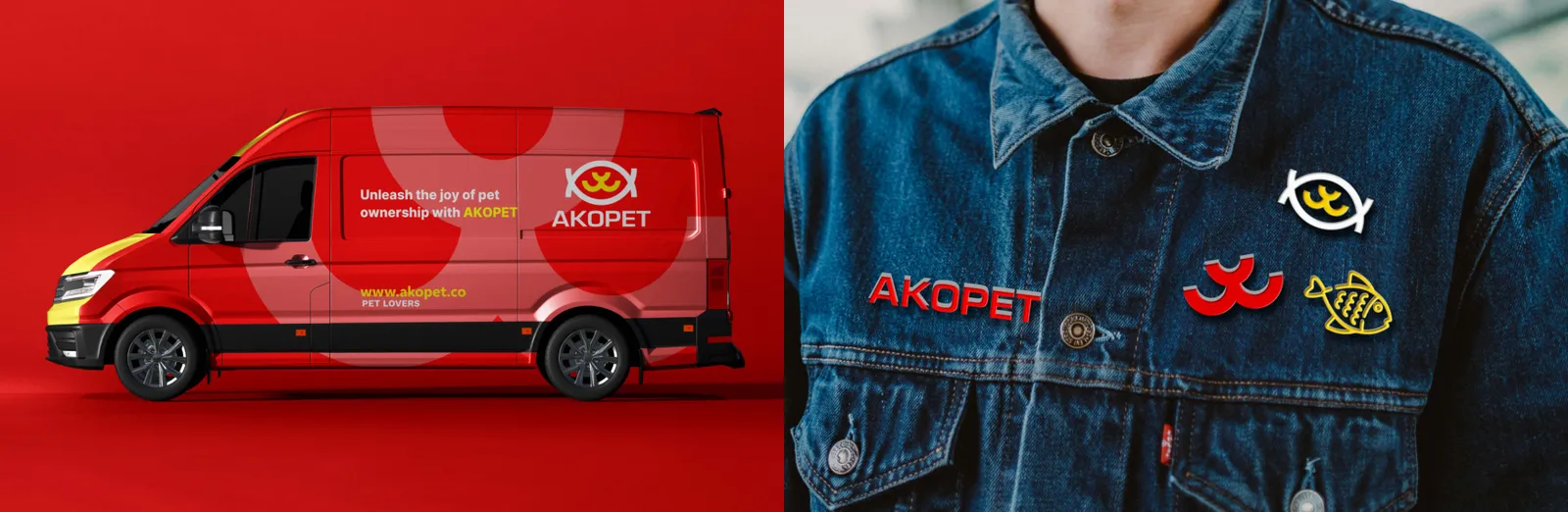
Integrating brand identity onto transport vehicles transforms every journey into a dynamic marketing opportunity, enhancing visibility and reinforcing brand recognition wherever the vehicle travels. A well-crafted brand badge offers a concise yet impactful representation of the brand, ideal for merchandise, promotional materials, and touchpoints where a compact visual identity is essential.