01
Genel bakış
01.1
Bir bakışta
Şirketin kanatlı aslanı, altın oran ve grid sistemiyle yeniden çizildi.
- Proje
- Görsel kimlik
- Alan
- Uluslararası ticaret
- Yıl
- 2024
- Hizmetler
- Görsel kimlik
01.2
Giriş
BARZIN ticaret şirketinin logosu, grafik tasarım prensiplerine ve detaylara dikkat etmeyi gerektiren heyecan verici bir proje oldu. Logo yeniden tasarlanırken, mevcut form ve kavramın kullanılmasına karar verildi. Altın oran ve grid sistemi kullanılarak, logo yeniden revize edildi ve logonun mevcut kavramın korunmasının yanı sıra daha fazla güzellik ve cazibe kazanması amaçlandı.
01.3
Hakkında
BARZIN uluslararası ticaret şirketi, uluslararası taşımacılık, gümrükt, ithalat ve ihracat ile mal tedariki alanlarında parlak bir geçmişe sahiptir. Şirket, İran'da dört şubeye ve Hindistan, Türkiye, Özbekistan, Birleşik Arap Emirlikleri ve Mısır gibi ülkelerde temsilciliklere sahiptir.
01.4
Tarihçe
Barzin Trading Company was founded in 2015, at a time when Iran’s international trade faced significant restrictions due to global sanctions. In the face of these challenges, Barzin showed resilience and forward-thinking vision, gradually securing its place in the competitive world of international commerce.
Driven by innovation and guided by a team of specialized experts, Barzin expanded its global presence while establishing credibility in international relations. Among its pioneering milestones was the creation of a unique digital trade platform designed to provide unmatched services in the region. Today, Barzin stands as a recognized leader in international trade, facilitating seamless transactions across Central Asia and Europe. Its growth is rooted in innovation, adaptability, and a customer-first approach, which continue to define the brand’s identity and long-term vision.
01.5
Misyon
Barzin’s mission is to optimize the supply chain to its highest potential while driving profitability across logistics and trade operations. The company is committed to: Innovating trade processes through cutting-edge solutions. Preserving financial credibility with robust and transparent management. Executing superior trade strategies grounded in comprehensive market analysis and competitive insights. By leveraging smart financial strategies and continuously optimizing performance, Barzin aspires to position itself as the most profitable and reliable trade partner in bulk commerce between Iran, Central Asia, and Europe.
01.6
Vizyon
By 2025, Barzin envisions becoming a leading force in international trade strategies by expanding into new markets and establishing strong offices across Central Asia and Europe. This vision reflects the company’s commitment to innovation, growth, and excellence in global commerce, as it strengthens its presence and influence on the international stage.
01.7
Marka değerleri
Purpose-Driven – Redefining industry standards with an advanced global trade portal.
Innovative Leader – Leading regional trade through technology and process improvement.
Authentic – Acting with integrity to build trust and strong partnerships.
Mission-Oriented – Aligning all efforts with efficiency, profitability, and excellence.
Visionary – Driving sustainable growth with a long-term international outlook.

01.8
Ses tonu
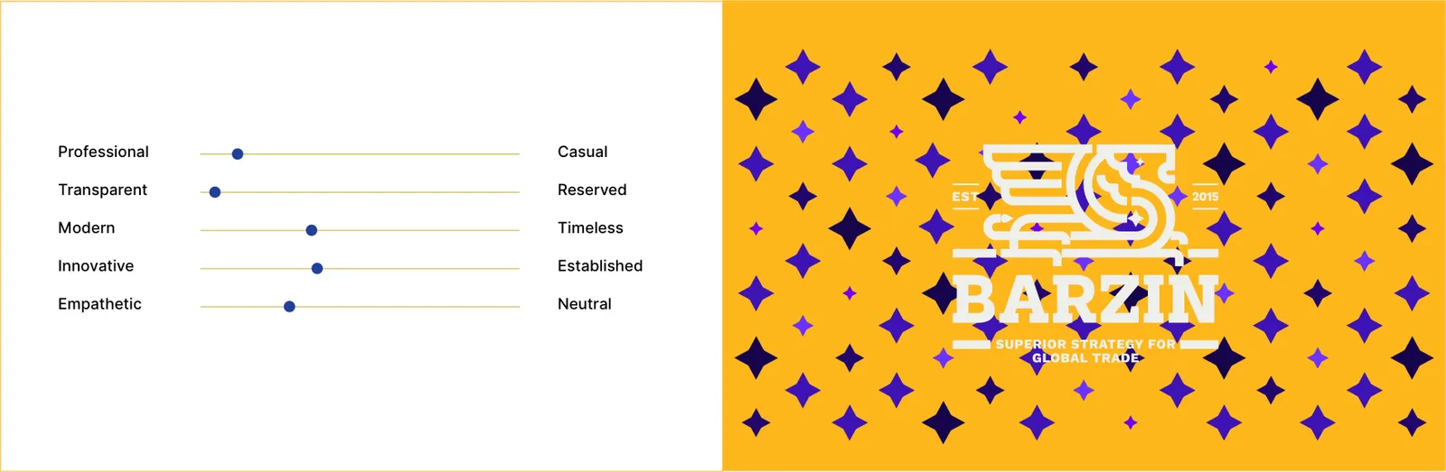
Barzin communicates with clarity, professionalism, and confidence. Its tone reflects:
Professional – Showcasing expertise and credibility.
Transparent – Open, honest, and trustworthy.
Modern – Relevant and progressive in approach.
Innovative – Forward-thinking with smart solutions.
Empathetic – Understanding client and partner needs. By maintaining this voice, Barzin reinforces its image as a reliable and future-oriented trade partner.
02
Logo
02.1
Marka logosu
İşaretin kendisi, tek başına.
02.2
Tasarım
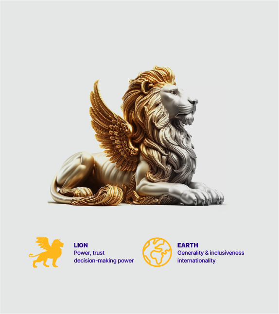
Logo, bir kanatlı aslan, sütun ve dünya küresinden oluşur ve altın oran ve grid sistemi düzenine uygun olarak güncellendi. Başı dik ve ileriye dönük bir bakışla oturur pozisyondaki kanatlı aslan figürü, sadece özel huzurunu ve zarafeti iletmekle kalmaz, aynı zamanda açık kanatlar güç ve güven sembolünü de izleyicilere aktarır. Renkler, Pantone renk prensiplerine dikkat edilerek titizlikle seçildi. İngilizce bir serif fontun kullanılması, logo kimliğinin korunmasına yardımcı olmakla kalmaz, aynı zamanda logonun şirket değerleriyle daha güçlü bir bağ kurmasını sağlar.
Genel olarak, bu değişiklikler Brizin şirketinin daha iyi tanıtım ve tanıtımını sağlamak için güçlü bir araç sağladı.
02.3
Konsept
The previous logo, which featured a winged lion, a column, and a globe, was updated using the golden ratio and grid system while adhering to design principles. The winged lion’s graphic shape, seated with its head raised and looking forward, conveys a sense of calmness and unique splendor, and the spread wings symbolize power and confidence to the target audience.
The logo is a core element of Barzin’s identity. It is designed with professionalism and precision to represent the company’s values, vision, and position in international trade. The logo speaks for the brand, ensuring recognition, trust, and consistency across all platforms.
02.4
Yapı
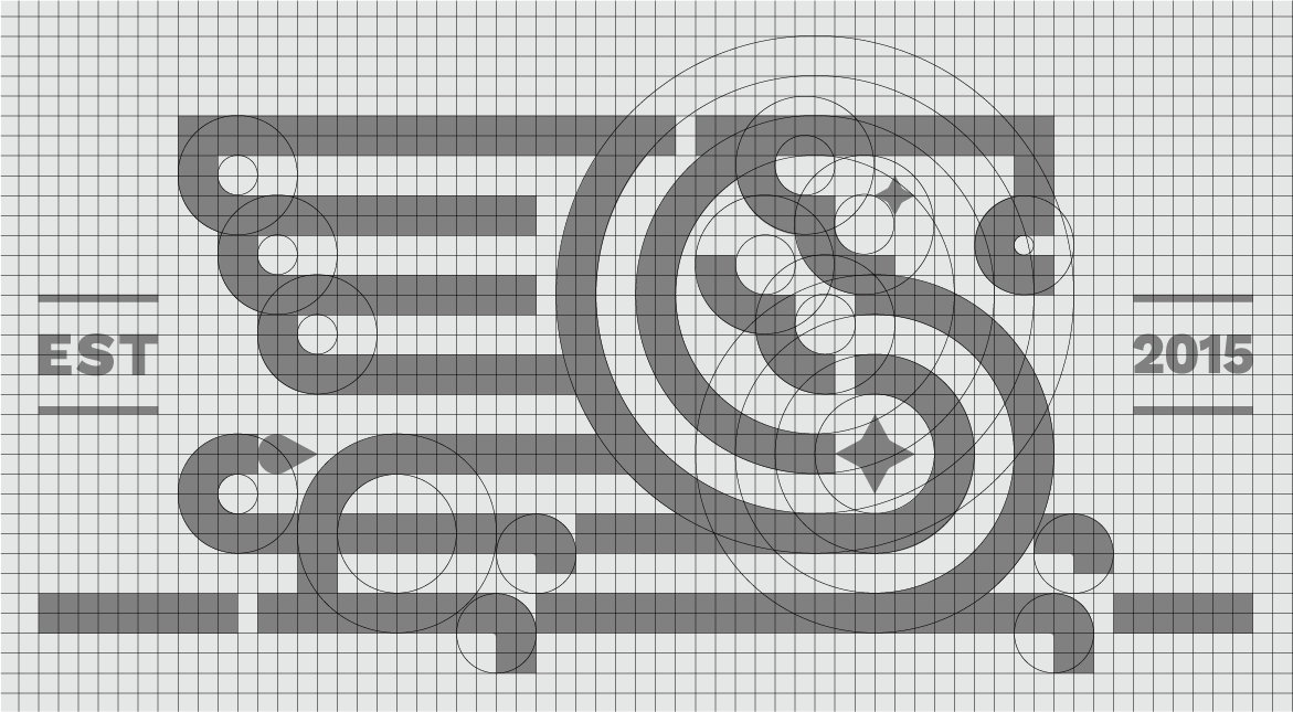
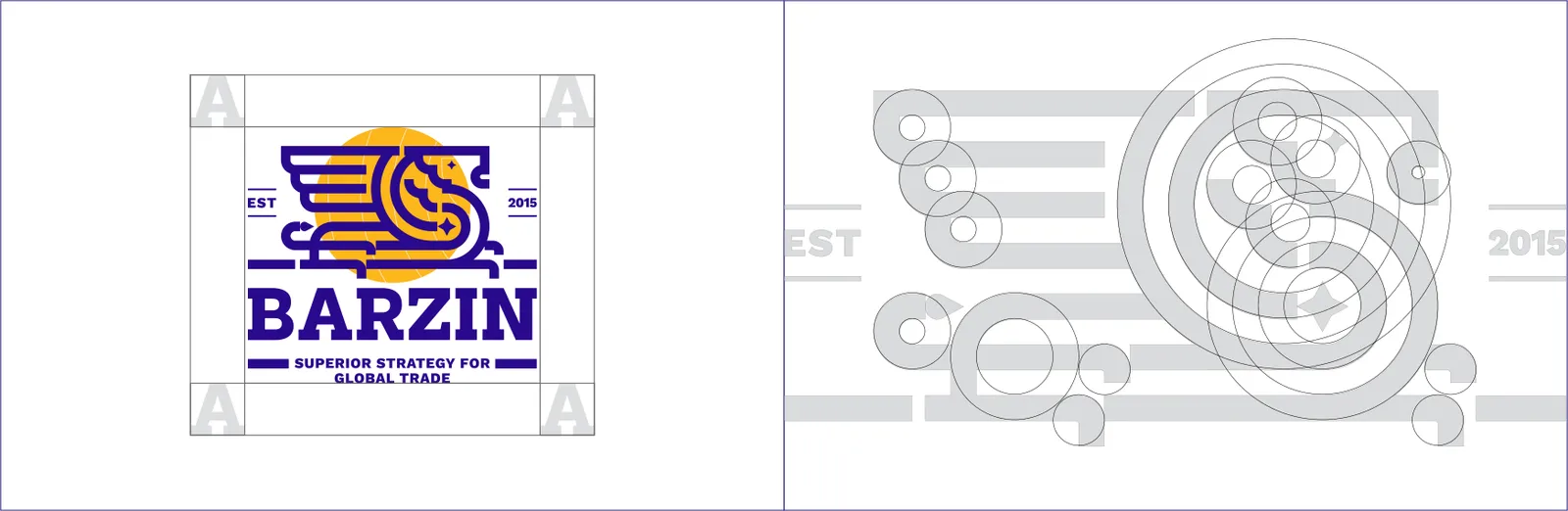
The logo structure defines the proportions, alignment, and positioning of each element within the Barzin logo. Consistent structure ensures a balanced, professional, and recognizable brand identity across all applications.

02.5
Koruma alanı
The exclusion zone defines the minimum clear space around Barzin’s logo to ensure visibility and impact. No text, graphics, or other elements should encroach within this area, maintaining the logo’s clarity and prominence.
02.6
Varyasyonlar
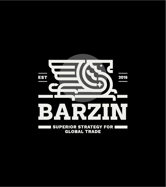
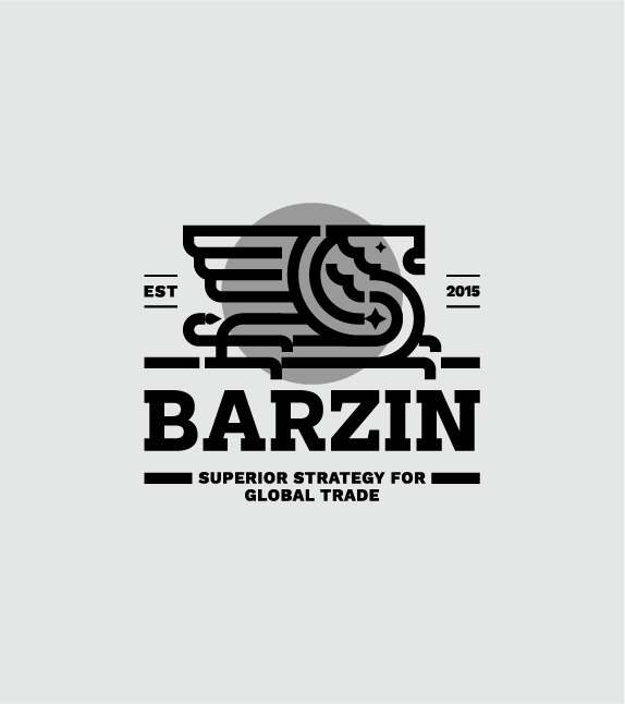
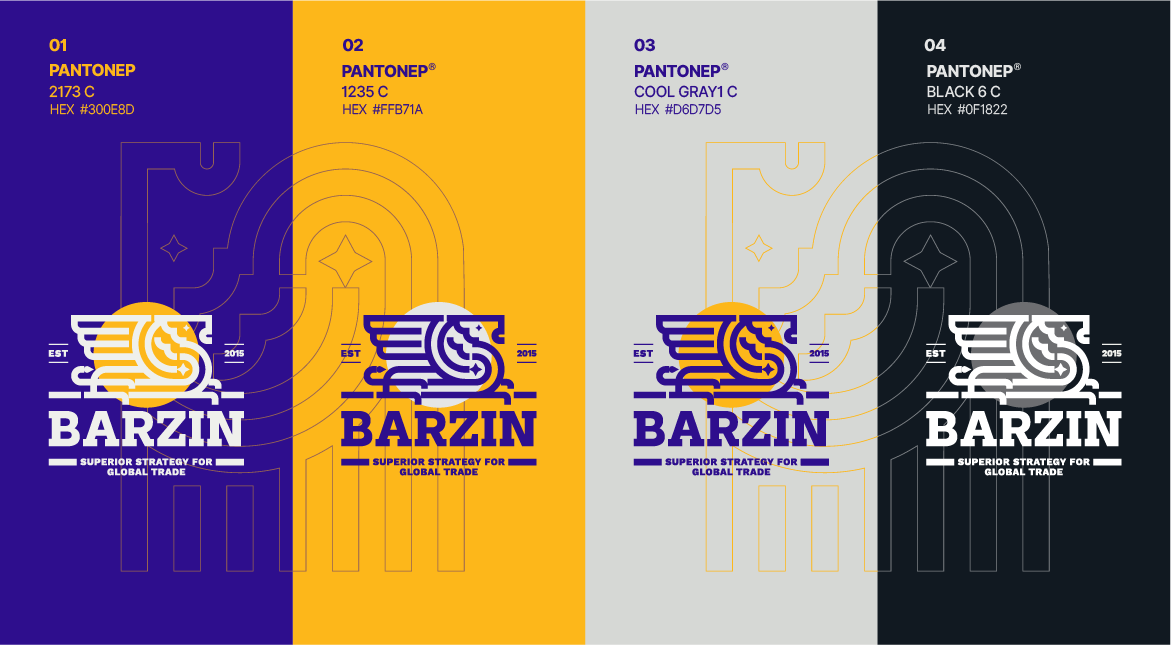
Barzin’s logo comes in multiple variations to ensure versatility and consistent branding across all platforms. Variations include full-color, monochrome, and simplified versions, each suitable for specific contexts while maintaining brand recognition and integrity.

02.7
Zemin üzerinde
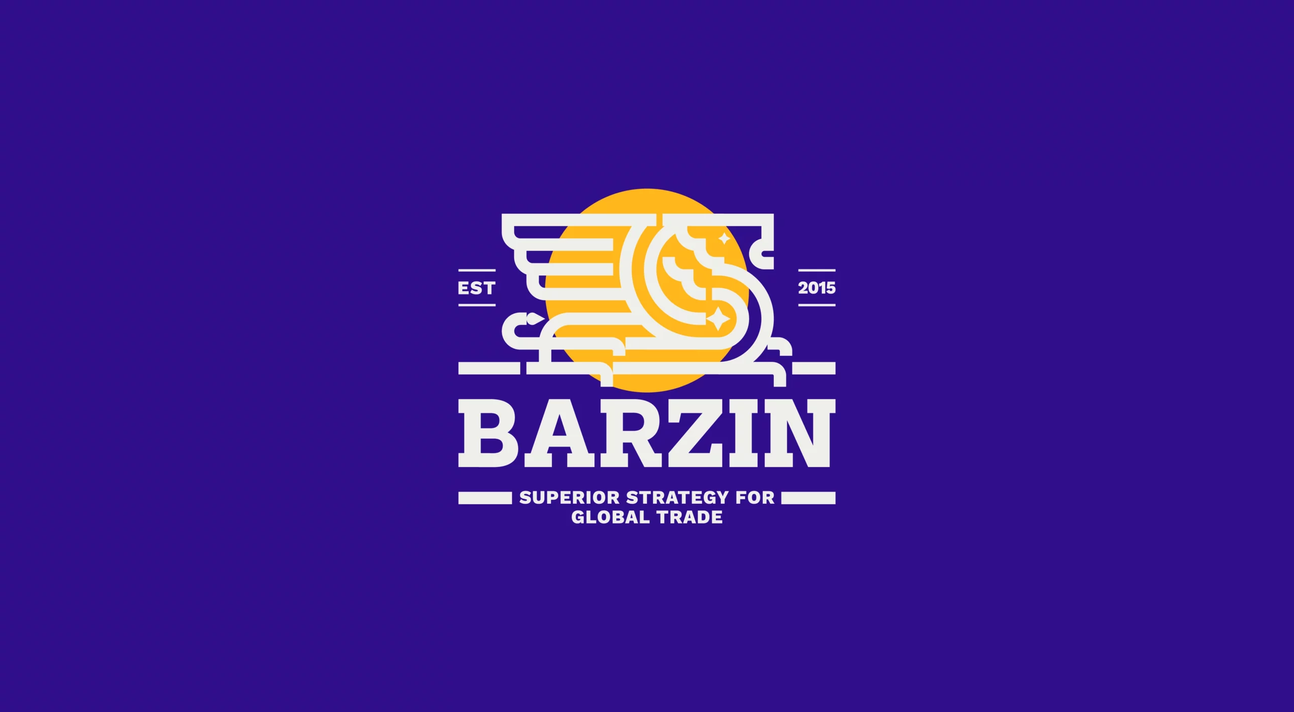
Barzin’s logo should be applied on backgrounds that ensure maximum visibility and contrast. Preferred backgrounds are neutral (white, charcoal gray) or brand primary colors (golden yellow, deep blue). Avoid using busy, overly colorful, or low-contrast backgrounds that could compromise logo clarity and recognition.
02.8
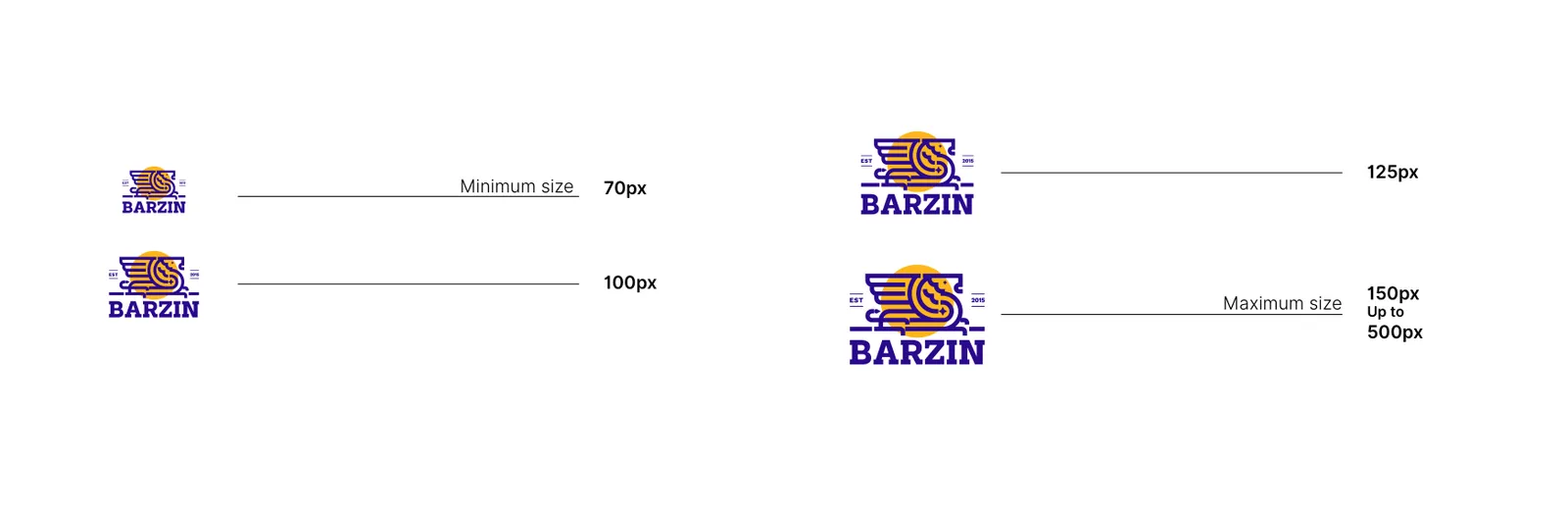
Minimum boyut
The logo must always be used at sizes that ensure readability and visual impact. Minimum size guidelines are established for both print and digital applications, ensuring that all details remain clear and the brand’s presence is consistent across all materials.
02.9
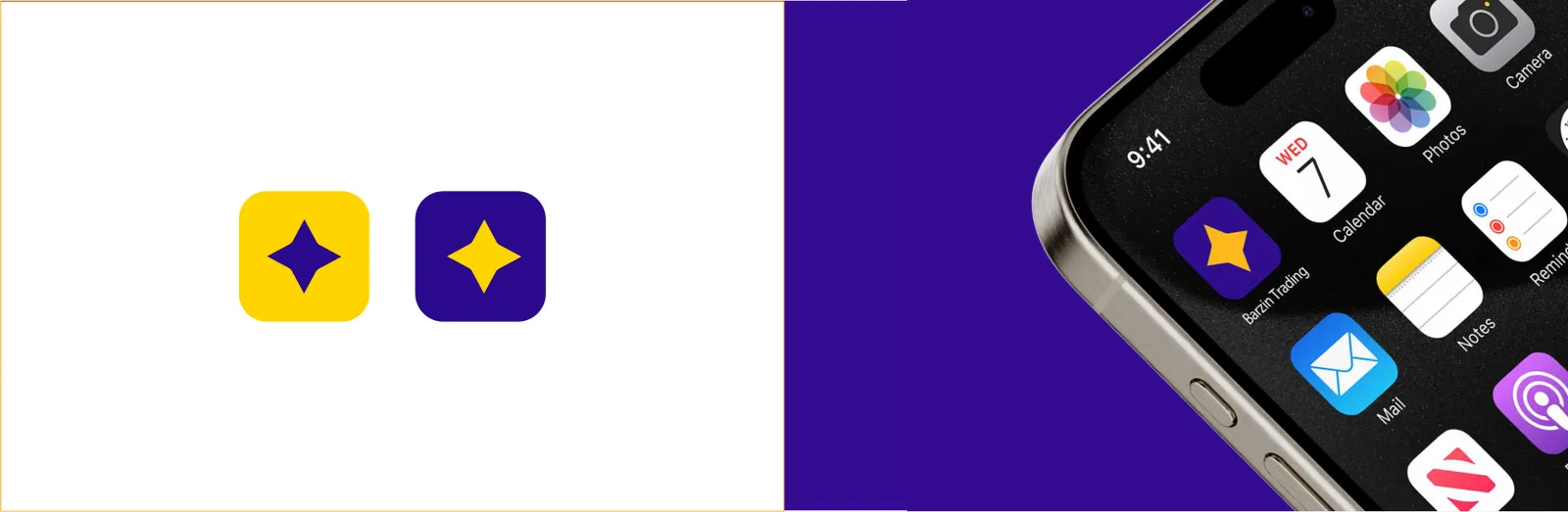
Uygulama simgesi
Barzin’s app icon is designed to maintain brand recognition and integrity in digital environments. It simplifies the main logo elements into a clear, scalable symbol that is instantly recognizable on mobile devices and software interfaces. The icon embodies the brand’s professionalism, innovation, and forward-looking vision, ensuring consistency across all digital touchpoints.
02.10
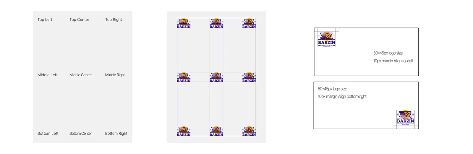
Yerleşim
Barzin’s logo placement is standardized to maintain visual consistency. Preferred positions are top-left or center for digital platforms and printed materials. Adequate clear space around the logo must always be preserved to uphold prominence and brand integrity.
02.11
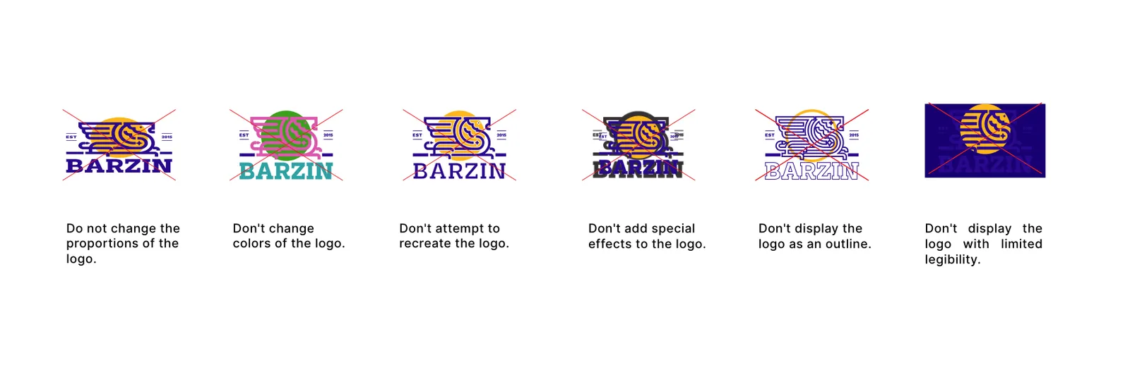
Hatalı kullanım
To protect brand integrity, the logo must not be altered, distorted, recolored, or overlaid with other graphics or text. Any use that compromises legibility, proportions, or the brand’s visual identity is strictly prohibited.
03
Renk
03.1
Palet
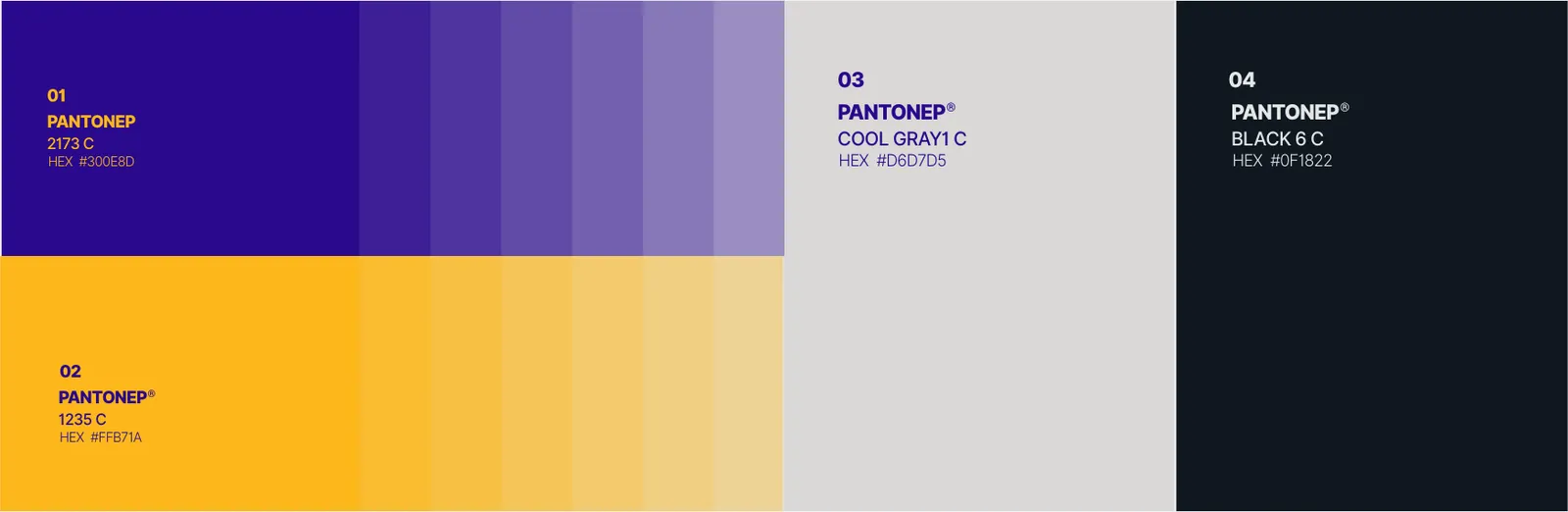
Kimliğin renkleri ve referansları.
- RGB:
- 48/14/141
- HEX:
- #300E8D
- PMS:
- 2173 C
- RGB:
- 255/183/26
- HEX:
- #FFB71A
- PMS:
- 1235 C
- RGB:
- 214/215/213
- HEX:
- #D6D7D5
- PMS:
- Cool Gray 1 C
- RGB:
- 15/24/34
- HEX:
- #0F1822
- PMS:
- Black 6 C
03.2
Renk hikâyesi
BARZIN’s color palette embodies strength, confidence, and elegance. Primary colors: Golden yellow symbolizes prosperity and excellence; deep blue represents trust and professionalism. Secondary colors: Neutral white ensures clarity, while charcoal gray adds sophistication. The combination of warm (gold) and cool (blue) tones balances BARZIN’s dynamic capabilities with dependable services, harmonizing tradition with modernity for strong brand recognition. Pantone standards ensure color consistency across all media.
03.3
Renk sistemi
04
Tipografi
04.1
Yazı karakterleri
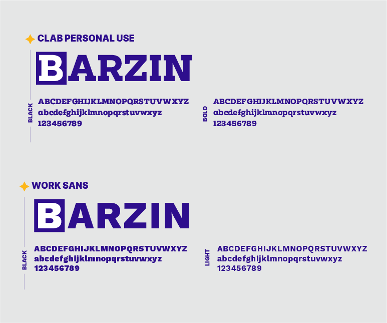
Kimliğin yazı karakterleri ve kullandığı ağırlıklar.
- ClabBlackBold
- Work SansBlackLight
04.2
Yazı örneği
The secondary font is Work Sans, used for body text, captions, and supporting content. It ensures readability, clarity, and a clean, professional appearance, complementing the primary font while maintaining visual harmony.
Barzin’s typography system uses Clab Personal Use for headings and Work Sans for body text, ensuring readability, hierarchy, and a modern professional look. Recommended usage: Headings (Clab Personal Use): Bold weights for H1-H3, emphasizing importance and brand personality. Body Text (Work Sans): Regular or Medium weights, sizes adjusted for readability across digital and print media. Consistent application of font weights and sizes reinforces the brand’s identity and visual cohesion.
Barzin’s primary font is Clab Personal Use, used predominantly for headings, titles, and key brand messages. This font reflects the brand’s modern, professional, and confident personality, ensuring visual impact and hierarchy across all applications.
05
Grafik öğeler
05.1
Desen
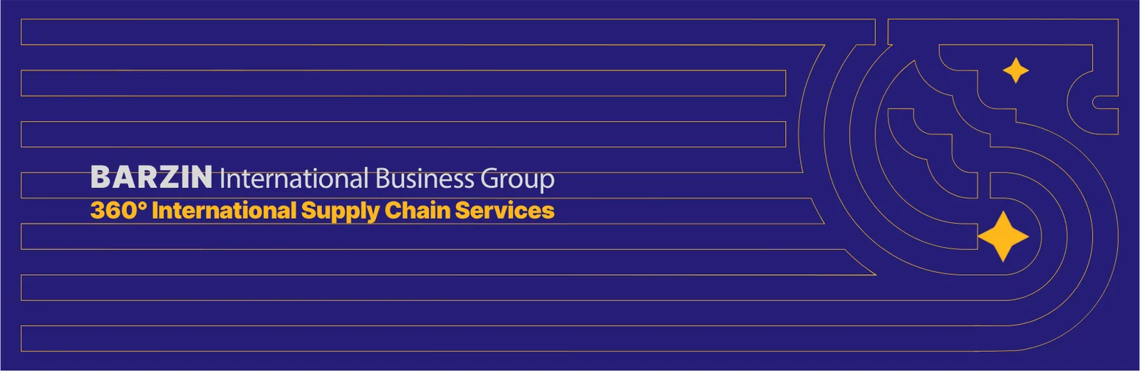
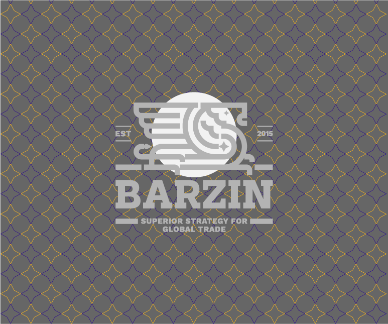
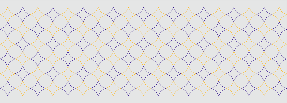
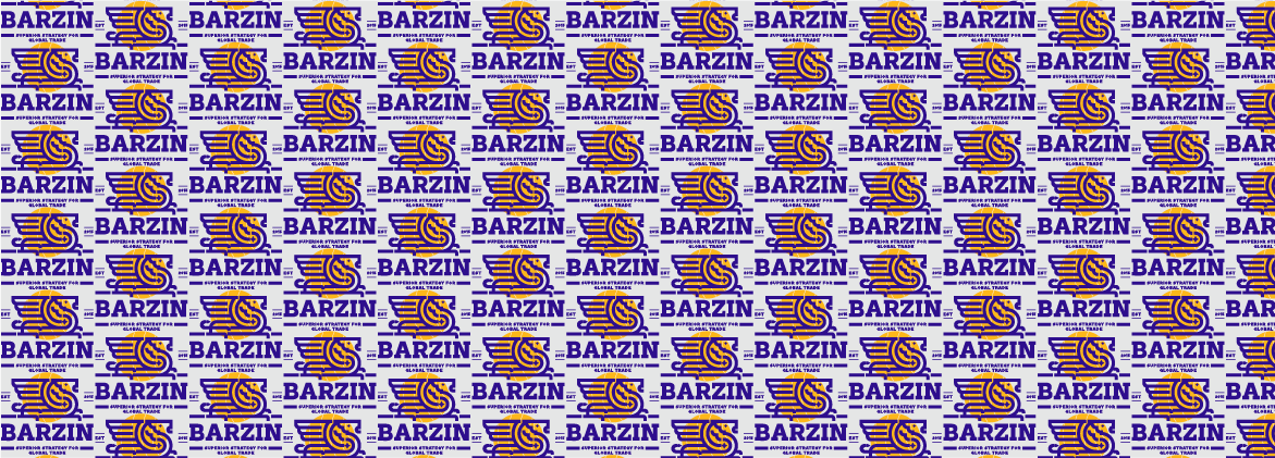
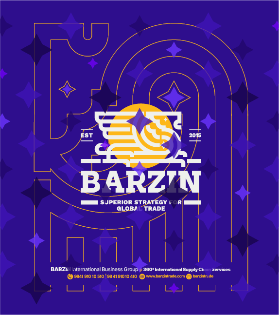
Barzin’s brand pattern extends the visual identity beyond the logo, creating a consistent and recognizable design language across all brand materials. Derived from elements of the logo, the pattern can be applied in backgrounds, packaging, digital interfaces, and promotional items, reflecting professionalism, innovation, and elegance.
Barzin’s brand pattern expands the visual identity beyond the logo, creating a cohesive and recognizable design language across all brand materials. The pattern is derived from key logo elements, including a four-pointed star and a linear version of the logo, which are repeated and arranged systematically. This approach ensures versatility for backgrounds, packaging, digital interfaces, and promotional materials, while reflecting Barzin’s professionalism, innovation, and elegance.


06
Kırtasiye
06.1
Kırtasiye seti
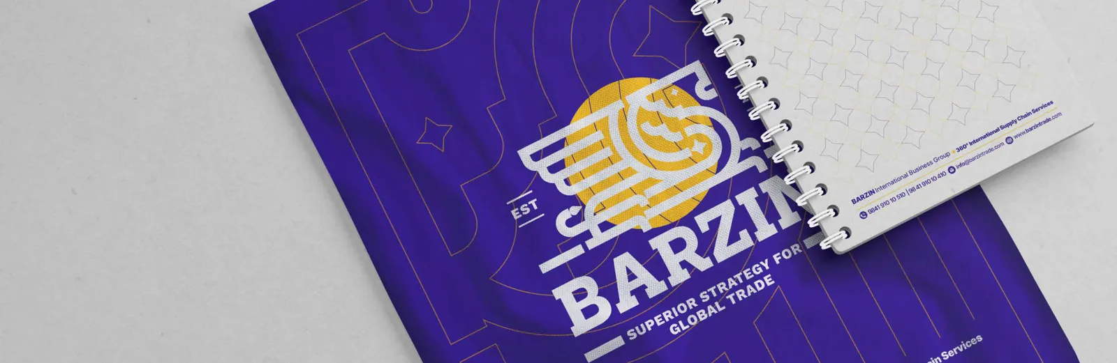
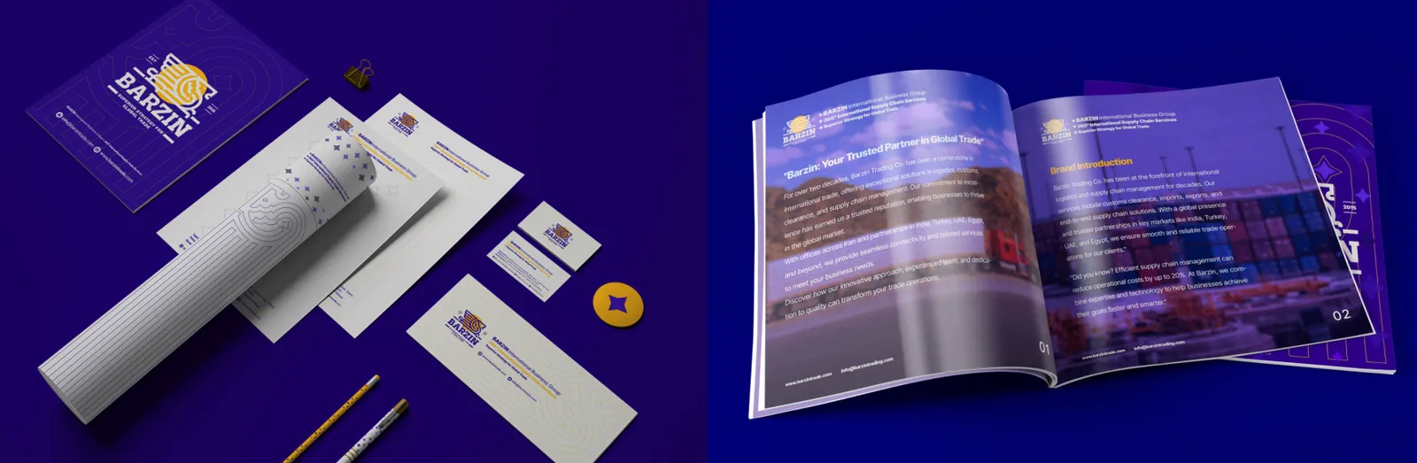
Barzin’s full stationery set includes business cards, letterheads, envelopes, notepads, and other office materials. This system ensures visual consistency across all office touchpoints. Design elements such as logo placement, brand patterns, and color hierarchy are applied uniformly to strengthen brand identity and provide a professional, cohesive impression to clients and partners.
06.2
Kartvizitler
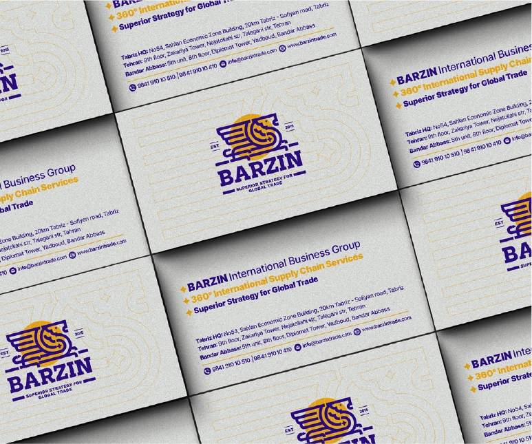
Barzin business cards are a key touchpoint in representing the brand. They incorporate the primary logo, brand colors, and approved typography to ensure a professional and cohesive look. The design prioritizes clarity of contact information, legibility, and visual hierarchy. Finishing options, such as matte or textured paper, may be used to reflect premium quality and brand sophistication.
06.3
Kimlik kartları
Brand badges are small yet impactful elements for employees, events, or merchandise.
Barzin employee ID cards ensure consistent brand representation while providing functional identification. They include the logo, primary and secondary colors, and typography, and may feature employee photographs and job titles. The design balances security, readability, and brand aesthetics, creating a professional and unified staff appearance.
They feature the logo and brand colors, maintaining visual consistency and enhancing recognition of Barzin’s identity in close-contact environments.
06.4
Antetli kâğıt
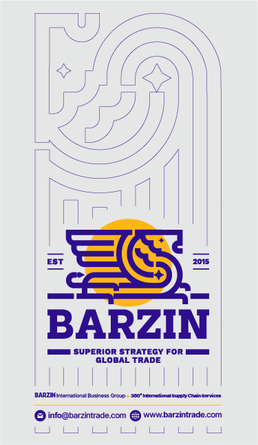
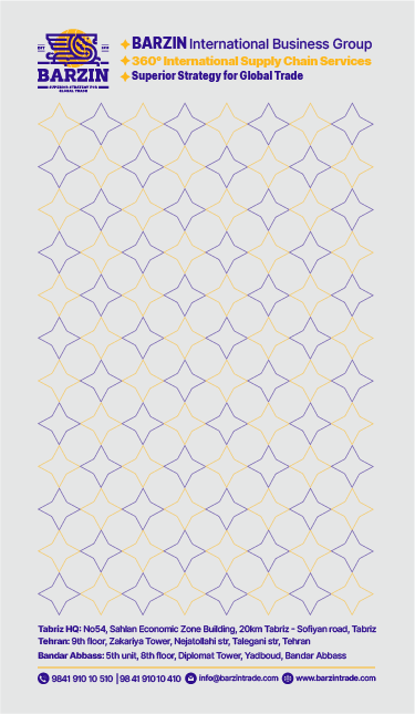
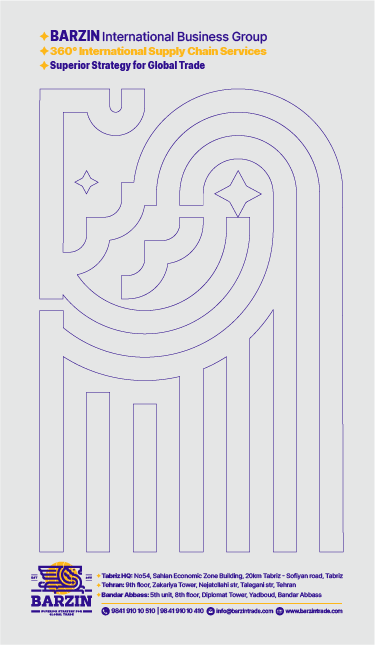
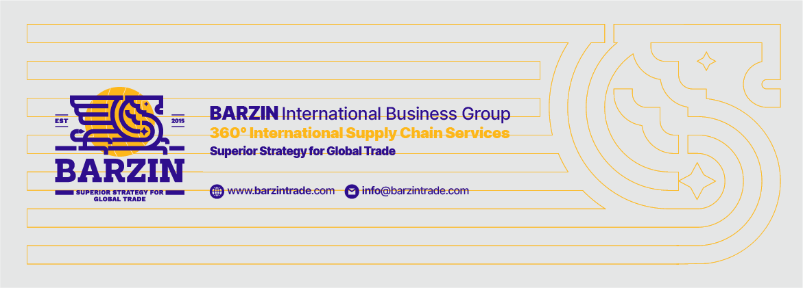
Barzin letterheads provide a professional canvas for official communications. The header includes the primary logo and brand colors, while typography ensures readability. Margins, spacing, and alignment are carefully designed to maintain visual hierarchy. Letterheads are adaptable for both print and digital correspondence, reflecting professionalism and reinforcing brand identity in every document.
06.5
Dosyalar
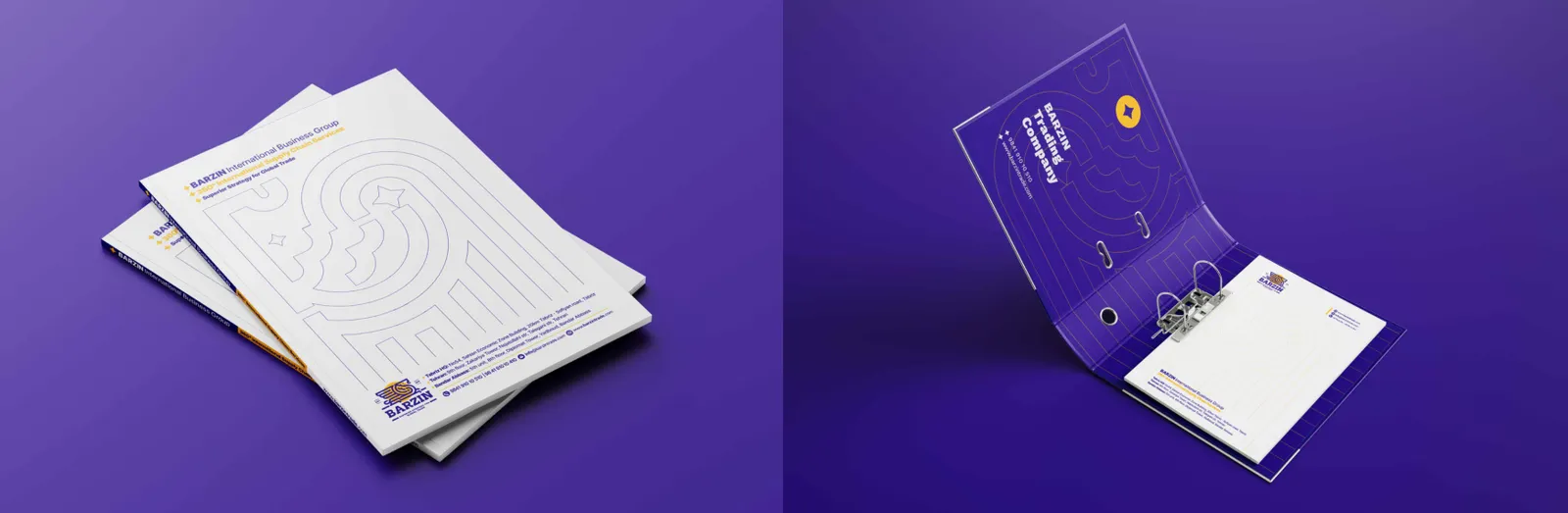
Folders organize documents while reinforcing Barzin’s brand identity. They incorporate the logo, color palette, and brand patterns, creating a professional and cohesive presentation. The folder design is versatile for client meetings, presentations, and storage, ensuring brand consistency in all interactions.
06.6
Defterler
06.7
Etiketler ve mühürler
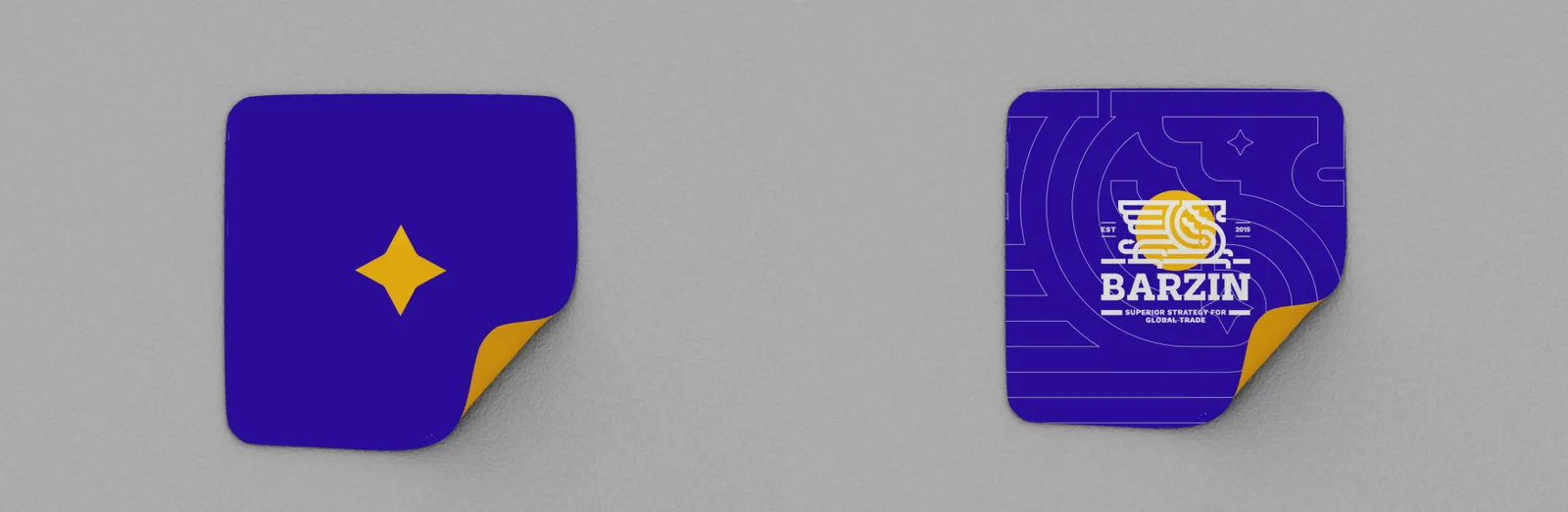
Branded stickers are versatile tools for promotion and brand reinforcement. They incorporate the logo, brand colors, and patterns, ensuring consistent visual identity.
Stickers can be applied on packaging, stationery, devices, or giveaways, enhancing recognition and engagement with Barzin’s audience.
07
Dijital
07.1
Web sitesi
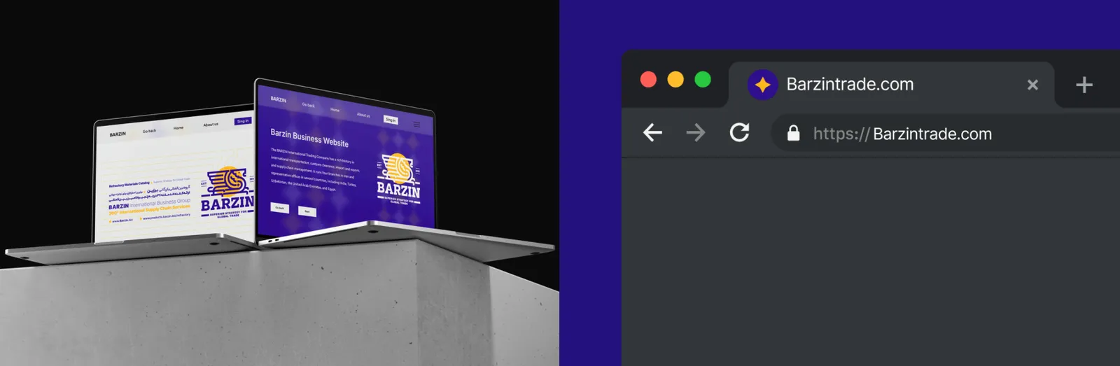
Barzin’s website serves as the primary digital platform for brand communication and client interaction. It incorporates the logo, brand colors, typography, and patterns consistently, providing a professional, modern, and user-friendly experience. The website emphasizes clarity, accessibility, and responsiveness across devices, reflecting Barzin’s innovation, reliability, and global presence.
The favicon is a simplified version of Barzin’s logo optimized for browser tabs and small digital spaces. It ensures instant brand recognition even at minimal sizes, maintaining clarity, consistency, and a professional digital identity.
07.2
Mobil uygulama
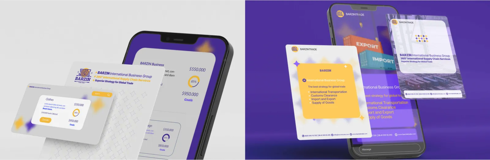
Barzin’s mobile application extends the brand’s digital presence. It incorporates the logo, color palette, typography, patterns, and iconography consistently. The design ensures intuitive navigation, a user-friendly interface, and responsive performance, reflecting the brand’s professionalism, innovation, and commitment to customer experience.
07.3
Sosyal medya
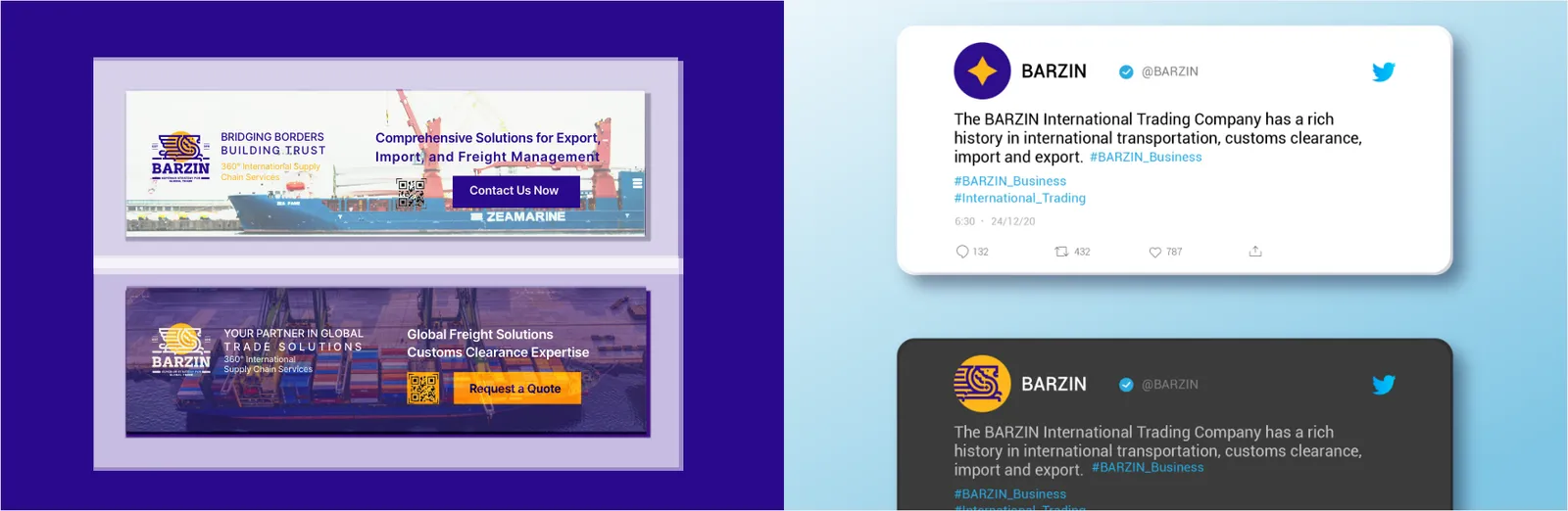
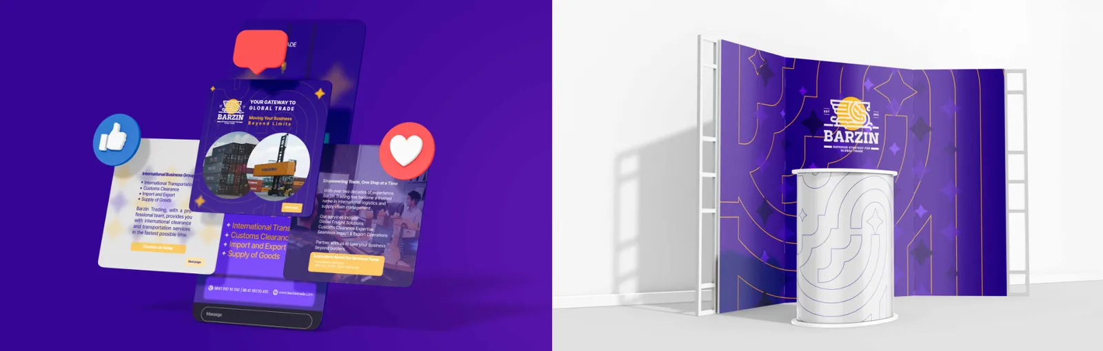
Barzin’s social media presence extends the brand’s identity across platforms. Profile images, banners, and posts utilize the logo, color palette, typography, and brand patterns consistently. The content strategy ensures clarity, professionalism, and engagement while reinforcing brand values and recognition.
Barzin’s Instagram campaigns leverage consistent visual identity with branded graphics, colors, typography, and patterns. Content is tailored for engagement, brand storytelling, and professional presentation, reflecting the company’s innovation and global positioning.
07.4
Kampanyalar ve e-posta
Digital advertising materials, including banners, display ads, and email campaigns, consistently apply Barzin’s brand elements. Logo, colors, typography, and patterns are used to maintain brand recognition and professional appearance. Ads are designed to be visually compelling, clear in messaging, and aligned with Barzin’s values and market positioning.
08
Marka ürünleri
08.1
Giyim
Branded caps enhance visibility and brand recall in casual or promotional settings. They feature the logo and brand colors while maintaining a clean, stylish, and functional design. Caps can be used at events, outdoor promotions, or as merchandise to engage audiences.
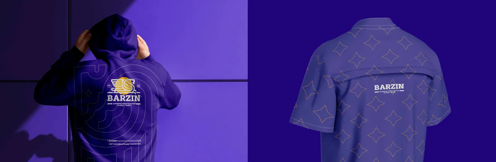
Branded hoodies combine comfort, functionality, and Barzin’s visual identity. The logo, color palette, and brand patterns are applied consistently to reflect professionalism and a modern aesthetic. Hoodies are used for staff uniforms, events, or promotional giveaways, reinforcing brand recognition in everyday wear.
Branded polo shirts are designed for staff uniforms, events, and casual corporate settings. The logo is prominently placed, and the color palette follows brand guidelines. The polos maintain a professional yet approachable appearance, ensuring staff represent Barzin consistently and stylishly.
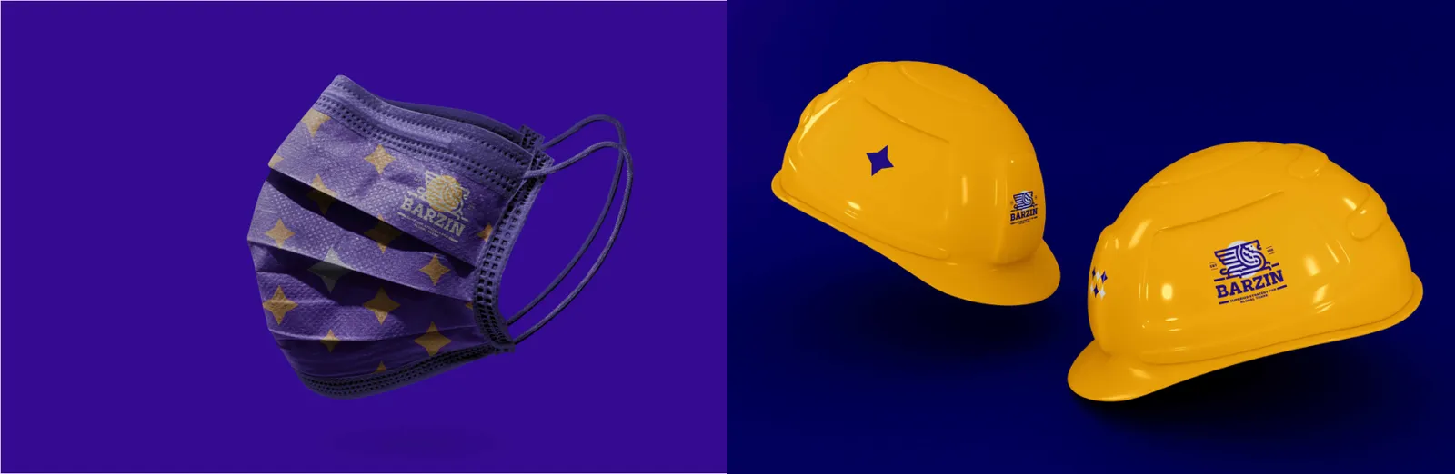
Branded face masks extend Barzin’s visual identity into safety and wellness accessories. They feature the logo and brand colors while ensuring comfort and usability. Face masks can be distributed as corporate merchandise, promotional items, or staff safety equipment, reinforcing brand presence in everyday contexts.
08.2
Çantalar
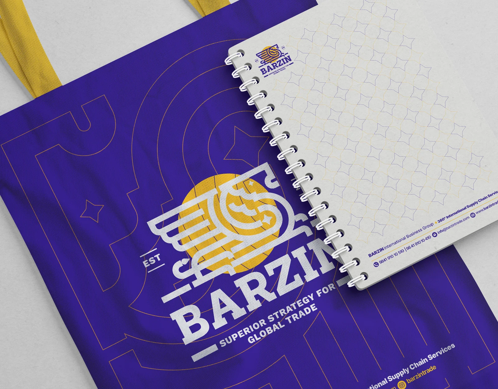
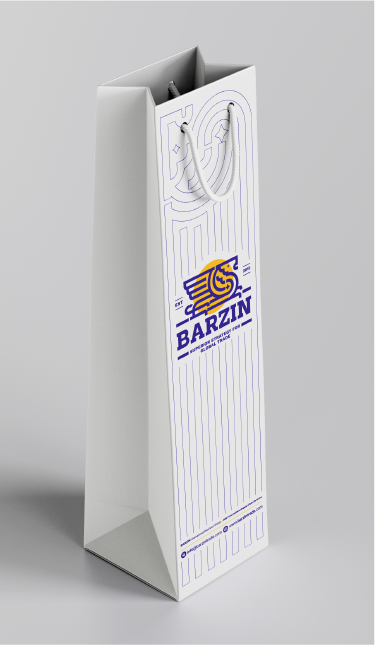
Branded bags extend Barzin’s visual identity to tangible, everyday items. They combine functional design with brand elements including logo, color palette, and patterns. The bags enhance brand visibility, convey professionalism, and provide a consistent experience for clients, partners, and employees.
Barzin packaging integrates logo, color palette, typography, and brand patterns to create a professional, cohesive, and premium presentation. Packaging communicates brand values of quality, elegance, and reliability while ensuring strong recognition and consistent visual identity across products.
08.3
Promosyon ürünleri
Branded pen drives serve as functional promotional items. They feature the logo, brand colors, and patterns, combining utility with brand visibility. These items reinforce recognition and can be distributed at corporate events, conferences, or as client gifts.
08.4
Ambalaj
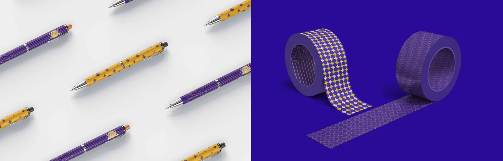
Branded packaging tape reinforces brand identity during shipping and handling. The logo, colors, and patterns ensure visibility and professional presentation, transforming even functional items into marketing tools.
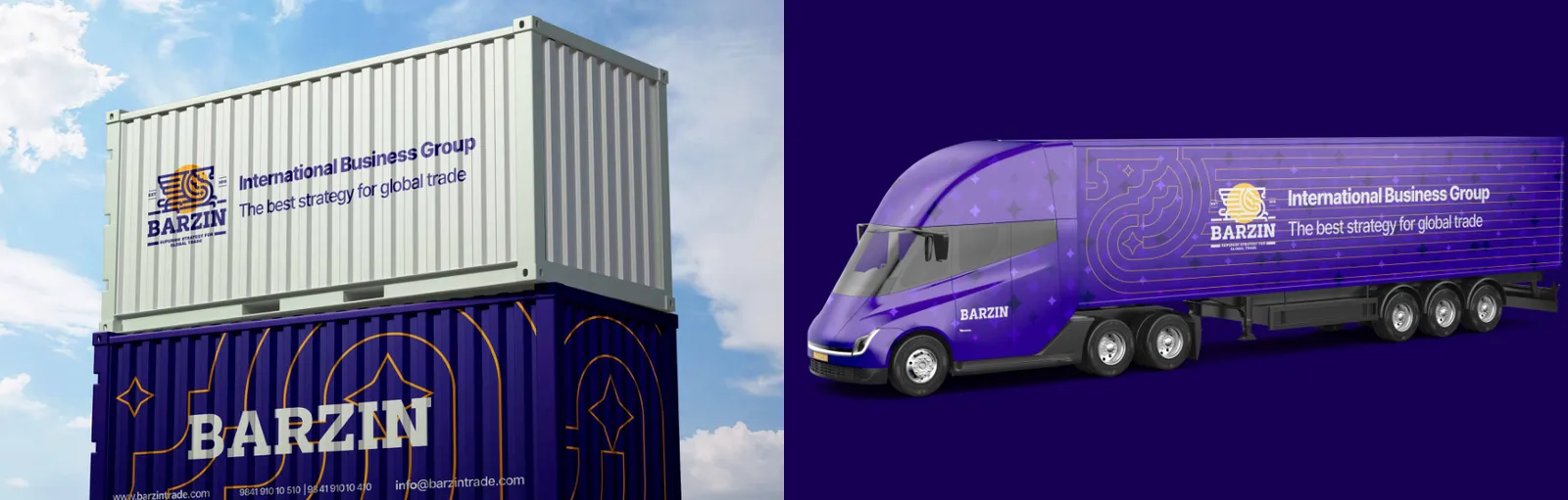
Branded shipping containers showcase Barzin’s global reach and professionalism. The logo, colors, and patterns are applied to maintain recognition and consistency during transport. Containers act as mobile brand ambassadors, reflecting Barzin’s reliability and international presence.
09
Uygulamalar
09.1
Tabelalar
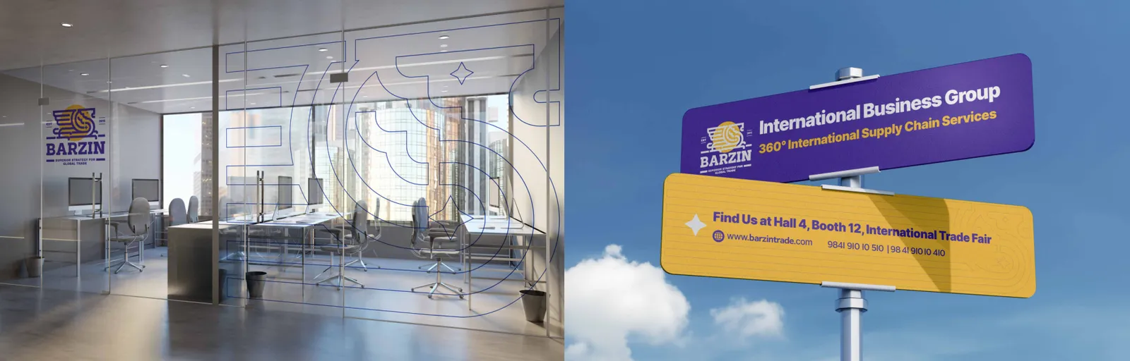
Street sign boards featuring Barzin’s brand elements ensure visibility and professional appearance in public and corporate environments. Logo, colors, and patterns are applied for instant recognition and consistency with brand guidelines.
Sign boards for offices, stores, or warehouses integrate Barzin’s logo, color palette, and brand patterns. Their design ensures visibility, readability, and a professional impression aligned with brand identity.
09.2
Etkinlik ve fuarlar
Barzin pop-up experiences provide temporary branded spaces for marketing, events, or product launches. Design elements include logo, colors, typography, and patterns to ensure consistent brand presence, engagement, and memorable experiences for visitors.
09.3
Reklam
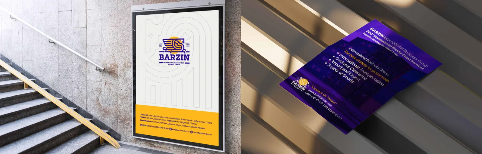
Posters are visual tools for promotion, announcements, and campaigns.
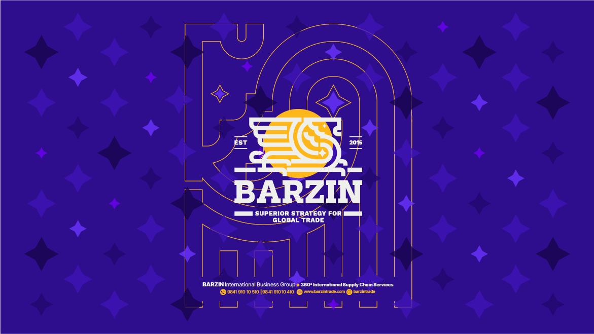
Billboards are high-impact advertising tools.
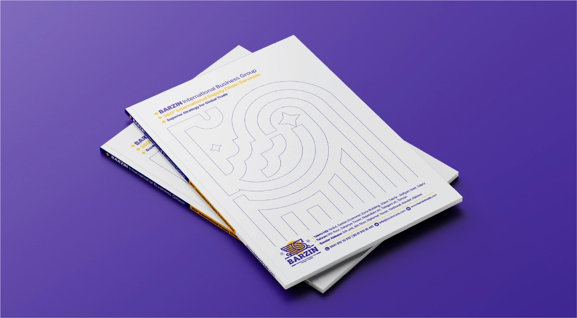
Brochures communicate Barzin’s services, mission, values, and brand story. They are designed using the primary color palette, typography system, and visual elements, including logo and patterns. Layouts are structured to balance readability with visual appeal. Brochures can be adapted for print and digital formats, ensuring consistency, professionalism, and effective communication of the brand’s key messages.
Barzin posters utilize brand typography, colors, logo, and patterns to maintain identity consistency. Layout and imagery are designed for high visual impact, clear messaging, and engagement, ensuring alignment with brand values and professionalism.
Barzin’s billboards utilize the logo, color palette, typography, and brand patterns to attract attention and communicate key messages. Layouts prioritize readability from a distance while maintaining a professional and cohesive visual identity.
Street posters communicate Barzin’s messages in outdoor environments. They utilize brand typography, colors, patterns, and logo placement to ensure clarity, visibility, and professional visual identity even in busy settings.
09.4
İç mekân
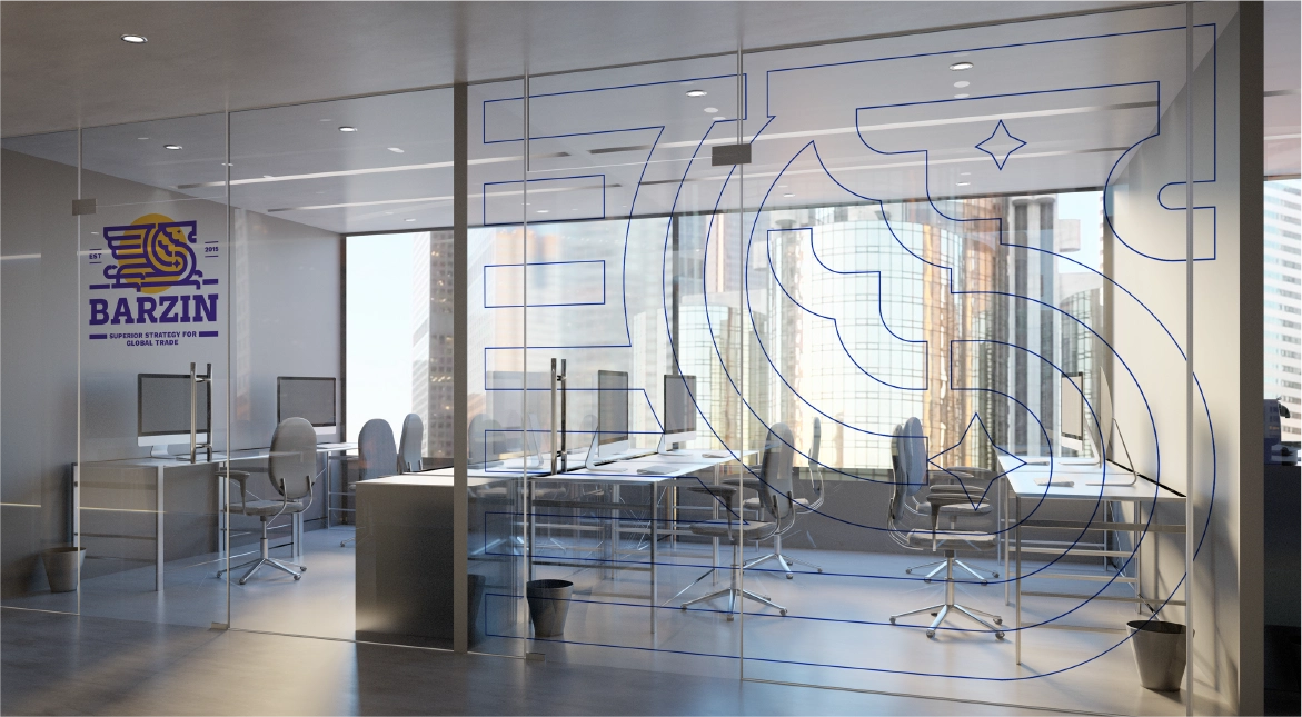
Interior branding of Barzin’s office spaces incorporates logo, color palette, typography, and brand patterns. Wall graphics, signage, and furniture elements create a professional, cohesive, and inspiring environment for employees and visitors.
09.5
Bayraklar
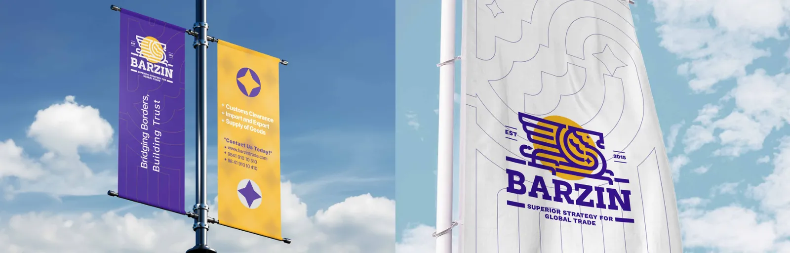
Branded flags carry Barzin’s visual identity in outdoor events, corporate spaces, and exhibitions. They prominently feature the logo, brand colors, and patterns. Flags enhance brand visibility, reinforce recognition, and create a professional, cohesive presence in large-scale or public settings.
09.6
Araçlar
Barzin-branded transport vehicles extend the brand’s visibility on the move. Logo, color palette, and patterns are applied consistently across trucks, vans, and cars. Vehicle branding ensures professional appearance, reinforces identity, and promotes Barzin during logistics operations.