01
Genel bakış
01.1
Bir bakışta
Düz çizgiler ve hesaplı açılarla kurulmuş bir kurt yüzü ve bir elmas.
- Proje
- Görsel kimlik
- Alan
- Forex
- Yıl
- 2024
- Hizmetler
- Görsel kimlik
01.2
Giriş
Sağlam çizgiler ve hesaplanmış açılar kullanılarak, bu logo izleyicide güven ve güç hisslerini uyandırıyor.
Turuncu ve siyah renk kombinasyonu, psikolojik açıdan izleyicilere coşku ve neşe ile ilgili olumlu anlamlar iletilmesini sağlar. Turuncu renk, coşku ve dinamizmi simgelerken, siyah renk güç ve ihtişamı temsil eder. Bu renk kombinasyonu genel olarak izleyicilere enerji ve güç duygusu verirken, aynı zamanda şirket ile finansal işlem kavramı arasındaki ilişkiyi de güçlendirir.
01.3
Hakkında
MONDFX, forex piyasasına erişim sağlayan finans şirketidir. MONDFX şirketi, yatırımcılara veya komisyonculara bu şirket aracılığıyla döviz çiftlerini forex piyasasında alıp satma imkanı sunuyor.
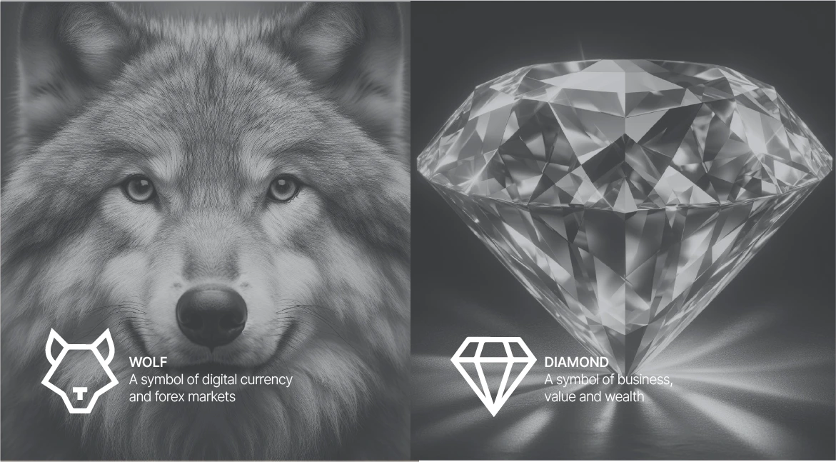
Bu logoda basit geometrik kurt figürü ve elmas şekli kullanılarak tasarlanmış. Elmas, zenginlik ve değeri simgelerken, kurt güç ve çevikliği (wolf of wall street filmdeki karaktere atıfta bulunarak) sembolize eder.
01.4
Tarihçe
Built to give every trader seamless access to the global Forex market.
01.5
Marka değerleri
The principles behind every product, every conversation and every page MONDFX publishes.
01.6
Ses tonu
MONDFX speaks with clarity, professionalism and confidence. Each track shows how close the voice stays to its trait — and how far from the opposite.
02
Logo
02.1
Marka logosu
İşaretin kendisi, tek başına.
02.2
Tasarım
Sonuç olarak, MONDFX logosu sadece bir görsel sembol değil, aynı zamanda markalaşma ve pazarlamada stratejik bir araçtır. Bu logo, şirketin ana mesajlarını etkili ve akılda kalıcı bir şekilde hedef kitleye iletmesine yardımcı olur. Dikkatli tasarımı ve grafik unsurların akıllıca kullanımı ile bu logo, MONDFX şirketinin finansal piyasalardaki yeteneklerini, değerlerini ve hedeflerini simgeler.
02.3
Konsept
The full logo is the MONDFX signature: the symbol, the MondFx wordmark and the company name MOND TRADES LTD as one fixed unit.
The MONDFX symbol is a geometric fusion of a wolf and a diamond — strength, precision and ambition in one mark. Its structure stands for stability and professionalism.
02.4
Yapı
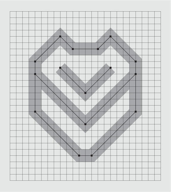
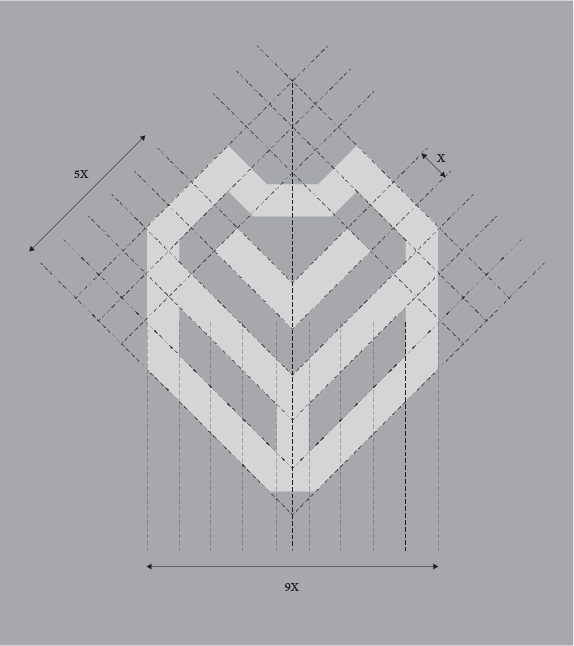
The symbol is drawn on a square grid with straight strokes of one weight and 45° angles. That geometry is what makes it read as precise and stable at every size.
Every edge of the symbol follows a 45° guide, and every width is a multiple of one module, X. The same angles make the chevron that the wolf and the diamond share.
02.5
Varyasyonlar
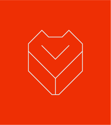
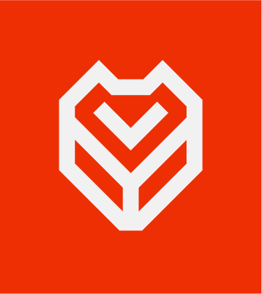
One logo, four arrangements. Choose by the space available; never build a new one.
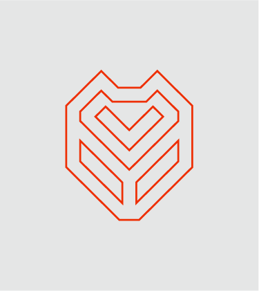
A single-line version of the symbol for patterns, watermarks and very large graphics. It never replaces the logo.
02.6
Minimum boyut
The symbol stays sharp down to 60 px on screen. Use the larger steps whenever the space allows.
02.7
Yerleşim
Place the logo in a corner of the format — top or bottom, left or right — with at least H to the edges. Keep one position across a series.
02.8
Hatalı kullanım
Use only the master artwork. These six changes are the most common — none of them is allowed.
03
Renk
03.1
Palet
Kimliğin renkleri ve referansları.
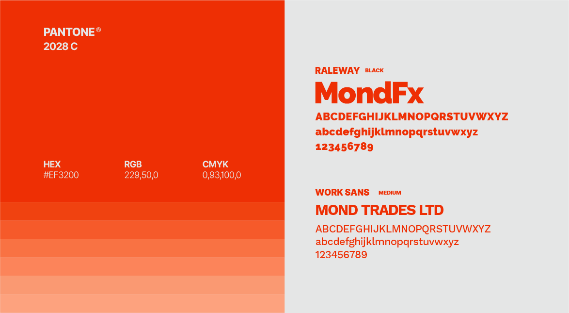
- RGB:
- 239/50/0
- HEX:
- #EF3200
- PMS:
- 2028 C
03.2
Renk hikâyesi
Orange Passion, action and determination — the dynamic nature of trading.
03.3
Renk sistemi
Two colours carry the brand: the red-orange for energy and action, the cool gray for balance. White and black support them.
Tints of the orange run from 100% to 10%. Use them for backgrounds, charts and tables — never for the logo. Text on a tint follows the pairings (3.5).
Each tile is drawn at its recommended share of a layout. Orange leads; gray calms; white and black give it air and weight.
Text needs 4.5:1; large text (18 pt, or 14 pt bold) needs 3:1. Orange text and white text on orange: large text only. Body text: black on white, gray or orange; white on black.
04
Tipografi
04.1
Yazı karakterleri
Kimliğin yazı karakterleri ve kullandığı ağırlıklar.
- RalewayBlack
- Work SansMedium
05
Grafik öğeler
05.1
Desen
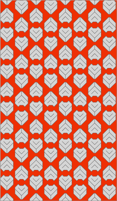
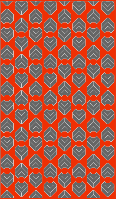
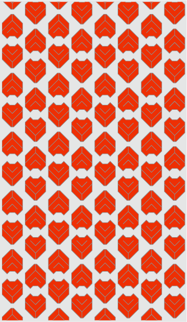
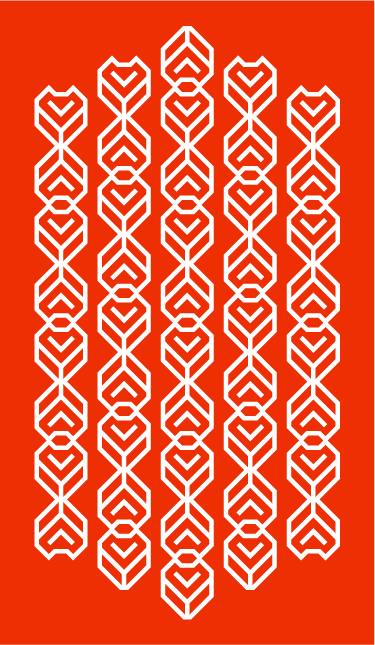
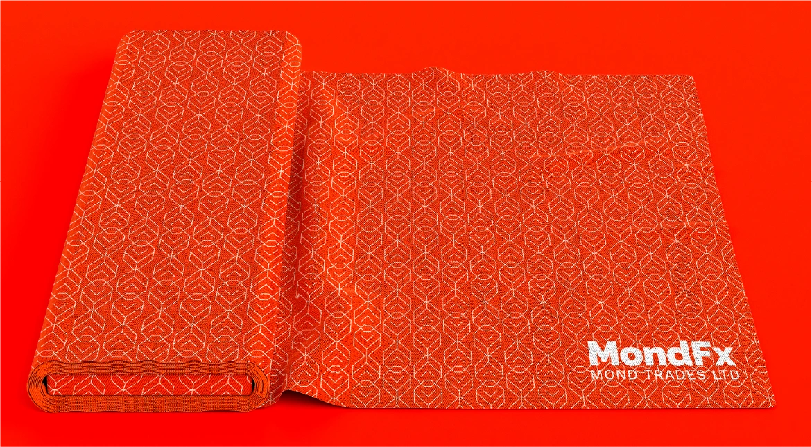
All three repeat the symbol — as an outline grid, as a chain of outlines and as solid marks. They turn any surface into MONDFX.
The symbol Wolf and diamond in one mark.
06
Kırtasiye
06.1
Kırtasiye seti
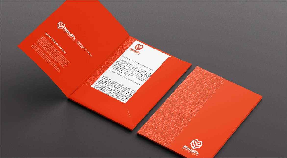
One family: orange, white and the outline symbol on every piece. Folder: orange outside with the logo; pattern inside the pocket. Keep the logo in the same corner across the set.
06.2
Kartvizitler
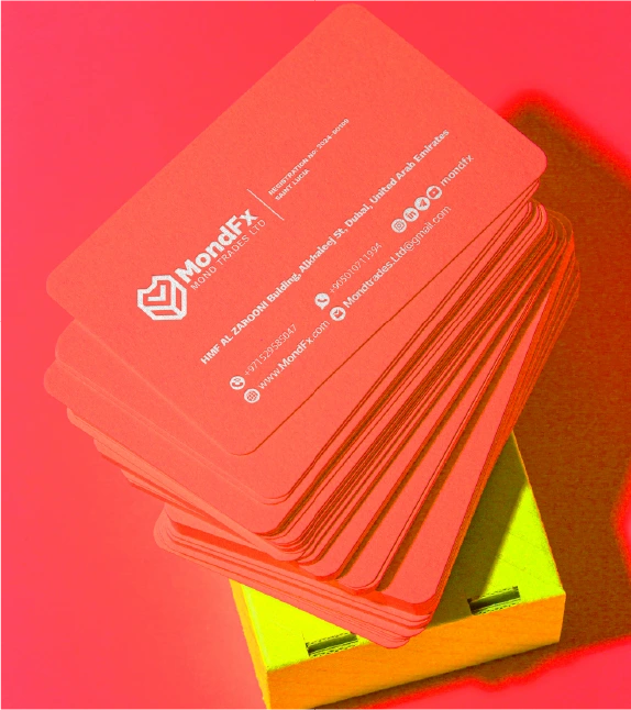
Two versions: orange with the light logo, white with the orange logo. The symbol large on the reverse, cropped by the edge. Name and details in Work Sans; figures in Work Sans.
06.3
Kimlik kartları
Card front (left) · on the lanyard (right) Orange card with the light logo at the top. Photo, name and role in Work Sans; the outline symbol behind. Orange lanyard printed with the MONDFX name.
06.4
Antetli kâğıt
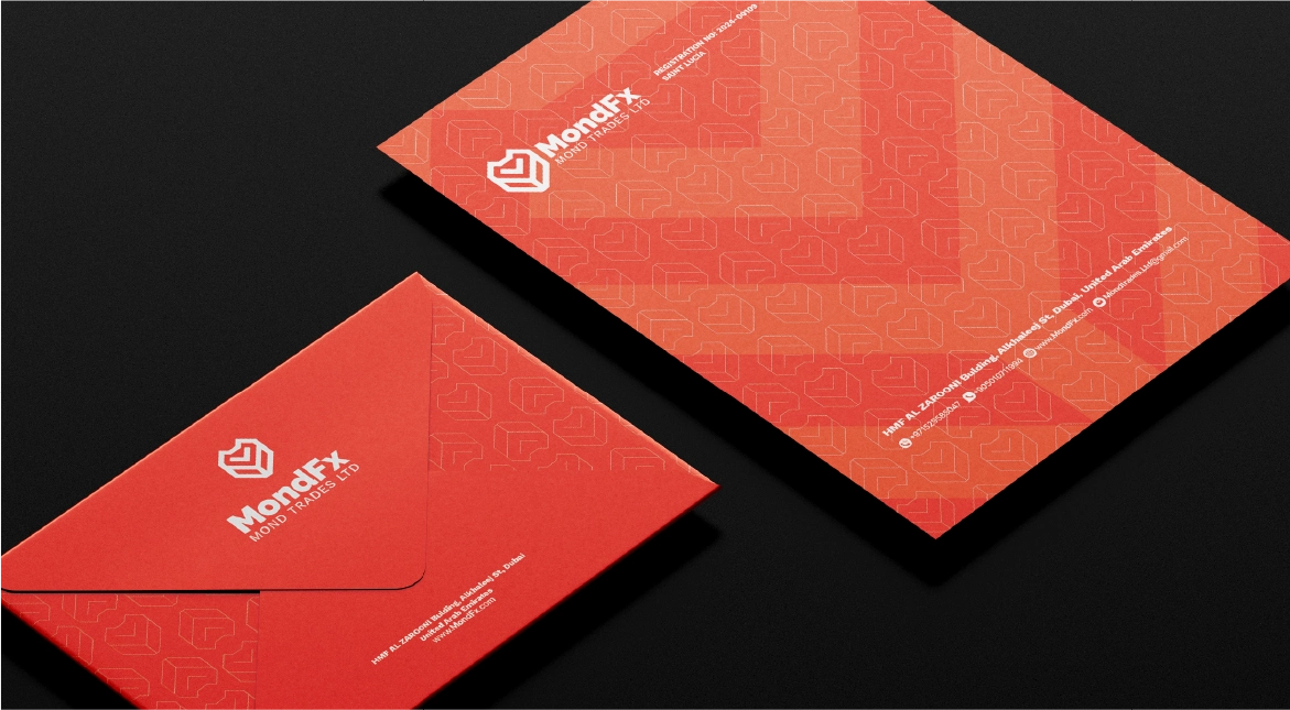
Letterhead White sheet; orange logo top-left; contact line at the foot.
06.5
Zarflar
06.6
Dosyalar
06.7
Takvim
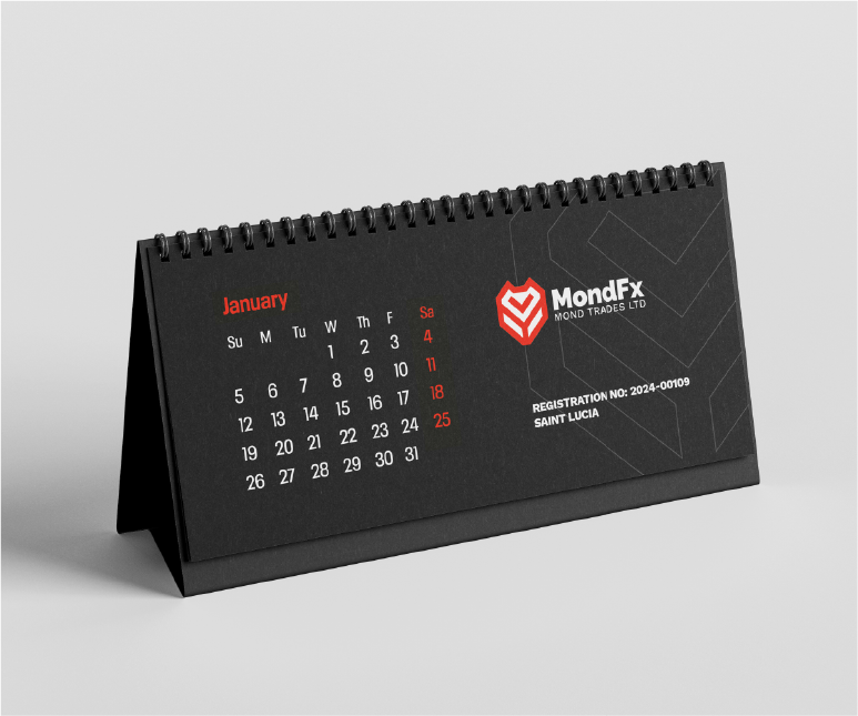
Trading book cover Book covers: black with the orange logo and the title in Raleway.
06.8
Etiketler ve mühürler
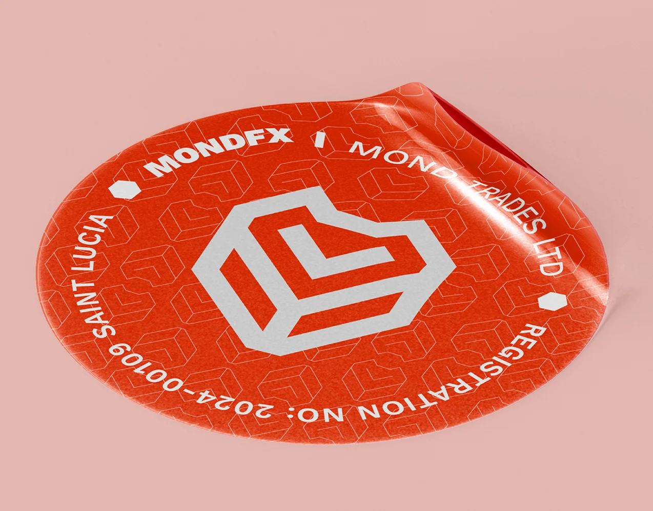
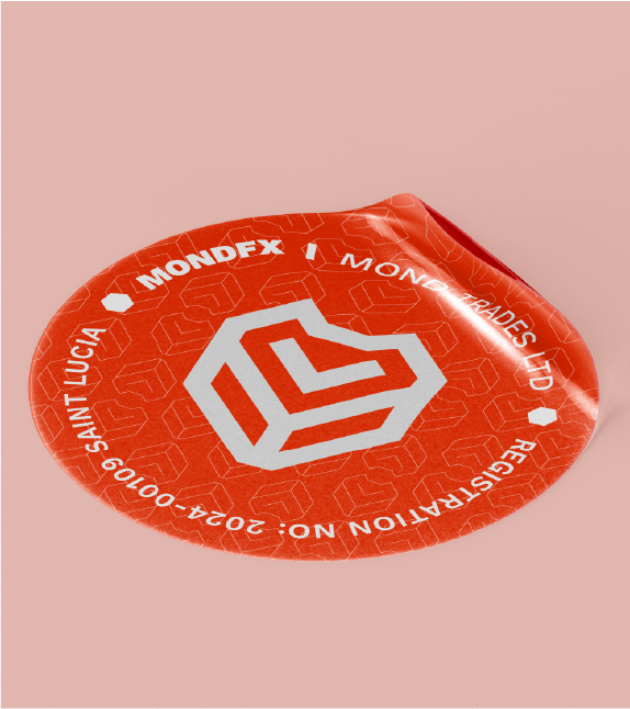
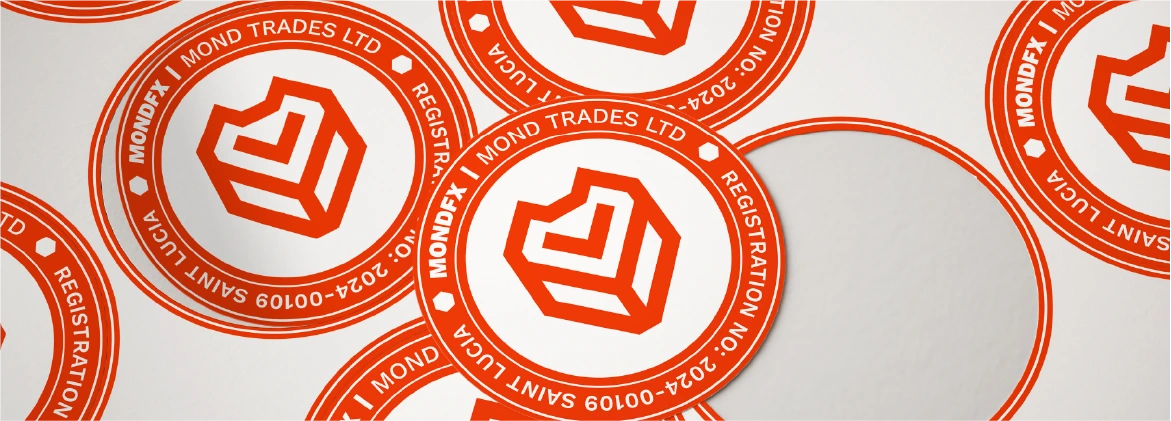
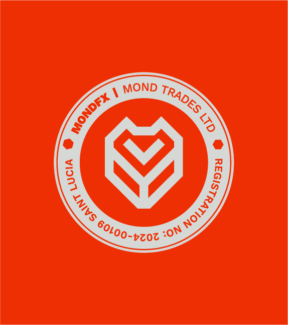
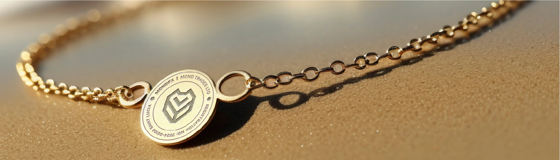
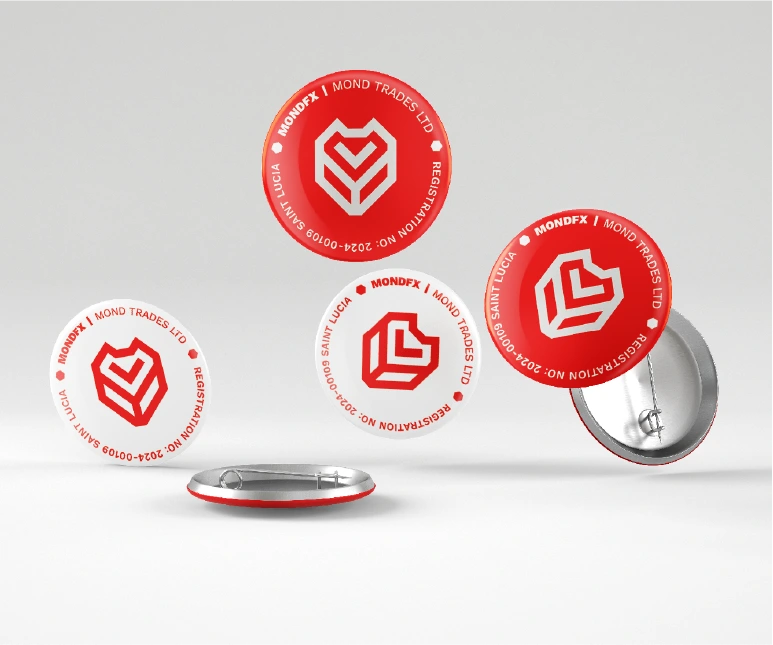
A circular seal sets the symbol inside the company details — MONDFX · MOND TRADES LTD · Saint Lucia · Registration no. 2024-00109. It marks stickers, badges, keychains and stamps.
07
Dijital
07.1
Web sitesi
Dark hero with the orange accent; one message per screen. Raleway for headlines, Work Sans for interface text. Favicon: the orange symbol (2.12).
07.2
Mobil uygulama
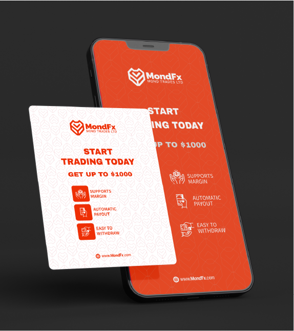
Orange screens for onboarding and offers; dark dashboards for trading. Charts on black; orange only for the value that matters.
07.4
Ekranlar
08
Marka ürünleri
08.1
Giyim
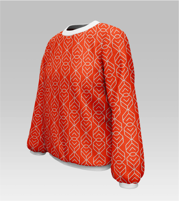
Orange garments with the light logo; the pattern all over on knitwear. Black polos: the symbol alone on the chest. One logo per garment, never stretched around seams.
08.2
Promosyon ürünleri
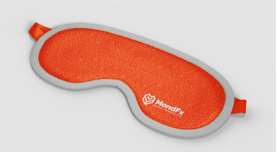
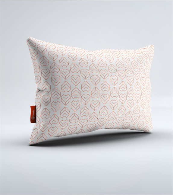
Small objects carry the seal, the symbol or the pattern — one at a time.
08.3
Ambalaj
Orange carries the brand at hand height: the pattern all over, the logo once and clear.
09
Uygulamalar
09.1
Tabelalar
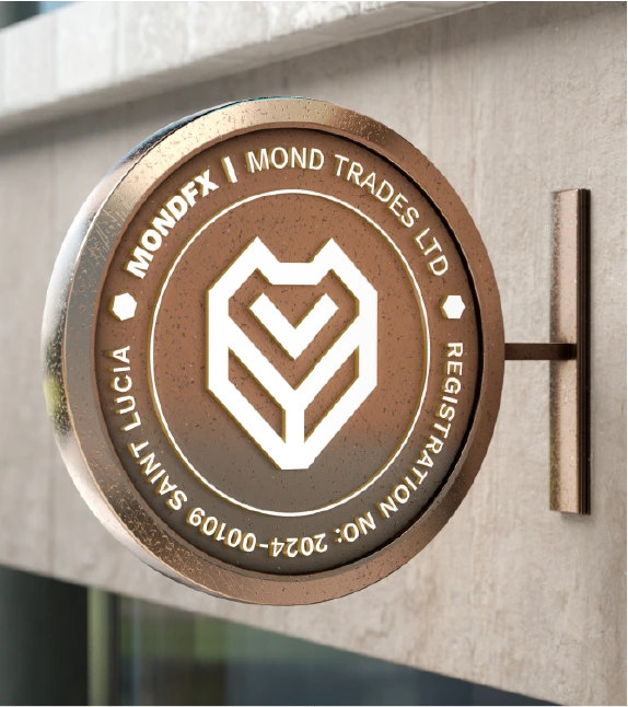
On buildings the logo works in metal and light: the wordmark alone on long facades, the full logo on fascias, the seal on round blade signs.
09.2
Etkinlik ve fuarlar
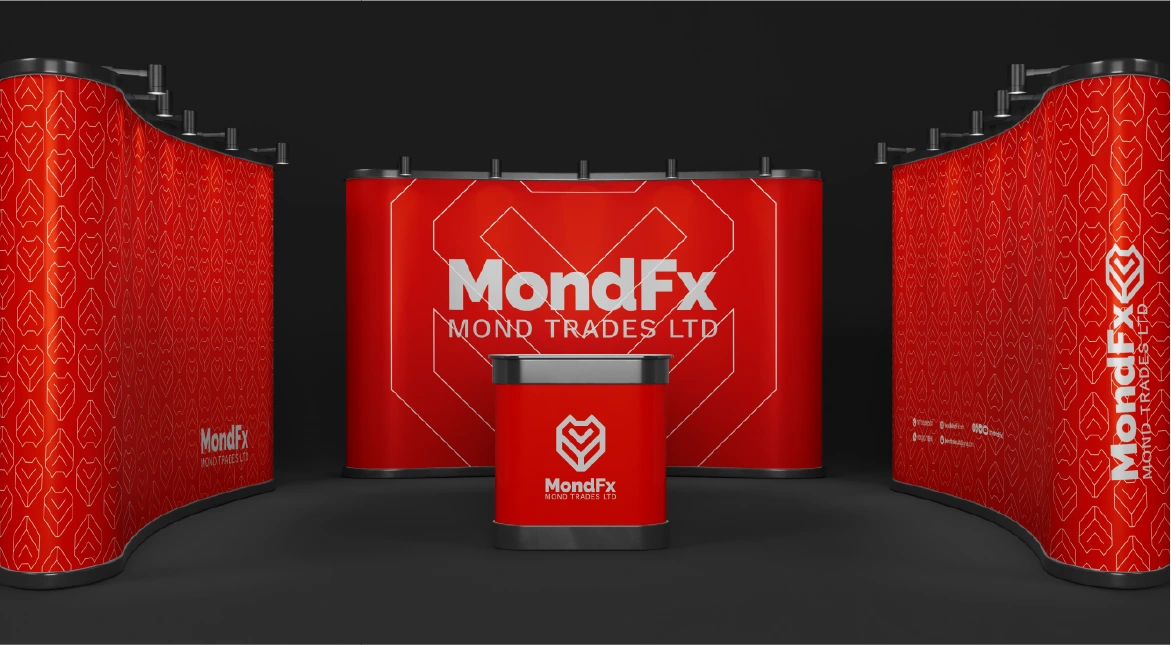
Reception walls in the solid pattern, stands in orange and white, the logo in three dimensions where people meet the brand.
09.3
Reklam
Billboards, flags, banners and vehicles: orange from far away, one short line, the logo large.