01
概览
01.1
一览
盾牌上的鹰象征力量与敏锐的洞察,以深绿与金色绘就。
- 项目
- 视觉形象
- 领域
- 自营交易公司
- 年份
- 2023
- 服务
- 视觉形象

01.2
简介
标志的造型以美观而易懂的方式呈现这些内涵。为此,标志设计采用了盾牌上一只鹰的形象。这一选择既富有视觉吸引力,又有力地象征了所期望的品质。
鹰象征力量与敏锐的洞察。
01.3
关于
自营交易公司 FENEFX 活跃于金融市场,让交易者无需拿自己的资本冒险即可参与交易。换句话说,这家公司为交易者提供所需的交易资金,并为他们提供一个提升交易技能与知识、从事更专业活动的平台。
标志传达出力量、信任、财富、精通、远见与增长的内涵。
01.4
品牌历史
The brand’s history is a journey through its milestones, showcasing the evolution, achievements, and legacy that shape its identity today.
FENEFX was established with a bold vision: to redefine the way traders access capital and navigate the financial markets. Recognizing the barriers that prevent talented traders from reaching their full potential, the company set out to bridge this gap by providing financial backing to skilled individuals. Instead of limiting traders with high entry costs and financial risk, FENEFX empowers them with funding solutions that allow them to focus on strategy and skill development rather than capital constraints. Over the years, the firm has expanded its presence in the proprietary trading industry, building a strong reputation for reliability, innovation, and trader success. Through continuous improvements in technology, evaluation processes, and educational resources, FENEFX has created an ecosystem where traders can thrive. Today, the brand is known not only for providing capital but also for fostering a community of ambitious traders who aim to master the financial markets.
01.5
使命
The mission defines the brand’s purpose, guiding its actions and decision-making to fulfill customer needs and create value.
At FENEFX, our mission is to provide ambitious traders with the capital, tools, and educational resources they need to succeed in the financial markets. We believe that financial constraints should not limit talent, which is why we remove the barriers to entry and empower traders to focus on honing their skills and executing their strategies with confidence. We strive to cultivate a professional and supportive trading environment where traders can grow, learn, and maximize their potential with minimal risk. Our goal is to foster a new generation of successful traders by providing access to funding, technology-driven solutions, and industry-leading support. Through our proprietary trading model, we help traders turn their expertise into profitable opportunities while minimizing their financial exposure.
01.6
愿景
The vision statement articulates the brand’s aspirations, serving as a roadmap for long-term growth and success.
Our vision is to become the leading proprietary trading firm, revolutionizing the way traders engage with financial markets. We strive to build a future where financial talent is recognized and nurtured, regardless of background or initial capital. By leveraging cutting-edge technology, data-driven insights, and an inclusive funding model, we aim to democratize access to financial markets, allowing traders worldwide to unleash their full potential. We see FENEFX as more than just a funding provider; we envision it as a global hub for trader development, innovation, and financial mastery. Our long-term goal is to create an environment where traders are not only funded but also mentored, supported, and empowered to become industry leaders. By maintaining the highest standards of integrity, trust, and financial excellence, we aim to redefine the future of proprietary trading.
01.7
品牌价值观
Core values reflect the principles that drive the brand, influencing its culture, behavior, and commitment to stakeholders.
Empowerment: FENEFX enables traders to develop their talents and skills without financial limitations. We provide a platform where traders can focus on their strategies and analysis, improving their performance and achieving financial goals. Integrity: Transparency and fairness are at the heart of everything we do. We are committed to providing a trustworthy trading environment where all processes and information are clear, trackable, and free from ambiguity. Our relationships with traders and partners are built on mutual trust, respect, and accountability. Growth: Continuous learning, personal development, and financial progress are core values at FENEFX. We help traders deepen their understanding of financial markets, enhance their skills, and achieve sustainable growth through strategic analysis and informed decision-making. Security: Trust and confidence are fundamental to our brand. We ensure that traders can operate in a secure and stable environment without unnecessary risks. Our infrastructure meets high standards of data security, Excellence: We are committed to delivering the highest standards in proprietary trading. From evaluation processes to support and educational resources, everything at FENEFX is designed to provide traders with an exceptional experience.
01.8
语气语调
The tone of voice establishes the brand’s personality in communication, ensuring consistency and resonance with its target audience.
Professional: The tone of FENEFX is based on precision, credibility, and expertise. All our communications maintain professionalism, clarity, and accuracy to ensure traders receive reliable and precise information. Inspirational: We speak in a motivating and empowering way, encouraging traders to push their limits and achieve greater success. Clear & Precise: We present information in a way that is easily understandable for traders of all experience levels. Our content is clear, direct, and free from ambiguity, enabling traders to make well-informed decisions. Supportive & Trustworthy: We guide traders with a friendly and trustworthy tone, ensuring they feel supported throughout their journey. Our goal is to create a sense of security and partnership, so traders never feel alone in their challenges.
02
标志
02.1
品牌标志
标志本身。

02.2
设计
展翅的鹰代表其在高空飞翔的力量,能从高处俯瞰全局。这一符号也暗含成长与发展的概念。盾牌则象征精通与保护,能为受众带来安全感与信心。
在色彩上,标志选用绿色和金色两种主色,效果十分出色。绿色象征成长与繁荣,代表金融市场与投资中的增长和盈利潜力;金色则象征财富、价值与信誉,激励目标受众参与交易和投资。
02.3
创意概念
The logo symbolizes the brand’s ethos, visually communicating its mission, values, and unique identity.
We all know logo is one of the most important things in a business/company. So, this logo should be created in a very professional way that speaks to the business company.
The FENEFX logo masterfully combines the majestic image of an eagle with the protective symbol of a shield. The eagle, with its outstretched wings, represents power, keen vision, and the agility required to navigate the financial markets. Meanwhile, the shield underscores the values of mastery and security, instilling trust and confidence. The thoughtful use of green and gold colors further symbolizes growth, prosperity, and the wealth of opportunities available to our traders.
02.4
标志结构
The logo structure uses a grid system for precise alignment, reflecting professionalism and attention to detail.


02.5
背景应用
The logo is optimized for seamless integration across different backgrounds, ensuring versatility and brand consistency.


02.6
错误用法
To maintain brand integrity, alterations or unauthorized uses of the logo, such as distortions or recoloring, are prohibited.
The examples above illustrate improper ways to use variations of the FENEFX Visual Identity. While this list is not exhaustive, it highlights some of the most common errors that can compromise the brand’s appearance. Please ensure that the FENEFX identity is always reproduced in the correct colors, with accurate positioning and proportions, and without any distortion or unauthorized alterations.
03
色彩
03.1
色板
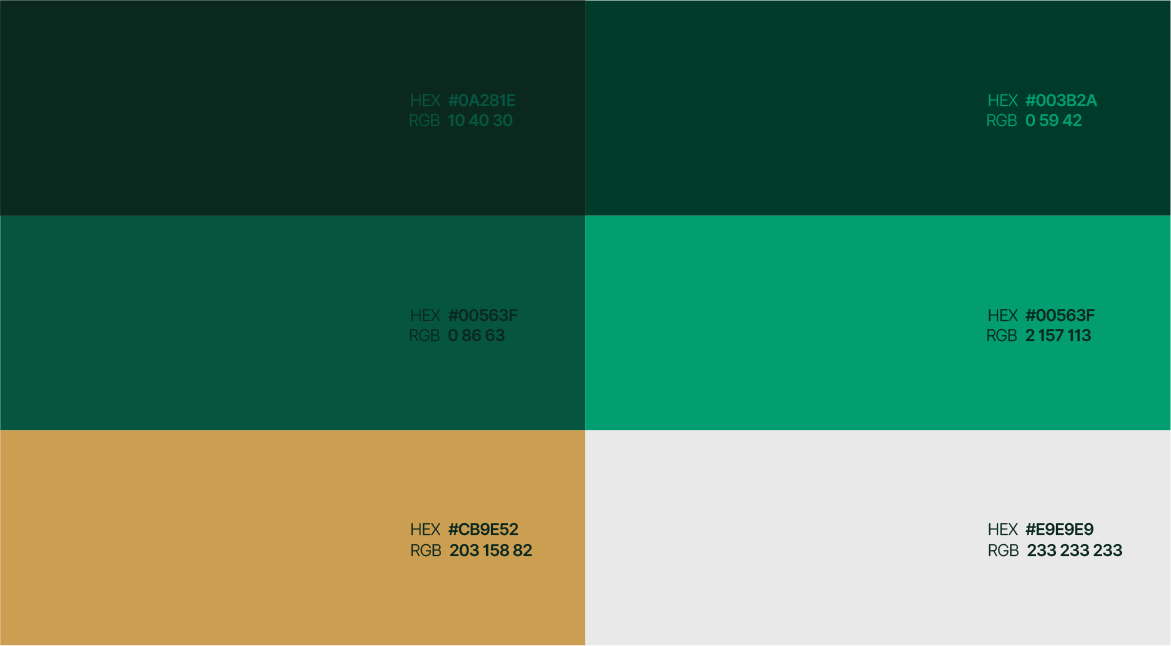
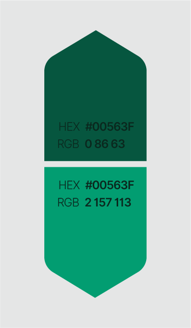
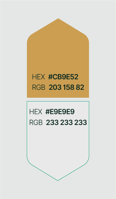
视觉形象的色彩及其色值参考。
- RGB:
- 10/40/30
- HEX:
- #0A281E
- RGB:
- 0/59/42
- HEX:
- #003B2A
- RGB:
- 0/86/63
- HEX:
- #00563F
- RGB:
- 2/157/113
- HEX:
- #029D71
- RGB:
- 203/158/82
- HEX:
- #CB9E52
- RGB:
- 233/233/233
- HEX:
- #E9E9E9
03.2
色彩故事
Each color in the palette has a distinct meaning, symbolizing the brand’s values and enhancing its narrative.
At the heart of FENEFX’s visual identity is a carefully chosen color palette that reflects its core values and mission. The vibrant green symbolizes growth, renewal, and the dynamic potential of every trader. It speaks to the continuous evolution and opportunity present in the financial markets. Gold, the complementary hue, represents wealth, value, and credibility. It reinforces FENEFX’s promise of financial opportunity and excellence, serving as a beacon of trust and success. Together, green and gold create a harmonious visual narrative that communicates security, optimism, and forward-thinking innovation. This deliberate color combination not only enhances the brand’s aesthetic appeal but also serves as a constant reminder of FENEFX’s commitment to empowering traders and fostering a prosperous trading community.
03.3
色彩系统
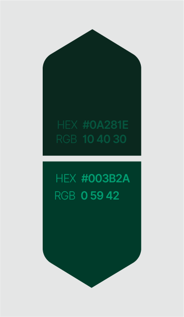
The color palette is the essence of the brand’s visual identity, carefully curated to evoke emotions and create memorable connections.
04
字体
04.1
所用字体
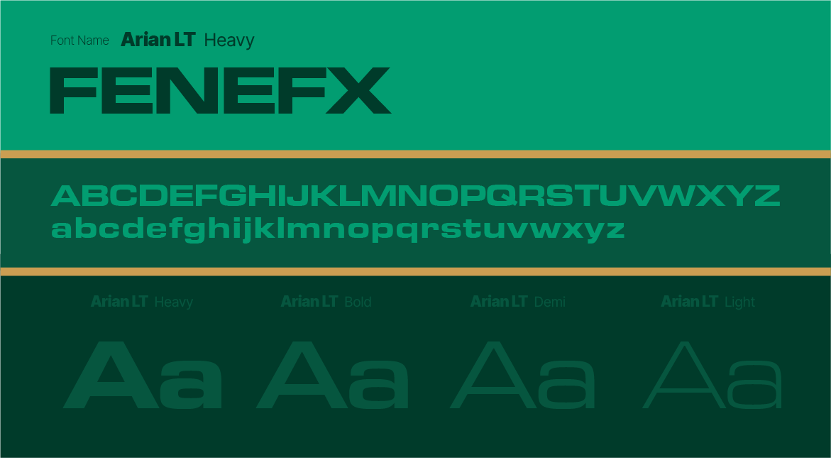
视觉形象所用的字体及字重。
- Arian LTHeavyBoldDemiLight
04.2
字体样张
Arian LT PRIMERY TYPEFACE Arian LT Arian LT is a sleek and modern sans-serif typeface designed for clarity and versatility. Its clean lines and balanced proportions make it ideal for both digital and print media, ensuring readability across various platforms. Arian LT’s minimalist aesthetic lends itself well to contemporary designs, branding, and editorial use, offering a professional yet approachable tone. Whether for headlines or body text, this font combines functionality with a touch of elegance.
The secondary font complements the primary font, adding flexibility while maintaining brand consistency across various applications.
Secondary Font Mytupi is a highly versatile and modern sans-serif typeface designed by Rasmus Andersson. It was specifically created for optimal readability and performance in user interfaces and digital screens. The font features a neutral and clean design with open letterforms, making it suitable for both small body text and larger headings.
05
图形元素
05.1
图案
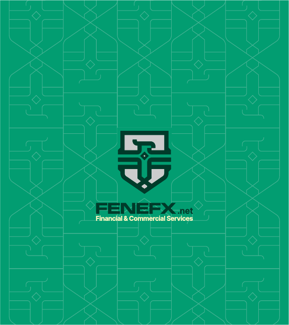
The brand pattern extends the visual identity, creating a cohesive design language that complements the logo and supports branding.




05.2
图标
Iconography enhances visual communication by using distinctive symbols that reinforce brand identity and improve user experience.

06
办公用品
06.1
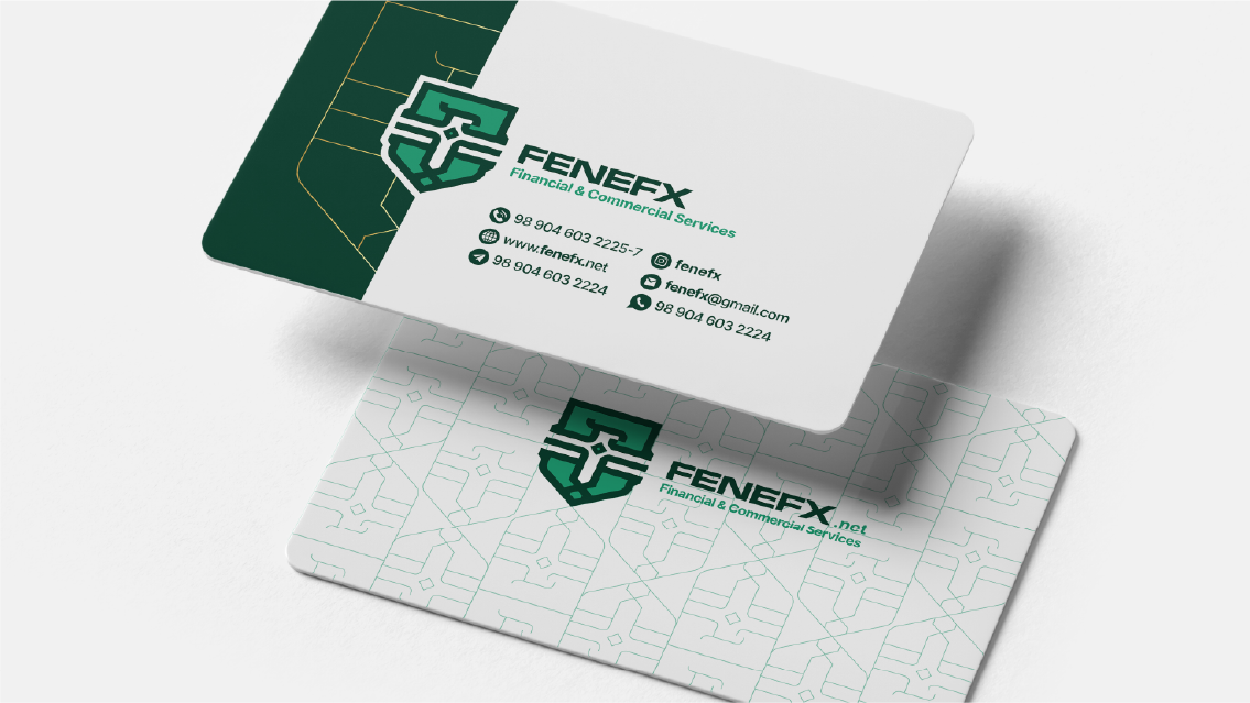
名片
A business card is a compact representation of the brand, offering essential contact information while reinforcing professionalism and brand identity.

06.2
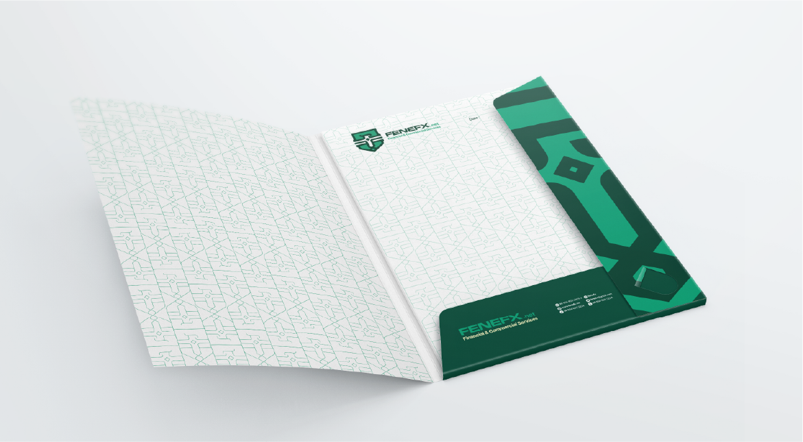
文件夹
Folders combine practicality with professionalism, organizing documents while showcasing the brand’s logo and design elements.
07
数字
07.1
网站
The website serves as the digital face of the brand, offering an engaging and user-friendly platform to communicate the brand’s message, products, and services.
Favicons are small, symbolic icons that enhance brand visibility on web browsers, bookmarks, and mobile interfaces, representing the brand in a compact digital format.
Fenefx.net https://www.
07.2
营销活动与邮件
Email marketing strengthens customer relationships by delivering personalized messages, promotions, and updates directly to the audience’s inbox.
FENEFX Weekly Newsletter Stay Ahead in Financial Markets Hello, dear trader! Welcome to the FENEFX Weekly Newsletter. In this edition, we’re excited to share the latest updates and exclusive insights designed to help you navigate the markets with confidence. Read More Only This Weekend! Don’t miss our limited-time offer to enroll in FENEFX’s advanced trading courses at a special discount. Strengthen your strategies, enhance your skills, and gear up for bigger gains.
New Features & Updates We’re committed to providing you with the best trading experience possible. Our latest update includes powerful risk management tools and more comprehensive market analysis reports.
08
品牌周边
08.1
服装
Branded hoodies merge comfort with style, turning everyday wear into a promotional tool.
A branded polo shirt offers a refined and professional look while reinforcing brand identity. It is a versatile uniform option for employees and a stylish promotional item for brand ambassadors.
Branded caps provide casual, wearable promotions that enhance visibility in daily life.
A branded tie adds elegance and professionalism, making it a refined accessory for corporate attire and brand representation.


08.2
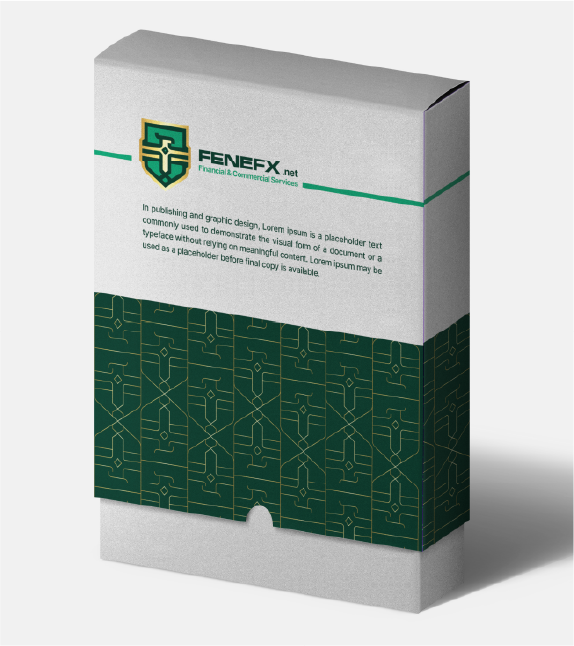
包装
Packaging reflects the brand’s identity while enhancing the unboxing experience, ensuring a memorable customer journey.
A gift card is a versatile branding tool that enhances customer engagement while providing a convenient gifting solution.
Branded packaging tape adds a personal touch to shipments, reinforcing the brand’s identity during delivery.

09
品牌应用
09.1
标识导视
The wordmark sign is a versatile brand asset used to display the brand name prominently in key locations, ensuring strong visibility and identity.
A branded company building showcases the organization’s identity, making a bold and professional impression.
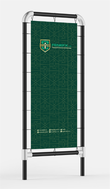
Street sign boards increase visibility in public areas, providing clear identification and navigation for customers.
09.2
广告
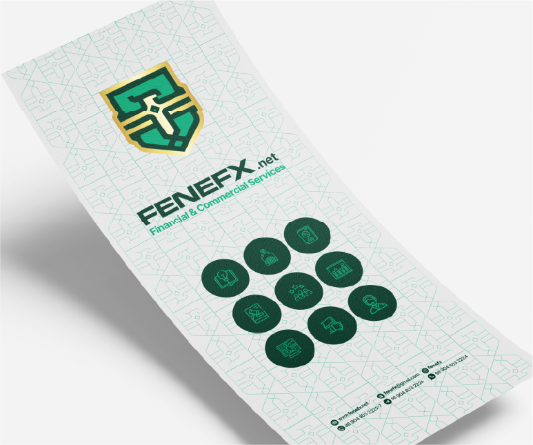
Brochures provide a detailed overview of the brand’s services and products, offering an engaging format for promotion and information sharing.
Posters visually communicate key messages in a bold format, perfect for promotional and informational campaigns.
Billboards maximize exposure in high-traffic areas, effectively communicating the brand’s message to a broad audience.
Street posters grab attention in urban areas, delivering impactful messaging and increasing brand awareness.