01
Visão geral
01.1
Em resumo
A, V and X fused into one geometric mark for a future-driven creative agency.
- Projeto
- Identidade visual
- Setor
- Creative agency · London
- Ano
- 2025
- Serviços
- Identidade visual, Brand Guidelines
01.2
Introdução
AVORIX is a future-driven creative advertising agency based in London. Its identity is built around the agency’s pillars: clarity, strategy and creative intelligence.
01.3
Sobre
The logo is a precise geometric fusion of the letters A, V and X: a minimal yet dynamic symbol for movement, cross-industry connection and forward-thinking strategy, designed to work as well in a favicon as on a London skyscraper.
Beyond the logo, mathematical grids, an adaptive type hierarchy and kinetic patterns drawn from the mark’s geometry turn the symbol into a brand language.
01.4
História
Avorix was established in London in 2025, at a time when brands required more than visual appeal — they needed clarity, meaning, and strategic direction. The agency was founded on the belief that creativity and strategy must move together to build strong and lasting brands. From the beginning, Avorix positioned itself as a future-driven creative agency, focusing on smart minimalism, geometric structure, and cohesive visual systems that transform ideas into meaningful brand experiences.
01.5
Missão
Avorix’s mission is to help brands shape their story, elevate their presence, and create meaningful impact through design, creative campaigns, and digital experiences. We combine strategic thinking with purposeful creativity to build brand identities that are consistent, scalable, and lasting.
01.6
Visão
Avorix envisions becoming a leading international creative agency that sets new standards in visual identity, creative campaigns, and digital communication. We aim to help brands not only be seen, but truly understood.
01.7
Valores da marca
Strategic Thinking: Every creative decision is grounded in purpose and analysis.
Meaningful Minimalism: Simplicity is powerful when it carries meaning.
Systematic Consistency: Visual identity is a living system, not isolated elements.
Purposeful Innovation: Creativity must solve real problems.
Clarity and Transparency: Clear form, clear message, clear communication.
01.8
Tom de voz
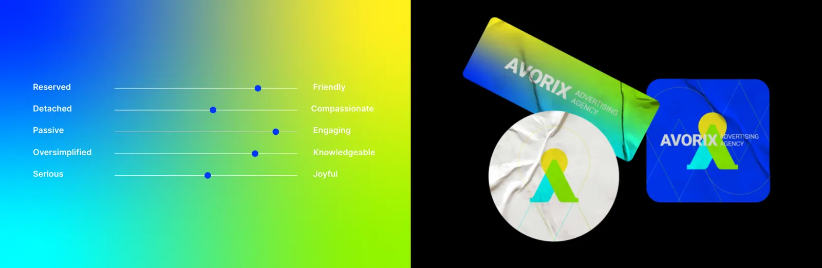
Avorix’s tone of voice is professional, clear, and future-oriented. The language is confident yet refined, inspirational without exaggeration, and strategic without unnecessary complexity. Avorix communicates with authority while remaining approachable and precise.
02
O logotipo
02.1
Conceito
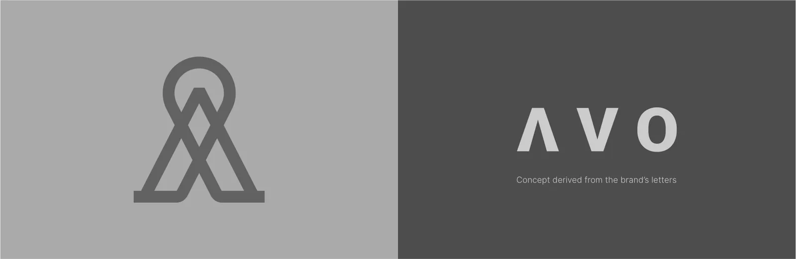
The Avorix logo is built on a smart geometric fusion of the three core letters of the brand name — A, V, and X. Designed with a minimalist and structured approach, the logo reflects the agency’s belief in the integration of strategy and creativity. Its dynamic form conveys clarity, motion, and connection while maintaining strong visual recognition across all applications.
The Avorix logo symbolizes forward motion, intellectual clarity, and strategic connection. The intersection of the letterforms represents the point where strategy and creativity converge, forming a unified and purposeful brand expression.

02.2
Construção
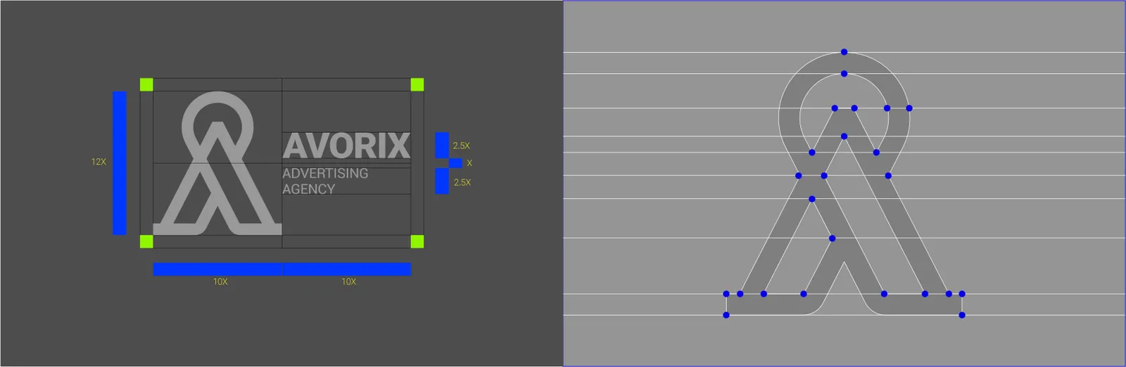
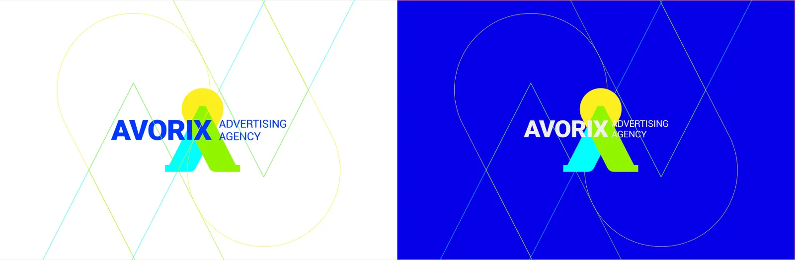
The Avorix logo is constructed using a precise geometric grid system. The integration of the letters A, V, and X follows strict proportional rules, resulting in a balanced, harmonious, and reproducible structure that reinforces consistency across all brand materials.
02.3
Área de proteção
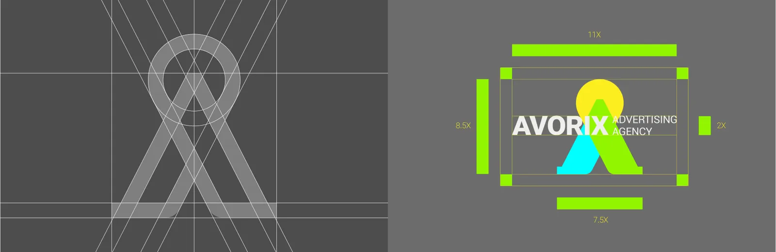
The logo exclusion zone for Avorix is defined using the internal geometric proportions of the mark. This clear space must remain free of any graphic, typographic, or visual elements to preserve legibility, impact, and brand integrity in all contexts.
02.4
Variações
The Avorix logo system includes primary, monochrome, reversed, horizontal, and vertical versions. All variations are derived from a single core structure, ensuring visual consistency while allowing flexibility across different backgrounds, layouts, and communication platforms.
02.5
Sobre fundos
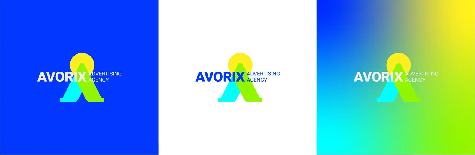
The Avorix logo is designed to perform effectively across a variety of backgrounds, including solid colors, gradients, and imagery. Approved background applications ensure maximum contrast, legibility, and brand recognition.
The logo should always maintain sufficient contrast with its background. On dark backgrounds, light or white logo versions must be used. On light backgrounds, the primary or dark logo version is recommended. Gradient backgrounds derived from the brand color system are fully approved when contrast is preserved.
02.6
Tamanho mínimo
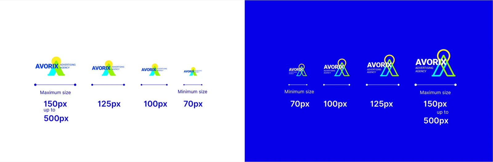
The Avorix logo must not be reproduced below the specified minimum size to ensure legibility, clarity, and consistent brand perception across all media.
02.7
Ícone do app
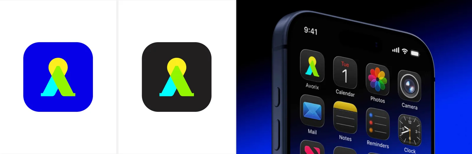
The Avorix app icon is a refined and simplified adaptation of the primary logo, focusing on the core symbol to ensure clarity, recognition, and visual strength at small digital sizes.
02.8
Posicionamento
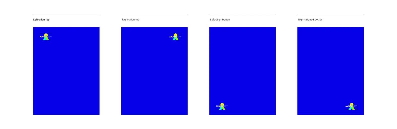
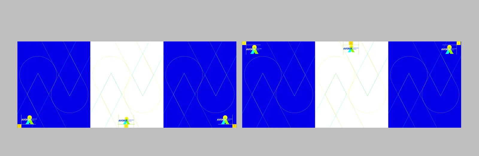
Logo placement follows a structured hierarchy depending on the medium. The logo should always be positioned to enhance visibility and brand recognition without overpowering other content.
Correct logo placement examples demonstrate how the logo should appear across various applications while maintaining consistency and visual harmony.
02.9
Usos incorretos
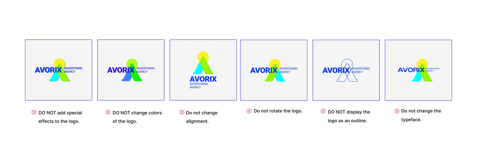
Any modification of the Avorix logo is strictly prohibited. This includes distortion, rotation, color alteration, shadow effects, outlines, or changing proportions.
03
Cor
03.1
Paleta
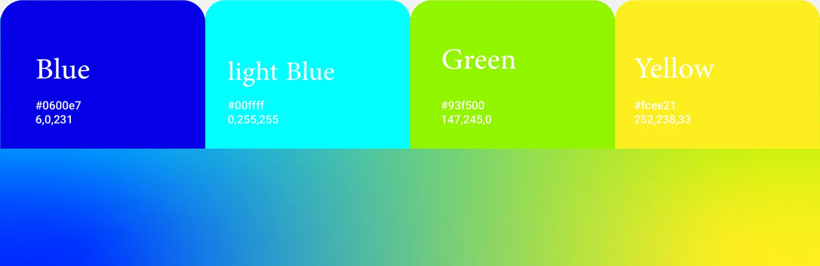
As cores da identidade e suas referências.
- Name:
- Blue
- RGB:
- 6/0/231
- HEX:
- #0600E7
- Name:
- Cyan
- RGB:
- 0/255/255
- HEX:
- #00FFFF
- Name:
- Green
- RGB:
- 147/245/0
- HEX:
- #93F500
- Name:
- Yellow
- RGB:
- 252/238/33
- HEX:
- #FCEE21
03.2
História da cor
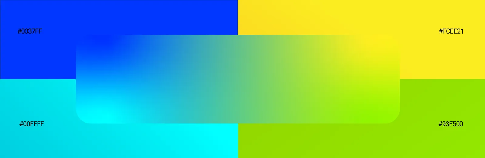
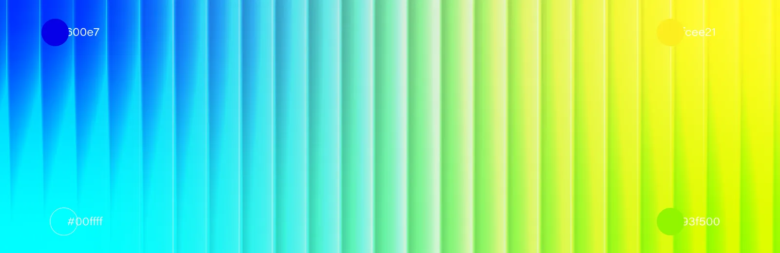
The Avorix color story is designed to express clarity, energy, innovation, and forward motion. The palette is built around high-contrast, vibrant hues that reflect the brand’s future-driven mindset and dynamic creative approach. Each color plays a strategic role in reinforcing brand perception, enhancing visual hierarchy, and supporting clear communication across digital and physical environments.
The smooth gradient transition between blue, cyan, green, and yellow symbolizes transformation, progress, and connection — key principles at the core of Avorix’s brand philosophy.
03.3
Sistema de cores
Blue #0600E7: Represents strategy, reliability, and clarity. Blue acts as the anchor of the brand, reinforcing trust and professionalism.
Light Blue (Cyan) #00FFFF: Symbolizes innovation, openness, and digital thinking. This color adds freshness and modernity to the visual identity.
Green #93F500: Reflects growth, progress, and creative evolution. Green connects the brand to forward movement and sustainable development.
Yellow #FCEE21: Represents energy, optimism, and impact. Yellow functions as an accent color to highlight key moments and calls to action.
The Avorix color palette consists of four core colors supported by a dynamic gradient system. These colors are selected to balance trust, creativity, growth, and optimism while maintaining strong visibility and consistency across all brand touchpoints.
04
Tipografia
04.1
Fontes
As tipografias da identidade e os pesos que ela usa.
- Roboto
- Arupala Grotesk
04.2
Espécime tipográfico
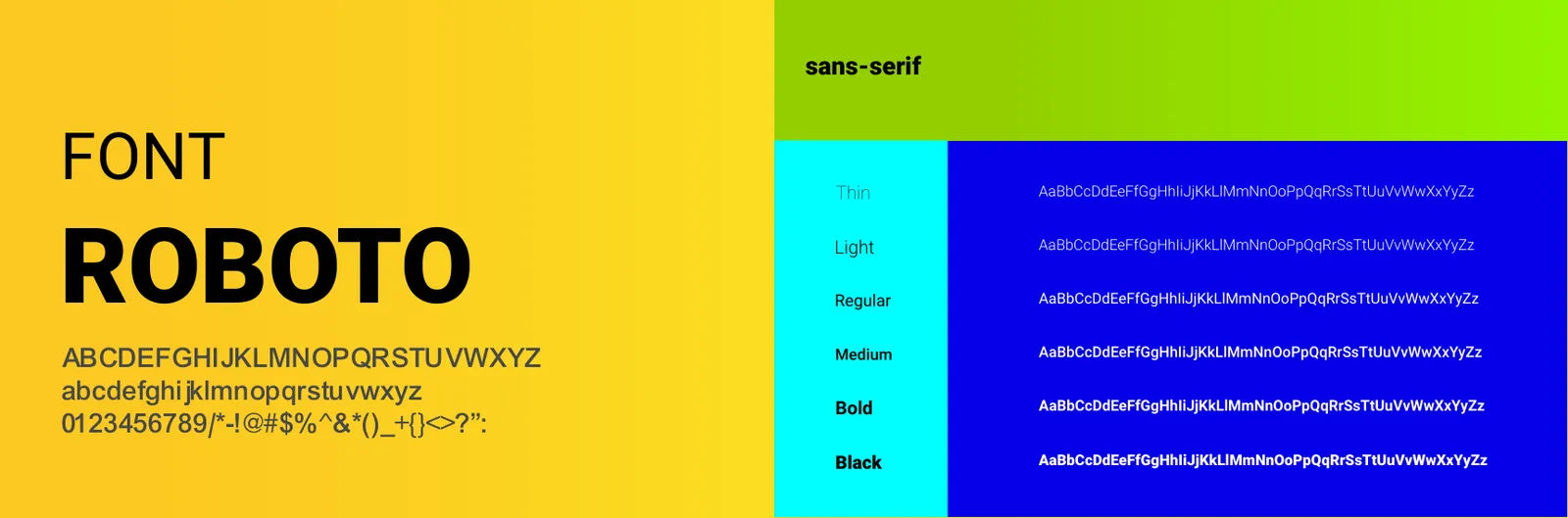
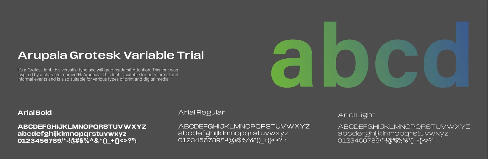
A clear and consistent hierarchy of font weights and sizes is essential to maintain readability, structure, and visual coherence across all Avorix brand communications. The typographic system is designed to support both strategic clarity and creative flexibility.
Avorix uses a controlled range of font weights to avoid visual noise and ensure a clean, confident, and professional appearance across digital and print environments.
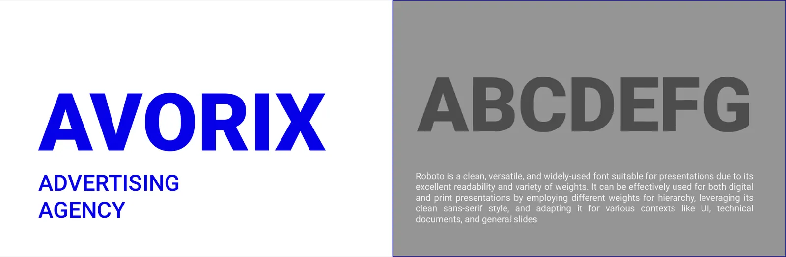
Roboto is selected as the primary typeface of the Avorix brand. As a modern sans serif typeface with geometric precision and high legibility, Roboto reflects the brand’s digital-first, future-driven, and strategic character.
Its clean structure, neutral tone, and wide range of weights make it highly adaptable across brand applications including headlines, UI elements, brand statements, presentations, and digital interfaces.
Roboto ensures consistency, clarity, and scalability across both digital and print environments while maintaining a contemporary and professional visual voice.
Arupala Grotesk is used as the secondary typeface of the Avorix brand. This grotesk-style font adds character, flexibility, and expressive contrast to the typographic system while maintaining harmony with the primary typeface.
It is primarily applied in editorial layouts, large-scale typography, creative headlines, brand campaigns, and visual statements where a stronger personality or emphasis is required.
The combination of Roboto and Arupala Grotesk allows Avorix to balance clarity with expressiveness, structure with creativity.
05
Elementos gráficos
05.1
Padronagem
The Avorix brand pattern is derived from the geometric structure of the logo. It extends the visual identity into a flexible graphic system that can be used across backgrounds, layouts, and brand materials.


06
Papelaria
06.1
Papelaria completa
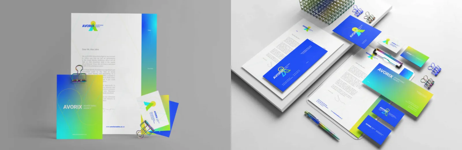
The Avorix full stationery set includes all official corporate communication materials designed as a unified system to ensure visual consistency across all formal brand interactions.
06.2
Cartões de visita
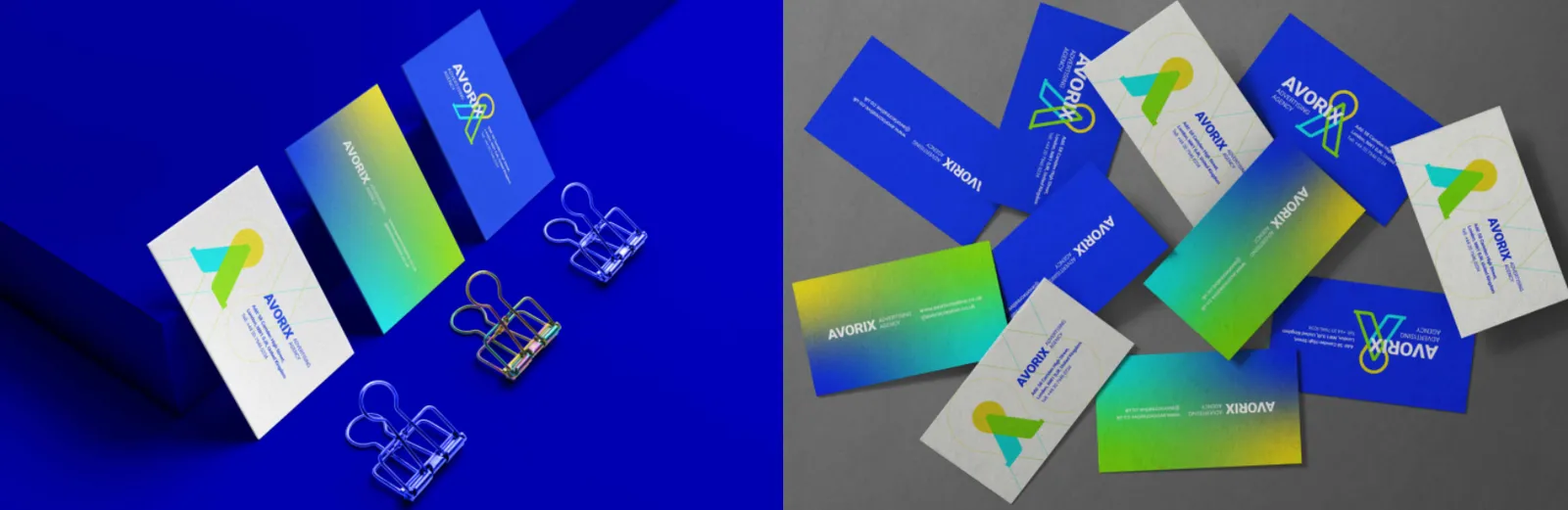
The Avorix business card is a key physical touchpoint that reflects the brand’s professional and future-driven identity. Its design is based on the brand logo, official typography, core color palette, and controlled white space to convey clarity, trust, and visual consistency.
06.3
Crachás
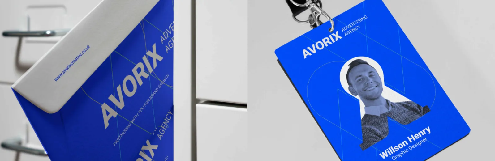
The Avorix ID card represents organizational structure and professional identity. It is designed with clear information hierarchy, legibility, and alignment with the brand’s visual system.
06.4
Papel timbrado
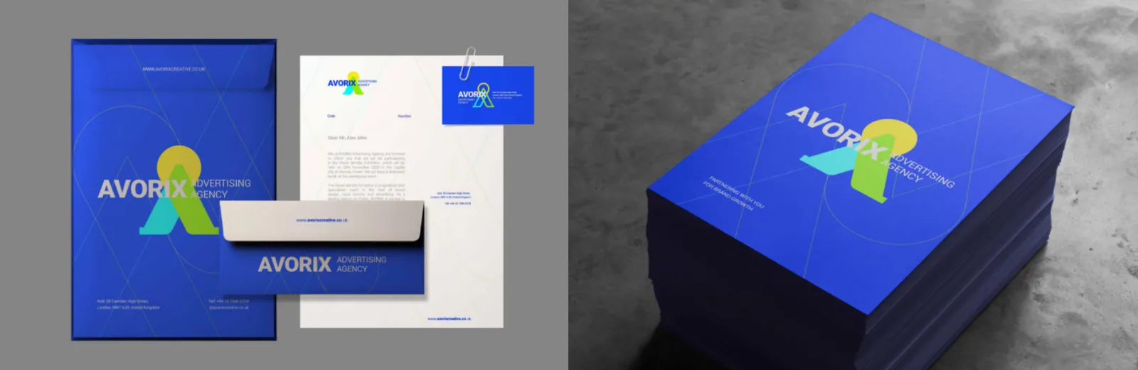
The Avorix letterhead is designed for official correspondence, combining the logo, contact information, and a minimal layout. Balanced composition and white space enhance readability and brand credibility.
06.5
Envelopes
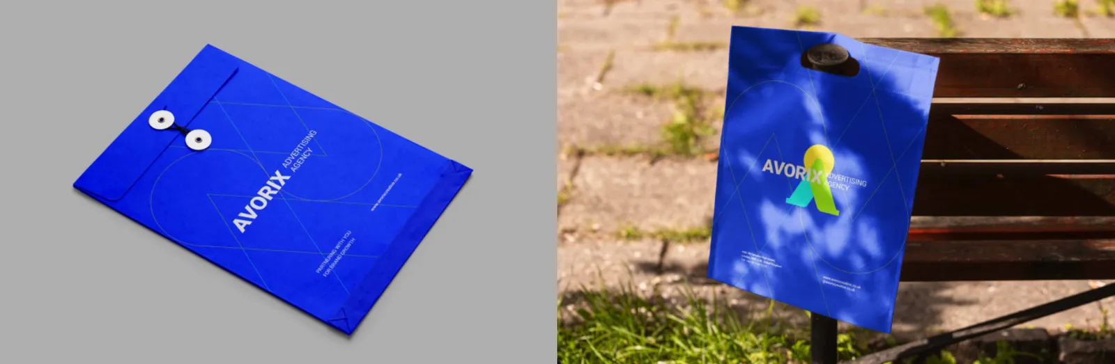
Avorix envelopes are designed to create a strong first impression. The use of brand colors, typography, and logo placement ensures immediate brand recognition before the envelope is opened.
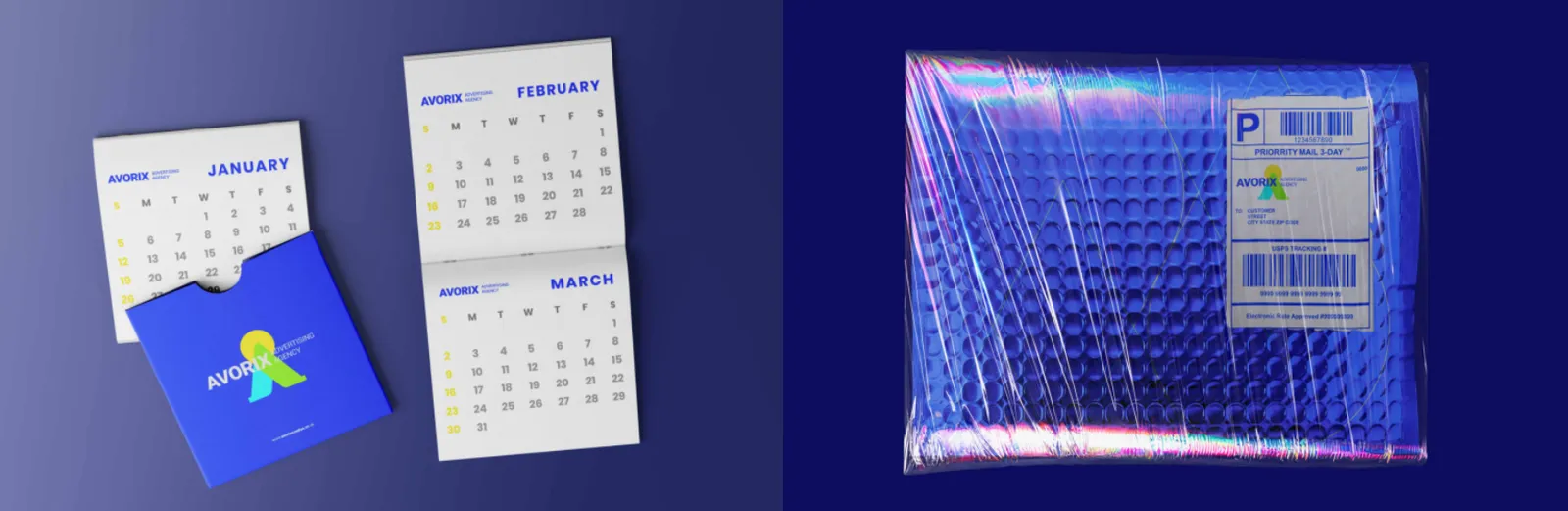
Avorix mailing labels maintain brand consistency in official shipments. Their design is clean, legible, and functional while reflecting the brand identity.
Address labels are designed for high readability and quick brand identification, using Avorix’s official typography and color system.
The Avorix office envelope is part of the official brand identity and must align perfectly with letterheads and other stationery items. Its design is clean, formal, and precise.
06.6
Pastas
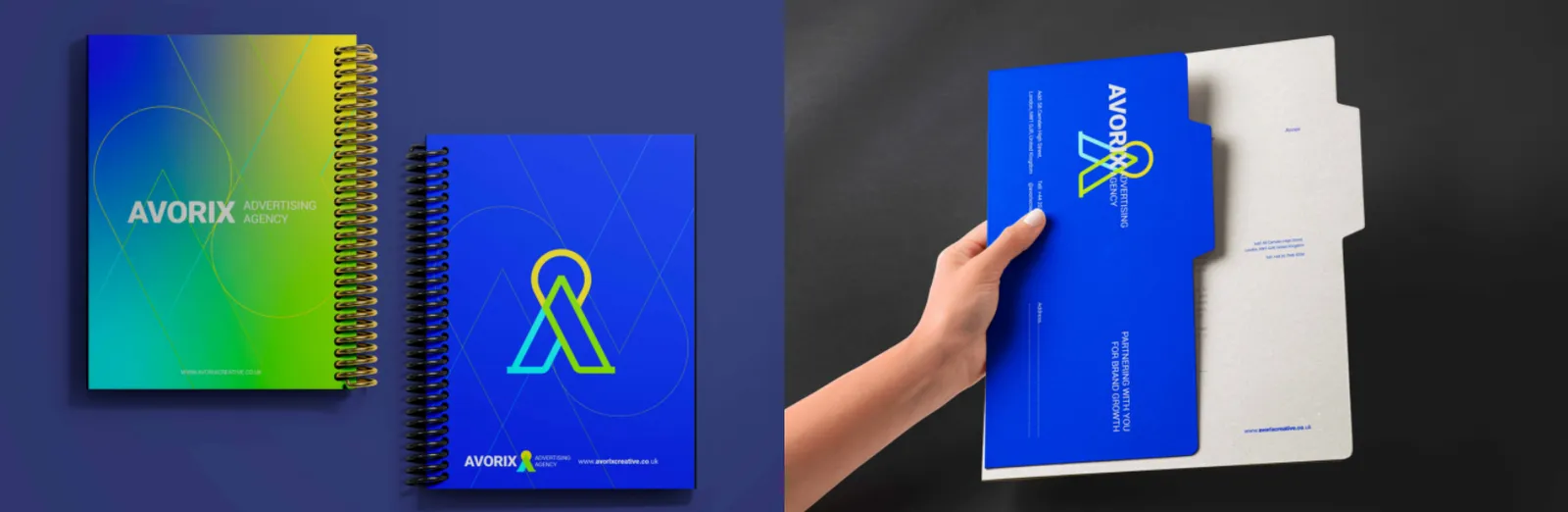
The Avorix folder is designed for presenting official documents, presentations, and contracts. Its structured graphic layout conveys professionalism, order, and credibility.
06.7
Cadernos
The Avorix branded notebook functions as both a practical and promotional item, reinforcing the brand’s visual identity through consistent cover and interior design elements.
06.8
Calendário
The Avorix calendar serves as a long-term communication tool, consistently displaying the brand identity throughout the year through minimal graphics, brand colors, and cohesive typography.
06.9
Adesivos e selos
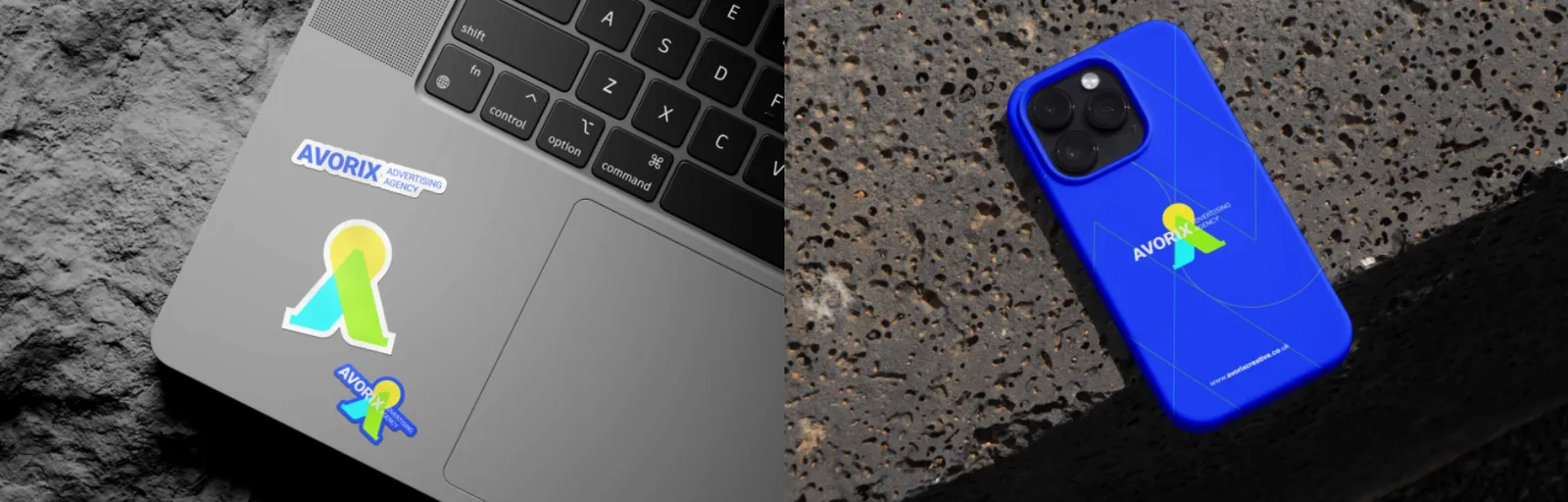
Avorix stickers are designed for flexible and creative use, featuring the logo, symbol, or brand patterns. They play an important role in increasing brand visibility.
07
Digital
07.1
Site
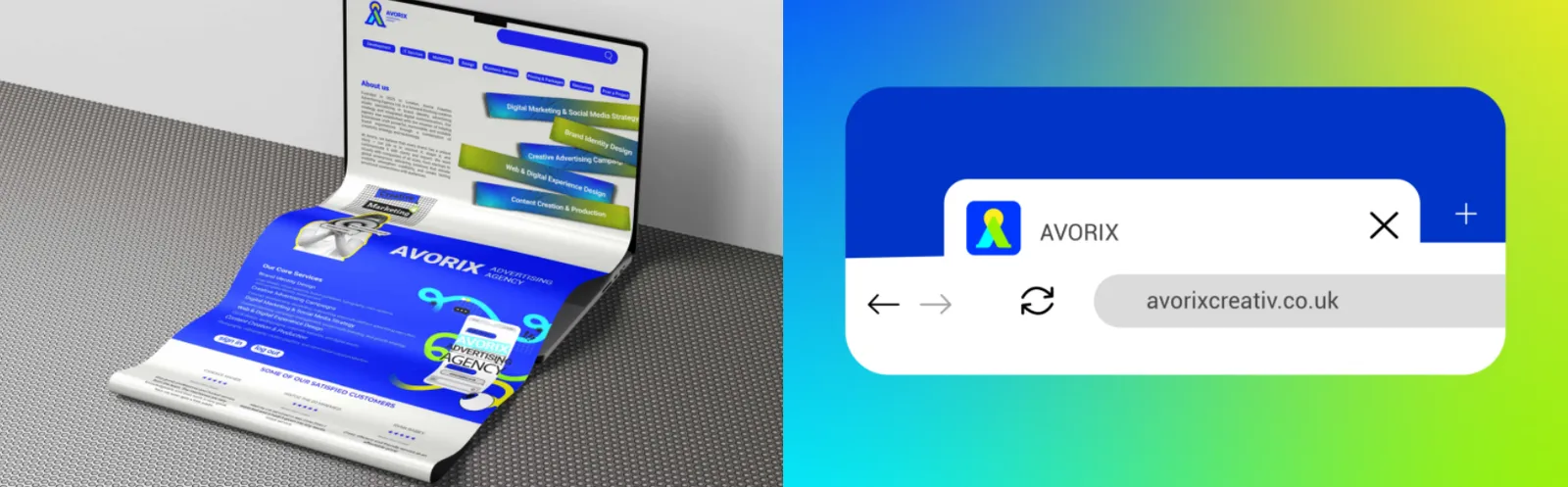
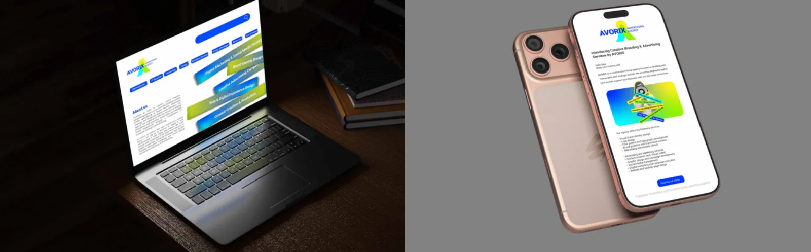
The Avorix website is the core of the brand’s digital presence, combining visual identity, intuitive user experience, and strategic messaging. Its design is based on minimalism, grid systems, and clear visual hierarchy.
The Avorix favicon is a highly simplified version of the brand symbol, designed for browser tabs and bookmarks. Despite its small size, it plays a key role in fast digital brand recognition.
Avorix landing pages are designed with a clear objective, using strong visual hierarchy, concise messaging, and clear calls to action. Full alignment with the brand’s visual identity is essential.
07.2
App móvel
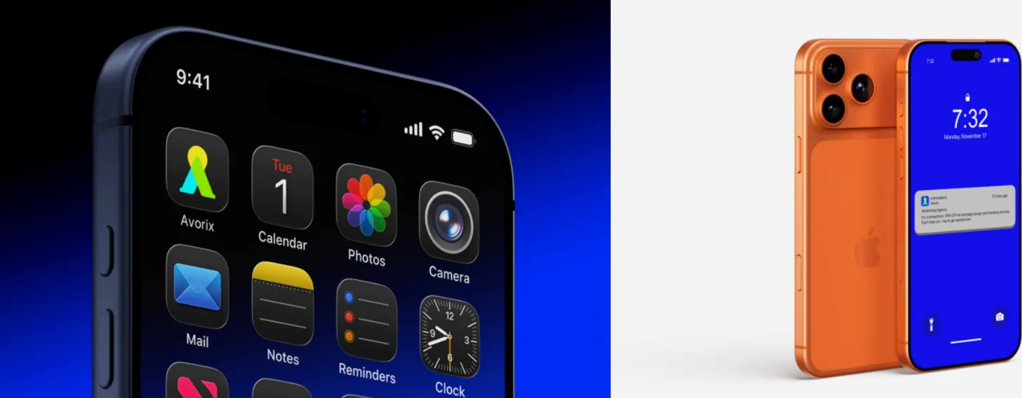
The Avorix app icon is a simplified and optimized version of the core logo symbol, designed for small-scale digital environments. It maintains high recognizability while remaining fully aligned with the brand’s geometric structure and color system.
Avorix push notification templates are designed to deliver messages quickly and clearly without visual clutter. Controlled typography, concise copy, and restrained use of brand colors ensure notifications remain professional, trustworthy, and unobtrusive.
07.3
Redes sociais
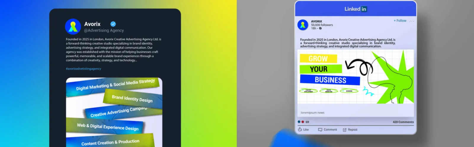
Avorix Twitter templates are designed for fast message delivery, using clear typography, balanced white space, and controlled brand colors to stand out in crowded social feeds.
The Avorix LinkedIn profile represents the brand’s professional and B2B presence. Profile images, cover visuals, and content must remain cohesive, formal, and aligned with the brand identity.
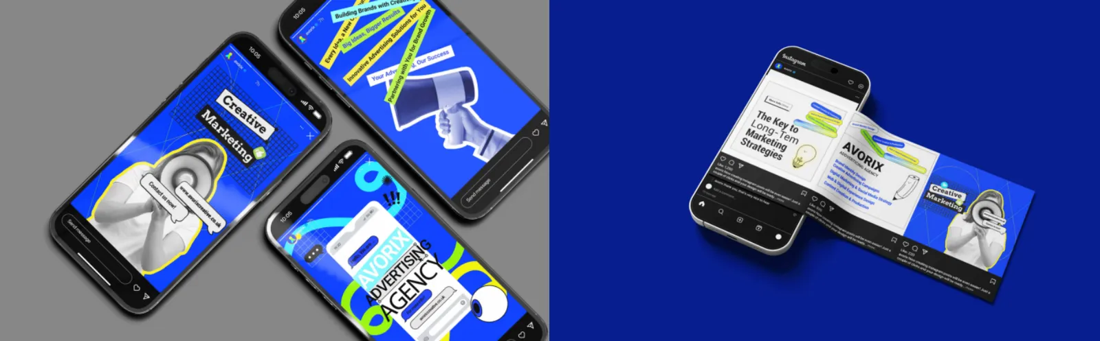
Avorix social media story templates are dynamic and minimal, optimized for vertical formats. They are designed to capture attention quickly and communicate brand messages effectively.
Avorix social media post templates are designed to maintain visual consistency across platforms. Defined grids, consistent typography, and brand colors reinforce the visual identity.
07.4
Campanhas e e-mail
Avorix email marketing templates are built on clean layouts, readable typography, and the brand’s color identity. They are designed to communicate messages clearly while reinforcing professionalism and trust.
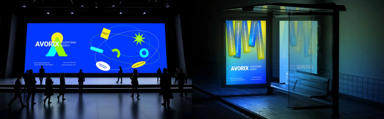
Avorix digital event graphics include banners, slides, and visual assets for virtual conferences, designed to be professional, cohesive, and optimized for digital environments.
Avorix digital display advertisements focus on concise messaging, strong visuals, and clear calls to action. They are designed to capture attention quickly while clearly expressing the brand identity.
08
Produtos de marca
08.1
Vestuário
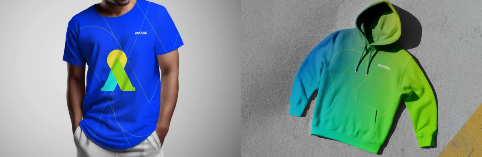
The Avorix hoodie functions as a lifestyle branding piece that brings the brand identity into everyday wear. Its design is based on the logo, minimal typography, and core brand colors, conveying a modern, creative, and professional feel.
The Avorix T-shirt is an informal yet effective branding medium. Controlled use of graphic elements and white space ensures a clean, timeless design suitable for various contexts.
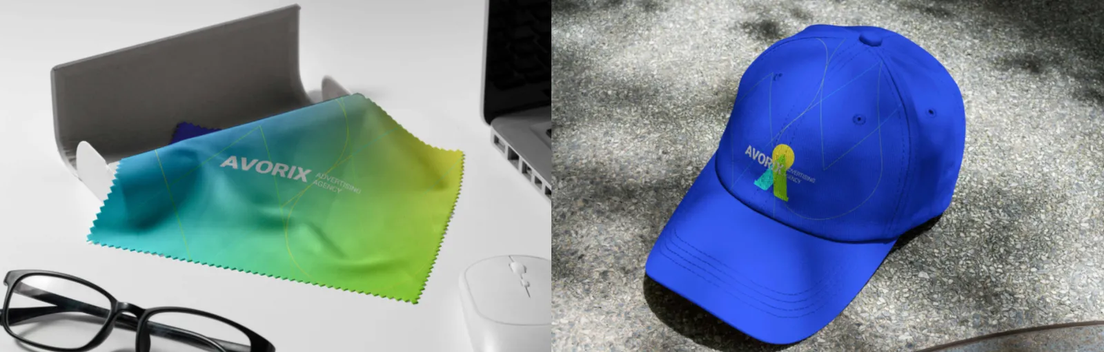
The Avorix cap features a clean design with subtle logo placement, presenting the brand in a modern and casual manner suitable for daily wear and creative events.
08.2
Sacolas
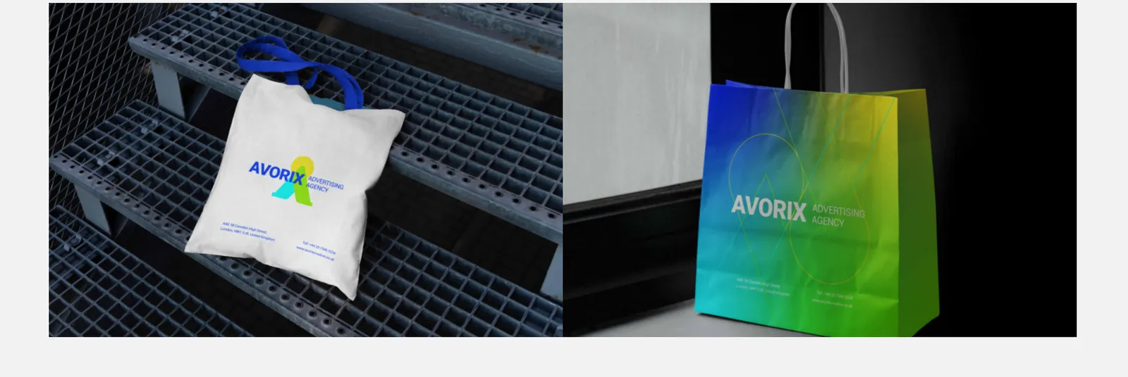
The Avorix branded bag is designed for everyday use while subtly expressing the brand identity. Logo placement and visual elements are applied in a balanced and legible manner.
The Avorix tote bag is a popular promotional item that extends the brand presence into everyday urban environments. Its design is clean, graphic, and based on the brand’s colors and typography.
The Avorix merchandise bag functions as a physical marketing tool that extends brand visibility into public spaces. Balanced use of the logo, brand colors, and visual patterns is recommended.
08.3
Brindes
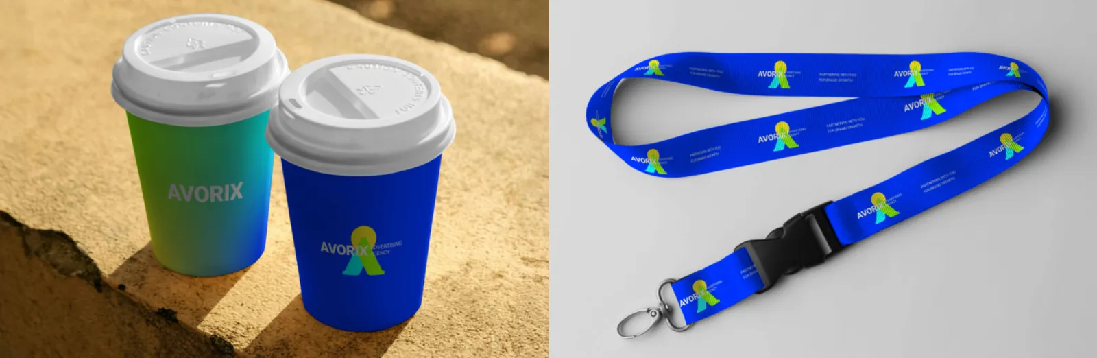
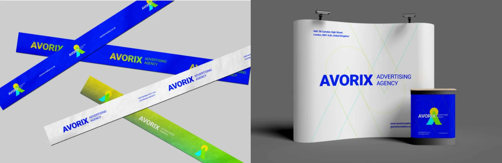
The Avorix lanyard is designed for events, conferences, and corporate use, reinforcing brand identity through consistent logo repetition or brand patterns.
Avorix drinkware items serve as daily-use products that integrate the brand into everyday routines. Their design is minimal, durable, and aligned with the brand color system.
The Avorix fabric glasses case is a subtle lifestyle accessory that expresses the brand through everyday details. Minimal logo or pattern usage is recommended.
The Avorix phone case acts as a digital-physical touchpoint. Its design remains clean, durable, and fully aligned with the brand’s visual language and colors.
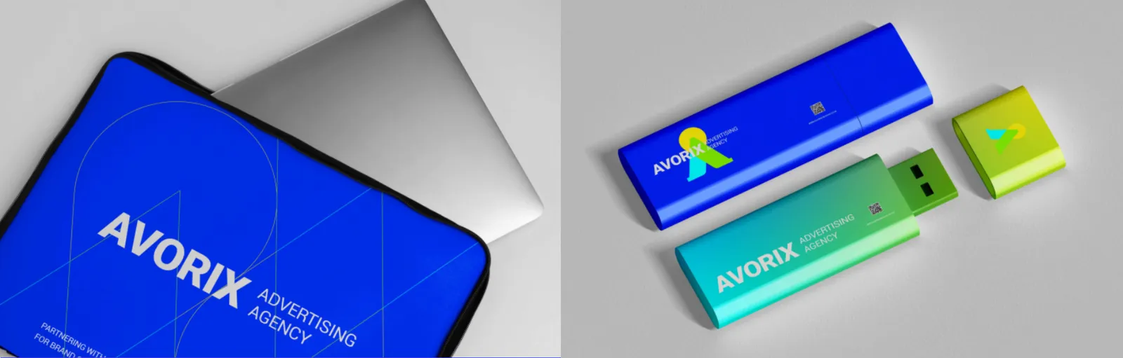
The Avorix branded USB drive is a professional and functional item used for file sharing, presentations, and gifts. Its design emphasizes simplicity and quality.
The Avorix laptop sleeve is a premium accessory for professional audiences, expressing the brand identity in creative and work environments. Its design is minimal, durable, and aligned with the brand’s colors and patterns.
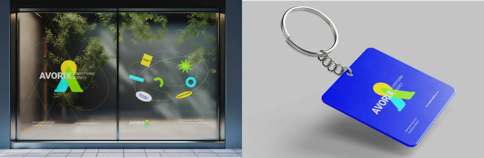
The Avorix keychain is a small yet lasting item that integrates the brand into everyday use. Its design is simple, durable, and based on the brand symbol.
08.4
Embalagens
Avorix product labels present information clearly and systematically while reinforcing the brand identity. Readable typography and strong information hierarchy are essential.
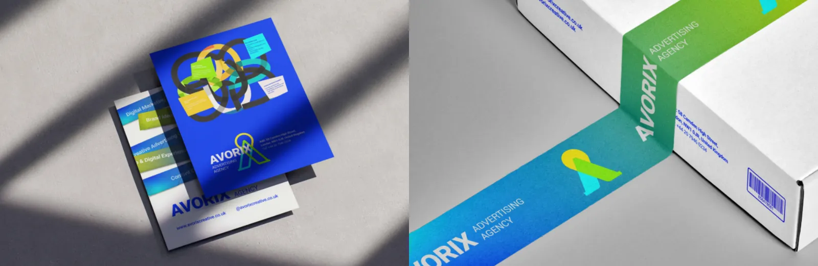
Avorix branded packaging inserts include message cards, guides, or additional information that enhance the unboxing experience and remain fully aligned with the brand identity.
09
Aplicações
09.1
Sinalização
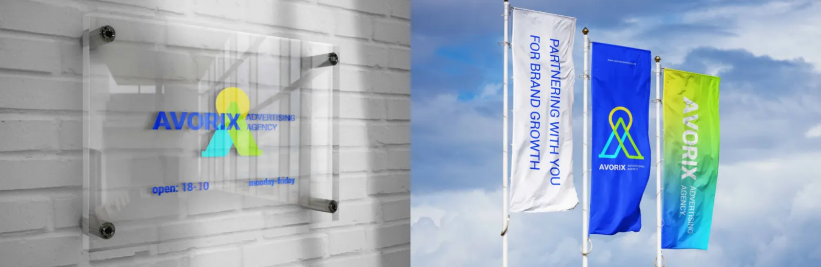
The Avorix company building visually represents brand credibility, modernity, and stability. Controlled use of the logo, brand colors, and official typography ensures a strong and consistent urban presence.
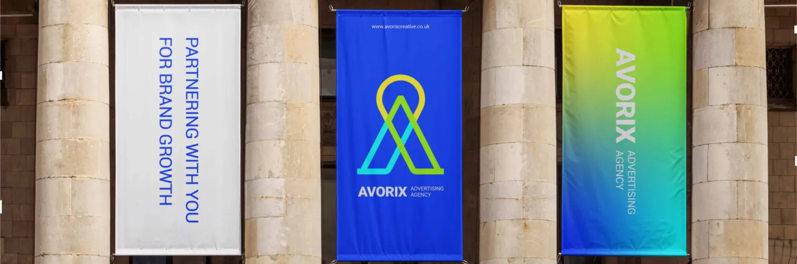
The Avorix flag acts as a symbolic brand element in open and formal spaces. Its design is simple, high contrast, and optimized for long distance visibility.
09.2
Eventos e feiras
Avorix pop up structures are designed for temporary brand presence at events and exhibitions. They are compact, visually striking, and fully aligned with the brand identity system.
09.3
Publicidade
Avorix flyers are used to promote services, campaigns, or events. Clear messaging, strong typography, and brand colors ensure high visual impact and engagement.
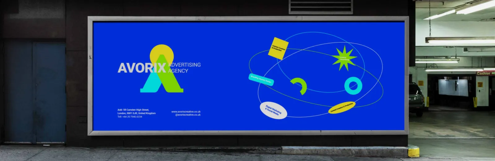
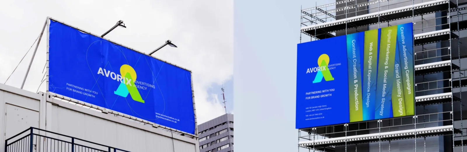
Avorix billboards are high impact brand touchpoints designed to communicate messages quickly and clearly. Large scale typography, strong color contrast, generous white space, and minimal visual elements ensure maximum visibility and immediate recognition.
09.4
Interiores
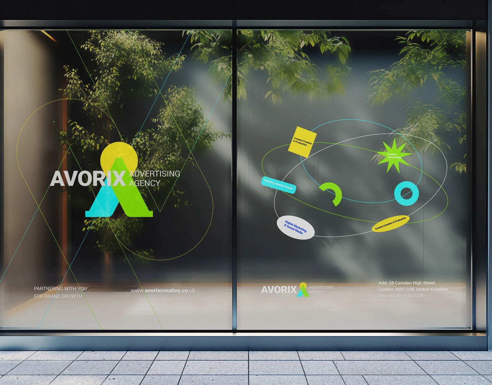
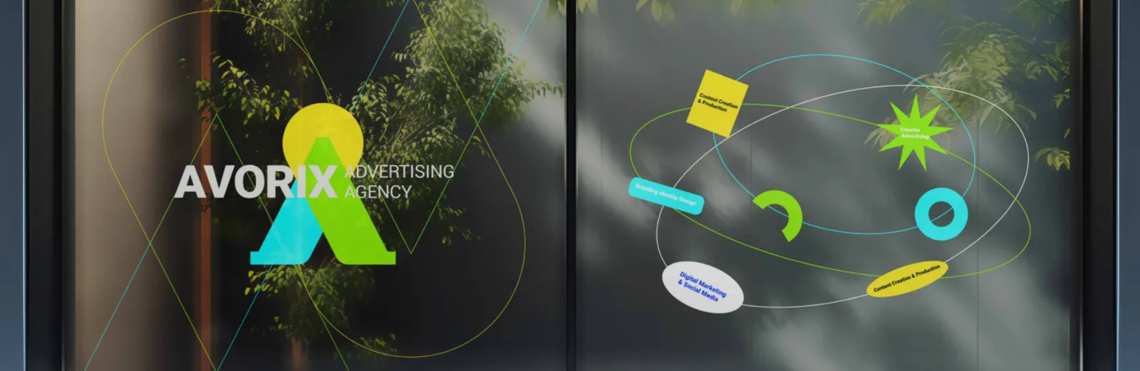
Avorix window decals are used in office and retail spaces and may feature the logo, brand patterns, or short messages. Designs remain clean, minimal, and unobtrusive.
09.5
Bandeiras
The Avorix flag acts as a symbolic brand element in open and formal spaces. Its design is simple, high contrast, and optimized for long distance visibility.
09.6
Veículos
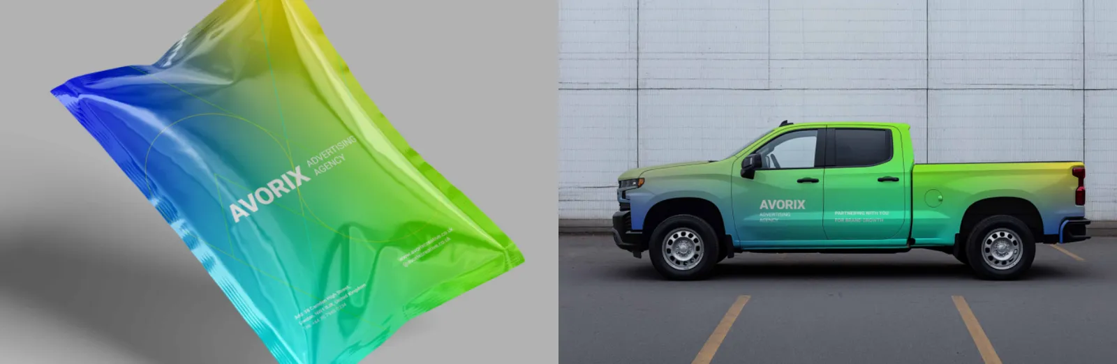
Avorix vehicle branding acts as a mobile advertising medium. Designs remain clean, legible, and high contrast to ensure recognition even while in motion.