01
Überblick
01.1
Auf einen Blick
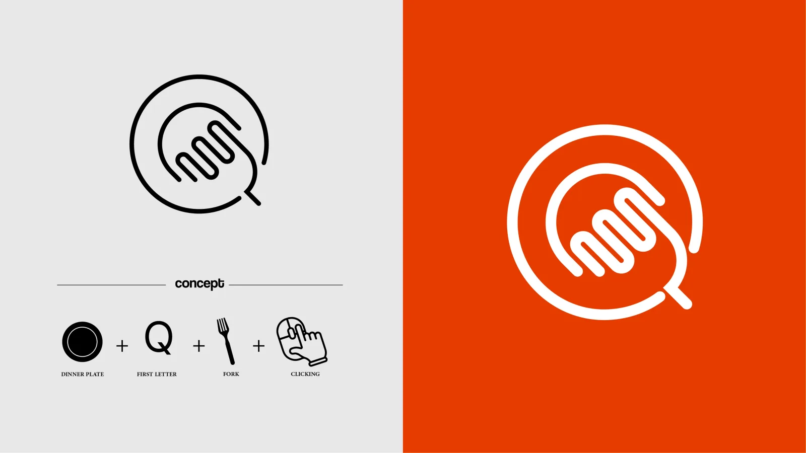
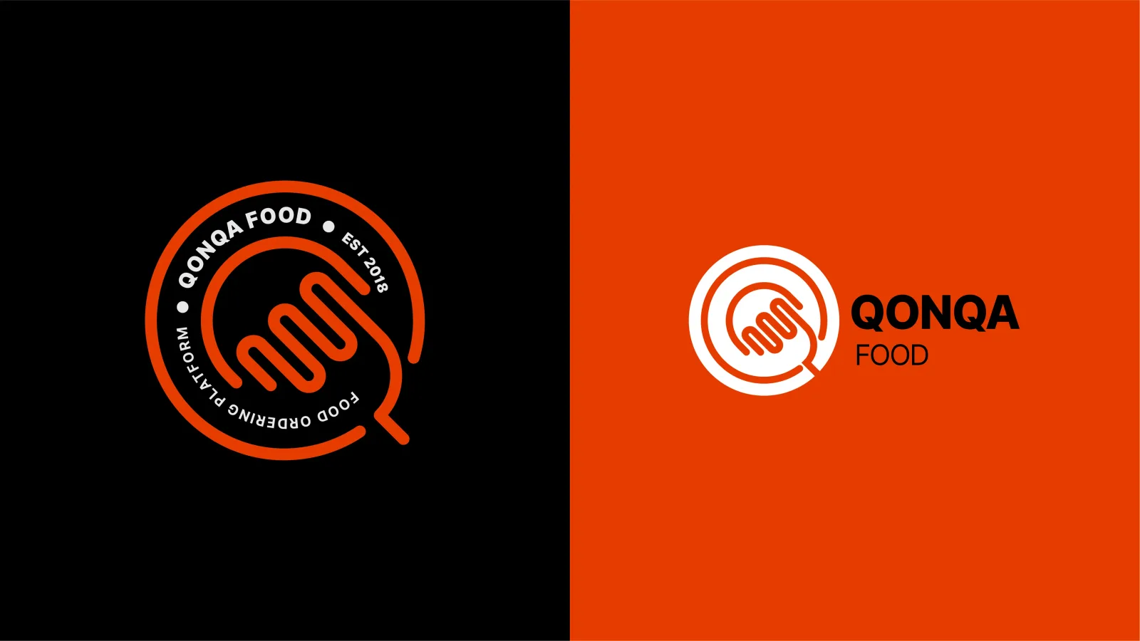
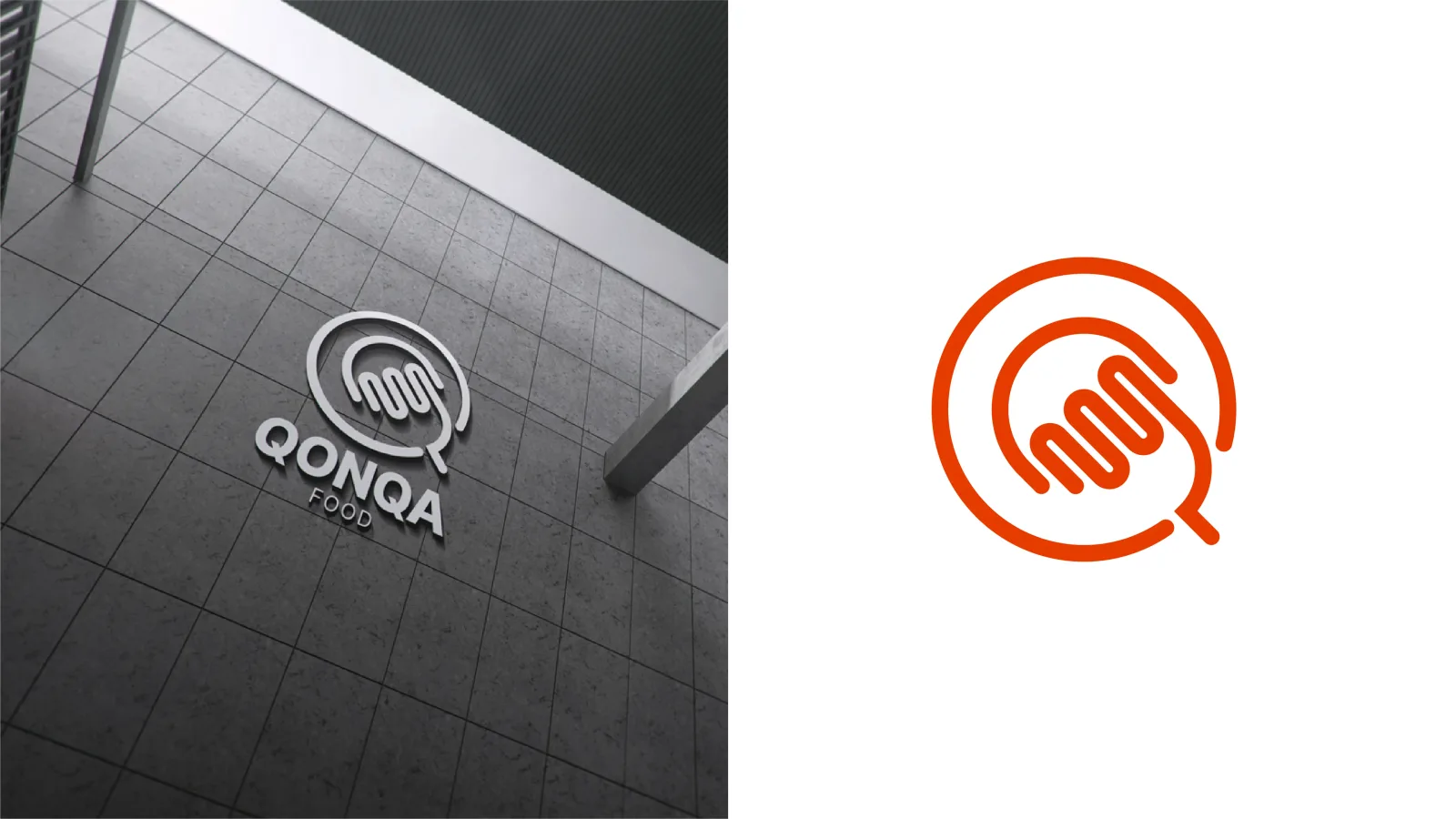
A circle, the letter Q, a fork and a tapping finger drawn as one line, for a FoodTech platform.
- Projekt
- Logodesign
- Branche
- Food-ordering platform
- Leistungen
- Logodesign
01.2
Einführung
Qonqa Food is a modern FoodTech platform that connects culinary experiences with digital convenience. The project is its brand identity and logo.
01.3
Über das Projekt
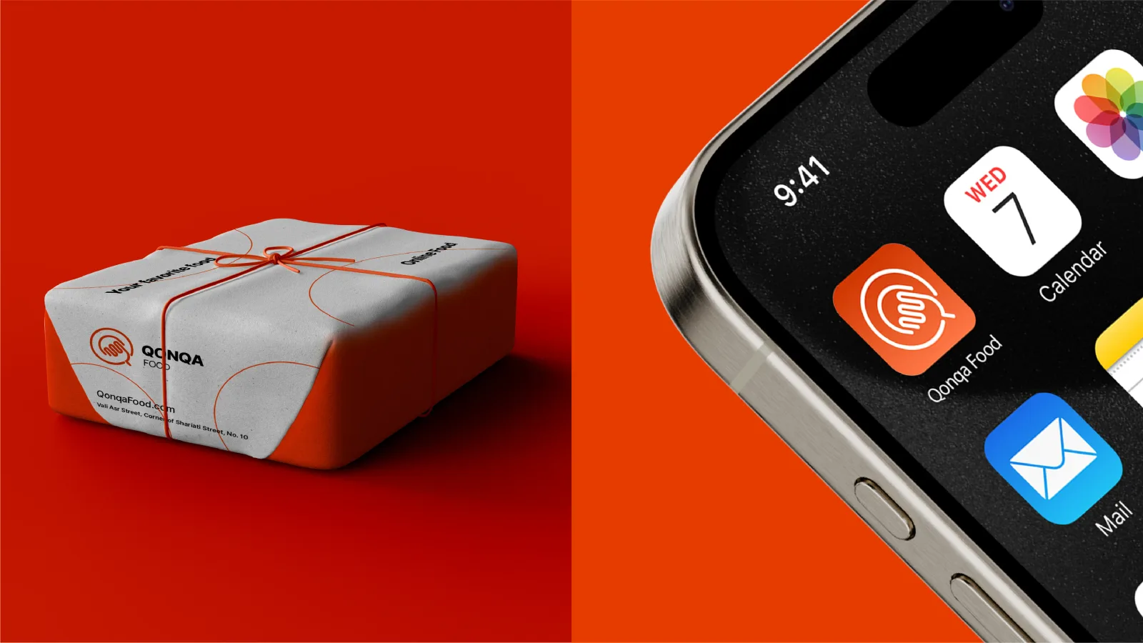
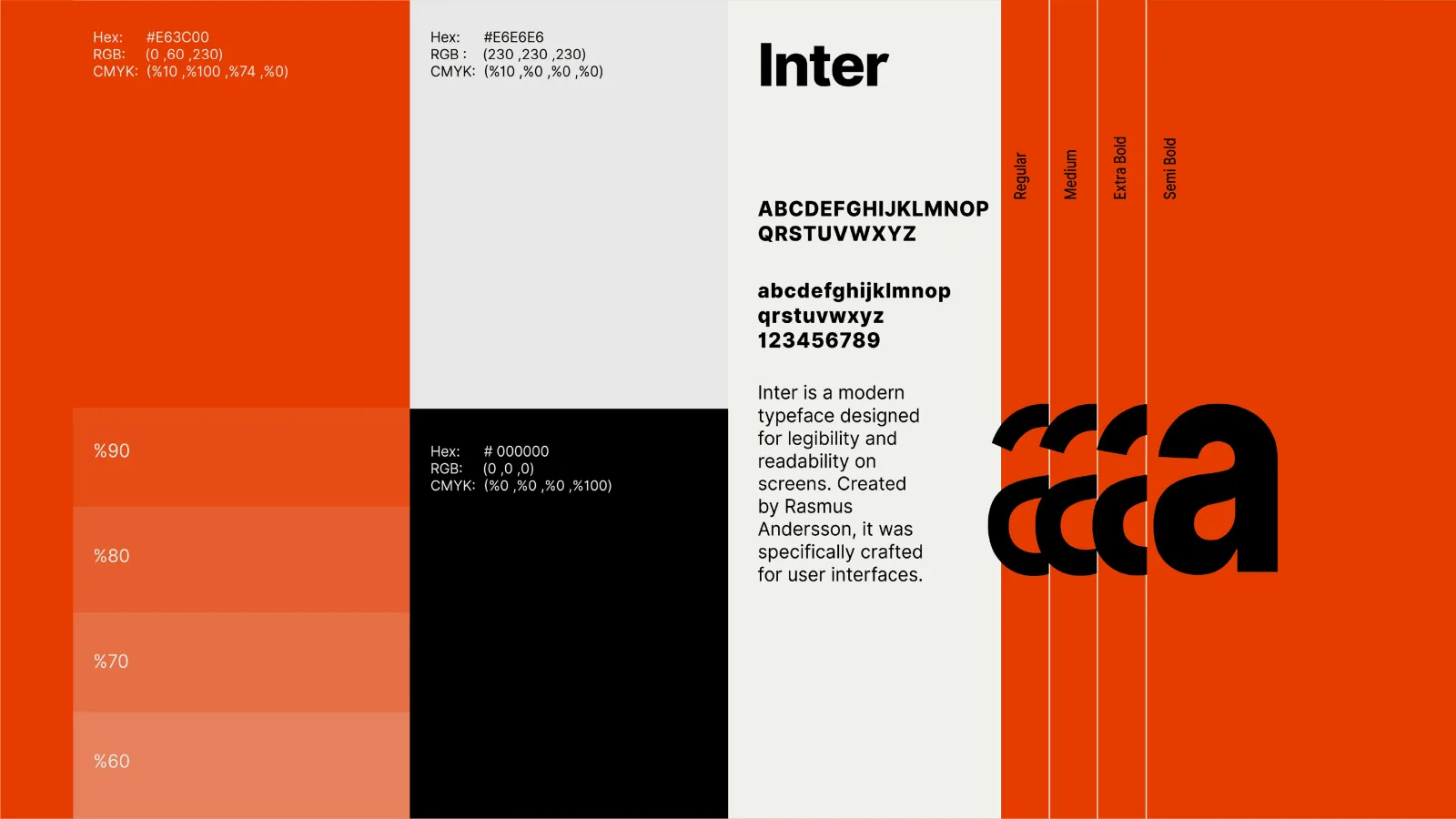
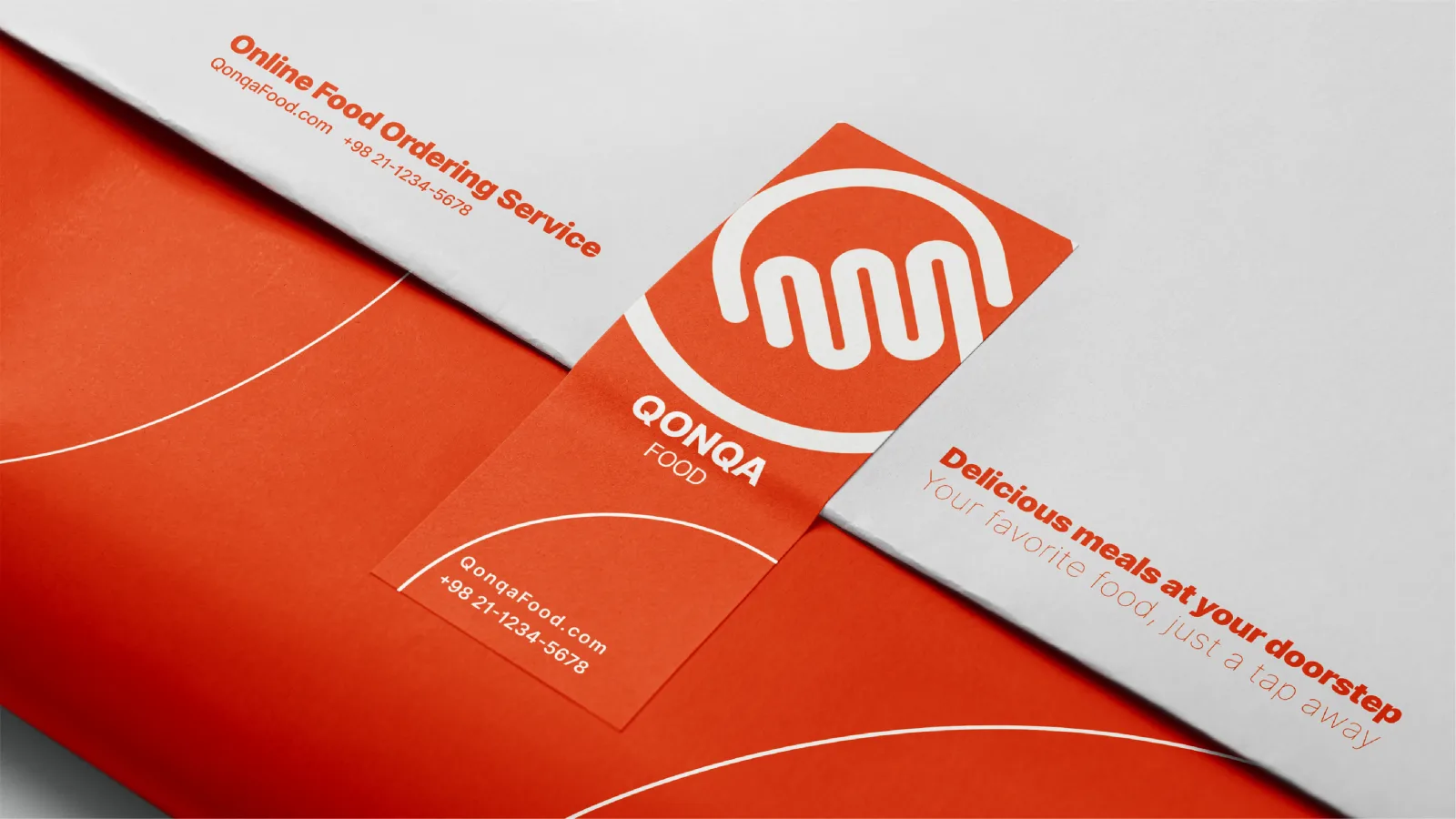
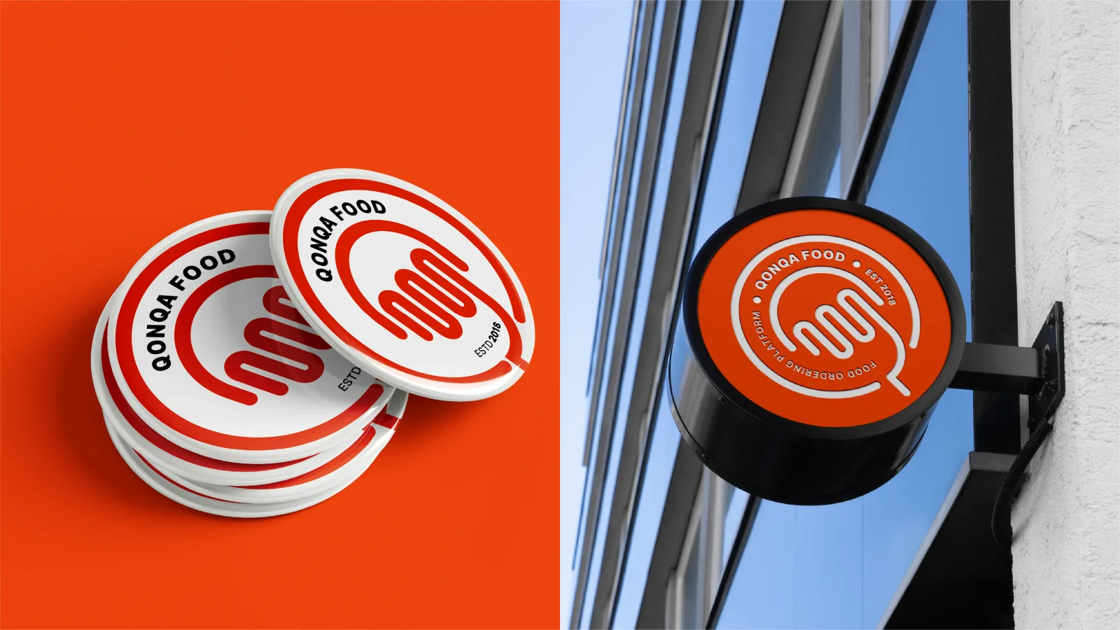
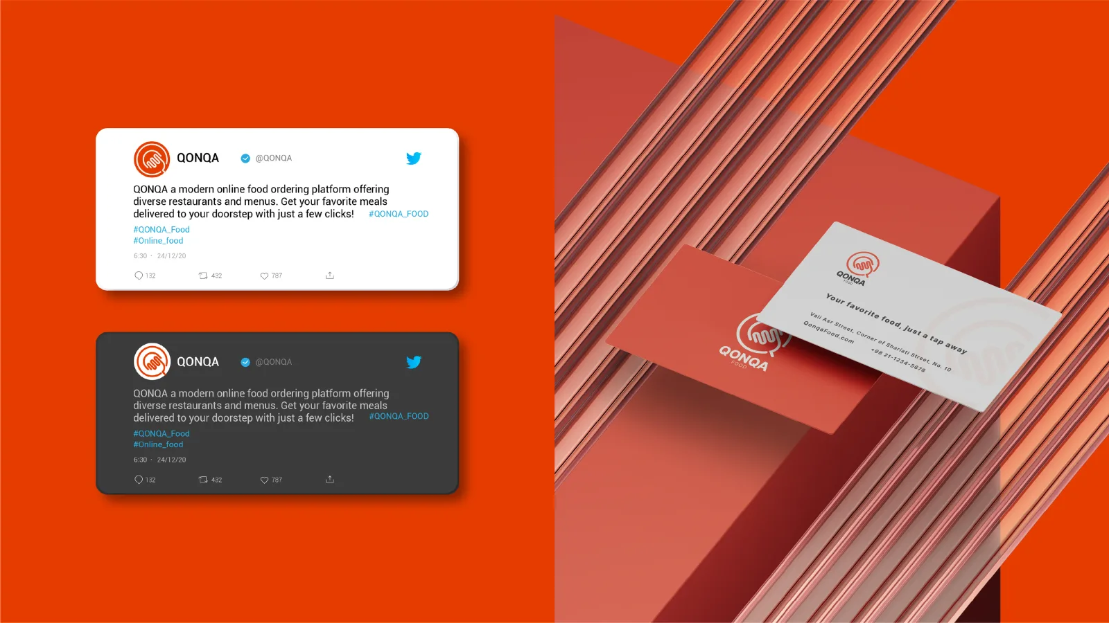
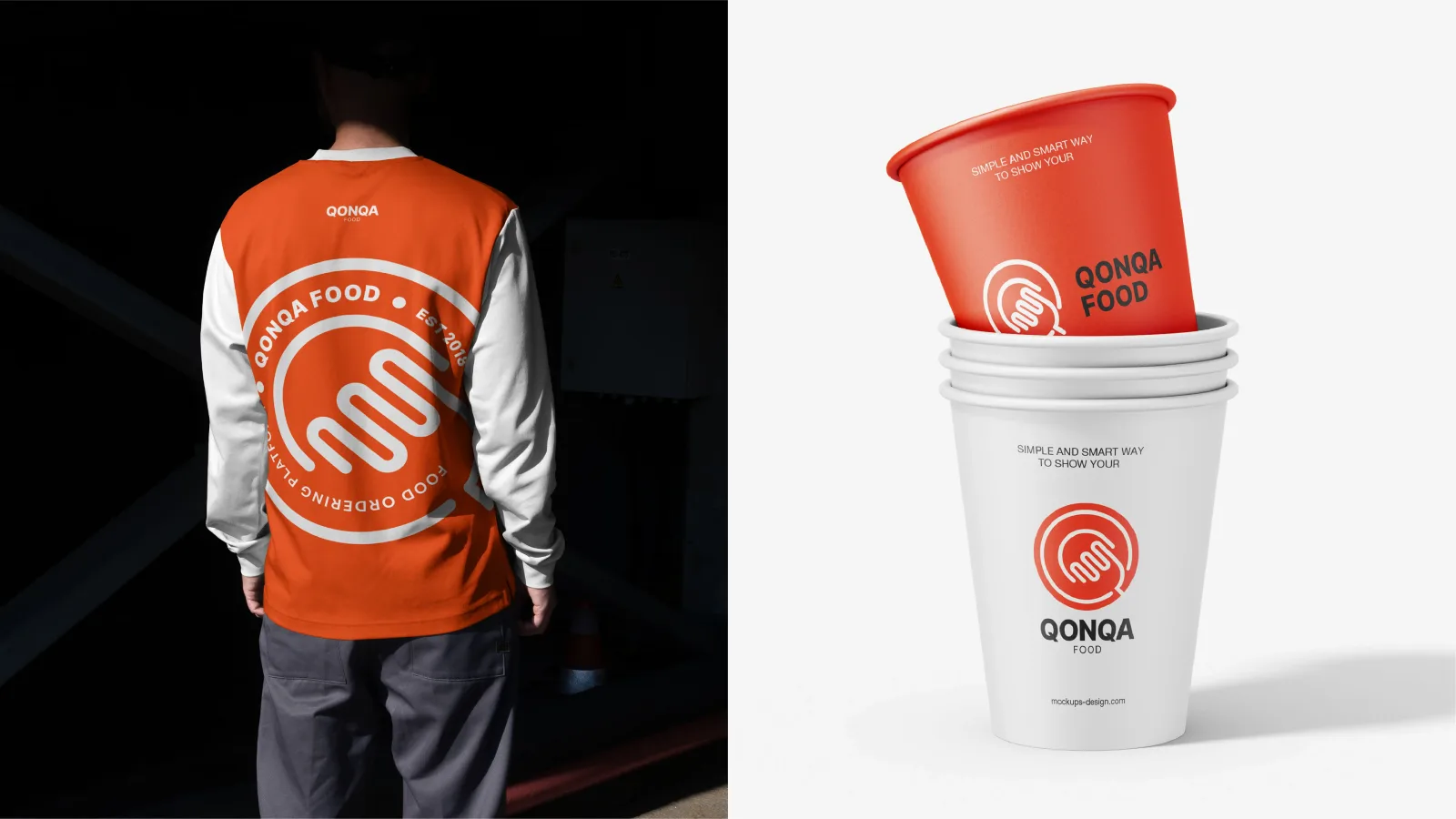
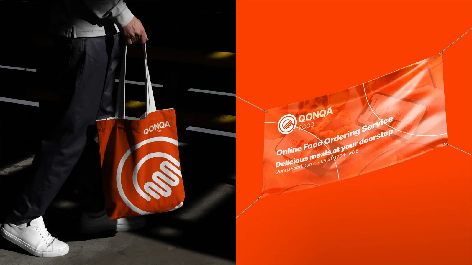
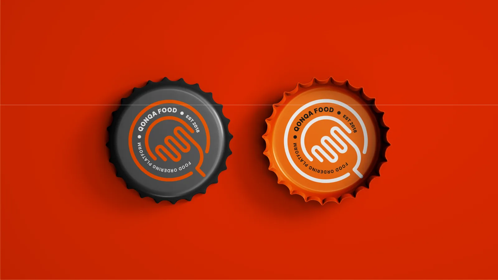
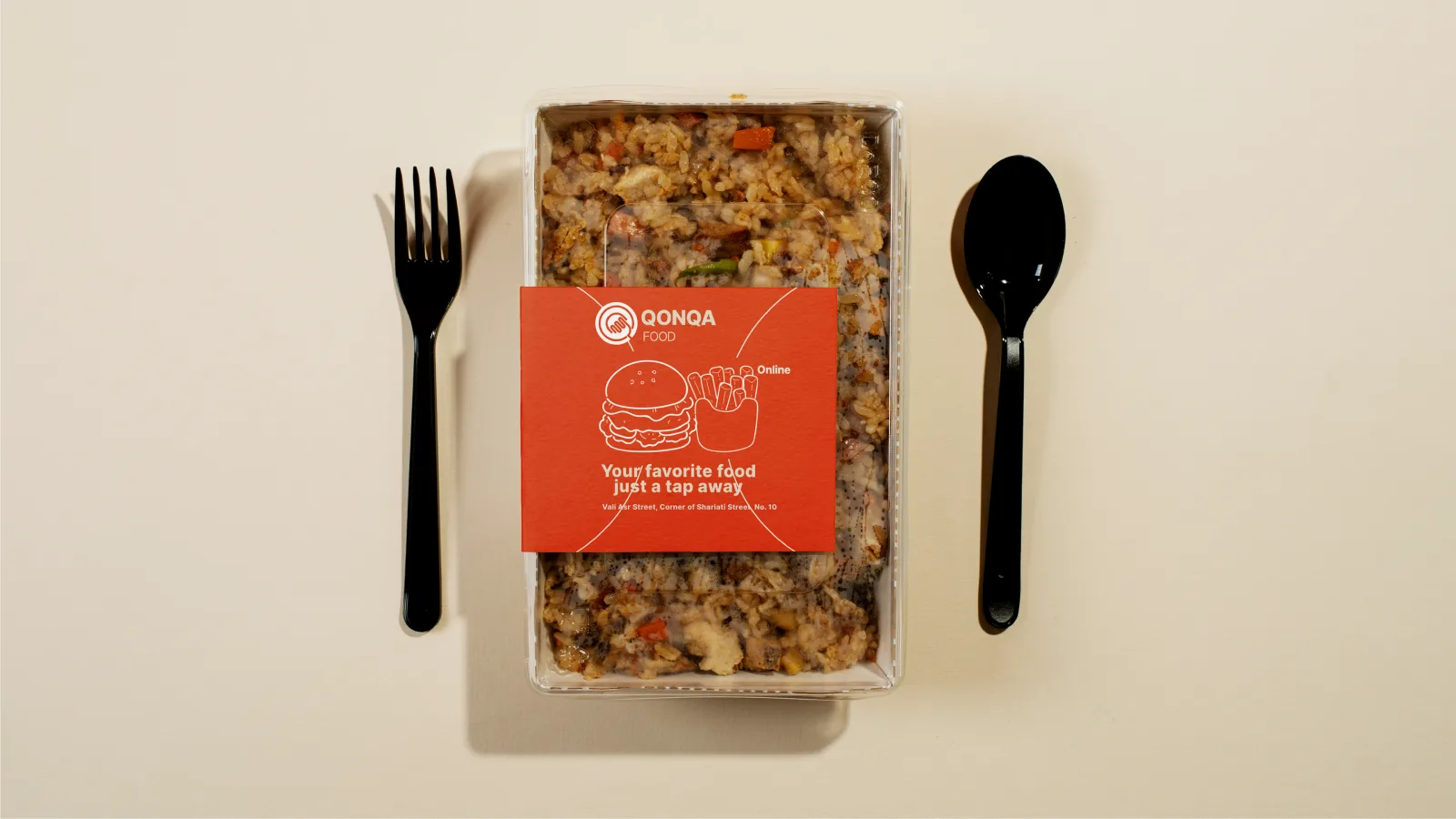
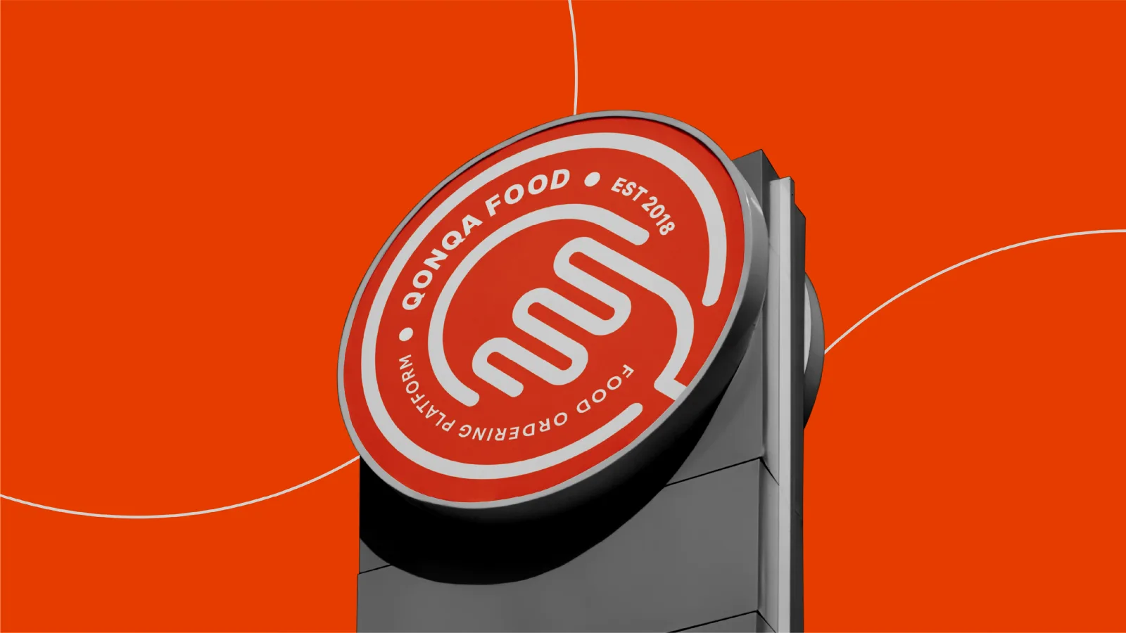
The mark joins a circle, the letter Q, a fork and a tapping finger into one continuous line, set in a bold orange with black and white, and carried from the app icon to packaging, signage and uniforms.
02
Das Logo
02.1
Konzept
02.2
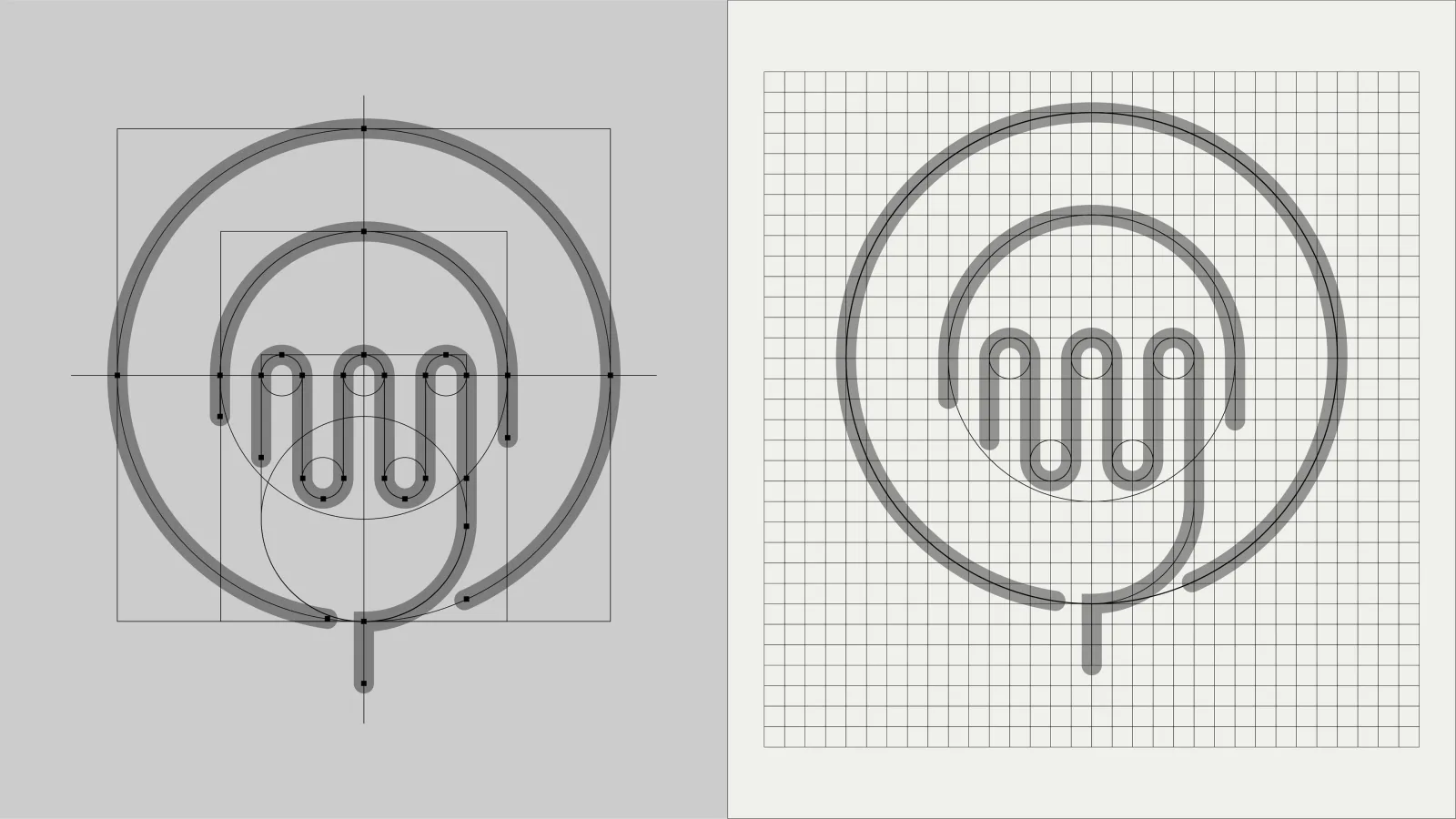
Konstruktion
02.3
Varianten
02.4
Auf Hintergründen
02.5
App-Icon
03
Farbe
03.1
Farbsystem
04
Geschäftsausstattung
04.1
Komplette Geschäftsausstattung
04.2
Aufkleber und Siegel
05
Digital
05.1
Social Media
06
Merchandise
06.1
Bekleidung
06.2
Taschen
06.3
Werbeartikel
06.4
Verpackung
07
Anwendungen
07.1
Beschilderung
07.2
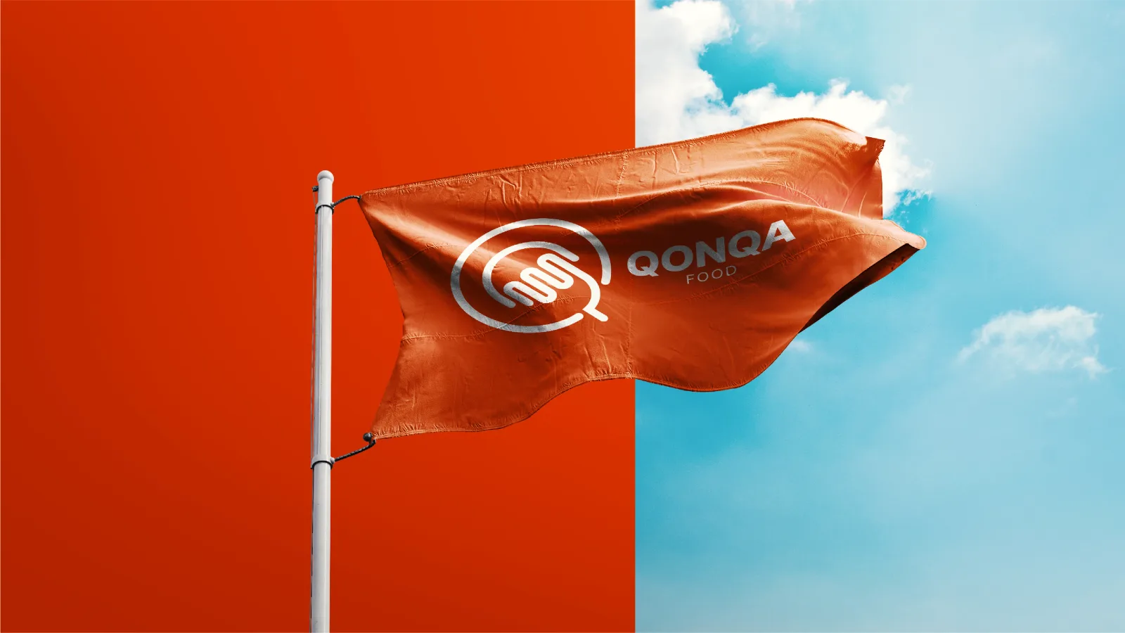
Fahnen