01
Überblick
01.1
Auf einen Blick
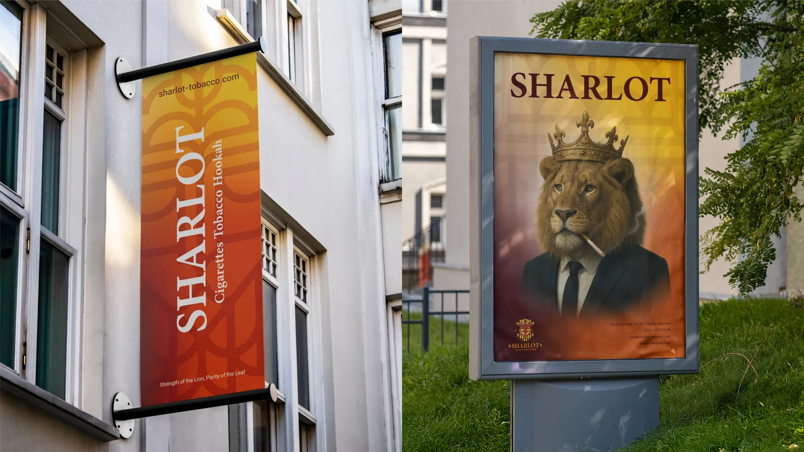
A lion and a tobacco leaf in one symmetrical emblem, for an exporter of premium tobacco.
- Projekt
- Logodesign
- Branche
- Tobacco
- Jahr
- 2021
- Leistungen
- Logodesign
01.2
Einführung
Sharlot is an international brand that exports premium tobacco and hookah products. The identity positions it as a symbol of luxury, power and uncompromised quality.
01.3
Über das Projekt
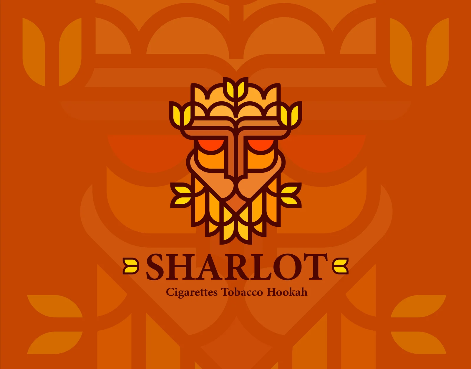
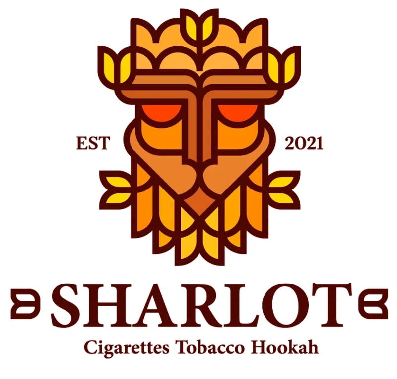
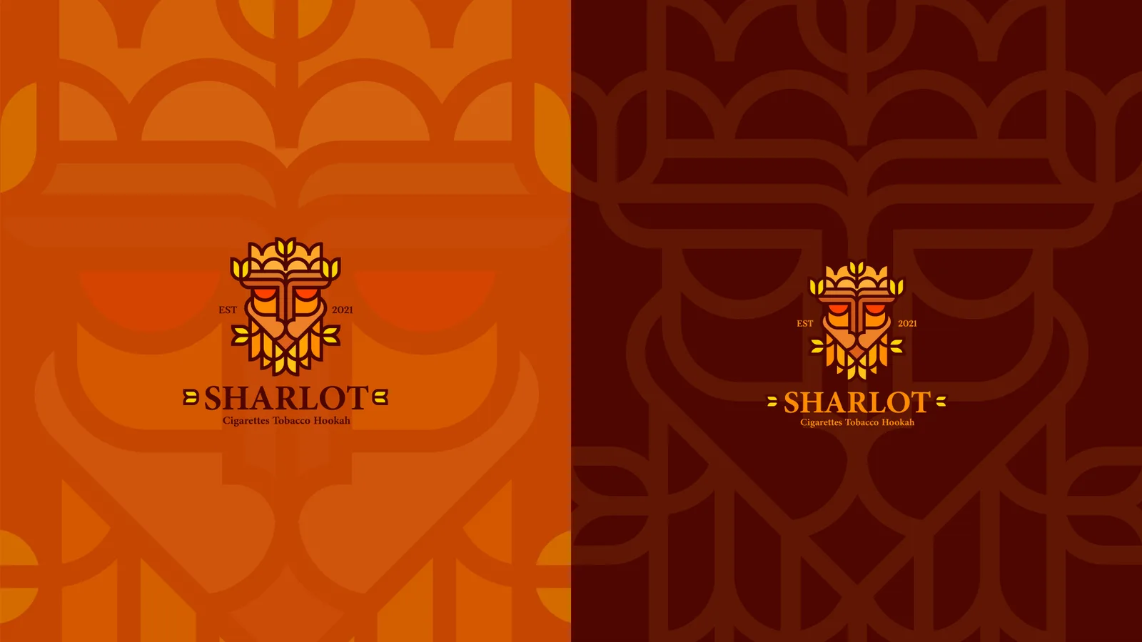
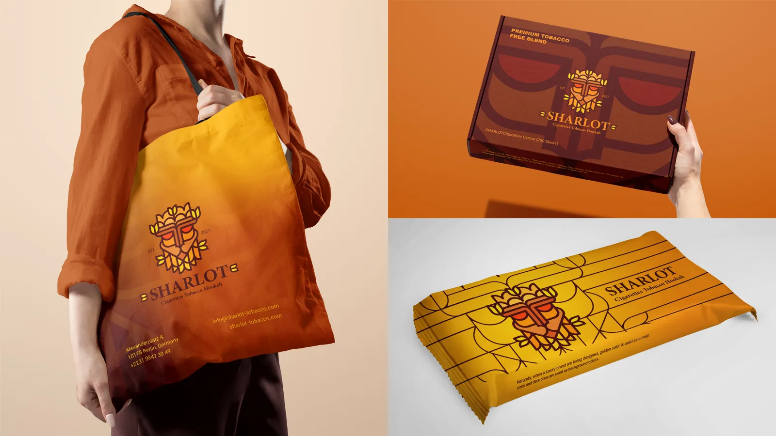
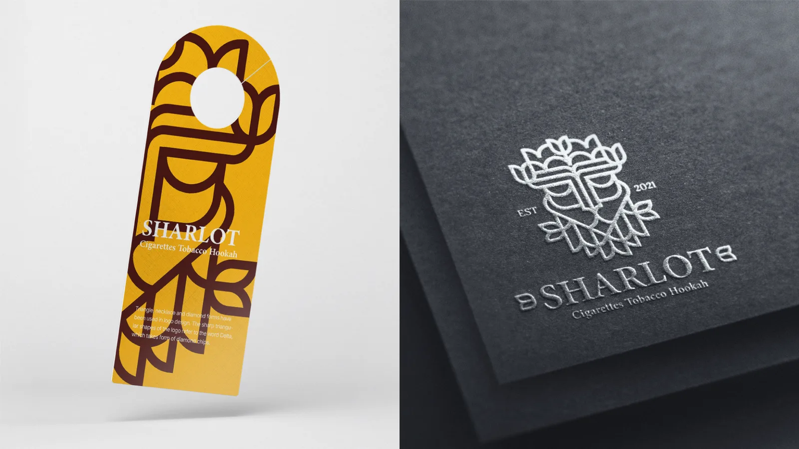
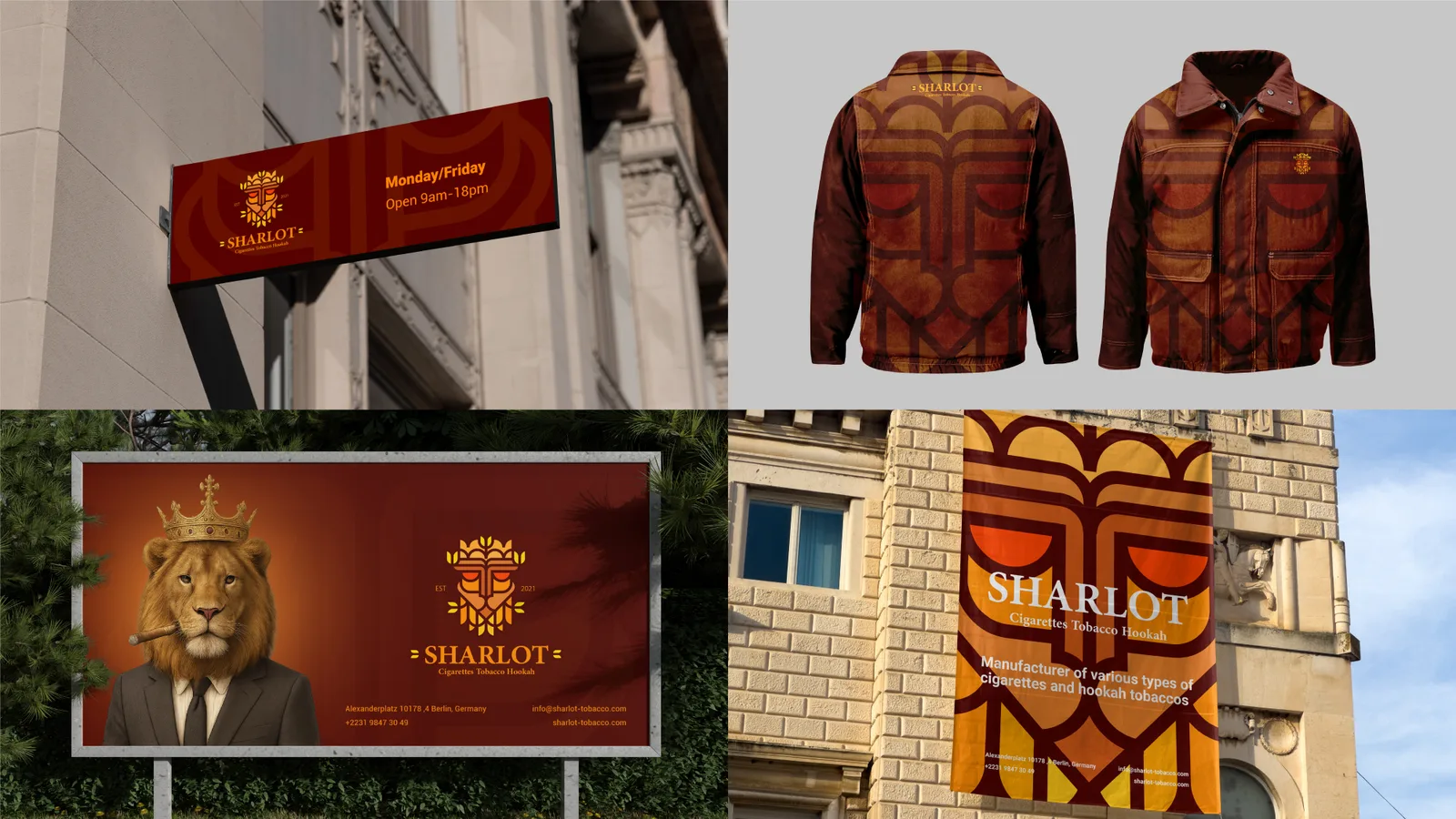
The emblem joins the lion, for power, prestige and originality, with the tobacco leaf, the essence of the product. Structural symmetry and smooth, decisive lines keep the forward-looking lion authoritative and recognisable on every pack.
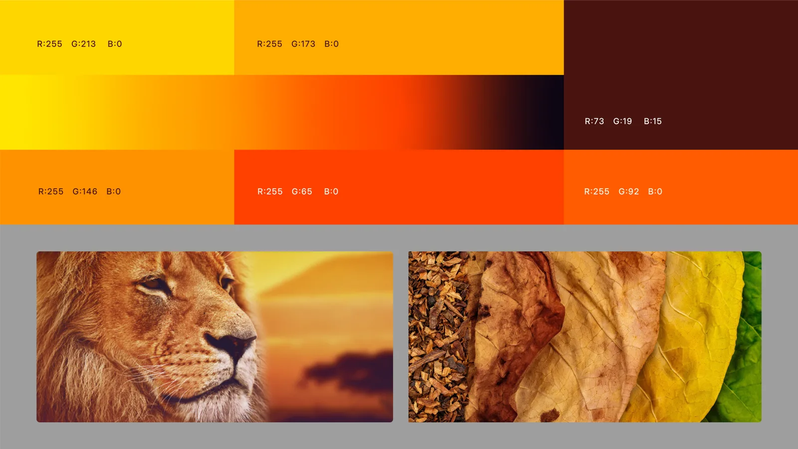
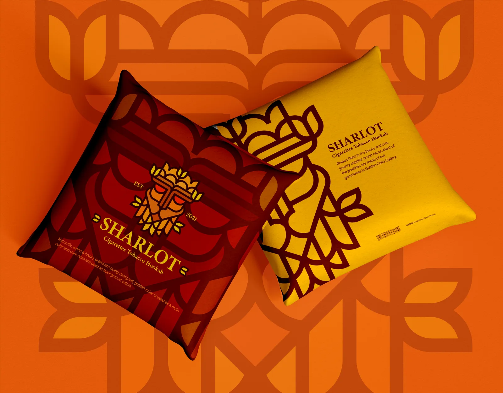
Brown stands for earthiness, premium quality and reliability; orange and yellow for passion, energy and warmth.
01.4
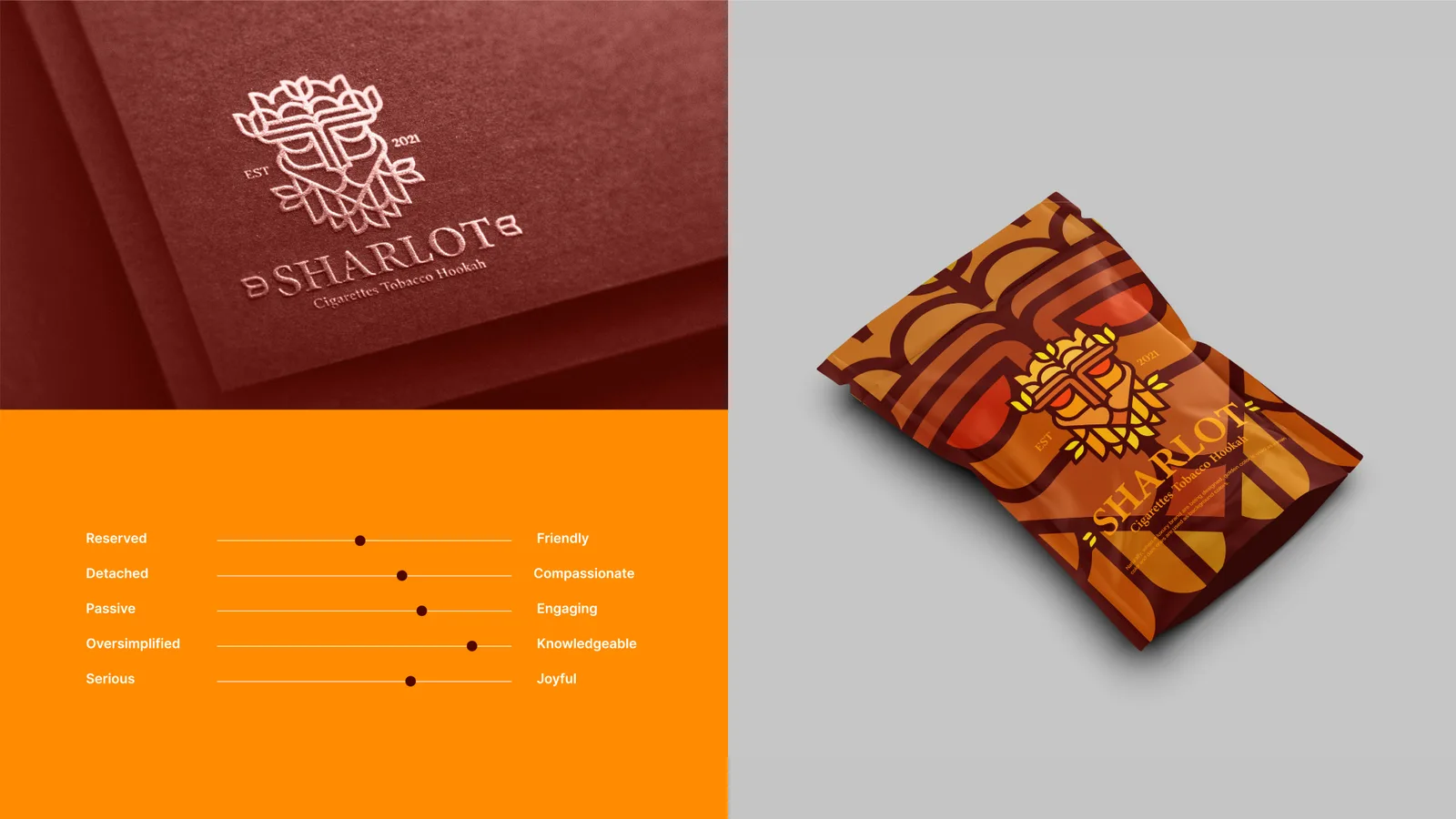
Tonalität
02
Das Logo
02.1
Markenlogo
Das Zeichen für sich allein.
02.2
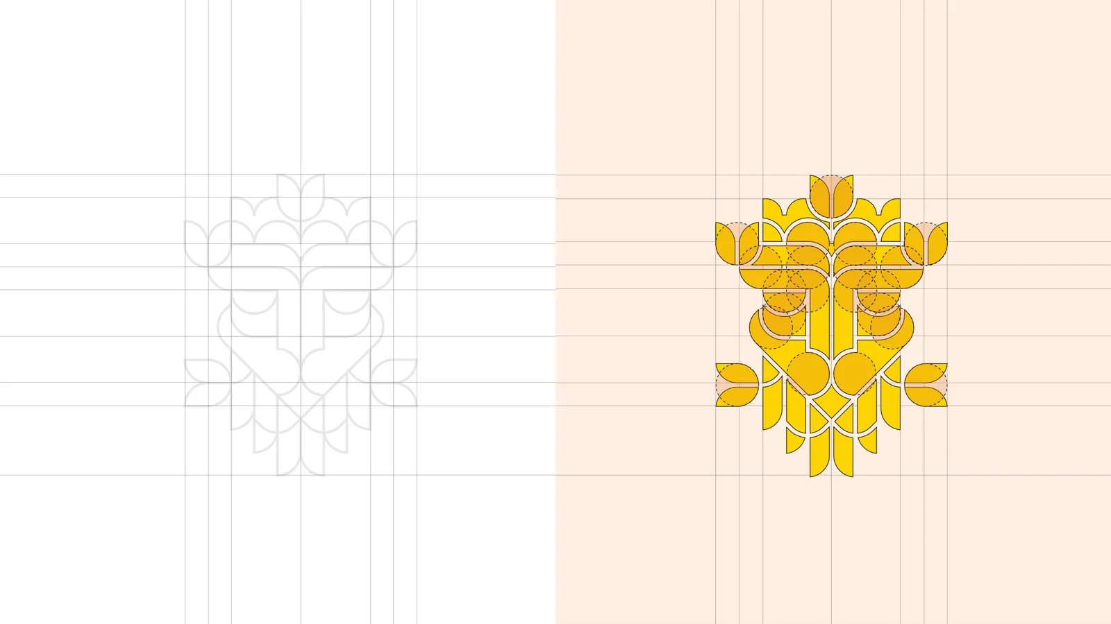
Konstruktion
02.3
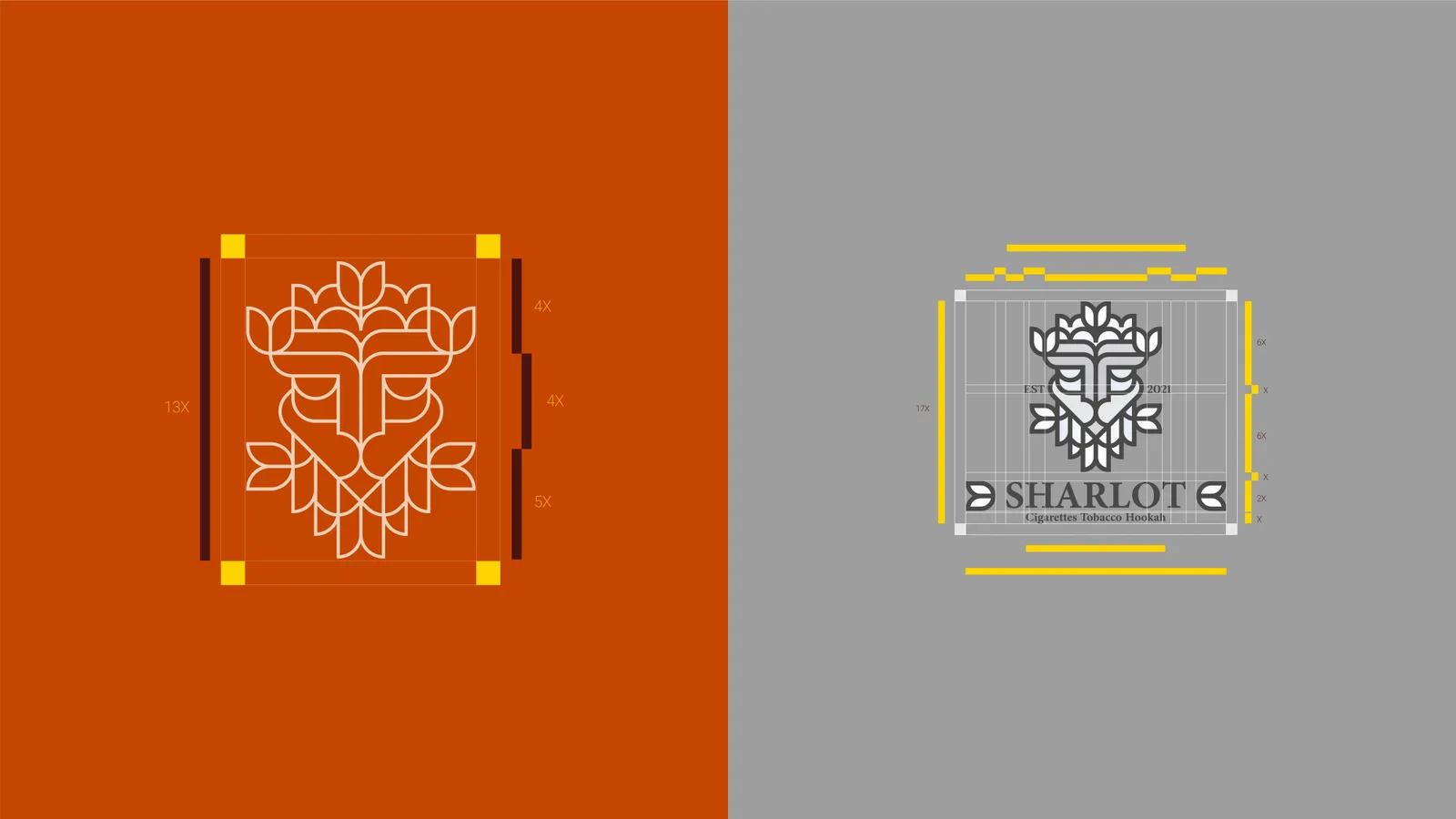
Schutzzone
02.4
Varianten
02.5
Auf Hintergründen
03
Farbe
03.1
Farbgeschichte
03.2
Farbsystem

04
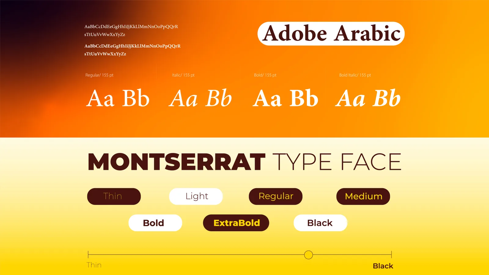
Typografie
04.1
Schriftmuster
05
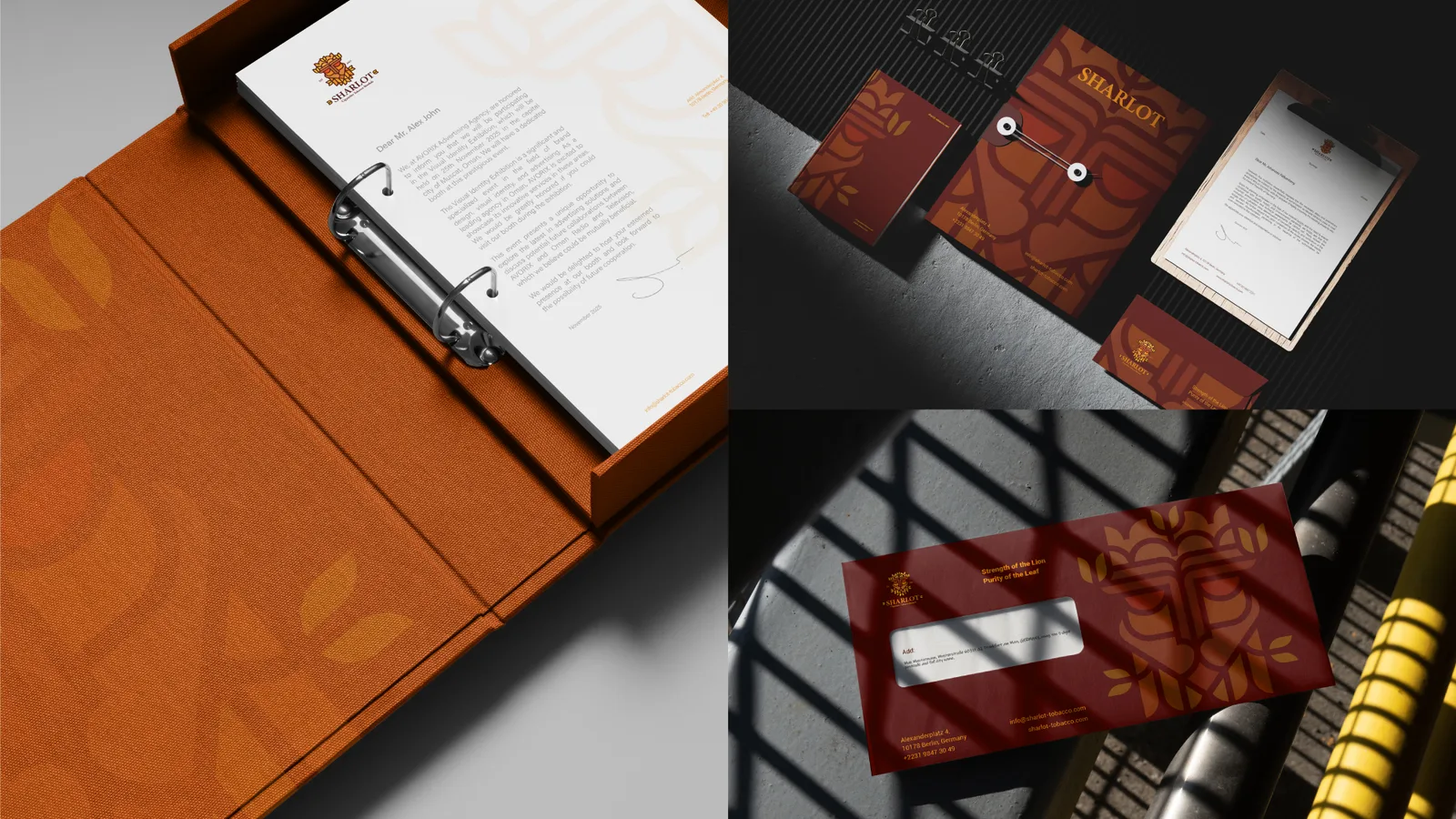
Geschäftsausstattung
05.1
Komplette Geschäftsausstattung
06
Merchandise
06.1
Taschen
06.2
Werbeartikel
06.3
Verpackung
07
Anwendungen
07.1
Beschilderung
07.2
Werbung