01
Aperçu
01.1
En bref
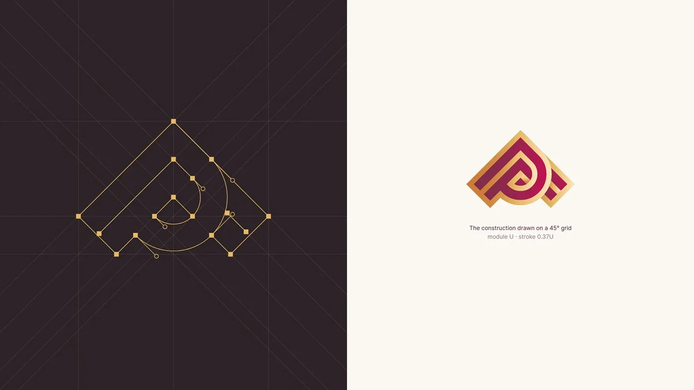
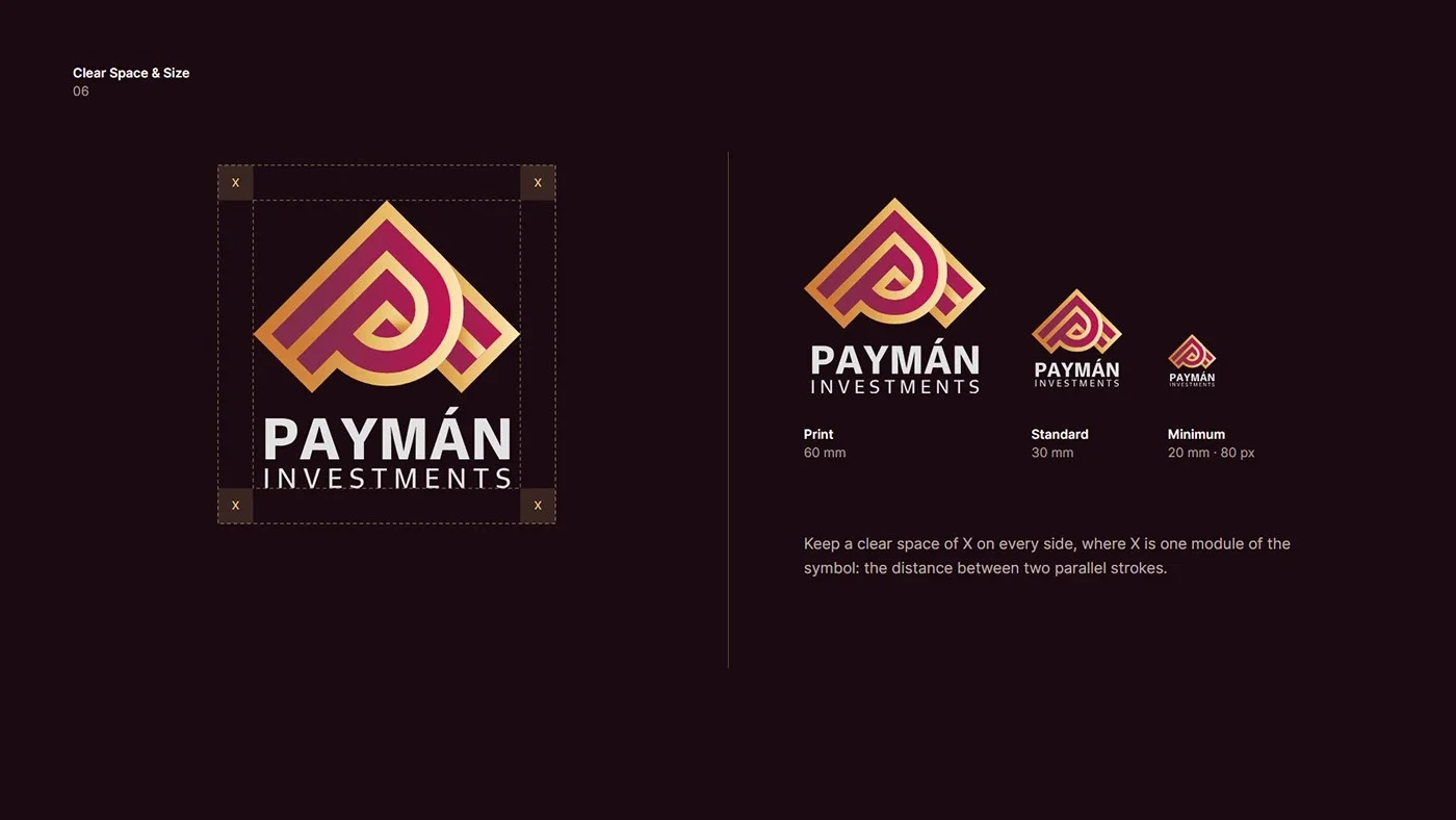
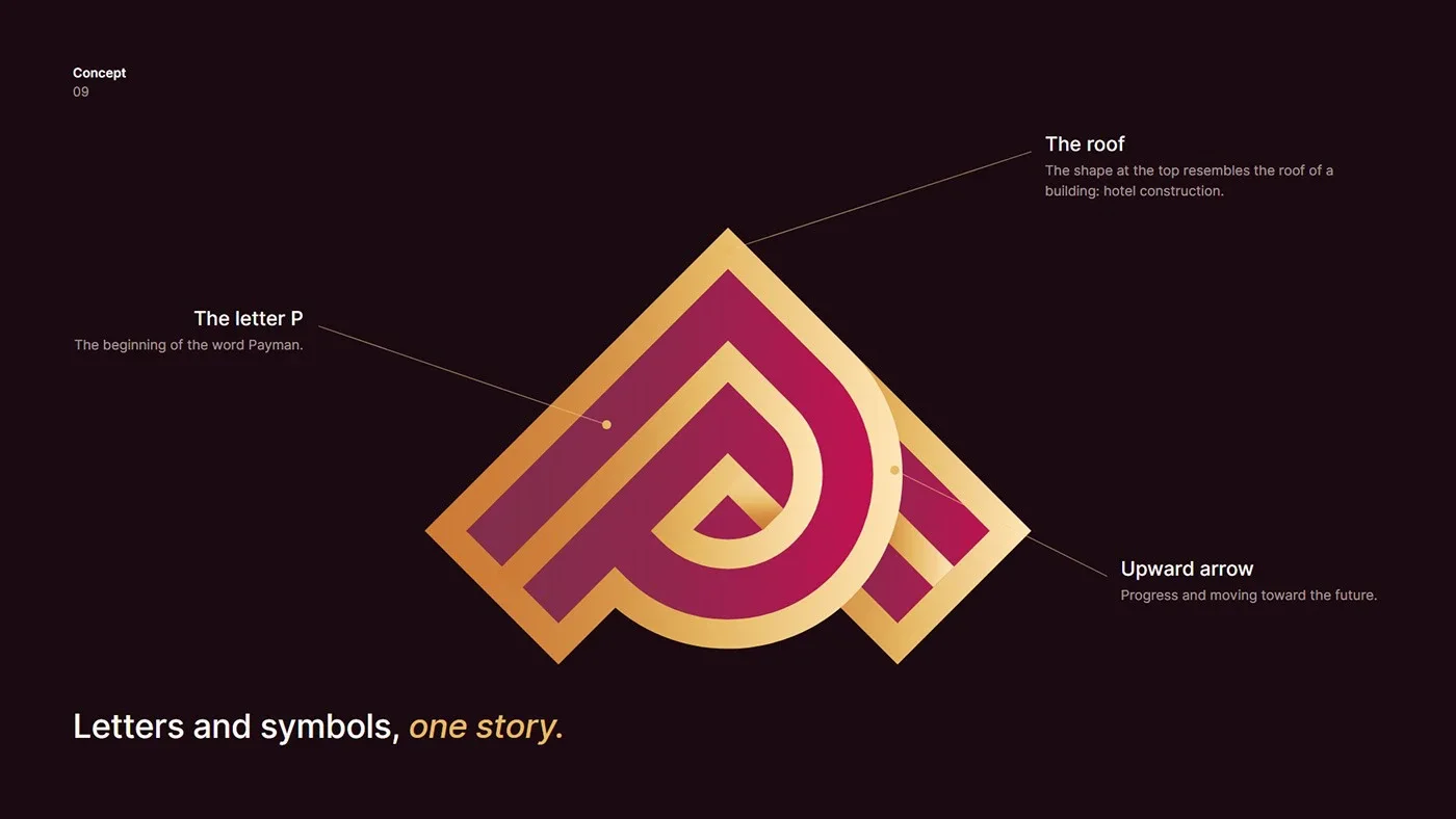
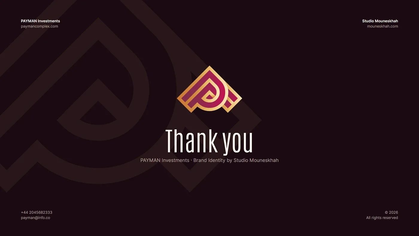
The letter P, a building’s roof and an upward arrow on a 45° grid, in royal purple and gold.
- Projet
- Identité visuelle
- Secteur
- Engineering · hotel construction
- Année
- 2026
- Services
- Identité visuelle, Création de logo, Brand Guidelines
01.2
Introduction
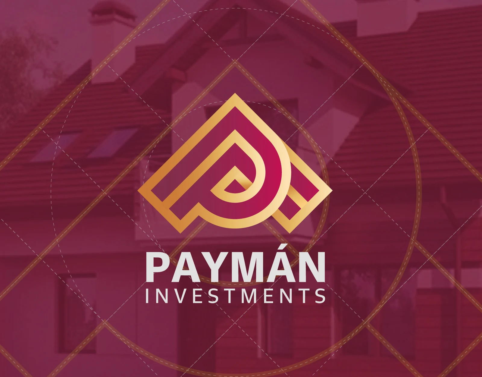
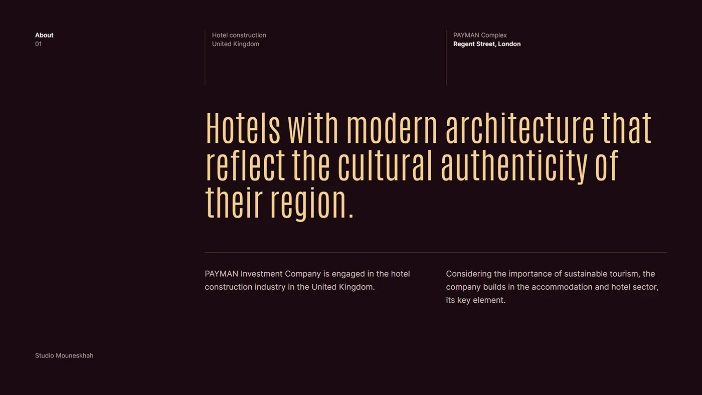
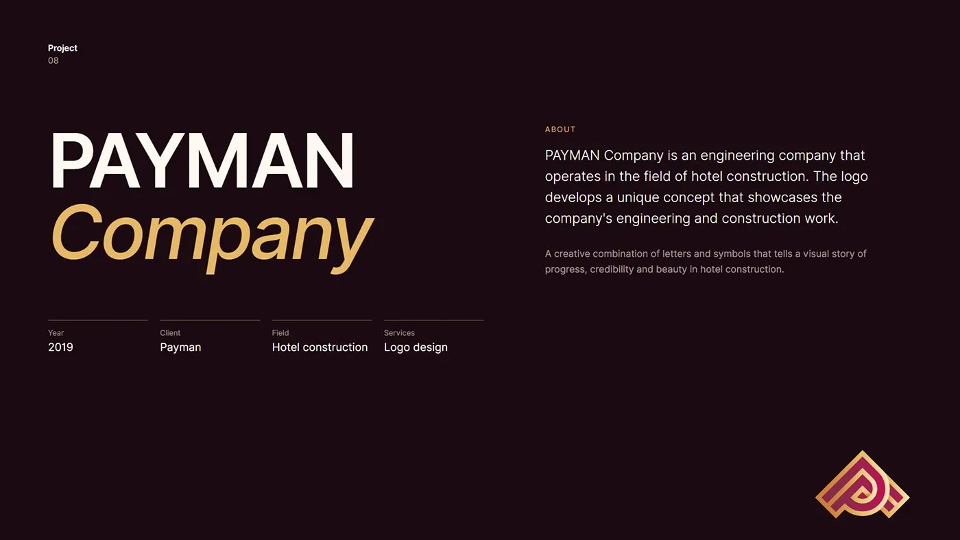
PAYMAN is an engineering company specialising in hotel construction. The identity turns its world, architecture, hospitality and progress, into a single, memorable mark.
01.3
À propos
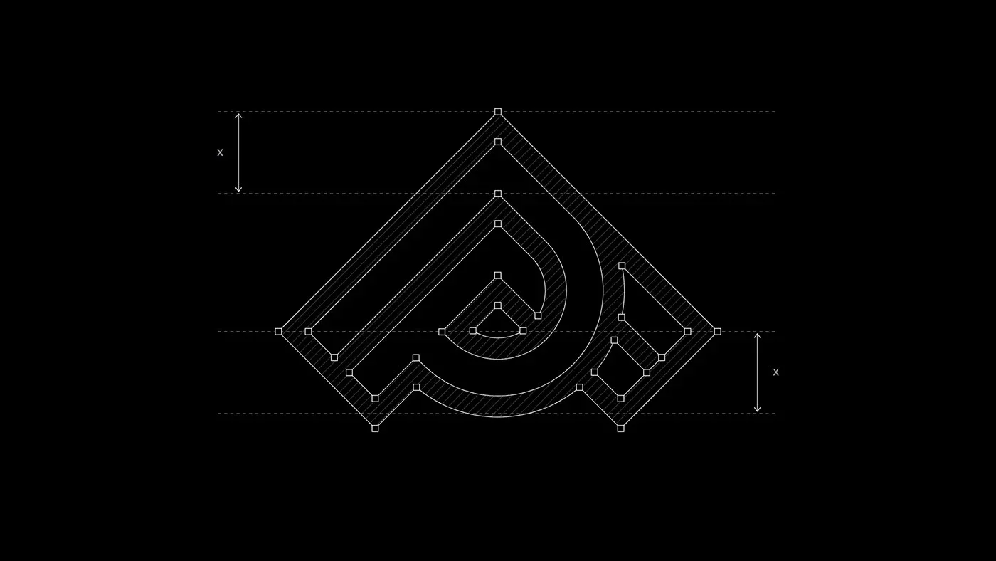
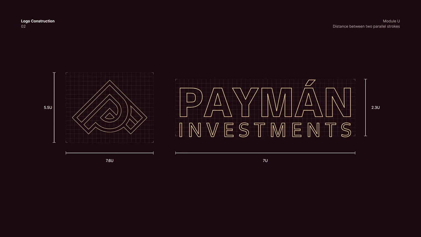
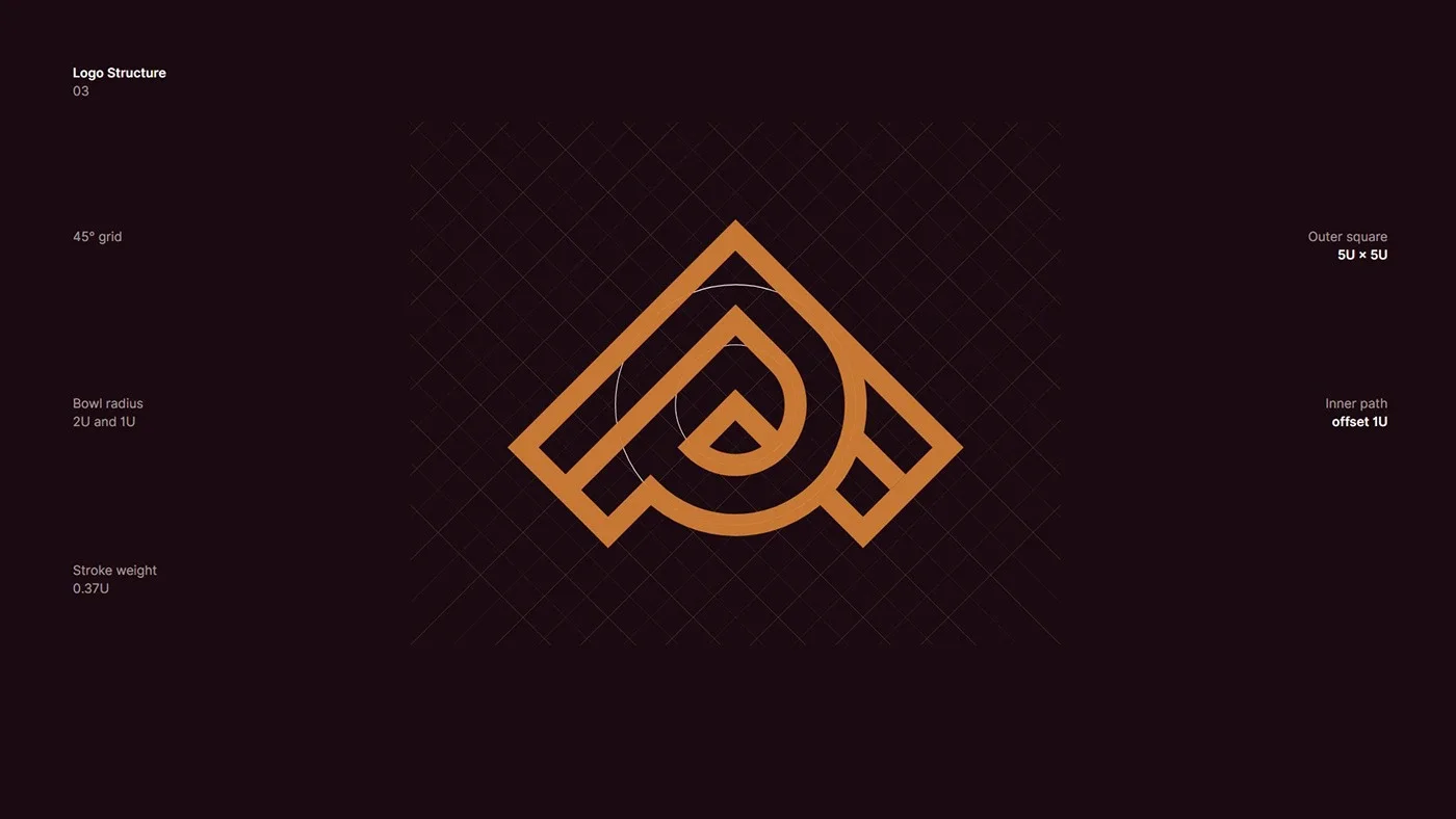
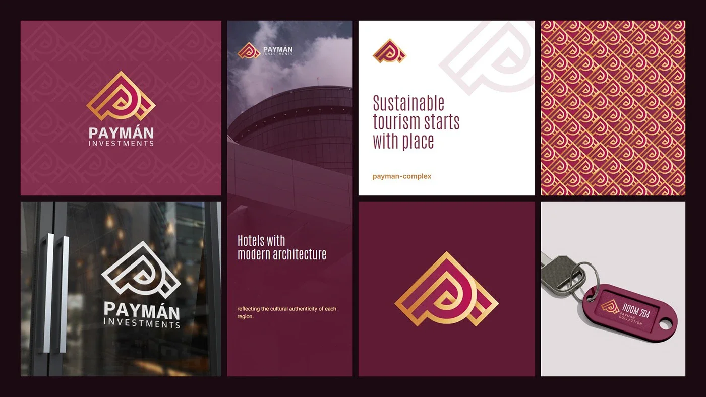
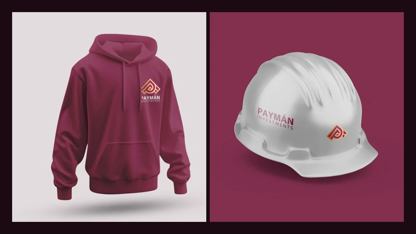
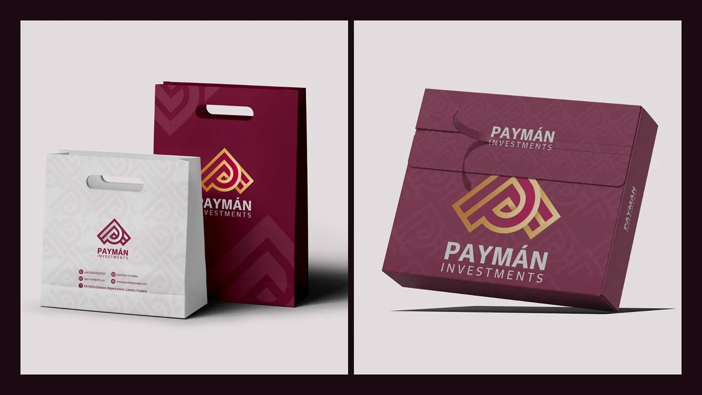
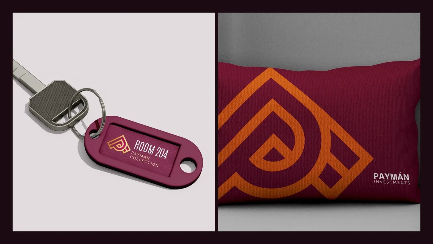
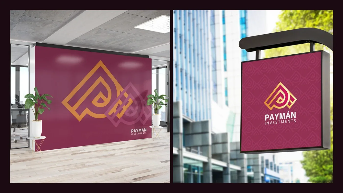
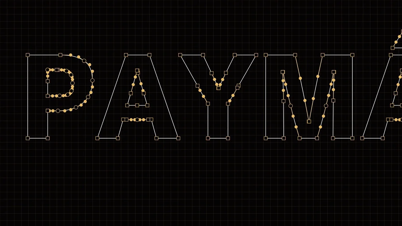
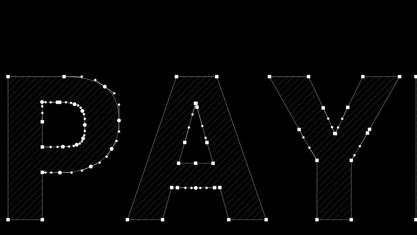
The logo combines the letter P with the roof of a building and an upward arrow, drawn on a precise 45° grid: a symbol of construction, growth and moving toward the future.
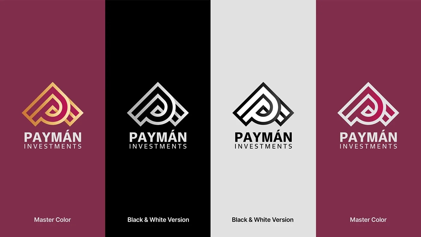
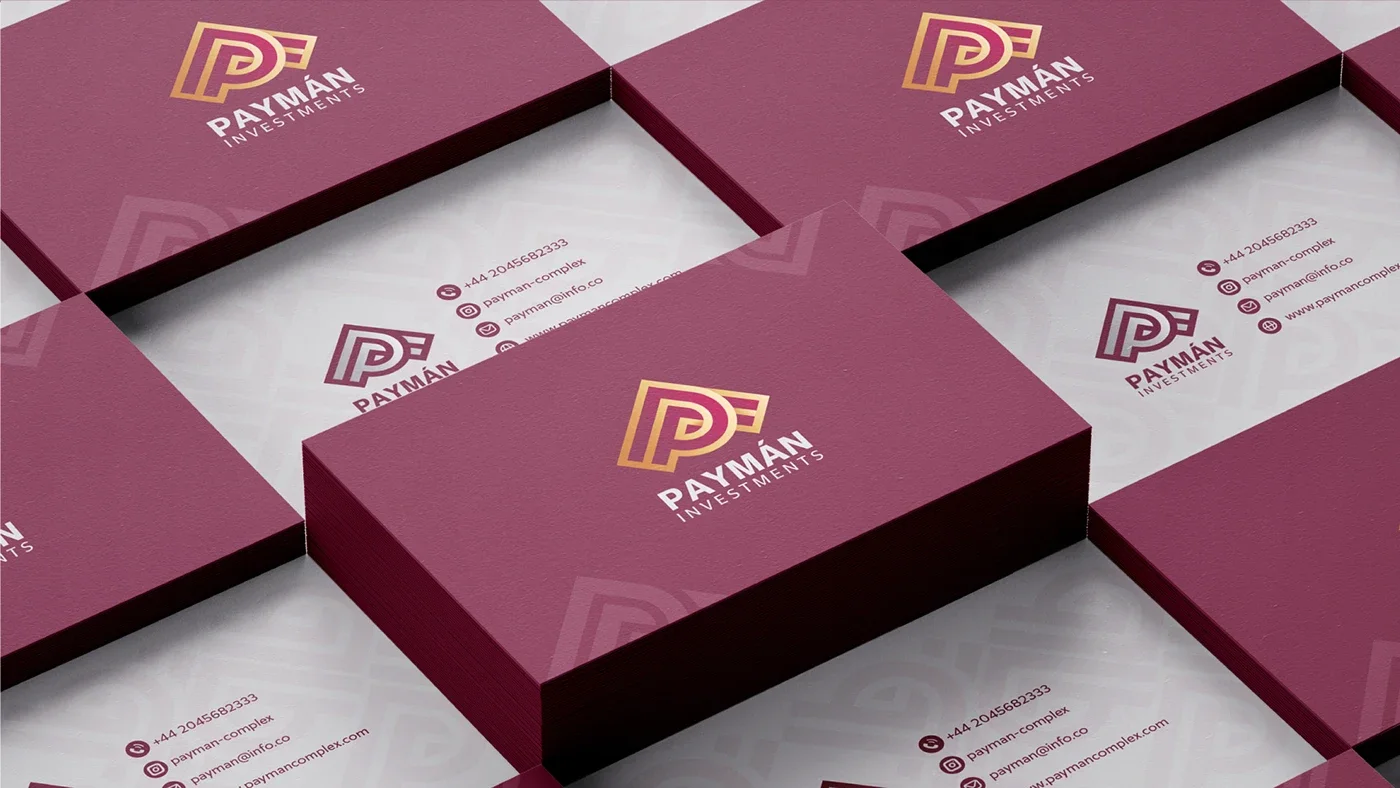
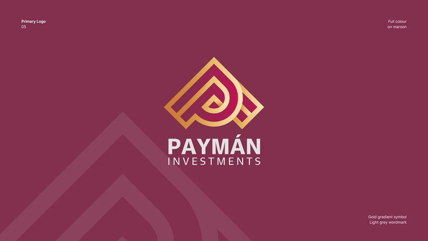
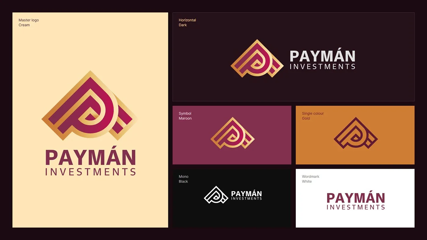
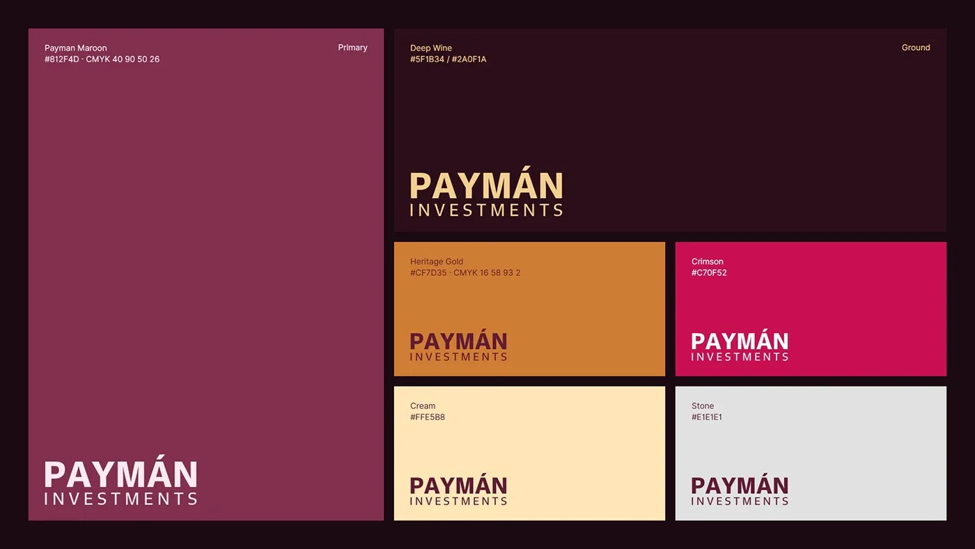
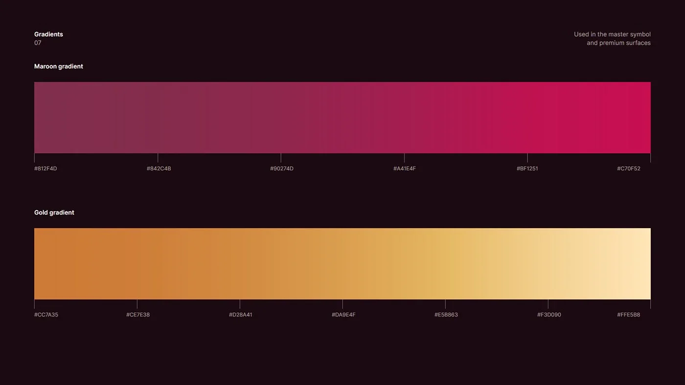
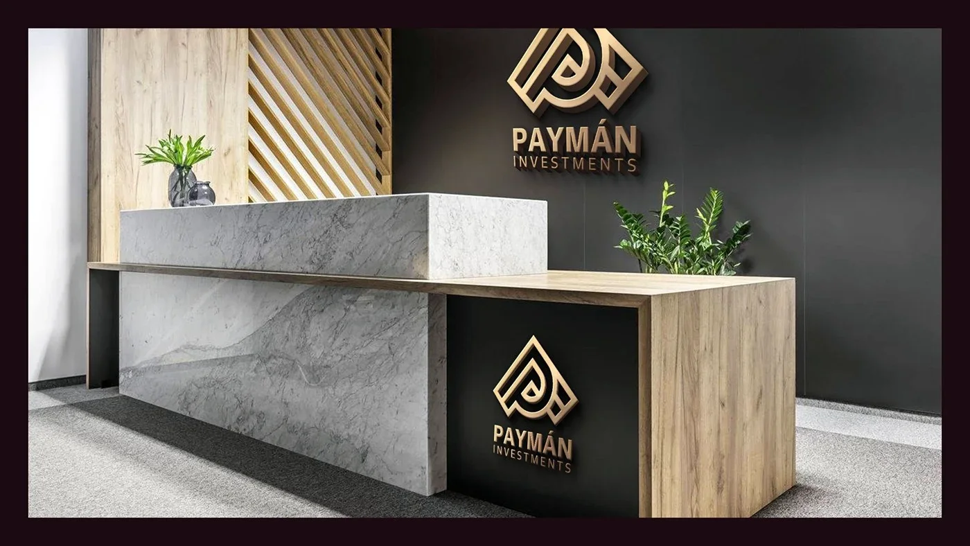
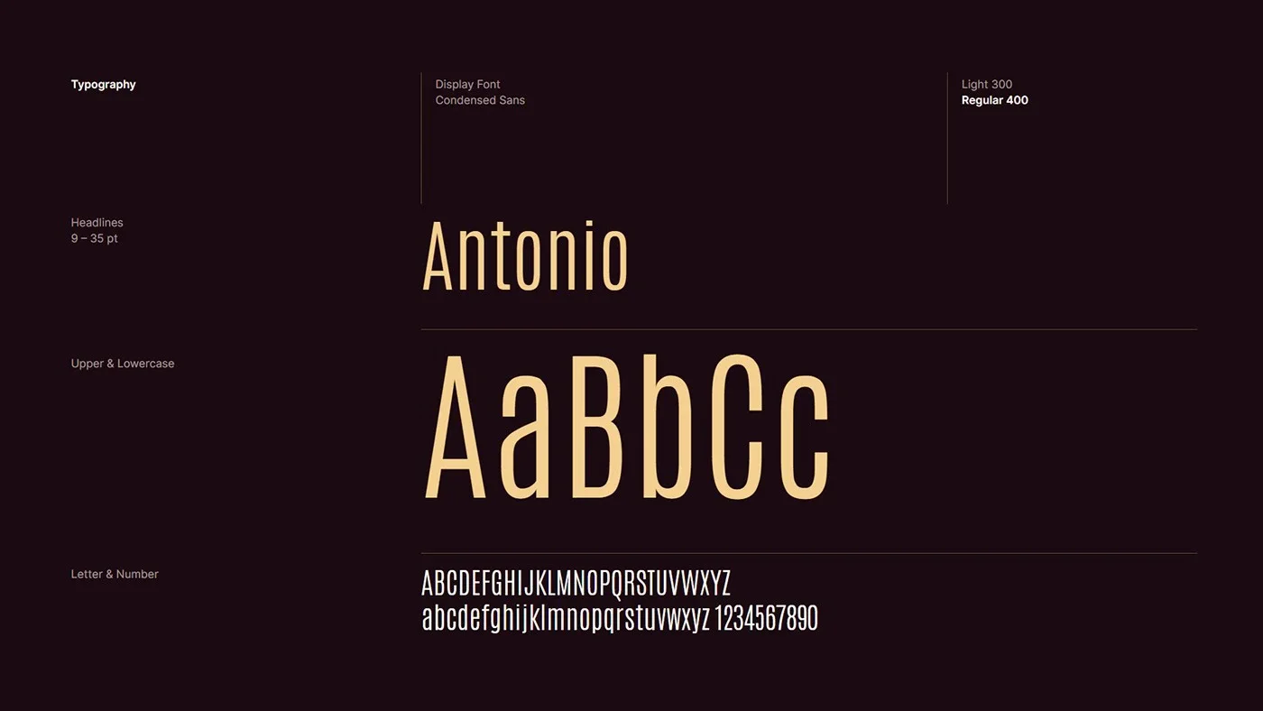
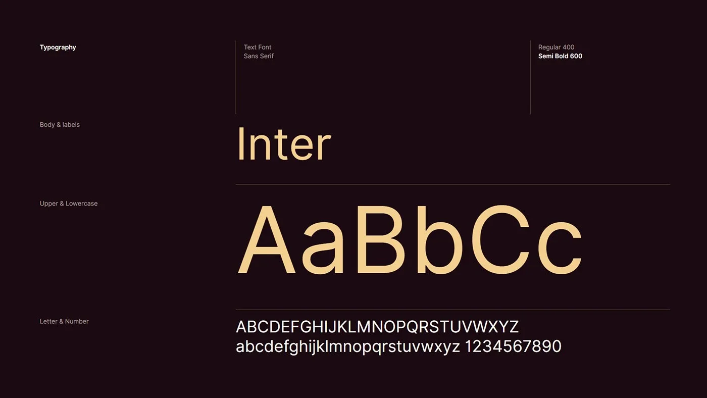
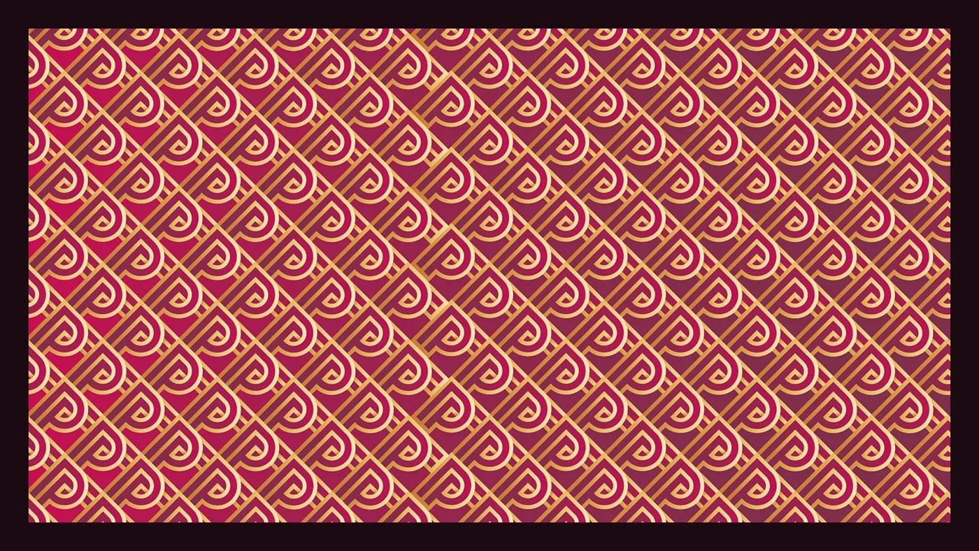
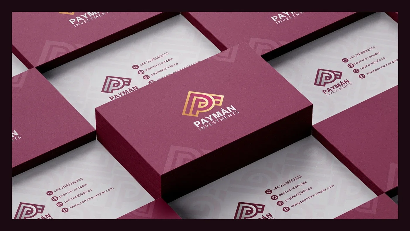
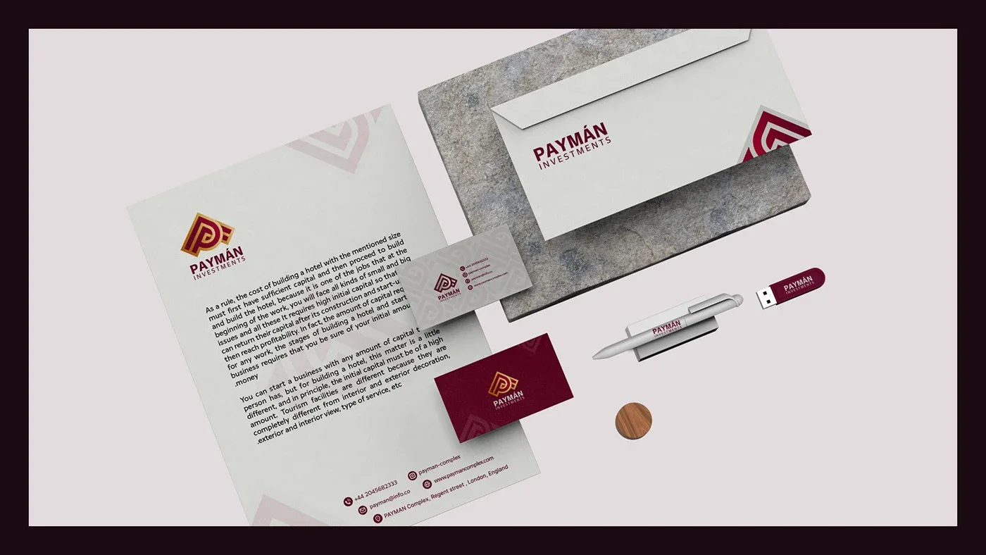
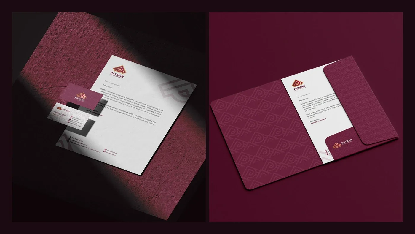
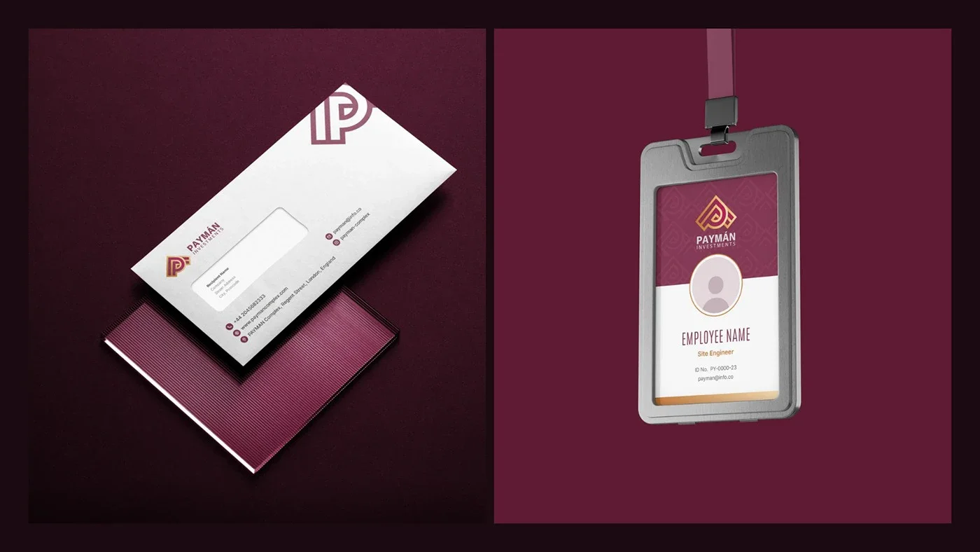
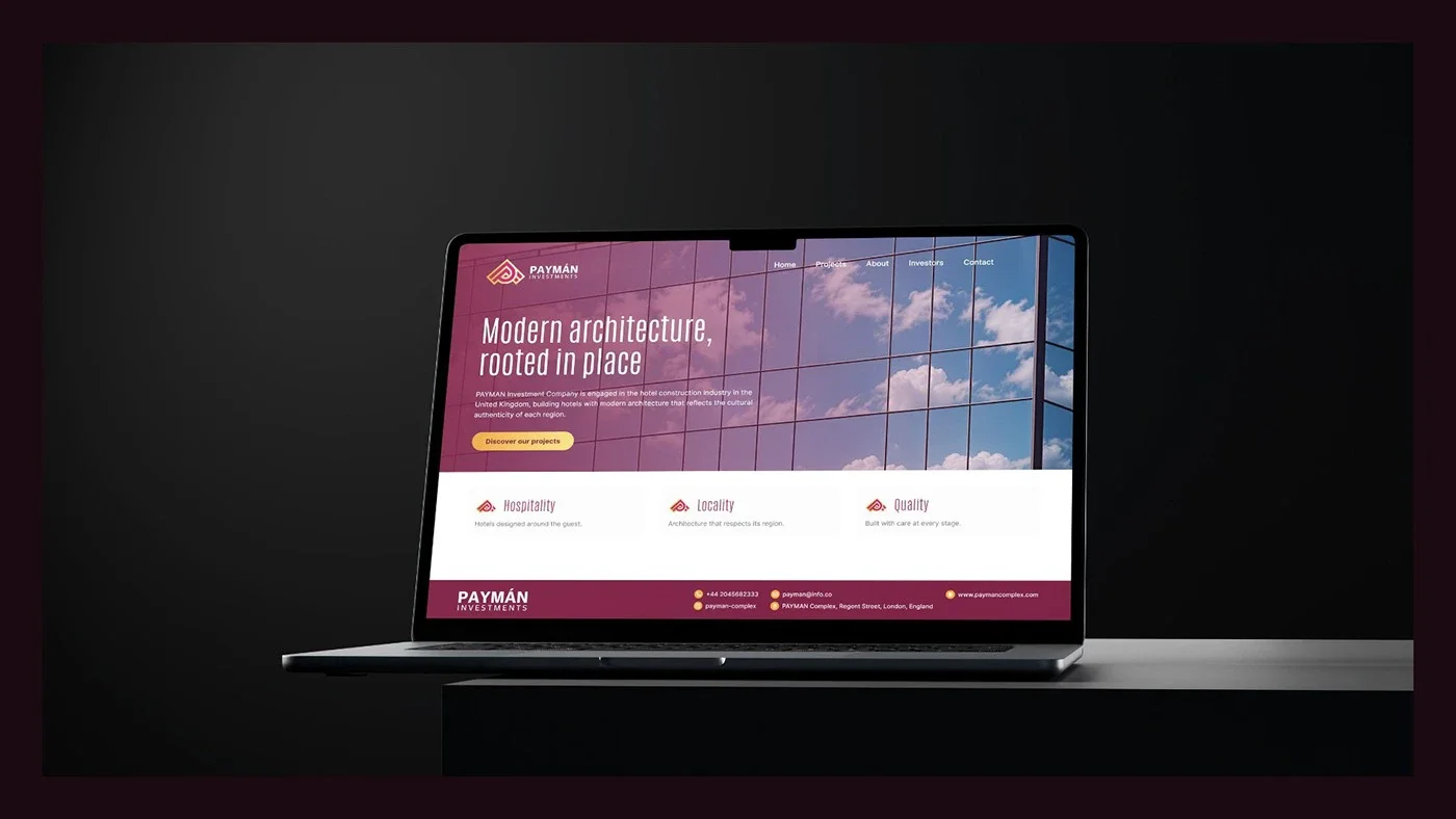
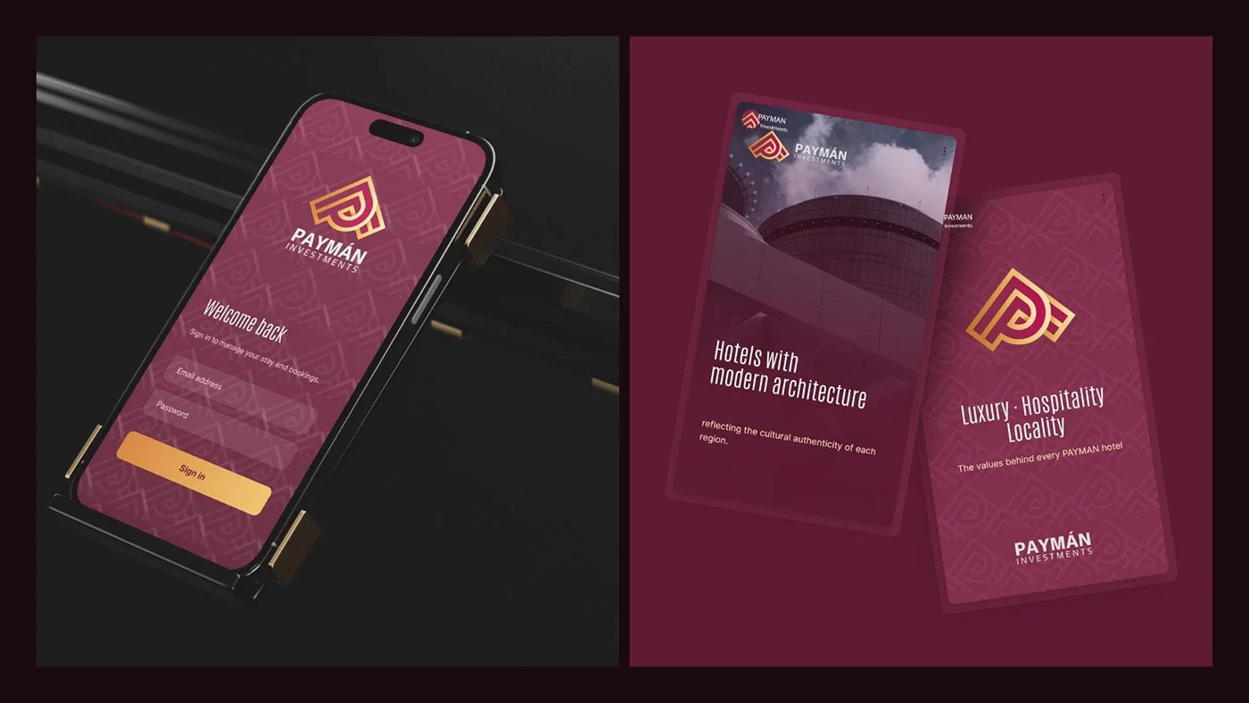
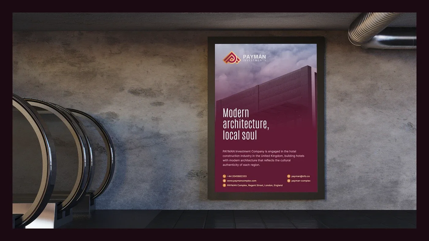
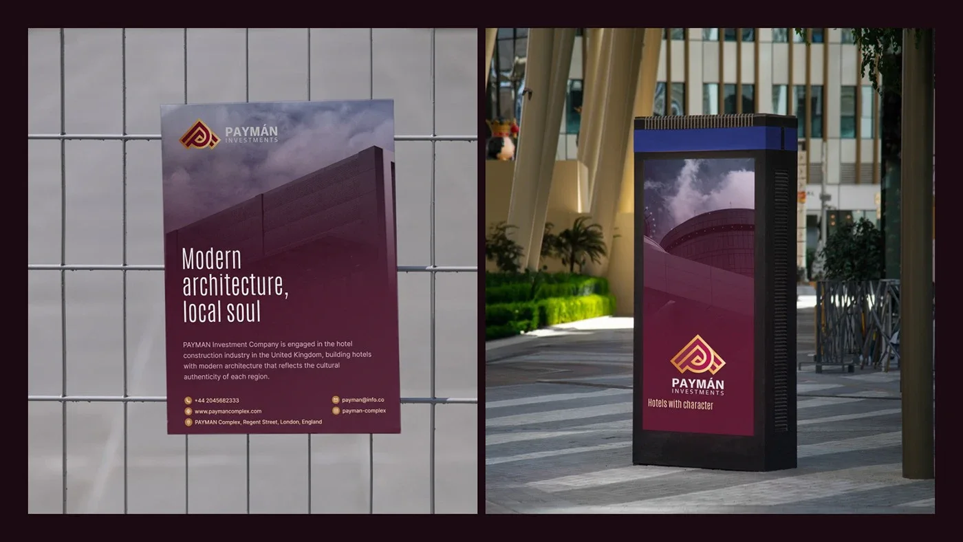
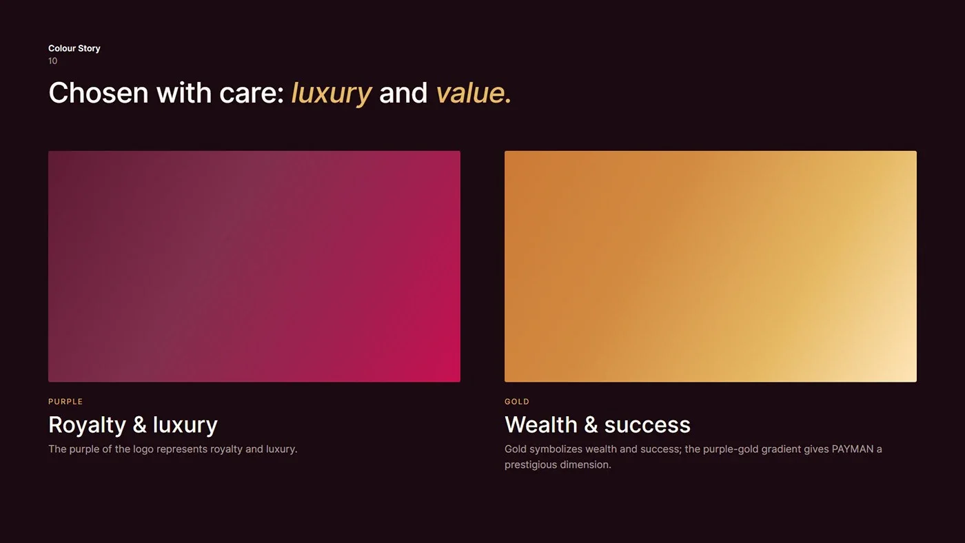
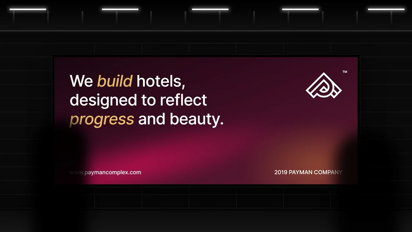
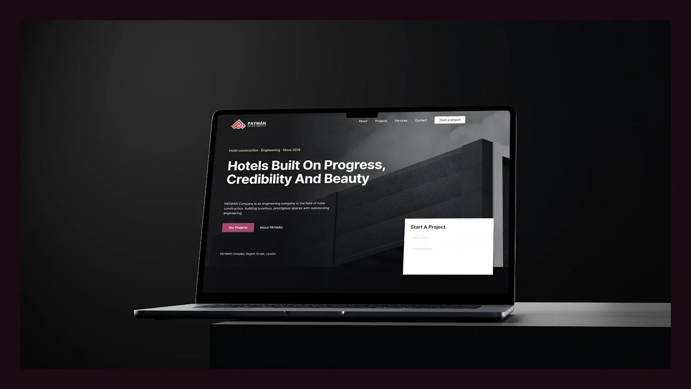
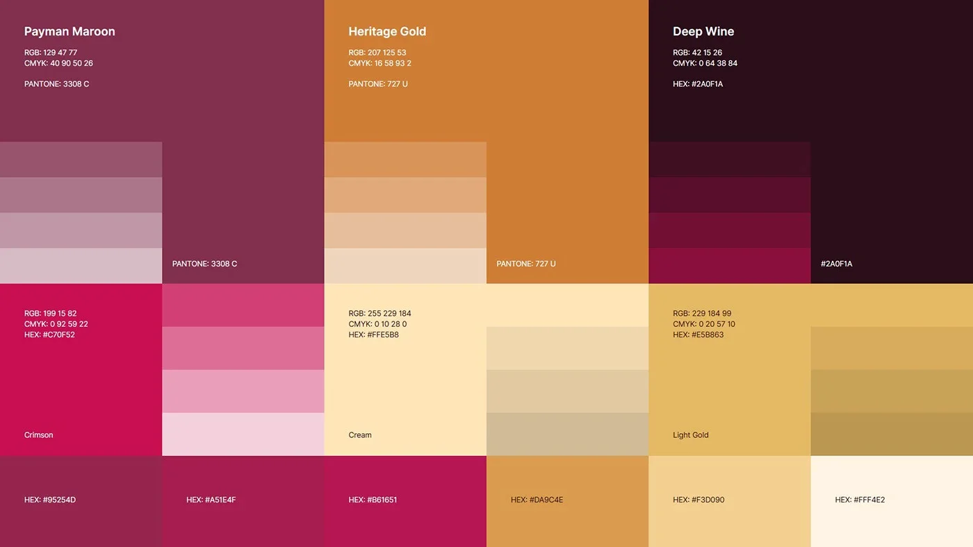
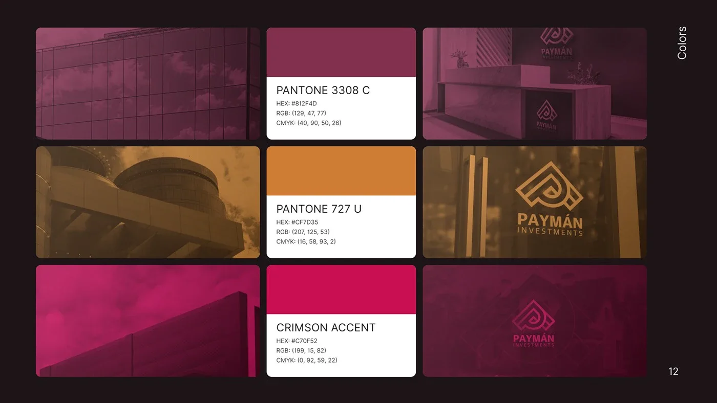
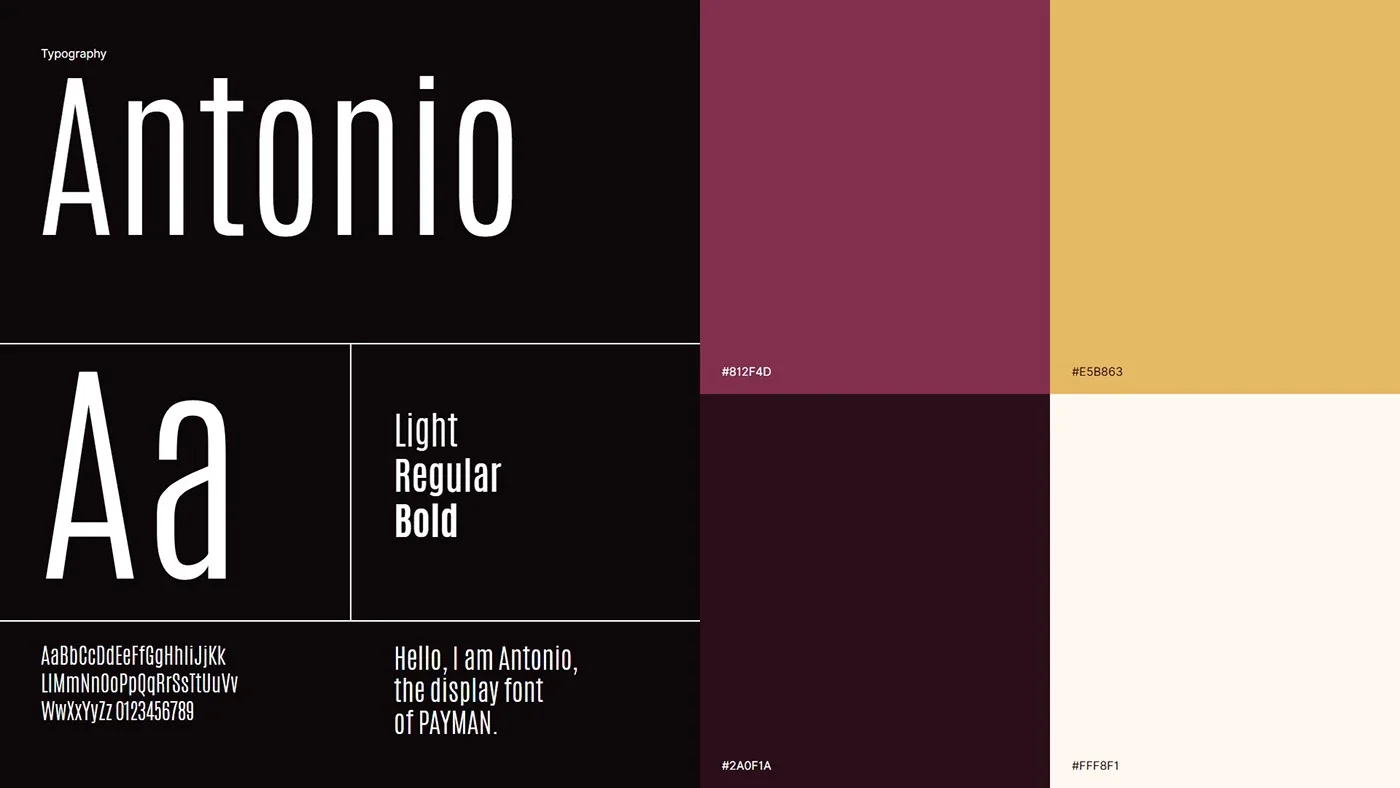
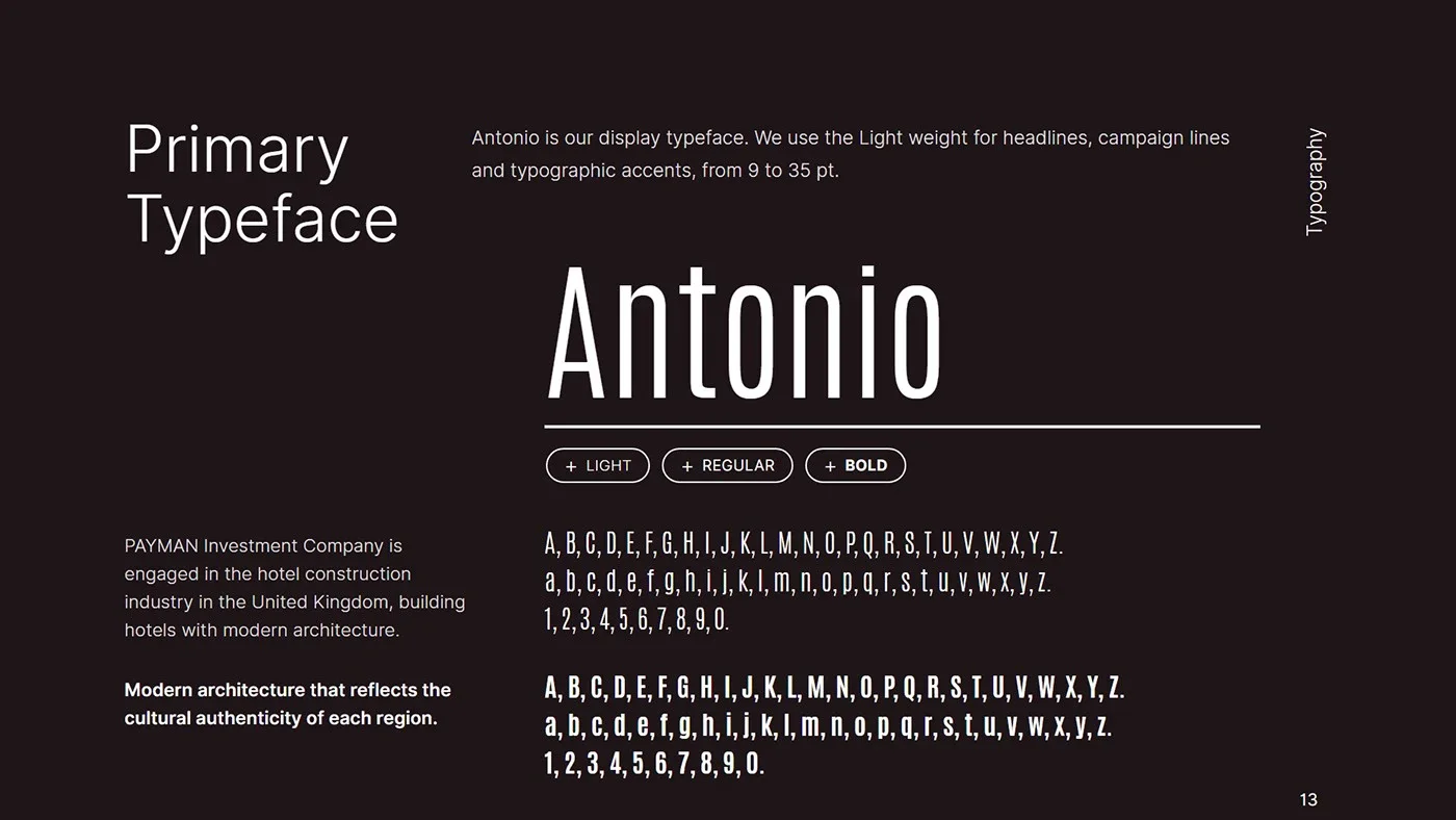
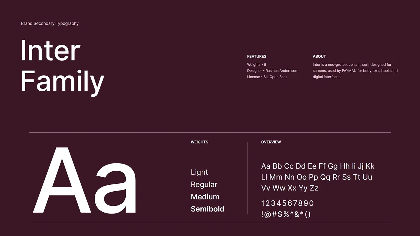
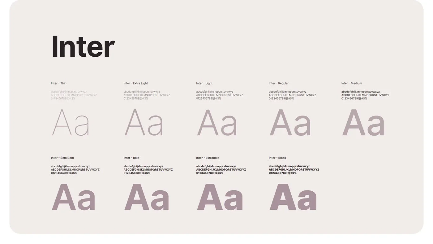
Royal purple expresses luxury and gold stands for wealth and success; their gradient gives the brand a premium feel. The guidelines cover the construction grid, colour palette, typography (Antonio and Inter), brand pattern, 3D logo renders, stationery, signage, digital and environmental applications.
02
Typographie
02.1
Polices
Les caractères de l'identité et les graisses utilisées.
- Antonio
- Inter
03
En situation
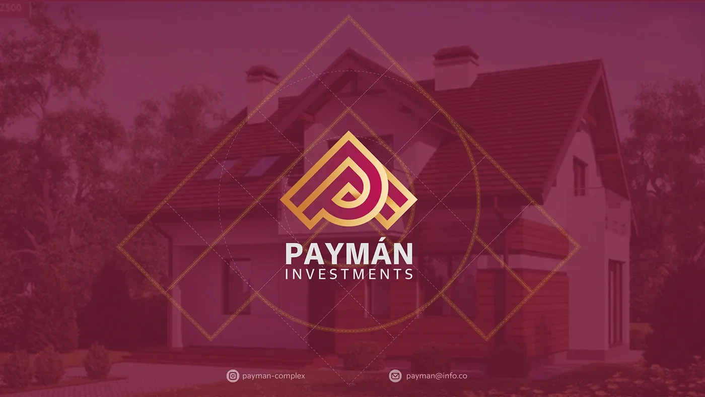
Le travail dans ses présentations et ses applications.
- 01
- 02
- 03
- 04
- 05
- 06
- 07

- 08
- 09
- 10
- 11
- 12
- 13
- 14
- 15
- 16
- 17
- 18
- 19
- 20
- 21
- 22
- 23
- 24
- 25
- 26
- 27
- 28
- 29
- 30
- 31

- 32
- 33
- 34
- 35
- 36
- 37
- 38
- 39
- 40
- 41
- 42
- 43
- 44
- 45
- 46
- 47
- 48