01
概览
01.1
一览
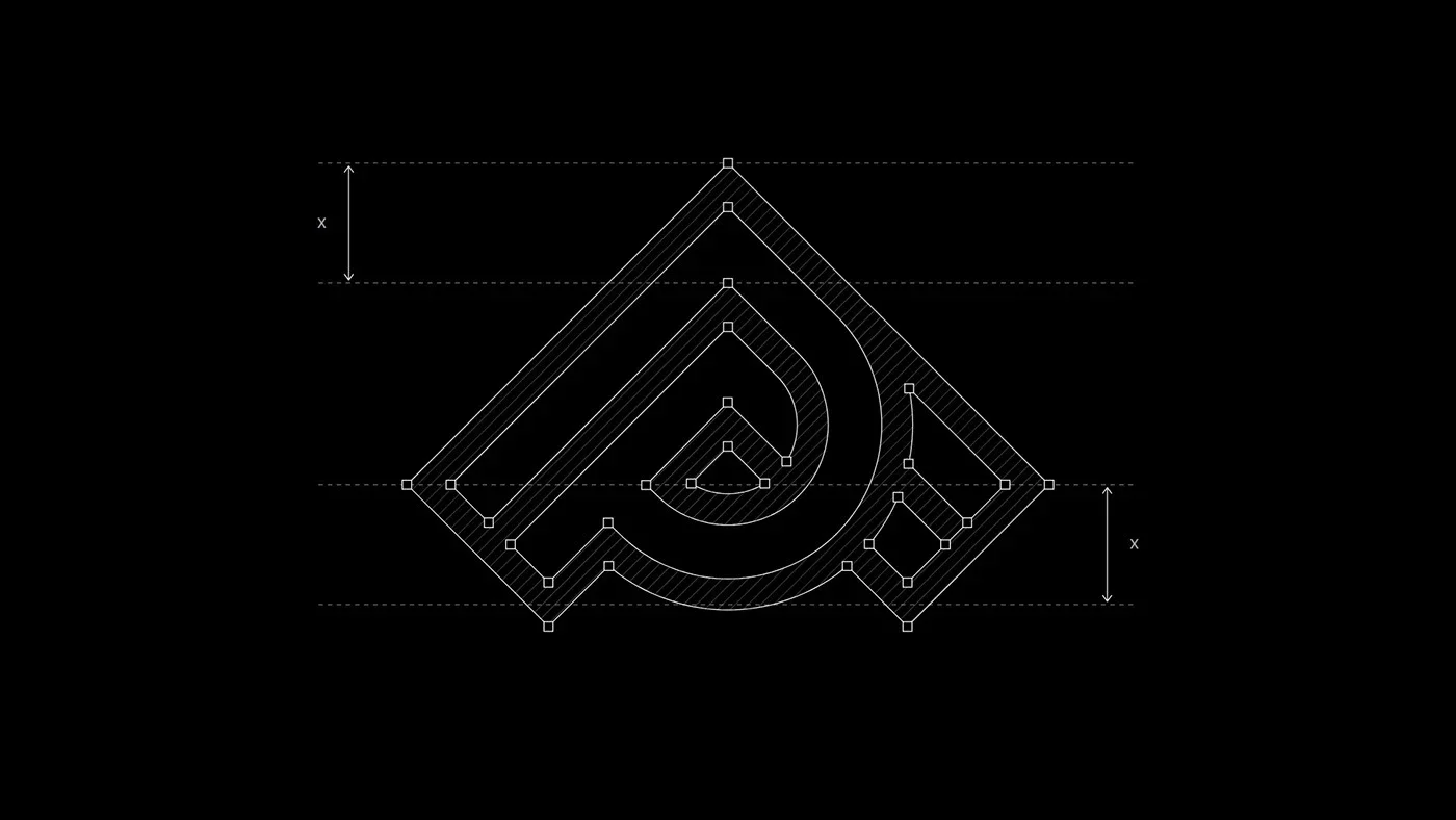
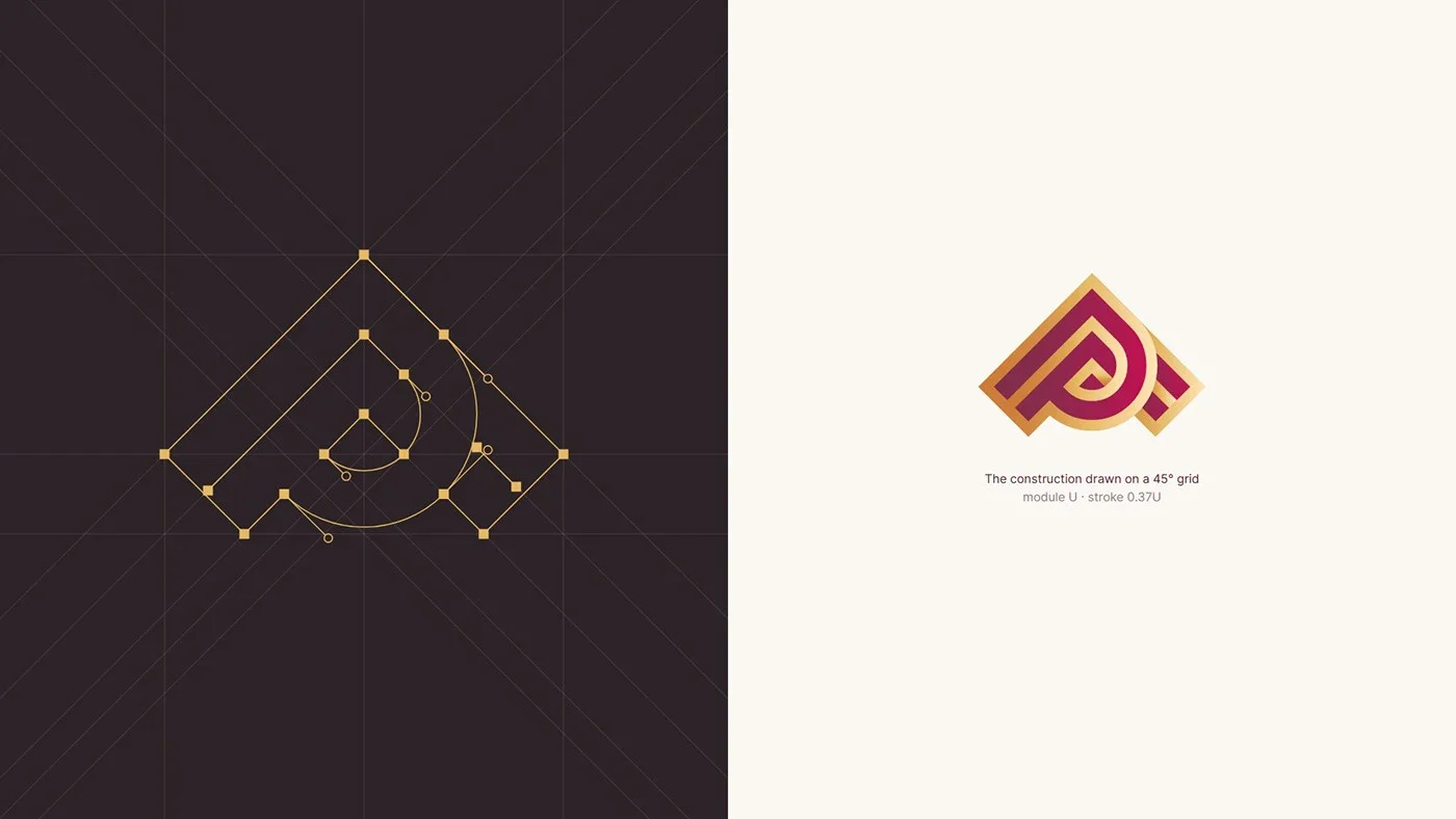
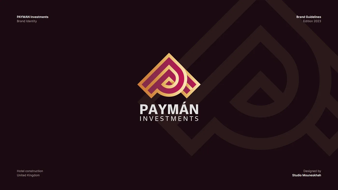
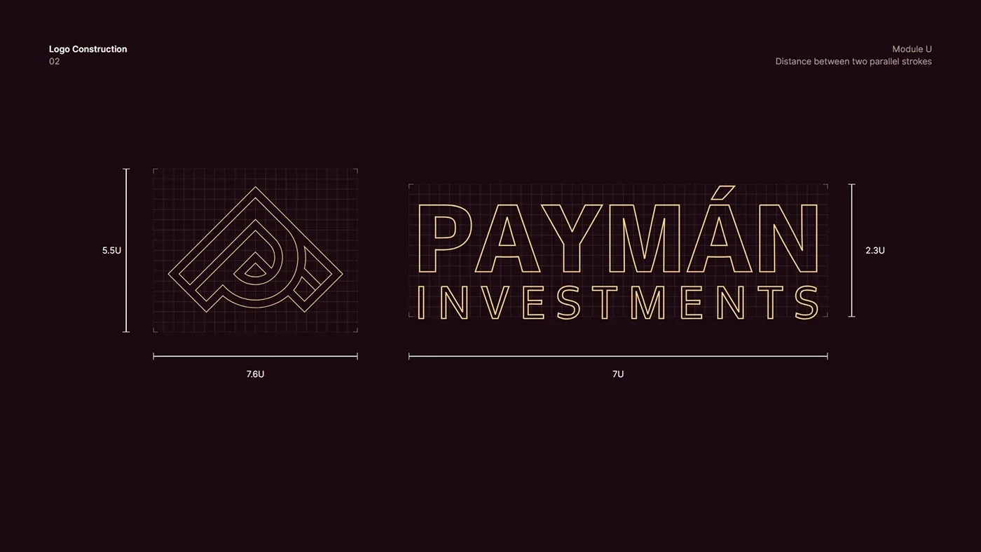
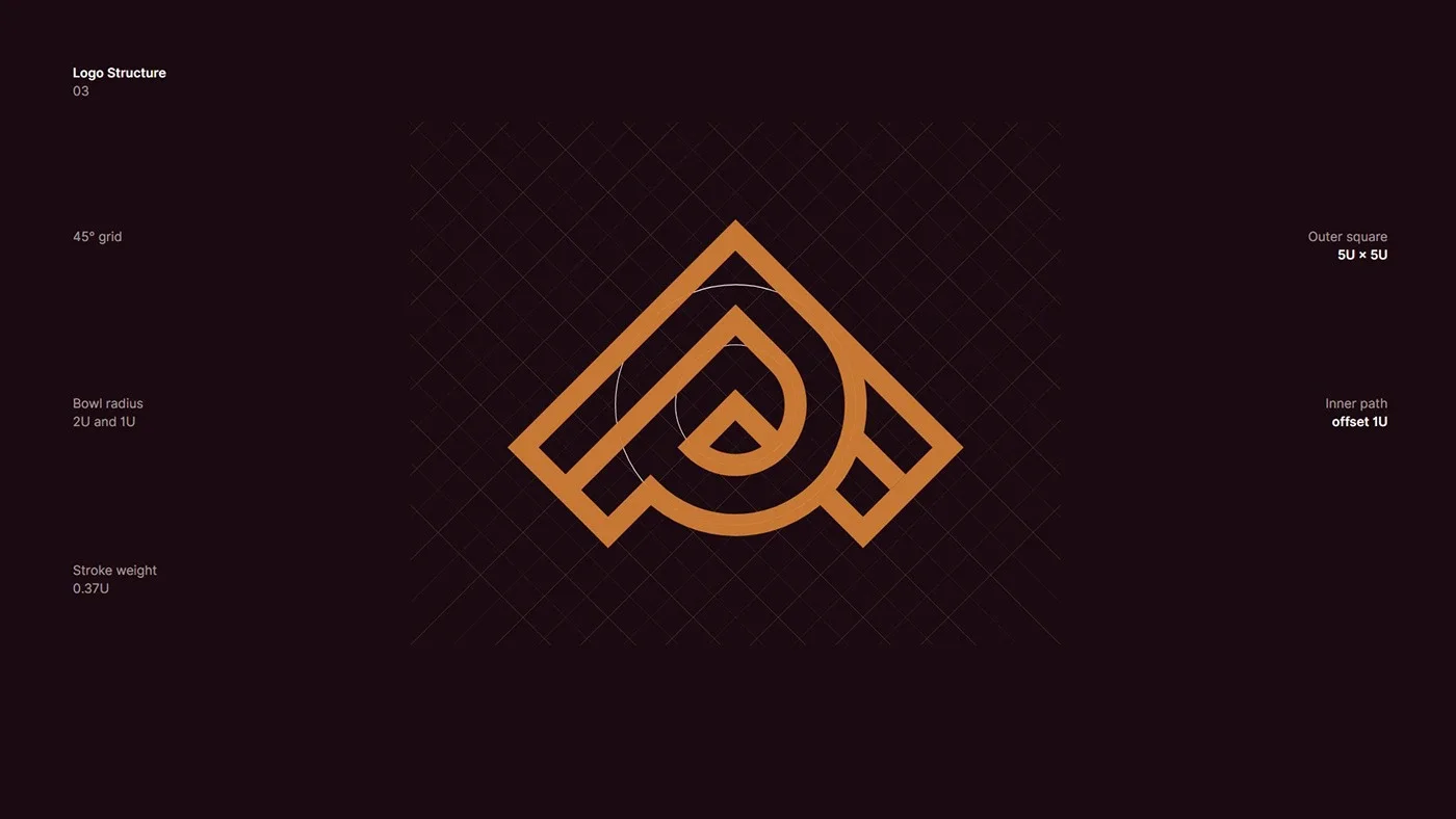
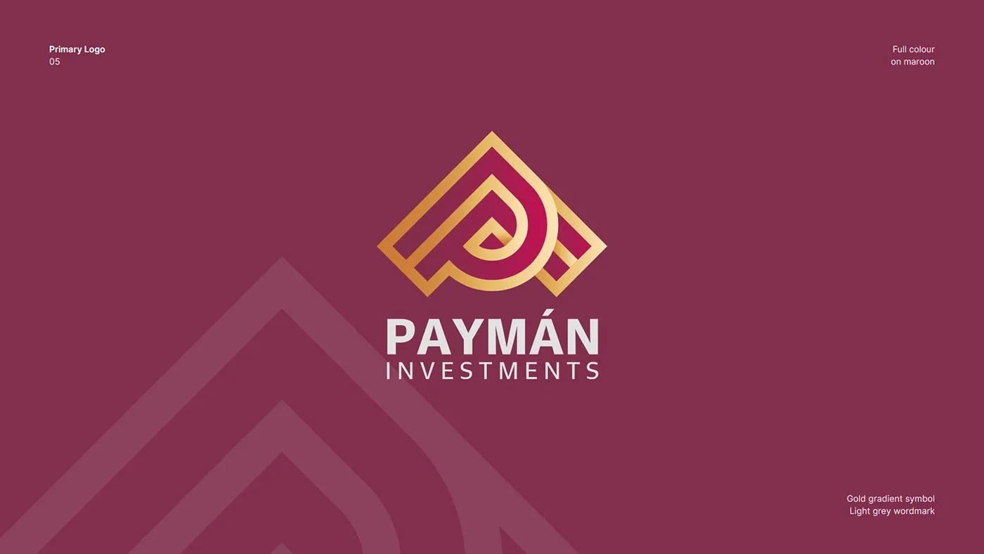
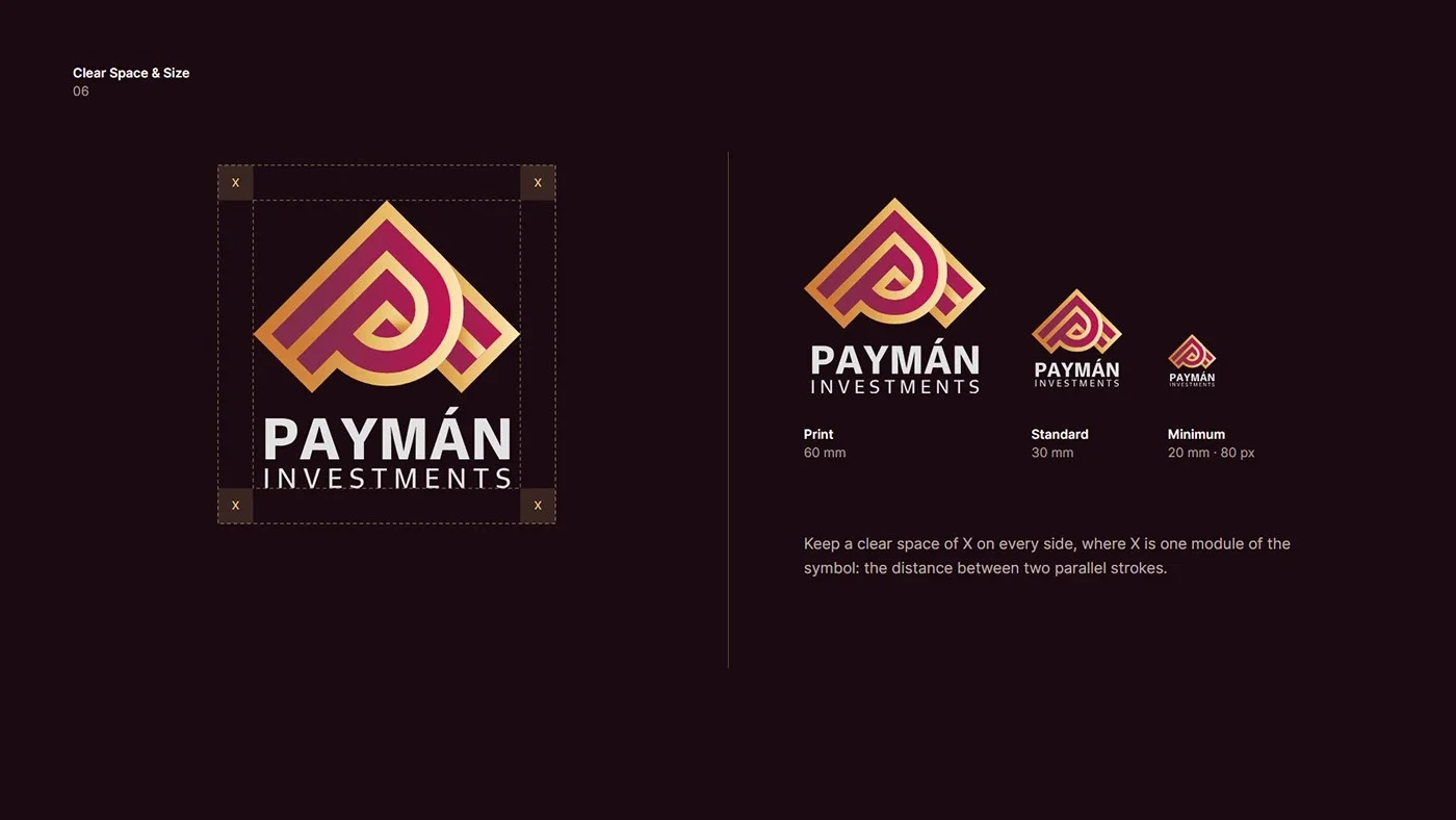
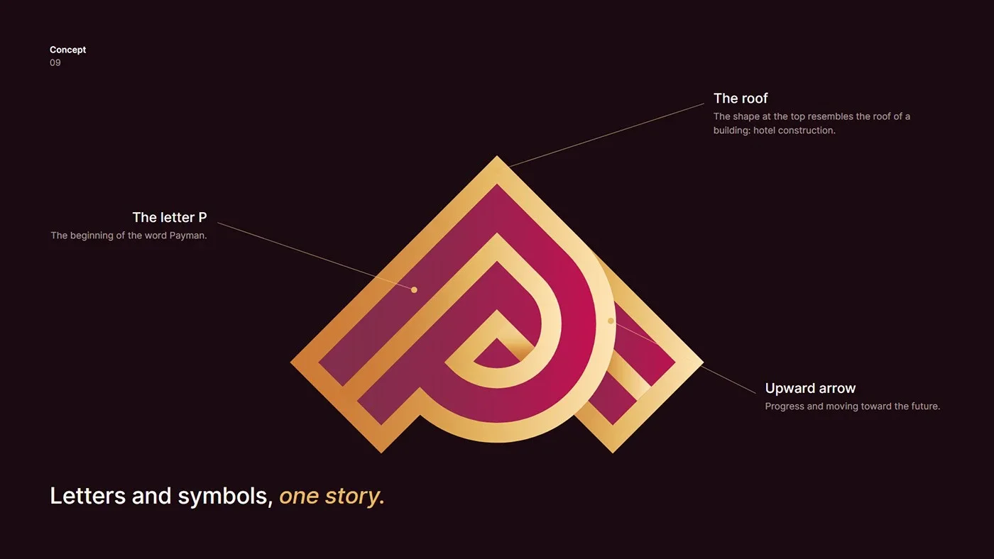
The letter P, a building’s roof and an upward arrow on a 45° grid, in royal purple and gold.
- 项目
- 视觉形象
- 领域
- Engineering · hotel construction
- 年份
- 2026
- 服务
- 视觉形象, 标志设计, Brand Guidelines
01.2
简介
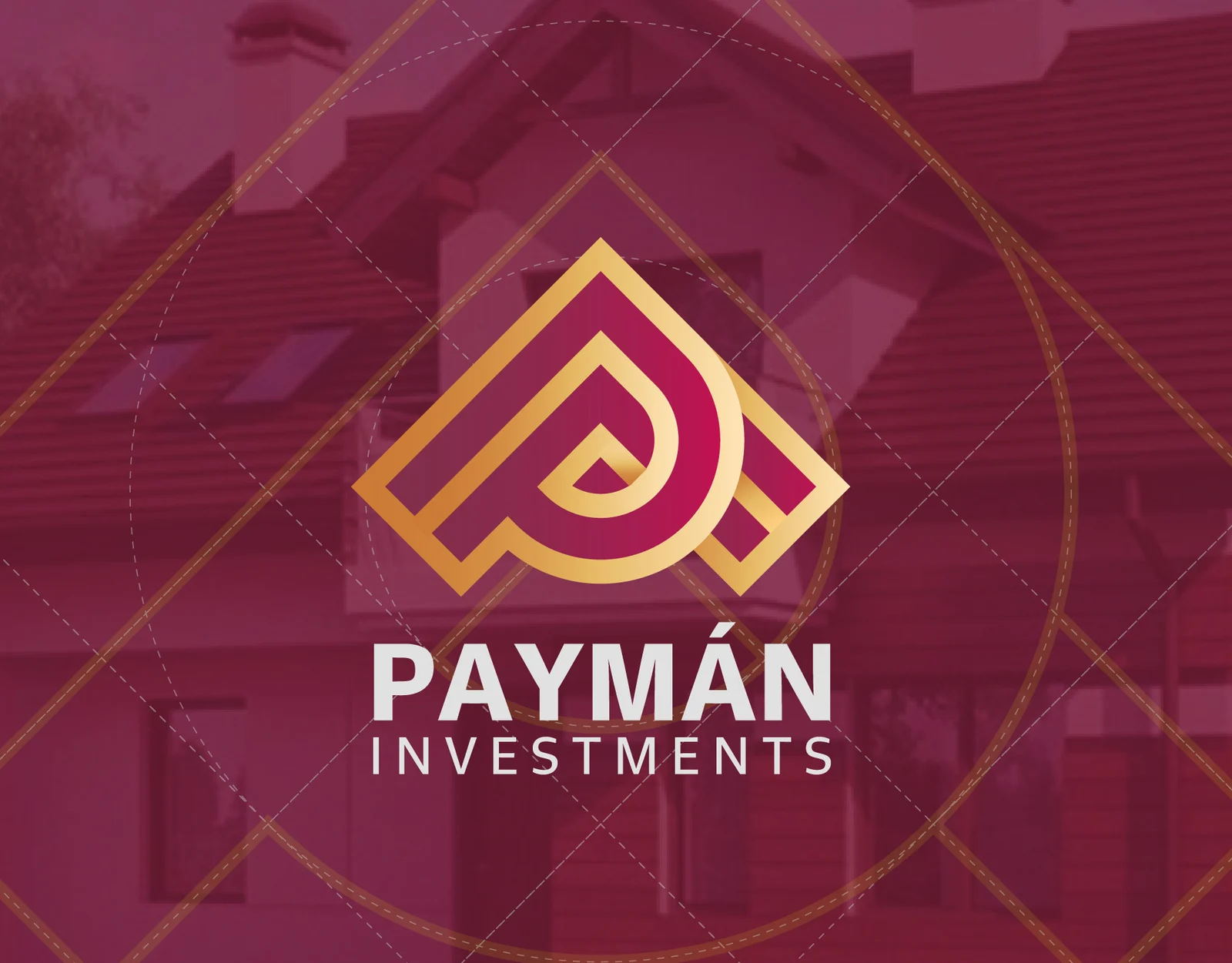
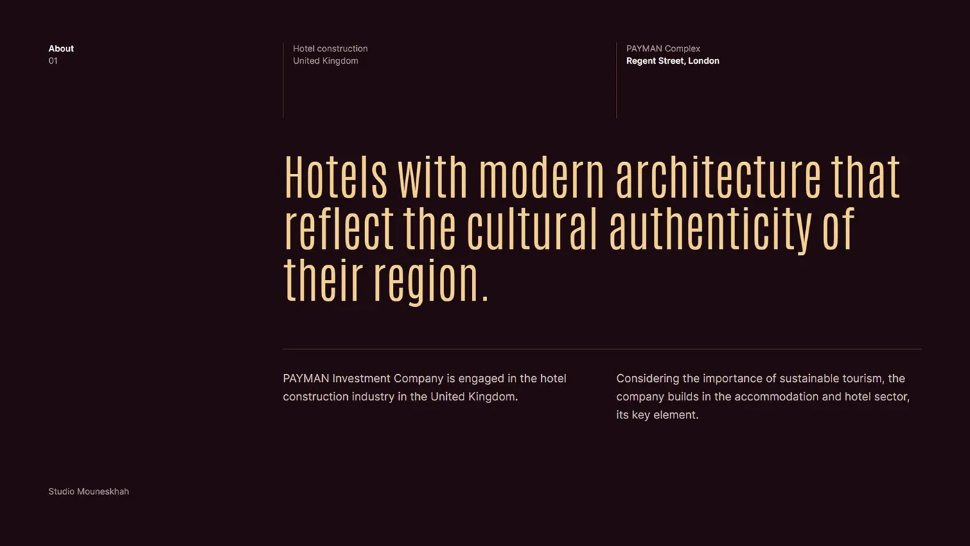
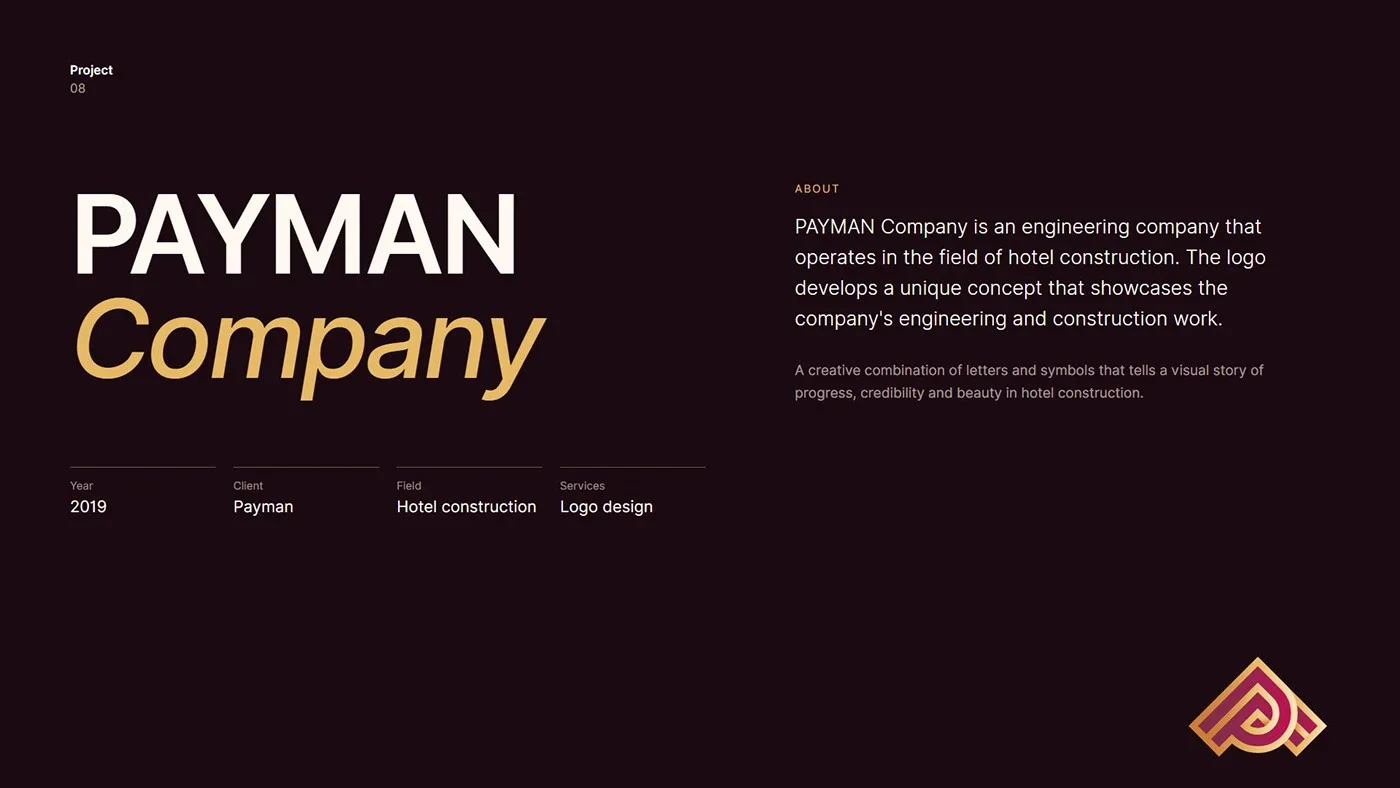
PAYMAN is an engineering company specialising in hotel construction. The identity turns its world, architecture, hospitality and progress, into a single, memorable mark.
01.3
关于
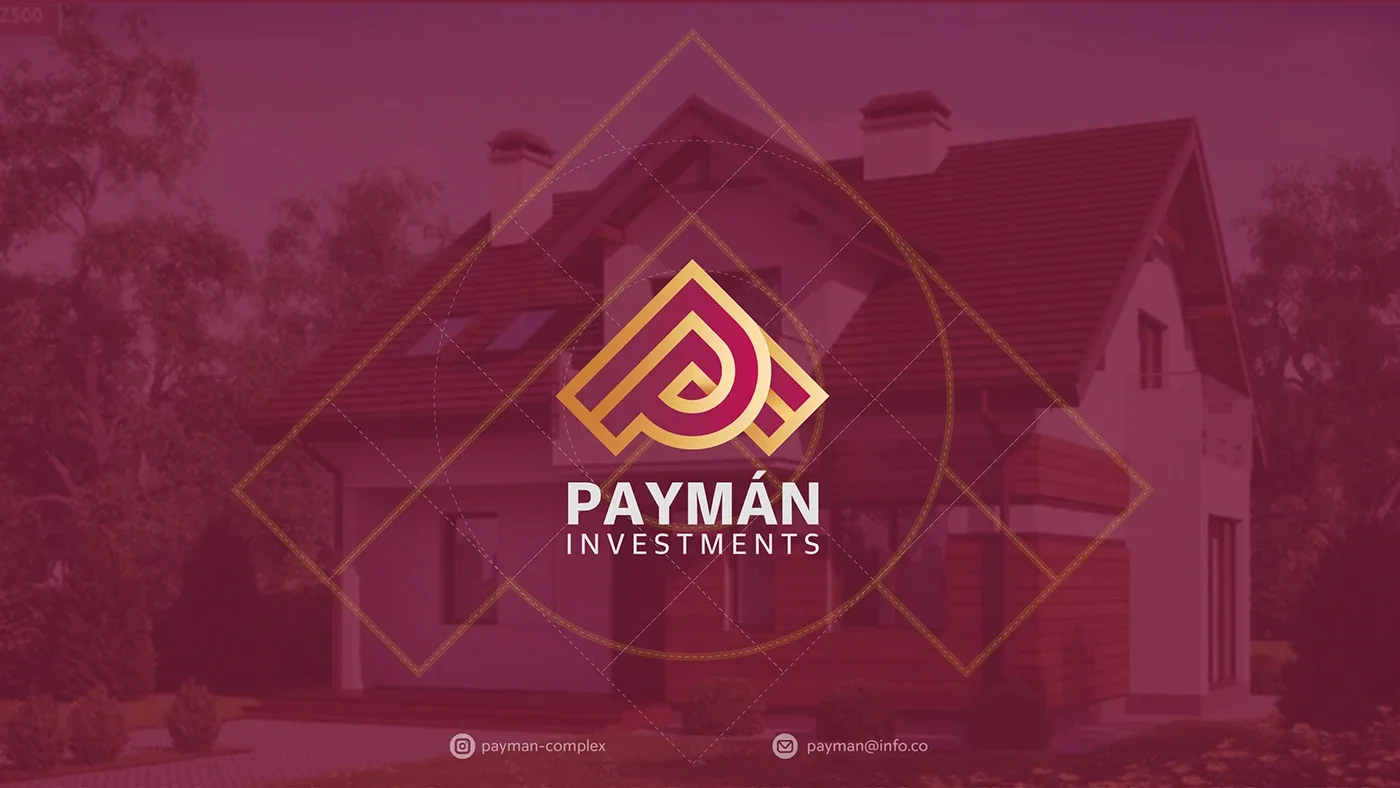
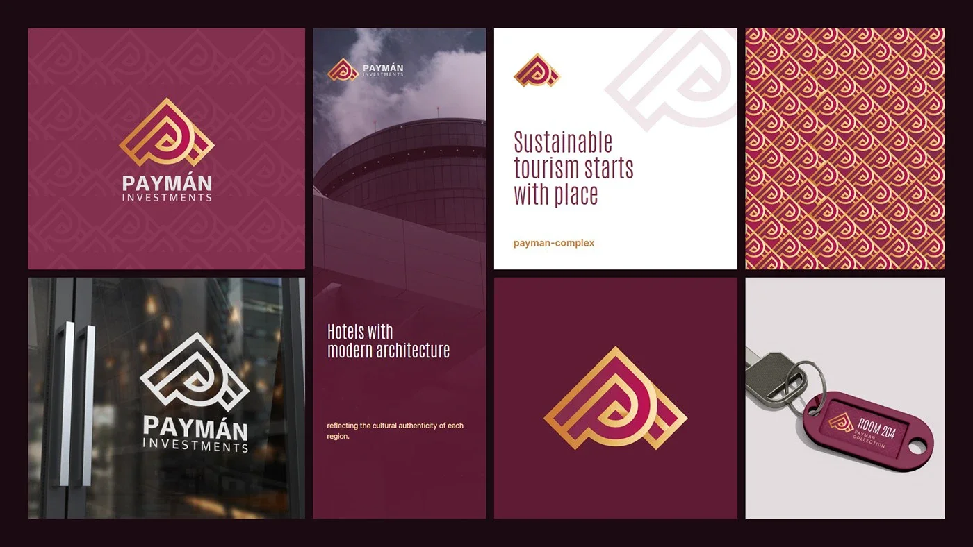
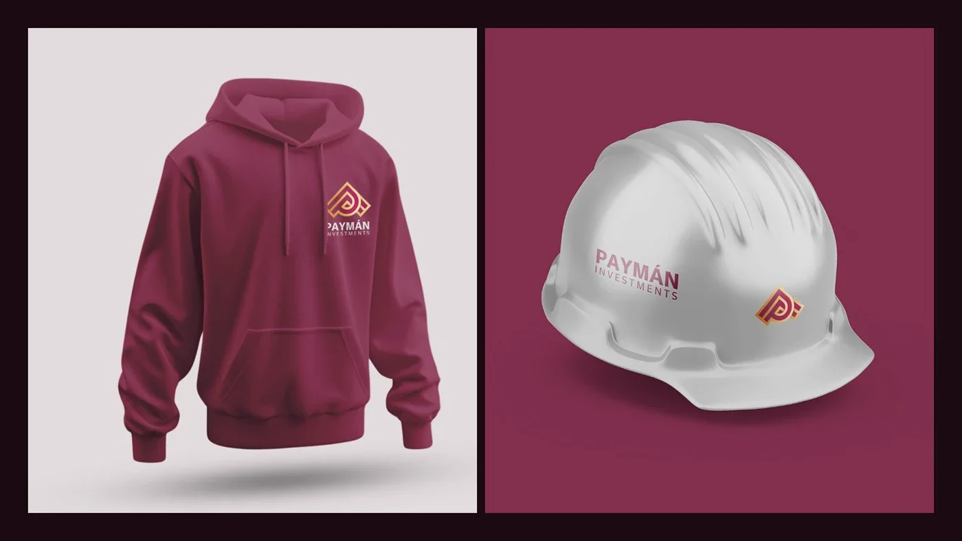
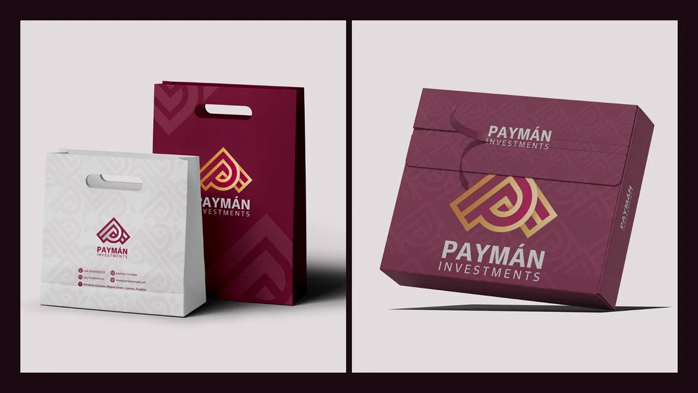
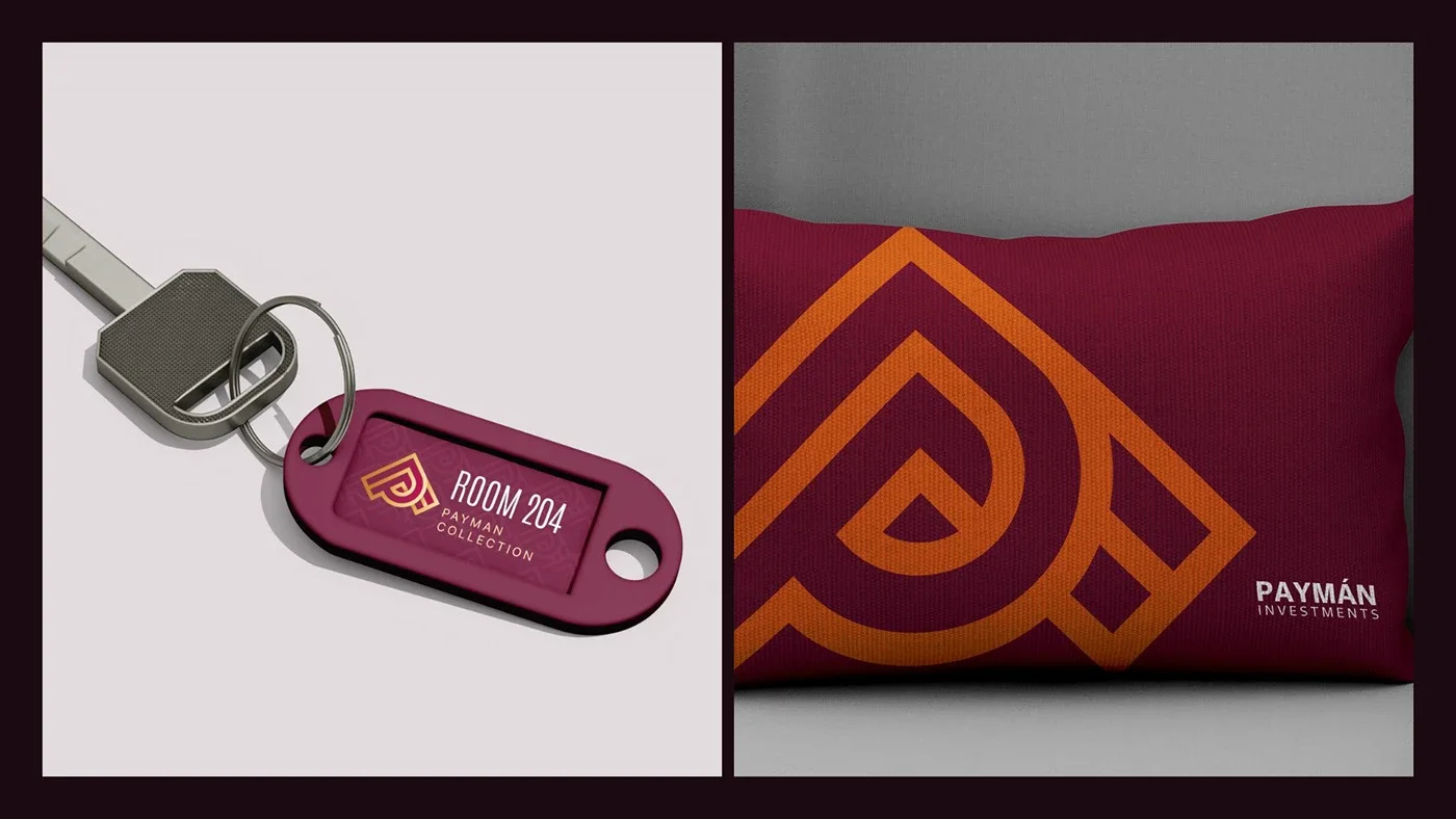
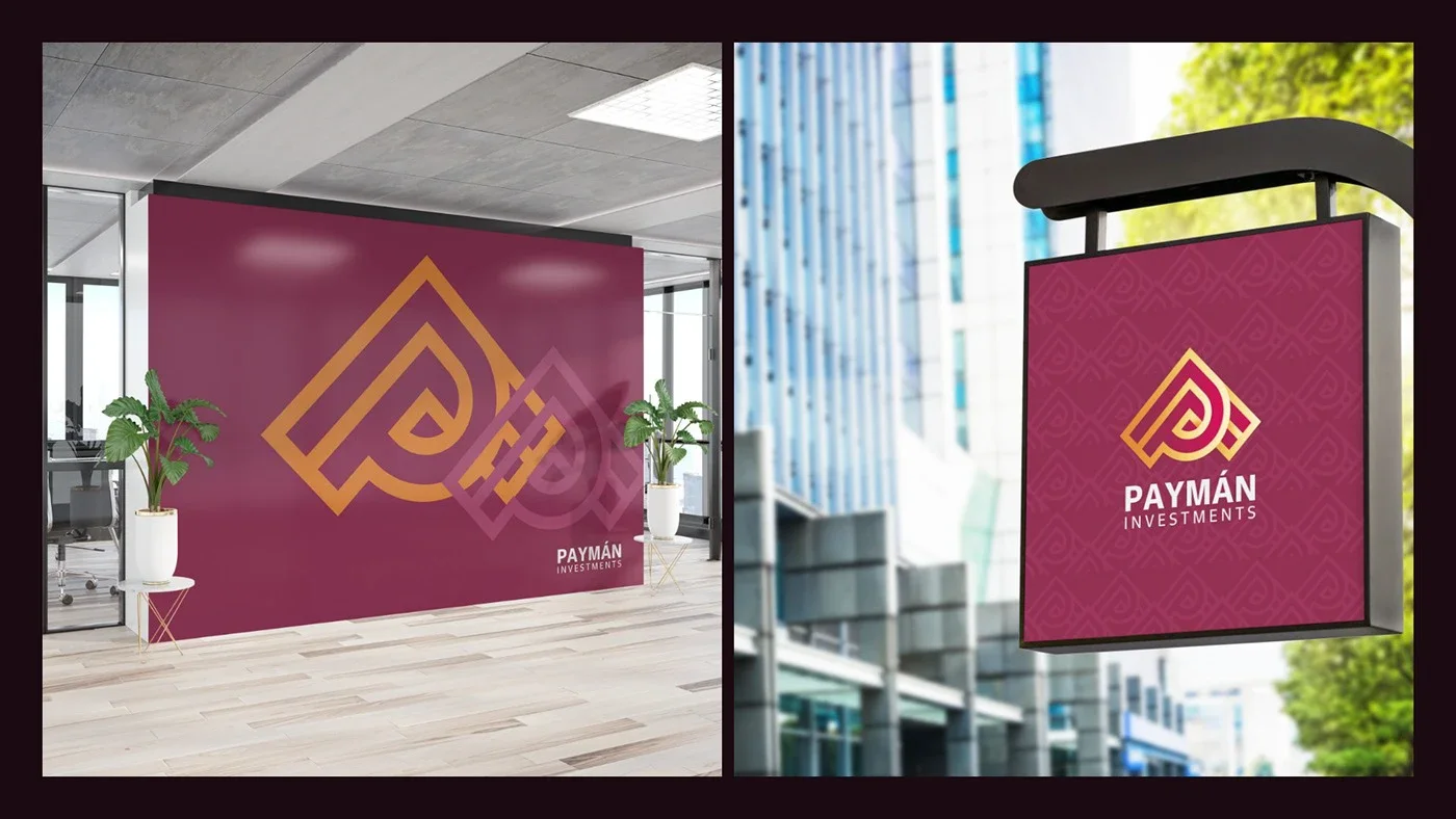
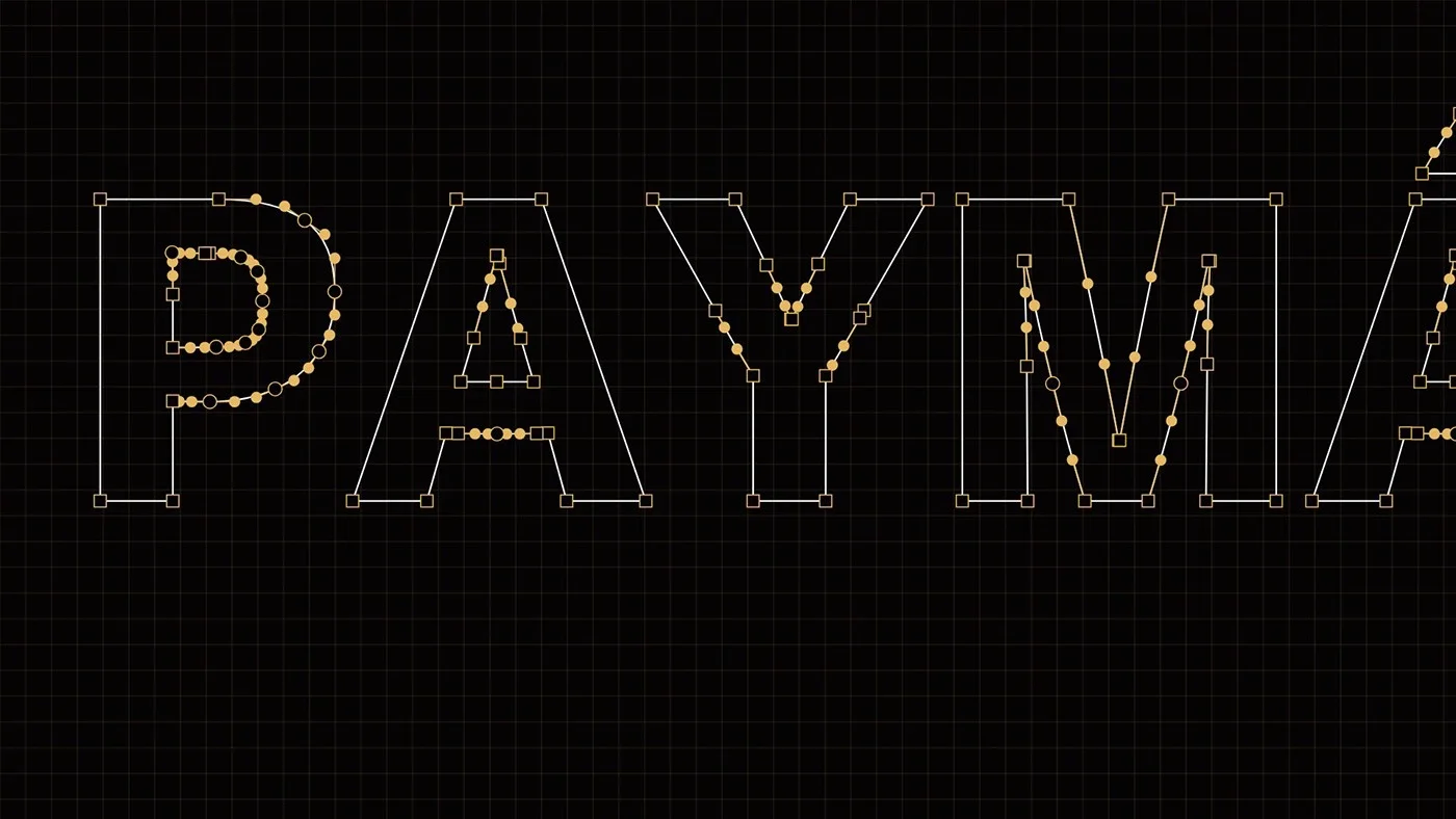
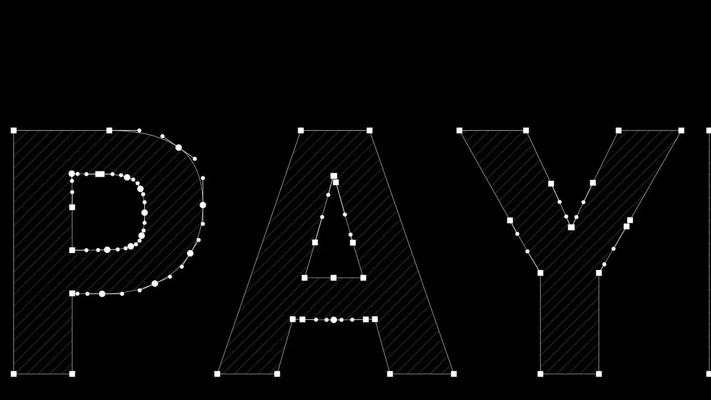
The logo combines the letter P with the roof of a building and an upward arrow, drawn on a precise 45° grid: a symbol of construction, growth and moving toward the future.
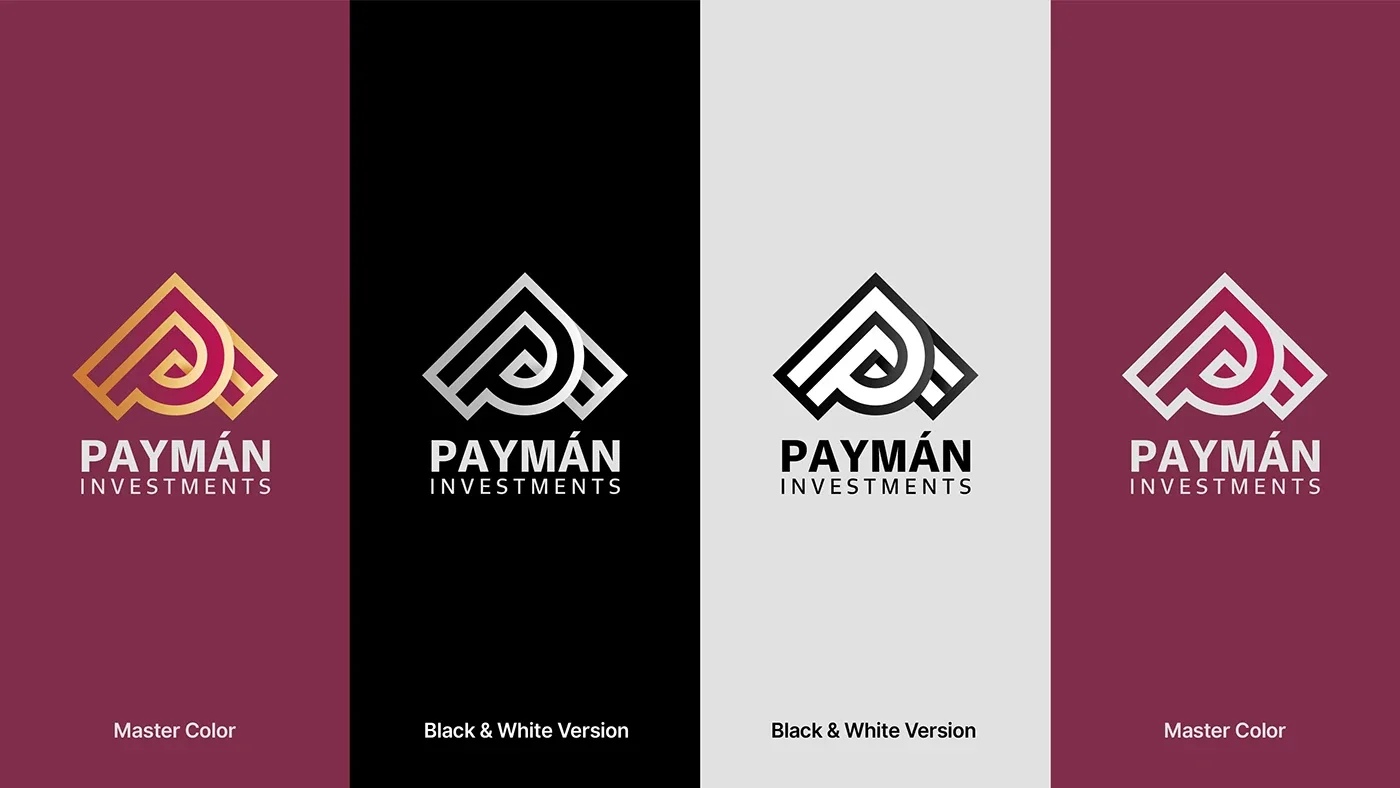
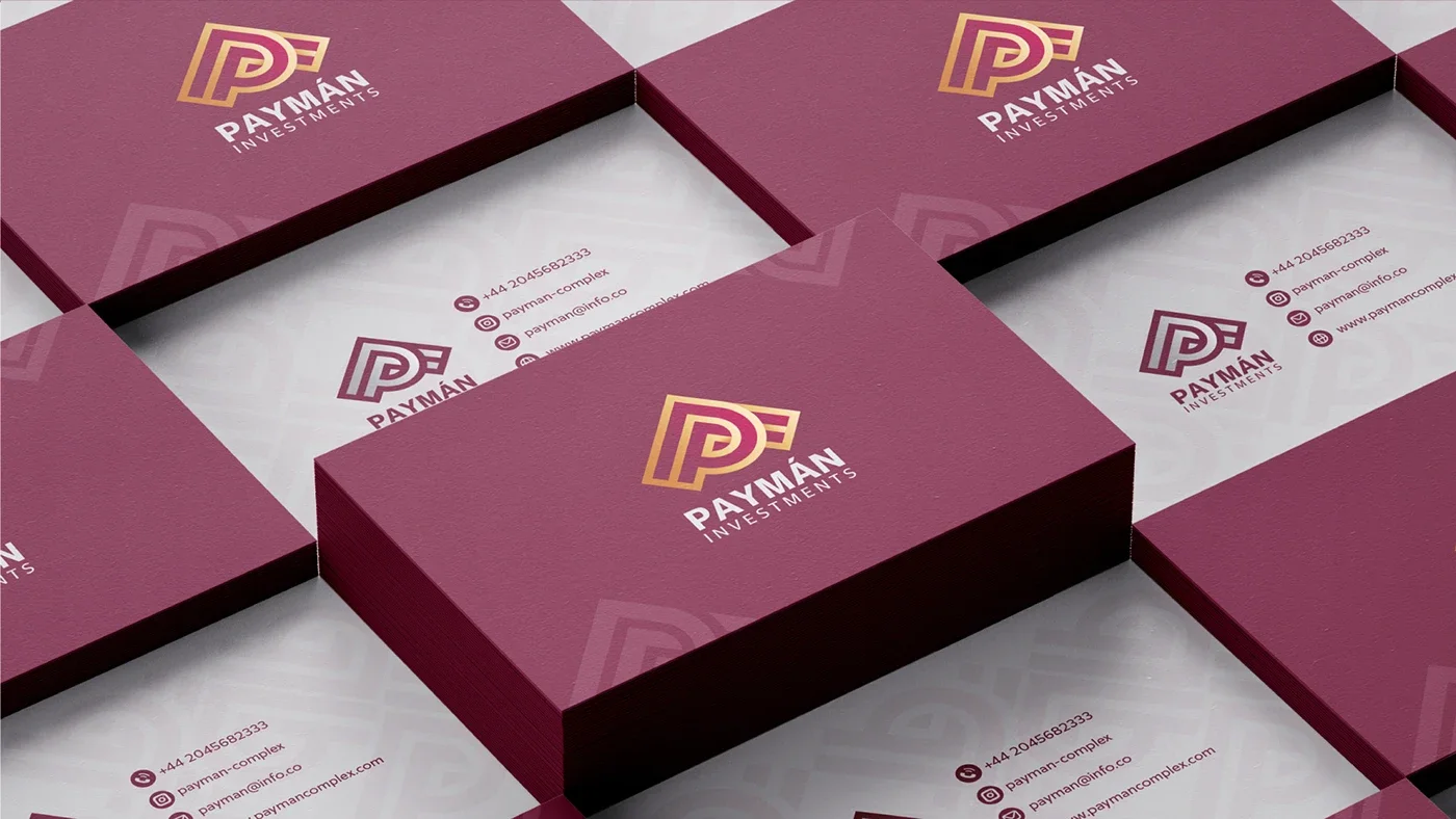
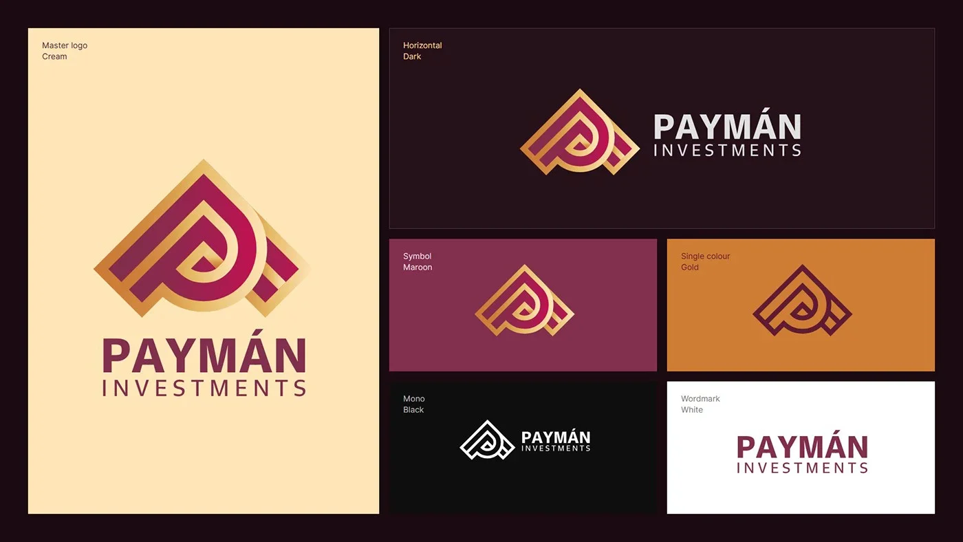
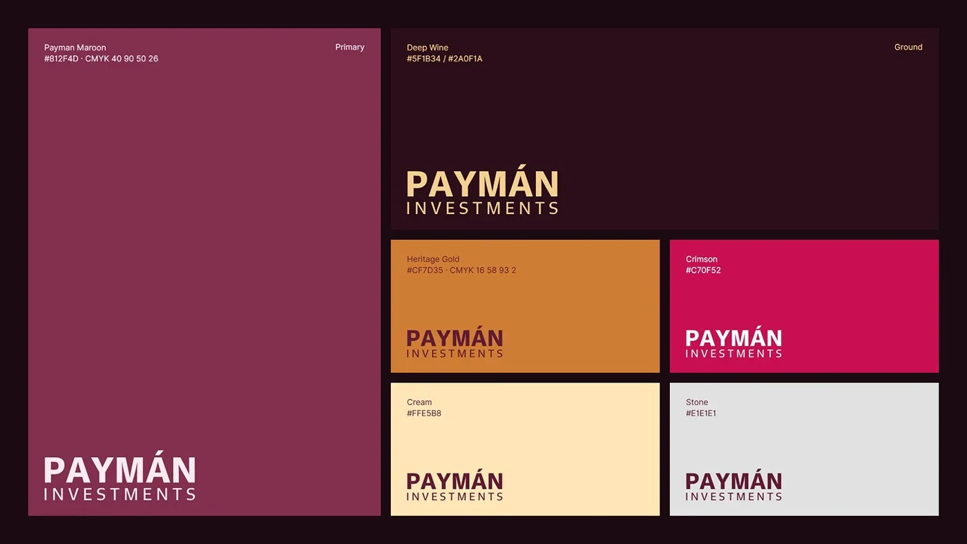
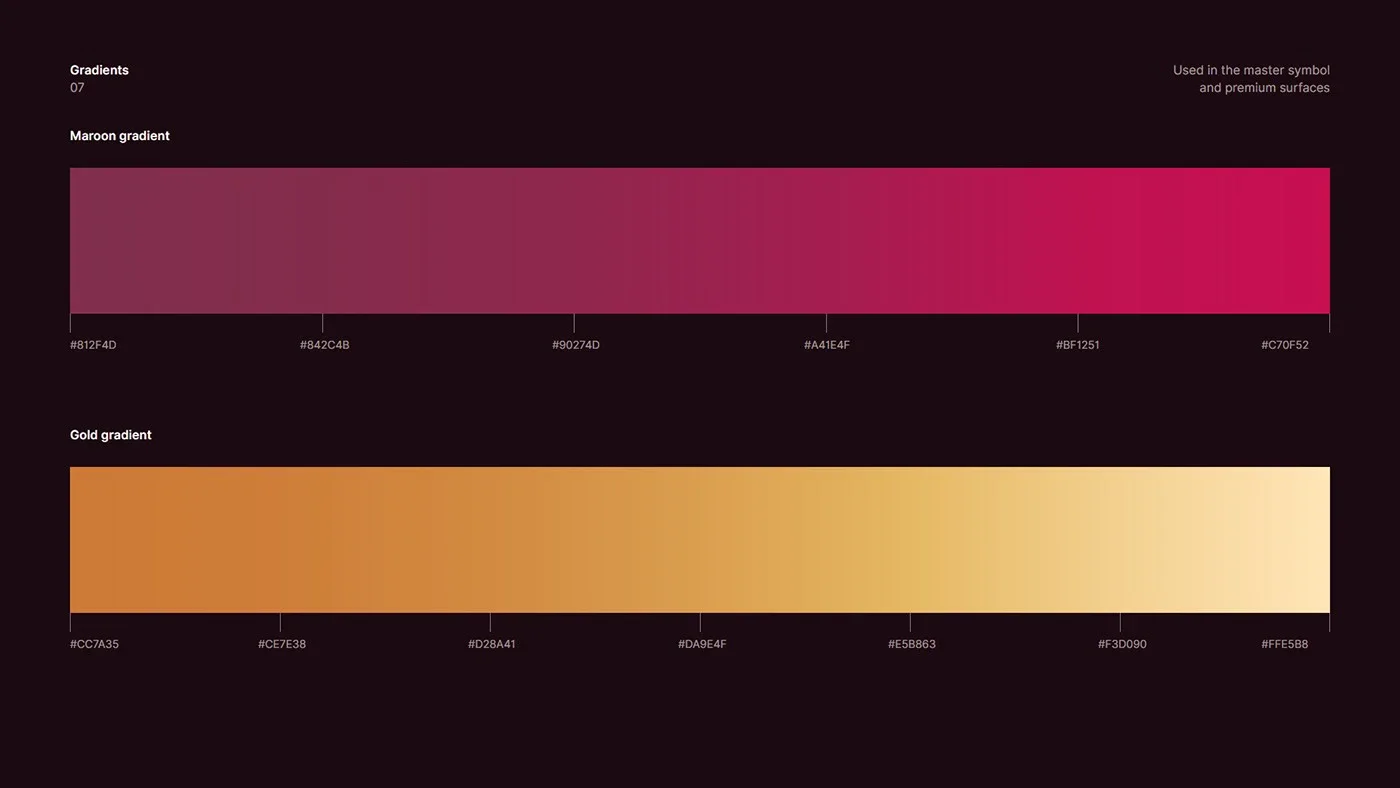
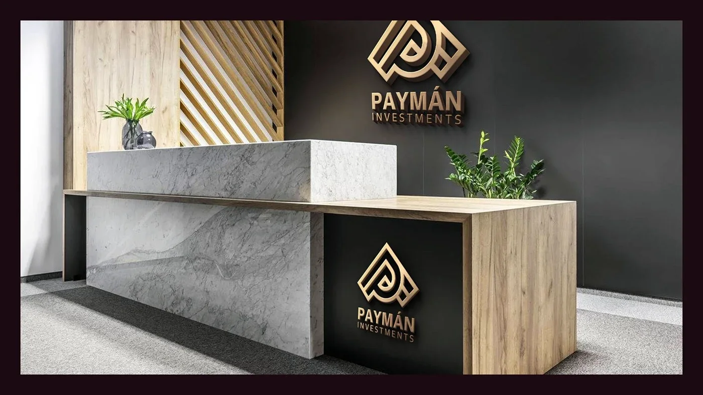
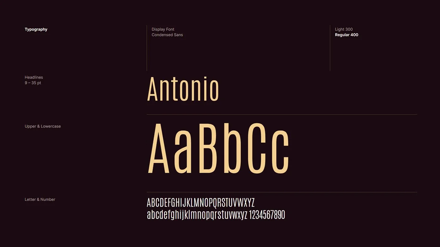
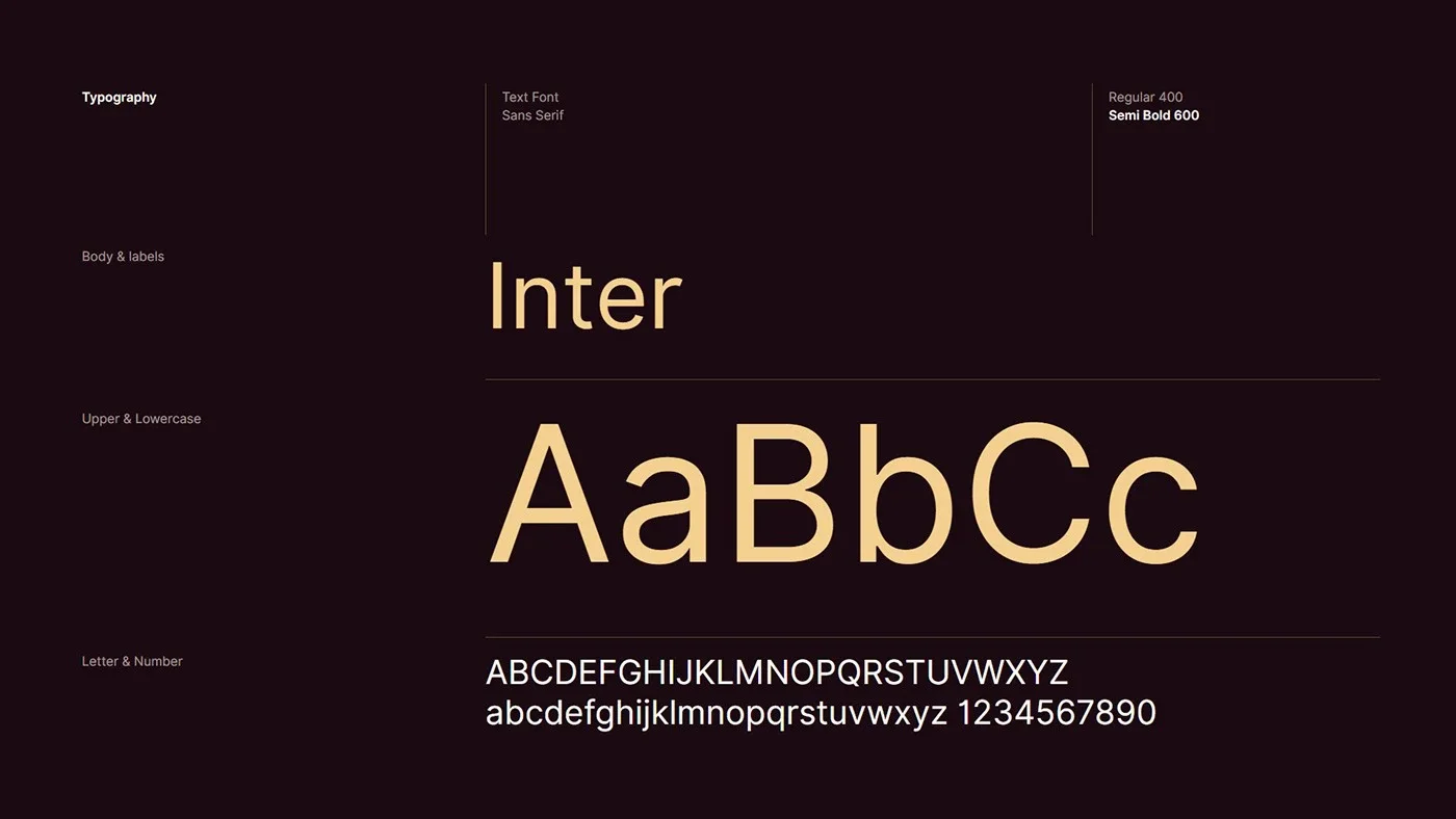
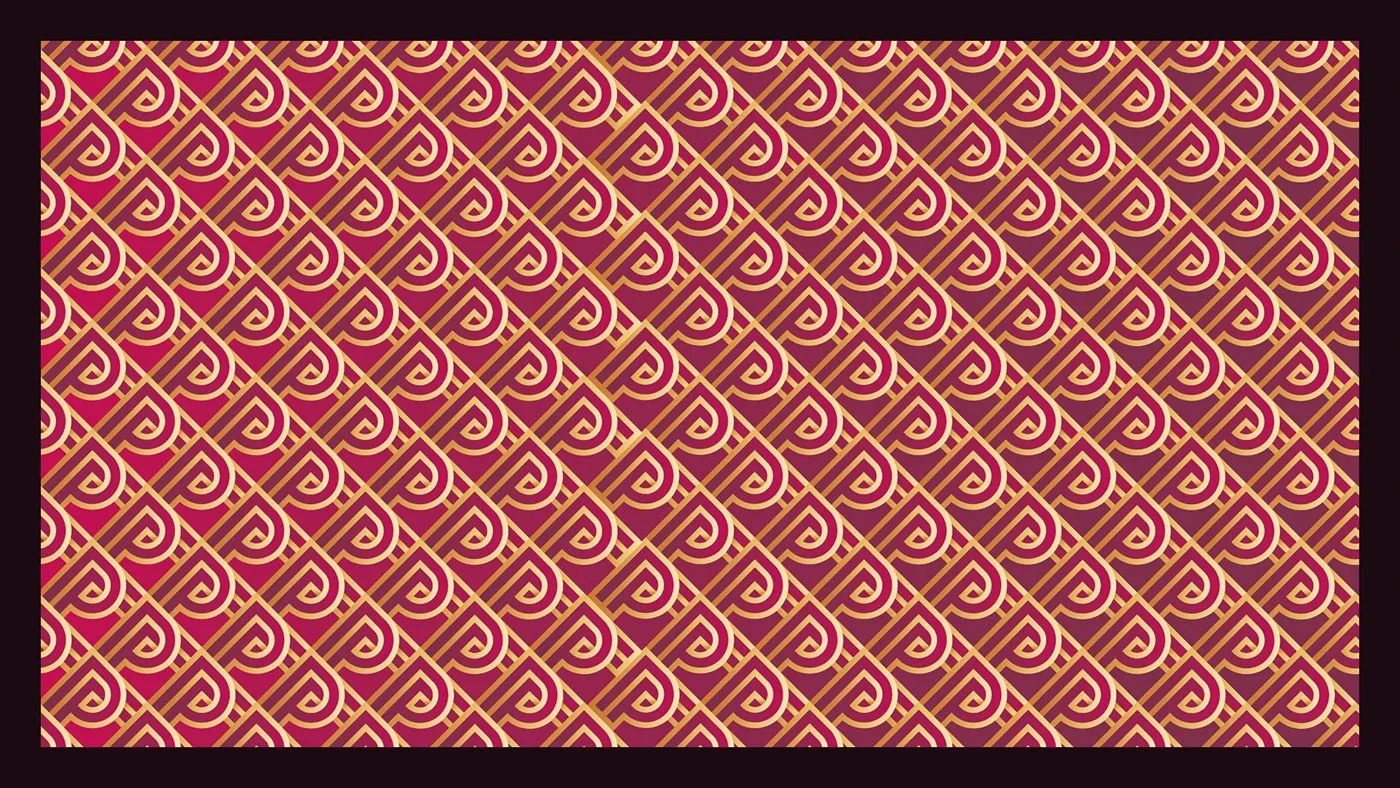
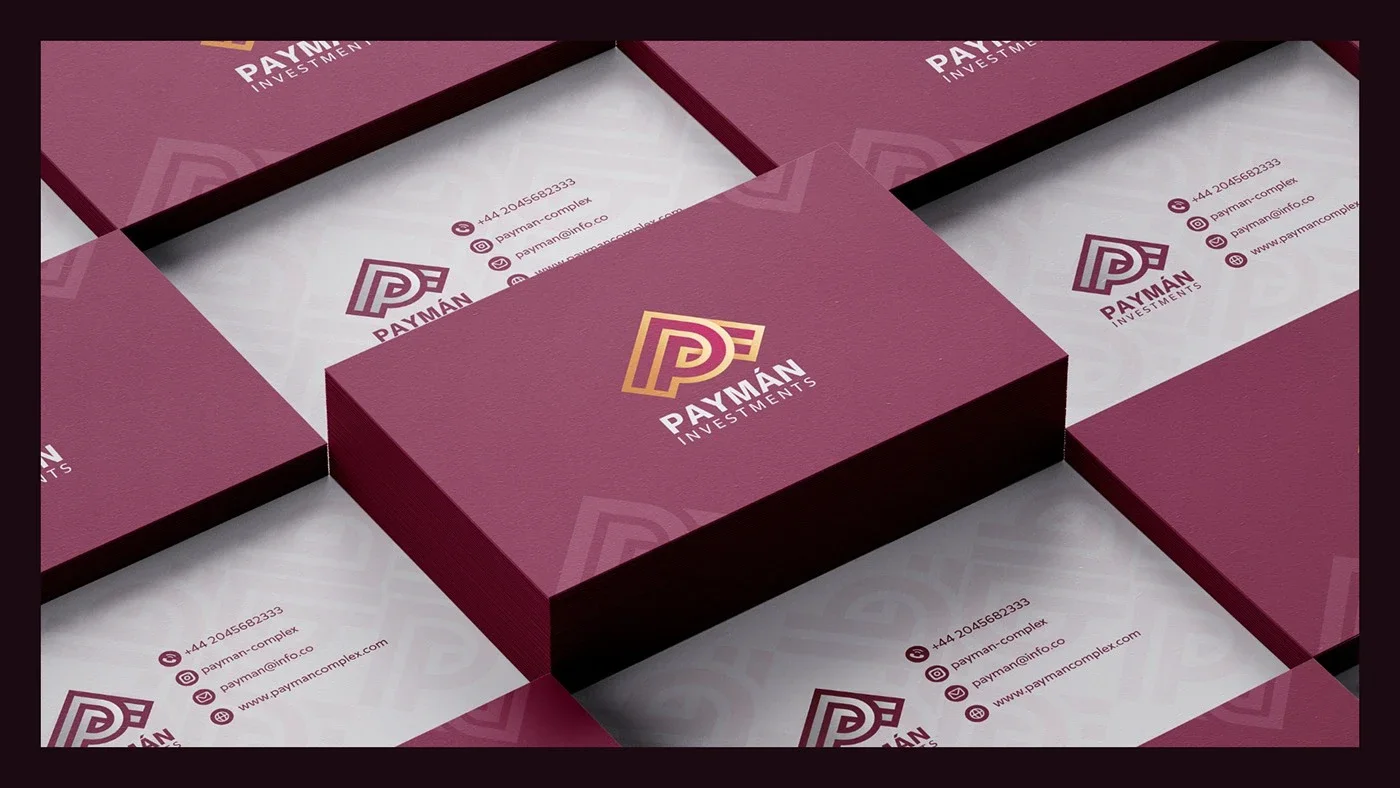
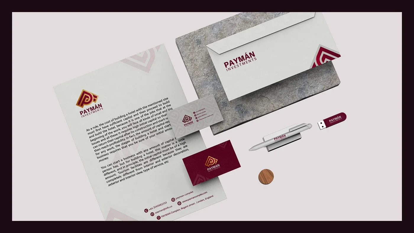
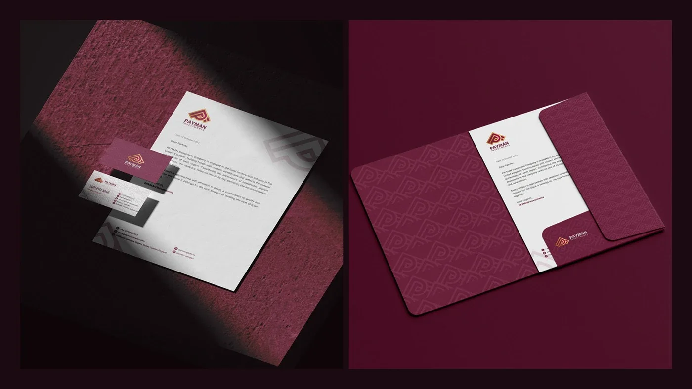
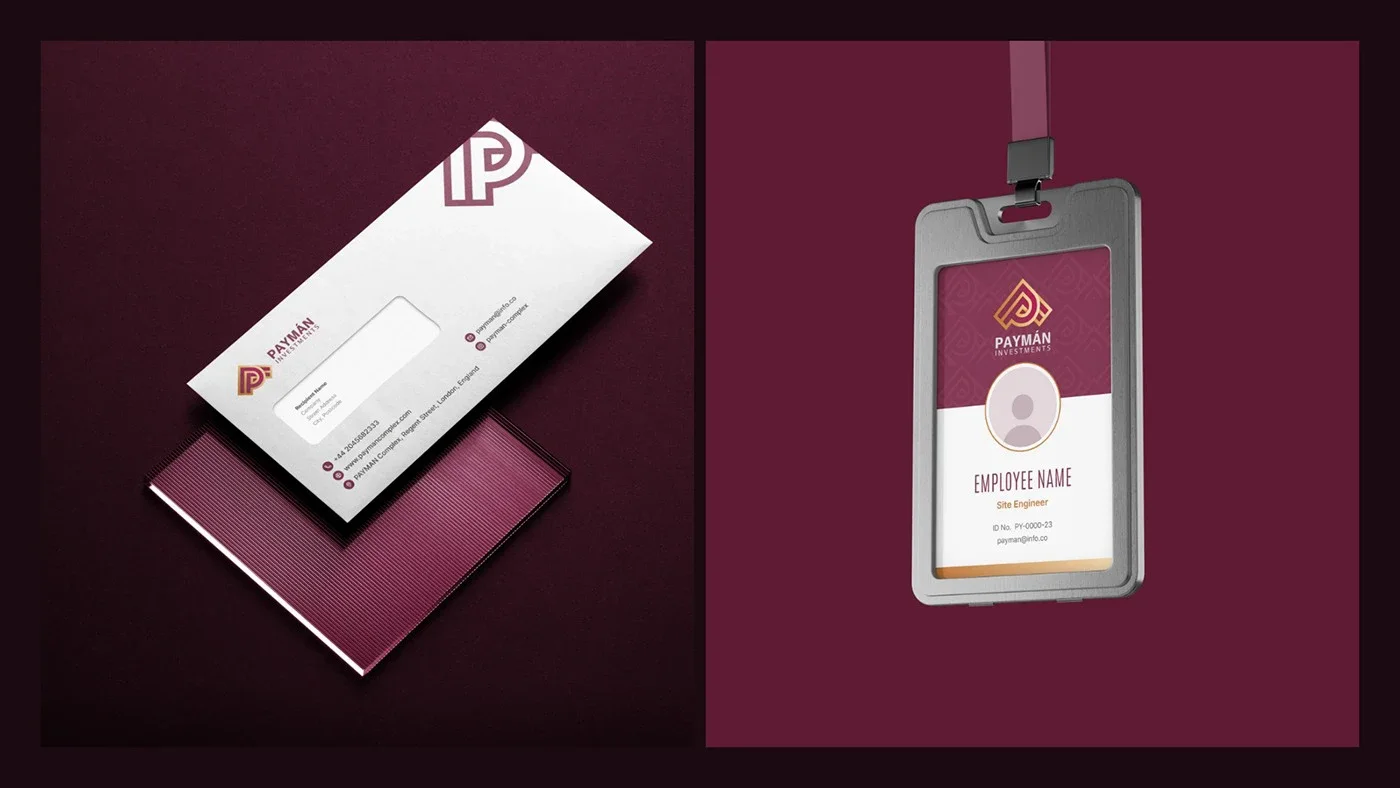
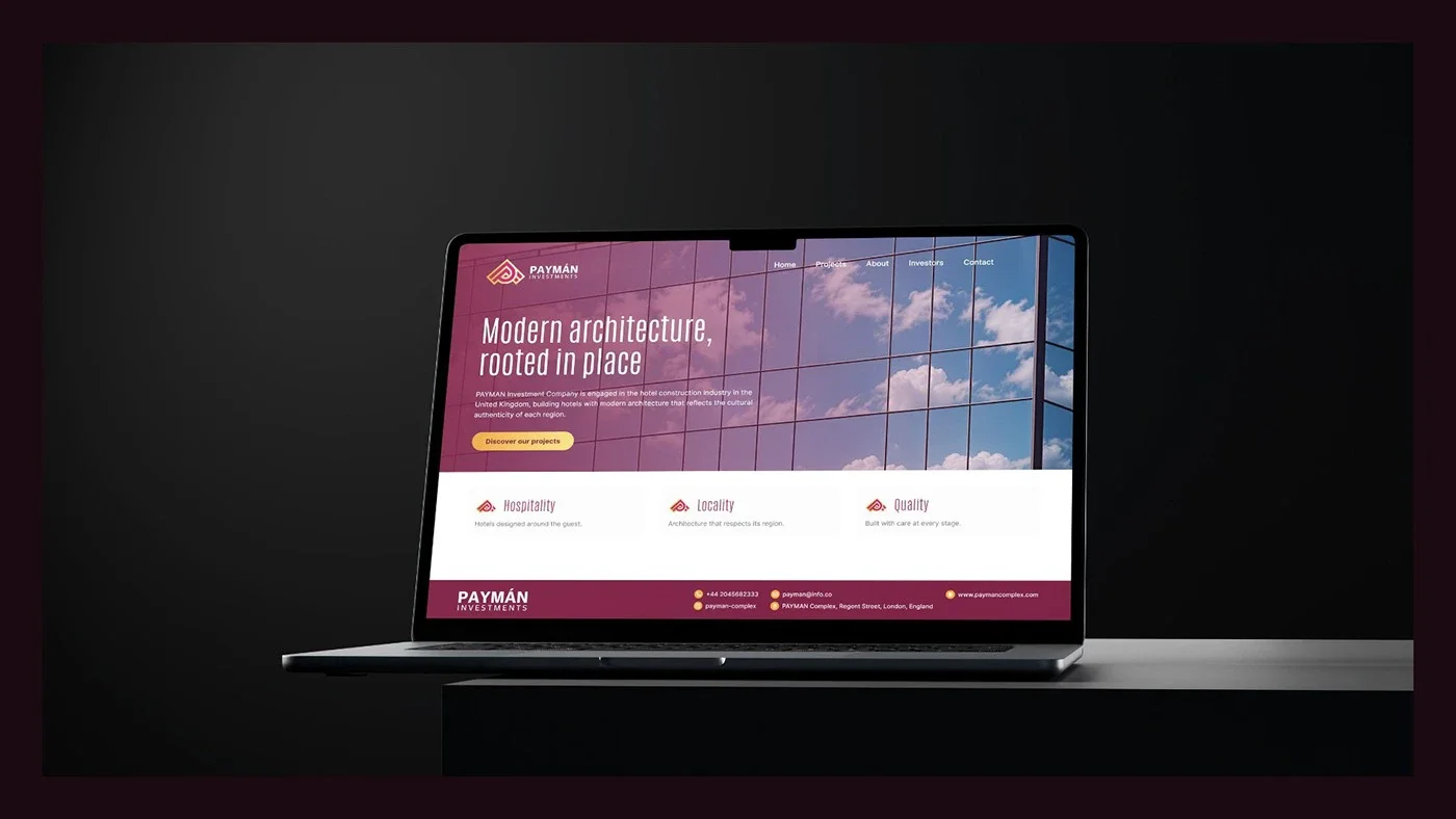
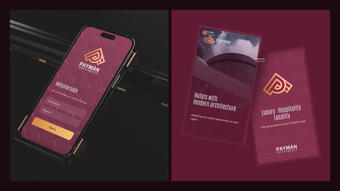
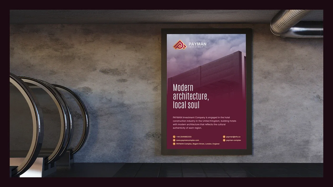
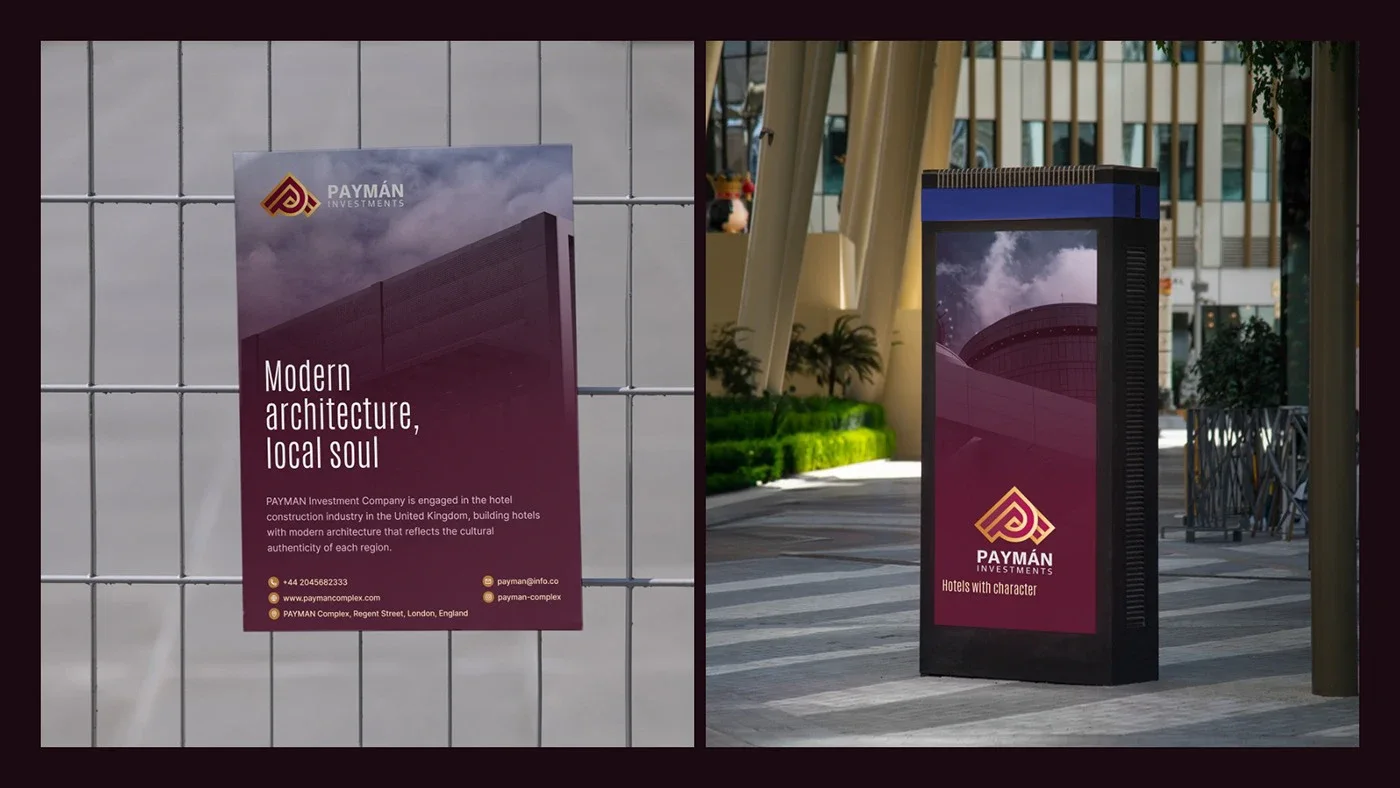
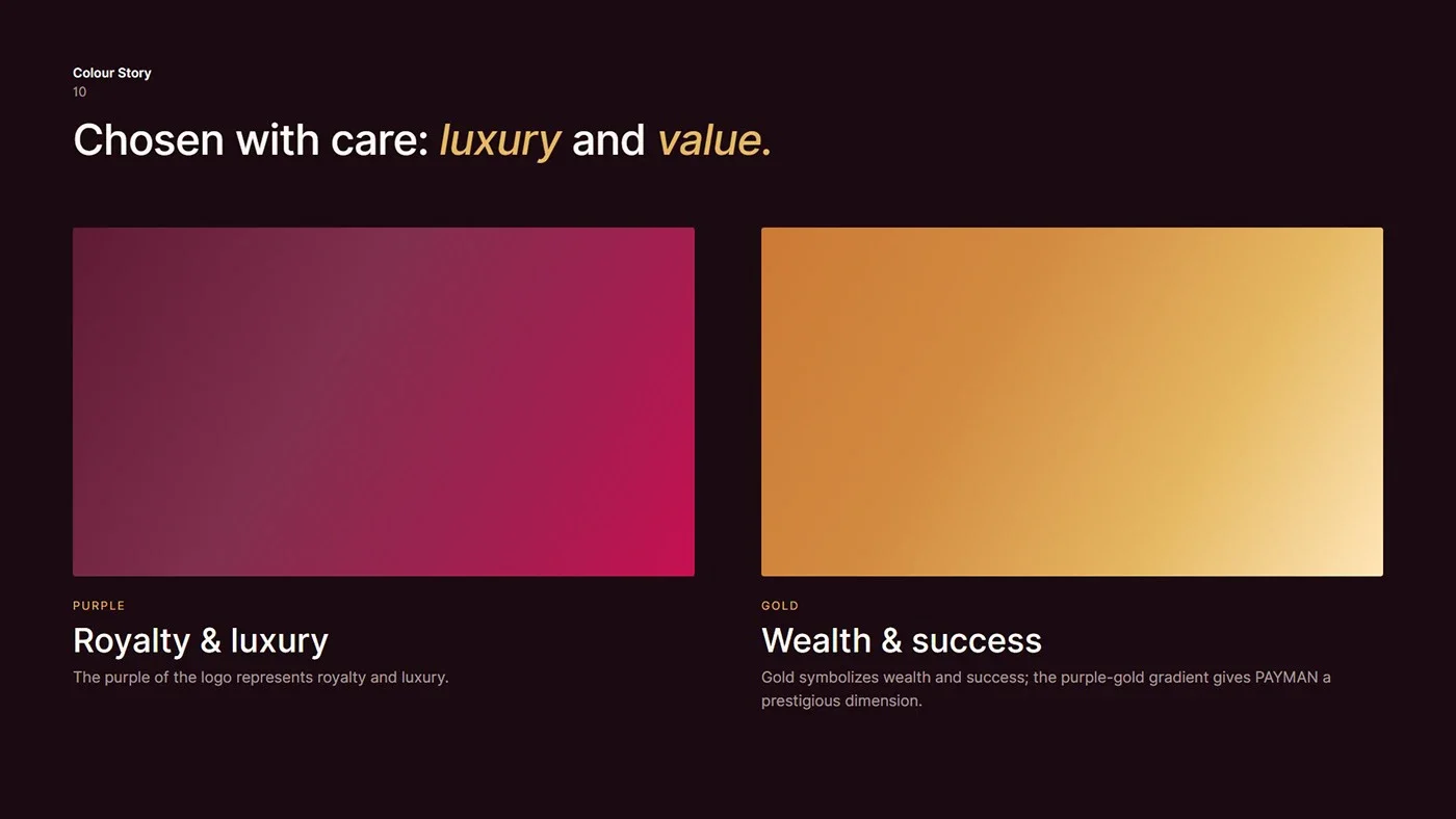
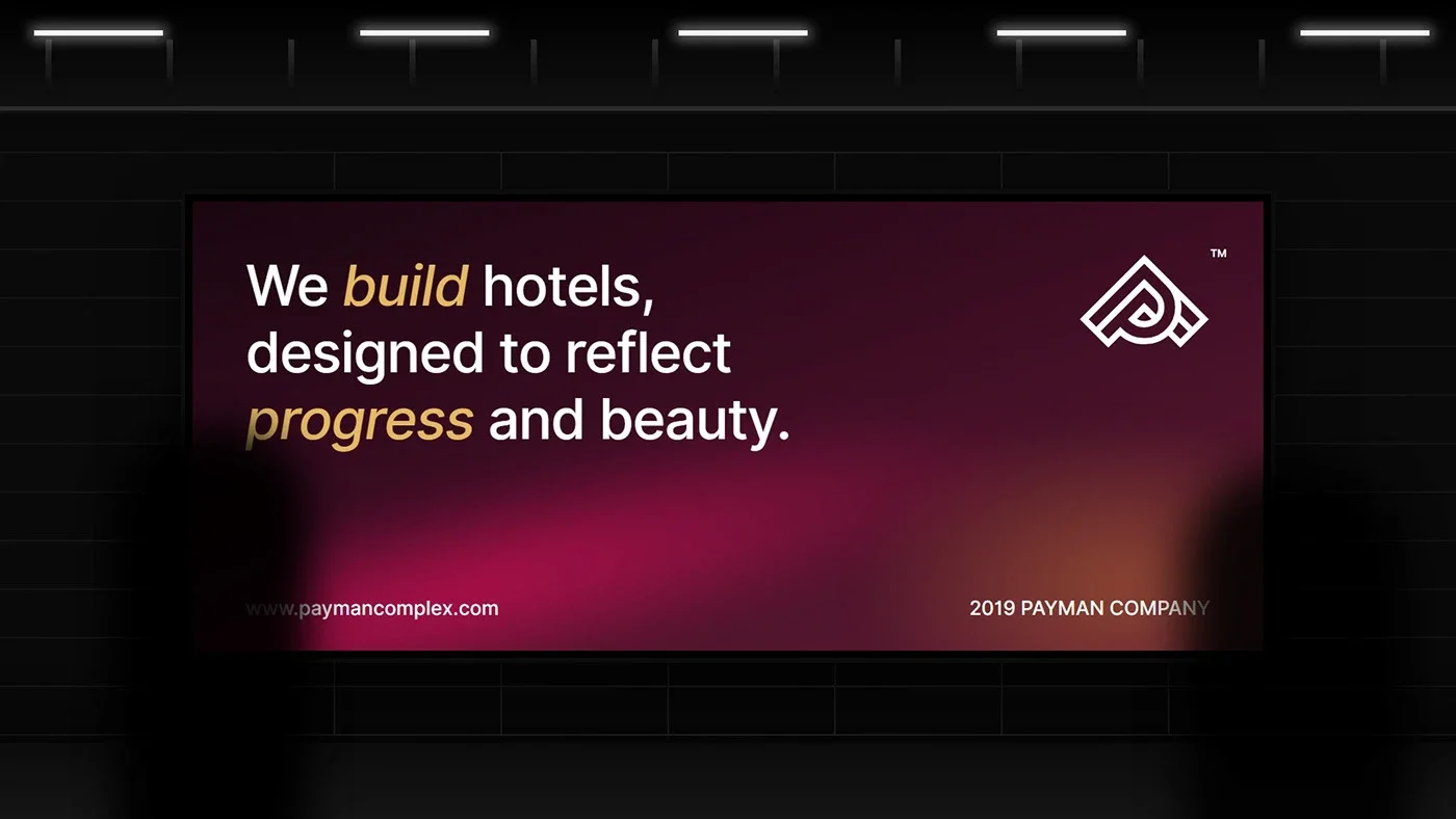
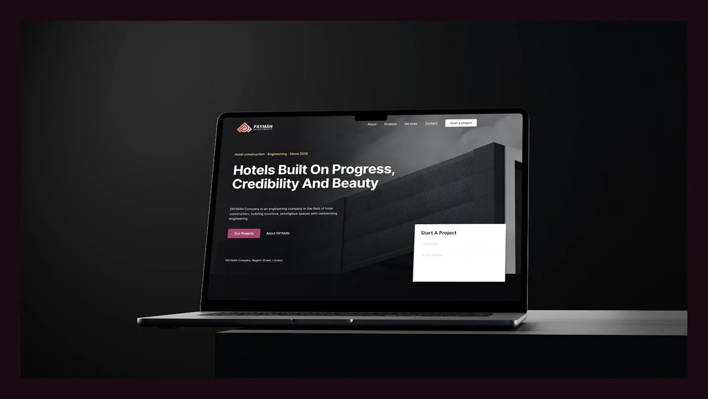
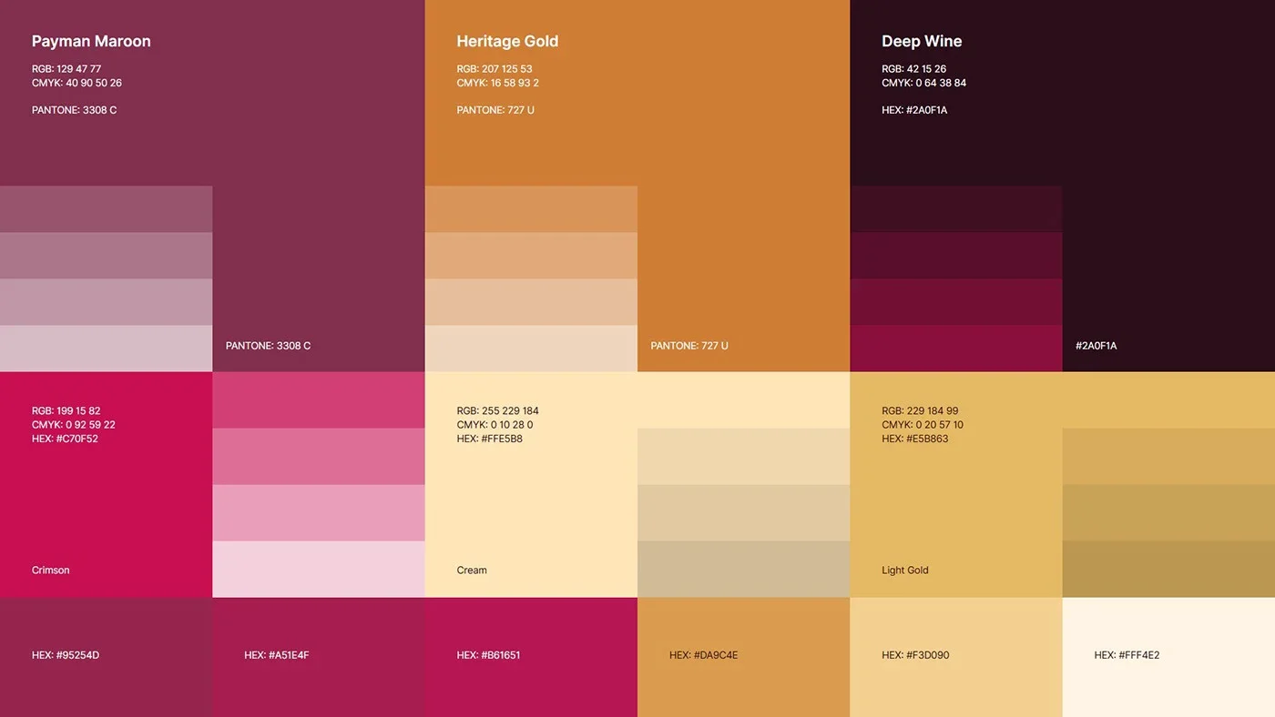
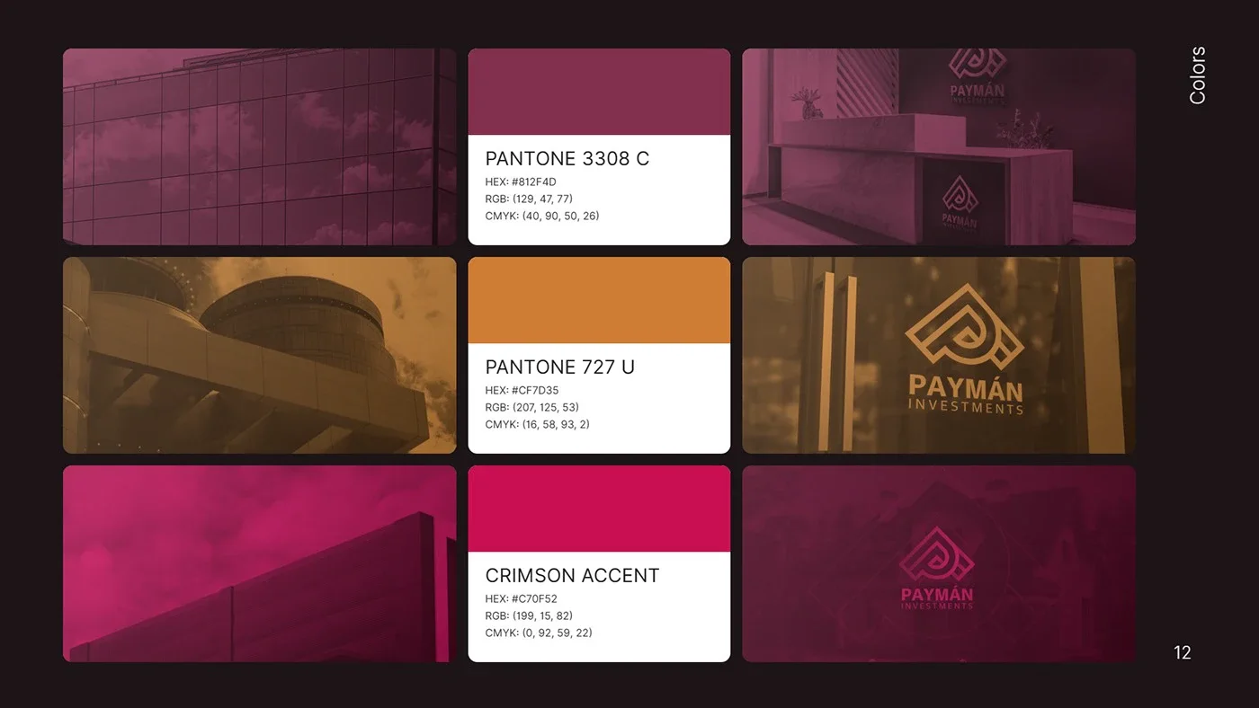
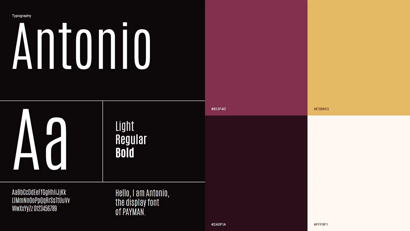
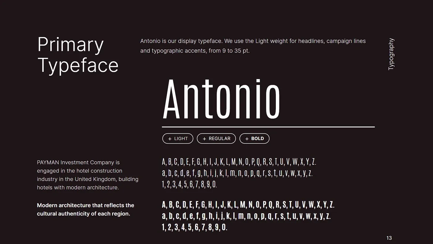
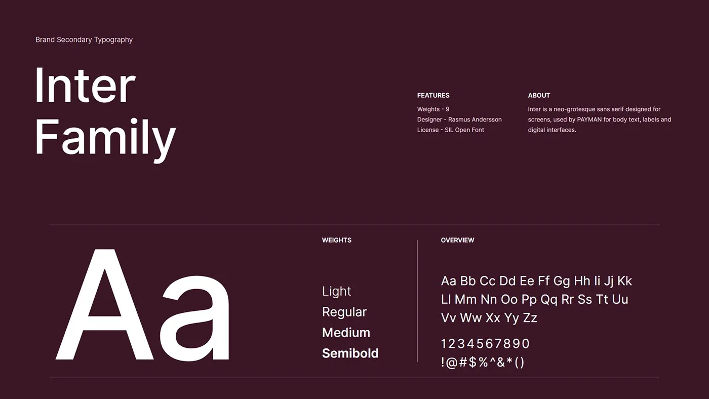
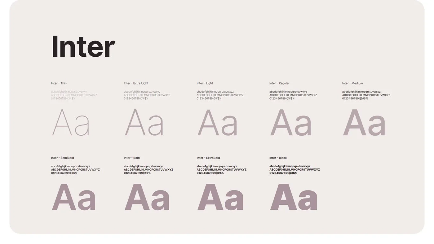
Royal purple expresses luxury and gold stands for wealth and success; their gradient gives the brand a premium feel. The guidelines cover the construction grid, colour palette, typography (Antonio and Inter), brand pattern, 3D logo renders, stationery, signage, digital and environmental applications.
02
字体
02.1
所用字体
视觉形象所用的字体及字重。
- Antonio
- Inter
03
应用展示
作品的展示与应用。
- 01
- 02
- 03
- 04
- 05
- 06
- 07

- 08
- 09
- 10
- 11
- 12
- 13
- 14
- 15
- 16
- 17
- 18
- 19
- 20
- 21
- 22
- 23
- 24
- 25
- 26
- 27
- 28
- 29
- 30
- 31

- 32
- 33
- 34
- 35
- 36
- 37
- 38
- 39
- 40
- 41
- 42
- 43
- 44
- 45
- 46
- 47
- 48